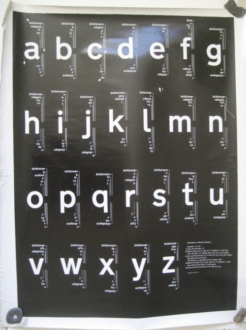
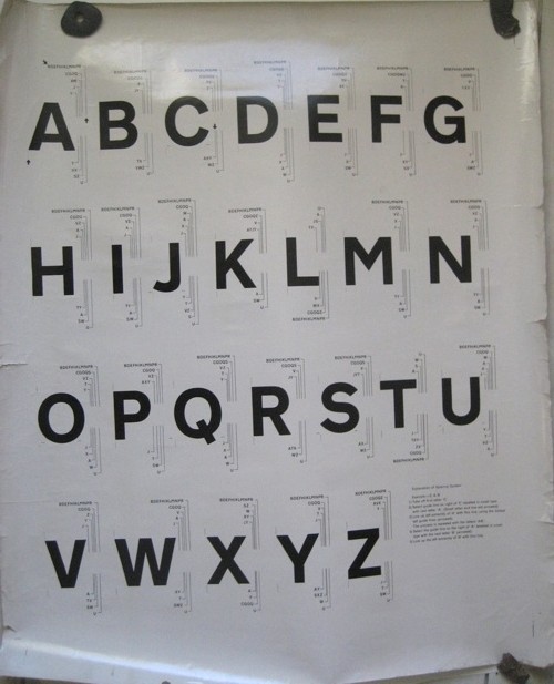
Just in case you thought it was all organised and museum-perfect here, a tale. I discovered a poster tube in Mr Crownfolio’s office, labelled ‘selling’ and in it, quite apart from a poster I could have sworn we’d sold years ago, I found these two oddities which I had also completely forgotten about. But when I took a proper look at them, they turned out to be quite interesting.
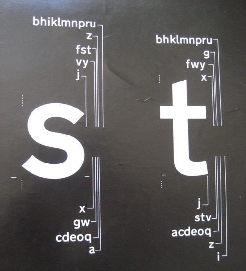
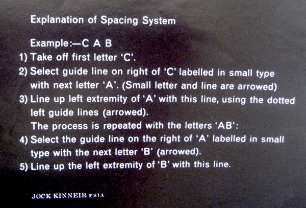
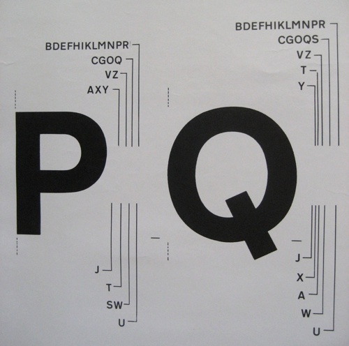
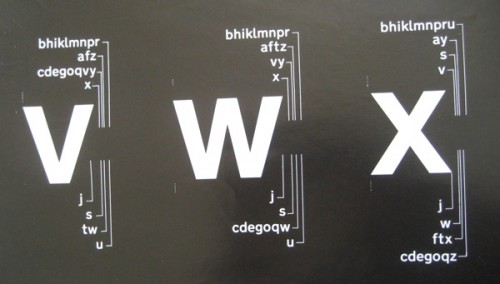
They’re spacing rules for a typeface.
There’s something rather attractive about this kind of very detailed practicality, I think.
And a bit of research gave me some ideas of what they might be. One clue is on the lower case chart.
For those of you reading on your iThing, these instructions are by the great graphic designer Jock Kinneir. He’s best known for designing the template and typeface for Britain’s road signage along with Margaret Calvert (the Design museum have written an interesting piece about it if you want to know more). But in 1964 they also designed Rail Alphabet, as part of the Design Research Unit‘s rebranding of British Railways.
So that’s what I think this is, particularly as the posters came as part of an assorted lot from the Malcolm Guest sale. I imagine that, given their battered and used state, they were up on the walls of a design office somewhere in the British Railways system.
Now of course rendered obsolete by the computer. But a rather a fascinating bit of graphic design history nonetheless.
What I’ve also discovered in the course of writing this post is that Rail Alphabet wasn’t just used by British Railways, but also by Gatwick Airport and the NHS too, right up until the mid 1990s. So it’s more than just a typeface, it’s the written identity of the post-war British state. That’s quite an achievement by Jock Kinneir and Margaret Calvert, and one that deserves more than just being taken for granted.
Even though Mr Crownfolio spends his working days adjusting type into just the right places, I’m not sure that we’ll ever put these up on the wall. Which begs the question of what to do with them. Might the National Railway Museum want them? Or anyone else? Any thoughts?
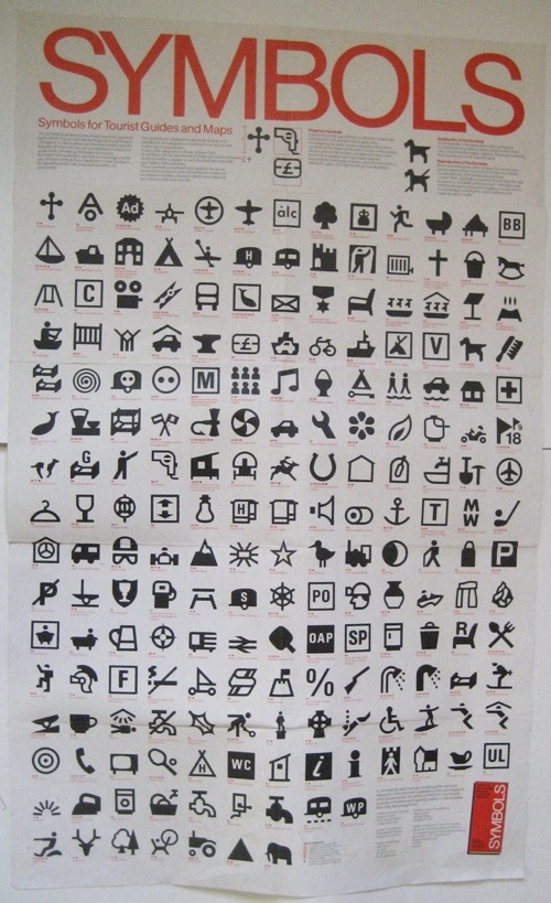
While we’re on the subject of oddities, it also gives me the chance to post this. I’ve always been fond of pictograms anyway, but some of these are particularly choice.
The poster is a chart of symbols for tourist attractions, published by the British Tourist Authority, sometime after decimalisation. I’m guessing it’s meant as a set of suggestions for designers and guide authors. While a few of them are familiar, not all of them caught on.
Some are possibly only required once or twice on any map of the country.
While others were too frightening ever to use at all.
I particularly like the caravan of doom. But there are so many. Anyone for underground disco?
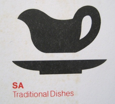
This has to be my favourite, however, and heaven knows I’ve lived in some bits of London where it could have been applied.
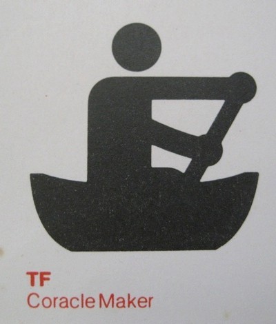
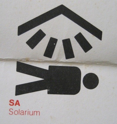
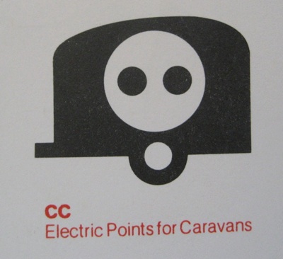
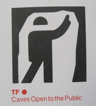
This might also be of interest:
http://www.frieze.com/issue/article/the_time_of_the_signs/
Regarding the ‘Explanation of Spacing system’ poster, I teach with Phil Baines (the interviewer in the above link) at Central Saint Martins College. We have a collection of lettering called the Central Lettering Record started in 1963 by Nicholas Biddulph. This would be a fantastic addition and a useful teaching aid for students. The individual spacing of text is a subject students often find difficult to grasp – there seems to be a misplaced assumption that the computer can do this.
You could always sell on ebay though.
Thanks for the link, that’s a really interesting read. And very good to know that these posters haven’t been rendered entirely obsolete.
Having tried to sell things like this before on eBay (vintage typeface display posters), I can say with some confidence that people don’t really search for this kind of thing!
Really love the poster of map symbols. Being very keen on such design and married to a map lover, it really appealed. It also reminded me of my absolute favourite symbol – the electrical-shaver-point-man that you see in bathrooms regularly on the shaver socket. Do you have any idea who designed that? If I could get a poster of that lovely half-shaven man, I would be a very happy lady.
If I ever see one, I will let you know at once.
I love those kind of pictograms. Back before the internet, a German man produced a giant book of as many as he could find (it was the size of a small microwave and twice as heavy) so there were just pages and pages of ‘fragile’ broken glasses, and this way up arrows and so on and on and on. I bet he had loads of shaver symbols in there too.
My particular obsession is washing symbols, though; I used to make little black and white mosaics of them, for no other reason than it rendered them very strange indeed.
I think you have identified a corner of the market there. I’ve always felt Fired Earth was missing something from their mosaics department.
Absolutely fascinating – and I can commend the Central Lettering record as a home as I suspect the posters sheets are uncommon. They remind me a bit of the layout sheets for Johnston that exist in the LT Collection. A couple of similar items
http://www.flickr.com/photos/36844288@N00/3794704858/
– showing Transport Medium
http://www.flickr.com/photos/36844288@N00/4467071320/
with the Carter/Gibberd alphabet used at London Heathrow – I doubt any now survive.
On the subject of the Rail Alphabet I have to say I often grimace as I pass through many a ‘re-signed’ railway station these days – signs using illegible typefaces, in bizarre colours and at angles designed to make sure you cannot see what station you are at – it is as if they have no idea of the thought that went into designing Rail, and the attributes required.
Thanks for those links – it’s good to see some other examples of the same kind of thing.
The big lesson for me in all of this has been about looking at things properly – we got the two sheets as part of a big lot and mentally filed them as type samples. And yet, when I finally looked at them properly and did a bit of research, they turned out to not only be interesting but also historically valuable. So they will definitely go either to the NRM or the Central Lettering Record as they deserve to.
And yes, I find a lot of modern signage (or to be precise the clutter of commercial ads and shop signs) pretty painful too.
This is categorically not Rail Alphabet but more like Transport Medium and Transport Bold. That is not to say that this typeface wasn’t ever used on the railways. I gather from the National Archives that Jock Kinneir was intending to use the same (or at least a very similar) typeface as was used for the road system on the railways. There are even examples of Transport being used (such as on the facia on the platforms at Coventry station). But in the end Rail Alphabet replaced Transport as the font of choice for the railways partly because the parameters were different (no-one is driving at 70mph on a railway platform needing to make instant decisions that affect the safety of motorists and pedestrians!) so in the end British Rail went for something altogether more ‘Swiss’ for the basis to its Rail Alphabet, believing that the aesthetic nature of the railway alphabet far outweighed the rigorous legibility requirements of the Transport typeface.
If you are convinced that these are examples of railway rather than road posters, then they are definitely pre-Rail Alphabet (which was completed 1964 for a launch by BR from January 1965) and were certainly never applied across the British railway system (except in a few trial situation like that which I have mentioned at Coventry). I’m pretty sure I remember reading correspondence between Kinneir and the BR Design Panel saying it was Kinneir’s intention to use the Transport typeface for British Rail until someone at BR leaned in the then fashionable direction of Akzidenz/Helvetica and overruled him. (The Design Research Unit may well have been involved with the move away from Transport.)
I would love these posters, by the way.
I should also have added that these alphabet posters are of historical significance since they show a prototype spacing method that was never used since both Rail Alphabet (Bristish Rail for railway signage) and Transport (Ministry of Transport for traffic signs) used tiling systems which would prove to be a lot easier to use than the method that Kinneir was trying to explain on the bottom of these posters.
Hello Nick,
Many thanks for a very interesting point. I’ve had a good stare at the posters next to Transport and Rail Alphabet and can’t argue with you (the lower-case ‘l’ and upper case ‘M’ in particular vary between the two fonts in case anyone else wants to check).
Which then, as you say, begs the question of what on earth these posters were produced for. I assumed that they were railway connected as they came from the Malcolm Guest sale, and he not only collected predominantly railway material, but also had contacts in the design studios. But I don’t have any proof of that, so they could indeed be anything at all.
The other reason is that these posters are used – they’re grubby and battered around the edges which led me to think that they were working guides, so to speak. But perhaps they were only prototypes, and the battering has come from being taken to and from meetings?
I now really do not know what to do with them. Shall we have a public vote on it – where do you think these bits of type heritage belong?
These posters are amazing. I selfishly think you should put them eBay. I would certainly bid.
I had no idea these would strike such a chord with people. But I have promised that they will go to an archive, and can’t really go back on that now.
Design 171 (March 1963) was “A special issue on British Railways” and had details of these fonts (Transport) being used prior to the decision of BR to use the alternative Rail Alphabet (loosely based on Akzidenz Grotesk), subsequently taken up by a number of other national railways including DSB (Denmark).
Design magazine can be found here but sadly doesn’t go back as far as 1963 online although Design 193 (January 1965) has more on the British Rail rebrand.
Thank you Nick, that’s very helpful. I am still hoping that Phil Baines will come over and give his thoughts, as so far I’ve only heard them second-hand. And I am definitely not qualified to comment!