Posters on Parade

When I was trying to find some festive-looking posters the other day, my search, rather wonderfully, came up with this in the Science and Society picture library.

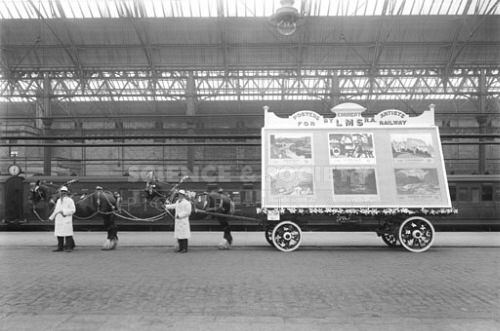
Poster wagon railway poster display for Blackpool carnival

We find ourselves at Blackpool station in 1925, and the cart is getting ready to take part in Blackpool Carnival.  Here’s what’s on display:

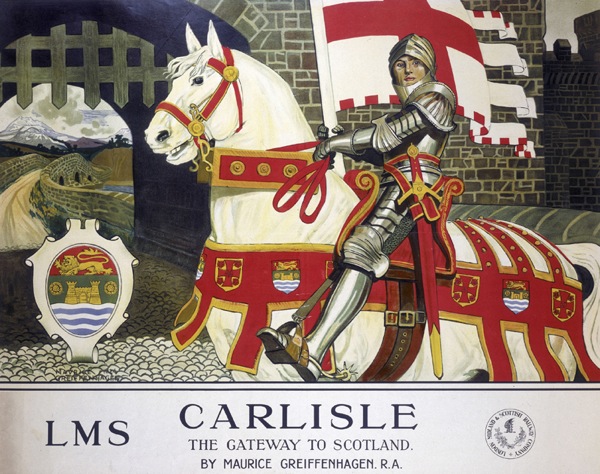
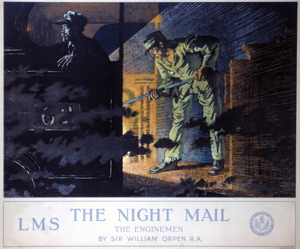
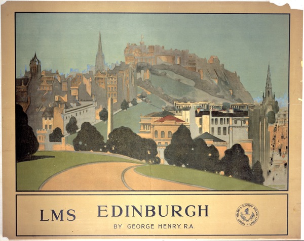
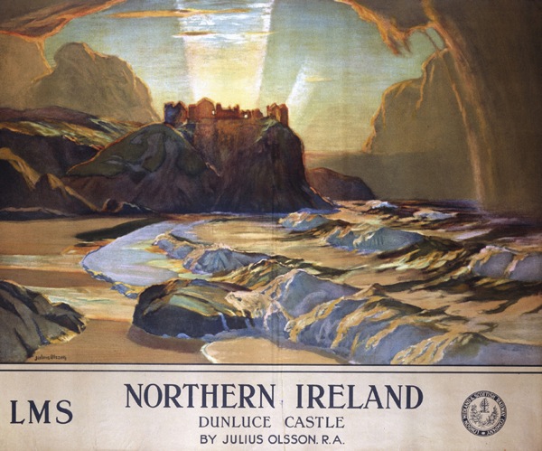
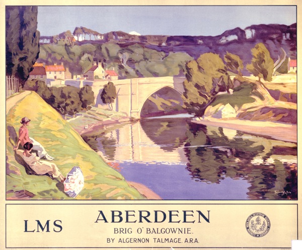
London, Midland & Scottish Railway display pulled by four horses. The display comprises railway posters designed by ‘eminent Royal Academy artists’: ‘Aberdeen’ by Algernon Mayow Talmage; ‘Carlisle’ by Maurice Greiffenhagen; ‘Edinburgh’ by George Henry; ‘The Peak District’ by Leonard Campbell Taylor; ‘The Night Mail’ by William Orpen; ‘Northern Ireland’ by Julius Olsson. The display is to be used in the Blackpool carnival.

This is clearly a fabulous thing simply for existing.  But it’s also interesting in that adds a new layer to how railway posters were shown – and therefore perceived – at the time.

'Aberdeen' by Algernon Mayow Talmage;LMS railway poster, 1924.

We’ve covered quite a bit of this ground on here before, mainly thanks to David Watt’s fine essay on Yorkshire railway posters, which I wrote about a while back.  He makes the point that railway posters are rather unusual because they are displayed at railway stations and so the viewer can assume that they are advertising rail travel, rather than just places.  So they don’t need to show trains or say ‘Travel By Rail’ and this makes them, in his words, semi-detatched from ‘mundane commercial purpose’.  As a result, these posters occupied a middle ground between fine art and the grubbiness of actually selling things.  (This status obviously has implications for modern day collecting of railway posters too, but that’s another thought for another day.)

'Carlisle: The Gateway to Scotland', LMS railway poster, 1924.Maurice Greiffenhagen

These particular designs are more explicit than most about this connection with fine art.  All of the posters on the wagon come from a set of sixteen commissioned by the LMS from Royal Academy artists; they are indeed fine art being displayed on a poster.

As such, they link up with another idea that has come up before, the sense of public bodies using artists and painters in particular for their posters as a form of social good.  I’ve discussed this before in the context of the GPO, Shell and London Transport posters.

The involvement of Shell shows that it wasn’t an attitude that was confined to state-own entities alone, and a similar ethos of public service seems to have been present in the railway companies before the war.  This wasn’t just confined to their publicity; the LNER kept open lines that were running at a loss because they felt that people needed access to them.   So these posters clearly fall into an established tradition of posters which are on the borderline between fine art and advertising, and which are produced, in part, because they are felt to be part of the railway companies’ duties to the wider society they serve.

What’s so interesting about the carnival cart above, though, is that is shows that the LMS had a slightly different attitude to the audience for these posters than I would have imagined – and it’s one that I find rather endearing.

'Edinburgh', LMS railway poster, 1924 George Henry

Until now I’ve always thought of these these posters being on display in stations, where passengers could inspect or ignore them at their will, or in occasional exhibitions (more on these here if you’re interested), where I would have imagined the audience was predominantly middle class.

But at Blackpool, the LMS is taking these posters out, which in itself shows a degree of pride that I wouldn’t have expected, but what’s more it’s taking them out in front of an audience which is probably not quite so genteel and alongside dancing girls, giant dogs and, er, people dressed up as food.

blackpool carnival procession no date

So the LMS is positioning the posters not as ‘high culture’ being foisted on the working classes from above, but very much as part of a thriving and quite varied popular culture.

There are a few other hints too, that this point of view might have prevailed.  This series of posters was one of the LMS’s best-sellers, with Carlisle a particular favourite.  But when I was looking to find the particular posters on display on the cart, I also found a reference to a colour print of William Orpen’s Night Mail.  There are no dimensions given, but I imagine that this would have been a much more affordable version than buying a copy of the original poster.  (And who did buy those? I would love to know.)

Dunluce Castle, Northern Ireland LMS railway poster, 1924 Julius Olsson

Perhaps we need to rethink what the fine art elements of railway posters meant at this time, and indeed later on when they were used by other companies in the same way.  We see something that was imposed on an ultimately indifferent population who were not interested in art, and this may indeed be how the original commissioners of the posters too.  But it’s possible that these images were enjoyed and taken up by a much wider variety of people than we, slightly snobbishly, tend to imagine.
The New Wave

I thought I’d said pretty much everything I could say about Sotherans by now, in particular about the unlikelihood of being able to sell posters at such prices in a world where, thanks to the internet, everyone should agree on what a poster is worth.   But it seems that modern technology  has made precisely no difference at all to their business model, because this year they have once again produced a new catalogue, and the prices are just as jaw-dropping as they have ever been.

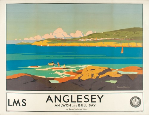
Anglesey Norman Wilkinson LMS Poster 1930
Norman Wilkinson, 1930, £1,995 – sold

So far, so not news.  But this set of posters is worth taking a look at, because it marks an interesting change in the focus of the company, and so perhaps also a movement in the market more generally.

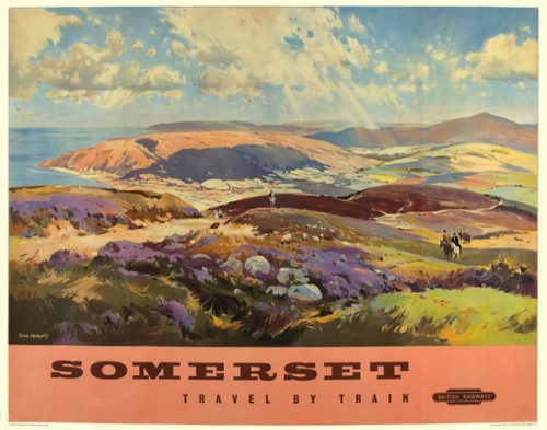
It is true that they still begin with the traditional railway landscape/Terence Cuneo favourites that we have come to know, like this Somerset poster by Jack Merriott.

Jack Merriott Somerset British Railways vintage poster 1960
Jack Merriott, 1960, £1,500

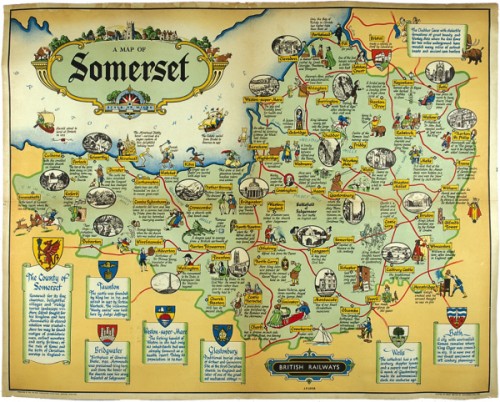
I do also have to note that this Somerset British Railways Map is apparently £760, unbacked, mostly because we bought one for £16.99 on eBay a while back.

JP Sayers British Railways Somerset Map
J P Sayers, 1937, £765

And then sold it for £56 a few years later.  I thought we’d done well, but clearly not.

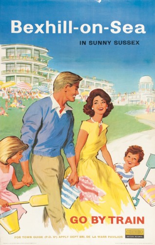
But there aren’t as many of these as you’d expect.  Very soon the catalogue shifts into an entirely different gear, one which might be called cheerful British kitsch.

Bexhill on Sea vintage british railways poster 1961
Anonymous,1961, £800

In fact a few pages in the catalogue look more like a romp through Quad Royal than an up-market poster sale.

Page from sotherans catalogue

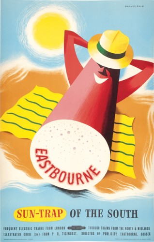
There are some good posters in here – I did actually type great and then deleted it, because mostly they’re not.  They’re bright, they’re very 1950s, but what they are not is classic graphic design (although I might just have to make an exception for a this stick of rock).

Eastbourne vintage travel poster 1950 Bromfield British Railways
Bromfield, 1950, £685 – sold

What’s really interesting though is that almost all of them have sold, and for prices that they just wouldn’t reach anywhere else.

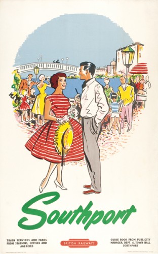
Southport, vintage British Railways travel poster 1965
Anonymous, 1965 (??), £485

The interest in this style is not entirely a new thing.  When I first started going to poster auctions in about 2002, Christies had just started selling these kinds of poster, and they were doing very well in the their auctions too.  But when Christies introduced their new £800 minimum lot price, this rather ruled them out.  Clearly though, as this catalogue shows, the demand for them hasn’t gone away.

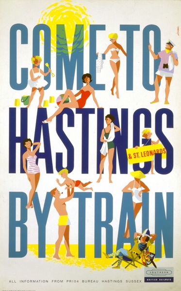
R M Lander come to hastings by train vintage british railways poster 1962
Lander, 1962, £685 – sold

Sotherans could be accused of pushing it to the limit, mind you.  As I’ve mentioned before, these two Harry Stevens posters are not exactly rare.

Harry Stevens vintage London Transport poster Travel Enquiries
Harry Stevens, 1974, £85 – sold

HArry Stevens litter vintage 1974 London Transport poster
Harry Stevens, 1974, £85 – sold

In fact they have been swilling all over eBay for some time.  Right now you can buy a framed copy of the top poster for £21 should you wish, and a portrait version of the lower one for £23.  Which does make me wonder whether Sotheran’s buyers are too foppish and tweedy to have come across the internet at all.

But it goes further.  There are a slew of posters on there without much in the way of merit.

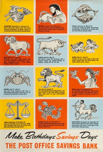
Birthday Savings vintage post office savings bank poster Rex Moreton 1960
Rex Moreton, 1960, £195 – sold

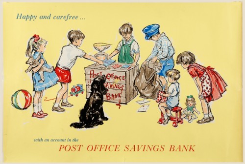
Happy and Carefree vintage Post office savings bank poster GPO 1960
Anonymous, c.1960, £125

They’ve sold too, when you’d struggle to get a tenner for them on eBay.  Really, who are these people? And how can I sell them some posters?

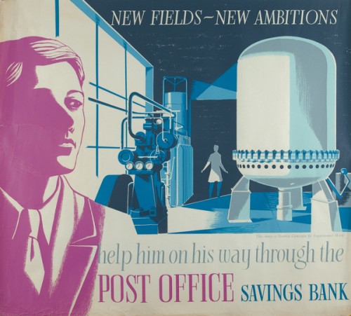
To be fair, there are also one or two nice GPO posters in there too, like this Eric Fraser.

Eric Fraser, vintage GPO poster, Neutron generator c1930-40
Eric Fraser, c.1930-40, £225

Along with one or two good LT ones too.

Peter Roberson London Museums vintage London Transport poster 1956
Peter Roberson, 1956, £500

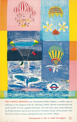
Enid Marx vintage London Transport poster 1965 The Science Museum
Enid Marx, 1965, £500

Although this William Fenton has to be in the ‘stretching it to get a tenner on eBay’ category.

William Fenton dull bus vintage London Transport poster of dull buses
William Fenton, 1969, £250

While you’d have to pay me to take this one away.

Bus Stop Poster 1970
Anonymous, 1970, £55

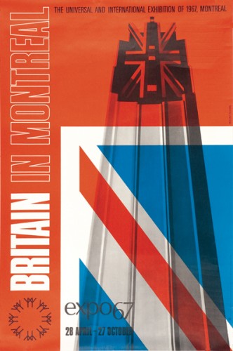
Worth noting too is this Mount Evans, which has to be one of the better pieces of post war design in the whole catalogue.

Mount Evans Britain CoI poster 1967
Mount/Evans, 1967, £350

The style is modern rather than kitsch, but it still represents the same movement away from landscapey railway posters and towards something more interesting (at least if you’re me).

So what does it all mean?  My first guess would have been that the world is running out of railway posters and so dealers like Sotherans have been forced to diversify.  But in fact, it’s the more modern posters which have been selling for them, leaving more traditional fare like the Somerset posters still for sale.  So this must be what people, even the rareified breed who go to Sotherans want these days.  Which is probably worth noting, not least because it gives the rest of us a good chance to do some upselling from eBay.

Now, I would send you off to the Sotherans catalogue to take a look at what’s sold for yourself.  But literally while I was typing this post, they took that page down, although you can still see an online version of the print catalogue.  So I think that more of the posters than I have listed are sold, but I’m not able to check that any more.  They have, however, replaced it with a new set of posters for sale, including a very interesting set of GPO Savings posters. I’ll take a proper look at them (and their prices) soon, but if you want to take a peek before then, you can find them here.

Show Card

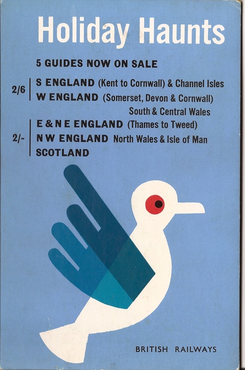
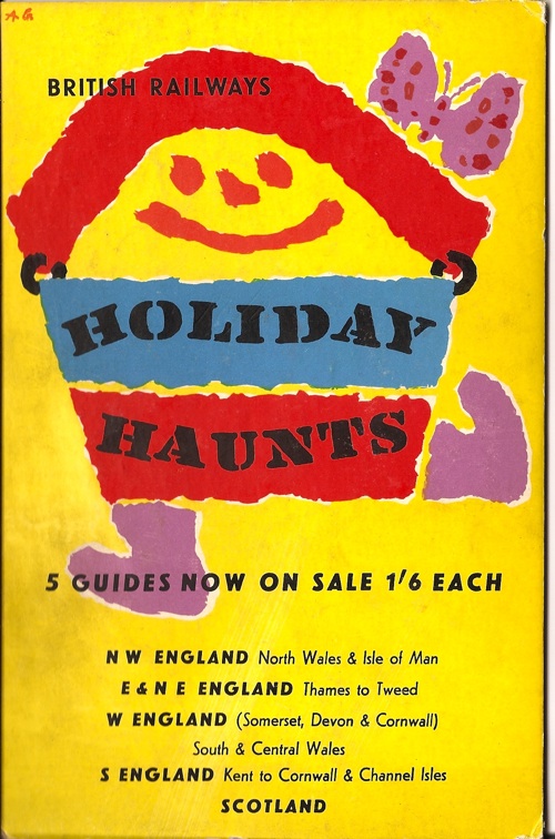
The designs here may at least be familiar to careful readers and/or shoppers.

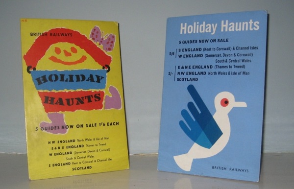
Tom Eckersley Holiday Haunts showcard

Because both of these appeared in the final Morphets sale last year.  The blue bird above is by Tom Eckersley, the happy beach kit below by Abram Games.

Abram Games Holiday Haunts showcard

But these particular examples aren’t posters, instead they are rather wonderful display cards, presumably for use in ticket offices and travel agents.

two British Railways showcards on our mantelpiece

This might seem like an extravagant piece of publicity, but Holiday Haunts was a major production for British Railways, with over 200,000 copies printed at its peak.  (If you want to know more, I’ve gone on about it at some length before.)

The design alone was quite enough reason to get these (from eBay, for a reasonably small sum), but actually the format is fantastic.  They’re small and have their own stands.  We don’t need to frame them or find some wall space and they look very fetching on the mantlepiece. I’m starting to think all posters should look like this.

Query

Today on Quad Royal, a reader’s question.  And it’s not one I can answer, so I thought I’d throw it open to you lot.

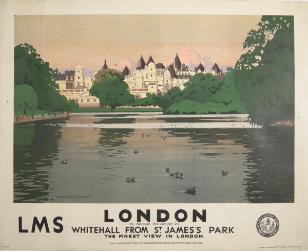
Take a look at this.

Norman Wilkinson Vintage Railway poser London Whitehall  - American

A classic.  A Norman Wilkinson classic from 1930 to be precise. But now take a look at the small print.

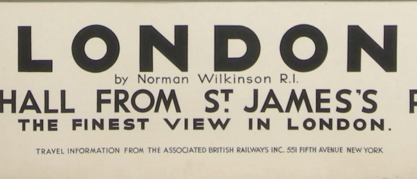
Wilkinson small print

Travel information from the Associated British Railways Inc, New York.

Now a bit of research tells me that this was a body formed by all the British Railway companies in the early 1930s whose job was to promote rail tourism in the UK to Americans, and which lasted until the Second World War. Their imprint appears on other posters – and in fact we bought one from the states with their name and address pasted over the original LNER text on a thin strip of paper.

But none of this answers the question I was asked.  Which is, does this make any difference to the value of the poster?  Is it a rarity, or do the usual considerations of artist, image, condition still count for more?  I don’t know, so I said I’d put the question out to you lot.  What do you think?

Spacing Oddity

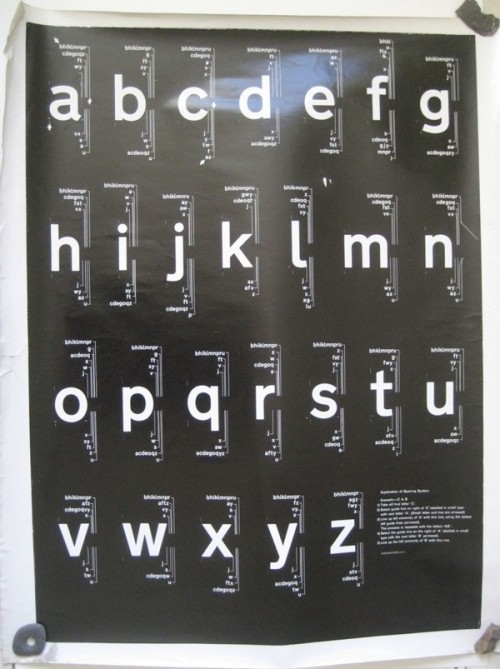
Just in case you thought it was all organised and museum-perfect here, a tale.  I discovered a poster tube in Mr Crownfolio’s office, labelled ‘selling’ and in it, quite apart from a poster I could have sworn we’d sold years ago, I found these two oddities which I had also completely forgotten about.  But when I took a proper look at them, they turned out to be quite interesting.

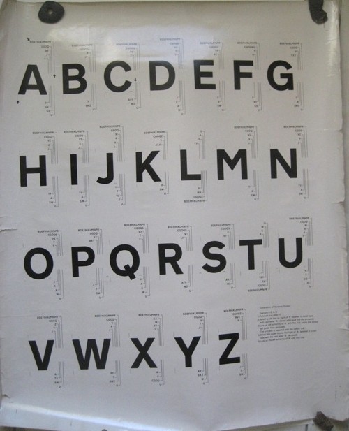
British Railways rail alphabet jock Kinnear display poster

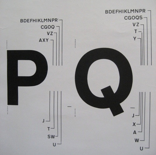
They’re spacing rules for a typeface.

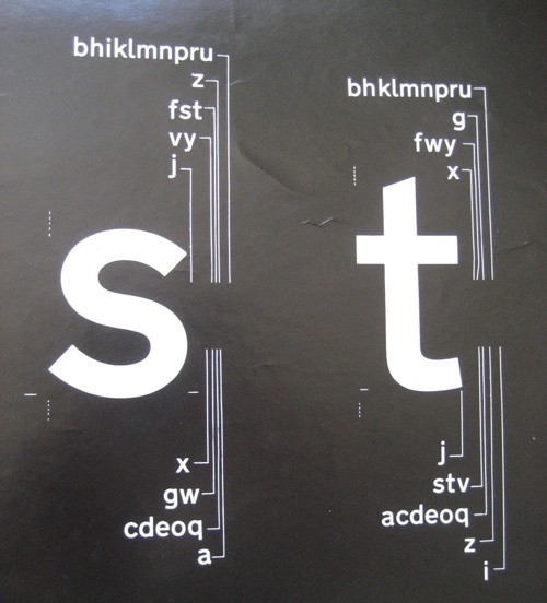
Detail from British Railways vintage poster Rail Alphabet Jock Kinnear

There’s something rather attractive about this kind of very detailed practicality, I think.

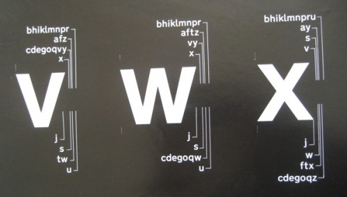
And a bit of research gave me some ideas of what they might be.  One clue is on the lower case chart.

British Railways Railway Alphabet vintage poster spacing detail Jock Kinnear

For those of you reading on your iThing, these instructions are by the great graphic designer Jock Kinneir. He’s best known for designing the template and typeface for Britain’s road signage along with Margaret Calvert (the Design museum have written an interesting piece about it if you want to know more). But in 1964 they also designed Rail Alphabet, as part of the Design Research Unit‘s rebranding of British Railways.

British Railways Rail Alphabet poster Jock Kinnear Margaret Calvert

So that’s what I think this is, particularly as the posters came as part of an assorted lot from the Malcolm Guest sale. I imagine that, given their battered and used state, they were up on the walls of a design office somewhere in the British Railways system.

British Railways Rail Alphabet poster Jock Kinnear Margaret Calvert

Now of course rendered obsolete by the computer. But a rather a fascinating bit of graphic design history nonetheless.

What I’ve also discovered in the course of writing this post is that Rail Alphabet wasn’t just used by British Railways, but also by Gatwick Airport and the NHS too, right up until the mid 1990s.  So it’s more than just a typeface, it’s the written identity of the post-war British state.  That’s quite an achievement by Jock Kinneir and Margaret Calvert, and one that deserves more than just being taken for granted.

Even though Mr Crownfolio spends his working days adjusting type into just the right places, I’m not sure that we’ll ever put these up on the wall.  Which begs the question of what to do with them.  Might the National Railway Museum want them?  Or anyone else?  Any thoughts?

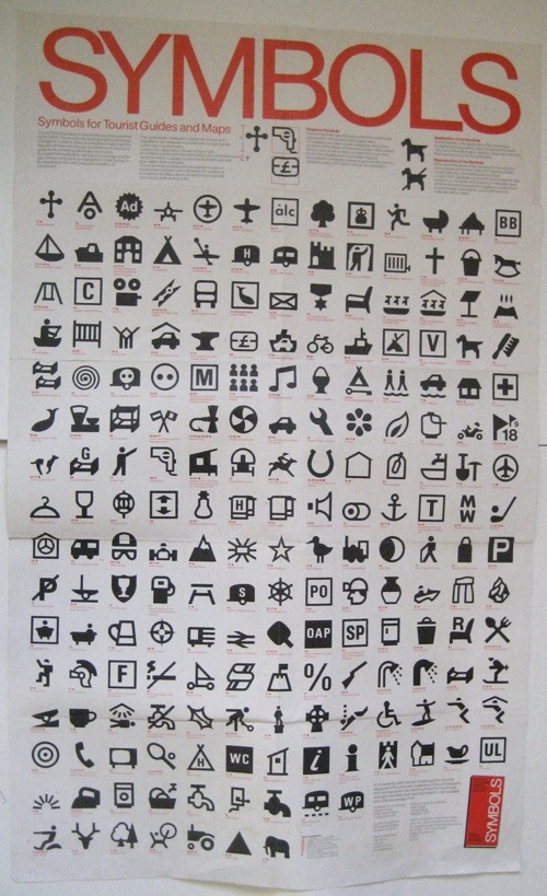
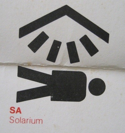
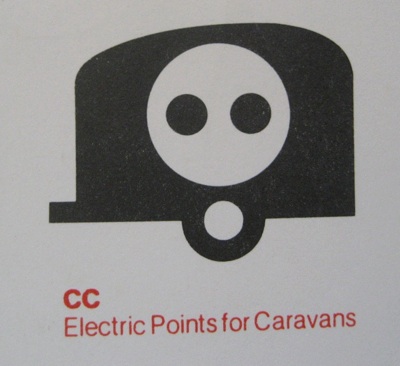
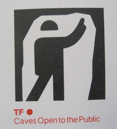
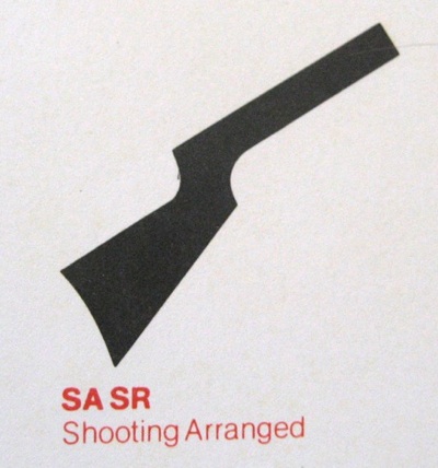
While we’re on the subject of oddities, it also gives me the chance to post this.  I’ve always been fond of pictograms anyway, but some of these are particularly choice.

Chart of symbols published by British tourist authority

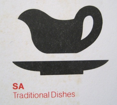
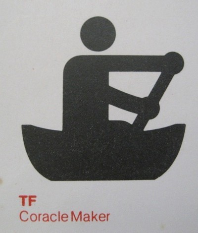
The poster is a chart of symbols for tourist attractions, published by the British Tourist Authority, sometime after decimalisation.  I’m guessing it’s meant as a set of suggestions for designers and guide authors.  While a few of them are familiar, not all of them caught on.

Symbol for traditional dishes

Some are possibly only required once or twice on any map of the country.

Coracle maker symbol

While others were too frightening ever to use at all.

Solarium symbol

Caravan of doom symbol

I particularly like the caravan of doom.  But there are so many.  Anyone for underground disco?

Caves are open symbol

This has to be my favourite, however, and heaven knows I’ve lived in some bits of London where it could have been applied.

Shooting arranged symbol

Observation

With this post, I am coming dangerously close to heckling myself.  Worse, I am heckling myself about railways and railwayana.  So I shall keep it brief; those of you with a sensitive disposition should look away now.

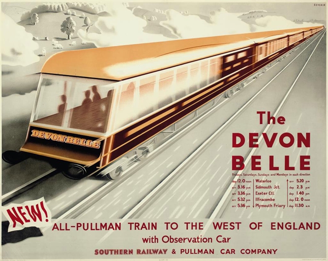
Last week I mentioned this poster, which is coming up for sale at Christies next month.  I wondered what this train was, and whether I could ride on it.

marc Severin, 1947 British Railways poster for Devon Belle

I had thought I might be deluged with very detailed answers from People Who Know about Railways, but I wasn’t, so I had to find out for myself.

First and most important fact is that this is the back of the train not the front – an observation car rather than an engine.  So it is a bit less like something from the 1947 World’s Fair than I had thought.
Pretty much everything else you might want to know about the Devon Belle can be found on Wikipedia and elsewhere, right down to what the observation cars were before they were made for the train (one was originally an ambulance car from the First World War, which is a pretty creative piece of recycling).  It was meant to be a glamourous and luxurious train, but back in the austerity days of 1947, the travelling public weren’t very keen to pay a supplement for all of that flummery, so it only lasted until 1954.

But before that, British Transport Films made a film about the Devon Belle, and you can see some stills from that at the Science and Society Picture Library if you want.  I’ve tried looking for the film itself on YouTube, but have only found a rather considerable amount of footage of people giving their Hornby Devon Belle’s a turn around the model track.  Which isn’t quite the same.
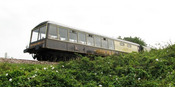
But that doesn’t matter though, much more important is that the answer to my second question is yes.  Both the Devon Belle’s observation cars are still preserved and so yes I can ride on them.  They’re not too far away from me either, at Swanage and Dartmouth.
Devon Belle observation car running at Dartmouth

Although looking at this picture of it running close to the edge in Dartmouth I may opt for genteel Swanage instead.  I don’t have a good head for heights.

Now, on the one hand this is just a brief digression on the subject of rolling stock.  But it’s also a reminder as to why posters can be so interesting.  They’re not just artworks, but they’re also a window into pieces of the past which might otherwise get overlooked.  Not just the histories of a pair of carriages, but the tensions at play in the late 1940s, when the British people desperately wanted a sleek, modern post-war world which looked like the World’s Fair, but were faced with the realisation that they couldn’t really afford it.  All of which sounds just very slightly familiar.