To my surprise, Quad Royal is a year old this week. So happy birthday to us. Now I am not going to write a long and self-congratulatory post, but we will be waving a few flags, as there are a couple of things which do need to be said.
First and foremost is a thank you to everyone for coming over and not only reading but commenting and linking and generally adding to Quad Royal. It’s been a great pleasure meeting people and conversing with them, not only on the blog, but also by email and on Twitter. (Pleasingly, we’ve just reached 200 followers on Twitter in time for this birthday, but if anyone else would like to follow Quad Royal on Twitter, it would be lovely to see you too). I’ve learnt a lot from some very knowledgeable people, and it wouldn’t have been one tenth as much fun without everyone. So thank you.
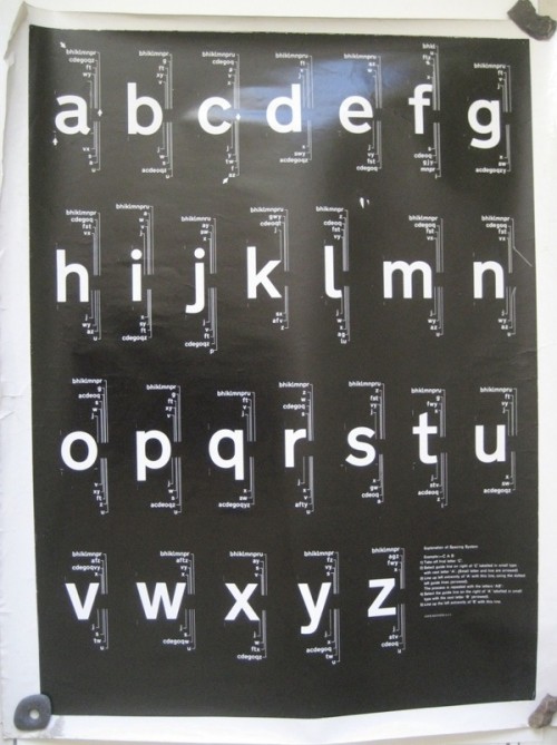
But getting to one has also made me think a bit about what the purpose of the blog is, other than a form of occupational therapy for me. It’s something I’ve been forced to consider anyway, as last week’s post about the Kinneir and Calvert Railway Alphabet (except it may not be that, go and look at the comments if you want to follow the story in all its typographical detail) has attracted more attention than anything else ever posted on here. Not only have the modernist type-nerds of the world tweeted it and linked to it, but it has turned out that the two posters (one illustrated below) are not only rare but of some historical importance.
Which is, to say the least. surprising. If you rewind to the beginning of it all, Mr Crownfolio and I bought a huge lot of misc posters from the tail end of the Malcolm Guest sale for the grand sum of £10. These then sat about in the corner of a room for six months in a tube marked ‘selling’. After I finally remembered that this was there, with the thought of putting them on eBay, I had a proper look at them for the first time. And when I did that, along with a bit of research, they turned out to be more interesting than I thought. Then, when they were up on the blog and other people had a good look at them they turned out to be really quite rare indeed.
All of which has made me realise that one of the important things about this blog is looking at graphics and posters closely. Because quite often they can turn out to be much more interesting than a cursory glance would lead one to suspect. The alphabet posters are perhaps the most extreme example of this, but it’s true of so many of the things featured on Quad Royal over the last year. Posters can tell us stories about how people lived, and what they thought about how they would like to live; they are designed by interesting people whose lives are intertwined with some of the important ideas of the last century, and in amongst all that they are a great pleasure to look at.
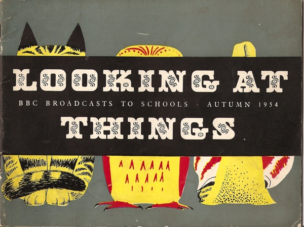
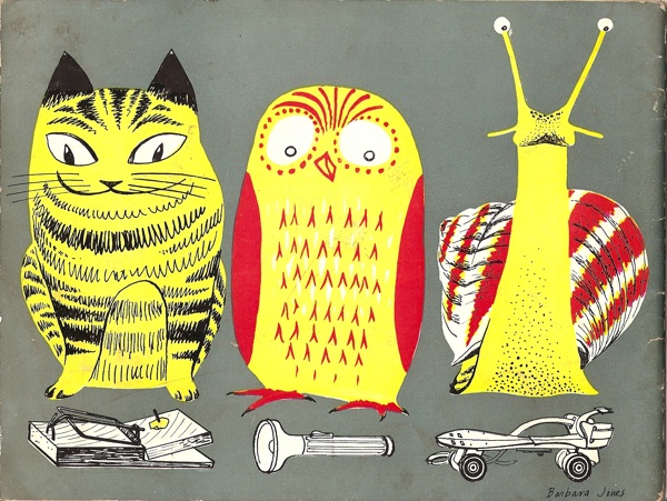
Of course, Barbara Jones got there long before I did.
Her BBC Schools series is all about the pleasures of seeing in detail. So here’s to another year of looking at things.
Incidentally, in case you think this is all a bit self-important and puffery, here’s a further cautionary tale. In writing this, I looked up the original Morphets lot which had the type posters in, to find out what we paid for them. Only it said ‘4 typographic posters’. Sure enough, down the back the shelves where miscellaneous things live were two more historically important documents. I really would have made a very bad museum indeed.


thanks for taking the time to write this blog; I get a great deal of pleasure from reading it and exploring the byways it throws up.
Keep up the good work
Crispin
Happy birthday. Looking forward to the terrible twos
Naughty not bad, of course.
Yes, many happy returns.
Thank you very much everyone!
Belated Birthday Greetings!
Keep it up.