Chaps like you
A bit of a miscellany today, of which the most notable items are these.
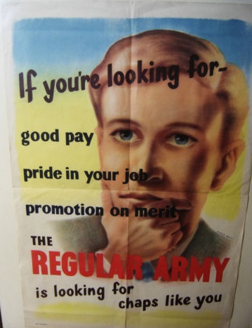
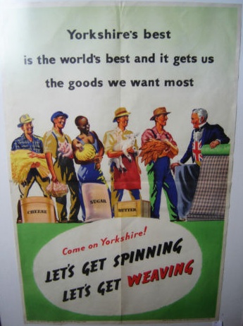
They’re a pair of 1940s government information posters, but what makes them different is that they’re not wartime posters but date, I am reasonably sure, from just after the war.
The message is certainly right for the times. World War Two itself may have been over, but the sense of emergency hadn’t gone away because the end of American Lend-Lease finance meant that the bill now had to be paid. What was needed now was more National Savings and even more production for export earnings. So, just as during the war, sheaves of posters were produced exhorting the nation to greater effort. The government’s publicity budget in 1946 was nearly £3m, almost as much as it had been during the war; by contrast, in 1938, they had spent just £257,000.
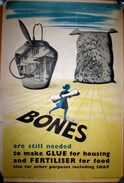
It wasn’t just the quantity of posters which carried on, plenty of the wartime messages didn’t change either, and in many cases the austerity slogans are almost indistinguishable from those produced while the war was on.
The ‘still’ is one clue in the poster above (which is ours and so not for sale on eBay right now), but it is definitely post-war, because it was designed by Dorrit Dekk, who only joined the Central Office of Information in 1946. But without that attribution it would be almost impossible to give a definite date to it.
But what’s really interesting about all of these posters, and what makes the pair for sale on eBay so unusual, is that in comparison with the wartime posters, very few of them survive. And I think there’s probably a very good reason for this. During the war, it was clear to everyone that this was a moment of great historical importance and so at least a few people saved the posters as souvenirs or documents or whatever you care to call them. After the war, though, the austerity and effort had been a noble cause was now just a relentless grind in a grey, bombed-out, rather cheerless country. It wasn’t a time that many people wanted a memento of.
There’s another reason, too. People were sick of posters telling them what to do. Six years of almost constant exhortation and instruction had left their mark, and no one wanted to listen any more. All of which make these eBay survivals both rare and unusual. Although whether they are £140 worth of rare is another question altogether.
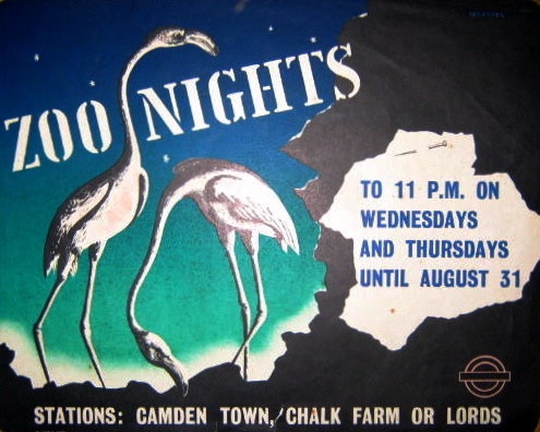
Mind you, they’re not along as there seems to be quite a lot of expensive on eBay at the moment. At first this London Underground poster doesn’t look unreasonable at £140, because it is lovely.
But then it is only 10″ x 12″, so that’s quite a lot of money for a small bit of paper. Mind you, if I start thinking like that, I’ll never buy anything again.
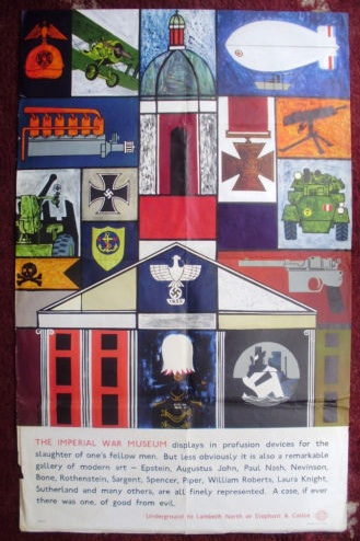
Elsewhere, this 1960s London Transport poster for the Imperial War Museum is definitely overpriced with a starting price of £125.
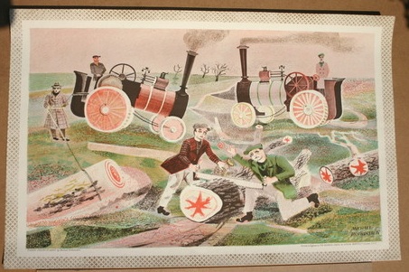
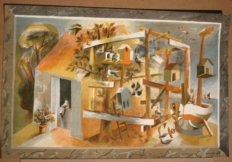
While this pair of school prints are at least starting at a reasonable £40 and £30 respectively, although I suspect they may go higher.
The first is by Michael Rothenstein, the second by Leonard Tisdall, both rather good. I’ve written about the school prints before, but it’s probably worth pointing out that it’s yet another example of artists in the 1940s and 50s taking work for children seriously. Good art was a very important part of the new world they were building; I wonder where that impulse has gone now.
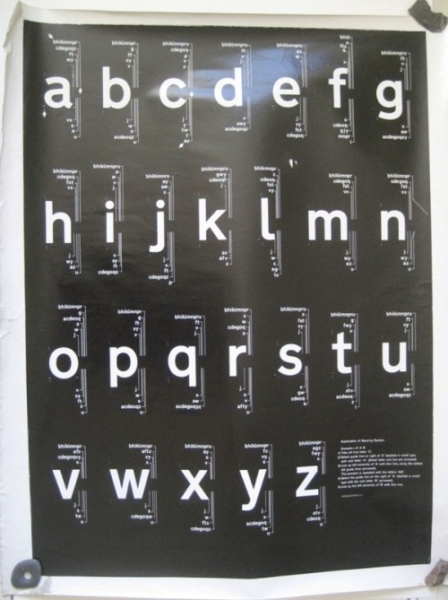
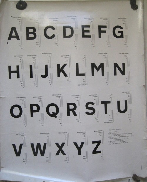
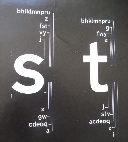
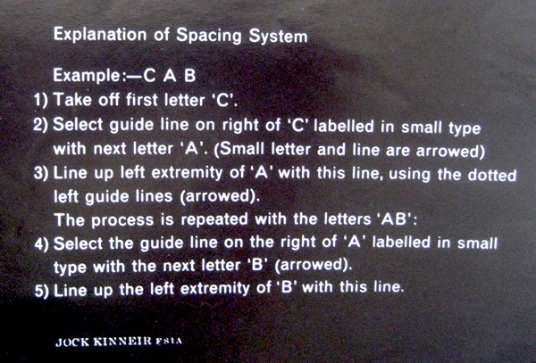
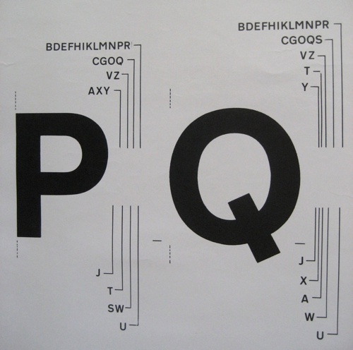
Finally, a rare feature which is things liked by Quad Royal turning up on television. Doesn’t happen often, so twice in one night is nothing short of a miracle. Firstly, a set of Fougasse Careless Talk Costs Lives posters turned up on the Antiques Roadshow, where Mark Hill valued them at £1,000-1,500. Mr Crownfolio, on our sofa, said £750. Any thoughts as to who might be right there? Then, straight after this on BBC Four, The Secret Life of the Airport featured Margaret Calvert talking about designing signs and typefaces for Gatwick. That bit’s about 10 min from the end, but the rest of it is worth your attention for some cracking archive footage too.
