Mr Huveneers, I presume
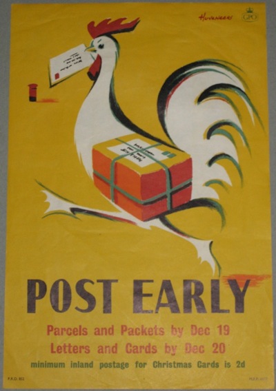
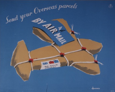
Unless you have studied GPO posters with a rather unnatural intensity, you probably wouldn’t know the name of Peter (or possibly Pieter) Huveneers. But it’s worth making his acquaintance. He designed a whole series of delightful posters for the Post Office throughout most of the 1950s.
The BPMA have about 20 of his designs catalogued, including this gem.
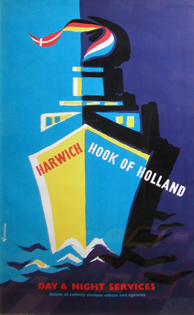
And he also worked for British Railways into the early 60s.
Until 1963, when the last piece of design I can track down is a British Railways poster in the National Railway Museum collection. And then he disappears.
Fast forward to 1968, when another designer called Pieter Huveneers sets up a design company in Australia. Now, if you’re Australian and of a certain age, Pieter Huveneers is a big name. He’s the down-under equivalent of Wim Crowel or Hans Schleger, a designer who shaped the fabric of everyday life.
Huveneers’ work is still written all over Australia. He designed the logos and identities for two of Australia’s national institutions, Australia Post and Telecom Australia when they were created in 1975.

(The Australia Post logo, with its neatly incorporated post-horn is still in use, although slightly rejigged in recent years. Telecom Australia rebranded itself as Telstra in 1995).
He not only designed the logo but also created the name of the bank which emerged from Australia’s biggest ever bank merger in 1981, when the Commercial Bank of Australia and the Bank of New South Wales became something much more modern and international.
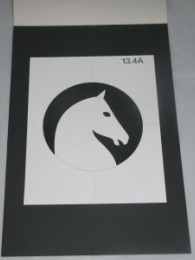
And completely rebranded one of Australia’s iconic breweries, Tooth – this is his logo design from 1981.
And that’s just what I’ve been able to find out about from the other side of the world, I’m sure there’s more as well.
The thing is, I have no way of proving that this is the same person. The dates add up, and the Australian Pieter Huveneers was born in c1926, which gives him plenty of time to be designing GPO posters before emigrating to Australia, and the chances of there being two of them in the design world at the same time have to be pretty slim anyway. But is it or not? I can’t say for sure.
But I seem to have reached the limits of what I can find out without being either a) Australian or b) within easy reach of the British Library. So if there are any Australian design historians out there who are able to tell me a bit more about him and his design studio, I’d really love to hear from them. As far as I can tell, he’s still alive too, so perhaps he might be able to answer the question of whether or not he designed those posters himself. Hope so.
