This arrived in the post the other day.
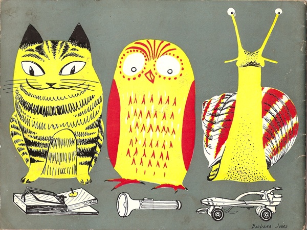
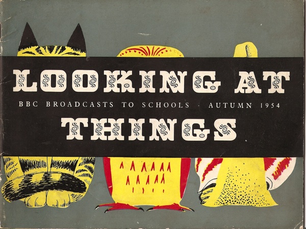
How fantastic is that? I can’t decide which of the three I like best. Although that is in fact the rear view – this is the front.
As it explains for itself, this is a leaflet for a BBC Schools programme called Looking at Things, and it’s by Barbara Jones.
One of the unfortunate side-effects of blogging is that we actually end up buying even more stuff than we would have done otherwise; I had no idea that these brochures even existed until I wrote about Barbara Jones last week. But now I do, and from there it’s only a short step to Abebooks, ephemera and even more stuff around the place.
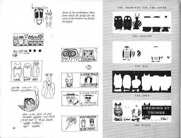
But this is a particular gem. It’s worth far more than the £2 it cost for the cover alone, but inside is also Barbara Jones explaining how a book cover is designed and printed, using our friends above as the examples.
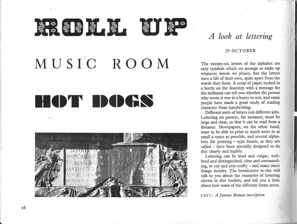
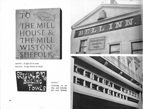
And there is also a spread about lettering and signs, which could have come from one of her own, grown up, books.
The aim of the programme – which had noted industrial designer Milner Gray as a consultant – was “to awaken the child’s interest in the shape and colour of things around him,” and “to look at the things around you with a ‘seeing’ eye.”
I don’t suppose anything as random and purposeless but yet important as this is taught in schools these days. Although please feel free to tell me that I’m wrong. And now I must go and look for some more booklets to educate my eye.
This is such a coincidence as I recent;y came across Barbara Jones myself after finding a old telegram in a family photo album. I instantly fell in love with her bird illustrations and as the telegram was credited with her name I checked her out online and found lots of lovely illustrator books. I will definitely look out for her work in the future!
The telegram sounds lovely – would you be able to send over a photo or a scan for the blog? She’s such a great designer, and definitely under-rated.
This looks so nice, I just bought one too!
Excellent, I think everyone should have one!