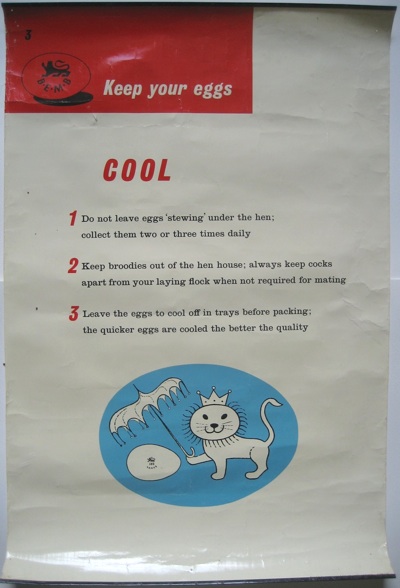
Only last week I was complaining that there really weren’t enough British food posters when this arrived through the post. I’d entirely forgotten than we’d bought it from eBay.
Although it’s only tangentially about food, and quite informatively prosaic to boot, I still rather like it. So much so that I would have hung it on the kitchen wall, were it not for the fact that there’s no more space. And the little hanger at the top of the metal bar (it’s got metal strips at the top and bottom just like a Shell educational poster) fell off when I photographed it. Never mind.
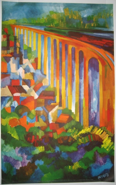
Another recent purchase was this splendidly information-free poster.
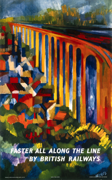
Thanks to the interweb, I am able to tell you that it is a British Railway poster by Myers (whose signature is just about visible bottom right), it dates from the 1950s, and it also existed with text too (image from the NMSI collection).
All of which leaves me with a couple of questions. Firstly, why are there two versions? Was the typeless one designed to go on the railway aficionado’s wall, and sold as such? Ours isn’t the only one, because the NRM have a copy too so there must have been a plan, even if I’m not quite sure what it was.
But it’s never come up on sale as far as I can tell. Faster All Along The Line with its title on has been sold a couple of times at auction, for £280-300, at Onslows and Morphets. But is it worth more or less with type? I have no idea – does anyone else?
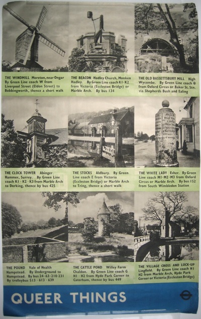
Finally, we bought this simply because it existed, and so I am sharing it with you for exactly the same reason.
It’s from 1938 and that’s all I know. Although I may have to go on an expedition one day to see if any or all of these still exist.


I bought a copy of the Myers without text on eBay last year (for a little more than you!). It was described as a printer’s proof but I’m a bit sceptical about that. It is quite common to see certain quad royal Cuneo BR posters without text. These are like the Myers in that the picture occupies the full sheet and the text was overprinted in white. It seems unlikely that all text-free copies are printers’ proofs. I suspect they were released for sale to the public or used to decorate BR offices, works, waiting rooms, etc. There was a practise for a while of cutting the text panel off the bottom of pictorial BR posters and framing the picture for display in waiting rooms.
As to value, if the Cuneos are anything to go by, the text-free versions seldom reach more than 50% the price of the text versions.
I saw the Myers on ebay and indeed asked the seller if they could comment on the lack of text – as I thought it might be a proof or indeed a later reproduction. Needless to say they never got back.
Queer Things is great BTW
All of which makes complete sense to me – it’s all in the grand tradition of posters being sold on as artworks. The NRM seems to have three – two with text and one without, so if they are proofs, there were an awful lot of them about.
Interesting about the price though; despite the fact that the poster is – for collectors and at auction – in some ways trying to attain the status of art, people don’t want it to go too far along that line.
A couple more BR posters which exist without text have come to mind…The Pembrokeshire quad royal by Leech which you admired in the recent Talisman sale (See first Malcolm Guest sale; £300 with text, £200 without). Also Brecknockshire double royal by Jack Merriott.
All these have the text overprinted onto the picture and date from the late 50s early 60s.
I have another theory as to why text-free copies are circulating… Maybe the printers printed extra copies of the picture to cover for possible wastage during later text overprinting and spare text-free copies were “liberated” by print workers…
I agree with some of mm’s overprinting comments where the text is black, but in the case of this particular poster I don’t think it applies. The white text is actually knocked out of the image. It’s an absence of ink. So it would have to be produced a separate print run to that which produced the Faster all along the line version.
Perhaps we should go back to the tube the poster came in and give it a good shake to see if the letters fall out…
It looks as though there must have been some kind of BR poster-selling initiative, which included the printing of these ‘art print’ versions. I will see what I can find out.
Obviously, if what Demy says about the Myers text is true then some of what I said is wrong. The Cuneo posters’ text is definitely overprinted in white, yellow or red. The ‘ink’ used has a slight sheen like a silk wall paint and is applied thickly enough to be felt on the surface of the paper. Unfortunately, I don’t have access to a Myers with text to be able to convince myself that it is not overprinted!
I may have made a hasty assumption – Does anyone have access to the poster with the text and can they have a look at it, please?
To go back over old ground, as seems to be my thing……….
I’ve acquired some Cuneos without words, and with words, and can do a bit of comparing.
The Cuneos which had no border such as “Tay Bridge” (White overprint when done) and “Clapham Junction” (Yellow overprint when done) both have no printer info at the bottom if they don’t have the title wording – it was ALL added on the second run-through and in the same colour.
The Cuneos which had a border such as “Service to Industry” and “Blue Trains” do have the printer info at the bottom in the white border area in black ink.
Whether this is definitive in any way I have no idea, but I would think those without any “Printed by” or “Published by” info were NOT meant to be let out into the world, while those that did have it were designed to have the ability to be released without the title. I would think the printer would like the advertising for their work, and BR would like the copyright-ish mention when the posters were seen.
Whether this was specific to Waterlow printers I also don’t know, but all the Cuneos mentioned were done by them as were the ” Faster” mentioned above.
I think we are moving towards some kind of taxonomy and explanation here, all of which basically boils down to there are all sorts of posters out there and, until someone goes through the archive (any volunteers?) we’re never quite going to know what British Railways actually intended.
But it’s good to go back through old stuff. Amuses me, anyway.