There are a few ideas that I want to pursue on the blog at the moment – I haven’t forgotten, for example, that there is more to be said about Graphis in 1950. That will get said soon, but for today I’m going back to my thoughts about how children shouldn’t be fobbed off with second-rate design, because it made Mr Crownfolio remind me about these (and I shouldn’t have needed reminding as Shelf Appeal mentioned them in dispatches recently too).
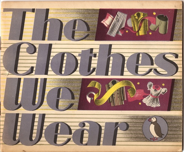
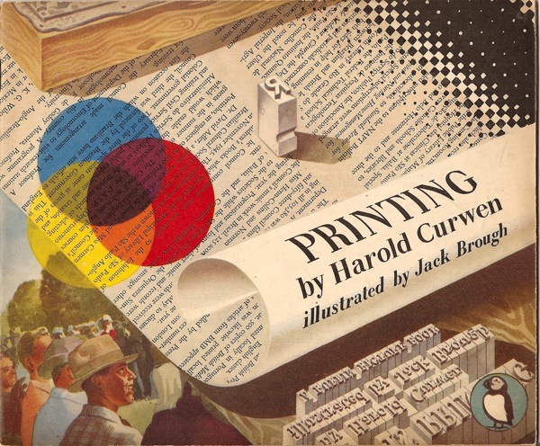
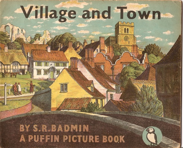
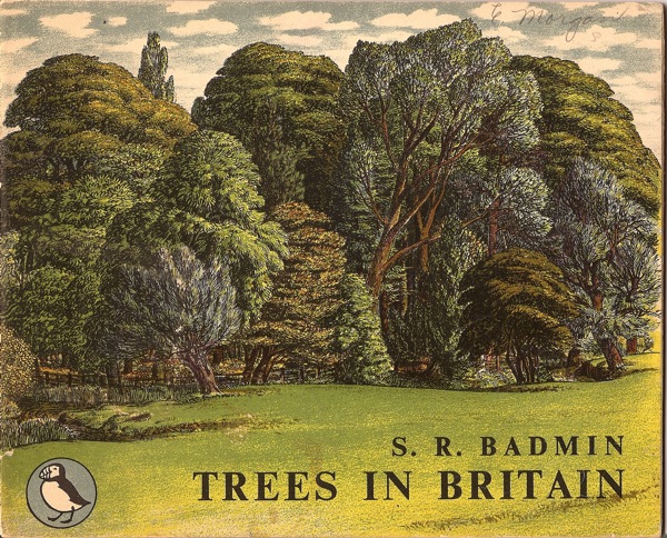
These are Puffin picture books, produced between 1940 and 1965, and they are things of beauty.
I’m not going to give you a full history of how and why they were produced, partly because it’s Friday, but mainly because there has been a book produced about exactly that, called Drawn Directly to the Plate and available here. (And do get it there, because they’re charging just £20, while the only copy on Amazon is priced at £85. Nice work if you can get it). It’s a bit of an odd book, because it veers between serious history and collectors’ handbook, sometimes within the same paragraph, but it’s still a useful introduction to a slightly different side of British graphic design.
This difference is one of the interesting things about these books, because the illustrators are, in the main, a very different set of people to those who designed posters, even Shell posters. Although S R Badmin did produce several wonderful books for them over the years.
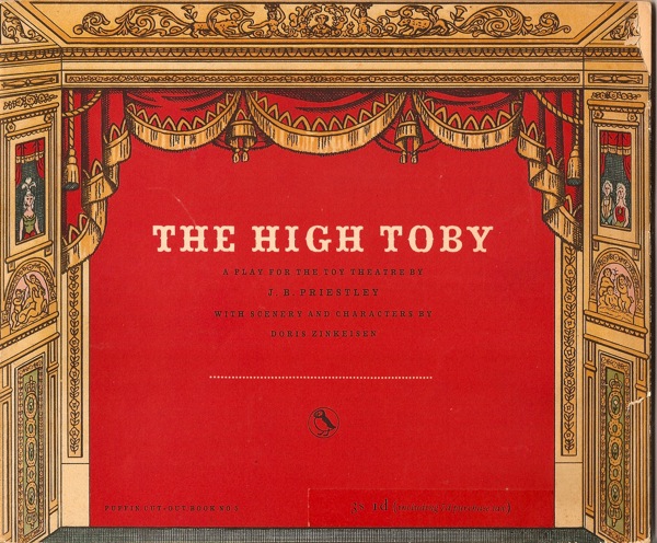
Anna Zinkeisen who designed posters for London Transport before the war also illustrated one – a book which contains all the scenery and characters you need to stage Priestley’s play.
As did one other celebrated artist.
But that’s about it.
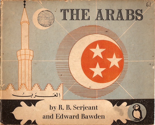
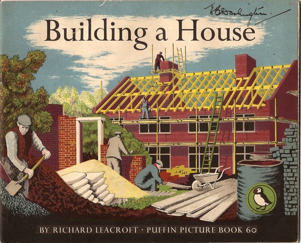
Now this may be a result of one of the other interesting things about these books, which is they are produced by autolithography, i.e. the illustrators drew straight onto the lithographic plate. This was partly a way of keeping the costs down, but it did also give the books a distinct and appealing style. You get most of a sense of it with the covers, which are the most complex parts of the whole books. There are colour spreads inside, but they tend to have a more limited palette.
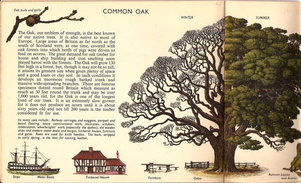
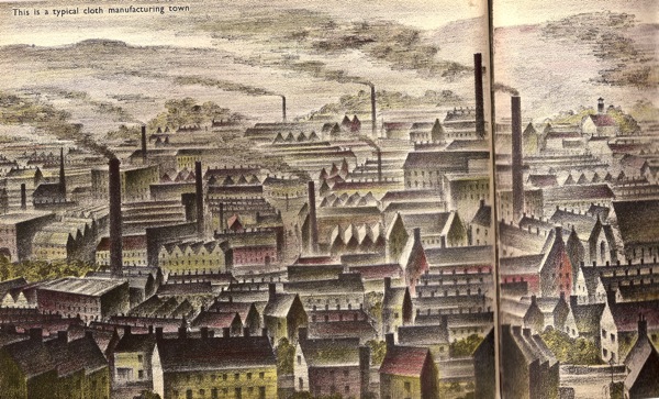
Most of the books do have a wonderful double page illustrated spread in the centre too, but unfortunately the format won’t fit in the scanner, so you’ll just have to take my word for that. Here’s as much of a typical cloth manufacturing town as I could fit in.
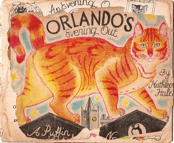
The format is pretty much the only thing which links the titles, which range from practical handbooks on woodwork through factual introductions to storybooks – including the wonderful Orlando The Marmalade Cat, who was clearly much loved even at the time.
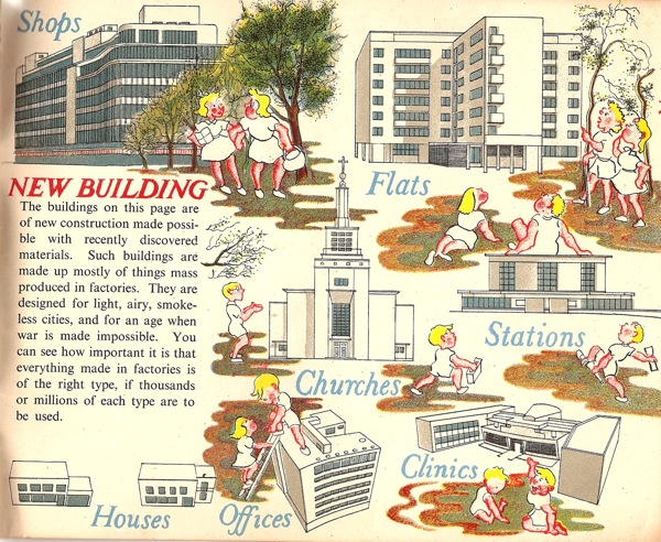
If they have anything in common though, it is the post-war faith in modernity. So many of the factual books end with the idea that we are now building a better world, quite often in concrete, or at very least light wood and glass. (This is the back cover of the Badmin book above, by the way).
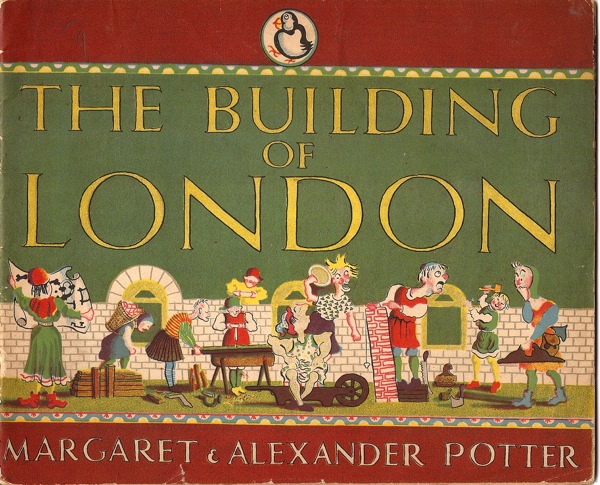
Despite this, there is also an enormous range of styles in the series, perhaps unsurprisingly given that they were produced over more than twenty years. This book is one of the most idiosyncratic (although, as you will note, it is still very much in favour of the modern).
But the most important thing about them is that once again, these are illustrators and designers taking children seriously. And not with a £75 collectors edition, but in the form of cheap, everyday books. A whole series of them. But these days we have so little faith in social equality that we certainly can’t believe that everyone deserves good design, least of all children. When they deserve it most of all.



I agree that the illustrators and designers were taking children seriously, but credit is due too to Noel Carrington and Allen Lane, who commissioned them. Drawn Direct to Plate is well-written and and fascinating, not least because of the combination of belief and commercial considerations that went into Picture Puffins.
Oh, how odd, I replied to this but the machine has eaten it. I was only really saying that I agreed with you, though. But the books are such a huge subject that they could easily sustain a blog of their own (and I was a bit surprised that I couldn’t find one when I was writing that), so all I could ever do in one piece was scratch the surface.
Just found this blog. Love love love. I plan to read it all very carefully and enjoy every minute. I have a wonderful old puffin,The Human Body, by Cyril Bibby and Ian T. Morrison. 1955. I don’t know how the plates were made but it does look like some sort of lithography because of the dot pattern. I’ve scanned and written about and used these glorious images many times. Here’s a sample http://seesaw.typepad.com/blog/2008/11/inside-the-human-body-50s-style.html. I’ve also just reblogged some of your puffin images on my Tumblr, which is the blog I’ve linked to my name here.
Happy to have found you! cheers. Liza
Thank you for all the kind words. And that does look very much like a Picture Puffin – certainly the date is right. So now you know that there are a whole stack more to collect too…