Christmas is the season for repeats, and not only on the television. Here on Quad Royal, this means revisiting a few posts which are worth a second glance. In this case – the Empire Marketing Board posters from Manchester City Art Gallery – the subject is also newly topical. The gallery will be staging an exhibition of some of their collection which opens in late February (more details here). Which means I may have to return to my old stomping grounds and report back to you. In the meantime, some thoughts on the poster collection as a whole.
For some time I’ve been meaning to post a link to the Empire Marketing Board Archive at Manchester Art Gallery.
It’s an exemplary online resource for a really interesting collection. The Empire Marketing Board was what Stephen Tallents did before he came to the GPO, and in many ways is one of the first attempts at the kind of ‘soft’ advertising and propaganda that we now take for granted.
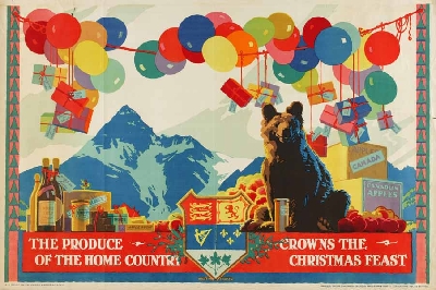
Austin Cooper, 1927
In his time at the Empire Marketing Board between 1926 and 1933, Tallents (working with Frank Pick and William Crawford of Crawfords advertising agency) commissioned some of the very best designers and artists working in Britain at the time. These included those such as Austin Cooper, Frank Newbould and Fred Taylor who were best known for their work for the railway companies,
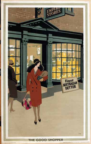
Frank Newbould
as well as fine artists like Paul Nash.
But I’ve been holding off writing about it for months. Why? Because these posters constitute an ideological problem of the first order, and it’s not one I have an easy answer to.
The issue at stake is, of course, Empire. The Manchester Art Gallery website describes the collection as ‘challenging and fascinating’.
Created during the 1920s and ’30s to promote trade and understanding between empire countries, the posters present a view of the British Empire that, from today’s perspective, is often uncomfortable. Although visually stunning, the posters contain images that would today be considered offensive. As a product of their time, they raise difficult questions about the legacy of empire.
I’m not proposing to get into a discussion about the legacy of Empire and the historic wrongs involved. What I’m interested in is how much ideology can adhere to images, in particular to these posters.
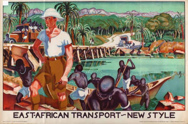
There is no denying that there are some posters in the collection which can only be interpreted as racism of the highest degree. This vision of the white man bringing civilisation is by Adrian Allinson.
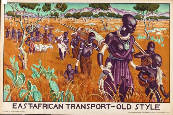
It gets worse, too – the implicit comparison is with the companion poster.
But these posters are by no means in the majority in the archive. To start with, a good portion of the posters are images of either produce,
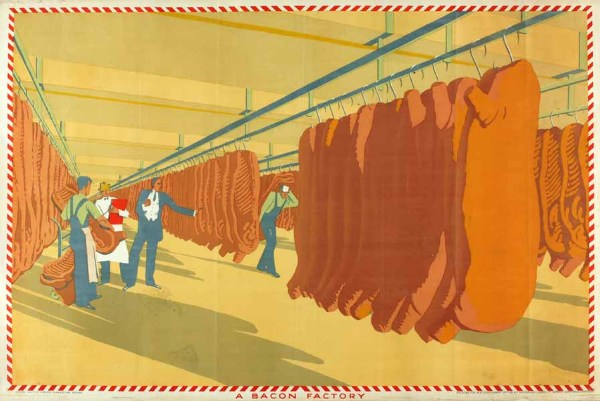
Anonymous
or pictures of Britain that wouldn’t look out of place on a railway poster.
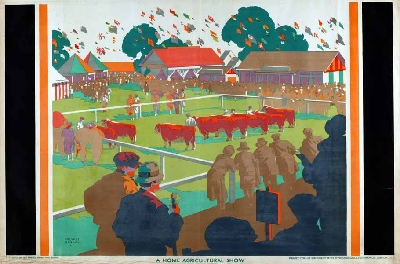
Gregory Brown
Or quite possibly both.
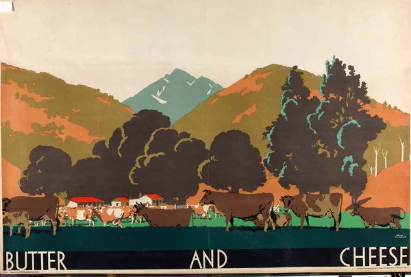
Frank Newbould
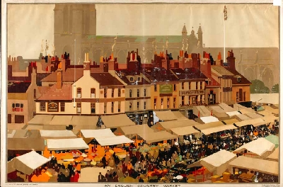
So my questi0n is, can a poster like this Fred Taylor of Market Day be interpreted as loaded, racist even?
I’ve had quite an interesting email conversation about this with Melanie Horton, the researcher who’s been working on the archive. She would argue that it is, that all the posters have to be seen as whole and cannot be separated from the politics of how they came to be produced.
I’m not going to tackle her arguments now as she has a booklet about the collection coming out soon (Empire Marketing Board Posters: Manchester Art Gallery ) and it only seems fair to read them in detail first. But I do have a few broader thoughts to raise before then.
Because what we are debating here isn’t in any way a new question. T.S. Eliot was undoubtedly a small-minded anti-semite, but does that devalue The Four Quartets, in which there is nothing of the sort? Or if you want a more modern version of the same problem, try yesterday’s Guardian, where Brett Easton Ellis is freely admitting to misogyny, sexism and generally being a rather unappealing bit of work. But what does that do to our opinion of his novels? As it happens, I love The Four Quartets but loathe American Psycho, so my answer is different in each case.
But this problem also came up when I studied Design History, in perhaps its most taxing presentation. Here it was known as the Volkswagen problem. And it is quite a problem.
The Volkswagen Beetle is a great piece of design which produced one of the most popular small cars of the twentieth century, and was also technologically very innovative. However it was also, and there is no too ways about this, a product of Nazi ideology. As if the name Volkswagen itself wasn’t enough of a clue, the Beetle was originally known as the KdFwagen – the Strength Through Joy car. Adolf Hitler commissioned it, approved it and set it into production. And yet we are not only prepared to forgive the Beetle, but clasp it to our hearts as one of the best-loved cars there has ever been.
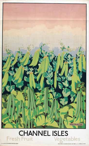
Keith Henderson
So where does that leave images like these?
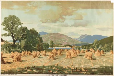
George Houston
Can we separate them out from how and when they were produced, and only see the oats and the peas and the pears?
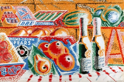
Anonymous
Or is it only the Volkswagen that can ever achieve that kind of forgiveness?
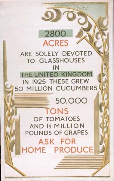
Your final Anonymous poster is stylistically at the Clifford & Rosemary Ellis end of the spectrum, but alas the initials DRE next to the cucumbers do not quite fit!
Just to make matters worse, I think you’ll find that the original artwork for the East African Transport- New Style poster showed the white man holding a whip rather than a pipe! I’m sure I read that in the ‘Buy and Build’ book about these posters.
Yes it does look possible, doesn’t it, but I can’t make that a C however hard I stare at it.
And interesting about the whip; I wonder whether those particular sentiments were seen as outdated even at the time? Perhaps the exhibition will reveal more.