I haven’t finished with exhibition design, not by a long way. A copy of Misha Black’s Exhibition Design recently arrived in the post. He’s a much droller read than Beverley Pick – as well as designing some rather nice exhibitions too – so parts of that will definitely be appearing on here one of these days.
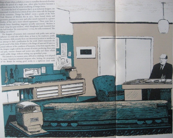
But in the meantime, that reminded me of Motif magazine, to be precise issue 4, because I photographed this ages ago and then left the results languishing. For here is Misha Black himself, waiting to see us in his office.
He’s writing about taste, style and the Industrial Designer, and I should probably read it thoroughly one of these days. Although the essays of this period on the moral arguments for good design over popular taste are not among my favourite things, as they mostly tend to pontifications. This issue of Motif is from 1960, though, so they are coming to the end of the the line; any moment now his arguments will be exploded by Pop.
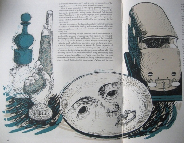
The drawings, however, by Edward Hughes, are lovely. Here is the miscellania on Misha Black’s shelves.
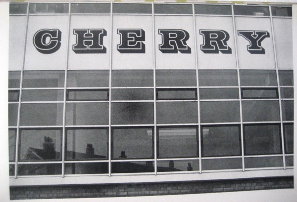
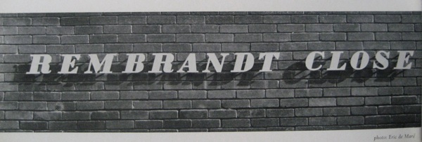
It’s pretty good issue all round, really. There’s an article on
featuring such delights as this.
And this.
Although Mr Tracy isn’t very impressed with the one above at all.
A plastic version of fat Bodoni italic: debased – the serifs have been thickened and the counters have been squared off – presumably to make the letters easier to produce. This letter form has no relationship (either of harmony or contrast) with the wall surface or the architectural style of the building.
That’s them told.
Also in there are pearly kings and queens, illuminated advertising in Piccadilly Circus and antiquarian prints; truly there is something for everyone here.
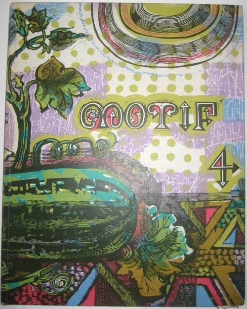
But my favourite thing of all is the cover.
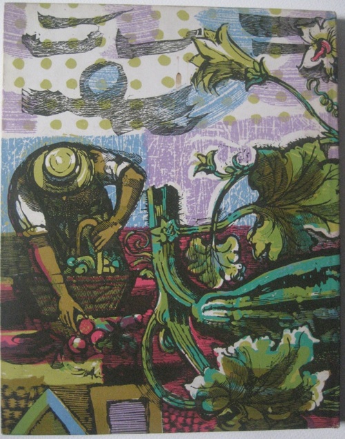
It’s by Laurence Scarfe, who is clearly someone I ought to know more about. Here’s the reverse.
We’ve just been offered some space to grow vegetables in, and that is what it is going to look like at the end of the summer. For definite.
