As promised, the results of last week’s compeitions. The first thing I need to say is thank you, because this has afforded me a great deal of entertainment; a high standard of entries came in, almost none of which had been seen before on here. We should do this more often.
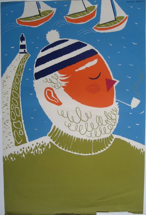
All of which has made the judging a bit difficult. A couple of themes did recur, one of which was the idea that an unseen Daphne Padden poster was bound to be chosen. I suspect James had his tongue just a little bit in his cheek when he suggested this one.
It’s ours, and as it’s an odd proof copy I rather suspect that there isn’t another one out there either. Very good.
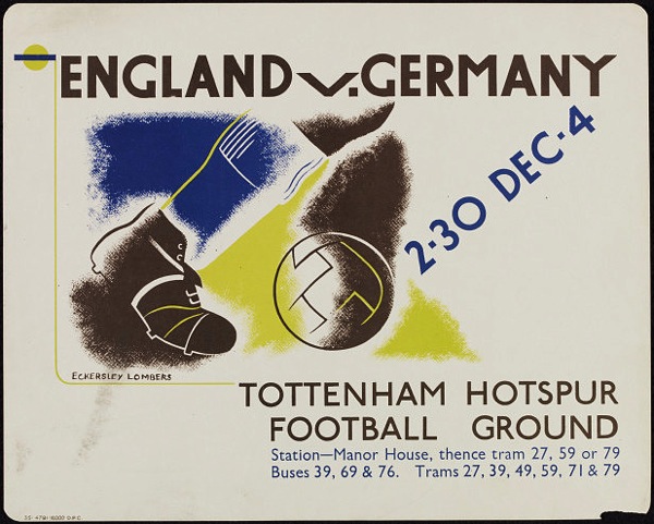
Other themes included football (which I don’t think I have ever mentioned on here before so it’s a fair cop) and pre-war posters, both of which come together in this 1935 Eckersley-Lombers suggested by medieval modernist.
I will try and remember that quite a few of you like 1930s modernism a bit more than I do when I’m posting from now on.
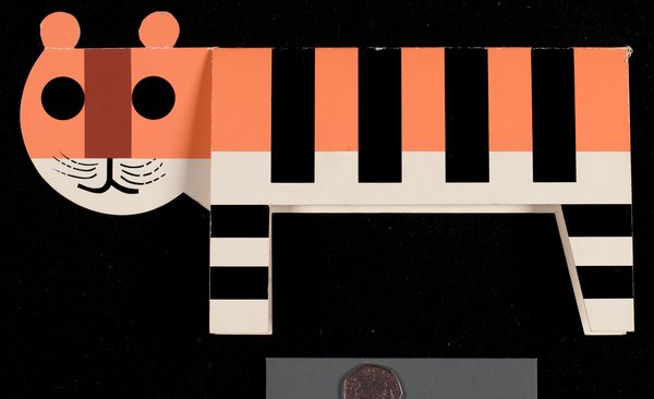
Another mention also has to go to medieval modernist for putting forward the best thing by a poster artist which isn’t a poster, this card by Tom Eckersley.
It’s great, but it’s definitely not a poster. So it doesn’t win.
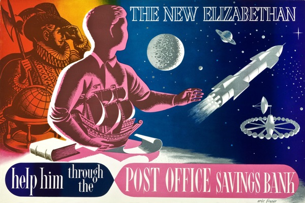
But I can’t keep you on tenterhooks forever. The winner, then, has to be this, for being so completely Quad Royal that I am bashing my head repeatedly against the desk in bewilderment that I haven’t put it on here before.
And that’s before I award the extra points for Diamond Jubilee topicality. So congratualations to self-confessed ‘new kid on the block’ Nick Morgan, who will get a copy of the book by post at some point this week, when buying the new Crownfolio Towers allows.
There was only supposed to be one winner, but then the publishers, Shire, came through and offered another prize. That will be going to this piece of ‘Ralph Mott’ (aka artists agents’ Ralph and Mott, aka probably Reg Lander who was their studio manager), which although pre-war has to win for being not only modernist and bizarre, but also the worst piece of photoshopping ever done before the invention of Photoshop.
Just look at the legs on that cow. Another book will be off to Sanderson in due course.
That’s actually the original artwork, which is currently on sale at Liss Fine Art. It’s worth following the link as there are some other crackers there, shown alongside the finished posters. Oddly, the railways don’t seem to have produced a poster from the image above. Can’t think why. What’s also strange is the lorry says ‘British Railways’ down the side, over what looks like Tippex, while the other posters were commissioned by the big four pre-war companies. Perhaps this one was never produced because of the war and then they thought about having another go afterwards. And then looked at the legs on that cow and shook their heads.
Finally, there was one more copy going in a general draw for comments/tweets/followers and that’s gone to @NemesisRepublic on Twitter.
So thank you again to everyone who took part. Normal service will finally resume later this week, with a good look at the new Onslows sale.


I’m not much of a railway historian, but I think ‘British Railways’ mean post-nationalisation and therefore post-war. Perhaps the artwork was done before the war and the name of the company amended after it.
Yes, I think you’re spot on there. But what’s odd is that the posters that were issued were issued before the war, or at least in the name of the four railway companies which predated British Railways.
But here we’re at the end of my railway history knowledge too. I shall put a call out for a proper railway historian and see if they know any more…
I don’t know when the collective term ‘British Railways’ was first used but it certainly appears on some joint publicity from the big four railway companies from the late thirties onwards.
http://www.onslows.co.uk/Catalogues/PS101210/lot0055-0.jpg
http://www.morphets.co.uk/BidCat/detail.asp?SaleRef=150110&LotRef=287
…and on the side of a container…
http://www.onslows.co.uk/Catalogues/PS101210/lot0053-0.jpg
The two Ralph Motts are from 1939.
Hurrah, someone who knows.
What you show is really interesting; so it looks as though the idea of British Railways was already in the air even before the war. Although we are assuming here that these aren’t 1930s posters which have been held over by the war and are being used in the transitional period of 1946 or so, which has to be a possibility too.
There must be a book somewhere on BR in the war and after. I might have to read it.
I think there are numerous war time examples of the use of ‘British Railways’. Here are a few varied examples;
http://www.iwm.org.uk/collections/item/object/32507
http://www.iwm.org.uk/collections/item/object/4673
http://www.iwm.org.uk/collections/item/object/17106
http://www.iwm.org.uk/collections/item/object/32540
http://www.iwm.org.uk/collections/item/object/15697
It seems that use of the term ‘British Railways’ and perhaps the idea of a unified entity would have been fairly well established before nationalisation in 1947.
Interesting. I will try and find out a bit more myself (at some hypothetical future moment when I do have some time!). The pre-war stuff is the most interesting, to me at least. I can see the war being a spur to rationalisation, but wonder what the motivation was before that?
And the Winner is available from…http://www.originaltravelposters.com/new/fulldetail.php?ID=433
I’d like to thank everyone, everywhere, for my ‘good’ taste…
Russell (osp/otp)
That is a bit of a winner. I’m rather envious (but also quite a lot broke!).