I was, of course, on the trail of something else altogether when I found this.
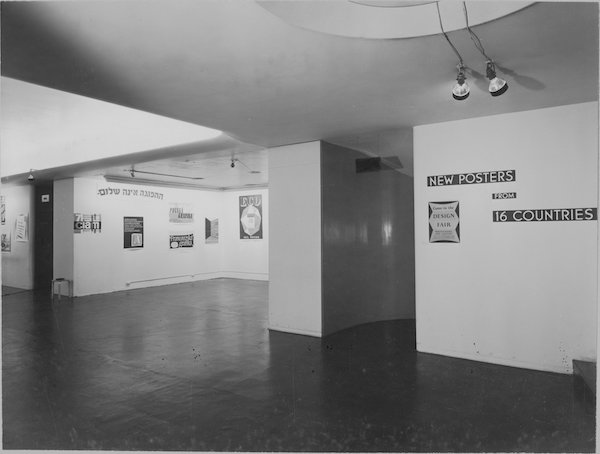
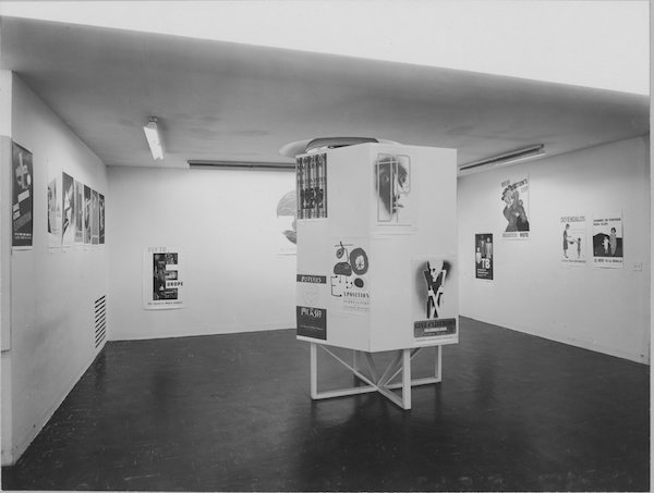
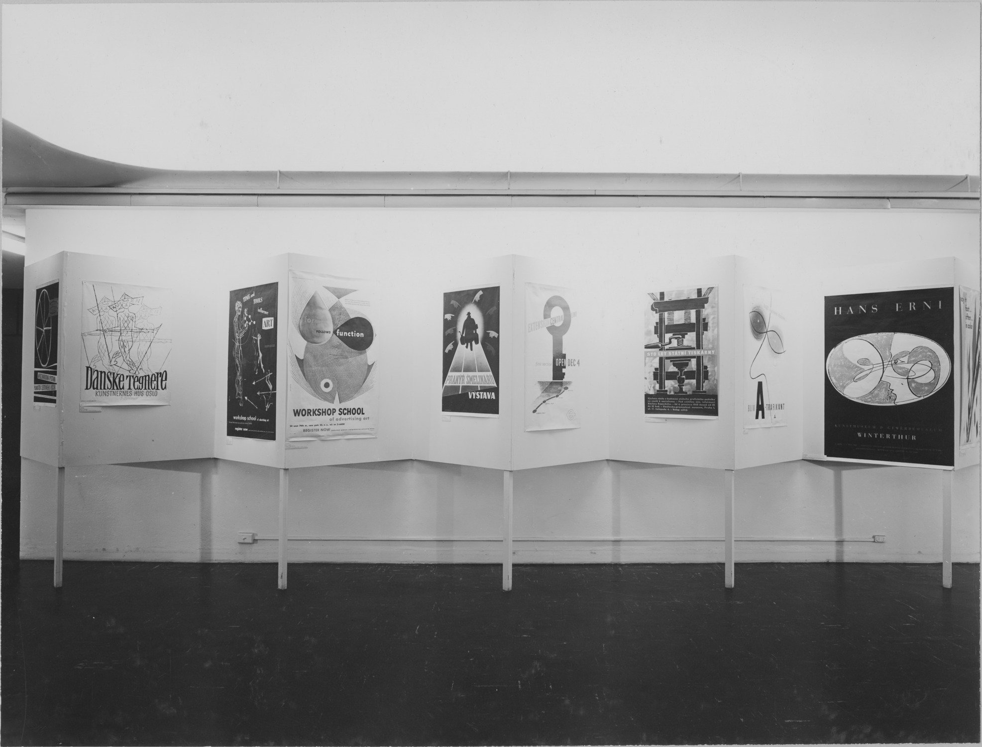
It’s an exhibition at MoMA, New York in 1949, displaying – as the wall tells you – new posters from sixteen countries.
I’m very taken with the sparse layout. If this show had been appeared in Britain in 1949, I’d have assumed that the design ended up this way because of the privations of post-war austerity. But in fact it doesn’t work like that at all. Britain, in 1946, with no money, raw materials or time to expend on exhibition design, produced Britain Can Make It.
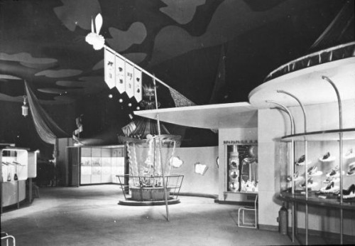
Which was, in truth, mental.
America, with all the plasterboard, paint, metal and ingenuity it can want, produces this instead.
Go figure.
The pictures here are all from MoMA’s website, but perhaps even more interesting is that they have also reproduced the exhibit checklist from the show as well.
So I can tell you that in the middle picture above, the posters on the right hand side are all RoSPA posters, just as they look to be. But better than that, we can start to seek out some of the exhibits.
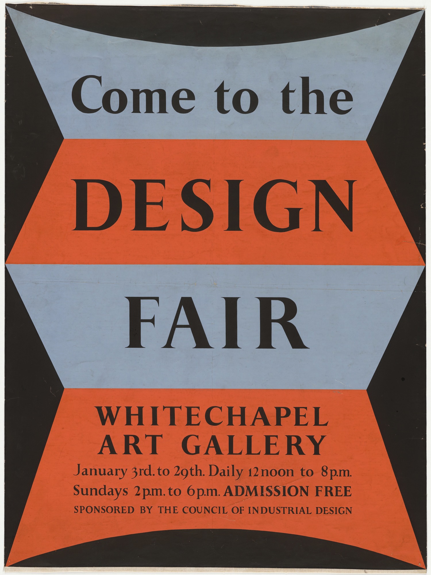
The brief for the exhibition was to show non-commercial designs, in part as a response to the use of posters for propaganda purposes during the war. Their publicity notes that there is increasing use of well designed posters, particularly in England.
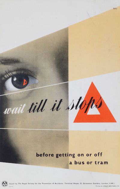
The British are well-represented in the exhibits, predominantly by RoSPA posters like this Schleger.
Along with this less well known George Morris example.
There’s also a Manfred Reiss GPO poster about helping the export drive, which might well be this one, although there is at least one more in the series.
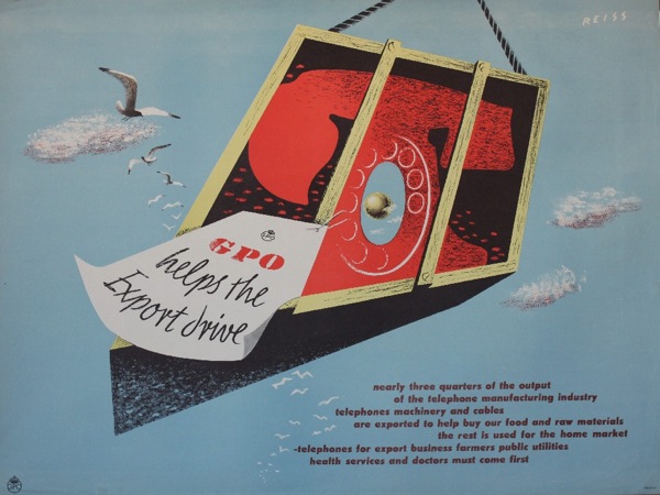
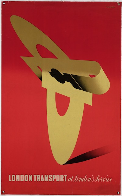
Others are harder to track down. There’s an Abram Games poster whose only description is ‘London Transport’. This doesn’t narrow things down very much, but given that this one is of the right date and in the MoMA collections, I’ll take a punt. (If you want to know more details of the punt, it looks as though lots of the works in the 1949 exhibition entered the MoMA collections as ‘gift of the designers’ in 1953. Which this one did as well. So there.)
It’s also sparse enough. The more I look through these posters, the more I can see that the aesthetic of the exhibition design is also that of the exhibits as well. The curators have chosen minimalist posters, with some elements of photography in places. The whimsy of the British early 1950s is hard to find, although traces do exist.
If only just. That’s by Peter Hatch, and you can see it on the right in the first picture.
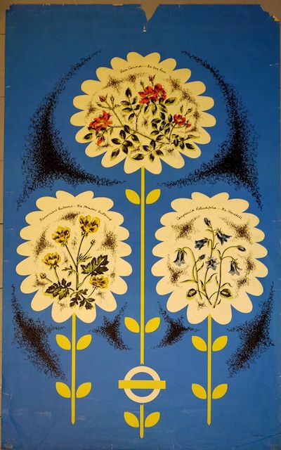
But British neo-Romanticism is almost nowhere to be found. That’s not what posters do, at least not in MoMa-world. The only exception is this wild card, by Nora Kay for London Transport.
Nora Kay went to the Royal College of art, that’s all I can tell you about her. (The picture is similarly anonymous, as it came from Pinterest, although I think via Rennies, but it’s not on their website any more so I hope they don’t mind. The poster seems to be as elusive as its designer.)
If I had more time, I’d try to reproduce the entire exhibition, if only so that I could walk round it in my head and see what late 1940s America thought the future might look like, at least in terms of graphic design. But that will have to wait for another day.
