Sell me something, please

As mentioned earlier this week, I was wandering around the Design Council Slide Collection at the weekend.  Actually, wandering probably isn’t the right word, because I was on a mission.  I was looking for some examples of good commercial design – i.e. nice graphics which want to sell me something other than a railway journey, and I thought that this might be one place where I would find some.

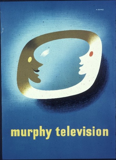
As it turned out, there were only a few, like this 1950 Abram Games design for Murphy Television,

Abram Games poster Murphy television 1950

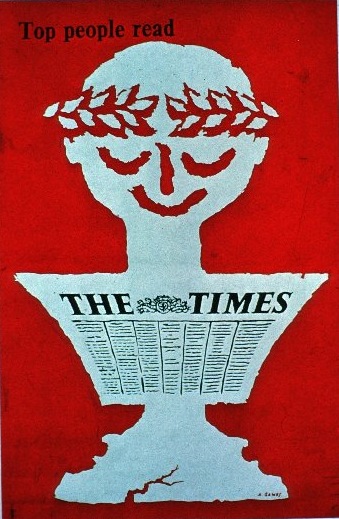
and a later, 1962, poster of his for The Times

Abram Games poster The Times 1962 Design Council Slide

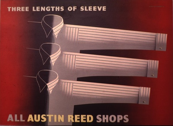
There’s also a nice Eckersley Lombers advertisement for Austin Reed (1939) which I hadn’t seen elsewhere.

Eckersley Lombers sleeve length advertisement Austin Reed Design Council Slide 1939

But that, dear readers, is about it.  And so I am still left pondering the question that sent me to their archive in the first place.  Where, oh where, has all the commercial design gone?

It was looking at the AP brochure which made me think.  So much of what was in there was commercial graphics – posters for everything from Carnation Milk to Mazda, Gillette and WH Smith.  But these posters just don’t seem to survive at all.  Mr Crownfolio and I have just six posters that I’d count as commercial advertising.  (To put this in perspective, we seem to have nearly 50 GPO posters…  I am as surprised as anyone to find that out)

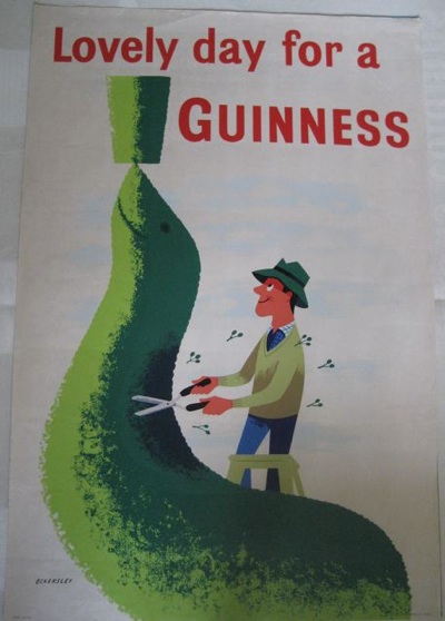
Furthermore, four of the six are for Guinness, whose posters seem to be an exception to the general absence as there are plenty of them about. (Why did they survive?  Could people buy them as art at the time?).  This Eckersley from 1957 is probably my favourite.

Tom Eckersley vintage Guinness poster 1957

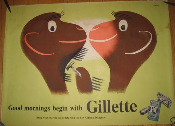
While this Eckersley is the only post-war advertising poster that we own.

Tom Eckersley Gillette vintage poster 1945-49

So where did they all go?

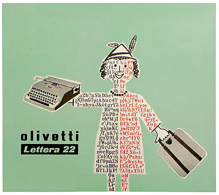
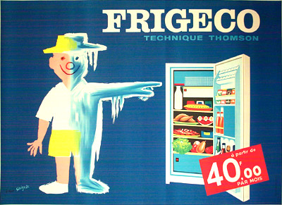
What makes their disappearance even more peculiar is that on the Continent, these advertising posters survive in droves.  Just a quick search on Savignac turns up more examples than I can rightly squeeze into one blog post.

Savignac Olivetti poster 1953

Savignac Fridgeco ad 1960

I particularly like the 1960 Fridgeco one for having a price, in just the same style as a modern French poster.

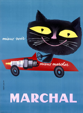
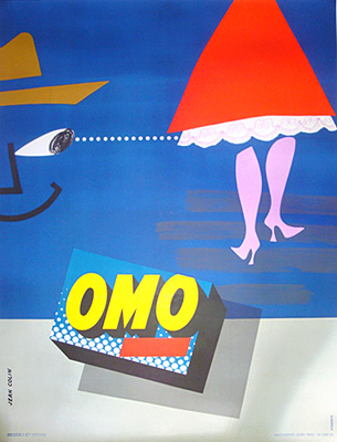
The same is true if I search for Jean Colin.

Jean Colin Marchal cat vintage poster

Jean Colin vintage OMO ad

And I’m sure I could achieve the same kind of results for most Continental poster designers.  So why did only ours disappear, when all of these were kept?  I am very bemused indeed and can’t come up with a ready answer.  Perhaps someone out there knows.  (If, of course, you are sitting on a large horde of British advertising posters, please do get in touch as well, I’d love to meet you…).

Operator, I can’t find anything

I’ve been meaning for a while to do a series of posts looking at the different archives that sit out there on the web, just waiting for you to rummage through their files of wonderful vintage posters.  These resources have exploded in the last few years, and it’s now easy to find out incredible amounts about the history of posters without ever leaving your chair – the kind of research that would have taken years and many many train journeys in the past, even had it been possible at all.  So, while the archives may not be making me fitter, I am certainly now both better off, and considerably more informed than I would otherwise have been.  Hurrah for the internet.

My thoughts were that I’d start with one of the straightforwardly brilliant ones, like the London Transport Museum catalogue – a complete itemisation of every poster and artwork they own, image-led, designed for users rather than museum curators.  But in fact, I find myself wanting to begin with two really quirky ones.  So today’s is the BT archive, which until a couple of weeks ago, I didn’t even know existed.

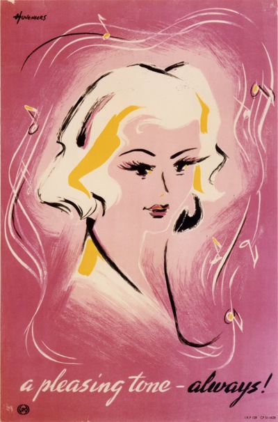
Pieter Huveneers Telephone poster
Pieter Huveneers, c1950.

The archivist at the BPMA very kindly pointed me in their direction, because the two collections are separated siblings.  When British Telecom was split off from the GPO in 1980, they got the posters about telephones and telegraphs, and the Post Office got the ones about letters.  But the artists, the poster sizes and even the cataloguing systems are very much the same.

Hans Schleger vintage GPO poster
Zero, 1944, TCB 319/PRD 375

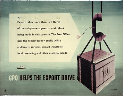
That, sadly, is where the resemblance ends.  The BPMA catalogue interface is lovely; it’s reasonably intuitive, I can find what I am looking for with some confidence, and all of the pictorial material is illustrated.  The BT catalogue is, if I am entirely honest, a pig.  The search logic follows its own rules, there is a wierd link called “ContextRef” which throws up an apparently random list of related material (which then defaults to the search page if you click on anything), and, worst of all, only about 10% of the material is illustrated.  What’s particularly annoying about that is that, in researching this, I’ve found a company who claim to have had the contract to digitise the entire BT archives.  So where have all these pictures gone then?  Although, on the plus side, I did find this 1948 Eckersley on their blog, and I swear I’ve never seen it before (if you have, please do say in the contact box below).

Tom Eckersley GPO vintage poster export drive

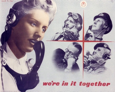
But, as you can see, I have spent rather longer than I intended sifting through page after page of slightly dry records (I don’t, I have to say, like reading catalogue numbers) in search of the few illustrations that do exist.  Because the few that are there are wonderful. This wartime Henrion is particularly wierd  – I’d like to find out more about him, some of the images are really quite disconcerting.

Henrion WW2 vintage poster GPO telephonist

Although this one, from 1951, is quite benign.

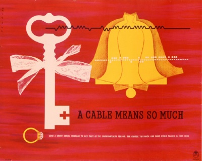
Henrion vintage poster GPO cable 1951

Then, after the best part of an evening reading ContextRef numbers and swearing, I found out how to buck the system.  Some, and quite possibly all the images are available through the BT image sales website.  Which is organised by picture, and theme, making finding images less of a needle in a haystack hunt.

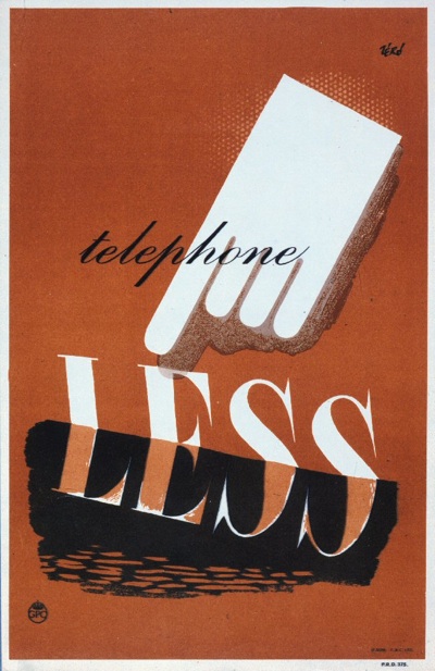
Reiss telephone less vintage gpo poster
Reiss, 1945

There are disadvantages, like the fact that there are rather more pictures of trimphones and Busby than there are posters, and the images are watermarked..  But it does at least, in the advertising and wartime sections, give you a rough overview of what kind of posters the GPO was producing and whether or not you might want to look at some more.

This isn’t the first time I’ve used the image sales get round; for a long time, the only way to find out what posters the National Railway Museum held was to go via the Science and Society website.  The NRM now do have a searchable online catalogue (of a railway buff kind) which is better than the slightly random selection that Science and Society used to dole out.  But if you’re searching an archive through image sales (do you hear me V&A as well?) it’s a sign that they could, possibly, do more towards making them available on the web.

Moan over.  So here’s one last nice poster to cheer ourselves up, a faultless Unger from 1951.  Pip pip.

Pictures down the telephone line

Today, dancing about architecture.  Or at least its close relative, podcasting about posters.

Actually, I’m being a bit unfair here. What I’ve been listening to is historian Scott Anthony on the BPMA podcast about Stephen Tallents, the man who brought artists to the GPO poster and Night Mail to the nation.  Although the lecture did still have slides, and yes, I couldn’t see them.

Barnett Freedman parcels GPO vintage poster
poster by Barnett Freedman commissioned under Tallent’s watch at the GPO

Nonetheless, this was a useful listen, not least as a reminder of just how huge and influential the GPO was in the inter-war years.   The largest employer in Britain, with over quarter of a million employees, it had a monopoly of communications which is almost unimaginable today, including oversight of the BBC.  So Tallents, as their head of public relations, had enormous influence to wield and a huge audience for his efforts.

McKnight Kauffer airmail vintage GPO poster
McKnight Kauffer Airmail Routes for GPO 1935

What fascinates me most is how much the great poster art of the pre and post war periods depended on the individual patronage of a few idiosyncratic individuals.  This does not only mean Tallents – who first started using talented designers when he was at the Empire Marketing Board before joining the GPO.
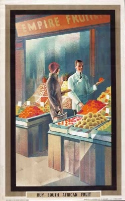
Empire Marketing Board poster Austin Cooper
Austin Cooper for Empire Marketing Board, 1933

Also following a remarkably similar track were characters such as Jack Beddington at Shell,
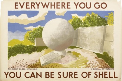
Graham Sutherland Swanage Shell poster
Graham Sutherland, Swanage for Shell

and of course Frank Pick at London Transport.

So why did they do it?  It’s a question that I think is important, because their attitude lingered on well after the individuals themselves had left their jobs.  Major companies and institutions employed great designers and artists to produce their publicity right up until the 1960s, simply because by then it was the done thing.  So how, and why did it start?

Anthony believes that this is mostly the corporate expression of the age-old notion of patronage.  Great designers and artists were employed because that’s what important people have always done; it’s just that, after the First World War, the important people happened to be companies and public institutions rather than dukes and kings.  There is some truth in that. Nikolaus Pevsner said of Frank Pick that he was the “Lorenzo the Magnificent of our age”.
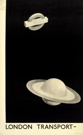
Man Ray London Transport vintage poster
Man Ray for London Transport

It’s almost possible to justify this as a logical business decision: great artists = great corporate image, which is how Anthony sees it.  But I also think that there is more to it than that.  In particular, there is a very particular belief in this period, associated with British modernism-lite, that design can be Good For You.  The lower orders will be morally improved, or at very least will stop liking chintz and veneers and pictures of kittens, if we just expose them to what great art and design is.  In its later incarnations, it brings us Utility furniture (the nation’s taste will be improved by good design because we won’t let them buy anything else) and tower blocks, which will make them happy people via the medium of modernist architecture.  But before the war, its main expression was in the commissioning of posters.

Both Jack Beddington and Frank Pick were trying to create art galleries which, while making Shell and London Transport look like forward thinking and enlightened companies, would also enrich the cultural lives of the people who saw them.
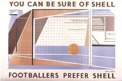
BEn Nicholson for Shell vintage poster
Paul Nash for Shell

And as a result they both – unlike for example the railway companies –  tended to commission artists at least as much as designers.  Shell used Paul Nash, Graham Sutherland, Duncan Grant and Ben Nicholson.  While London Transport commissioned Man Ray as well as McKnight Kauffer.  Even Stephen Tallents commissioned Vanessa Bell to produce a poster for the GPO (although it was never used)
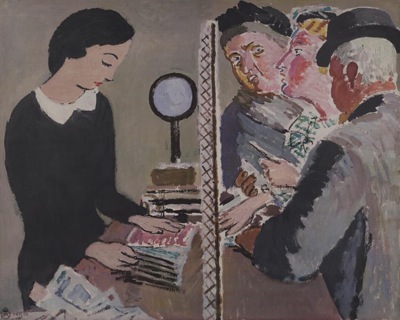
Vanessa Bell unused poster design for GPO 1935

Shell explicity referrred to their lorries which carried their posters on the sides as a travelling gallery, and as John Hewitt notes, they are displayed in a ‘frame’ of white space, with the text not allowed to encroach on the image, allowing viewers to see the design as an artwork as well as advertising.
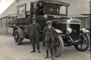
Shell Lorry with poster billboard
Shell lorry with billboard, 1925

For London Transport, Pick was even more explicit.  In 1935 he described the whole of London Transport as a work of modernist art.

…underneath all the commercial activities of the Board, underneath all its engineering and operation, there is the revelation and realisation of something which is in the nature of a work of art…It is in fact a conception of a metropolis as a centre of life, of civilisation, more intense, more eager, more vitalising than has ever so far obtained.

And how better to express that than in the modernist forms of McKnight Kauffer, for example?
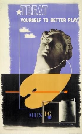
McKnight Kauffer for London Transport

Even the GPO was not immune.  Anthony pointed out in the podcast that there was a Poster Advisory Group, set up by Tallents, which was there to ensure that the artworks were only of the highest quality.  Its members were Kenneth Clark, art historian and general arbiter of taste, the art critic Clive Bell and Shell’s Jack Beddington (Kenneth Clark opened exhibitions of Shell posters for Beddington; the world of good taste was a small one).  Now, this for me is a real give away about the purposes of these posters.  This committee isn’t a group of people who are going to have an opinion about the commercial effectiveness of posters, they are simply there to make sure that they conforms to the highest possible standards of prevailing artistic  merit.  The GPO, being such a huge national institution, has a moral duty to improve the quality of Britain, and Kenneth Clark and co are going to make sure that they stick to the task.  (I’d quite like, incidentally, to read the minutes of this august body.  Perhaps I’ll turn into a historian and do that one day).
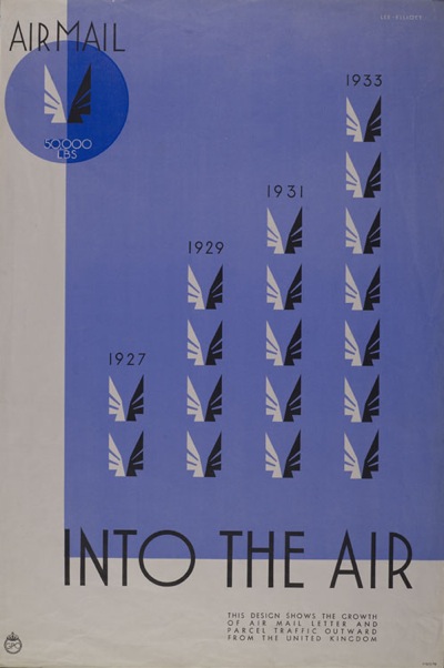
airmail vintage gpo poster

(This, by Theyre Lee Elliott was the first design they approved in 1935).

But now those attitudes have almost completely disappeared.  We are too cynical to believe that good design, or indeed anything done by a corporation, can improve us.  The only national institution which has a vestige of these attitudes remaining, is the BBC, which we still believe should do us good rather than make a profit.  Whenever people talk about the BBC, though, these attitudes are always described, somewhat disparagingly, as Reithian.  I think that’s a bit unfair on poor old Lord Reith.  What Scott Anthony and all these posters have shown us is that the idea that great national institutions should improve our lives in some way, was all around between the wars.  It’s just that Lord Reith’s ideas of how this should be done are pretty much the only ones which remain.

As if to demonstrate how much the ideas of what institutions should do for us have changed, an ad for the Post Office came up on Spotify while I was writing this.  Twice.  They’re giving away iTunes gift cards to coincide with stamps of great album covers.  But the end line of the advertisement is “Win enough free music to annoy loads more people”.  Need I say any more.

The next BPMA podcast, meanwhile, is Paul Rennie, talking about GPO posters.  As someone who relishes a challenge, I’m rather looking forward to it.
Find me an artist. From 1953 please

Sometimes, writing about graphics can feel like a constant harking back to a golden age of British graphic design, long since lost to the evil forces of photography, Photoshop and general bad taste.  But not everything from that time has disappeared.

Like Artist Partners for example, who are not only still going but have set up a usefully informative website which covers their past as well as their present.  And their past was very glorious indeed.

Founded in 1950, the agency represented some of the biggest names in illustration, graphics and photography from the fifties onward.  There’s no point repeating their entire history, because they’ve done the job already.  Although I was particularly interested to see that Reginald Mount was one of the founding partners.  He’s a fascinating character who seems to pop up at all sorts of interesting points in the history of graphics, and I’d be interested in finding out more about him one of these days.

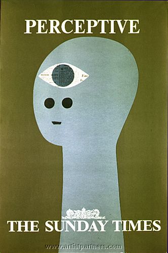
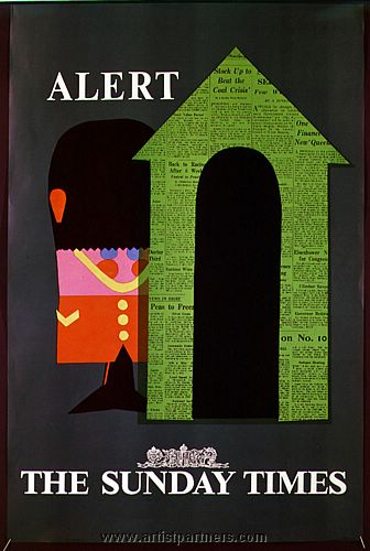
They’ve put together a small retro section on their website as well, with a few nice images, like these Sunday Times advertisements by Patrick Tilley.

Patrick Tilley vintage sunday times advertisement Patrick Tilley vintage sunday times ad

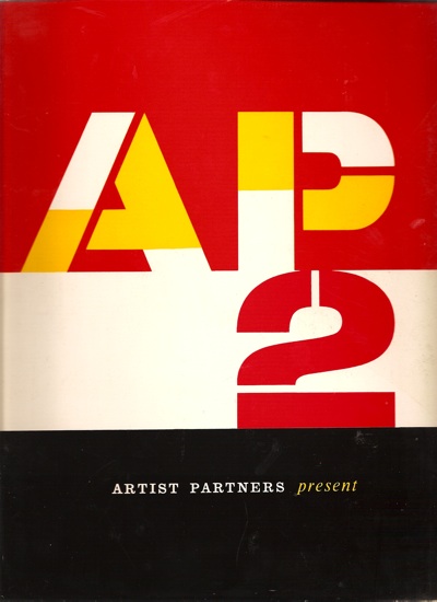
But it’s not the website that made me want to post about them, it’s this (the cover also, incidentally, designed by Tilley), which we’ve had on the bookshelves for a while now.

Cover of Artist Partners graphic design brochure

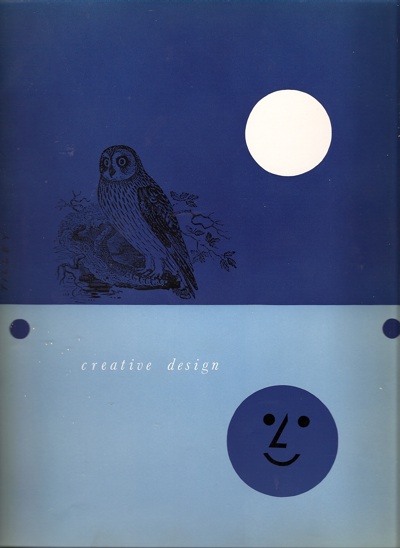
Dating from, I guess, the early to mid 50s, it’s a brochure for the artists represented by AP, and a very delightful book in its own right.  Here’s one of the section headings for example.

Divider from Artists Partners graphics book

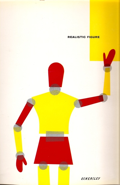
Or this one, by none other than Tom Eckersley

Eckersley Artist Partners graphics book divider

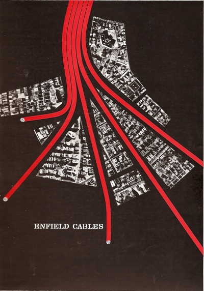
Oh to be sitting at at an advertising agency desk in 1954 and trying to decide who to commission.  Because there is such as wealth of wonderful talent in this book.  Amongst other people, Artist Partners represented Eckersley, Hans Unger, George Him, Eileen Evans, and of course Reginald Mount.  And even Saul Bass.  Here’s a trade advertisement for Enfield Cables.

Saul Bass Enfield Cables ad Artist Partners book

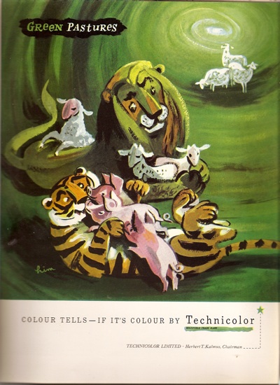
And a rather fetching advertisement for Technicolour by George Him.

AP George Him technicolour ad

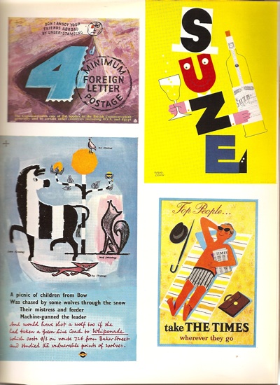
My main sadness is that it’s only partially in colour, because there are simply hundreds of pieces which I haven’t ever seen before.  For every page like this

AP content various

(Two Hans Ungers – one GPO, one London Transport, a Leupin and another Patrick Tilley)

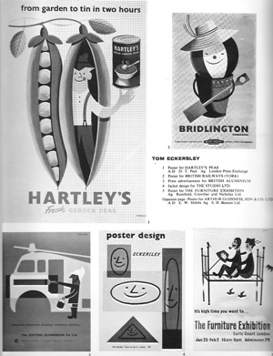
there are ten like this.

AP eckersley page

I’ve managed to find the peas one in colour at least for your entertainment.

Tom Eckersley Hartleys peas graphics

That’s more than enough for now, but I’ve still only barely scratched the surface of this wonderful book.  I’ll post some more images from it next week.

But if you can’t wait that long, Abebooks is offering one copy for sale.  I can’t tell you anything about the condition as it’s all in German – but let me know how it is if you can’t resist anyway (or, indeed, if you speak German).  Well it was there this morning, but now it’s gone.  Hope you like it.

Collect Posters Carefully

These thoughts are the result of what was quite literally fall out from my previous musings about poster sizes.  When I was scanning Eckersley’s illustrations, his obituary (from The Times, August 18 1997) dropped out of Poster Design.  And it told me something I didn’t know.

I’d always been aware of his being Tom Eckersley, O.B.E., but I had no idea that he’d got the honour in 1948, at the age of just 34.  It was in recognition of his contribution to the war effort.  Which looked like this.
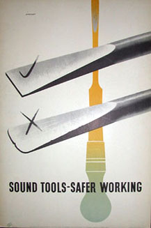
Tom Eckersley Rospa poster

And also this, amongst many, many others.

Tom Eckersley Wartime ROSPA poster

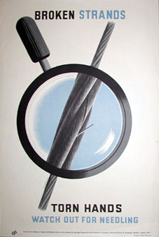
He was awarded the honour for all of his posters for the Royal Society for the Prevention of Accidents – and possibly also for the fact that he designed all of these posters while at the same time drawing maps for the RAF as his day job.  I find it really interesting – particularly in light of the current backlash against ‘Health and Safety’ – that this campaign was seen as such a central part of wartime propaganda, to the extent that Eckersley was, as far as I know, the only wartime poster designer to be honoured in this way.  Although please do correct me if that’s wrong.

But I’m not just telling you this because it’s an interesting snippet.  ROSPA, who commissioned all of these posters, have als0 put up an interesting archive of all of their World War Two Safety Posters, with images from Abram Games and Arnold Rothholz as well.  So there are lots of lovely images for you to look at, and a bit of history as well.  (If you want to follow the trail any further, it leads, with a certain inevitability, to Rennies who have many more posters on their site).

Guardian writer bien informée

I’ve been overtaken by events over the last few days, which has eaten into my thinking and posting time more than I would have liked.  Fortunately, Sam Leith in today’s Guardian has been writing intelligently about posters, so that I don’t have to.  His points about the decline of lithography and the absence of concept apply to more than just political posters.

He’s using the newly revamped and re-opened People’s History Museum in Manchester for the posters which prove his point.  They do have an excellent digitised archive too, so you can wander through their collections and draw your own conclusions.  The images, however, are still a bit ropey.  Here’s one poster I liked, a touch green perhaps.

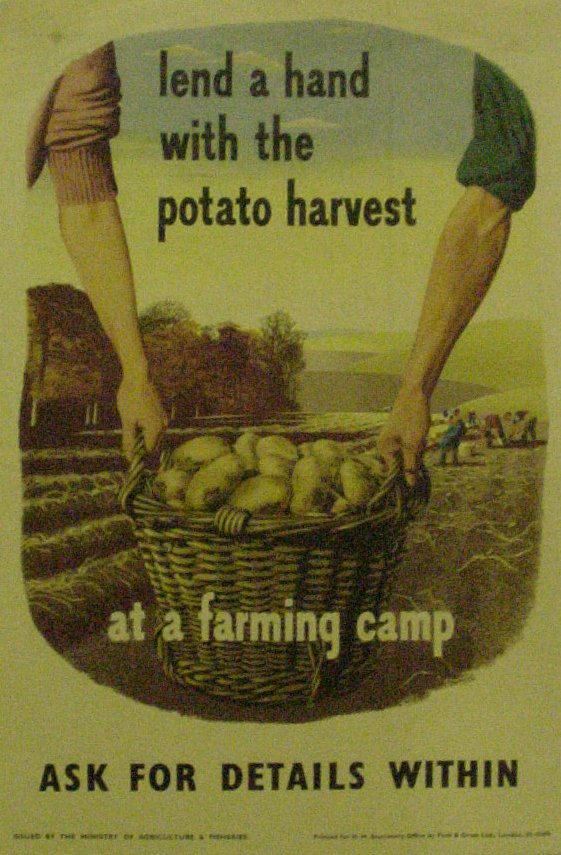
vintage green potato harvest poster

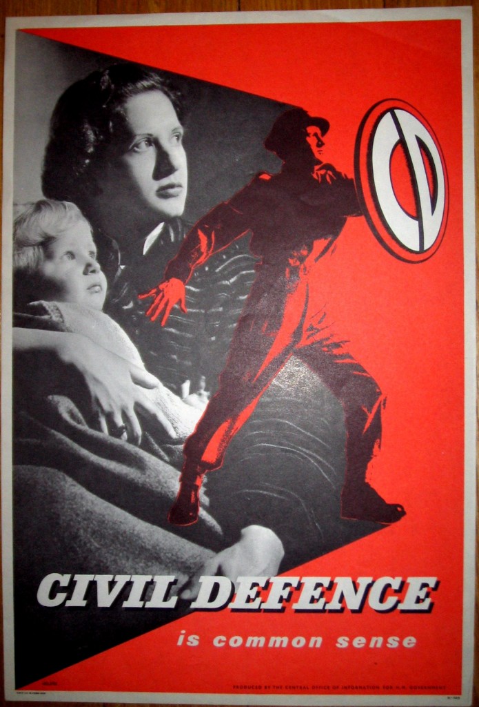
But the other Civil Defence one above actually comes from our own collection, as their image from the same series was more of a collection of pixels than anything else.  But I’m sure that’s just teething problems.

(And yes, I know, our images aren’t that great either.  We only took them as mug shots for our own reference, not having any idea that they might end up out there on the web.  So apologies if a) they are less than orthogonal, and b) you see more of our floor that you might strictly wish to.)

Meanwhile, elsewhere on the web, you can buy  this:

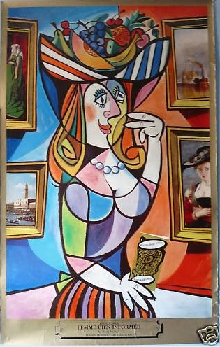
femme bien informee london transport poster

Possibly the only time you are going to see the words Harry Stevens and Art in the same sentence.  There on the other hand, it is only £9.99 at the moment.  On eBay of course.