Exceptional

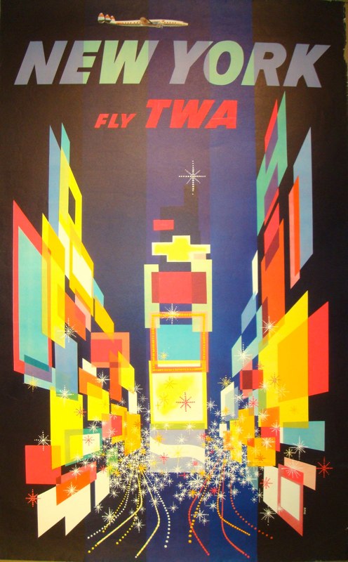
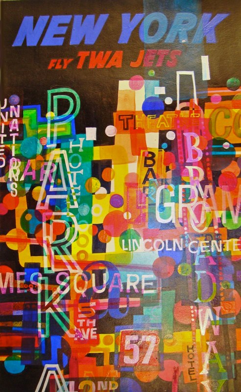
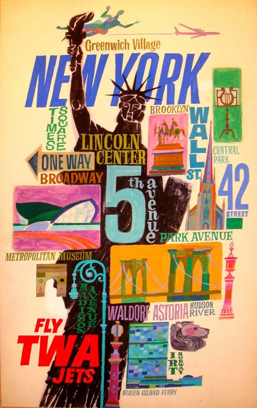
As the masthead suggests, Quad Royal is meant to be a blog about British graphics and design.  But I often find myself making an exception when a David Klein poster comes up in an auction I’m mentioning, mainly because they catch an optimism about the 1950s that the British tend to express more in a cheery whimsicality than in the neon and rush of the city.

David Klein TWA vintage travel poster New York

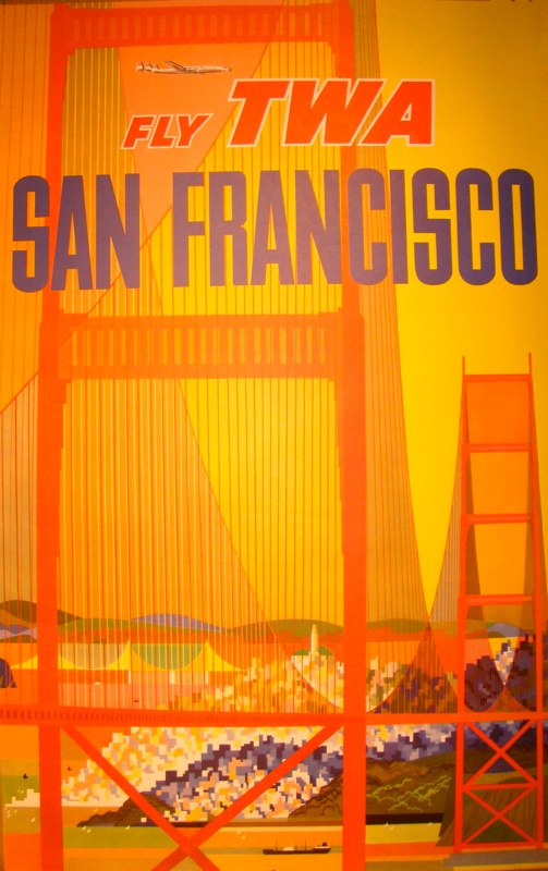
It’s not something Britain ever really had in the 1950s, with the possible exception of Piccadilly Circus.  We didn’t have Klein’s golden sunshine either.

David Klein vintage TWA travel posters San Francisco

I am making an exception of him once again today, mainly because I have discovered (and apologies because I can’t remember who pointed me to it first) the Compleat David Klein on the web.  The posters alone are wonderful.

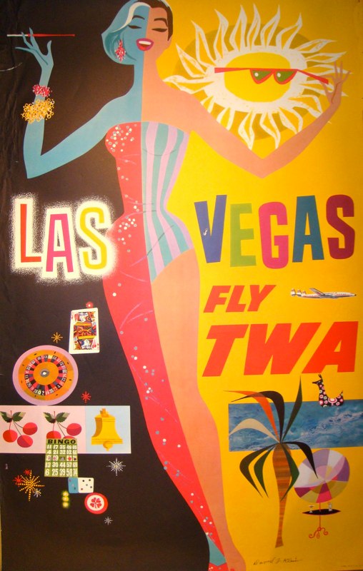
David Klein vintage TWA travel posters Las Vegas

These posters would, I imagine, have been seen over here quite a bit.  This one alone must have been a direct influence on R M Lander – take a look here if you don’t believe me.

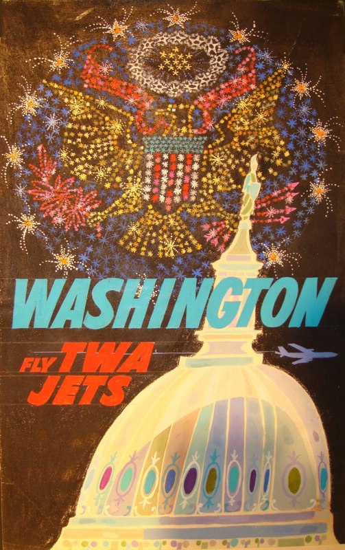
But what’s actually best about it is the collection of original art works – many for posters which aren’t themselves displayed.

David Klein TWA vintage travel poster artwork washington

My favourites, perhaps unsurprisingly, are those advertising the neon and the rush.

David Klein TWA vintage travel poster New York lights artwork

David Klein TWA vintage travel poster New York artwork

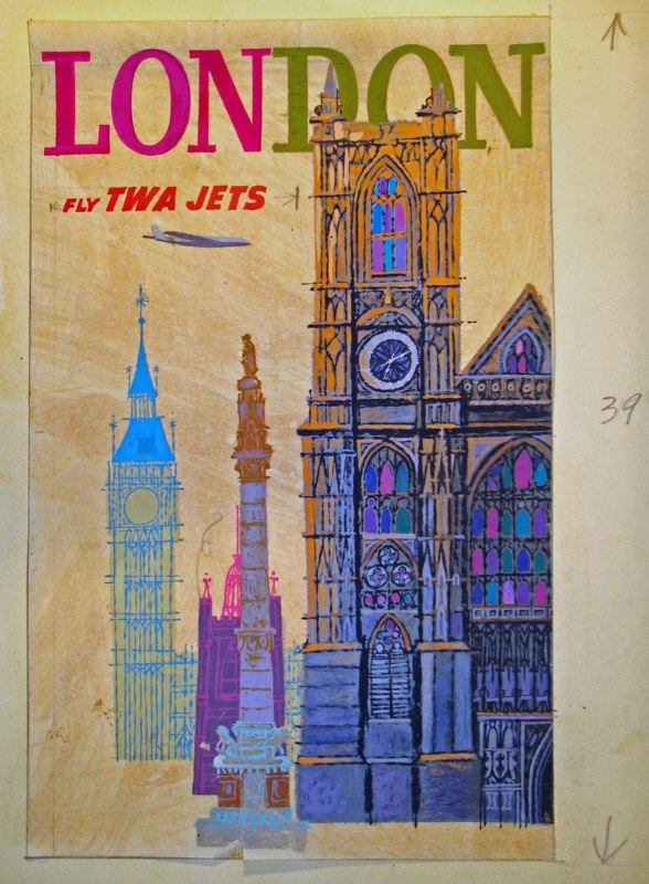
The European destinations are sweet, but just don’t have that same excitement.  Klein was much much more about the new than the old, as his portrayal of Britain also shows.

David Klein TWA vintage travel poster London

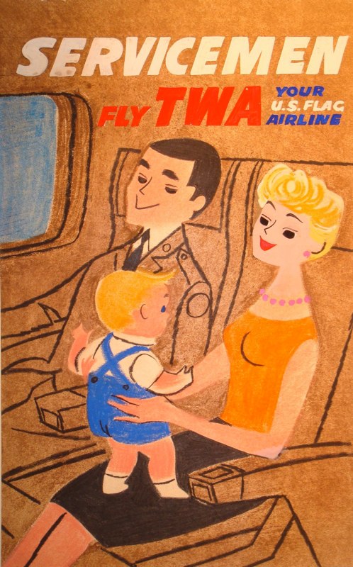
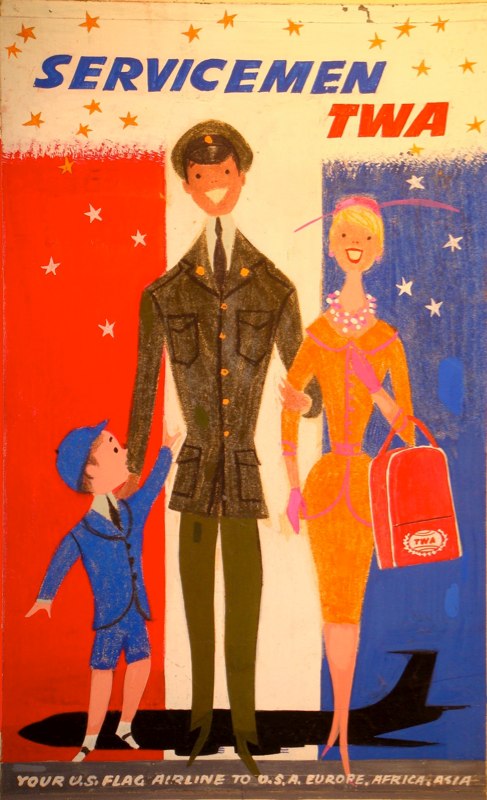
The other set I do like are those advertising travel for American Service families.

David Klein vintage TWA travel posters service family

This is mainly because they are among the very few posters from this time that look like the graphics now fed back to us as 1950s retro. This kind of visual memory is always very partial, and this is a subject I’ll be coming back to in a week or so.

David Klein vintage TWA travel posters family serviceman

Anyhow, there’s way more on the website than I could display here – all I’ve even looked at is the TWA posters and there is much more besides – so do pop over and take a look, it’s well worth it.

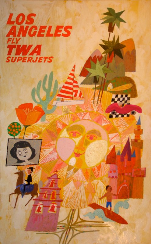
David Klein TWA vintage travel poster Los Angeles artwork


Runabout

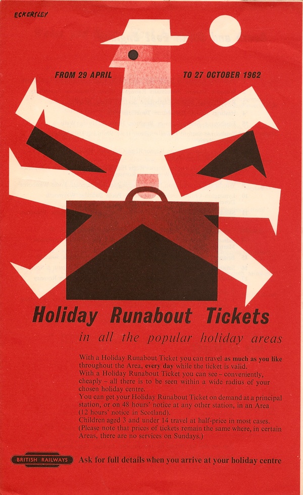
Mr Crownfolio has been diversifying into ephemera again.  But I can’t really complain when it’s as good as this.  And anyway, we haven’t had a nice Eckersley on the blog for a while.

Tom Eckersley British Railways leaflet Holiday runabout tickets 1960

But this isn’t some niche piece of design for a high-end firm.  What we have here is a popular leaflet produced by a giant nationalised industry.  I can’t think of anyone working in a similar way today.  Which is more than a shame, to me that represents a loss of respect for other people – respect for their intelligence and taste, but also a respect in terms of making the world better looking rather than uglier.  And that’s quite something to lose.

A good home

Earlier this week, I went to the Design Archives at the University of Brighton, to see if they wanted Daphne Padden’s archives, or at least what we had acquired of it.

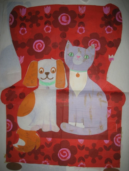
Daphne Padden cat dog armchair design

Fortunately they were not only very delightful but also decided they did want them, and these three images are just a few of the designs that are now in their safekeeping.

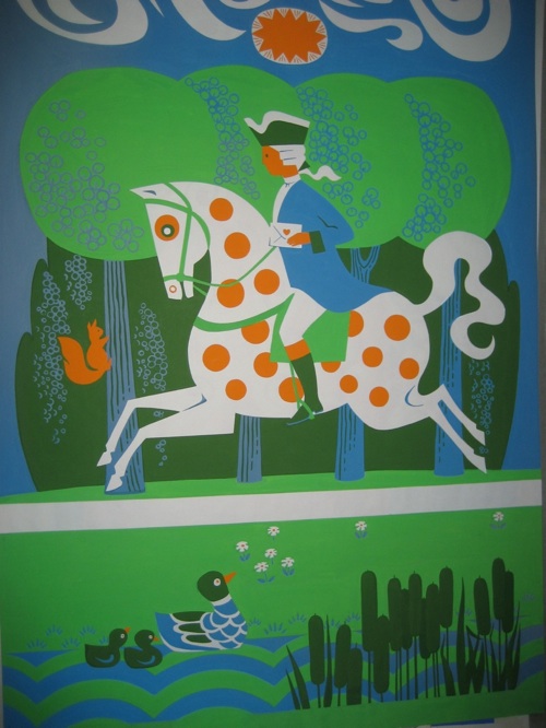
Daphne Padden mail rider design

With them are also all manner of other things, including rough sketches, a kind of portfolio of work (some of which I have posted here before) and much else besides.  Once they’ve been catalogued and conserved, students and researchers can go and have a look at them.

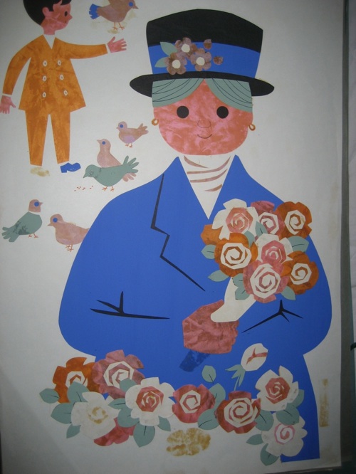
Daphne Padden flower seller design

I’m really pleased, and not just because it’s a relief to have found a good home for a collection which deserved better than just hanging round our house not being seen.  It’s also good because the sketches and collected work showed me that she had done a great deal more in her life than just design posters – and a great deal more than anyone would have expected from a woman working alone at that time (I’m thinking particularly of the Marks and Spencers designs here).  Now that story won’t be lost, it’s preserved for good, and I think that’s really important.

The forgotten man

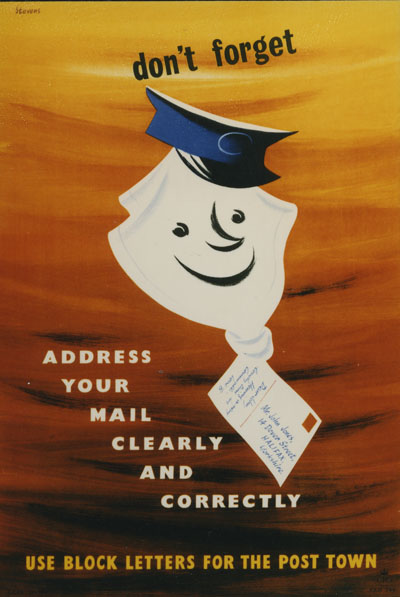
I’ve said it before, and I will no doubt get around to saying it again, but Harry Stevens is a very underestimated poster artist.  That thought is mostly provoked by this 1954 poster, which we bought a copy of recently, (although one which I have to admit is slightly more battered than this picture).

harry Stevens address mail clearly vintage GPO poster 1954

It’s good, isn’t it?  And so’s this.

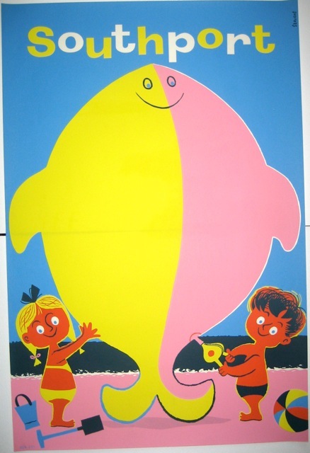
harry Stevens vintage southport coach poster 1950s

And indeed this.

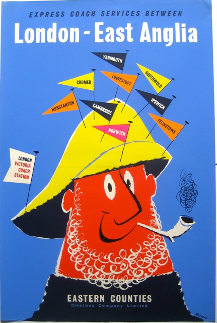
Harry Stevens vintage east anglia coach poster 1950s

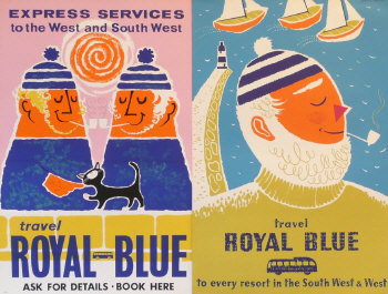
Mr Crownfolio wonders every so often whether that poster is Harry Stevens gently taking the mickey out of Daphne Padden’s sailor types.

2 x Daphne Padden Royal Blue vintage coach posters

Or perhaps fishermen were just picturesque visitor attractions all over the 1950s.  Who can say.

But back to Mr Stevens.  There are two things to say about him really.  One is that he is so thoroughly overlooked that there is very little out there on the web about him at all.  In fact pretty much the only biography I can find is that on the London Transport Museum website, and even that is pretty short.

The other is that he wasn’t overlooked at the time.  He regularly turns up in annuals of good taste like ‘Designers in Britain’ and, as the LTM biography says, won the Council of Industrial Design Poster Award in 1963.  So why is he so little known now?

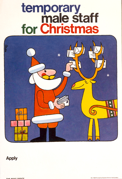
It can’t be because his work has disappeared, beacause he has to be one of the most prolific poster artists of his generation, working right through into the 1970s.  This somewhat perplexing poster dates from 1971 for example.

Harry stevens male staff quite perplexing vintage ish gpo poster

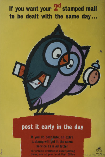
He did quite a bit of this cartoon-style work for the GPO.  Some of it is as good as anything he ever did, like this owl from 1960.

Harry Stevens vintage GPO poster owl 1960

By the end of the decade, it goes get a bit repetitive and less appealing, probably just because he produced so many of the things.

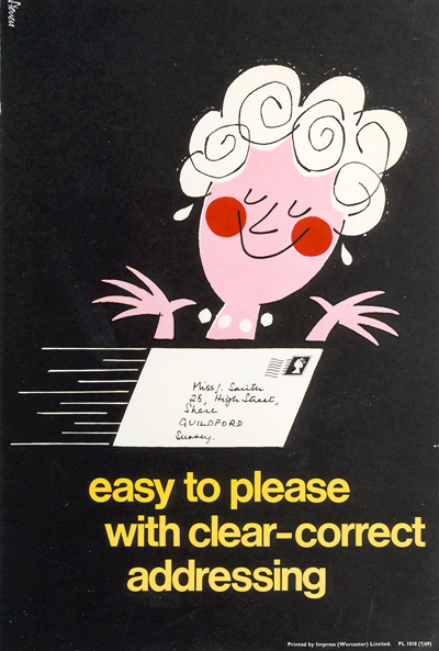
Harry Stevens correct addressing cartoon poster GPO 1969

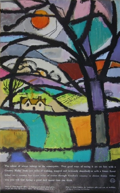
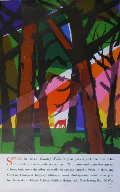
But don’t let that put you off his work, because he did do some really good posters too.  Perhaps some of his most adventurous designs were for London Transport.  Here are two he did in 1961 and 1963 respectively.

harry Stevens vintage London Transport poster 1961 Winter

Harry Stevens vintage London Transport poster Country walks 1963

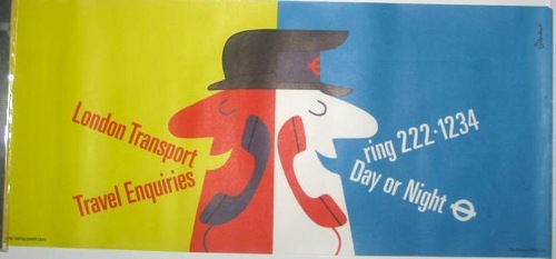
But he could also do a much more graphic treatment for them too – I keep mistaking this particular poster for an Eckersley, although it does in fact date from 1976..

Harry Stevens vintage London Transport poster 1976

In terms of sale prices, even his later work is now starting to fetch higher prices and be sold by posh dealers, as I’ve mentioned before.

HArry Stevens litter vintage 1974 London Transport poster

But he’s still not really a name, and I do think this is an unfair omission.  Possibly he is just a bit too jovial for modern tastes. Then Tom Eckersley can tend that way too, particularly in the 1950s.

Stevens’ work definitely deserves better.  He was capable of producing a good poster right into the 197os.

harry Stevens vintage LT coach tour poster 1970

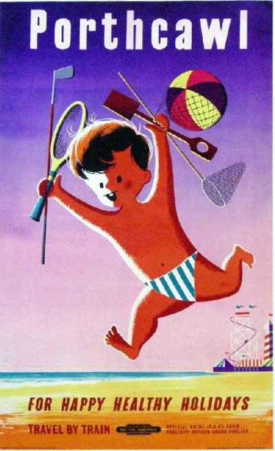
But for me, the posters he did in the 1950s and early 1960s are still some of my favourite things.  Interestingly, he seems to have done relatively few for British Railways – this Porthcawl is one of the very few  I can find.

Harry Stevens porthcawl poster vintage British Railways

Along with this artwork of yet another salty sea dog.

harry stevens vintage British Railways poster artwork 1955

In contrast, the coach companies kept him very busy indeed.

harry Stevens 1957 coach poster

Harry Stevens vintage coach poster

On the basis of those alone, he deserves to be better appreciated.

A final addendum, the London Transport Museum lists him as a designer and fine artist, but the only trace I have been able to find of the latter is this, ‘Spirit of Southern’.

Harry Stevens BR painting

The painting was commissioned by BR Southern Region in 1969 (not something that would ever happen now) but wasn’t very popular apparently and rarely got displayed.  But if anyone knows of any more artworks of his around and about, please do let me know as I would love to see them.

A curiosity

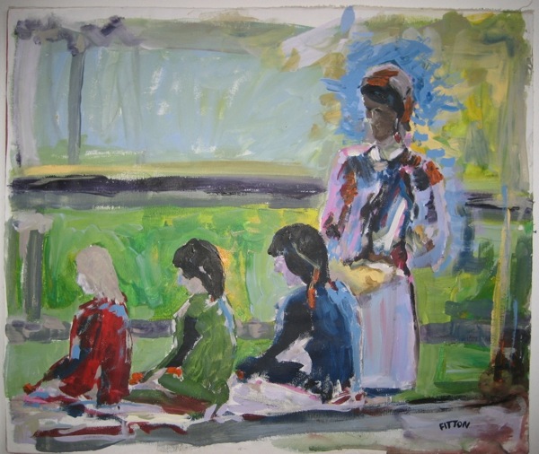
Once again, found in the great warehouse of curiosities which is eBay.  It’s a Fitton, not a poster this time but a painting.

James fitton funny sketchy thing

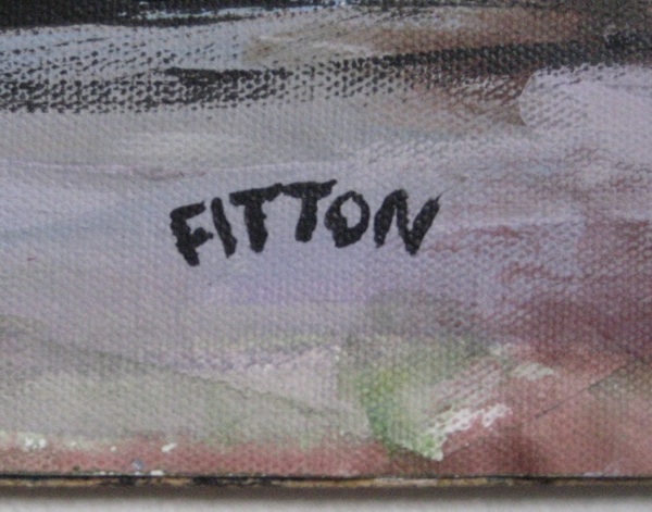
And I’m pretty sure it’s the same Fitton too.  Certainly the signature matches those on the paintings in the Dulwich Art Gallery catalogue.

James Fitton signature

But even were it not signed, that acid green is reminiscent of the luminosity of the colours in quite a few of his posters  (although we almost certainly wouldn’t have found it on the great online jumble sale without a signature, I must admit).

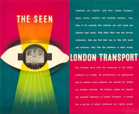
James Fitton The Seen London Transport vintage poster 1948

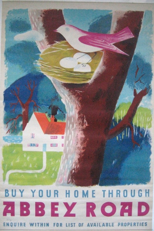
James Fitton abbey Road poster

We paid a very small amount for it, and frankly you can see why, as it is a sketch, and a sketchy one at that, rather than a painting.  But having said that, I’m starting to become rather fond of the thing.  It looks best from a distance, an experience I can recreate for you here by shrinking it to a thumbnail.

And so, propped up on the highest shelf of the Ladderax, it works rather well.  The overall effect is one I rather like and generally tend to aim for, that of an impoverished 1950s architect trying to make the best of a slightly recalcitrant house.  And this might be a painting by one of the architect’s friends.  Well I can always pretend, can’t I?

Architecture subsidiary art to confectionary, obviously

I’ve been reading quite a lot about the Festival of Britain recently (mainly because there is, still, precious little else written about design in the 1950s).  But it has reminded me that I really do need to get around to inventing some form of time travel.

This is Barbara Jones sorting out exhibits for Black Eyes and Lemonade, the exhibition at the Whitechapel Art Gallery which was her contribution to 1951.

One of the questions we used in choosing the old exhibits for Whitechapel was memory – when you think of the posters you can remember seeing as a child, what comes up first? …but then people would say Thorleys, I’ve never forgotten that.  So I telephoned Thorleys who said ‘yes of course, but you’ll have to come and look for it – all our old advertising stuff is in a shed.  Anything left over has been shoved in there for years – do come in old clothes!’
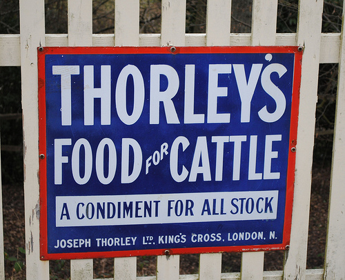
Thorleys feed advertising sign as at Black Eyes and Lemonade

We needed boiler suits, rubber gloves and Wellington boots, but it was all there, crammed into a warehouse on the Regents Canal.  The latest discards were near the door, clean and new, but beyond them far to the back were rolls and bundles thickly black with London grime.  We peeled off the top layers to find more than a century’s advertising: posters, tin plates, glass plates, leaflets that unfolded to show chicks bursting from the egg, and portraits in oils of prize animals fed on Thorleys.  The collection filled a whole room of the gallery.

In the course of my searches, I also came across these.
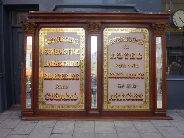
Black Eyes and Lemonade pub mirrors

They are a pair of pub mirrors which were also part of the exhibition, and which came up for sale last year.
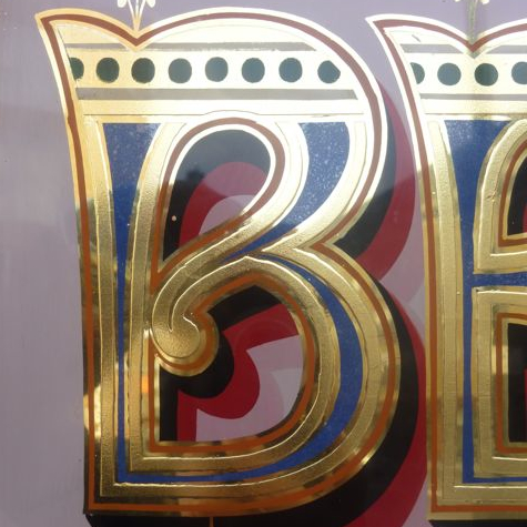
Black Eyes and Lemonade Pub mirror detail

Here they are on display in 1951, in a whole room of pub exuberance.
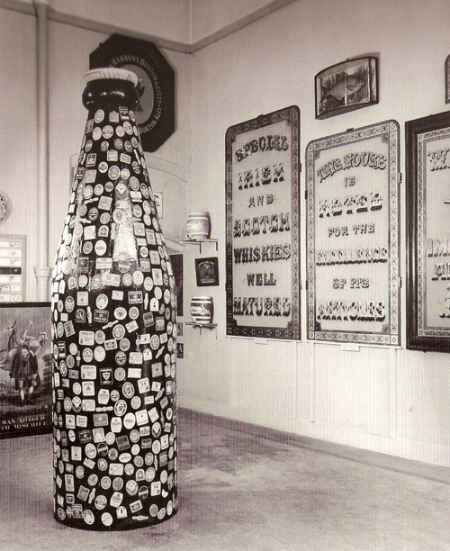
Black Eyes and Lemonade Whitechapel Art Gallery Barbara Jones pub display

The more i see of Black Eyes and Lemonade, the more I want to recreate it; at the very least on the internet, but preferably in real life.

The only good selection of images of the exhibits in situ I’ve ever come across is in A Snapper Up of Unconsidered Trifles (as mentioned in my last post), so a whole documentary set must exist somewhere but, frustratingly, there are no picture credits in the book so I don’t know where they are and I do have a few other things to do before I set off on that particular diversion.
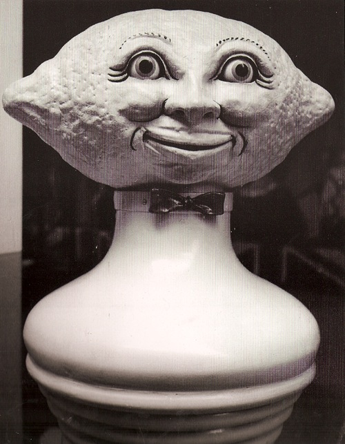
Black Eyes and Lemonade Whitechapel Art Gallery Idris Talking Lemon Barbara Jones

The two pictures which get most reproduced when people are talking about it (which doesn’t happen often enough) are the Idris talking lemon above – apparently it said that lemonade is good for man, woman and child – and the 1930s fireplace in the shape of an Airedale dog.
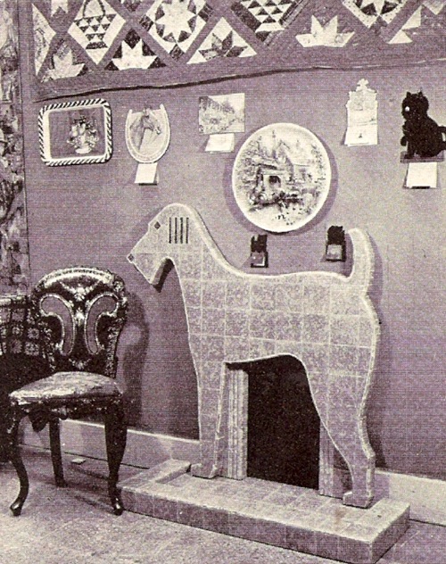
Black Eyes and Lemonade Airedale Fireplace

I think that’s probably because they were the two exhibits which most challenged people’s ideas of what ought, and ought not to be in an art gallery.  Popular art wasn’t a new idea in 1951, but that was as long as it kept itself to nice safe territory like fairground rides, barge boat painting and morris-dancers hobby horses.  The products of commercialism and the near past were much more dangerous and definitely not art, as Barbara Jones’ own memories make clear.

…we had borrowed two waxworks from Madame Tussauds – Queen Anne for general appeal and the beloved late Chief Rabbi for Whitechapel.  The first local visitors were delighted to see him, but later the Synagogue felt he was too near the talking lemon for dignity.  So we swapped the waxworks round, though the visual balance was destroyed, and Queen Anne stood nearer the lemon.

There was plenty more too.  I can’t scan the iced model of St Paul’s Cathedral made by Aircraftsman Brown of the RAF School of Cookery, although I really wish I could because it is a delight in royal icing.  And its caption was the title of this piece, which makes me think that the whole thing must have been a very witty entertainment indeed.  Perhaps I’ll use my time travelling to go back to the exhibition too, as well as doing a raid on some choice poster archives.
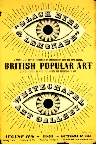
British popular art 1951 exhibition poster Barbara Jones

For now, while time travel isn’t possible, perhaps someone should think very hard about putting together some of this exhibition again.  Because this collection, this way of looking at the world was a revolutionary piece of thinking back in 1951.  This is a time when people want minimalism made from new materials, colours and styles, not old things, when even the government is putting its weight behind good design as a way of educating and improving society.  Black Eyes and Lemonade is challenging all of this, and taking a view on taste, design and the visual arts which was post-modern before modernism had even properly got going in Britain.

Ruth Artmonsky’s book takes Barbara Jones at her own estimation as a ‘jobbing artist’.  She was in fact much more than that, in many parts of her work she was a pioneer – Black Eyes and Lemonade could probably sit quite happily next to the Jeremy Deller retrospective when that opens later this year even though it’s sixty years old.  But because it’s ephemeral, it’s forgotten.  And she deserves better than that.


Incidentally, I had hoped that the catalogue would help me to find some more bits and pieces from the exhibition to illustrate, and the good folks at St. Judes have kindly put some of their copy online.  But the text is, well, a bit dry, so sadly it doesn’t really help.