This was sold on eBay on Friday.
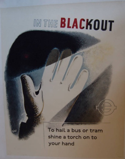
From 1944, it is a lovely piece of Hans Schleger/Zero in prime linen-mounted condition. Mr Crownfolio and I did have rather deluded hopes of picking it up for a pittance, seeing as it was being sold in the States. But it went for nearly £250 – unsurprisingly – which means that I can bring myself to tell you that the same seller has another one from the series on offer this week.
In a way, I’m not really upset that we didn’t get the first poster. It’s a classic, but I’m not sure I like it enough (certainly not £250 of enough). Would it ever get framed and hung on the wall? I don’t think so.
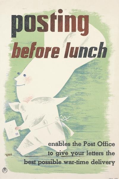
One of the reasons is that it may be a classic World War Two London Transport poster, but I’m not sure it’s a classic Schleger. His posters are usually either a bit stranger, or at very least a bit wittier, like this GPO poster from just a year or two later (known in our house as the ‘Prawn Chef’).
I wonder if there is a reason why his London Transport posters are so sensible. Because the other thing that has struck me about the two offered on eBay is just how much they resemble other designers’ work on the same themes – and how much they all resemble each other.
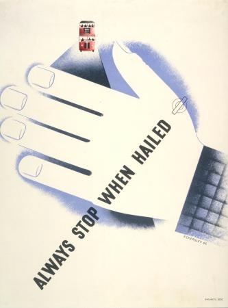
Here’s Tom Eckersley on the other side of the question – reminding bus drivers to stop when they are hailed in the blackout.
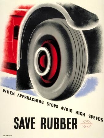
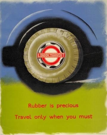
And also reminding the drivers to save rubber.
While James Fitton (whose work really does deserve more appreciation than it gets) informs the travelling public that they too can help save this precious wartime commodity.
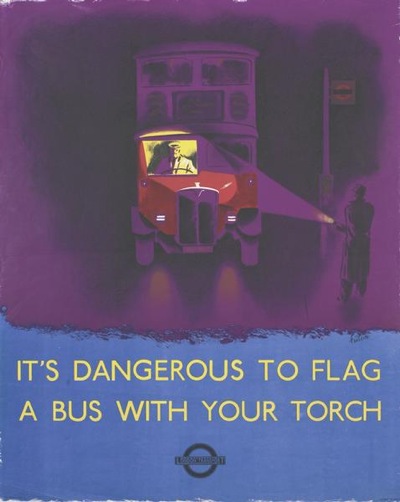
And finally, we’re pretty much back at the beginning again, as Fitton also tells us how not to flag down a bus during the blackout.
Two things strike me from this series. One is what a great designer James Fitton was, in particular for his luminous use of colour. His posters easily stand up to the work of both Eckersley and Schleger.
The other – which was the thought that started all of this off – is that, for such a diverse set of designers, the results do have more in common than I would expect. This is mainly in the way that they’ve all used a simplicity of technique, each poster illustrating the issue fairly literally with no visual puns or distracting images. I wonder whether, somewhere in the heart of the London Transport wartime archives, there is a memo which says: This is war. And safety. So don’t let the designers get away with any of their clever-clever stuff. Oh, and on the way out, make sure you give them an airbrush. Perhaps I should write to the London Transport Museum and ask.

Hello
Good stuff. Thanks.
You’re right about these Zero posters. Actually, you haven’t shown the best of this series which shows a man in a hat exiting the underground station. The rest are a bit dingy and, quite honestly, a bit poorly painted. I’m not sure that, in the greater context of his career, I would call Zero a poster designer. Anyway….
The point is that, at the beginning of the war, it was noticed that the hospitals were full of people who had fallen over in the blackout, walked into a lamp post, or had hurt themselves in a workshop. These posters were made to address these issues and to reduce the number of accidents and to free up A&E resources to where they were really needed (on the bomb site). H&S was born, and it was a good thing.
Fitton was a great poster designer and Eckersley too. I have a few Fitton’s for vegetables etc.
If you go to http://www.rennart.co.uk/thesis/pdf
you can download a file of my project on WW2 Industrial Safety Propaganda
or
you can check the story in abreviated form on
http://www.socialvision.co.uk/eye.pdf
I’ve had a lot of fun collecting safety stuff. One day I’ll do a book about it all.
Best
P
Thanks for that – it’s good to have the background. Sadly I can’t get the links to work as I’d love to read a bit more, so do let me know where I can find them. And then I’ll read the book when you do it…
Good luck with the launch of the current one, by the way!
Sorry, the links were the wrong way around
http://www.rennart.co.uk/eye.pdf
http://www.socialvision.co.uk/thesis.pdf
Best
P