For a change, let’s look at something which isn’t a poster.
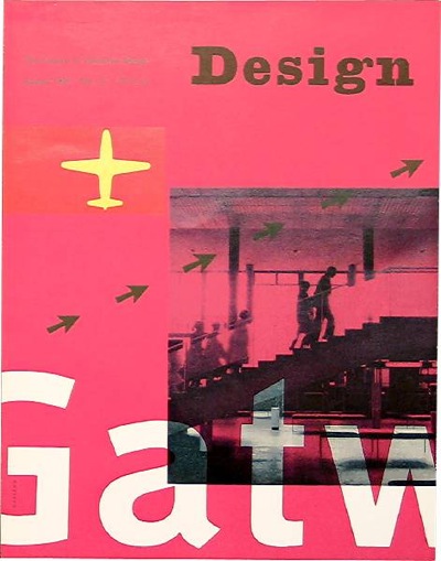
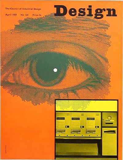
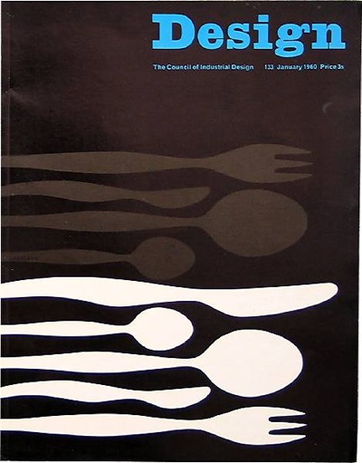
Kathy Kavan’s post about Galt Toys design and branding (which I remember with great clarity from my own 70s childhood) led me to designer Ken Garland’s own website. It’s a treasure trove of delights, like these Design magazine covers from 1958-60.
It’s hard to imagine a government-sponsored quango (which the Council for Industrial Design was) producing anything as fresh and interesting as this now.
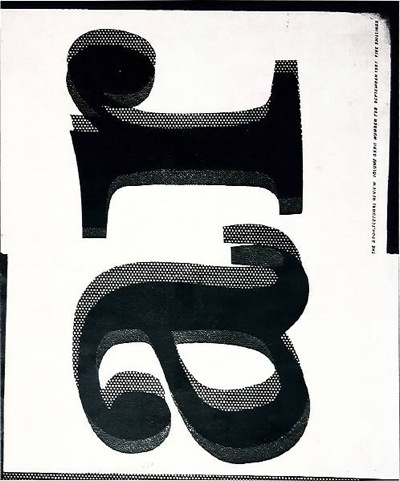
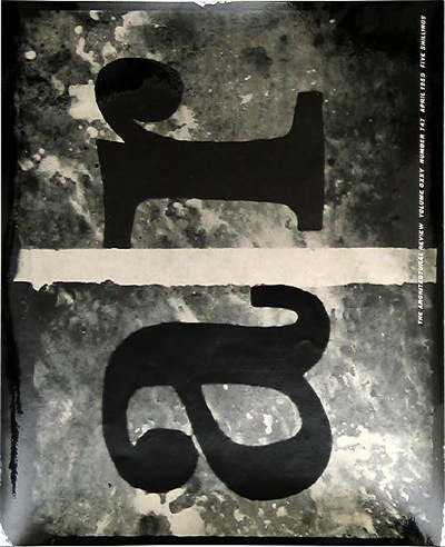
These covers for the Architectural Review meanwhile, from 1957 and 1959, still look irrepressibly modern.
David Carson himself would have been proud of these two.
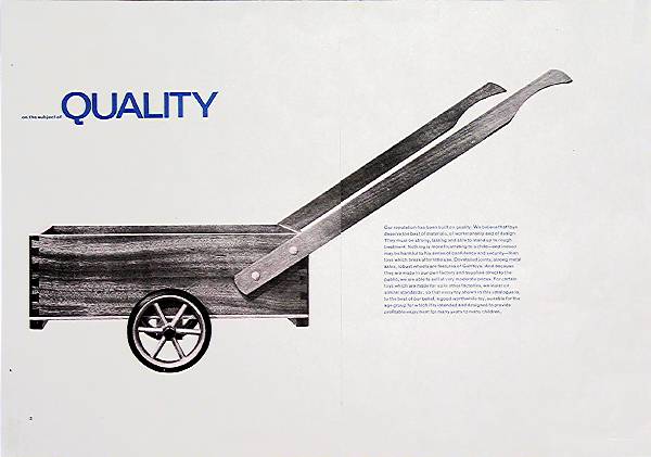
But these last two aren’t very typical of Garland’s work which is, in the main, an understated and very British take on modernism. Whatever you think the story of British modernist graphics is – or isn’t – there’s a moment in the 1960s where the UK takes on board the mainstream of European graphic thought and makes it mainstream.
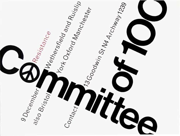
Poster for Committee of 100, 1961
Designers like Garland also add something new to the modernist mix though. There’s a lightness of touch and even a sense of humour which makes them distinctively British.
But go and take a look for yourself, it’s an exemplary website and archive with lots of interesting thoughts about the designs and the process which led to them, as well as the images themselves.
