Temple Gate in Bristol, 1961. Which, I can testify, looks nothing like that now.
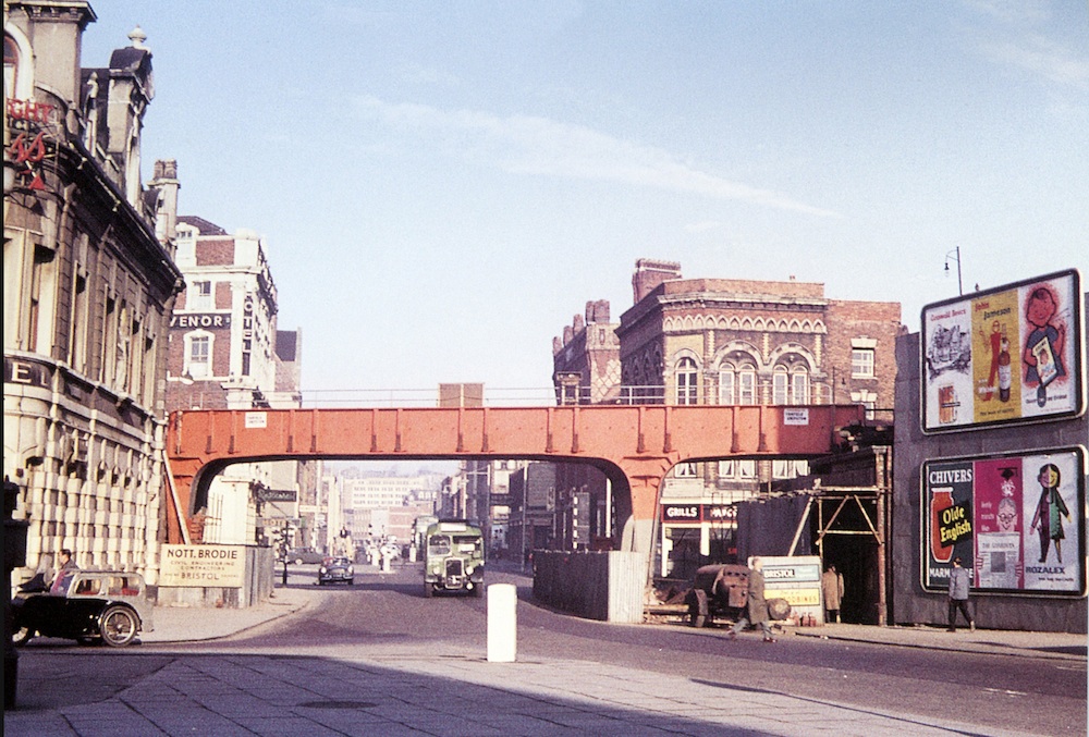
But just look at those posters on the right. This is not just because, as ever, it’s both rare and wonderful to see posters out in the wild, but also because, taken as a group, they are not bad. Admittedly I wouldn’t pay money for the Chivers one, but the design for Rozalex (bottom left) is rather good, as is the utterly unidentifiable one above it. In case you’re wondering, Rozalex is a barrier cream to keep off dirt and you can still buy it today. Should you wish.
Also interesting is the Guardian advert. Is that them feeling that they have to keep up with Patrick Tilley’s adverts for the Sunday Times? I will have to investigate…
Addendum: I’m pulling this up from the comments, because it’s a great photo of the CWS poster in another location – Roman Road to be precise.
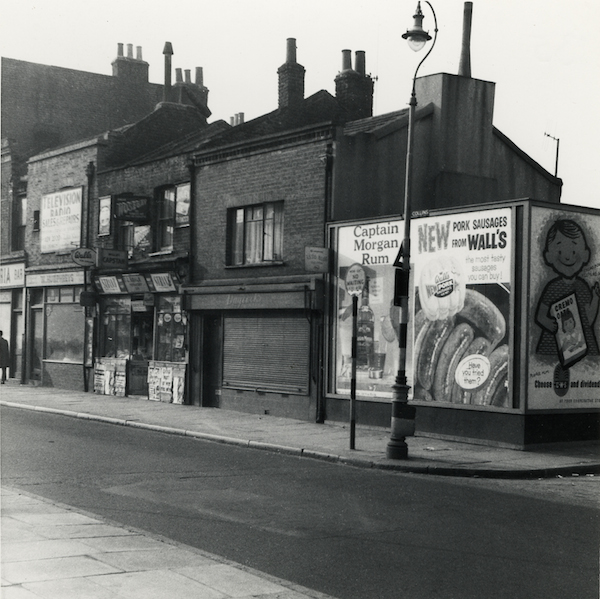
The image comes from East London History.
And the other posters are, as is so often the case, not that good.
It’s nice to have you back, hope the builders are doing a good job, and not taking more than twice the estimated time!
Been missing your regular poster and design insights to while away the evenings. So much so, I’m off buying all sorts of random things without advice!
And I’ve even setup a website to sell some…………….
So you have. How very interesting – and I do like your Lander Porthcawl. Although I am not buying another poster, not ever, oh no.
Thanks, I could try my Father Ted style encouragement on you, but that might be uncalled for!
So I’ll just say that it goes along with your look at Lander last year and is another example of how very versatile he was over such a long period of time. It’s difficult not to like at least something of his, whatever your poster tastes; which is something I’m not sure can be said about any other poster artist/designer.
Welcome back.
The hotel behind the sidecar is still there so far as I know, although I have not been past it for some months; it is no longer a hotel though. I had a look at the original picture on Flickr, and the poster above the Rozalex one bottom right is for the Cooperative Wholesale Society. What it is advertising I couldn’t make out [children’s clothes??], but the blue oval in the text line at the bottom of the poster can just be identified as a CWS logo.
When I get a moment I’ll go through some issues of Modern Publicity and see if any of those turn up in there.
Great photo!.. demonstrates just how prolific modern illustration was used in advertising at that time! I have illustrated for a lot of high street names, but not once have I had the pleasure of a poster campaign.. how times change!
The Chivers Marmalade ad may not be attractive but at least it can be read clearly at a distance!
Yes, it’s an interesting thought, just how much illustration was woven into the fabric of everyday life.
And yes, that is true about the Chivers one. I think that is the eternal battle of advertising though, isn’t it: it looks lovely but Does It Work?
With regard to the CWS poster, I’ve just come across this
http://eastlondonhistory.com/wp-content/uploads/2012/11/3-Roman-Rd-1960s.jpg
Not clothes – porridge! Just thought you might like to know.
N
I always like to know! Thank you, that’s great – I may well put that on the blog proper, in fact, as it’s so good.