Cigarettes, Germs and Paper

The Reginald Mount posters coming up for sale at Van Sabben, which I blogged about last week, have made me realise that I’ve never properly written about his work, in particular the posters he produced as Mount/Evans along with Eileen Evans.  This is particularly surprising because not only was the first poster ever to appear on Quad Royal a Mount/Evans production, but it’s one of several we own.  This one hangs above Mr Crownfolio’s desk as a perpetual warning.
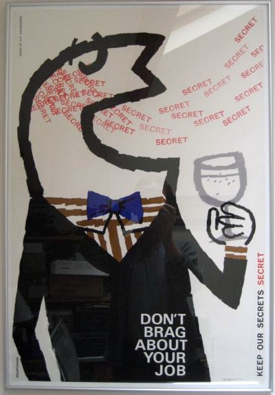
Don't Brag about your job Mount Evans poster for COI 1964
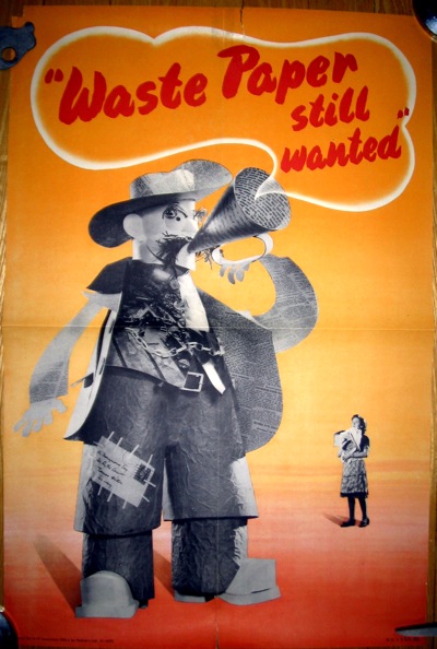
That we have so many is partly a matter of chance; what I think was the residue of the Mount/Evans studio, or at least a fair collection of their duplicates, was being sold through Onslows just as we started collecting posters.  So we bought some of them.  But it’s also because they, and he, produced some great work.

Waste Paper Still Wanted, Mount Evans

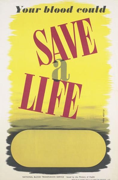
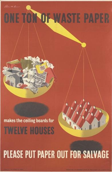
Reginald Mount only really hoves into view in 1939, when he was taken on by the Ministry of Information as one of only a very small number of in-house designers.  Before that it seems that he worked for advertising agencies such as Lintas and so probably never got to sign anything he did.  Eileen Evans joined him there as a filing clerk, until her own design skills were noticed, and from then she and Mount worked together for more than thirty years.  Two of the posters she designed are below (from the VADS/IWM collection).

Eileen Evans give blood poster

Eileen Evans Save paper salvage poster

After the war, both Mount and Evans stayed on when the MoI became the Central Office of Information.  Dorrit Dekk remembers working with both of them in the late 1940s.

The studio existed – Reggie Mount had been there right through the war and Eileen Evans – Reggie was senior designer and Eileen was his second in charge – I mean his right hand helper […] but Reggie taught me everything to make me into a designer.

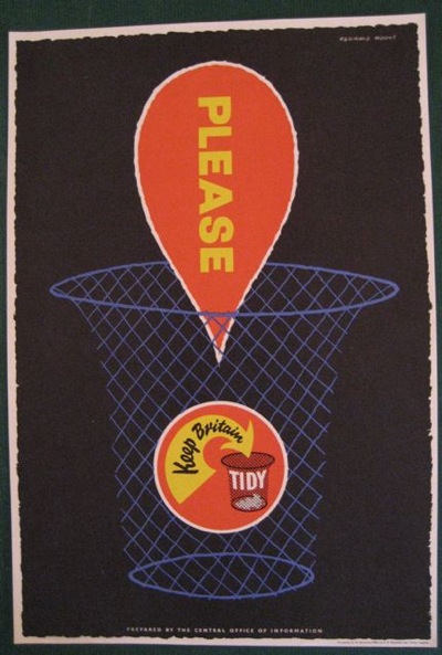
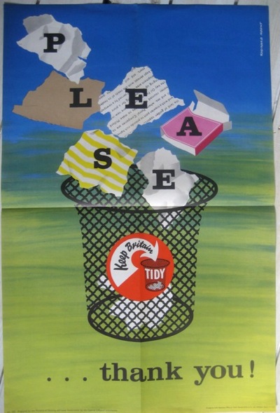
My guess would be that this arrangement continued for some time into the 1950s, because plenty of posters exist from the early to mid 1950s just signed Reginald Mount.  These include some of the Keep Britain Tidy ones which pop up at auction every so often.

REginald Mount poster Keep Britain Tidy 1950s

Reginald Mount Keep Britain Tidy poster 1950s

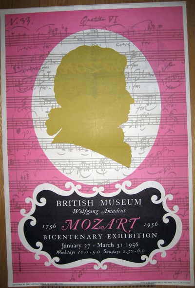
As well as some more obscure ones – this is for a Mozart Bicentenary Exhibition at the British Museum.

REginald Mount poster Keep Britain Tidy 1950s

Then, somewhere along the line they either go part-time or freelance or both.  Reginald Mount is certainly listed as one of the founding partners of Artist Partners in 1953.  But much later on, they seem to have gone into formal partnership as Mount/Evans, although quite when I don’t know.  The earliest poster with this credit that we have is from 1963.

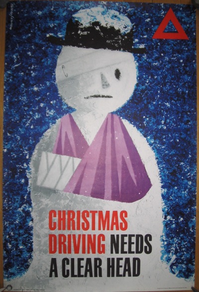
Mount/Evans Christmas Driving poster 1963 for CoI

(Apologies for the slightly scrappy quality of some of the photos; they were taken for reference a long time before the blog was ever thought of).

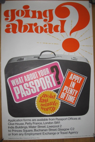
Although they might have left the employment of the government, the CoI still seem to have provided the majority of their commissions.  Some were for the public, like this passport poster from  1966.

Mount evans passport poster CoI 1966

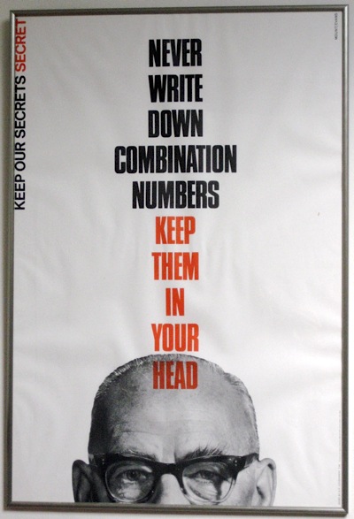
While others were only for internal communications, like these secrecy posters, which belong to the same set as ‘Don’t Brag About Your Job’ above.

Mount Evans Combination Numbers Keep Our Secrets Secret
Keep Our Secrets Secret Mount Evans Unneccessary Dupliation Central Office of Information

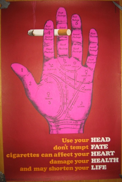
Although much of this is guesswork, because they worked together and signed posters as Mount/Evans occasionally before this.  And Reginald Mount also produced posters under his own name in the 1960s, like this anti-smoking poster in the Science Museum.
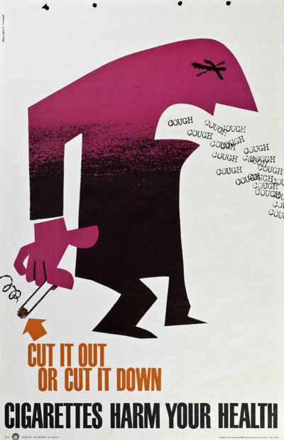
Reginald Mount anti smoking poster 1960s
Not only is it the close, but hacking relative of ‘Don’t Brag About Your Job’ above,  but Mount/Evans also produced several posters on a similar theme.

Mount Evans smoking poster hand

All of which leaves me a bit confused about how they were working.

What’s more, it’s proving quite hard to find any clarity.  Not only is very little written about them, but Google is not my friend: the existence of a Mount Evans in Canada (very popular with walkers, it seems) and a street called Reginald Mount in Leeds does not make for easy searching.  So if you’ve got any more information, please do get in contact.  I’ve also ordered a book about the Central Office of Information which may or may not help.

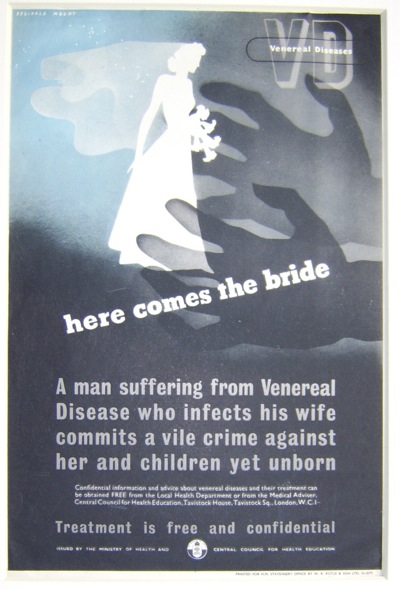
But their work is starting to become more appreciated, and to appear on the market too.  This Reginald Mount VD poster is for sale at Books & Things for £120.

Mount VD poster 1960 Books and Things

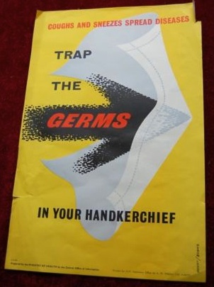
While this health poster – with what must be a very early Mount/Evans signature – is now a very reasonable £55 on eBay.

Mount Evans germs poster on eBay

Or possibly even less for a best offer.
By Gyroscopic Monorail

Nothing warms the cockles of my heart like finding a new archive or designer.  Even better, both.  So today – thanks once again to the lovely online library which is VADS – meet A E Halliwell and his archive.
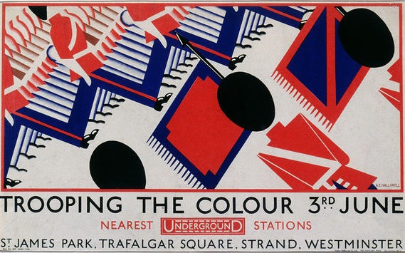
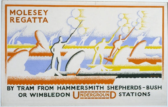
Halliwell was more of an arts educator than a full-time designer, teaching at the Central School and Camberwell.  But before that, he did do a number of rather good modern posters, mainly for London Transport.

Trooping the Colour London transport poster A E Halliwell 1929

A E Halliwell vintage London Transport poster Molesey Regatta

Surprisingly, not all of the designs in the Halliwell archive are in the London Transport Museum Collection – like the Molesey Regatta one above.  I don’t know whether this is because the designs were rejected or in fact that the LTM archive isn’t as omniscient as I’d always thought.  It would be interesting to know though.

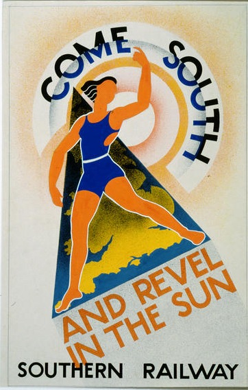
Given the style of the designs above, it’s not surprising to discover that he also produced posters for the Southern Railway too.

A E Halliwell Southern Railway poster vintage travel

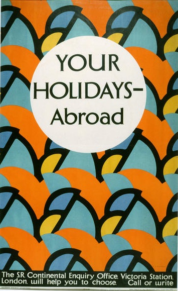
Although he did also manage to introduce a surprising touch of Bloomsbury to railway advertising with this 1928 poster.
A E Halliwell Southern Railway Holidays abroad poster Bloomsbury stylee

It’s good, but I also think it’s a nifty piece of niche marketing, the idea being that people who had enough money to travel abroad (not many in 1928) were probably sophisticated enough to deal with a less literal version of the modern.
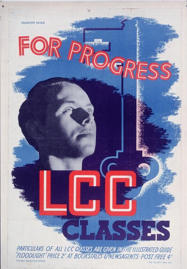
But there are other gems in there too.  Some of his best work, for me, was done for the state.

A E Halliwell LCC poster VADS

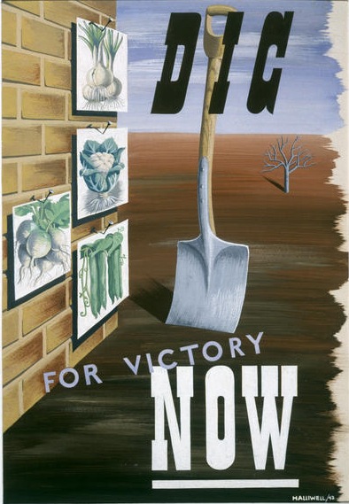
A E Halliwell Dig For Victory vintage World war two propaganda poster

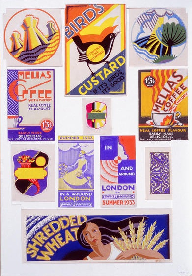
But there are more reasons to like the archive too.  One is that it preserves a lot of Halliwell’s more ephemeral designs, the kind of things that not only don’t tend to survive, but are rarely attributed when they do.

A E Halliwell vintage advertising designs

I particularly like the Birds Custard design.

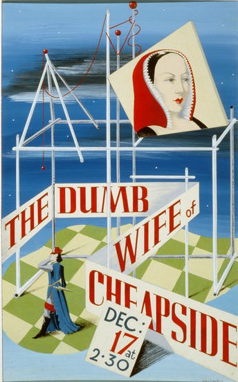
Even when Halliwell moved more into teaching than commercial work, he still designed, and the archive also has a good selection of these, too.  I’m guessing, as it’s one performance only, that this must have been a student play.

A E Halliwell Dumb Wife of Cheapside poster archive theatre

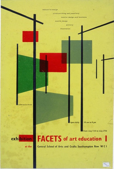
While others are more obviously related to his teaching work.

A E Halliwell facets of art education poster vads archive

All of these are dated 1930 by the archive.  I would be surprised, to say the least.

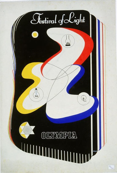
But best of all, if you’re like me and prefer the more modern stuff to the 1920s deco, is that Halliwell also collected some of his favourite student work over the years.  Some of which is really excellent.

Olympia festival of light A E HAlliwell; archive

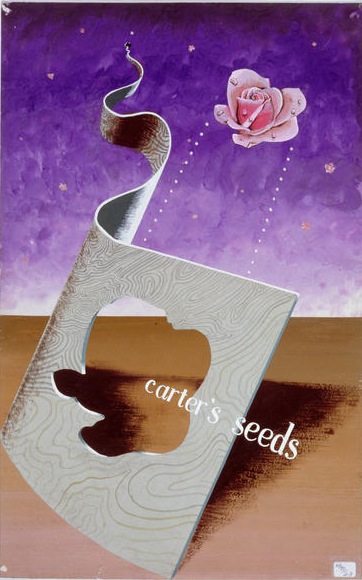
I particularly covet this one.

Carters Seeds student work A E HAlliwell archive

Although I’m not entirely convinced I haven’t seen that in a 1950s design annual.  I will do some research and report back.

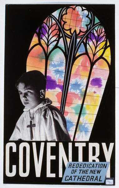
I have definitely seen this one before too, but can’t remember where.  Can anyone help with where or how?

Re-dedication of Coventry Cathedral poster A E HAlliwell archive

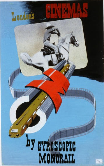
This one, meanwhile, could only have been student work.

Underground student madness

Why didn’t the future look like this in the end?  I think we were robbed.


Radiowl Times

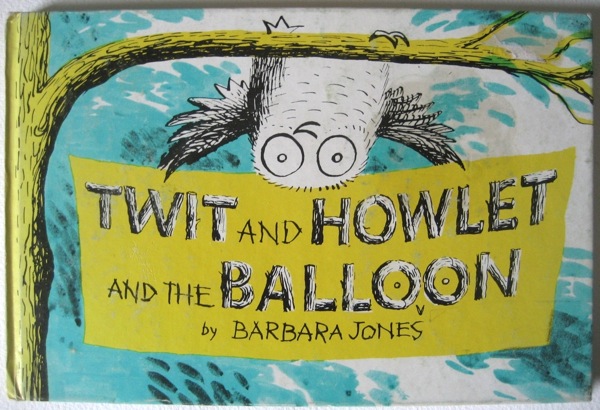
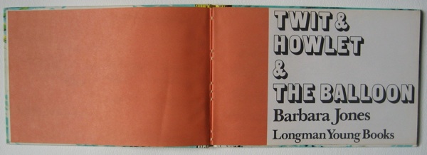
You may have noticed by now that not only do I like Barbara Jones, but I perhaps like her owls best of all.  Which means that I have been wanting a copy of this, the apotheosis of all her owlery, for quite some time.

Barbara Jones Twit and Howlet front cover

It’s a late children’s book from 1970, and given that the only time I’d ever seen it on offer was for £650 on Abebooks, I didn’t think we’d ever own one.  But, finally, eBay came up with a copy.  And at a price which meant that we didn’t have to mortgage the cats to buy it, either.

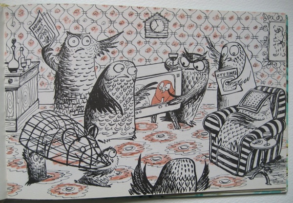
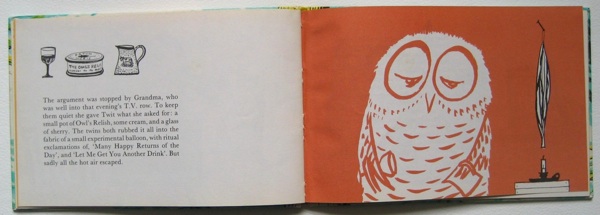
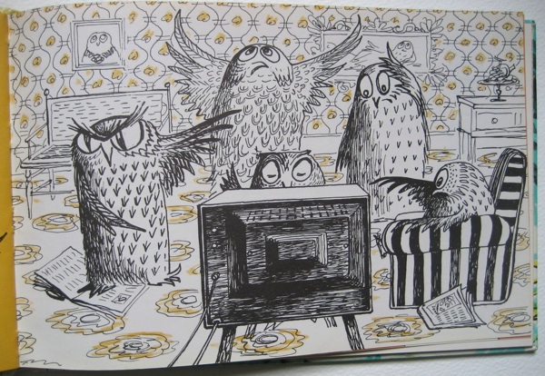
Now, as a set of illustrations of owls by Barbara Jones, it can’t be bettered. Here are the family having their nightly row about the correct colour balance of the television set.

Barbara Jones Twit and Howlet argument about TV

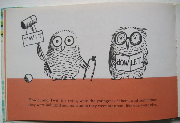
And here are Twit and Howlet themselves.

Barbara Jones Twit and Howlet the twins

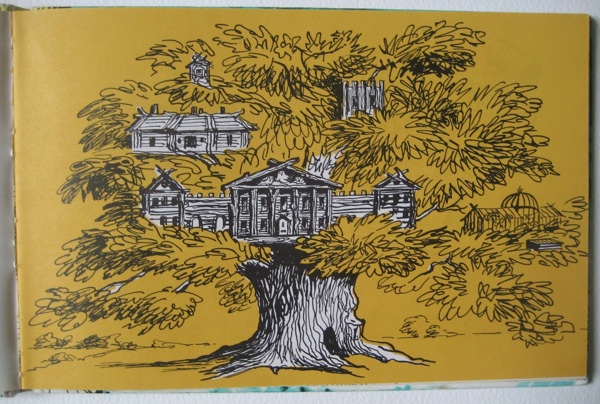
This is their house.

Barbara Jones Twit and Howlet Owlery

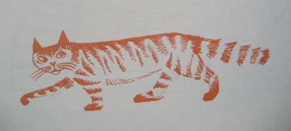
And here is a passing cat (owls and cats are, of course, deadly enemies).

Barbara Jones Twit and Howlet cat

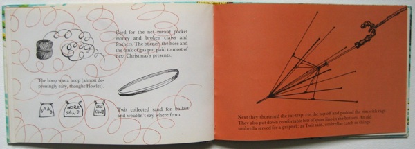
But it’s not just the drawing which make the book delightful, some of the page layouts are a total joy as well.

Barbara Jones Twit and Howlet title pages

Barbara Jones Twit and Howlet double spread

This is perhaps my favourite.

Barbara Jones Twit and Howlet double spread 2

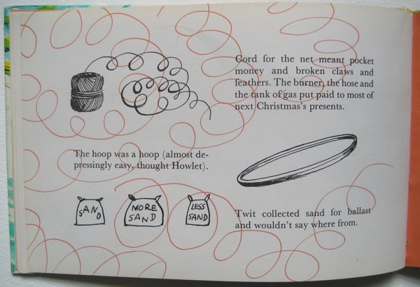
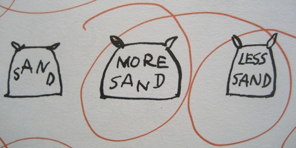
Barbara Jones Twit and Howlet sand

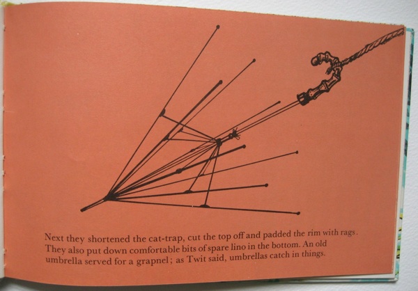
Barbara Jones Twit and Howlet umbrella

The details are also brilliant, like the sand in the illustrations above.

Barbara Jones Twit and Howlet sand detail

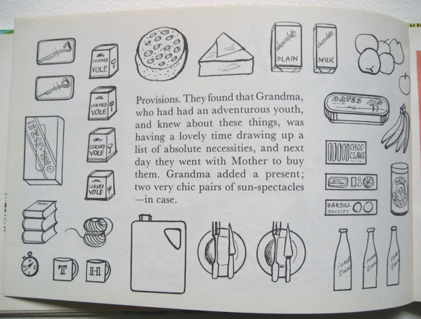
Along with the provisions the two owls buy for their trip.

Barbara Jones Twit and Howlet provisions

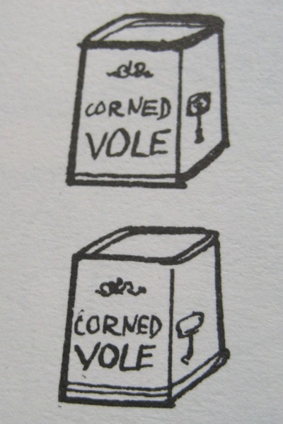
Barbara Jones Twit and Howlet corned vole

But having said all that, I can see why there aren’t many copies available, because it doesn’t really work as a children’s book.

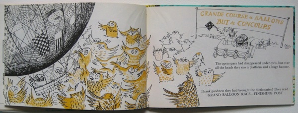
The plot is quite simple – Twit and Howlett build a hot air balloon and accidentally fly across the Channel and win a French balloon race with it. Organised by French owls, obviously.

Barbara Jones Twit and Howlet French balloon race

But most of the book isn’t concerned with what happens, it’s all about building the balloon.  And it’s done with a sense of humour (and a few long words) that is probably beyond the average picture book reader.

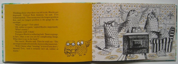
Barbara Jones Twit and Howlet Critical Path analysis

Thinking about what there was left to do, Howlet got depressed. ‘Critical Path Analysis,’ he said.  Twit looked startled. ‘That means start the longest problem first and our longest problem is the gunge for the envelope.’
‘What’s gunge?’ Twit asked.
‘Oil, rubber or mastic,’ replied Howlet, importantly.
‘What’s mastic?’
‘Gummy stuff, I think.’
Twit gave Howlet a withering look. ‘Same as gunge, in fact; what a one you are for complicating things.’

Meanwhile the owl family are still arguing over the television set.

Barbara Jones Twit and Howlet owl tv argument again

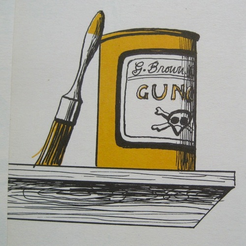
Next morning Howlet went back to the library and then on to the Chemist’s. He came back at last with a tin of something that the books and the Librarian and the Chemist all said would be suitable.

Barbara Jones Twit and Howlet gunge

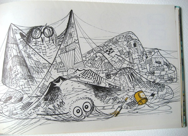
They started to treat the envelope, first with elation, then with stickiness, and at last with a creeping immobility that had to be felt to be believed; but it was all done at last and hung up to dry.

Barbara Jones Twit and Howlet gunging

The Chemist had prudently given Howlet a bottle of gunge-solvent, so they had a long gruesome preen before dinner.

I love it, but I don’t think that’s quite the point.

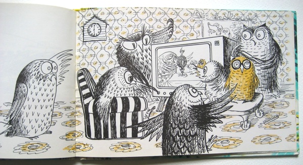
I also think that she lost interest once the balloon had been built – the later illustrations do rather tail off in quality and detail. But you will be relieved to hear that the owls do get home safely in the end, and they get to see themselves with the cup on television.

Barbara Jones Twit and Howlet best colour row ever

It was the best colour-row ever.

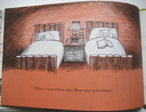
Barbara Jones Twit and Howlet back at home in bed

Barbara Jones Twit and Howlet  back cover

And quite possibly the best owls ever too.


Ham-fish-ted

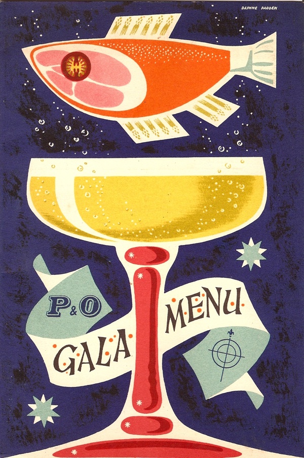
We didn’t just buy this for the pun potential, honestly.

Daphne Padden menu for P&O Gala S S Empire Fowey 1959

Although that was quite a big part of why we did.  It is, of course, another lovely Daphne Padden for P&O, from the S S Empire Fowey in 1959.

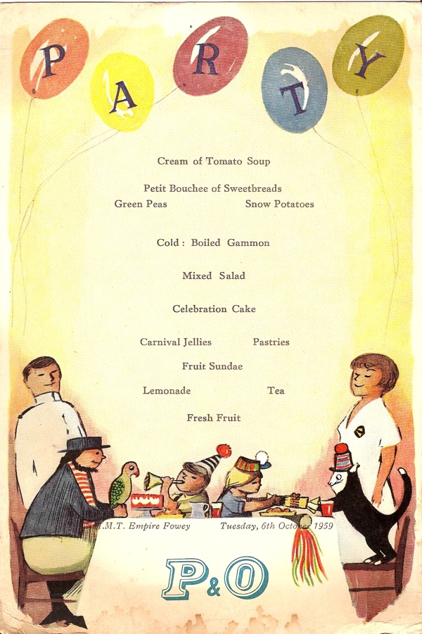
Along with it came this, which is the menu for what looks like the children’s party on the same day.

P&O children's party menu S S Empire Fowey 1959

I can’t see too many modern children going for the Petit Bouchee of Sweetbreads at the start, although the jellies, celebration cake and lemonade are pretty timeless.  Sadly, this one isn’t signed, so if anyone has any ideas about who might have designed this – particularly the determined ship’s cat, do get in touch.  This may well become Small Crownfolio’s party invitation later this year.

In addition to being wonderful though, this also turns out to be a window into a bit of social history that I didn’t even know existed.  It was sold on eBay as a cruise ship menu; which it sort of is, but at the same time isn’t.

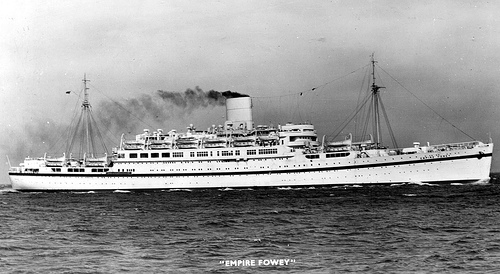
The design was certainly produced for a cruise ship – it was used on the SS Arcadia in 1957, and probably also elsewhere.  But the S S Empire Fowey wasn’t going cruising in 1959.  It was a troopship, operated by P&O but transporting British soldiers (and their families, hence the children’s menu) to postings in Cyprus, Aden and elsewhere.  Apparently there was even school provided for the children aboard, as the journeys could last up to a month.

S S Empire Fowey troopship

The Empire Fowey herself had a fascinating life – she began life as a German liner, was taken over as a troop transport and then gunship.  But in 1945, with the Allied victory, she was taken by the British as part of the war reparations, at which point she became a troop ship, but operated by P&O.  Then, in 1960, once air travel was becoming the norm for army postings, she was sold to a Pakistani cruise firm, who used her to take pilgrims to Mecca, until she was finally scrapped in 1976.

The Fowey’s odd status, half cruise ship, half transport ship explains a couple of things.  Like the fact that the menu has no printing on the back (unlike the others we have for ‘real’ cruises which have a design on the back as well).  And the way that the menu itself isn’t as lavish as I’d come to expect from P&O in the fifties.  Still, it’s rather nice to think that the army and its families got a small taste of the cruising life, even if it was just for one night only.

And f any of this has whetted your appetite for troopships, menus or even indeed sweetbreads, another near-identical set is available on eBay from the same seller.

Woof Woof

So, why, you may be wondering, am I bothering you with 1950s children’s ephemera today?  Evocative and delightful, to be sure, but what’s the reason for its being here?

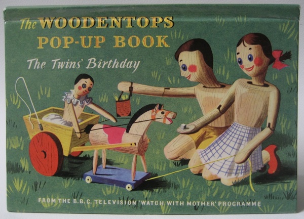
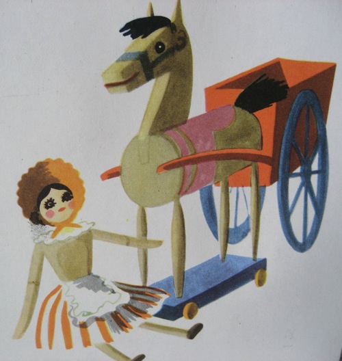
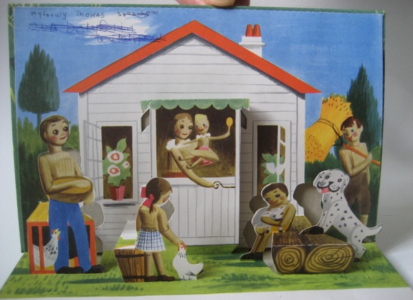
Woodentops pop up book cover illustrated Barbara Jones

Here’s a clue.

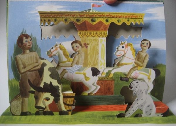
Woodentops pop up book Twins Birthday fairground pop up

The roundabout and its flying fairground horses have turned up before on here.  And in each case they are the work of Barbara Jones.

In amongst all of her ephemeral works like murals and exhibition designs, the fact that she also designed The Woodentops tends to be forgotten.  But surely the series must have reached more people than anything else she did.

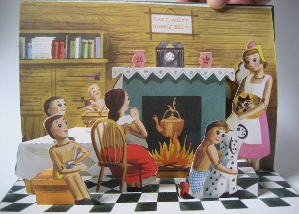
Barbara Jones Woodentops twins birthday final pop up

Apart from a few rare survivals, the series has pretty much disappeared, which means it’s hard to see what she created.  But there were also three spin-off books of which this pop-up design is one.

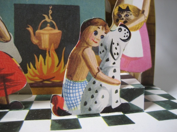
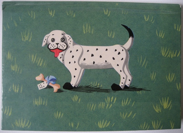
The fairground scene is the clearest hint that she was still using her own interests and style even while designing for children.  But Spotty Dog, who definitely has a bit of Staffordshire china in his breeding, is a reminder of her interest in folk art.

Barbara Jones close up spotty dog woodentops pop up book

While some of the twins’ birthday present toys must have looked a bit old-fashioned, even in 1955.

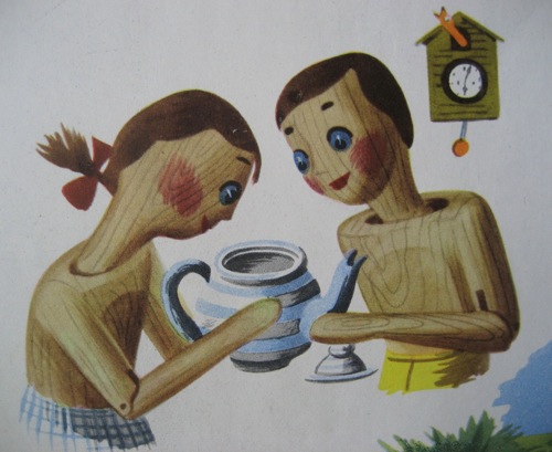
Woodentops pop up book illustration toys Barbara Jones

So although the drawings were a bit more sharp-edged than her usual work, the sensibility and eye are still very recognisably the same.  Which I love, because there is no reason at all why children shouldn’t have art and illustration of the highest quality.

Woodentops Barbara JOnes illustration of twins

Now at this point, I’d usually be complaining that no one would ever commission someone as left-field as Barbara Jones to design a book or series these days.  But for a change that isn’t true.  Of course there is plenty of sub-standard stuff out there (I’m looking at you, Peppa Pig spin-off books), but, as I’ve been discovering over the last four years, there is also a wealth of fantastic children’s illustration and animation too.

Barbara Jones Woodentops pop up book first page

What we’re really missing these days is someone as idiosyncratic as Barbara Jones designing and illustrating books for grown ups instead.  But that’s a whole other story.

Back cover of Barbara Jones Woodentops pop up book

Beck indeed

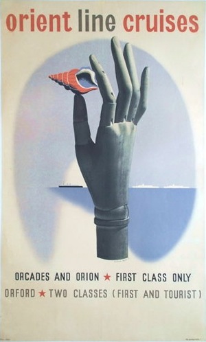
While I pointed out the P&O archive a while back, I also said that I wanted to come back to it.  And there’s one very good reason for doing so; his name is Richard Beck.

Richard Beck Vintage P&O poster orcades 1937

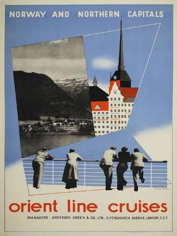
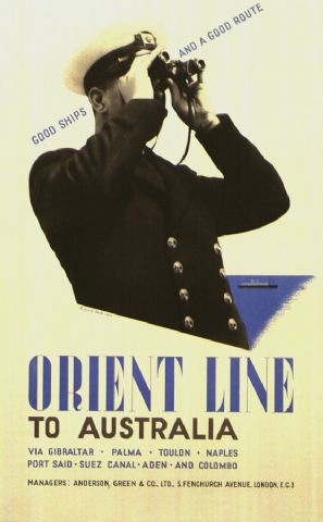
The handful of posters that he produced for P&O are that rare thing, home-grown British modernism.  And it looks first class.

Orient Line Cruises to Norway vintage travel poster Richard beck 1937

Beck seems mainly to have been active in the late 1930s.  All these three posters for the Orient Line apparently date from 1937.

Orient Line Vintage travel poster Richard Beck 1937

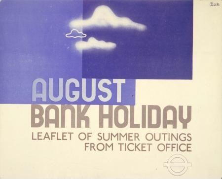
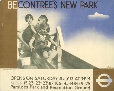
At about the same time, he was also working for London Transport – these two panel posters were designed in 1935.

August Bank Holiday vintage London Transport poster Richard Beck 1935

Beckontree Park vintage London Transport poster 1935 Richard Beck

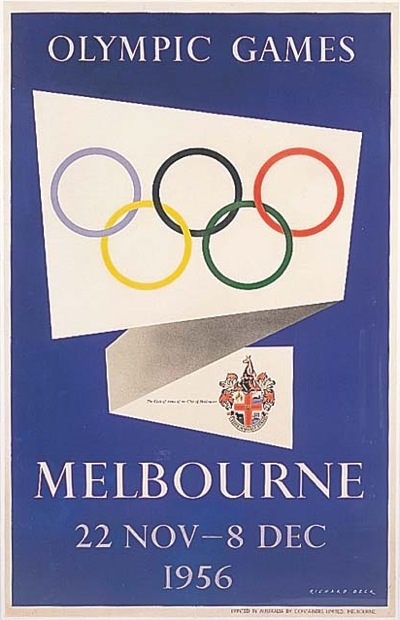
But even before the start of World War Two, Beck seems to disappear from the record for a while.  He next pops up as the designer of this.

Richard Beck vintage poster 1956 Olympics Melbourne

For a change, though, it’s possible to account for all of this, because there are a couple of decent biographies of him out there on the web – the best here.

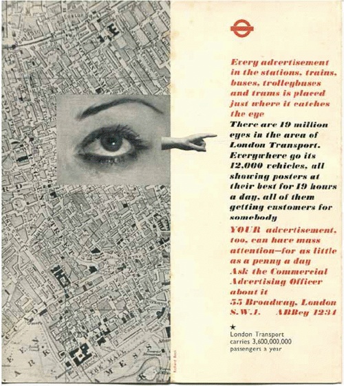
To start with, his early work looks as European as it does, because he studied at the Blocherer School in Munich, so was far more exposed to European modernism than the average British designer.  Hence his uber-modernist designs for London Transport, like this leaflet.

Richard Beck leaflet for London Transport 1930s

Secondly, he then disappears because he went to the other side of the world.  In 1939, he went to New Zealand as design consultant for the British Pavilion at the Wellington Centennial Exhibition.  And he never came back; instead he migrated to Australia, serving in the Australian Imperial Force during World War Two and then setting up a design consultancy in Melbourne when the war was over.

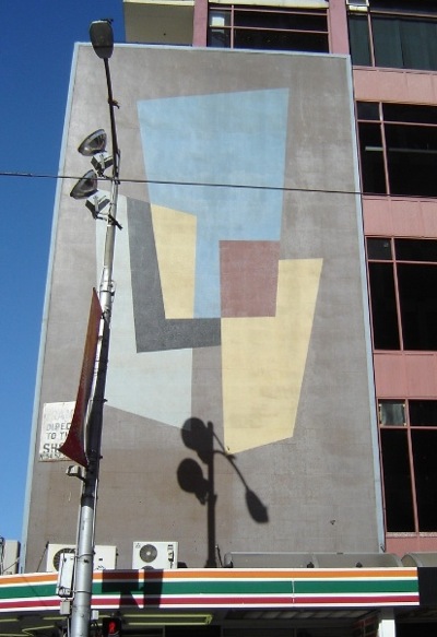
Mural on Hosies Hotel Richard Beck Melbourne Olympics 1956

He did very well, too, designing not only for the Olympics (the mural above still exists in Melbourne, although it was apparently once much brighter) but also for a whole range of clients and companies, including stamps for Australia Post and the new decimal currency.  And Australian wine too.

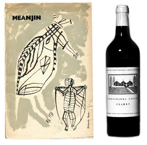
Richard Beck wine design 1950s

Beck did well for himself.  But one of the reasons I find his story so interesting is that he wasn’t the only one.  Just as British design after the war was revitalised by an influx of European designers, it seems that Australian design was also very much shaped by immigrants.  Pieter Huveneers designed for at least as many Australian institutions as Richard Beck.  Did the world of British graphic design seem too closed and old-fashioned for these designers, or was the appeal of a new sunshine life simply so appealing after the rigours and horrors of World War Two?  We may never know.  But if there’s an Australian Crownfolio reading this who has some of the answers, I’d love to hear from you.