Time future contained in time past

I have to face the fact that I do not know where most of the collectables in this house have come from.  I can account for almost every table and teaspoon, but not it seems the ephemera, the posters and the books.  Especially not the books.  I came across two Hans Schleger exhibition catalogues while looking for something else the other day.  “You’re going to say that you’ve never seen those before,” said Mr Crownfolio, and he was right.  But I’m sure I haven’t.

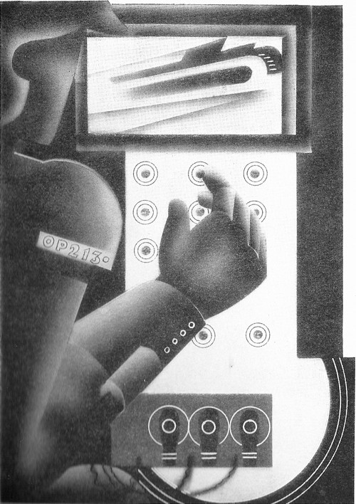
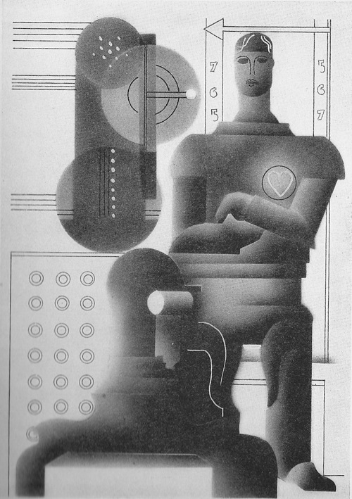
Still, those are for another day; today’s post is a different unaccountable book instead.  We’ve had it for a while, that’s all I can tell you.  It’s The World in 2030 by the Earl of Birkenhead, illustrated by Edward McKnight Kauffer.

McKNight Kauffer Earl of Birkenhead illustration world in 2030 everyday life

Having been thinking about McKnight Kauffer on here recently, I got this down from the shelf.  And then when Shelf Appeal in turn posted another of his illustrations, it only seemed fair to continue the conversation.

But what a great subject for Kauffer this is: how better to express the future than in the modernist style?  Reaching its apotheosis in the final illustration, the future as seen in 2030, a double layer of a future so exciting that it can’t quite be expressed.  Although looking, in the end, quite a lot like a London Transport poster.

McKNight Kauffer Earl of Birkenhead illustration world in 2030 the future

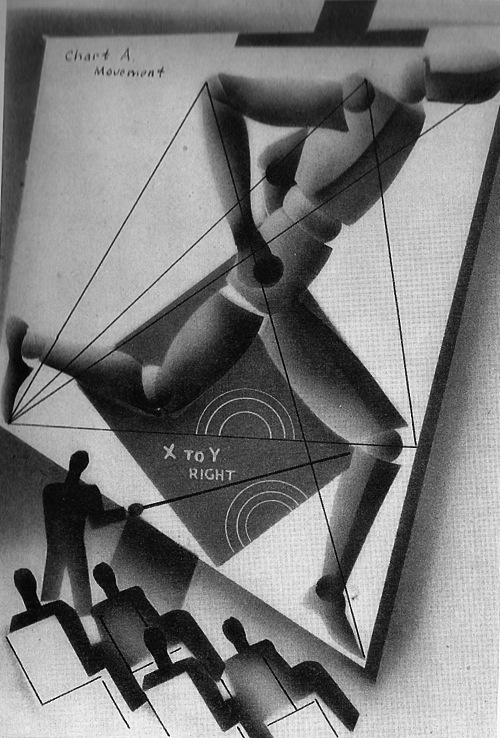
But, as is the way of prophecies, the book is less revealing about the future than about the time in which it was written.  The first, long, chapter for example is all about the future of war.

McKNight Kauffer Earl of Birkenhead illustration world in 2030 the future of war

While this illustration is for ‘The Amenities of 2030’

mcKnight Kauffer Earl of Birkenhead Amenities illustration world in 2030

Amenities isn’t a word that sings the future to us any more, is it?  Local amenity societies, town planning, public conveniences.  It’s a word which wears a cardigan and slippers these days.  But it was young and futuristic once too.

As so often with these books, I can recommend the illustrations more than the text.  Birkenhead was an M.P., Lord Chancellor, great friend of Churchill and sensible enough to commission Kauffer, but his views haven’t aged as well as the illustrations.

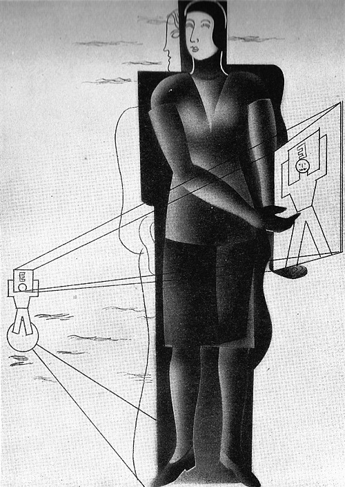
An average woman is more valuable to the state than the average man: but the most gifted woman is less valuable to the state than an exceptional man.

She doesn’t look very  pleased with her proposed lot either.

McKnight Kauffer Earl of Birkenhead Woman n 2030 illustration

It seems to be fairly expensive on Abebooks at the moment, although I’m sure we didn’t pay such monies for it.  Then again, what do I know?
Que savez vous de la Grande Bretagne?
I got some lovely photographs by email before Christmas (so thank you Adrian Jeffery) and to my shame, what with one thing and another, rather left them to one side.  But now I am here to make amends.

Because this is a fabulous thing.

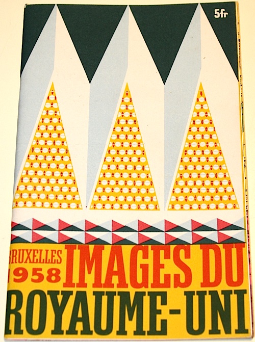
British brochure Brussels Expo 1958 cover Barbara Jones Illustration

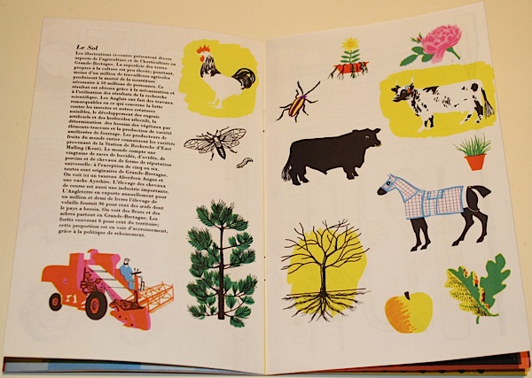
It’s the brochure for the British pavillion at the 1958 Brussels Expo (home of the Atomium).  Which would be fine enough as it is, but what’s even better is that it’s illustrated by Barbara Jones.  And it’s something which doesn’t come up very much at all, even in the Ruth Artmonsky book.  This is the French version.

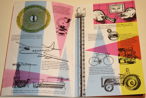
Brussels expo 1958 British pavilion brochure page spread cow

Now I’d be  more than happy just to wallow in the pictures here.  But the brochure (catalogue? guide?  I’m not entirely sure) is also more interesting than that, because it epitomises the debate that I’ve been mulling over for a while, the conflicted relationship between modernism and Britishness.

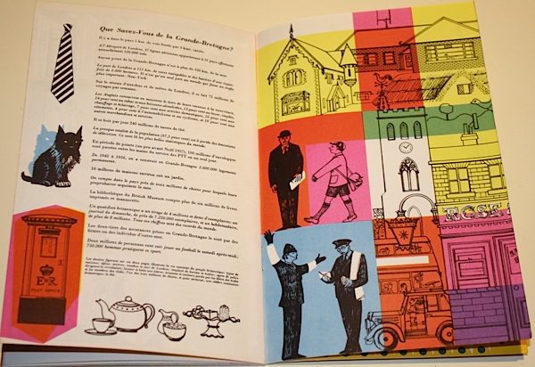
Brussels Expo 1958 catalogue for British Pavilion Barbara Jones illustration

Now, design historians tend to love Expos and other sorts of National Exhibitions, because it is design, if you like, giving a speech.  It’s fine to read them as a guide to the state of the nation, and its self image, because that’s exactly what they are designed to express.  So here we have a Britain of friendly policemen, tea and Scottie dogs.

Brussels Expo 1958 British Pavilion Guide barbara jones

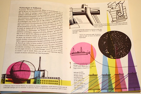
But we also have modern industries, housed in sparkling factories.

Brussels expo British pavilion catalogue Barbara Jones illustration factories

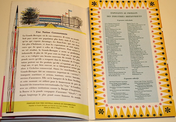
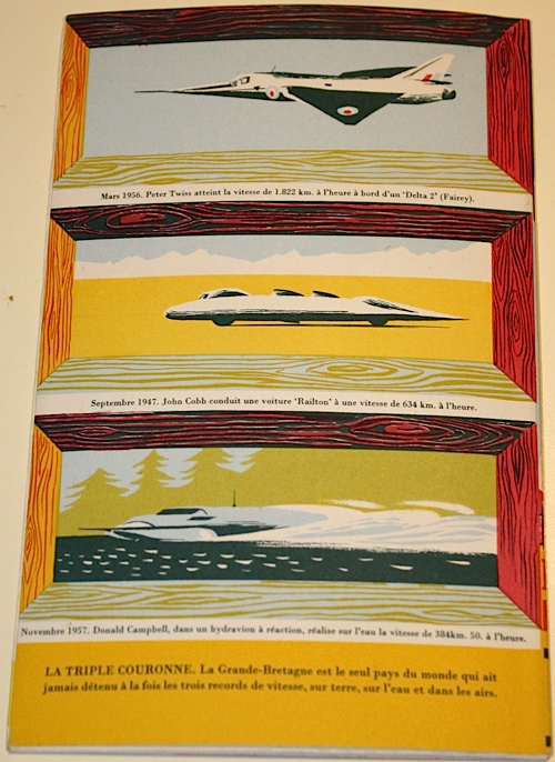
The tension between these runs all the way through the brochure (catalogue? guide?  I’m not really sure) right until the back cover.  Here are modern machines, but made safe by a more traditional frame.

Back cover Brussels Expo 58 British Pavilion catalogue

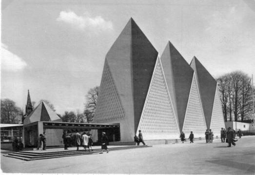
Now it could be argued that if you commission someone like Barbara Jones, connoisseur of folk art and disappearing traditions, to do your illustrations, then this is what you are going to get.  But the same conflict runs through the entire display.  Here is the shard-like exterior.

British Pavilion Brussels Expo 1958

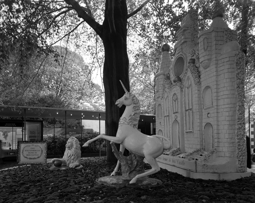
But this is what happens when you get up close.

Brussels Expo British pavilion lion and unicorn

And if that looks just a bit familiar, almost the entire design team for the Brussels Expo had indeed worked together on the Festival of Britain.  Here’s Jonathan Woodham’s summary of the problems they faced.

[Britain’s] national ambitions were caught between the worlds of heritage, as represented in the Hall of Tradition, of scientific innovation, as displayed in the Hall of Technology, and of economics and industrial competitiveness, as represented architecturally by the more contemporary character of the glass-fronted British Industries Pavilion.

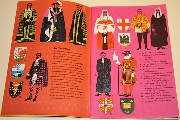
All of this is made manifest in the brochure, from royalty to machinery.

Royalty spread from British pavilion catalogue Brussels expo 58

Machinery spread from British pavilion catalogue Brussels expo 58

I tend to see this later part of the 1950s as the height of Britain’s optimism about the brave new post-war world of spindly legs and bright colours and good design for all.  But even in 1957-8, it was impossible to be simply modern.  Being British was always much more complicated than that.

Over-modern and over here

An interesting comment appeared a week or so ago on a older post about Beverley Pick.

He was a man.  Bless him… He was my uncle and a very clever man..He also did the original Moby Dick… Beverley was originally from Austria and lived many years in Sunningdale during the winter. Autumn he would visit his House in Cork and in his latter years he and his wife would live in France where they had a gorgeous home. He is now buried in the Churchyard at Sunningdale. There was so much to this man we will never know it all…

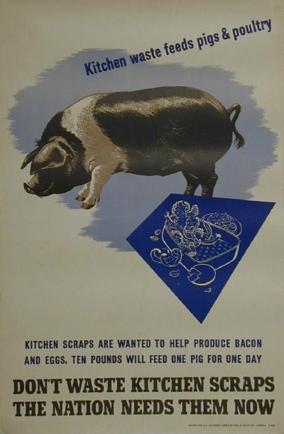
I’ve written to Odile Walker, who posted those intriguing memories, and I hope she’ll come back and tell us more.  But in the meantime, one thing that I never knew stands out.  Despite his British-sounding name, Beverley Pick was an emigré from Austria.

Beverley Pick pig waste vintage WW2 propaganda poster
Beverley Pick, WW2 poster

Now, I’ve been thinking for a while about the degree to which post-war British graphic design was shaped by people who were one way or another foreigners. There are so many of them that it would be hard not to really.  But finding that this is also true for Beverley Pick has pushed me into action.

So here is a roll call of as many emigré designers as I can think of who worked in the UK in the decade or so after the war.  It’s an impressive selection. With, for no particular reason other than that’s the way it turned out, lots of GPO posters as examples.

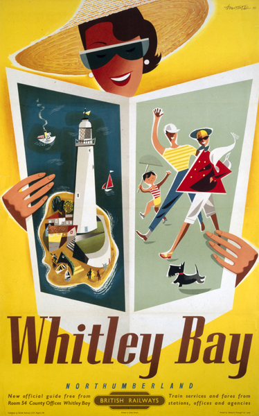
Andre Amstutz

Whitley bay poster Andre Amstutz vintage british railway poster
British Railways, 1954

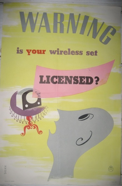
Dorrit Dekk

Dorrit Dekk vintage GPO wireless licence poster 1949
GPO, 1949

Arpad Elfer

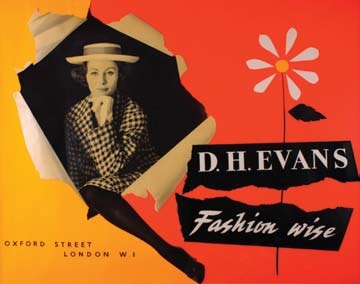
Arpad Elfer design for DH Evans poster 1954
D H Evans, 1954

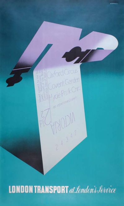
Abram Games

Abram Games vintage London Transport poster at your service 1947

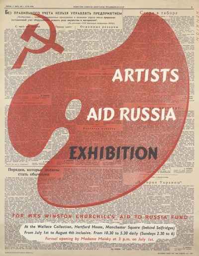
F H K Henrion

Henrion Artists and Russia Exhibition 1942
1942

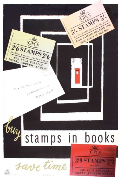
H A Rothholz

H A Rothholz stamps in books poster vintage GPO 1955
GPO, 1955

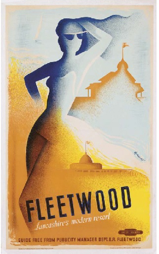
Pieter Huveneers

Pieter Huveneers fleetwood poster 1950 vintage railway poster
British Railways, 1950

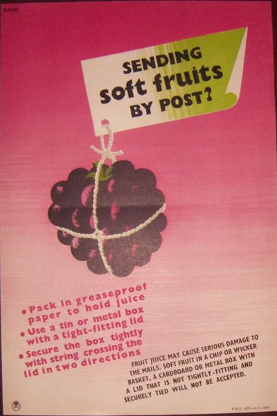
Karo

Karo vintage GPO soft fruits by post poster 1952

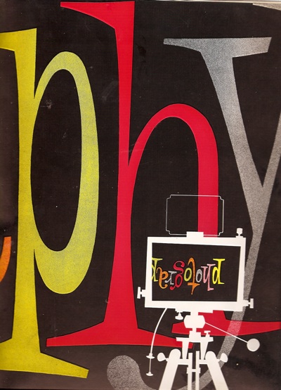
Heinz Kurth

Heinz Kurth design for Artist Partners brochure divider
Artist Partners

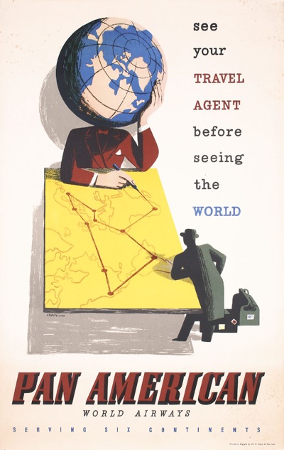
Lewitt-Him

Lewitt Him Pan American vintage travel Poster

Manfred Reiss

Manfred Reiss vintage GPO poster 1950
GPO, 1950

Hans Schleger

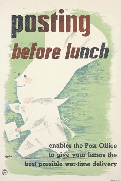
Hans Schleger vintage GPO ww2 poster posting before lunch
GPO, 1941

Hans Unger

Hans Unger 1951 vintage GPO poster
GPO, 1951

Together they make up pretty much half the content of this blog most months.  And I am sure that there are plenty more I have left out – please feel free to remind me who they are.

That’s all I am going to say for now, partly because this is quite long enough as it is, but also because I am in the process of working out what the story might be.  So if you have any thoughts on why British design became such an emigré profession, I’d love to hear those too.

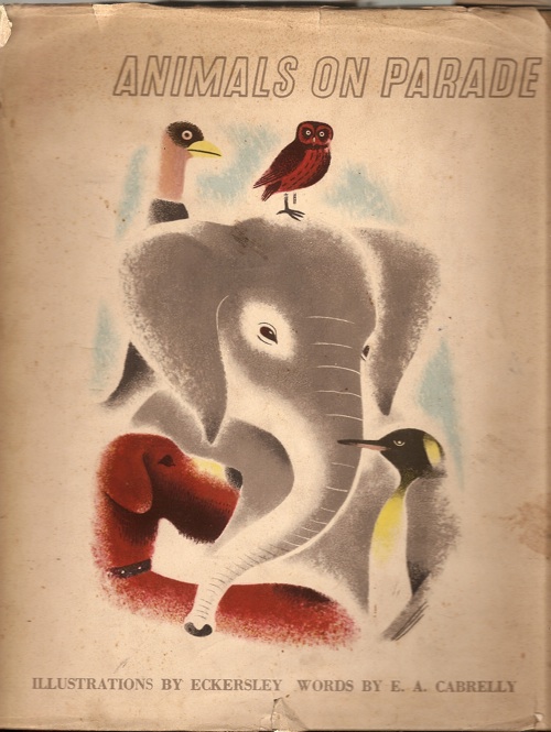
Animals on Parade

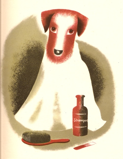
Woof.

Dog from Tom Eckersley Animals on Parade 1947

He’s a fine fellow for a Monday morning, isn’t he.  I only wish I felt so well-groomed myself.

You probably won’t be surprised to learn that he’s by Tom Eckersley, and he comes from this:

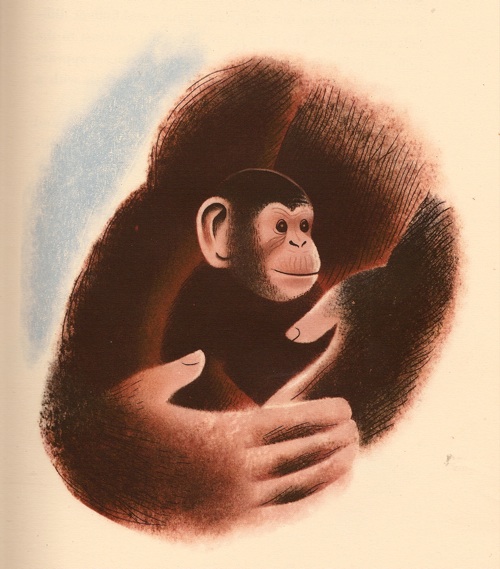
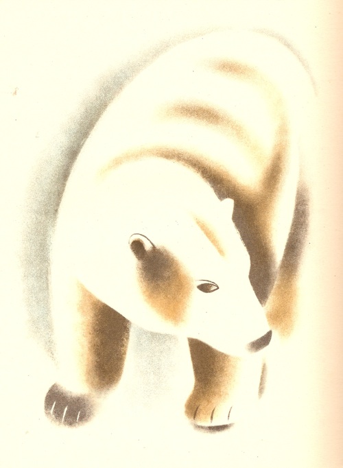
The book was published in 1947 and is filled with really wonderful illustrations.

So much so that the pictures can really do most of the talking here.  They have to in the book as well, because the text really is infernally dull.

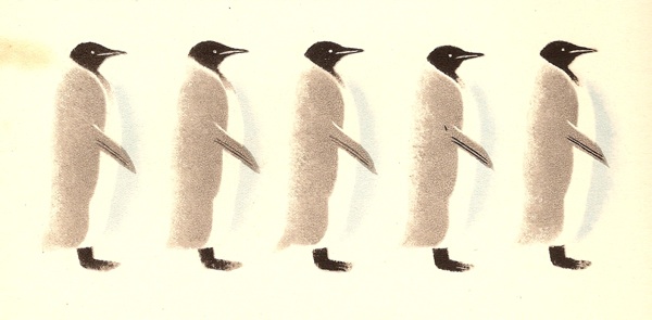
There’s a mix of full-page illustrations like the ones above, with smaller insets as well.  So penguins are available singly or in fives.

Penguin Tom Eckersley Animals on Parade 1947

Penguin line Tom Eckersley Animals on Parade 1947

There are also a couple of very pleasing layouts too.

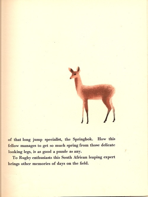
Springbok layout animals on Parade eckersley

Although the book is post-war, the style very much reminds me of the air-brushed Eckersley/Lombers London Transport posters from the late thirties

Tom Eckersley Eric Lombers vintage London Transport poster

Although these rather lovely fish could almost have come from an Eric Ravilious plate.

What’s also pleasing is that I’m not pointing you at something which is jaw-achingly expensive, although you do have the option of buying it from Sotherans for £138 if you like the pain.  But it’s on Abebooks for between £15 and £20, which makes a pleasant change.

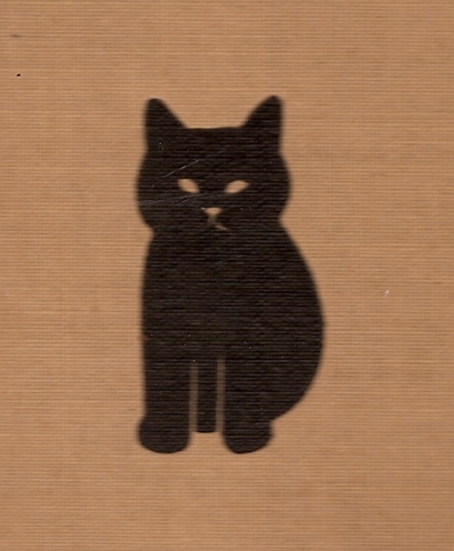
And if the dust jacket is missing, it’s not quite the crying shame it might be for some books.  Because the board covers also feature this lovely cat.

cat board cover Tom Eckersley Animals on Parade

Who might almost have come from this book.  I wonder if the Eckersleys kept cats themselves?

A life in pieces

Once more, a post around a book, although a bit more tangentially this time.

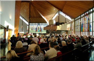
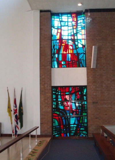
Mr Crownfolio is reading Electric Eden, a book about British folk music (in the widest sense as it seems to include the god-like genius of Julian Cope as well).  And when he was reading about Fairport Convention, he made a rather surprising discovery, which was that Richard Thompson (a.k.a. Mr British Folk) had, for a year, been Hans Unger’s assistant, making the windows for St Columba’s Roman Catholic Church in Upton-on-Chester sometime in the mid 1960s.  Here’s the church and all of the people.

St Columbas Catholic Church Upton on Chester wide shot

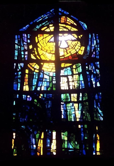
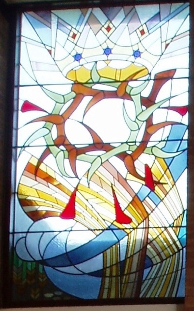
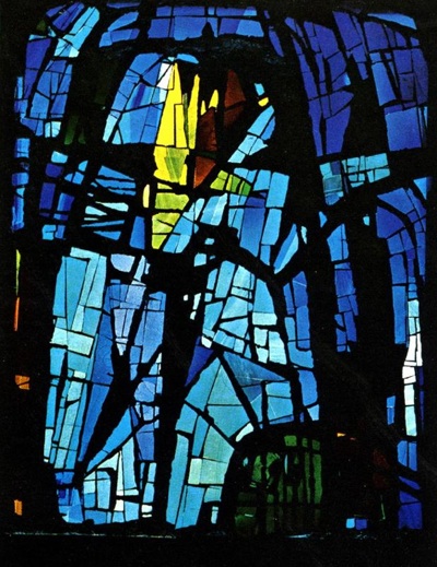
And here’s one of Unger’s windows.

Hans Unger window for St Columba's Chester

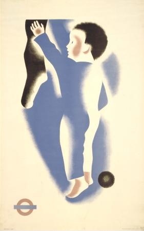
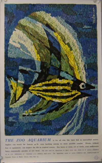
Now quite apart from the unsuspected folk/Hans Unger overlap, my surprise was also because I had no idea that Unger made stained glass.  He did do a lot of wonderful posters.  The best known are for London Underground, like this fishy gem from 1956.

Hans Unger London Transport poster 1956

I’m also rather fond of this little GPO one from 1954.  Apparently this format was designed to be displayed in telephone boxes.

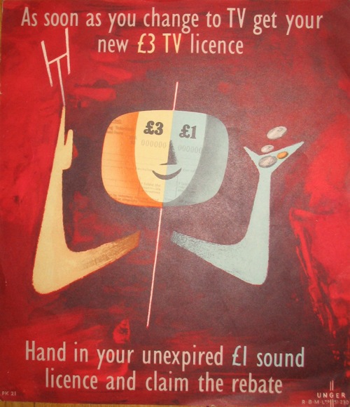
Hans Unger TV licence GPO poster 1954

These later (1962/1967) GPO ones were up at the most recent Morphets sale, and prove that his style evolved a great deal over the decades.

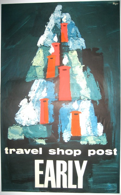
Hans Unger Post Early 1962 GPO Christmas poster

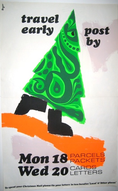
Hans Unger 1967 GPO Post Early Christmas poster

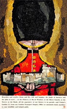
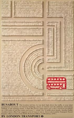
But perhaps I shouldn’t be amazed about the stained glass, because at the same time that he was producing the GPO posters, Unger also did a number of mosaic posters for London Underground,.  And mosaic is, after all, just a different way of making patterns with glass.

Hans Unger guard mosaic poster for London Transport 1962

Hans Unger Mosaic bus poster London Transport 1970

What’s interesting about these, is that they are jointly signed by Hans Unger and Eberhard Schulze.  Once again, it’s Richard Thompson who can tell us a bit more.

Hans was a terrific designer, who made some memorable posters for London Transport, amongst other things. He took his own life in the late 70s. I believe his partner, Eberhard Schultz, went back to Germany.

A sad ending.  But before that happened, it seems that they were very productive together.  Here’s St Stephen’s Astley, a Manchester church which was consecrated in 1968.

Unger Schulze St Stephens Astley window

Unger Schulze St Stephens Astley

And the chapel of the Rochdale Pallottine Convent.

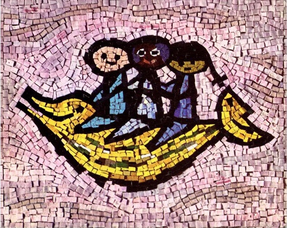
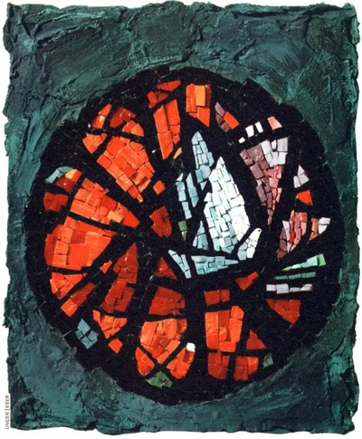
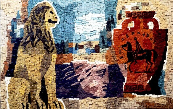
But the stained glass was clearly a sideline in comparison to their main work in mosaics.  Here’s a mosaic for UNICEF,

Unicef Mosaic Unger Schulze

and a 1964 Christmas card for the BBC.

Unger Schulze 1964 Christmas Card for BBC

How about a mosaic of Elvis?

Unger Schulze Elvis mosaic

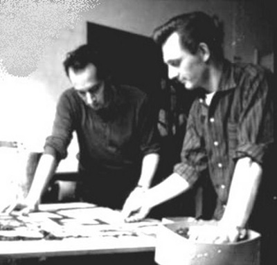
And this is just a tiny sample of what they produced together (there is a huge archive here if you want to take a look for yourself).  Their partnership became very well known, and their smaller works were apparently much in demand by collectors.  Here they are working together in about 1964.

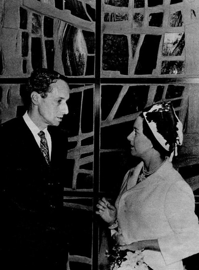
And here is Unger being presented to the Queen with some great piece in the background.

He looks rather worried really.

So, a whole side of Hans Unger’s life and work that I had no idea about.  But there’s a rather odd coda too.  Sadly, soon after Unger’s death, Eberhard Schulze injured his back and had to give up mosaics.  But he clearly wasn’t someone who relished early retirement.

He went on to develop a successful career as a specialist aquarist, becoming England’s leading discus fish breeder and even carried out aquarium installations for the rich and famous, such as the Saudi Royal Family and the Sultan of Brunei. He now lives in Nonthaburi in Thailand.

If anyone can add to this, I’d love to hear from you, as I feel rather as though I’ve only just scratched the surface of the subject here.  And also, if anyone can explain why all these new churches were being built in the north, I’d also love to know.

And if you’re inspired enough to want to buy one for yourself, Martin Steenson at Books and Things has this Unger/Schulze fish poster for sale for just £30.

Unger Schulze London Transport poster fish

It’s a bit battered, but still lovely.

Ahead of his time

This may be the only blog post I ever write in praise of estate agents, particularly as we’re thinking of selling our house and so will be dealing with them on a regular basis.  But here goes.

We had one round today for a look, and he was clearly a very nice man because he spent as much time staring at the posters on the walls as at the house itself.

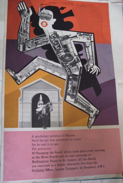
He was also very perceptive.  After a long hard look at this Henrion, he pointed out that it really was pop art before its time.

Henrion London Transport poster 1956 Changing of the Guard

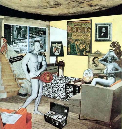
Or at least completely of its time.  The LT poster is from 1956.  Which is exactly the same year as Richard Hamilton’s iconic collage, Just What Is It that Makes Today’s Homes So Different, So Appealing? (I use iconic here in the technical sense, meaning over-represented and over-cited to the point of tiredness, if not actually cliche).

Richard Hamilton Just What Is It that Makes Today's Homes So Different, So Appealing? 1956

Yes, there are other things going on with the Henrion too.  Its angles and sense of speed owe a lot to Rodchenko et al, while its raiding and reworking of Victorian imagery was part of a wider trend in the fifties.  But it’s still as genuinely weird as the Hamilton, if not stranger.

Adrian Shaughnessy writes of Henrion, much later on, that

despite his work with government departments and giant corporations, despite his OBE, and despite his eminence within post-war British design, he retained a radical sensibility.

Which, again, is spot on.  The whole series of three posters that he produced for London Transport in 1956 are peculiar, not least because theu’re a series which don’t match.  Every time I see this poster, I am convinced that it was designed in about 1972, if not later.

F H K Henrion Hampton Court London Transport poster 1956

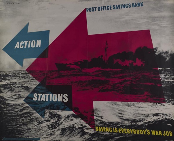
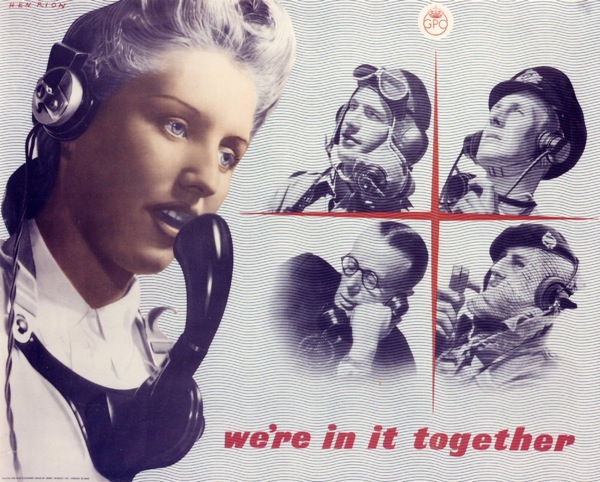
Here are a couple more strange ones from his earlier wartime work.

Henrion GPO vintage wartime poster

Henrion GPO telephone vintage WW2 poster

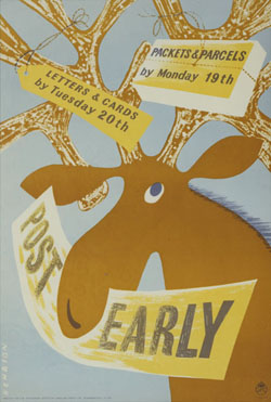
And a reminder that he could also do cute.

Henrion post early

All of which means that Henrion deserves rather more credit than he ever gets.  He designed the British Leyland logo too,

British Leyland logo henrion

And, while we’re here, let’s have a cheer for visually literate estate agents too.  Let’s hope he can sell houses as well.