Kill All Flies

It’s August, it’s the silly season.  In Quad Royal world this means that I have a house full of people, a holiday to plan for and no time to write anything.  Elsewhere, it manifests itself in the fact that news is so slack that posters have made an appearance on the BBC news website.

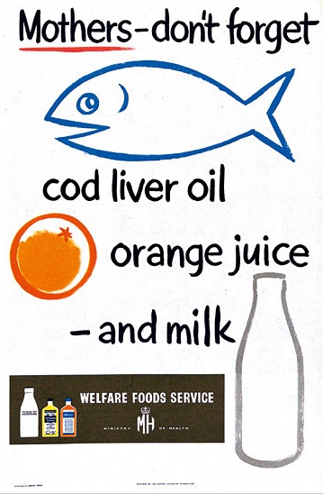
Health Education poster Cod Liver oil

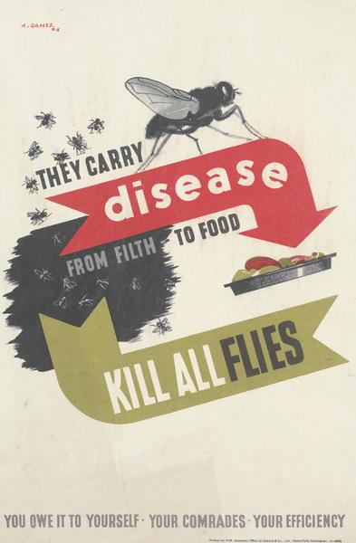
Wierdly, these have taken the form of a slideshow, with music.  I know, it’s almost as though they’ve forgotten that television has been invented.  But there are a few lovely posters on it.  I’ve taken quite a shine the one above, mainly I suspect because it reminds me of a Macfisheries poster.  And they’ve also included this rather entertainingly blunt Abram Games poster, which I’ve had on my ‘to post’ list for ages.

Abram Games disease flies health education poster

The reason for all of this is, apparently, the publication of a book on the subject by the WHO.  It’s taken me some digging and delving to find anything about it, and then it turns out to have been published for a while now, so quite what is going on here I don’t know.  But it’s called Public Health Campaigns: Getting the Message Across and is available on Amazon should you be interested.

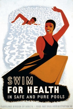
American swimming for health poster

While not many of the posters in the book would qualify as high design, the book does raise some interesting questions.  The main one of which is, do posters work?

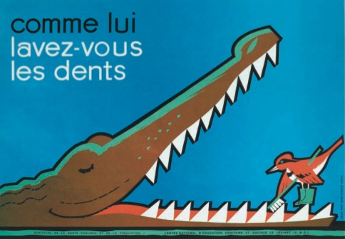
French brush your teeth poster crocodile

In the slideshow, Dr Laragh Gollogly argues that marketing posters can at least quantify their effectiveness by seeing whether sales rise or not (although that does remind me of the famous quote – ‘half the money I spend on advertising is wasted, the trouble is I don’t know which half.’).  But for posters which seek to influence what people do, there is no test at all.

How do we know what really works?  There has been no systematic collection or evaluation of massive social marketing campaigns and indeed this book presents only a smattering of the total global output on the subject.  Posters vary hugely from country to country and over time.  By publishing this book WHO hopes to spur those involved or interested in public health care campaigns to stop and think critically.  Which posters work and which don’t?  How do we evaluate their effectiveness?  Can a poster work on its own or does it need to be part of a much bigger approach to behavioural change?  Although posters are getting flashier, are they getting better?

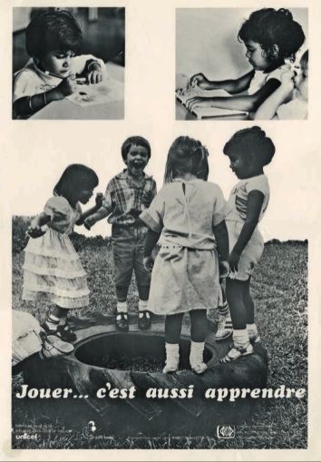
French poster for play

These are questions which don’t just apply to the posters in the book.  How much did World War Two posters affect what people did or didn’t do?  Did they even make people feel better or worse about what was being asked of them, from recycling to the blackout?  I’d love to know.

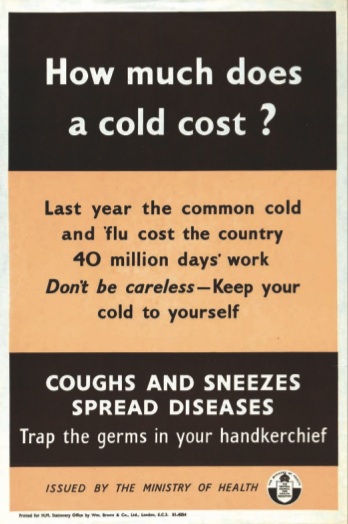
WW2 ministry of health poster about cost of colds

The book itself is a bit frustrating, because it doesn’t give any context for the posters themselves, in terms of place or date, and even scratching through the acknowledgements at the end doesn’t help much.  Although it did let me identify this Lewitt-Him for certain.

Lewitt Him WW2 poster grow fingers

But this is also a reminder of just how difficult collecting and curating posters can be.  There’s an interesting article on the Wellcome Library blog about this, as a spin-off from the book too.  They also link to their own online catalogue, which includes many posters.  But no pictures, which makes it simultaneously fascinating and deeply frustrating.  I’ve been wondering for some time about Summer is here–and now extra cleanliness please. Issued by Danish Bacon Company Limited. It’s by Unger, it’s from the 1950s, and it’s probably not half as interesting as I imagine.  But because I can’t see it, it’s now, in my head, the greatest poster ever.  Still, and more importantly,  I wonder if it did its job and prevented any cases of food poisoning?  We may never know.
Rich Inner Substance

We’re going out of our usual territory today, but the detour is worth it.  The destination?  The Museum of Anti-Alcohol Posters.

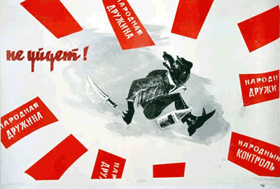
Out Soviet Anti Alcohol poster
Out!

This is a great collection of anti-drinking posters put together by Yuri Matrosovich for no other reason than his own amusement.

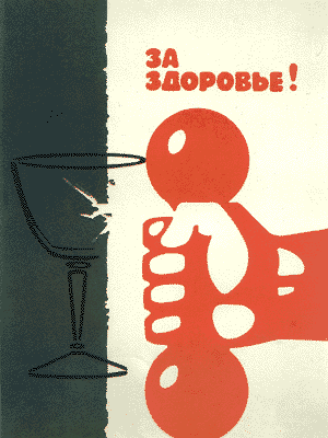
To Health Soviet anti-alcohol poster
To Health!

He found a few, then started to collect them, and then put them online and that is, er, it.

Russian vintage anti-alcohol poster

All the information I can give you about them is the English translations that he’s provided (and if anyone feels up to translating the one above I’d be very grateful); not knowing any Russian, I can’t discover dates or designers or, indeed, anything at all.

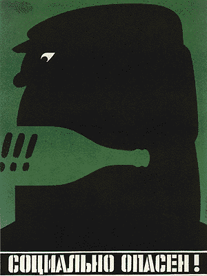
Socially Dangerous Russian anti-alcohol poster
Socially dangerous!

All there is to do is enjoy them.  There are plenty more on Yuri’s website, but as he himself says, some are brilliant, some a bit more slapdash.  But worth taking a look at anyway.

Rich Inner Substance Russian anti-alcohol poster
Rich Inner Substance

And now I’m off for a drink.

Bloggery

Or possibly Oh Bloggery.  Because there is a whole world out there where blogs reference other blogs and link up to other posts and then blog about blogging, all of which ends up being so self-referential and post-modern that it makes my head spin.  So Quad Royal tends to just plough its specialised little furrow, minding its own business and talking about posters.

This post (the hundredth, incidentally), is a rare exception, mainly because I want to say thank you.  QR has been going for less than five months, and yet there are now a proper amount of people subscribing (138 at the last count).  Which I never really expected for a blog which is, in the end, just someone wittering on about what they do and don’t like.  With some pretty pictures.  So you are all too kind.

While we are doing self-referential and bloggery will eat itself and so on, I can also point at Shelf Appeal‘s lovely  banner.

Emily sutton Shelf appeal banner

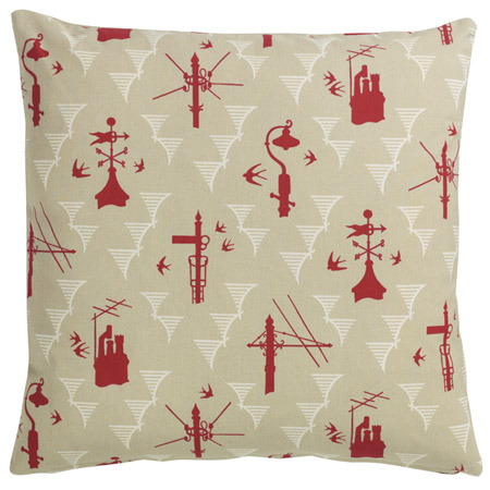
It’s by Emily Sutton (who comes via the very delightful St Jude’s) and, although it’s new, it’s just what I would choose where I not so overwhelmed with old things that new graphics are too much to even think about.  Should you want new stuff to go with your old things, St Jude’s is a very fine place to try.  I am currently coveting this cushion (and will probably buy it in due course when we haven’t just had to repair the car and buy a new dishwasher…)

St Judes Kensal Rising cushion

The third and final blog-related item is even more of a digression, although it is at least about old things.  But The Country Seat is such an absorbing read that I really needed to point it out.  Now I have an odd fascination with this, but whether you think that stately homes are a) the greatest work of art created in British culture or b) the gilded icing on a decadent lifestyle created by the exploitation of others is actually a bit irrelevant.  Because what is so good about this blog is that it is excellent, well-researched journalism written by someone who really knows what they are on about.  Every post is not only readable but a proper story, to the extent that it’s better than a good half of what appears in the papers (particularly true should you have the misfortune to read the Observer).  It’s the spare time creation of an enthusiast, but why he’s not getting paid to do this when he does it so well, I do not know.

Right, that’s over now.  As you were.  Tomorrow will be business as usual, with old things.  Posters even.

Telegraphese

Such is the confusing nature of the modern world that telegrams have been arriving in my inbox.  I’d rather they were delivered by a messenger with brass buttons on his jacket, but I guess that’s not really an option any more.  Nonetheless, all of them are still very much worth looking at.

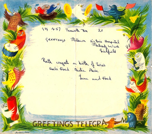
Laura Figiel sent me these two.  The first, from 1957 is by Barbara Jones.

Barbara Jones GPO greetings telegram

Excellent owl-work there.  Just in case you were wondering as I did, the news is that  the twins are now both 52, and one of them is Laura’s mother.

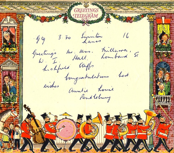
This 1956 example, meanwhile, is by Fritz Wegner.

Fritz Wegner GPO greetings telegram

Now I can’t tell you very much about him, I’m afraid, except that he has quite possibly gone on to illustrate children’s books, including some by Allen Ahlberg.  Which might lead me on to a post tomorrow.  I shall say no more until then.

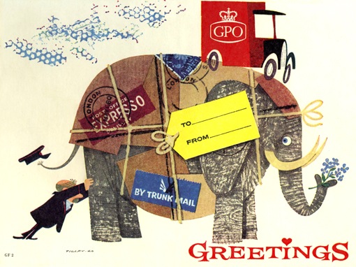
This isn’t strictly a telegram, but it is a greeting.  It’s by Patrick Tilley, and was designed to send postal orders in.

Postal Order artwork by Patrick Tilley

Now these do come up on eBay every so often and aren’t expensive at all – the Wegner sold a couple of months ago for just £6.  So if you want lovely graphics for not very much money at all, the telegram is your friend.  And no one will ever say that about an email.

Clean as new

Now it’s not often that I get to discover a whole new genre of posters, but today I can share just that with you.  Dry cleaning posters.

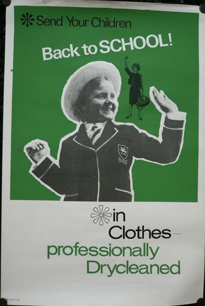
vintage dry cleaning poster school clothes

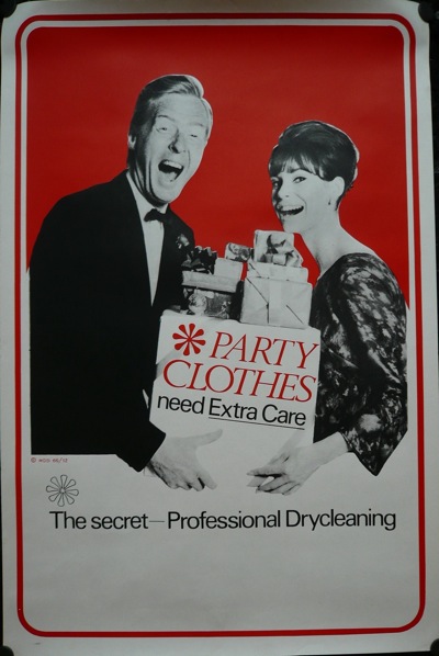
This whole collection from, I am guessing, the 60s and 70s, was sent to Quad Royal by Roly Seaton.  I think the Kenneth Williams-a-like here is one of my favourites.

vintage dry cleaning poster party clothes

Roly acquired them when a dry cleaners in Leeds was closing down, and left them outside the shop for any takers.  I imagine them having been very dapper in Leeds in the 1960s.

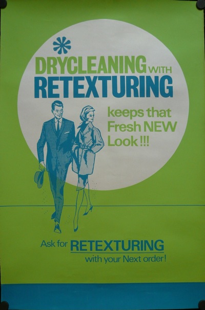
retexturing vintage dry cleaning poster 1960s

And very well textured.  But, quite apart from the kitsch amusement value, I’m interested in these posters for a couple of reasons.

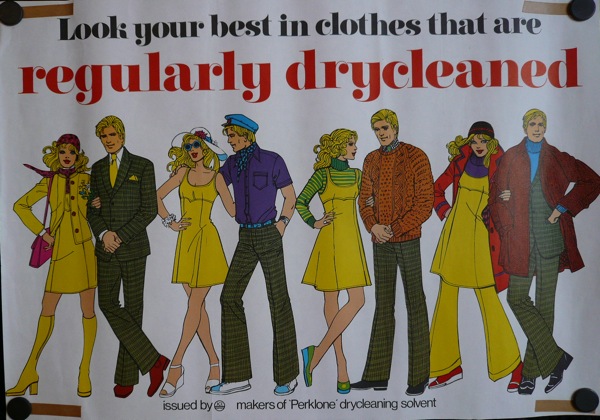
One is that they do, once again, show just how the overall standard of graphics had declined by the 1970s.  This poster was clearly done by someone whose day job was illustrating Simplicity patterns.

vintage 1970s dry cleaning poster hand drawn figures

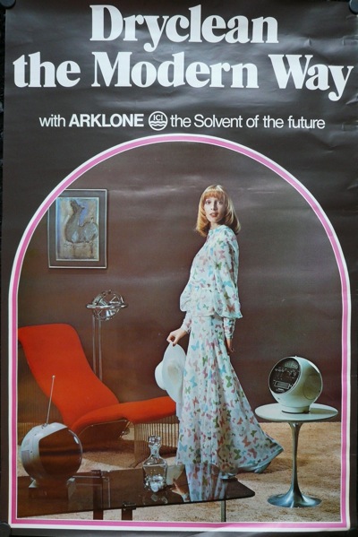
While all that this one has going for it is the fabulous 1970s image of modernity that it wants you to believe in.

vintage 1970s dry cleaning poster

Shagpile, smoked glass, round TV; truly this has to be the future.

Now I wouldn’t claim that any of these posters are design classics, and I don’t suppose I’ll ever know who designed them or when, but they do illustrate once again just how little we know of the visual past.  Even after just forty or fifty years, so much of the graphic design that people saw on a daily basis has entirely disappeared.  And not just from the dry cleaners.  Every greengrocer, every chemist, every corner shop would have been full of posters and signs, hand drawn or printed, good or bad, but almost all of which have gone.

What we think of as the appearance of the 1960s is a very partial construct, made up of London Underground posters, a few high end pieces of graphic or corporate identity design which are now collected and revered, and perhaps a few films.  But what most people saw on a daily basis was very, very different – and perhaps as hard to recreate now as the mindset of the Middle Ages.  It’s a sobering thought.

Whitsun greetings

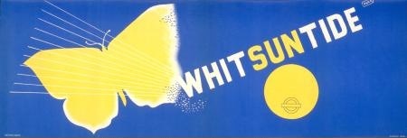
McKnight Kauffer vintage London Transport poster Whitsun

Have a lovely and I hope sunny Bank Holiday.  I’m off to be a pirate for the day.

Whitsun vintage London transport Poster Oscar Berger

(With thanks to Edward McKnight Kauffer (1938), Oscar Berger (1940) and the LT archive…)