Hit the North
Today this poster is your starter for ten.
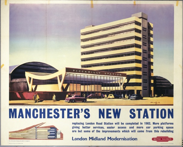
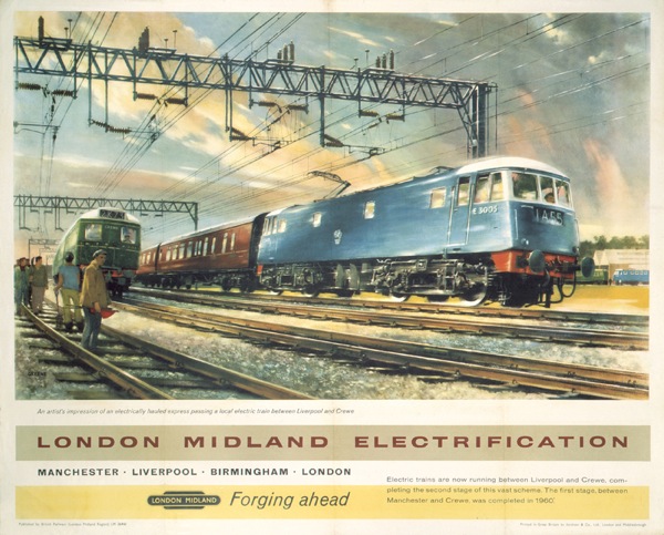
The question is, what’s so unusual about it? (Other, that is, than it’s Manchester Piccadilly Station looking quite spruce; I regularly used to get the last train home from there in the early 80s, and it was a dump. Always)
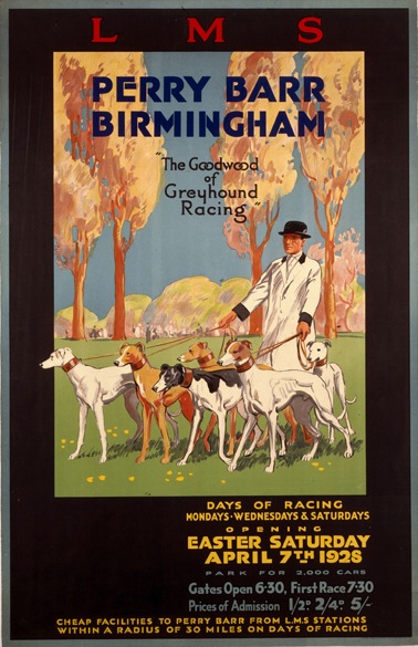
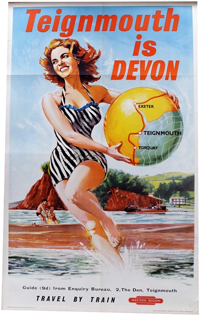
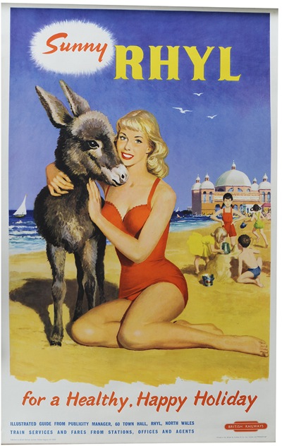
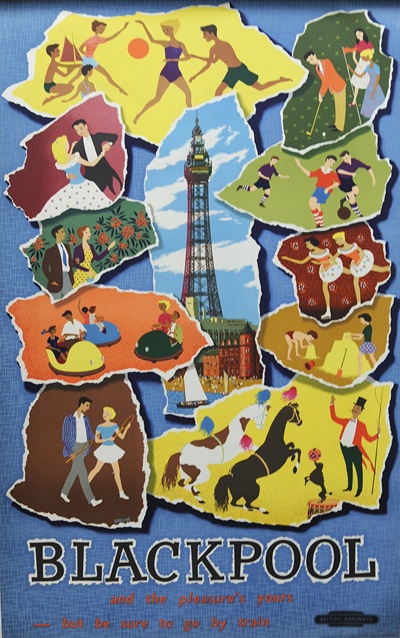
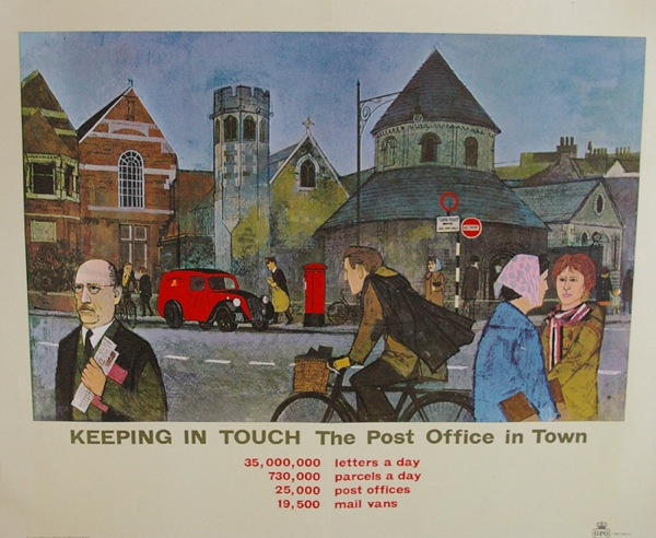
The answer is that it’s a railway poster depicting Manchester. They are rarities indeed, don’t you know. As are posters of Leeds, Liverpool and Birmingham too. Although I did manage to find Perry Barr looking quite bucolic in 1928.
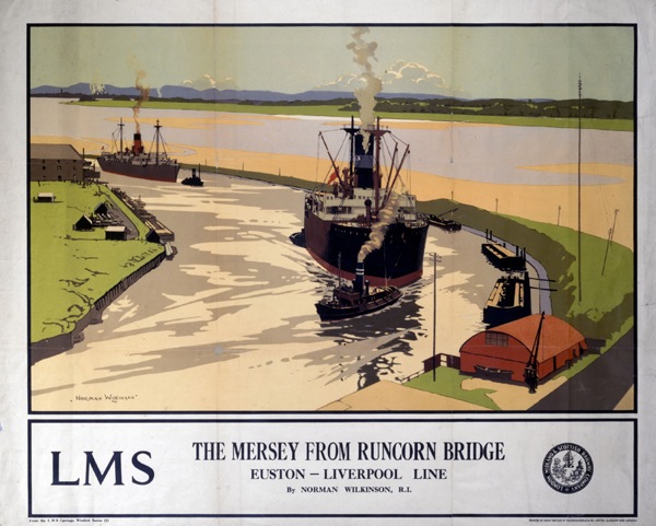
But generally the point remains: should you happen to map the world by railway poster, the industrial heartlands of Britain are pretty much invisible. I can only find one exception and that’s this Norman Wilkinson poster of the Manchester Ship Canal.
Now I put this point to Mr Crownfolio, and he looked at me as though I was in pursuit of the blindingly obvious to no apparent purpose. I can see where he is coming from with this. Birmingham, Manchester and their ilk are not pretty, they are not by the seaside: in short they are places that you come from rather than travel to. So why would the railway companies want to make posters of them?
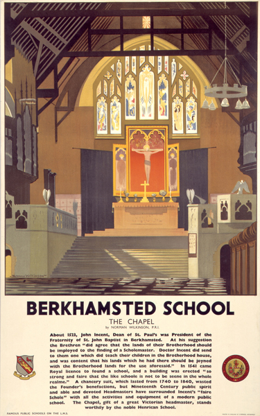
But this is a point which is actually worth making, so bear with me. Because there were several series of railway posters which could quite easily have taken in points in the industrial north. Like Norman Wilkinson’s depictions of schools, for example.
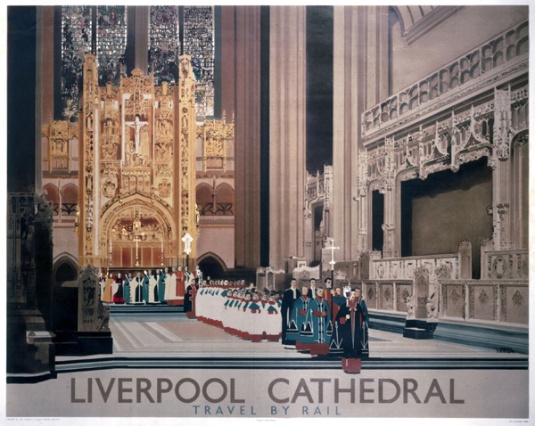
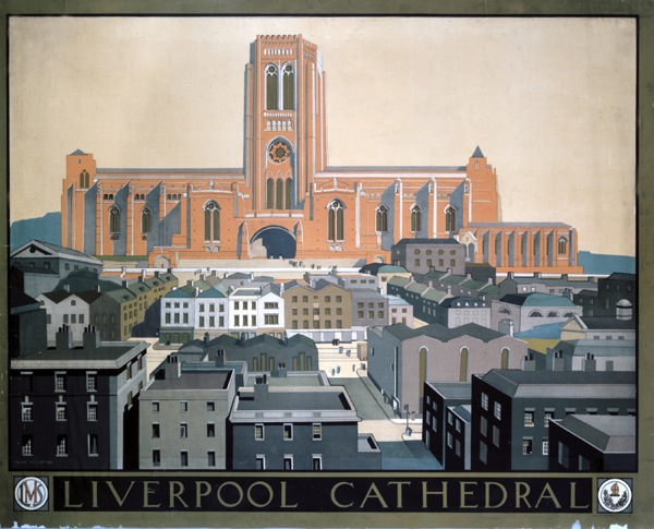
Or indeed they could have been included in the endless series of churches and cathedrals. Liverpool alone gets a chance here, and twice – posters by Fred Taylor and Keith Elleston respectively.
But Liverpool is, in all probability, a special case. Having only been built a decade before, Giles Gilbert Scott’s cathedral was a modern marvel, built just ten years before, as well as simply a landmark to be visited.
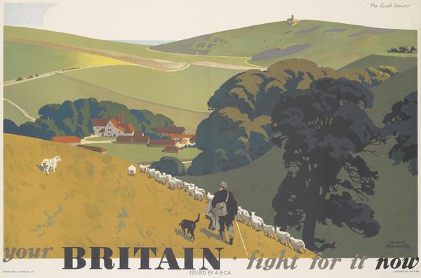
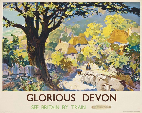
Why this matters beyond just northern pride is that the railway posters are reflecting an important part of British culture. When we think of Britain, it is a southern landscape we see in our mind’s eye. Perhaps the most potent representation of it ever made is Frank Newbould’s wartime poster for ABCA.
And of course Newbould is a railway poster artist, so he knows exactly what he’s doing there. This isn’t just a piece of countryside you want to visit, it’s a landscape that you need to believe in.
The writer and academic David Matless has called this vision of the countryside ‘Deep England’, and I have mentioned this idea before in passing. Matless articulates the idea in a very good book called Landscape and Englishness, which I will revisit one day in a post when my copy finally re-emerges from storage. To summarise a subtle and well-documented argument in the meantime, Deep England is a version of Britain which has its greatest potency between the wars, and one of its many uses is to represent an eternal image of Britain to set against the forces of modernity and change. And this timeless country is very firmly based in the south.
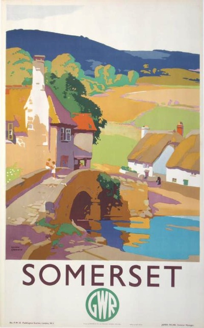
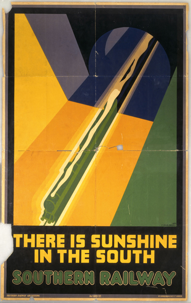
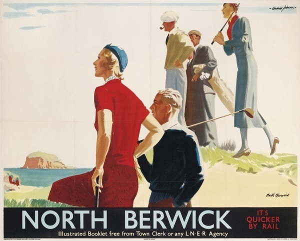
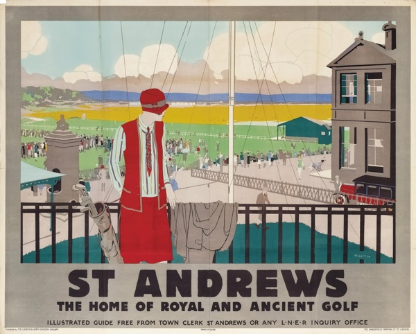
All of which adds some additional reasons why railway posters don’t mention the North. Yes, it might not be somewhere you want to go to, but it is also, in a wider sense, not somewhere you want to see either. Because railway posters weren’t just about suggesting you travel to a different place by train. As David Watts suggests in his very interesting essay (discussed on here in the post I have already linked to above), they also rely for their impact on the implicit contrast between the bucolic idea that they represent, and the forces of modern industrialism, in the form of the railway, which surrounds them. So sticking a picture of Mancunian cotton mills in there simply doesn’t work.
Although this does go some way towards explaining a small sub-genre of northern and midlands posters, which are designed to celebrate the modernisation of the railways.
Because of course it’s fine to mention these cities if you are actually enthusing about industry. The Manchester Piccadilly poster at the top probably fits into this category too (these tend, as a rule, to be post-war).
All of which is not only important because of what it tells us about railway poster design and prevailing British culture. To flip it on its head, it also reveals a great deal about why people like railway posters. As I’ve said before, railway posters are a refuge, a form of Safe Art in a world of abstraction and conceptualism. But there’s more to the railway poster than simply nice old-fashioned landscapes. By omitting the problematic north and Midlands, these images also tap into some of our deeper feelings about Britain and what we want to see. No wonder they are so popular.
Now, some of you may be on the side of Mr Crownfolio and thinking that this is still, to some degree, a statement of the blindingly obvious. But I think it matters now. Because one thing that has been bothering me for some time is that the North has disappeared from our consciousness, taking Birmingham and Stoke with it on the way. Back when I was a teenager and travelling in and out of Piccadilly Station, there was a very definite sense of their being a Northern culture and sensibility, taking in everything from The Smiths to Boys from the Blackstuff and all points in between. Hell, I was proud to come from the North, even if they wouldn’t let me belong there.
But where is that now? I can’t seem to discover its like anywhere. Eighty years after its supposed heyday, Deep England has finally triumphed. We all think like southerners, act like southerners and see like southerners. And thus a whole swathe of Britain and its history has been made invisible.
This isn’t healthy. But it also isn’t true. We can’t help our railway posters, we probably can’t even help liking them. But we can pay attention to what we see elsewhere. For a whole set of reasons, both social and political and just sensible, we need to make sure that we look at the whole of the country, not just the easy, prosperous, reassuring parts. So beware the lure of the deep landscape. By all means look at it; but make sure it isn’t the only thing you see.
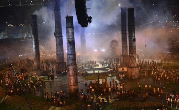
Two small addenda to that. The first is that one of the very many wonderful things about the Olympics Opening Ceremony was the fact that it took a long hard look at Britain’s industrial heartlands, and what’s more saw something to celebrate as well as fear. Something that makes us British.
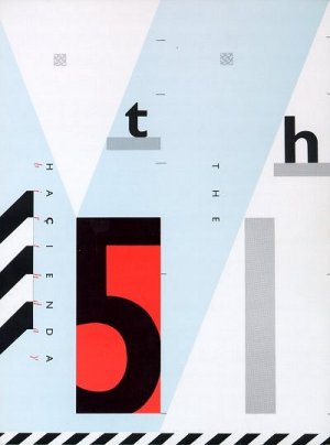
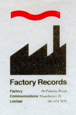
The second is a bit of a tangent but still worth noting, and that’s the way in which the north still has – or certainly had last time I looked – its own very distinctive visuals. Fifty years after the railway posters, Factory Records set the style which made Manchester look different.
I was very surprised to arrive in London and discover that not everything worth finding out about happened in sans serif. Or that the clubs were nowhere near as interesting.
But this is worthy of a whole post of its own on another day. In the meantime, don’t forget the factories.
