Me, Grayson Perry and the railway poster

I mentioned a while ago that I was trying to be nice about railway posters.  It’s all Grayson Perry’s fault.  We came late to his Channel 4 series about taste, and it’s only available on 4OD for just a few more hours, but I am sure it will get repeated because it was one of the best pieces of television I’ve seen in a very long while ( as an ex-tv person, I have high standards).   There wasn’t a poster in sight, just plenty of spray tan, Jamie Oliver tableware and cushions with pictures of labradors on, but it’s still got me thinking about what I do and don’t approve of on this blog, and why.

Grayson Perry All in the best possible taste working class

One of the reviews described Perry as being ‘like one big, walking open mind’, and that was the real pleasure of the series.  He managed to enjoy every visual environment he came into, and to treat them all with equal respect.  That picture above is him dressed up for a night out with the girls in Sunderland, so it isn’t the kind of respect you might expect, but it was very genuine.

Perry had obviously been reading his Bourdieu about how class and wealth are the determinants of taste – his script even used the phrase ‘cultural capital’ when talking about middle class people with the confidence to buy art from junk shops.  But he wasn’t just spouting the jargon, Perry walked around clearly believing that everyone’s choices in decor, clothes, even tattoos, were as valid as anyone else’s.  It was a rare and refreshing spectacle.

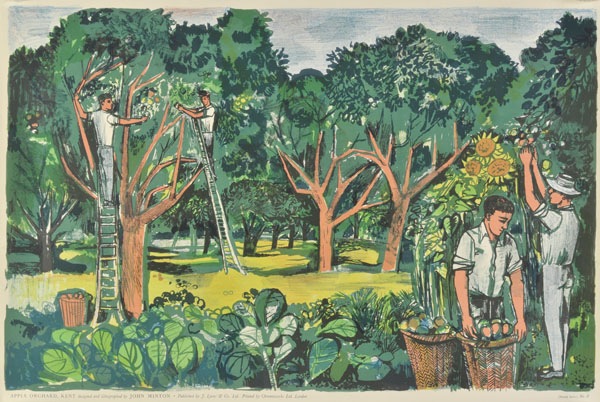
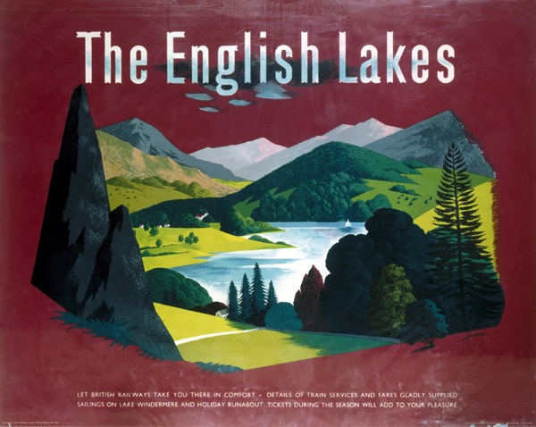
So why am I banging on about this, other than to persuade you that the series is well worth three hours of your time when it is finally repeated.  Well, it made me think about a lot of things again and one of them, perhaps strangely, was how I categorise railway posters.  Here’s Exhibit A (all posters courtesy of the NMSI today).

British Railways poster showing Bamburgh Castle and the Farne Islands. Northumberland, Jack Merriott.

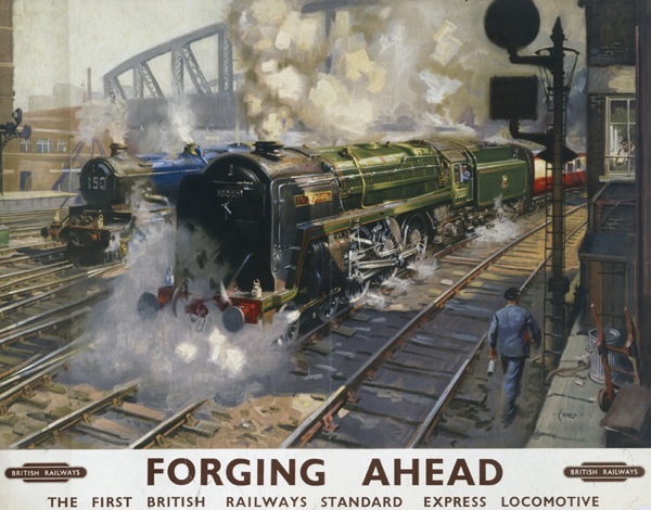
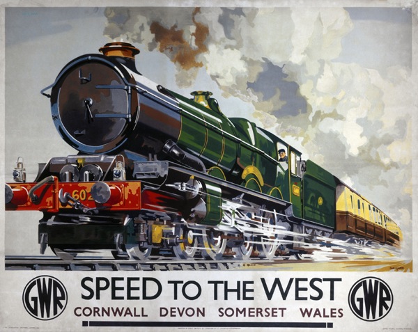
I found it really quite hard to choose this poster, a typical landscape one, as I kept being tempted by ‘more interesting’ ones on the search.  So that’s my taste laid bare.  Now for an even harder task, I’m going to find a Terence Cuneo and post that too.

1951 British Railways poster Terence Cuneo Forging Ahead

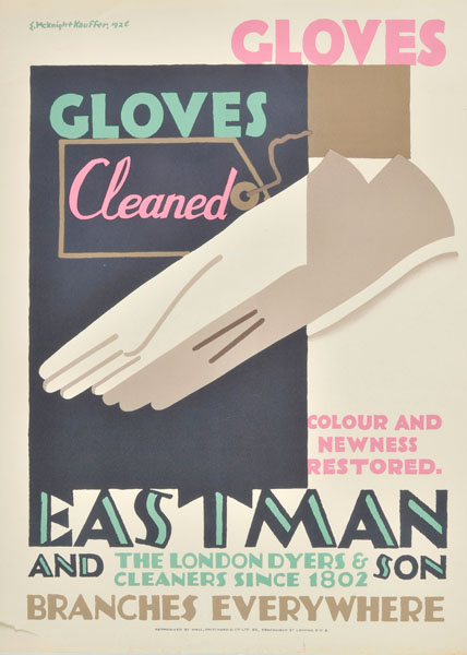
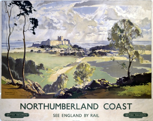
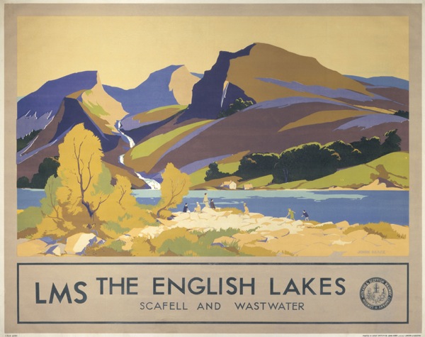
It won’t come as any surprise to you that I do not love this sort of thing. But lots of other people do, clearly; his works go for thousands and there is a statue of him in Waterloo Station.  I don’t think there’s a statue of Tom Eckersley yet, but I much prefer this.

'Mablethorpe', BR poster, 1960. Tom Eckersley girl on beach

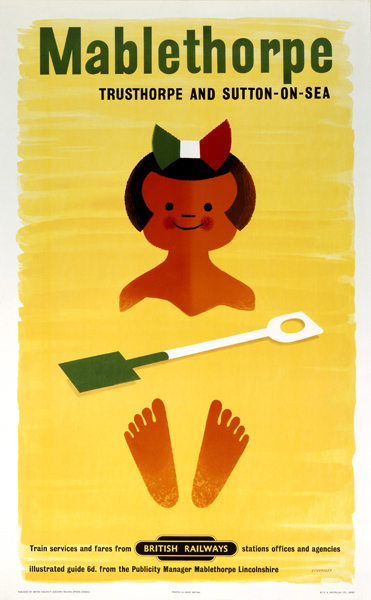
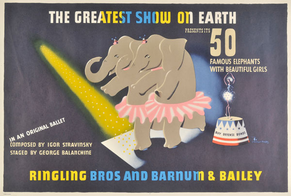
Or even, for a fairer comparison with the posters above, this.

British Railways (London Midland Region) poster. Artwork by Lander. 1951. lovely

Not only am I ranking these in a hierarchy of taste which is not based on a coherent theory, in fact on nothing more than my own personal opinion, but I’m also, in the process, implicitly criticising other people for liking pictures of fields and trees.  Or, indeed, trains.

Now on the one hand this is fine.  Not even Grayson Perry would argue against personal taste.  It is what it is, and what’s the point of having a blog and writing thousands and thousands of words without pay unless it is to indulge your own taste and opinions.  But I think he would be trying to find the good in the other things too.  And in the case of these railway posters I may be able to manage it.

John Mace English Lakes LMS poster 1930s

Instead of categorising these posters as not-an-Eckersley and therefore failures, it’s possible to see them as a natural development, and a very democratic one too, of one of the key strands in British art, the landscape painting.  In the period both before and after the war, when fine art was off on a continental, abstract and primitivist path, British landscape artists were never going to be in fashion.  Unless they were very lucky, they were going to find it hard even to be seen as fine artists.  But that didn’t mean that the art died out, it just went somewhere different for a while, on to posters.  (There’s a lot more that could be said in this argument, but that can wait for another post).

'Cornwall', GWR/SR poster, 1936 Adrian Allinson

In seeing these as inferior to the more abstract poster designs by artists like Games and Eckersley, I’m just expressing the cultural preferences (or perhaps prejudices) of my kind; I’ve been brought up with the narrative of the progress of fine art and so the more graphic designs are, clearly, superior.  I don’t have the money to buy a Picasso, but I will flex my cultural capital by putting a poster on the wall instead.  See my discrimination at work, even if I can’t afford the real thing.

But other people with other backgrounds might have a very different opinion.  Imagine being brought up in the landed gentry, in a house stocked with eighteenth and nineteenth century watercolours alongside the pictures of dogs and pheasants.  If you didn’t have the money for fine art, a railway poster might look very appealing indeed.  It’s just a different story, that’s all.

In the course of the series, Grayson Perry, as well as exploring, makes a series of tapestries about the people he’s met and their tastes. The programme would be worth watching for these alone; they’re based on Hogarth’s Rake’s Progress and are wonderful.

Grayson Perry Vanity of Small Differences tapestry

Their collective title,though, is The Vanity of Small Differences.  Which pretty much sums up the situation with railway posters, because there isn’t that much difference between them in the end, just the slight distinctions of personal taste.

'Speed to the West', GWR poster, 1939 Mayo

Well except for the pictures of trains.  I still haven’t managed to get my head round those yet.  But I will try, I promise.

Paddenalia, inter alia.

I’ve been meaning to post this for ages, and now the Jubilee has been and gone but I’m carrying on regardless.  They’re Marks and Spencers’ Jubilee packaging designs – this is the tin we bought.

Marks and Spencers Jubilee shortbread tin

Remind you of anyone?  To me, there is a definite touch of Daphne Padden about them, particularly this pigeon.

M&S Jubilee packaging for teacakes - pigeon

And of course she designed for Marks and Spencers too.

Daphne Padden Marks and Spencers Christmas cake design

But this isn’t them raiding their archives, they are apparently by an illustrator called Phil Hankinson.  I must drop him a line and ask whether he likes Daphne Padden or whether it is just a happy accident.

Marks and Spencers Jubilee teacake packet

The pictures (because I ran out of time to take them myself and we’re still eating the shortbread anyway) are borrowed from H is For Home’s blog about the packets.  They did it properly, and on time, not like me.

While we’re on the subject of Daphne Padden, a few of her paintings (and a couple of her father’s too) are up for auction tomorrow.  It’s a saleroom close to where she lived, so I wonder what the connection is?

Daphne Padden bird watercolour paintings
Daphne Padden, est £30-50

Dominic Winter’s forthcoming sale, meanwhile, contains a small set of McKnight Kauffer posters, which are worth taking note of because they include this one which I’ve never, ever seen before.

McKnight Kauffer elephant ballet
McKnight Kauffer, 1942, est. £400-600

Yes, that is for an elephant ballet to the music of Stravinsky.  I will let the catalogue explain more…

This advertised the extraordinary Circus Polka, an act featuring fifty elephants in tutus ridden by similarly-clad dancers, which brought together the remarkable talents of the dancer and choreographer George Balanchine (1904-1983), the composer Igor Stravinsky (1882-1971), and the circus manager John Ringling North. By 1942 Stravinsky was an established composer living in Hollywood, and Balanchine was a well-known choreographer and the founder of the American School of Ballet. The elephant ballet was performed during the 1942 season entitled Holidays, in New York’s Madison Garden building where Barnum’s circus had performed since 1881.

These two are also discoveries for me.

McKNight Kauffer Eastman Gloves poster 1926 Dominic Winter
McKnight Kauffer, 1926, est. £200-400

McKnight Kauffer Schools exhibition News Chronicle 1938 poster
McKnight Kauffer, 1938, est. £100-150

This is considerably more familiar, mind you.

McKnight Kauffer ARP poster home front world war two Dominic Winter
McKnight Kauffer, 1938, est. £100-150

There seems to be an unerring rule that wherever the McKnight Kauffer ARP poster is offered for sale, the Pat Keely treatment of the theme must also be there too, and it applies here just as always.

Pat Keely ARP Calling You poster home front 1938 Dominic Winter
Pat Keely, 1938, est. £100-150

I wonder whether these went out together, and whether quite a few were saved together by their recipients as souvenirs of what must have seemed, even then, to be a turning point in Britain’s history.  Later on in the war, the pressure to salvage paper must have been greater, and so fewer posters survived.  Or do these ones exist in great numbers because of an enormous print run?

Also for sale are a couple of Lyons prints, of which my favourite is this John Minton.

John Minton Apple Orchards Lyons Print Dominic Winter
John Minton, 1951, £200-300

More obscure, but quite enticing despite this, are a collection of Edward Bawden and John Aldridge wallpaper samples.

Edward Bawden wallpaper design Dominic Winter
Edward Bawden, c1940s-50s, est £300-500

But then they’re just as expensive as a good poster, and quite a bit smaller, so perhaps not.

While we’re on this kind of track, shall I draw your attention to a few things worth noticing on eBay as well?  Top Quad Royal tip is this Hans Unger, although it comes with a rather aggressive start price of £193.  But it’s still nice.

Hans Unger 1959 London Transport poster theatre

We have a copy ourselves, but one which could probably win a competition  for worst preservation and condition of a poster ever.  It’s so bad that I am too embarrassed to put a picture of it on here.  Mr Crownfolio is saving it for when he retrains as a poster conservator, but even then it may still be beyond rescue.

This earlier London Transport poster is rather less my personal cup of tea but probably a bit more of a bargain at £120.  It’s by Alan Sorrell and dates from 1938 and is, if you ask me, a rare example of neo-classicism in poster design of the times.

London transport poster 1938 Alan Sorrell river

While this is an interesting and quite rare Home Front poster for just £39.99.  This campaign was one of the rare early succeses for the Ministry of Information. who generally spent the first two years of the war getting everyone’s backs up.

Home front poster Go To It World War Two ministry of information 1940

But then that price probably reflects the fact that while it is a very important piece of historical ephemera, most people, including me, don’t actually want to sit and look at it all day.

A sentiment that also applies in even greater measure to this.

1960s southern region train map thingy

Advertised as a ‘fantastic train poster from the 60s70s’, it has a Buy It Now price of  £175, but then the seller clearly had a crisis of confidence because the opening bid is set at £10.  What am I missing here?  Can any train fans enlighten me?


No room for horse play here

One day, I am going to move into the Brighton University Design Archives for a month or two, which I think should be long enough to explore.

There is a ridiculous amount there (both the Henrion and Design Council archives alone can be measured in metres), so it’s forgiveable that the holdings aren’t all digitised and web catalogued for me to survey from the comfort of my desk.

Imagine my delight then when I came across these.

HA Rothholz vintage GPO greetings telegram poster 1950

Well in fact it was Mr Crownfolio who came across the cache first, as a result of doing some detective work on those RoSPA posters I mentioned the other day. Because that’s a 1950 GPO poster by HA Rothholz, and it’s just one of a whole heap.

For some reason, out there on the Archives Hub are dozens of his posters, all from his own archives which are held in Brighton.  I don’t know why he’s been singled out, but I do know it’s a jolly good thing. Take a look at this Post Office Savings Bank poster to start with.

Post Office Savings Bank poster 1960 HA Rothholz

Or this wonderful wartime RosPA poster.

HA Rotholz vintage RosPA ww2 safety poster hats are in fashion

It’s not, I’ll be honest with you, a complete treasure trove of undiscovered work.  The RoSPA posters and the GPO work, to start with, are fairly well archived as it is.  Although I had never seen this particular GPO poster until now.

HA Rothholz vintage GPO poster pack parcels golliwog

To be fair, it is in the BPMA’s catalogue when you go looking for it, they just don’t shout about it.  Ah, 1956, not entirely a paradise of good design and right thinking then.

There are also a few things, like this coach poster, that I would have had no idea about otherwise.

HA Rothholz vintage 1950s coach poster excursions

What’s most enlightening about this archive, though, is that seeing it altogether gives a proper overview of Rothholz’s career.  The outline story is quite simple.

Rothholz came to London in 1933 to study at the Reimann School (principal one Austin Cooper and an institution that I would love to read more about if anyone can point me at a source).  Despite being interned as an enemy alien during the war in both the Isle of Man and Canada, he returned to Britain in 1942 and became one of the main designers of RoSPA’s safety posters.  Others are better known, but this is one of my favourites.

Vintage Rospa ww2 safety poster No room for Horse play here HA Rothholz

In the decade or so after the war he produced a flurry of posters, continuing to work for RoSPA, but also for the GPO.

vintage GPO poste r3d is the minimum foreign rate HA ROthholz

Along with, to a lesser extent, London Transport.

HA Rothholz vintage London transport valentines poster Courtesy and service 1947

Apart from the GPO work, the flood of posters seems to dry up by the mid 1950s.  The biographies give us a clue:

He also designed graphics and a mural for the ‘Lyons Corner House’ restaurant, at Marble Arch, and contributed to the corporate identity styles of Winsor & Newton and The Wellcome Foundation.

He must have done quite well too, because he employed people (look at the comments here for some personal testimonies).  Here’s a piece of his Winsor and Newton design from the archive.

HA Rothholz winsor and newton poster from archive

This is a story we have come across before.  As television takes over, and advertising agencies start to design campaigns rather than posters, another designer moves over to the fields of brand identity and corporate style.

While it may be nothing new, it’s still fascinating to see it played out across an entire archive from the comfort of my own desk.  And if anyone can fill in any of the gaps, please do get in contact.

Oddities and curiosities

Right you lucky people, the Onslows Summer auction is upon us and it is time at last to see what is on offer.

Except amongst the things that haven’t been up before, there isn’t very much that makes my heart beat faster.  It’s a sale of curiosities and oddities, well for me at least.  Things like this very late Ashley Havinden from 1962.

Ashley Havinden (1962) Join the Welsh Guard, original Recruiting poster

Ashley Havinden, 1962, est. £70-100

This poster won an advertising award but ironically was not a success due to being printed in English.

Oops.

While this Tom Purvis would be odd on the basis of what it is advertising alone.

Tom Purvis (1888-1959) Sleep Allenburys Diet, original varnished lithograph poster, mounted on old linen with wood batons top and bottom
Tom Purvis, est. £500-1,000

What you can’t see from that image is that it is also the size of a house (well, nearly).  Here’s the photo taken when it was originally sold in 1990 at the sale of Purvis’s studio.

Purvis poster shown to scale

Don’t say you weren’t warned.

This poster also keeps coming up at the moment (and if I am honest, I keep trying to buy it for cheap and failing).

Nevin's B+I Line Liverpool - Dublin, original poster printed C W Massey poss Henrion
est £200-300

Onslows don’t give an attribution, but I do swear that says Henrion.  Any thoughts, anyone?

Entertainly after the conversations earlier this week, these two Ralph Mott posters have also made an appearance.

Ralph Mott vintage 1930s b2b railway poster
Ralph Mott, late 1930s, est £70-100

Ralph Mott (1888-1959) Warehouse your Goods, original poster printed for GWR,LMS,LNER,SR  Vintage railway poster
Ralph Mott, late 1930s, est £70-100

Yes, that does say British Railways on the second one.  The plot thickens.

There are, of course, plenty more railway posters on offer, and however much I keep going through the listings, none of the classic ones are really speaking to me in this sale.  My favourite is probably this one.

Nevin (dates unknown) The French and Italian Riviera, original poster printed for BR by Charles & Read 1953
Nevin, 1953, est. £400-500

I’m as surprised about that as anyone.

In the case of this Alan Durman, I feel as though I ought to like it, but just can’t quite manage to.

lan Durman (1905-1963) Herne Bay on the Kent Coast, original poster printed for BR(SR) by Baynard 1962
Alan Durman, 1962, est. £600-700

Whether this is because it’s not quite as good as the rest of his stuff, or simply because it’s all been a bit overexposed recently, I don’t know.  Whichever way round, I doubt that I’m reflecting the majority taste here.  But if midcentury we must have, and we must it seems, I’d rather it looked like this.

John Cort Winter Sports go by train, original poster printed for BR(SR)
John Cort, est. £250-300

But it’s not all about railway posters, all the usual categories are there too.  Like GPO posters.  There’s a slew of these more modern ones.

Ken Howard (b1932) The Post Office in Space, Goonhilly Downs, original poster PRD 1636
Ken Howard, est £70-100.

I like the idea of the Post Office in Space a great deal, but generally my experience with this kind of design is that I can scarcely pay people to take them away.  Lets see if Onslows have more luck.  There are also one or two good posters too.

Manfred Reiss, vintage GPO poster 1950 helps the export drive
Manfred Reiss, 1950, est. £250-300

This is labelled as Beaumont, but the signature, to my eyes at least, seems to say Reiss.  Must find out more about both of them though.

There are also wartime posters by the tonne, of which this is probably the most interesting one.

Anon Dig For Victory, For their sake - Grow your own vegetables, printed for HMSO by Weiner circa 1940
Anonymous, est. £300-400

From which you might conclude, quite rightly, that the remainder are of more interest as memorabilia than for their graphic design value.  For example, this Reginald Mayes straddles both WW2 and railway posters, hence the estimate, but I don’t think I’d frame it and hang it up to look at.

Reginald Mayes Reginald Mayes (1901-1992) In War and Peace we serve, No 573 printed for GWR, LMS, LNER and SR by Truscott c 1940
Reginald Mayes, 1940, est. £700-1,000

Mind you, I’ve had my fill of Union Jacks this month as it is.

There are also London Transport posters too.  This pre-war Freda Lingstrom is in my mind a much nicer thing than the Mayes, but is estimated at much less.

Freda Lingstrom (1893-1989) To the Countryside, original poster printed for London Transport by Vincent Brooks Day 1933
Frida Lingstrom, 1933, est. £250-350

One day I will work out the precise price loading which is added for a picture of a steam train.

At the end there are also a nice run of David Klein posters, with some temptingly low estimates.


David Klein, 1962, est. £200-300

Or for even less, you can get the understated British version.

Gaynor Chapman (1935-2000) Britain Tower of London, original poster printed for British Travel by W S Cowell 1968
Gaynor Chapman, 1968, est. £50-70

There’s a very good reason why the sale has turned out this way, and it’s a point that was made very strongly this week.

The answer is of course eBay, where a whole set of these wartime RoSPA posters was up for auction.

Pat Keeley vintage world war two rospa poster swarf

They fetched reasonable prices for slightly battered posters printed on thin paper – this Keeley with a Rothholz on the back went for £67, with the top price being £150.

But once upon a time a lot like this would only ever have been sold at an auction house, probably making its way up to Onslows in the end.  But now they don’t.  Who’d be an auctioneer these days?

Eventful

I have nothing to say about this other than that it is brilliant.

Surbiton lagoon genius

I should have been able to tell you that it was for sale at Books & Things too, but I sent the picture over to a friend who comes from Surbiton as I thought it might amuse her.  She only went and bought it, didn’t she.

You can, however buy this.

Barbara Jones Christmas card cat 1957

In fact you probably should.  It’s Barbara Jones’ Christmas Card from 1957, and its for sale on eBay right now.

I do know, that this isn’t what I promised, which was a post about Onslows.  Events, dear boy, events.   It will be here in due course.

Winners

As promised, the results of last week’s compeitions.   The first thing I need to say is thank you, because this has afforded me a great deal of entertainment; a high standard of entries came in, almost none of which had been seen before on here.  We should do this more often.

All of which has made the judging a bit difficult.  A couple of themes did recur, one of which was the idea that an unseen Daphne Padden poster was bound to be chosen.  I suspect James had his tongue just a little bit in his cheek when he suggested this one.

Daphne Padden Royal Blue artists proof

It’s ours, and as it’s an odd proof copy I rather suspect that there isn’t another one out there either.  Very good.

Other themes included football (which I don’t think I have ever mentioned on here before so it’s a fair cop) and pre-war posters, both of which come together in this 1935 Eckersley-Lombers suggested by medieval modernist.

1935 vintage London transport poster Eckersley Lombers football

I will try and remember that quite a few of you like 1930s modernism a bit more than I do when I’m posting from now on.

Another mention also has to go to medieval modernist for putting forward the best thing by a poster artist which isn’t a poster, this card by Tom Eckersley.

Tom Eckersley Tiger card 1982

It’s great, but it’s definitely not a poster.  So it doesn’t win.

But I can’t keep you on tenterhooks forever.  The winner, then, has to be this, for being so completely Quad Royal that I am bashing my head repeatedly against the desk in bewilderment that I haven’t put it on here before.

Vintage post office savings bank poster eric fraser 1953 genius

And that’s before I award the extra points for Diamond Jubilee topicality.  So congratualations to self-confessed ‘new kid on the block’ Nick Morgan, who will get a copy of the book by post at some point this week, when buying the new Crownfolio Towers allows.

There was only supposed to be one winner, but then the publishers, Shire, came through and offered another prize.  That will be going to this piece of ‘Ralph Mott’ (aka artists agents’ Ralph and Mott, aka probably Reg Lander who was their studio manager), which although pre-war has to win for being not only modernist and bizarre, but also the worst piece of photoshopping ever done before the invention of Photoshop.

Ralph Mott railway poster prewar odd cow

Just look at the legs on that cow.  Another book will be off to Sanderson in due course.

That’s actually the original artwork, which is currently on sale at Liss Fine Art.  It’s worth following the link as there are some other crackers there, shown alongside the finished posters.  Oddly, the railways don’t seem to have produced a poster from the image above. Can’t think why.  What’s also strange is the lorry says ‘British Railways’ down the side, over what looks like Tippex, while the other posters were commissioned by the big four pre-war companies.  Perhaps this one was never produced because of the war and then they thought about having another go afterwards.  And then looked at the legs on that cow and shook their heads.

Finally, there was one more copy going in a general draw for comments/tweets/followers and that’s gone to @NemesisRepublic on Twitter.

So thank you again to everyone who took part.  Normal service will finally resume later this week, with a good look at the new Onslows sale.