Now we are two

I missed Quad Royal’s second birthday last week, and am now feeling terribly guilty. This is the closest thing to a poster birthday card I could find at short notice.

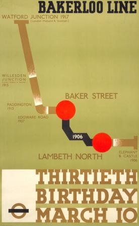
Thirtieth birthday bakerloo line vintage london transport poster

Even if the number and the date are wrong.

Anyway, I just wanted to say how much I appreciate  everyone who’s been reading and  commenting and telling me when I get things wrong over the last two years on here. It’s always nice to know there is someone out there on the other end of the internet, reading it. So thank you.

A good home

Earlier this week, I went to the Design Archives at the University of Brighton, to see if they wanted Daphne Padden’s archives, or at least what we had acquired of it.

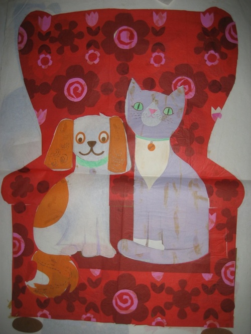
Daphne Padden cat dog armchair design

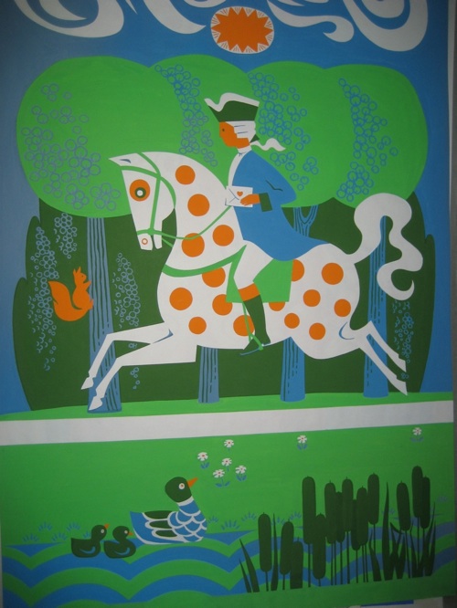
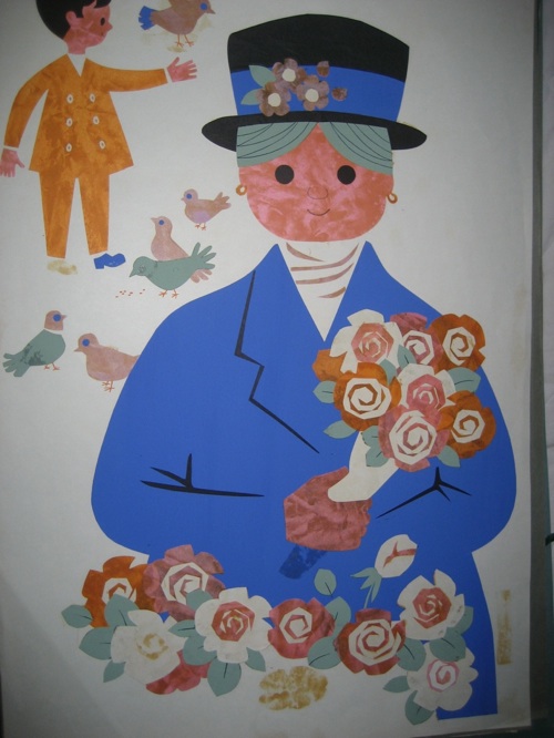
Fortunately they were not only very delightful but also decided they did want them, and these three images are just a few of the designs that are now in their safekeeping.

Daphne Padden mail rider design

With them are also all manner of other things, including rough sketches, a kind of portfolio of work (some of which I have posted here before) and much else besides.  Once they’ve been catalogued and conserved, students and researchers can go and have a look at them.

Daphne Padden flower seller design

I’m really pleased, and not just because it’s a relief to have found a good home for a collection which deserved better than just hanging round our house not being seen.  It’s also good because the sketches and collected work showed me that she had done a great deal more in her life than just design posters – and a great deal more than anyone would have expected from a woman working alone at that time (I’m thinking particularly of the Marks and Spencers designs here).  Now that story won’t be lost, it’s preserved for good, and I think that’s really important.

Art overtaken by life

See my urgent book.

my book is urgent

I have had to read it very quickly, because tomorrow it goes back to the British Library for someone else to read urgently too.

Now its subject – modernism, bombsites and English culture – might not seem immediately applicable to our concerns here on Quad Royal.  But in fact it’s been surprisingly enlightening, mainly because it has forced me to think about British Surrealism.  Now this is a style which in the 1930s spreads very quickly from fine art into the world of graphic design.
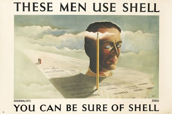
Zero journalists Use Shell vintage poster 1938

But then, during the Second World War, it goes underground (a fine place for the art of the subconscious to be) and is seen no more.  According to this book (Reading the Ruins if you want to buy it yourself rather than be hectored by the British Library) Herbert Read asked in 1951 what had happenned to surrealism?

The break-up of the Surrealist Movement as a direct consequence of the Second World War is an historical event which has never been adequately explained…

The book’s answer to this question is a very interesting one, which is that war itself was so surreal that it rendered the artworks redundant.  This was Stephen Spender’s view too, in 1945.

The immense resources of all the governments of the world are now being devoted to producing surrealist effects. Surrealism has ceased to be fantasy, its ‘objects’ hurtle round our heads, its operations cause the strangest conjunctions of phenomena in the most unexpected of places,

That’s an idea I’ll come back to in a moment, but what surprised me most about this was the idea that surrealism had disappeared.  Because in graphic design that definitely wasn’t the case.  We bought this quite recently – it’s by Henrion and I think dates from 1947.
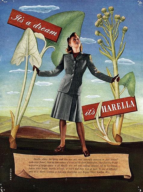
Harella henrion vintage post war fashion poster

His ‘Agriculture and Country’ pavilion at the Festival of Britain was also described at the time as surreal, with a giant white oak tree growing up through the space, while large swathes of Britain Can Make It also featured the same kind of odd juxtapositions of scale, space and objects too.
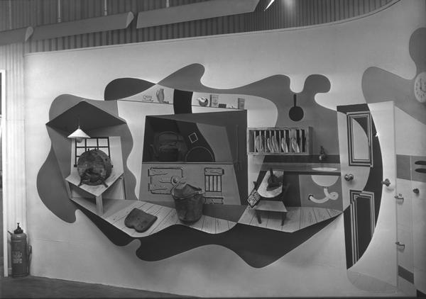
Kitchens display Britain can make it

And remember those Lines of Communication GPO posters I mentioned a while back?  There’s a strong streak of surrealism to be found in some of those as well.
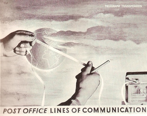
Hans Schleger post office lines of communication poster

And I am sure there is more elsewhere, too.

But thinking about World War Two posters (something I’ve been forced to do quite a bit recently), the surrealism is simply not there.  Just as in the art world, it disappears; but the difference – compared to fine art  – is that the style does come back after 1945.

Stephen Spender pins down very clearly the reasons why surrealism disappears during the war.  Humankind can only bear so much strangeness, and the every day world offered more than enough during World War Two.  Here is novelist Inez Holden remembering an episode during the Blitz.

One morning I walked back through the park, and saw the highest branches of a tree draped with marabout, with some sort of silk, with two or three odd stockings [and] … balanced on a twig was a brand new bowler hat. They had all been blown across the street from the bombed hotel opposite. A Surrealist painter who I knew slightly was staring at this, too. He said: ‘Of course we were painting this kind of thing years ago, but it has taken some time to get here.’

How this operates visually can be seen in the career of the photographer Lee Miller.  Before the war, she had been a surrealist photographer.  During the war, she is also a surrealist photographer, but this time it is called reportage.
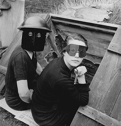
Women in Fire Masks

(source Telegraph/Lee Miller archives)

The world is inside out and the surrealism of the subconscious is now on the surface.  There is no need to invent it any more (If you want to see more of Lee Miller’s photographs, there is a good website of her works here).

There are other, more pressing reasons for turning away from surrealism too.  The disembodied hands – or in the case of this 1937 poster by Schleger eyes and ears – are now too disturbing to portray.
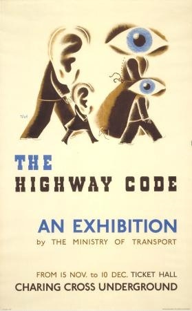
Hans Schleger 1937 Highway Code exhibition Charing Cross

Because they are now not the fantasies of the imagination but the kind of body part that you might be unlucky enough to find on an ordinary street after a bombing raid.

Interestingly, pretty much the only surrealist wartime poster I can think of  – this safety one by Lewitt Him – is in part relying on this horror to make its point.
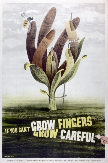
Lewitt Him vintage poster world war two grow fingers surrealist

But this is a rare exception; the style of the war is modernism, not surrealism.  And this is not only from a fear of the bombed out body.  I don’t believe that people wanted to look into their subconscious during the war, there was too much fear and horror in there to be acknowledged.  The black thoughts of death, fate and atrocity had to be banished into the underworld for daily life to go on.  Instead it is the brighter future promised by modernism which helped them to get through.
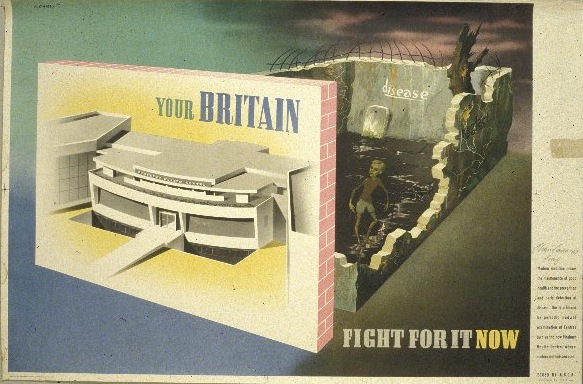
Abram Games abca Finsbury Health Centre rickets vintage ww2 poster

Interestingly the Games poster above does have a surrealist element to it, but it is safely contained in a narrative structure; the black underworld is in the past, the bright modernism is in the future.

While its possible to argue that other posters like the Vegetabull have elements of surrealism in them, they have exchanged the true strangeness of surrealism for a cosy humour.
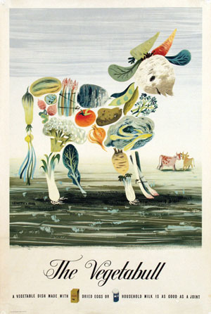
Lewitt Him Vegetabull vintage poster Ministry of Food

I’d call that whimsy instead.  Humour was a favourite way for the British to cope with the war, and whimsy was a way of dealing with the surrounding surrealism, of defusing it.


Only after the war could the true strangeness of surrealism – and its underlying fears – be looked at properly, because, finally, it was safe to do so.  Designers can choose to be odd and uncanny because the world around them no longer looks like that.
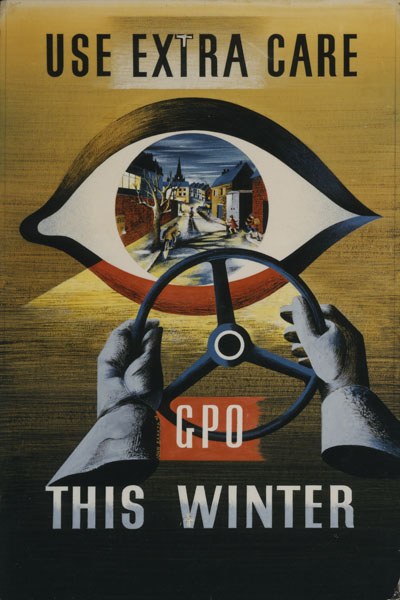
John Kraber 1948 GPO internal poster artwork

Indeed choosing to recreate this disorder in a controlled way, these designs are, in a small way, healing some of what has happened during the war.
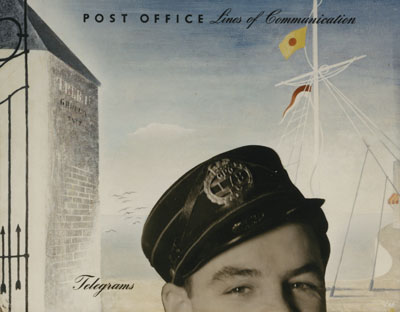
GPO vintage Poster Zero Hans Schleger lines of communication 1950

So the way that surrealism flourished again for a while in the late 1940s and the very early 1950s makes perfect sense.  Which only leaves one big question, why this did not happen in art as well?  Or was Herbert Read wrong?  I’m not enough of an art expert to answer that question one way or another, but there are enough British surrealist paintings about to make me suspect that he might have been.

Leonora Carrington Bird Bath

Perhaps everyone was too busy looking at Paris and New York to have noticed.  But here I  am treading into areas which I don’t really know about – so if anyone else has some thoughts on this, I’d love to hear them.
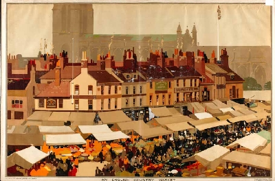
Anglo-American relations

In the cold dark days of winter, it’s always good to see an auction coming along to cheer me up.   But with January being the season of abstinence and all that, it’s probably good that it’s an American auction, at Swann Galleries, so without too much that absolutely has to be bought.

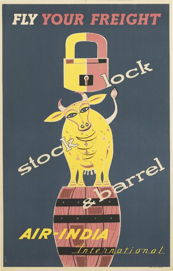
IR INDIA / FLY YOUR FREIGHT.  40x25 inches, 101 1/2x63 1/2 cm. Bombay Fine Art, Bombay vintage poster
Anonymous, est. $400-600

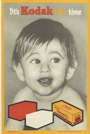
That doesn’t mean there aren’t things I like, though.  The first two of these have an Indian slant.  It’s obvious in the one above, but the only clue in the one below is that it’s printed in Madras.

vintage commercial poster IT'S KODAK FILM TIME.  29 3/4x20 inches, 75 1/2x51 cm. Prasad Process LTD., Madras.
Anonymous, est. $400-600

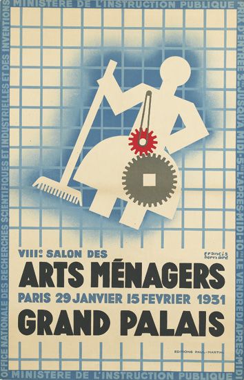
Elsewhere,  I am amused at the logical end to the idea of the house as a machine for living in, which is that the housewife must, of course, become a robot.

FRANCIS BERNARD (1900-1979) VIII SALON DES ARTS MÉNAGERS. 1931.  38x24inches, 97x61cm. Editions Paul-Martial, vintage poster
Francis Bernard, 1931, est. $600-900

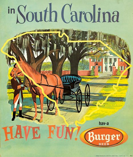
This poster, meanwhile,  is not just worth noticing because it’s advertising Burger Beer, although that’s quite funny enough.

BURGER BEER / HAVE FUN IN SOUTH CAROLINA. Circa 1955. vintage poster
Anonymous, c. 1955, est. $400-600

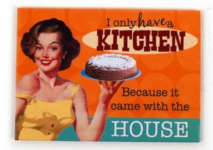
It’s also possibly the only piece of genuine 1950s graphics that I’ve ever come across which actually looks like the current pastiches of the period – that style so beloved of giftshops and eBay for fridge magnets and signs for your kitchen.

frdge magnet

I never thought that existed in real life, but it seems it did, so there you go.

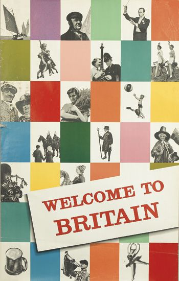
In amongst these diversions, there are also a handful of British posters too.  Well I say British posters, but these two I suspect were designed for the American tourist market.

vintage poster WELCOME TO BRITAIN.  39 1/2x25 inches, 100x63 1/2 cm. British Travel Associatio
Anonymous, est. $500-750

I’ve recently been reading about Britain’s attempts to reinvent itself as a modern country in the 1950s but, in this instance at least, the project hasn’t been working.  The design may be modern, but the images are all as traditional as can be: pageantry and pewter posts, policemen and, if we’re being honest here, peasants.

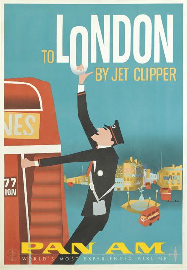
And don’t forget our quaint buses either.

AARON FINE (DATES UNKNOWN) TO LONDON BY JET CLIPPER / PAN AM. Circa 1960.  41 1/2x28 inches, 105 1/2x71 cm.vintage poser
Aaron Fine, est. $600-900

That is a rather wonderful poster though.

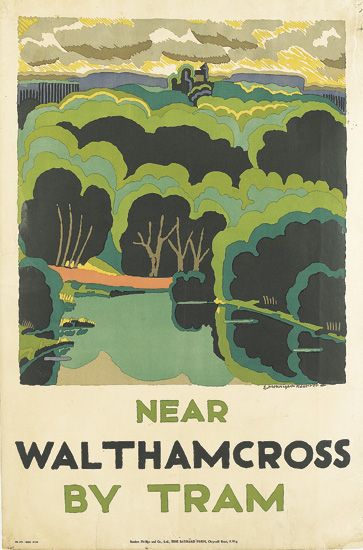
Finally, one entirely British poster.  Well, apart from the fact it’s designed by an American.

EDWARD MCKNIGHT KAUFFER (1890-1954) NEAR WALTHAM CROSS / BY TRAM. 1924.  30 1/4x20 inches, 77x51 cm. Baynard Press, London.  vintage poster
McKnight Kauffer, 1924, est. $600-900.

But I think we’ll allow that one as landscapes don’t get much more British than that.

Next week: Harry Stevens and posters on display.  If things go to plan, that is.

Return of the Volkswagen

Christmas is the season for repeats, and not only on the television.  Here on Quad Royal, this means revisiting a few posts which are worth a second glance.  In this case – the Empire Marketing Board posters from Manchester City Art Gallery – the subject is also newly topical.  The gallery will be staging an exhibition of some of their collection which opens in late February (more details here).  Which means I may have to return to my old stomping grounds and report back to you.  In the meantime, some thoughts on the poster collection as a whole.

For some time I’ve been meaning to post a link to the Empire Marketing Board Archive at Manchester Art Gallery.

It’s an exemplary online resource for a really interesting collection.  The Empire Marketing Board was what Stephen Tallents did before he came to the GPO, and in many ways is one of the first attempts at the kind of ‘soft’ advertising and propaganda that we now take for granted.

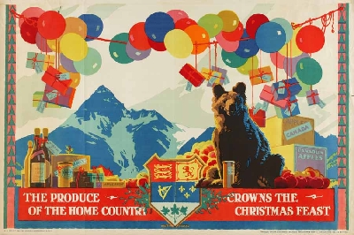
Empire Marketing Board poster Christmas produce bear
Austin Cooper, 1927

In his time at the Empire Marketing Board between 1926 and 1933, Tallents (working with Frank Pick and William Crawford of Crawfords advertising agency) commissioned some of the very best designers and artists working in Britain at the time.  These included those such as Austin Cooper, Frank Newbould and Fred Taylor who were best known for their work for the railway companies,

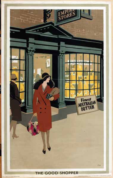
Good Shopper Empire Marketing Board Poster Frank Newbould
Frank Newbould

as well as fine artists like Paul Nash.

Paul Nash Empire Marketing Board poster

But I’ve been holding off writing about it for months.  Why?  Because these posters constitute an ideological problem of the first order, and it’s not one I have an easy answer to.

The issue at stake is, of course, Empire.  The Manchester Art Gallery website describes the collection as ‘challenging and fascinating’.

Created during the 1920s and ’30s to promote trade and understanding between empire countries, the posters present a view of the British Empire that, from today’s perspective, is often uncomfortable.  Although visually stunning, the posters contain images that would today be considered offensive. As a product of their time, they raise difficult questions about the legacy of empire.

I’m not proposing to get into a discussion about the legacy of Empire and the historic wrongs involved.  What I’m interested in is how much ideology can adhere to images, in particular to these posters.

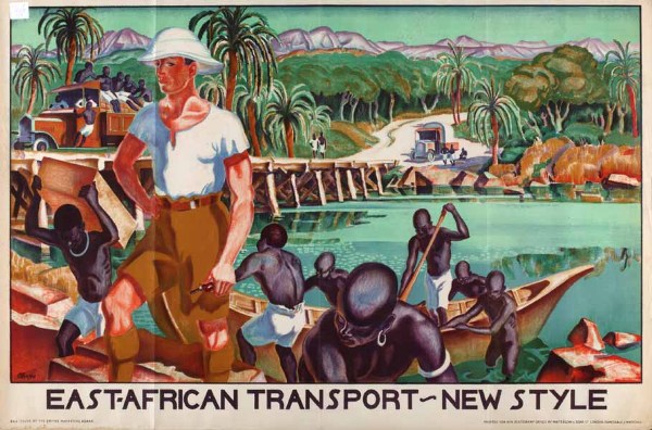
There is no denying that there are some posters in the collection which can only be interpreted as racism of the highest degree.  This vision of the white man bringing civilisation is by Adrian Allinson.

Allinson Empire Marketing Board poster African Transport

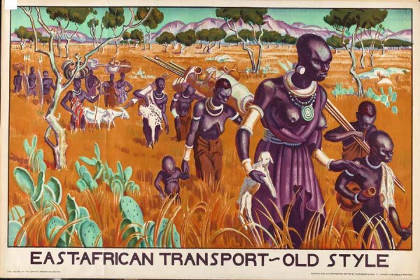
It gets worse, too – the implicit comparison is with the companion poster.

Allinson Empire Marketing Board African transport

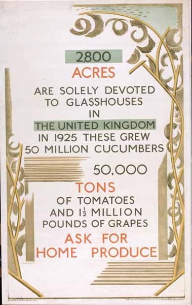
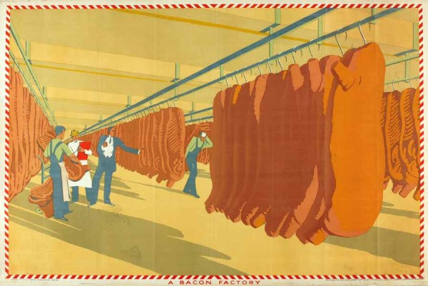
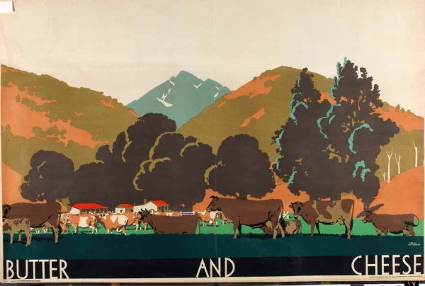
But these posters are by no means in the majority in the archive.  To start with, a good portion of the posters are images of either produce,

Bacon Factory Empire Marketing Board poster
Anonymous

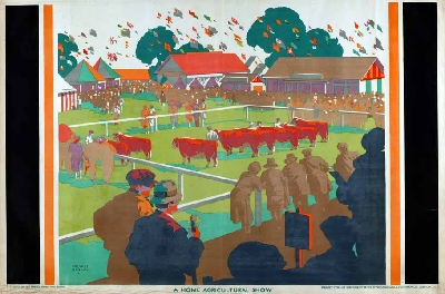
or pictures of Britain that wouldn’t look out of place on a railway poster.

Home Agricultural Show Empire Marketing Board poser
Gregory Brown

Or quite possibly both.

Frank Newbould Empire Marketing Board poster
Frank Newbould

So my questi0n is, can a poster like this Fred Taylor of Market Day be interpreted as loaded, racist even?

Fred Taylor Market Day Empire Marketing Board Poster

I’ve had quite an interesting email conversation about this with Melanie Horton, the researcher who’s been working on the archive.  She would argue that it is, that all the posters have to be seen as whole and cannot be separated from the politics of how they came to be produced.

I’m not going to tackle her arguments now as she has a booklet about the collection coming out soon (Empire Marketing Board Posters: Manchester Art Gallery ) and it only seems fair to read them in detail first.  But I do have a few broader thoughts to raise before then.

Because what we are debating here isn’t in any way a new question.  T.S. Eliot was undoubtedly a small-minded anti-semite, but does that devalue The Four Quartets, in which there is nothing of the sort?  Or if you want a more modern version of the same problem, try yesterday’s Guardian, where Brett Easton Ellis is freely admitting to misogyny, sexism and generally being a rather unappealing bit of work.  But what does that do to our opinion of his novels?  As it happens, I love The Four Quartets but loathe American Psycho, so my answer is different in each case.

But this problem also came up when I studied Design History, in perhaps its most taxing presentation.  Here it was known as the Volkswagen problem.  And it is quite a problem.

The Volkswagen Beetle is a great piece of design which produced one of the most popular small cars of the twentieth century, and was also technologically very innovative.  However it was also, and there is no too ways about this, a product of Nazi ideology.  As if the name Volkswagen itself wasn’t enough of a clue, the Beetle was originally known as the KdFwagen – the Strength Through Joy car. Adolf Hitler commissioned it, approved it and set it into production.   And yet we are not only prepared to forgive the Beetle, but clasp it to our hearts as one of the best-loved cars there has ever been.

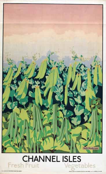
Channel Island Pea Harvest poster Empire Marketing Board
Keith Henderson

So where does that leave images like these?

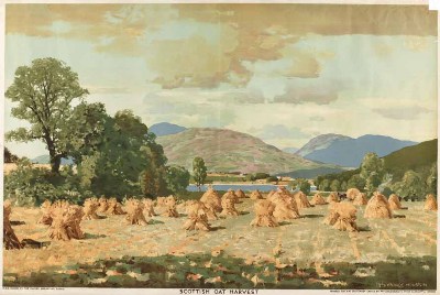
Oat Harvest Empire Marketing Board Poster
George Houston

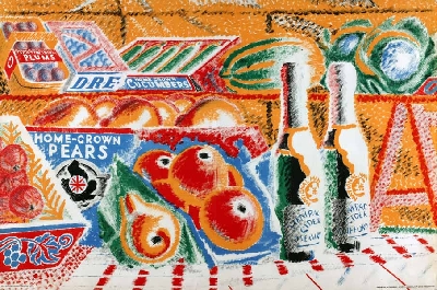
Can we separate them out from how and when they were produced, and only see the oats and the peas and the pears?

Empire Marketing Board Poster
Anonymous

Or is it only the Volkswagen that can ever achieve that kind of forgiveness?

Christmas Joy

Another set of festive posters from the BMPA today.  These three have nothing in common other than that they are all wonderful.  Oh, and I’d love to own a copy of each and every one of them.
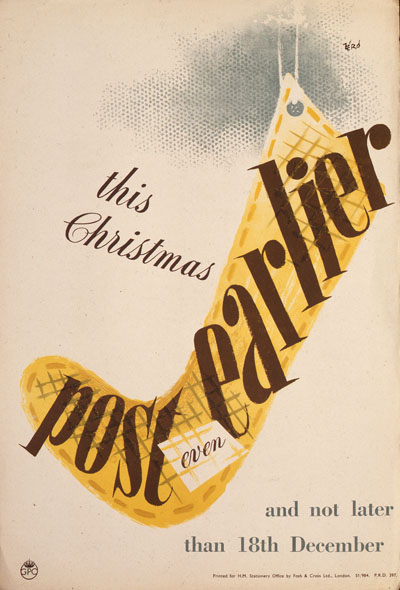
This first one is a wartime design by Hans Schleger from 1943.
Hans Schleger Vintage GPO wartime ww2 post early Christmas poster stocking

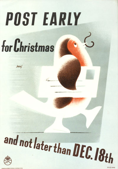
While I can tell you next to nothing about this one at all: only that the artist is Davies and it dates from 1946,  Any more information (and of course copies of the poster) gratefully received.

Davies vintage post early GPO poster 1946 robin skating

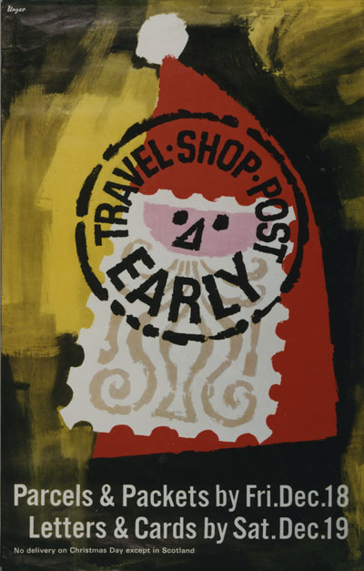
Finally a much later Hans Unger from 1964.

Hans Unger Vintage shop post early GPO poster 1964 Father Christmas stamp

But all of them both good design and very cheerful.  Happy Christmas Posting everyone.