Over-modern and over here

An interesting comment appeared a week or so ago on a older post about Beverley Pick.

He was a man.  Bless him… He was my uncle and a very clever man..He also did the original Moby Dick… Beverley was originally from Austria and lived many years in Sunningdale during the winter. Autumn he would visit his House in Cork and in his latter years he and his wife would live in France where they had a gorgeous home. He is now buried in the Churchyard at Sunningdale. There was so much to this man we will never know it all…

I’ve written to Odile Walker, who posted those intriguing memories, and I hope she’ll come back and tell us more.  But in the meantime, one thing that I never knew stands out.  Despite his British-sounding name, Beverley Pick was an emigré from Austria.
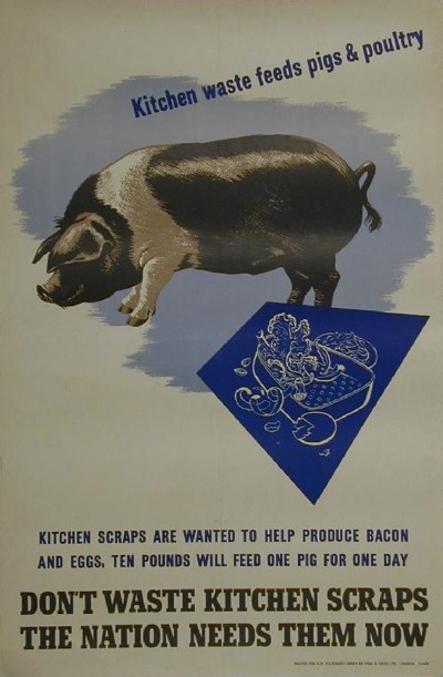
Beverley Pick pig waste vintage WW2 propaganda poster
Beverley Pick, WW2 poster

Now, I’ve been thinking for a while about the degree to which post-war British graphic design was shaped by people who were one way or another foreigners. There are so many of them that it would be hard not to really.  But finding that this is also true for Beverley Pick has pushed me into action.

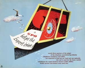
So here is a roll call of as many emigré designers as I can think of who worked in the UK in the decade or so after the war.  It’s an impressive selection. With, for no particular reason other than that’s the way it turned out, lots of GPO posters as examples.

Andre Amstutz
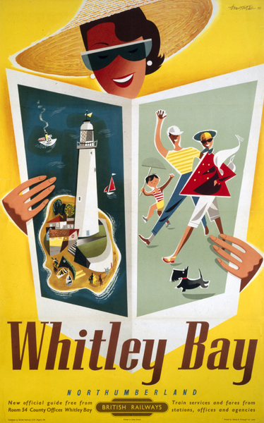
Whitley bay poster Andre Amstutz vintage british railway poster
British Railways, 1954

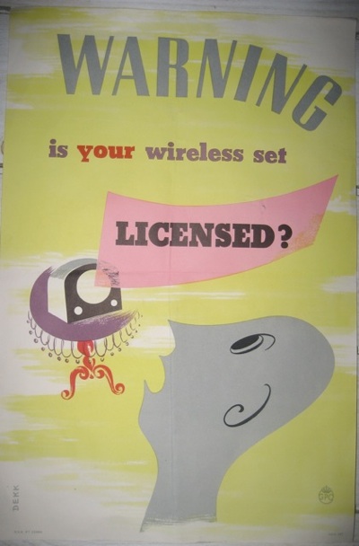
Dorrit Dekk

Dorrit Dekk vintage GPO wireless licence poster 1949
GPO, 1949

Arpad Elfer

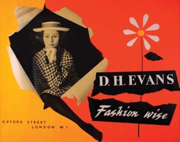
Arpad Elfer design for DH Evans poster 1954
D H Evans, 1954

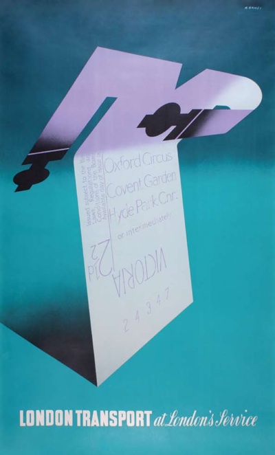
Abram Games

Abram Games vintage London Transport poster at your service 1947

F H K Henrion

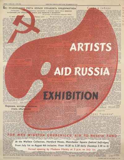
Henrion Artists and Russia Exhibition 1942
1942

H A Rothholz

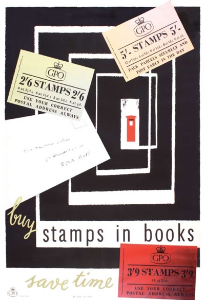
H A Rothholz stamps in books poster vintage GPO 1955
GPO, 1955

Pieter Huveneers

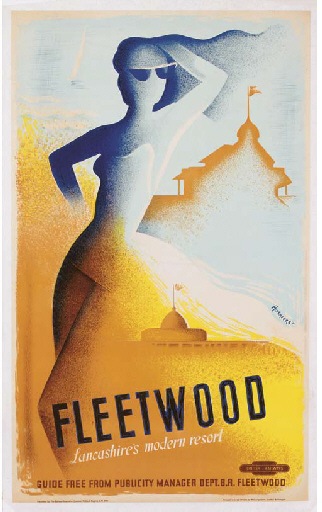
Pieter Huveneers fleetwood poster 1950 vintage railway poster
British Railways, 1950

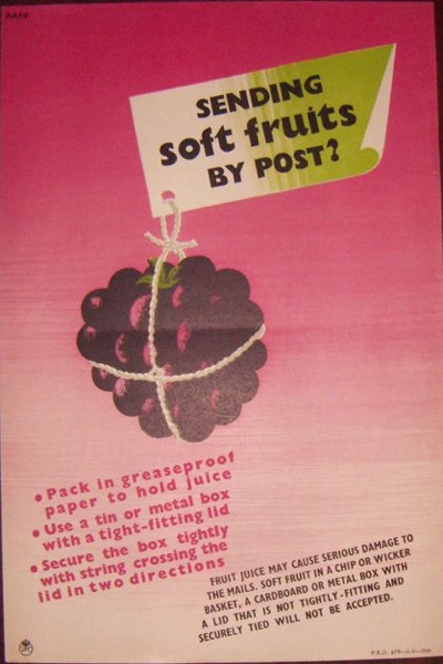
Karo

Karo vintage GPO soft fruits by post poster 1952

Heinz Kurth

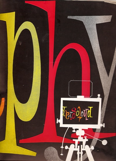
Heinz Kurth design for Artist Partners brochure divider
Artist Partners

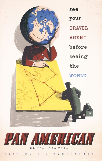
Lewitt-Him

Lewitt Him Pan American vintage travel Poster

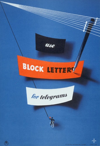
Manfred Reiss

Manfred Reiss vintage GPO poster 1950
GPO, 1950

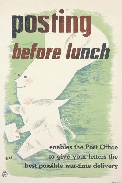
Hans Schleger

Hans Schleger vintage GPO ww2 poster posting before lunch
GPO, 1941

Hans Unger

Hans Unger 1951 vintage GPO poster
GPO, 1951

Together they make up pretty much half the content of this blog most months.  And I am sure that there are plenty more I have left out – please feel free to remind me who they are.

That’s all I am going to say for now, partly because this is quite long enough as it is, but also because I am in the process of working out what the story might be.  So if you have any thoughts on why British design became such an emigré profession, I’d love to hear those too.
Artist and Balloonist

Last time I posted about Royston Cooper, I was shocked just how little it was possible to find out about him.  To the tune of nothing.  Christies could give me his dates, but that was about it.

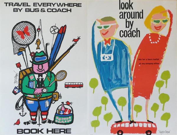
Royston Cooper bus tour posters from Morphets

But, his widow, Marie, got in contact with the blog to say thank you for mentioning him.  I asked her to write something about him, so that the next person to search would at least do better than I had.

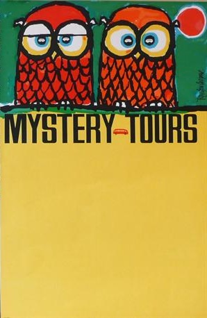
Owl mystery tours coach poster Royston Cooper

And she has, for which I am very grateful.

Royston Cooper 1931-1985 Designer/artist/painter/typographer.

Commissioned to design posters/prints/decorative drawings/brochures/annual reports/packaging/restaurant decor for major companies in UK and Europe. Always with a new approach.

Jovial character. Studio of 23 years in Belsize Park, London NW3.  Popular meeting place for clients and artists alike.

Also Balloonist flying his own balloon ‘Sunny Money’ G-BDBI in UK/France/Belgium/Germany/Sweden/Gordon Bennett races in the U.S.

I rather like the sound of him from that.

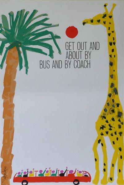
Royston Cooper giraffe coach poster from Morphets

Since I first wrote, Artist Partners have also put up a slightly more formal CV for him, which is great.  I’m really pleased that his life is now being recognised in proportion to the wonderfulness of the work.

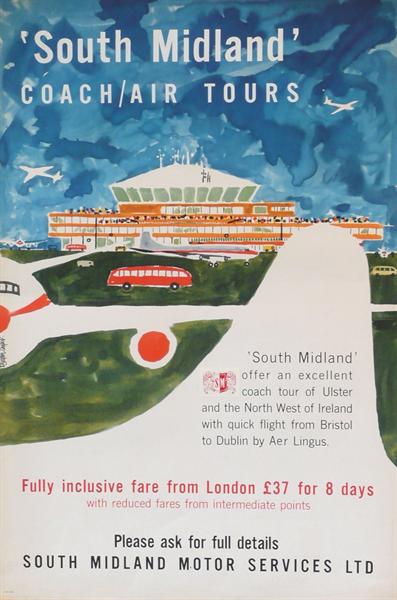
Air Coach poster Royston Cooper

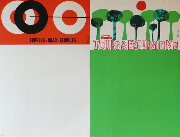
All the images, incidentally, are Royston Cooper posters which are on sale at Morphets in a few weeks time, and I’ve chosen only ones I’ve never seen before.  Don’t eat them all at once.

Two coach posters by Royston Cooper from Morphets

And now for something completely different

It’s very easy to reconstruct the past through the sensibilities of today.  We go back through the copies of Graphis and Modern Publicity, wade through the posters and the magazines that remain, only picking out the things that chime with us now.  And so we put together a story about the fifties which is about how a friendly kind of modernism finally caught hold in Britain.  But that’s not the whole story, just one thread out of the many different styles and designs that were going on at the time.

And why, you may ask, am I being told this once more?  It’s because I’ve found this website, a lovely tour round the work of illustrator Norman Weaver, put together by his daughter.

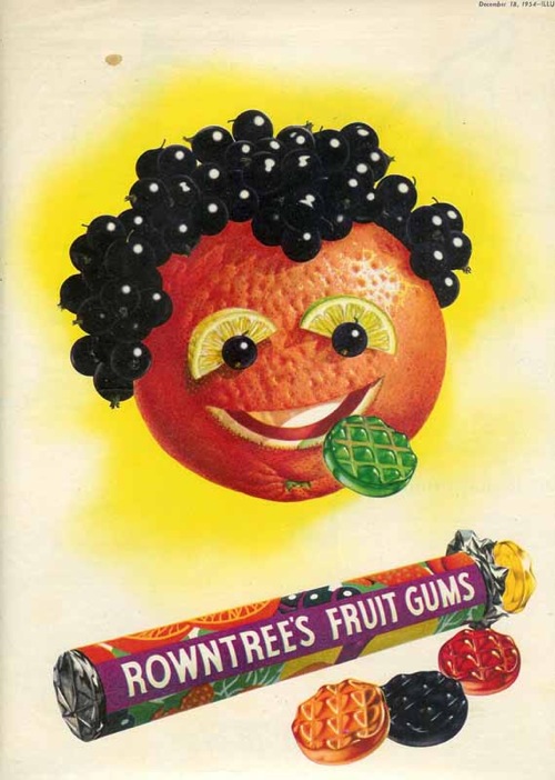
Norman Weaver Rowntrees fruit gums advertisement

The website would be worth a visit for Weaver’s biography alone, which includes training as a cabinet-maker for Heals, being General Eisenhower’s personal map-maker during the war, becomng an official photographer during the aftermath of the concentration camps and finally settling down to a career as a a still life artist.  And he worked with Beverley Pick for a while too, creating giant murals for the Festival of Britain.  It’s enough for five lives, and well worth a read.

Norman Weaver Heinz advertisements

But the other reason to take a look is that Weaver’s work is important.  If you flip through any magazine of the period (and I can speak with some authority here, having been required to read both Woman and Woman and Home right through from 1949-1963 in my time) they are full of these kinds of slightly hyper-realistic illustrated advertising.  And Weaver was one of the very best exponents of this style.

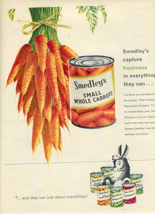
Norman Weaver Smedleys advertisement

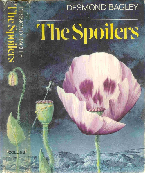
He was represented by Artist Partners, and like many illustrators of the period did a lot more than just advertising.  There are some very recognisable book jackets too.

Norman Weaver book cover for the spoilers

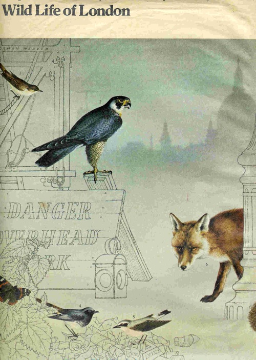
As well as some beautiful wildlife illustrations – these were for a Sunday Times article about wildlife returning to London.

Norman Weaver London wildlife

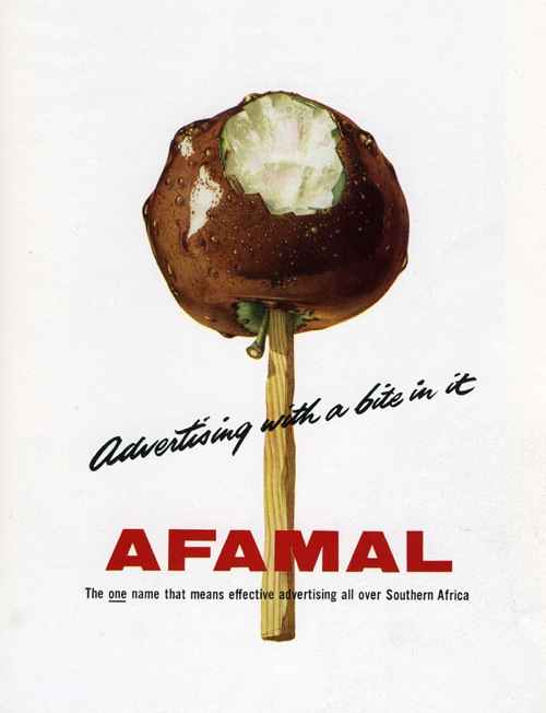
But it’s still the commercial and advertising drawings that are the most compelling for me.

Norman Weaver Afamal advertisement

I think that’s because they tell another one of the really important stories of the time.  While the architects and the designers were all busy embracing Scande-lite modernism, with its wide plains of wooden floors and less is more ethos, for an awful lot of people the opposite was true.  More was very definitely more.

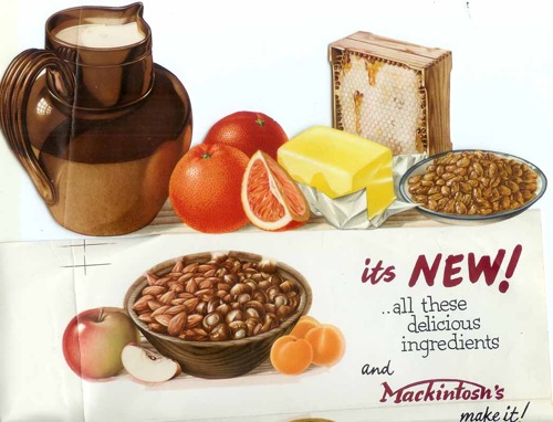
Norman Weaver mackintosh food ad

The rising tide of consumer goods in the years after the war must have seemed almost impossibly abundant after rationing, utility and bombs, a time at last of fridges, colour and as much food as you could want to eat.

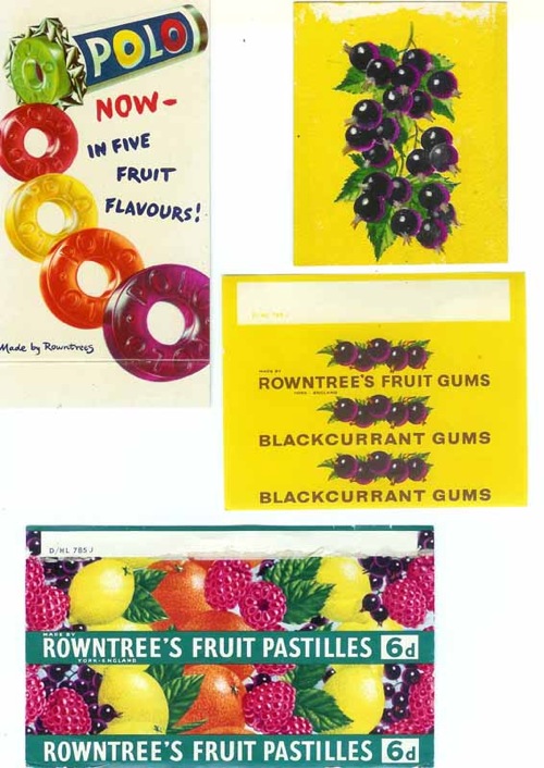
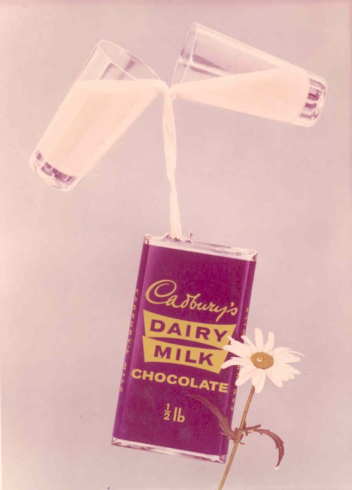
Weaver’s drawings celebrate this bounty in all of its vibrant, glistening detail.

Norman Weaver sweet wrappers

It’s impossible not to look at the past through the lens of the present, and I know that one of the reasons I like these illustrations is the fantastic colour and optimism – the latter in particular isn’t something you often find in modern design.

Norman Weaver Cadburys Dairy Milk

So all I’m really doing is telling another, slightly different story about what things looked like fifty or sixty years ago, it’s not any closer to the truth than any other.  But it’s a start.

Trouble with Harry

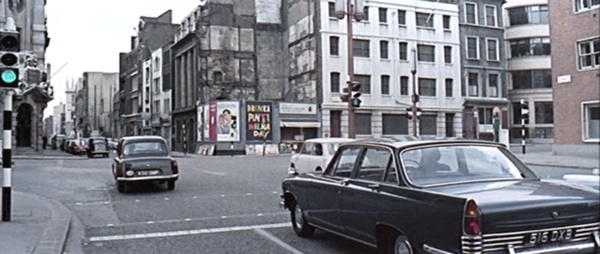
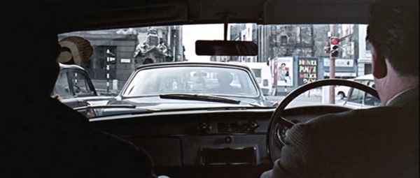
When I posted the still from the Ipcress File with Patrick Tilley’s Drinka Pinta Milka Day poster in it, I thought it was just an amusing chance to see a poster in situ.

Ipcress File screen shot 1

What I didn’t know was that I’d stumbled on a coincidence of hilarious and ironic proportions.  Patrick Tilley wrote to give me the full story.

Thanks for your last two posts. Who was the sharp-eyed fan who noticed the poster in the Ipcress File? Clever stuff.

Just by the by, I was at the time and for several years later closely involved with Len Deighton who I chummed up with when he was briefly represented by Artist Partners – and involved somewhat disastrously with the Ipcress File in its scripting stage.

Len had received the draft script which he hated and asked me to write an assessment of it (as withering as possible). I did so on the promise that it would be “for his eyes only”. So I took a fairly strong line but still a professional one.

What I did not expect was that he would pass it to Harry Salzman (then a movie mogul and partner in the Bond Films with Cubby Broccoli. They didn’t come bigger). I got a call from Harry to come and see him that evening at his house in Mayfair re the script and went with high hopes of a promising career in the industry.

Wheeled in to his presence I was confronted by Harry in statesman-like mode who demanded how “a member of the public” (me) had obtained a copy of the script to which I had no right and that he, the director and scriptwriter had been so offended by my critique that they had no wish to work with me and prophesied I would never ever work in the industry again!

Taken totally by surprise I was lost for words but felt unable to defend myself by saying Len had given me the script and asked me to critique it. (Industry phrase). Basically because with Len – having cut a three-picture deal – was on the verge of making it big.  I didn’t want to jeopardise his position. Result, I was ushered out into the night – feeling I had been run over by a bus. Bla, bla, bla…

With hindsight, the situation was completely illogical. Since Len had given him my assessment, he obviously knew how I had acquired the script. I think it was some kind of a test. What I should have done was to stand my ground and respond with a few expletives to show I wasn’t prepared to take any s***.

Looking back, it is hard to understand the awe in which he and Cubby were held by anyone connected with the industry. There’s an  ironic postscript to this story  The screenplay as filmed incorporated several of the recommendations I made in my report to Len.

But, hey – that’s showbiz. I did go on to write screenplays but those stills from the Ipcress File brought back the memories of that encounter. Definitely a night to remember.

I wonder how impressed Harry Salzman would be to know that he’d immortalised one of Patrick’s posters in the film.  Not very, I suspect.

Ipcress File screenshot 2

Sell me something, please

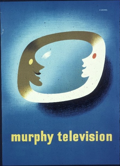
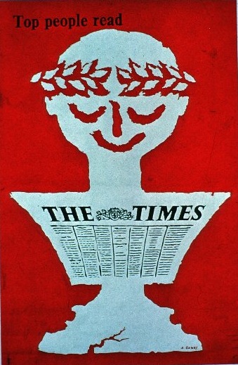
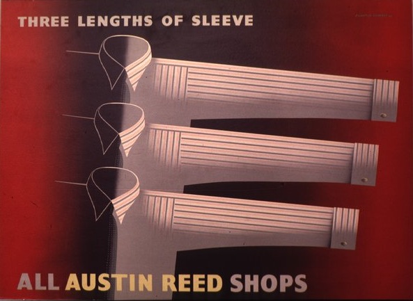
As mentioned earlier this week, I was wandering around the Design Council Slide Collection at the weekend.  Actually, wandering probably isn’t the right word, because I was on a mission.  I was looking for some examples of good commercial design – i.e. nice graphics which want to sell me something other than a railway journey, and I thought that this might be one place where I would find some.

As it turned out, there were only a few, like this 1950 Abram Games design for Murphy Television,

Abram Games poster Murphy television 1950

and a later, 1962, poster of his for The Times

Abram Games poster The Times 1962 Design Council Slide

There’s also a nice Eckersley Lombers advertisement for Austin Reed (1939) which I hadn’t seen elsewhere.

Eckersley Lombers sleeve length advertisement Austin Reed Design Council Slide 1939

But that, dear readers, is about it.  And so I am still left pondering the question that sent me to their archive in the first place.  Where, oh where, has all the commercial design gone?

It was looking at the AP brochure which made me think.  So much of what was in there was commercial graphics – posters for everything from Carnation Milk to Mazda, Gillette and WH Smith.  But these posters just don’t seem to survive at all.  Mr Crownfolio and I have just six posters that I’d count as commercial advertising.  (To put this in perspective, we seem to have nearly 50 GPO posters…  I am as surprised as anyone to find that out)

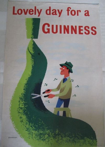
Furthermore, four of the six are for Guinness, whose posters seem to be an exception to the general absence as there are plenty of them about. (Why did they survive?  Could people buy them as art at the time?).  This Eckersley from 1957 is probably my favourite.

Tom Eckersley vintage Guinness poster 1957

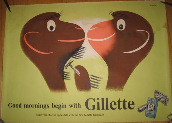
While this Eckersley is the only post-war advertising poster that we own.

Tom Eckersley Gillette vintage poster 1945-49

So where did they all go?

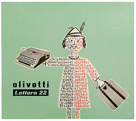
What makes their disappearance even more peculiar is that on the Continent, these advertising posters survive in droves.  Just a quick search on Savignac turns up more examples than I can rightly squeeze into one blog post.

Savignac Olivetti poster 1953

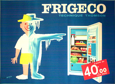
Savignac Fridgeco ad 1960

I particularly like the 1960 Fridgeco one for having a price, in just the same style as a modern French poster.

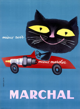
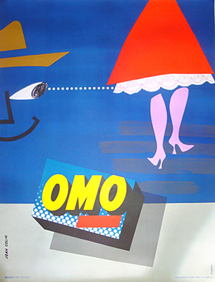
The same is true if I search for Jean Colin.

Jean Colin Marchal cat vintage poster

Jean Colin vintage OMO ad

And I’m sure I could achieve the same kind of results for most Continental poster designers.  So why did only ours disappear, when all of these were kept?  I am very bemused indeed and can’t come up with a ready answer.  Perhaps someone out there knows.  (If, of course, you are sitting on a large horde of British advertising posters, please do get in touch as well, I’d love to meet you…).

This good design, it’s just not British

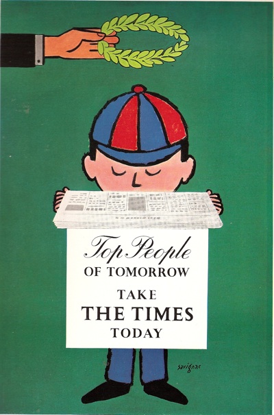
I haven’t finished with the Artist Partners AP2  brochure/catalogue/thingy, not yet.  There’s a large chunk of its content that I’ve been ignoring so far, and that’s the sheer number of foreign designers who are represented in the book.  Designers like Savignac, for example.

Savignac times poster Artist Partners brochure

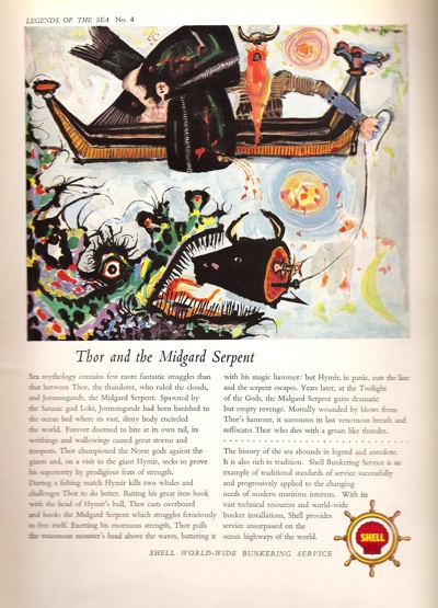
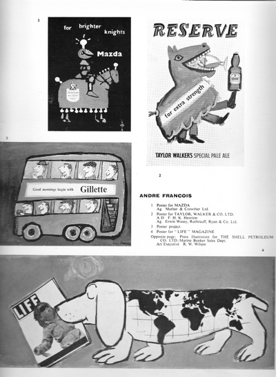
Or Andre Francois.

Andre Francois shell ad from Artist Partners book

Now in itself, that’s perhaps not so surprising – it’s good for Artist Partners and good for the designers.  But it leads to a couple of interesting thoughts.  The first is that these renowned designers are clearly working for UK agencies and firms as well as in their own country, which I didn’t know.  These two images above aren’t the only examples, the book contains plenty more in black and white.

Here’s Francois working for Mazda, Gillette and Taylor Walkers Ale.

Andre Francois advertising in Artist Partners brochure

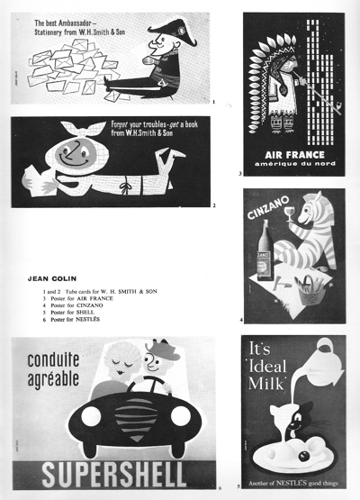
Then Jean Colin for WH Smith and Nestle, as well as in French.

Jean Colin from Artist Partners Book

I haven’t turned up any examples of these designs anywhere else, even though all three artists are highly collectable, which once again shows how much our view of these graphics is based on the very partial sample of what has survived.

On top of this, it is also surprising just how many foreign designers there are in AP2.  On top of those who mainly lived and worked abroad, (and the AP book also includes Herbert Leupin, Donald Brun and Saul Bass), several more of those represented are emigres who came over as a result of the war – designers like Hans Unger and George Him.

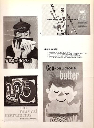
There’s also Heinz Kurth, who gets a double-page spread in the book and may well belong in this category too.

Heinz Kurth from Artist Partners book

He also did the really excellent photography illustration that I’ve illustrated before (currently pinging its way round the web thanks to Martin Klasch)

Heinz Kurth image for AP2 book

But I can’t seem to find out anything more about his story and whether he actually worked in Britain or not – I’m guessing he did from the AP images, which are pretty much all British.  He did also do this.

Heinz Kurth film poster for Norman Wisdom Just My Luck

which does rather suggest he was based in the UK, and which you could buy if you wanted for just £100,  a bit of a bargain if you ask me.

Which leads me to a further, bigger conclusion, about just how much modernism really was a foreign import  in Britain.  But that’s another thought for another post, not least because there are a few books I need to read before I stick my opinions on the line.  If you’ve got anything to say on this, please do let me know.