I was planning to do a random image amnesty today, which would have been a collection of fabulous posters that I have picked up but not managed to jemmy into a blog post, and which are all now idly shuffling their feet in the great image waiting room which is my computer desktop.
Except I’m not going to, because this one was first.
Which meant I got distracted by thoughts of just what a great designer Royston Cooper was and went off to explore. So now this post is made up of what I found along the way.
Mostly this was lots of lovely posters. Like these from 1962, 1959 and 1962 again.
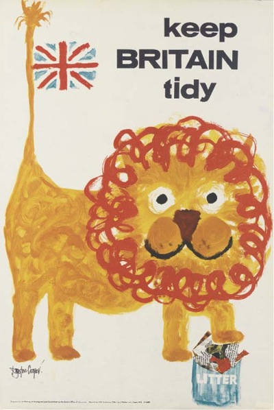
He’s probably best known for his Keep Britain Tidy posters. This one from 1962 is the one you find most often,
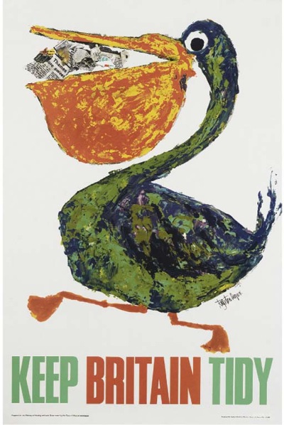
including at the bottom of our stairs. But the later (1965) pelican is also fine.
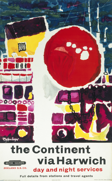
What’s intriguing about searching for him online is that, unusually, the vast majority of results came from auctions. There are a few pieces of his work in the NRM collection including this 1960 poster. Sailing from Harwich has never looked so glamorous.
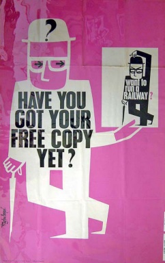
And there’s also this slightly grim NRM image of another great design.
1962 again. Must have been a vintage year for him.
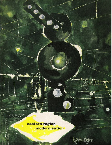
This railway brochure (an object which combines both railwayana and ephemera and thus is very frightening to me indeed) came from a railway flickr set.
But that’s about it. And there’s nothing written about him either, literally all I know are his dates, 1931-1985, and even those are from Christies.
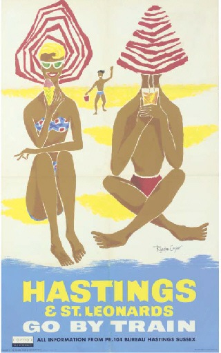
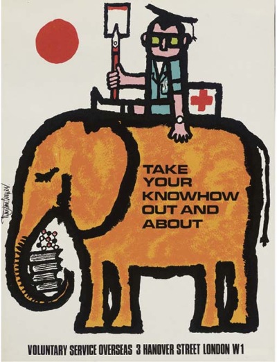
Even without information, though, people must like him because his work certainly sells. The Hastings poster above went for over £1000 at Christies four years ago, and they’ve sold lots of other posters that just don’t appear anywhere else. Like this 1965 effort for VSO – and it went for £110, what a bargain.
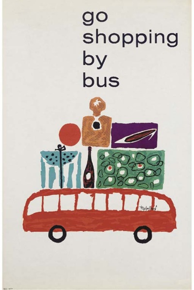
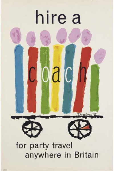
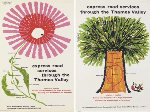
As well as this second lovely coach poster from 1958 (spectacularly modern for the date and costing a mere £192)
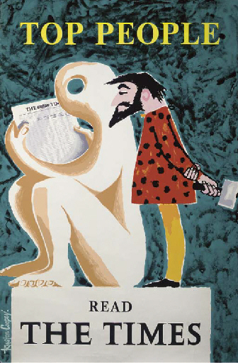
and this less characteristic piece of 1965 Times advertising as well which went for £300.
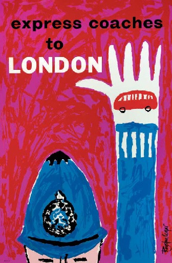
I’m going to try and find out a bit more background, but for now, here are some more coach posters to keep you happy while that happens. And if you do know anything about Royston Cooper at all, please get in contact, I’d really like to hear from you.
Pretty good post. I just came by your blog and wanted to say that I’ve really enjoyed reading your blog posts. In any case I’ll be subscribing to your feed and I hope you write again soon!
Glad you liked it! I’ll be back again next week, don’t worry
Dear crownfolio!
Just wanted to mention that you were mentioned in Coudal Partners – Fresh Signals. I hope it means a lot more people finds your great blog. Carry on. 🙂
Many thanks for that – and the kind words!
Dear Crown folio, I met up with Royston in London in the early 60’s, his larger than life presence and personality swept all before him although always claiming that his kidneys wouldn’t allow him to last long. I managed to keep up with him until the late 70’s just before my emigrating to Australia. His design for anything had the stamp of Royston, be it golf championships for Schweppes or restaurants, always seeming to use the talents of master ceramist Appicella. I could go on for ages but should you need more detailed anecdotes please do not hesitate to get in touch
Yours Tony Gregory
Hi,
Thank you for posting these prints!
Roy was my great uncle, and although he passed before my time, by the stories he certainly was larger than life!
Please feel free to reach out if you’re still interested in learning more,
Cheers,
Dom
Hi
Firstly, thanks for the Blog, it is an absolute favourite of mine and one I frequently refer back to.
I’m another great fan of Royston Cooper, and wondered if anyone can help answer a question.
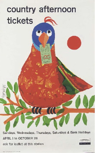
Many of his works, including almost all of those above, have a circular device, almost invariably red, that seems to act as a signature. Often it’s the sun, as in the Country Tickets or VSOE, or the well known Spain travel poster.
Other times it’s smaller and less obvious such as the polka dots on the bikini in the Hastings poster, or the destinations on the coach map (as well as the centre of the flower), or whatever the Lion is throwing away.
Sometimes it’s an integral part of the image, as in the eye of the sculpture, but often it’s standalone.
I’ve always assumed it’s just a neat and consistent signature device, but now rereading your blog, and the other comments, I wonder if it might be a stylised balloon?