Ceci n’est pas un crease

Everyone has spent their weekend listing posters on eBay, it seems.  Well, everyone except me.  But there is a something for almost every taste out there this morning.

Quite a bit of it is, however, somewhat battered.  Like this Tom Purvis poster, for example.

Tom Purvis 1933 Shell Oil poster kingfishers

This series has been mentioned on here before, as an example of the shift in Shell advertising from technical to natural.  Which it is, along with being by Tom Purvis.  So I really ought to like it.  But I don’t, not even a little bit.

Mind you, it’s in better condition than the next exhibit, this whole collection of posters in the States, apparently discovered in an attic in 1967.

Chester poster Claude Buckle 1930s GWR

Cotswolds vintage Ronald Lampitt GWR vintage travel poster 1930s

Ayr vintage LMS railway poster 1930s Robert Eddie

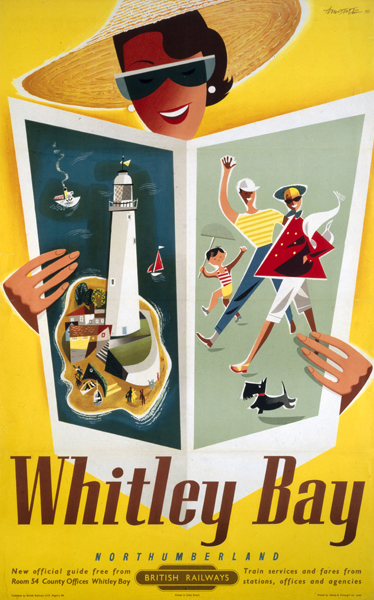
The three above are the classics, but my favourite has to be this one.

Bellevue Manchester vintage 1930s railway poster

In my head, I am now back in Manchester, to a soundtrack of the Smiths.  And I’ve never seen that poster before either, so it’s doubly pleasing.

These are all a bit spotted and chewed, but there are other ways to mistreat posters.

Clive Gardiner Country Houses vintage London Transport poster 1951

My eyes, my eyes.  It’s Out and About: Country Houses by Clive Gardiner from 1951, in case you can’t tell. Sadly there are several in this state up for sale, including Literary London by Sheila Robinson.

Sheila Robinson vintage London Transport poster Literary London 1951

Although the listings beg more questions than they answer.

Unfortunately this poster has been stored wrapped in an obscure way, which has left it too unravel as shown.
However there are no creases caused by this, so once framed or flattened out it will look good as new.

No, there are creases, I can see them.  Which leads me to suggest that it will take more than flattening to sort this out.

As is all the fashion these days, they’re all listed for £99, which I don’t really think they’re worth in this condition.  While the Peter Roberson below wouldn’t be worth that if if were flat, mounted on linen and offering to make me a cup of coffee every morning.

Peter roberson vintage London Transport poster, anniversaries 1972

Well, perhaps for the coffee.

There have also been a rash of Shell Educational posters turning up too.  A complete set of S R Badmin’s monthly Guide to Trees is available for the rather eyewatering sum of £350.

S R Badmin Guide To Trees shell educational posters April

Which compares rather unfavourably with both the full series of John Leigh Pemberton’s Life In… posters at just £1.99 each

John Leigh Pemberton Shell Educational Poster life in the corn

and also these six County posters, which have an even lower starting price of £1.50.

Shell County Guide educational posters Wiltshire

I wish I knew, for no other reason than my own satisfaction, what Shell educational posters were really worth.  I’ve seen auction houses really talk them up (although not always manage to sell them) while other auction houses won’t even take them these days.  So I shall watch these sales with interest and see if I can draw any conclusions.

Finally, someone other than us is selling Daphne Padden posters.  So if you’ve missed something you liked, here’s another bite at the cherry.

Daphne Padden granny Post Office Savings Bank vintage poster

These ones are also signed in pencil, as were some of the ones that we bought from her estate sale, so I wonder whether they too came from her own collection.  Perhaps I’ll email and ask.

Thick and Thin

This has been hanging around on the bookshelves for a bit, waiting to find a home.

Royston Cooper vintage coach poster lounging on bookshelves

Which is quite a tricky problem as I can’t exactly roll it up as it’s on card.  Fortunately I’m starting to quite like it where it is; it may be there for a while.

The design is by Royston Cooper and dates, according to Christies at least, from 1960.  Until the long one turned up on eBay, I’d only ever known the image in its upright form.

Royston Cooper Thames Valley flower coach poster in portrait form

But I think I prefer it reclining.  Here’s the whole thing for your delectation, and to enable you to consider just how little a coach trip from Worcester to Slough in 1960 would be as much fun as the poster.

Royston Cooper Thames Valley coach vintage poster in landscape long thin

All of which made me think about long thin posters.  Partly only so that I could post this, which is one of my favourite posters ever.

Atoms at Work vintage 1950s poster Sheffield Atomic Energy Authority

The entire 1950s encapsulated in a fifteen inch long piece of paper.  Genius.

Mr Crownfolio remembers that the seller told him this was produced for the Sheffield buses, but other  long thin posters turn up in a couple of places.

For example, the GPO produced strip posters for their vans.  At  51″ long, they were almost like till rolls and I’ve only ever seen them on the BPMA site.  Which makes this Austin Cooper, at a mere 6″ x 20″, a bit of a mystery.

Austin Cooper Vintage GPO poster Telegraph less 1944

It dates from 1944 so perhaps they were fixed to bicycles rather than vans.  Or something.

London Transport were the other home of strangely shaped posters, like this 1974 Harry Stevens that I think may have been meant for display on a bus stop.

Harry Stevens bus stop litter poster business man 1974

And this Eckersley from 1960 which the LT Museum site call a panel poster.

Tom Eckersley London Transport Panel Poster 1960 Lost Property

Which were meant for both buses and tubes, it seems.

Panel posters were produced for display in Underground car interiors, as well as on the inside and outside of buses and trams. Because they did not have to fit a standard frame or wall space, they are smaller than other poster formats and vary slightly in size.

And I imagine that because so many were pasted on, only a few survive.  That’s a shame really, because in many ways they are very manageable posters, much easier to find space for than some of their bigger cousins.  At least I hope that’s true, because we’ve bought another two from the seller of the Cooper, by Studio Seven and Lander this time.  More on those when they arrive.

Books and Canons

Right, back to the bookstacks once more.  In a way I’m rather pleased that there’s a backlog of things I need to write about, it shows that posters and graphic design are starting to be taken seriously.  But more than most, today’s book is both necessary and useful.

Paul Rennie GPO Poster Design book cover

It’s GPO Design by Paul Rennie, a neat guide to the posters of the GPO.  Evem better, it’s reasonably priced and available.  That doesn’t sound like much to ask, but in this case, it’s about time.  Because until now, the only book ever written on GPO design was published by a private press in a limited edition, and went for £320 at auction the last time I saw a copy.  Which makes me particularly grateful for this.

What you get is a fairly straightforward run through the history and structures of the GPO as it affects poster design, the varying kinds of GPO posters and what they were meant to achieve, and a look at some of the artist and designers who worked on the campaigns.  Plus of course, lots of lovely posters to look at.

Tom Eckersley vintage poster Please pack parcels very carefully GPO 1957
Tom Eckersley, 1957

It’s simple, but given that absolutely nothing else is available, it’s exactly what’s needed.

So, for example, I now know why so many GPO schools posters survive compared to the commercial campaigns: they were sent out in their thousands to schools, where they were so much more likely to be kept, or at least thrown to the back of a cupboard, compared with the ones sent out to Post Offices.

John Armstrong vintage GPO educational poster 1937
John Armstrong, educational poster, 1935

Although, I have to say, I don’t find the designs of the school posters half as satisfying as the commercial ones, as they have a tendency towards the dreary.  The only exceptions being the McKnight Kauffer ones, which are rather fine.

McKnight Kauffer, vintage GPO educational poster 1937
McKnight Kauffer, educational poster, 1937

The book has provoked me to some thoughts, though.  Although they’re not really criticisms of the book itself, as it is meant to be a brief and straightforward run through.  My target is probably more design history as a whole, as reflected in this particular text.

What is starting to bother me is the existence of an established hierarchy of designers.  At the top of the tree are those who were also fine artists.  The chapter on individual designers here begins with Paul Nash, and moves on to ‘fellow member of Unit One, theatre designer and surrealist’ John Armstrong’, only later moving on to the poster designers themselves.

Implicit here is the idea that design itself is not enough, it is better (whether that is aesthetically more pleasing or simply more worthy) if it has been touched by the hallowed hand of fine art.  Alone, it does not deserve the attention.

Perhaps it is possible that posters designed by artists are generally better, although I’m not sure I subscribe to this point of view.  But where it really gets irritating is the continual reproduction of this Vanessa Bell design.  It turns up everywhere that GPO design is discussed.

Vanessa Bell unused post office design 1935

Now, this is a failed poster.  It was rejected by the GPO and never used.  Even Bell herself didn’t think the design worked.

I don’t know why it has been so, but for some reason it has taken me ages to do anything I thought would do at all – I think partly because of the difficulty of getting several figures into a small space and yet making them tell at a distance. I have stood about in Post Offices until your employees looked so suspicious I had to leave! – and yet I don’t know that in the end what I have done has much resemblance to a Post Office. However, there it is…

Letter from Vanessa Bell in BPMA archive, quoted in essay by Margaret Timmers

It is possible to see the design as an example of where art and commercialism failed to meet, and Rennie does discuss it in this context briefly.  But I don’t think that this alone is enough to account for its ubiquity.  Because this isn’t just art, it’s Bloomsbury art.  And Britain loves the Bloomsberries, to the extent that it can skew our critical and historical judgement sometimes.

But even when we get the artists out of the way, the book still chooses to comment on the prevailing list of designers, from Austin Cooper and McKnight Kauffer at the top, then moving down to the post-war brigade of Eckersley, Henrion, Schleger et al. (How and why this canon has developed is an interesting question and one I’ll come back to another day as this post is already quite long enough as it is.)

Hans Schleger vintage GPO poster design 1945
Hans Schleger, 1945

Partly this annoys me because I got my critical grounding in English Literature during the late 1980s, where any belief in the Canon of Dead White Males was to be stamped on as a sign of a backward and outmoded way of thinking.  I’m probably not so extreme about it now, but the ingrained urge to stamp hasn’t quite gone yet.

But again, I also think that it can get in the way of us seeing what is really there.

Pieter Huveneers vintage airmail poster 1954
Pieter Huveneers, 1954

Because one of the joys of the GPO Archive is that they commissioned a wide range of artists, some of whose work I’ve never seen anywhere else.  (The illustrations of the book do reflect this, by the way.)

For example, I was furtling around in there this morning for another reason altogether and came across this, which I have known and liked for ages.

Derrick Hass postcards crab vintage GPO poster
Derrick Hass, 1954

It’s by Derrick Hass, who also did this Christmas design, as seen on here before.

Derrick Hass shop early post early vintage GPO Poster holly

Now it turns out, after I got curious, that Derrick Hass went on to have an extraordinary career in advertising, working as an art director in most  of London’s top agencies for almost forty years, and winning prizes for his work into the 1990s.  His life and work is an important part of graphic design history, and one I’d like to know more about.

But if we only keeps looking at what we already know, histories like that will fall by the wayside.  So it’s fantastic that one book on GPO Design is at last available, but now we need a much bigger one too.  One which tells all the stories.

Over-modern and over here

An interesting comment appeared a week or so ago on a older post about Beverley Pick.

He was a man.  Bless him… He was my uncle and a very clever man..He also did the original Moby Dick… Beverley was originally from Austria and lived many years in Sunningdale during the winter. Autumn he would visit his House in Cork and in his latter years he and his wife would live in France where they had a gorgeous home. He is now buried in the Churchyard at Sunningdale. There was so much to this man we will never know it all…

I’ve written to Odile Walker, who posted those intriguing memories, and I hope she’ll come back and tell us more.  But in the meantime, one thing that I never knew stands out.  Despite his British-sounding name, Beverley Pick was an emigré from Austria.

Beverley Pick pig waste vintage WW2 propaganda poster
Beverley Pick, WW2 poster

Now, I’ve been thinking for a while about the degree to which post-war British graphic design was shaped by people who were one way or another foreigners. There are so many of them that it would be hard not to really.  But finding that this is also true for Beverley Pick has pushed me into action.

So here is a roll call of as many emigré designers as I can think of who worked in the UK in the decade or so after the war.  It’s an impressive selection. With, for no particular reason other than that’s the way it turned out, lots of GPO posters as examples.

Andre Amstutz

Whitley bay poster Andre Amstutz vintage british railway poster
British Railways, 1954

Dorrit Dekk

Dorrit Dekk vintage GPO wireless licence poster 1949
GPO, 1949

Arpad Elfer

Arpad Elfer design for DH Evans poster 1954
D H Evans, 1954

Abram Games

Abram Games vintage London Transport poster at your service 1947

F H K Henrion

Henrion Artists and Russia Exhibition 1942
1942

H A Rothholz

H A Rothholz stamps in books poster vintage GPO 1955
GPO, 1955

Pieter Huveneers

Pieter Huveneers fleetwood poster 1950 vintage railway poster
British Railways, 1950

Karo

Karo vintage GPO soft fruits by post poster 1952

Heinz Kurth

Heinz Kurth design for Artist Partners brochure divider
Artist Partners

Lewitt-Him

Lewitt Him Pan American vintage travel Poster

Manfred Reiss

Manfred Reiss vintage GPO poster 1950
GPO, 1950

Hans Schleger

Hans Schleger vintage GPO ww2 poster posting before lunch
GPO, 1941

Hans Unger

Hans Unger 1951 vintage GPO poster
GPO, 1951

Together they make up pretty much half the content of this blog most months.  And I am sure that there are plenty more I have left out – please feel free to remind me who they are.

That’s all I am going to say for now, partly because this is quite long enough as it is, but also because I am in the process of working out what the story might be.  So if you have any thoughts on why British design became such an emigré profession, I’d love to hear those too.

Number 20

It could only really be this today.

Lewitt Him vintage GPO poster 1941 post early

Which is by Lewitt Him and dates from 1941.

As has been pointed out in the comments, the last posting day on all of these posters has been a very consistent 20th December throughout, even in wartime, which is very British and reassuring.

But what intrigued me is that there is no mention of first or second class post – just different posting days for parcels or cards and letters.  So I asked the BPMA, who told me that first and second class was only introduced in 1968.  I’d always thought – that like first and third class railway carriages – it was the invention of the Victorians.  But now I know – better informed thanks to the internet (and the lovely postal archive people).

Don’t panic though, in this modern age of segregated post, you can still get your first class items off tomorrow.

Door 19

Hans Unger yesterday, Hans Unger today.  The GPO certainly kept him busy in the 1950s and 60s.

Hans Unger vintage post early poster GPO 1958

He designed this in 1958, and very lovely it is too.  But please don’t set fire to any post boxes on its account, that would be very inconsiderate.