Operator, I can’t find anything

I’ve been meaning for a while to do a series of posts looking at the different archives that sit out there on the web, just waiting for you to rummage through their files of wonderful vintage posters.  These resources have exploded in the last few years, and it’s now easy to find out incredible amounts about the history of posters without ever leaving your chair – the kind of research that would have taken years and many many train journeys in the past, even had it been possible at all.  So, while the archives may not be making me fitter, I am certainly now both better off, and considerably more informed than I would otherwise have been.  Hurrah for the internet.

My thoughts were that I’d start with one of the straightforwardly brilliant ones, like the London Transport Museum catalogue – a complete itemisation of every poster and artwork they own, image-led, designed for users rather than museum curators.  But in fact, I find myself wanting to begin with two really quirky ones.  So today’s is the BT archive, which until a couple of weeks ago, I didn’t even know existed.
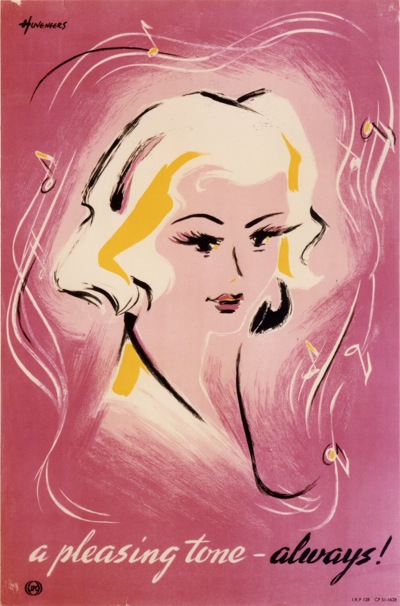
Pieter Huveneers Telephone poster
Pieter Huveneers, c1950.

The archivist at the BPMA very kindly pointed me in their direction, because the two collections are separated siblings.  When British Telecom was split off from the GPO in 1980, they got the posters about telephones and telegraphs, and the Post Office got the ones about letters.  But the artists, the poster sizes and even the cataloguing systems are very much the same.

Hans Schleger vintage GPO poster
Zero, 1944, TCB 319/PRD 375

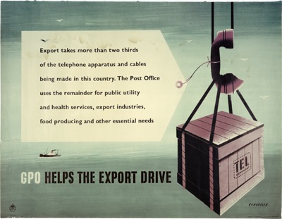
That, sadly, is where the resemblance ends.  The BPMA catalogue interface is lovely; it’s reasonably intuitive, I can find what I am looking for with some confidence, and all of the pictorial material is illustrated.  The BT catalogue is, if I am entirely honest, a pig.  The search logic follows its own rules, there is a wierd link called “ContextRef” which throws up an apparently random list of related material (which then defaults to the search page if you click on anything), and, worst of all, only about 10% of the material is illustrated.  What’s particularly annoying about that is that, in researching this, I’ve found a company who claim to have had the contract to digitise the entire BT archives.  So where have all these pictures gone then?  Although, on the plus side, I did find this 1948 Eckersley on their blog, and I swear I’ve never seen it before (if you have, please do say in the contact box below).

Tom Eckersley GPO vintage poster export drive

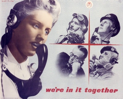
But, as you can see, I have spent rather longer than I intended sifting through page after page of slightly dry records (I don’t, I have to say, like reading catalogue numbers) in search of the few illustrations that do exist.  Because the few that are there are wonderful. This wartime Henrion is particularly wierd  – I’d like to find out more about him, some of the images are really quite disconcerting.

Henrion WW2 vintage poster GPO telephonist

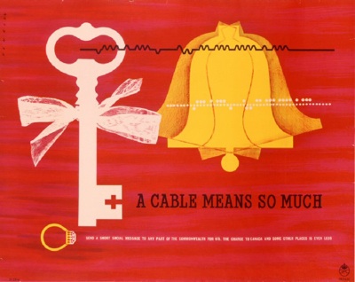
Although this one, from 1951, is quite benign.

Henrion vintage poster GPO cable 1951

Then, after the best part of an evening reading ContextRef numbers and swearing, I found out how to buck the system.  Some, and quite possibly all the images are available through the BT image sales website.  Which is organised by picture, and theme, making finding images less of a needle in a haystack hunt.

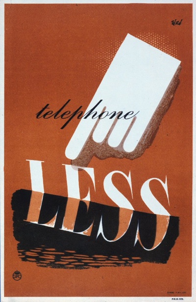
Reiss telephone less vintage gpo poster
Reiss, 1945

There are disadvantages, like the fact that there are rather more pictures of trimphones and Busby than there are posters, and the images are watermarked..  But it does at least, in the advertising and wartime sections, give you a rough overview of what kind of posters the GPO was producing and whether or not you might want to look at some more.

This isn’t the first time I’ve used the image sales get round; for a long time, the only way to find out what posters the National Railway Museum held was to go via the Science and Society website.  The NRM now do have a searchable online catalogue (of a railway buff kind) which is better than the slightly random selection that Science and Society used to dole out.  But if you’re searching an archive through image sales (do you hear me V&A as well?) it’s a sign that they could, possibly, do more towards making them available on the web.

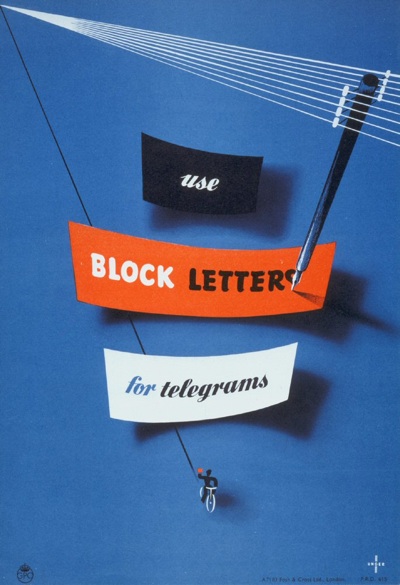
Moan over.  So here’s one last nice poster to cheer ourselves up, a faultless Unger from 1951.  Pip pip.
Mr Huveneers, I presume

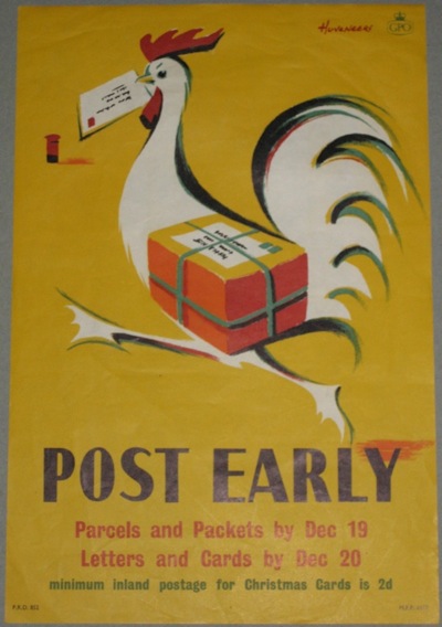
Unless you have studied GPO posters with a rather unnatural intensity, you probably wouldn’t know the name of Peter (or possibly Pieter) Huveneers.  But it’s worth making his acquaintance.  He designed a whole series of delightful posters for the Post Office throughout most of the 1950s.

Huveneers vintage GPO poster post early

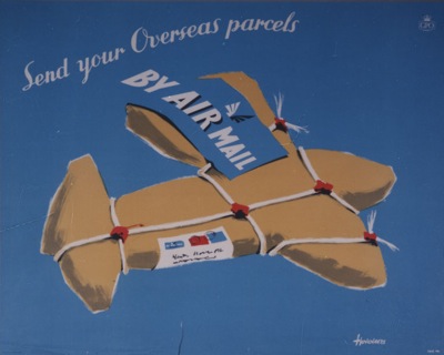
The BPMA have about 20 of his designs catalogued, including this gem.

Huveneers air mail GPO poster from BPMA

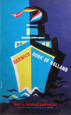
And he also worked for British Railways into the early 60s.

Huveneers Harwich Hook of Holland poster

Until 1963, when the last piece of design I can track down is a British Railways poster in the National Railway Museum collection.  And then he disappears.

Fast forward to 1968, when another designer called Pieter Huveneers sets up a design company in Australia.  Now, if you’re Australian and of a certain age, Pieter Huveneers is a big name.  He’s the down-under equivalent of Wim Crowel or Hans Schleger, a designer who shaped the fabric of everyday life.

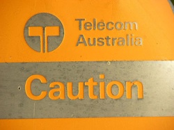
Huveneers’ work is still written all over Australia.  He designed the logos and identities for two of Australia’s national institutions, Australia Post and Telecom Australia when they were created in 1975.

an australian stamp

telecom australia sign

(The Australia Post logo, with its neatly incorporated post-horn is still in use, although slightly rejigged in recent years.  Telecom Australia rebranded itself as Telstra in 1995).

He not only designed the logo but also created the name of the bank which emerged from Australia’s biggest ever bank merger in 1981, when the Commercial Bank of Australia and the Bank of New South Wales became something much more modern and international.

oz bank logo

And completely rebranded one of Australia’s iconic breweries, Tooth – this is his logo design from 1981.

tooth brewery logo

And that’s just what I’ve been able to find out about from the other side of the world, I’m sure there’s more as well.

The thing is, I have no way of proving that this is the same person.  The dates add up, and the Australian Pieter Huveneers was born in c1926, which gives him plenty of time to be designing GPO posters before emigrating to Australia, and the chances of there being two of them in the design world at the same time have to be pretty slim anyway.  But is it or not?  I can’t say for sure.

But I seem to have reached the limits of what I can find out without being either a) Australian or  b) within easy reach of the British Library.  So if there are any Australian design historians out there who are able to tell me a bit more about him and his design studio, I’d really love to hear from them.  As far as I can tell, he’s still alive too, so perhaps he might be able to answer the question of whether or not he designed those posters himself.  Hope so.

Something fishy going on

Now here’s a thing.  To be precise, it’s a website about Macfisheries, full of pictures of pre-war shops and employee reminiscences.  But it’s also got a fair smattering of the work of Hans Schleger, who designed pretty much the entire corporate identity for the food chain throughout the 1950s, from shop layout to packaging design and advertising.

To whet your appetite, here are some packaging designs (photos from the Hans Schleger exhibition at the V&A in 2007).

Hans Schleger strawberries packaging Macfisheries

Hans Schleger shrimp packaging Macfisheries

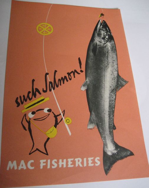
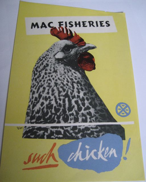
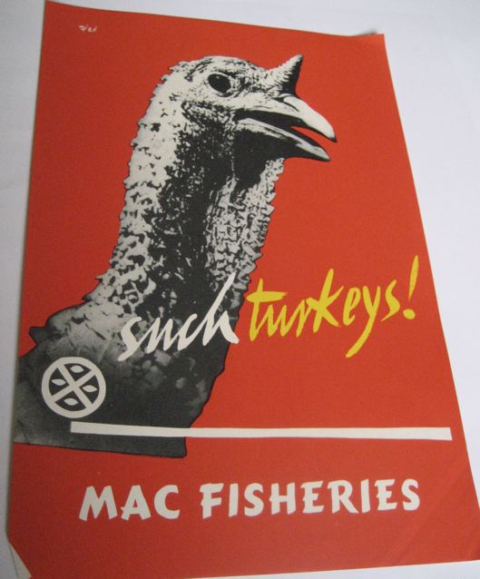
But what I really wanted to draw your attention to are the brilliant in-store posters that Schleger and his studio designed to be displayed in the shops.

Hans Schleger salmon Macfisheries poster

Hans Schleger chicken vintage poster Macfisheries

Macfisheries Hans Schleger turkey poster

I want to buy salmon, turkey and chicken right this minute.  From a beautifully-designed shop please.

But these posters have got me thinking.  Because I have never, ever seen one of these in the wild – at an auction or on eBay (and if anyone has, there’s a comments link below where you can tell me all about it at the bottom of this post).

One of the reasons, I suppose, that railway posters and London Underground posters have ended up being so collectable is that they are out there to be collected in the first place.  Both the railway companies and London Transport did sell contemporary editions of their posters*.  So pristine copies – however few – were kept and framed and had at least a fighting chance of surviving for longer than the duration of the advertising campaign.

Whereas, I’m guessing, the Macfisheries posters were put into a wet and rather smelly bin at the end of the week or month.  And so now next to none survive, apart from perhaps the few above and those that Schleger himself kept and which are now at the National Archive of Art and Design (about whom I am going to grumble at length one of these days as they are absolutely inaccessible online).  I’d imagine that as a result, they are quite valuable; then again, it might work the other way, as there’s no established market in them.  I rather doubt that though.

* I once saw on eBay a 1930s poster advertising that London Transport posters could be bought at their 55, Broadway headquarters.  Not only did I fail to buy it, I didn’t even keep an image of it, and now I can’t track it down at the London Transport Museum.  Any clues, anyone?

Modernism to go

Right now, you can pick up the bargain of the year so far on eBay.  It’s this:

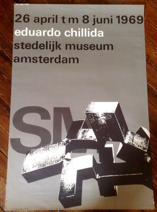
Wim Crouwel vintage poster stedelijk museum

and this

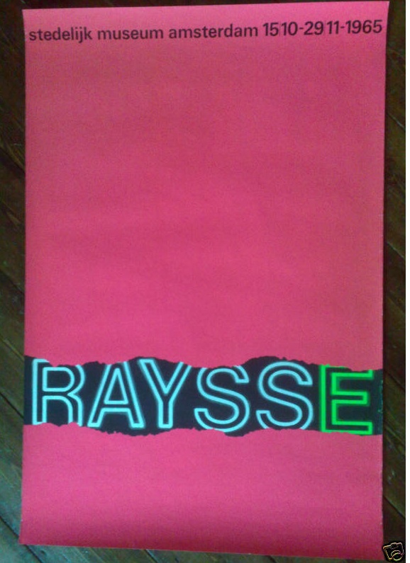
wim crouwel vintage poster raysse museum

and also this

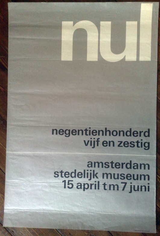
wim crouwel vintage poster 3 stedelijk museum

In fact it’s five posters designed by Wim Crouwel for the Stedelijk Museum in Amsterdam in the 1960s, and as I write, they are currently going for under £10 for the lot.  Which is madness.  They’d be a bargain just for five anonymous pieces of good design, but for five pieces of Wim Crouwel’s work, it’s a crime.

We simply don’t have designers like Crouwel here in the UK.  This isn’t only because we didn’t do this kind of formal, grid-based, type centred modernism.  (To get a sense of how mainstream it was in Holland, just imagine the British Museum or the V&A commissioning a poster like this in the 60s, and then go and have a lie down to clear the resulting headache.)

It’s also because, for some reason, very few designers in this country have achieved the ubiquity managed by Crouwel.

“It was actually quite difficult to avoid Wim Crouwel’s work. In the 1960s the Netherlands was inundated with posters, catalogues, stamps designed by him, even the telephone book.”
– Karel Martens

Who can match this?  Abram Games did design the Festival of Britain symbol, it’s true, but he hardly styled the entire 50s.  Perhaps Hans Schleger is the only one who can come close* – with his work for Libertys and MacFisheries (of which more later), the John Lewis logo and even the London Transport bus stop roundel to his name, it would have been easy to live, travel and shop in a Schleger-shaped world.  But did many people ever notice they were doing this? I rather doubt it.

Anyway, this is a bit of a distraction from the business in hand, which is that there are five brilliant pieces of design for sale for not very much money at all so far.  Proof that eBay can still come up with the goods sometimes.

*I am disregarding Pentagram as I find most of their designs a bit safe and dull.  Perhaps I was living a visual life shaped by Pentagram in the 1970s and 80s, but if I was I didn’t care much either way.  But if you think I am in need of correction on this – or you’ve got a better example – please do say.