East Wind (blustering)

A while ago, I wrote about John Griffith’s fantastic drawings of shop-fronts for Motif.  Which are so good that they can easily stand a bit of repetition.

Motif 3 art journal of brilliance front cover by John Griffiths

Even a bit more.

Motif 3 John Griffiths shopfront pictures Fratelli Camisa

They’re so wonderful that I not only wanted to find out more about him, but also wanted to see some more of his work, without much luck.  Mr Crownfolio got on the case, though, and we don’t yet have anything like a biography, he has turned up these three BBC Schools booklets.  This one dates from 1968, and is the most reminiscent of his Motif drawings.

John Griffiths 1968 BBC Schools Time and Tune booklet front cover

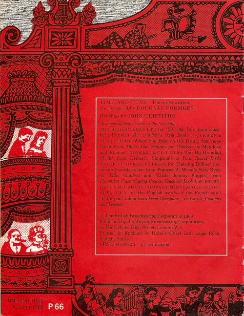
This theatre and orchestra could easily have come from Motif.  Here’s its other half.

John Griffiths 1968 BBC Schools Booklet Time and Tune back cover

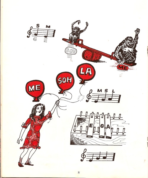
Nothing inside is quite as good as that, although I do quite like this scratchy little set of musical drawings, which remind me a bit of Barbara Jones, not least in the seemingly random way they’ve been put onto the page.

John Griffiths 1968 BBC Schools Booklet Time and Tune

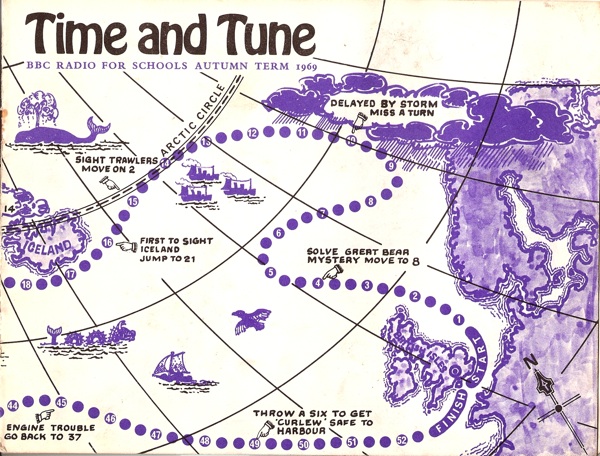
He was also commissioned to produce another the next year.

John Griffiths BBC Schools Booklet Time and Tune 1969 front cover

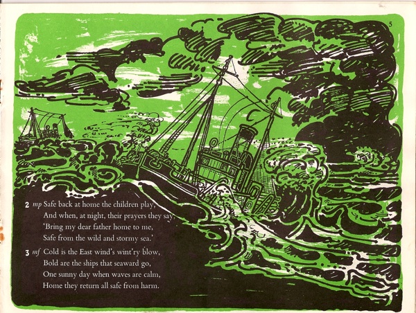
I particularly like this illustration inside, which is more than good enough to be framed and hung on a wall.

John Griffiths BBC Schools Booklet Time and Tune 1969 inside illustration

East Wind (blustering) is the title of the song, along with tempo instructions.

Now I’ve said it before but it’s a point worth repeating, the illustration in these BBC booklets is not only of a fantastically high standard, but also interesting, even edgy.  I can’t see children today being exposed to things of this quality as a matter of course.  Yes, there are some children’s books which are interesting, risky, eye-opening.  But in the general litter of ephemera which is aimed at them at school or at home, is there anything which has ambitions even one tenth as high as these booklets?  If there is, I can’t think of it (and I’m not going to post a picture of the CBeebies art magazine to prove my point but trust me, it makes my eyes ache).

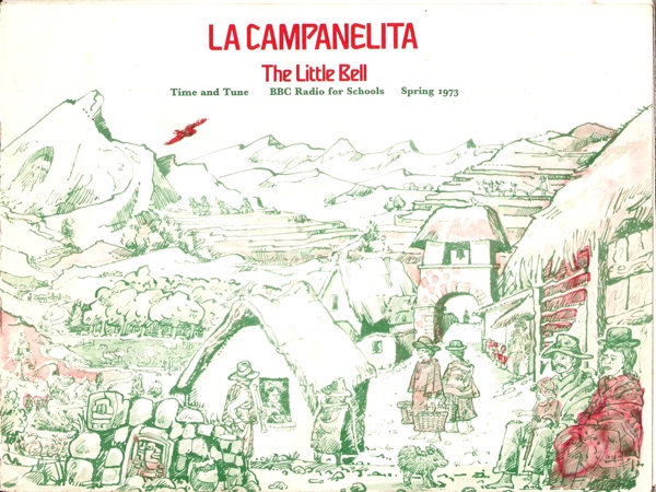
Does this matter?  Yes I think it probably does.  Because this is the third BBC booklet by John Griffiths that we’ve managed to find, dating from 1973.

John Griffiths 1973 BBC Schools music booklet

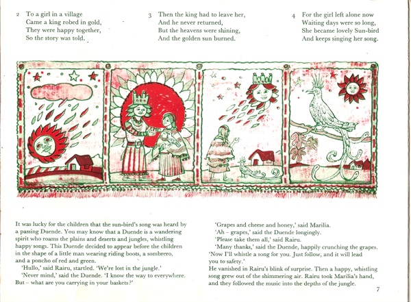
I was completely taken aback when this fell out of the envelope because know that I sang from this booklet at school.  In particular, I remembered the spread below as though I’d only seen it yesterday.

John Griffiths 1973 BBC Schools Booklet inside

Now I’m not saying that it was John Griffiths’ illustrations that turned me into a design fiend (if I’m honest, I like this booklet the least of the three).  But the fact that I can remember these pictures so clearly despite the passing of well over thirty years suggests that I stared at them so hard and so long that they became part of the structure of my brain.  So if we are furnishing our children with things that might perhaps last a lifetime, hadn’t we better make sure that we’re giving them something good?
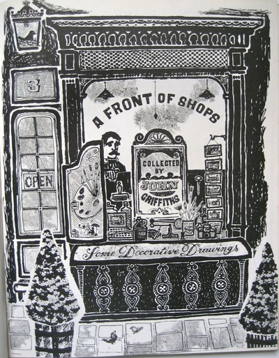
Some Decorative Drawings

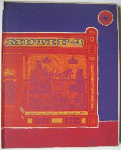
Clearly I have the willpower of a small amoeba.  I write about something on here, but then I don’t just walk away, oh no.  I only have to go and buy it.  Like,  say, Motif, which I wrote about only last week.

Motif 3 art journal of brilliance front cover by John  Griffiths

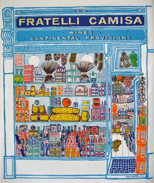
The good news is that we didn’t get the whole set of thirteen for £650, just two for rather less than that.  One of which is the one above.  But it’s the right one, because it has the shopfront illustrations in it.  And they are, frankly, brilliant.

Motif 3 John Griffiths shopfront pictures Fratelli Camisa

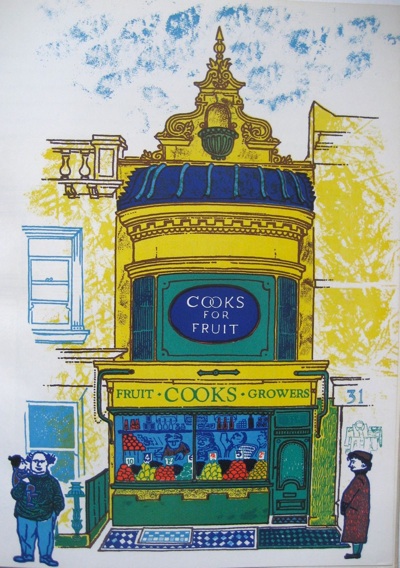
That’s my favourite, not just because it is utterly bright and enticing, but also because I used to go there, sometimes, in my London days.  And look at the little dog peering out of the door.  But the other illustrations are just as wonderful too. Here is Cooks Fruiterers in Brighton.

John Griffiths shop front illustrations from Motif 3 1959

Pretty much all I can tell you about them is that they’re by John Griffiths.  Here’s his title page for the set.

Motif 3 shopfronts by John Griffiths title page

Now the style of these Decorative Drawings isn’t entirely surprising.  They could sit quite happily alongside the work of David Gentleman and Roger Nicholson from about the same time, as well as John Minton too; each part of the same neo-Romantic version of Britain in the 1950s.

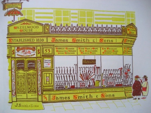
Smiths Umbrella shop John Griffiths Motif 3

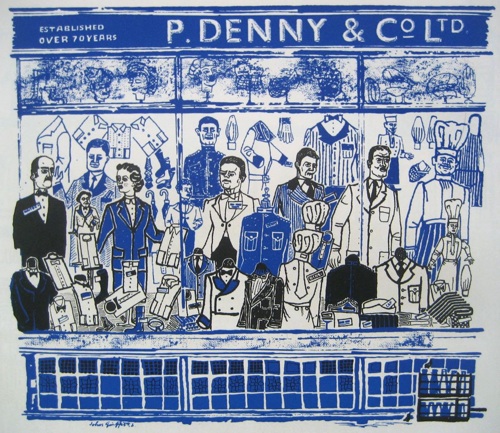
And in their love of the myriad heaps of objects to be found within British shops –  here cooks’ striped aprons and white jackets for waiters – these drawings have obviously been born out of Eric Ravilious’s High Street.

P Denny John griffiths Motif 3 work of brilliance

At the same time, though, Griffiths is very much doing his own thing.  This isn’t a representative High Street, rather a celebration of architecture and idiosyncracy.

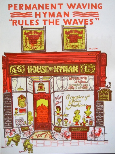
Hyman waves shop front illustration John Griffiths Motif 3

In his championing of Victorian and Regency architecture, Griffiths is very much ahead of his time, along with pioneers like John Betjeman.

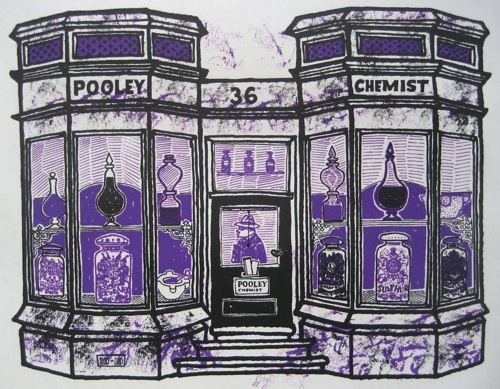
pooley chemist JOhn Griffiths illustration from Motif 3

But in his eye for the eccentric and quirky, he’s out on his own.  There are some great snippets of text accompanying the drawings.  The chemist above occasions the following comment:

Pooley the Chemist in Wimbledon Village took over what was a doctor’s house in 1825.  The manager almost apologised for the poor display in the windows and said they had lost their best jars in the war.  But what they have left are fine enough.

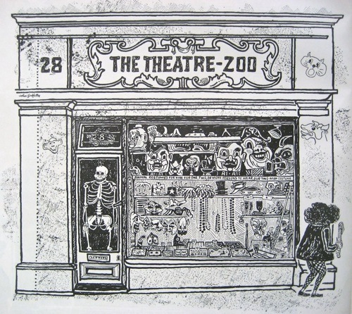
But it’s this which wins hands down, an animal costume shop off St Martin’s Lane.

Theatre Zoo John Griffiths Motif 3

He assured me it would be easy to change a lorryload of students into a cartload of monkeys.  A midget dressed in a bright red jacked with black and white check tights suddenly walked by whilst I was drawing the façade and I did wonder for a moment.

And there goes the midget, off on the right hand side of the picture.

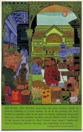
Motif can tell me almost nothing about John Griffiths other than that he was born in 1926 and designed a mural and theatre for the Garden Section of the British Pavilion at the Brussels International Exhibition 1958.  Irritatingly, the internet can’t tell me much more.  He designed a poster, Rhubarb and Roses, for London Transport in 1965.

John Griffiths Rhubarb and Roses 1965 Vintage London Transport poster

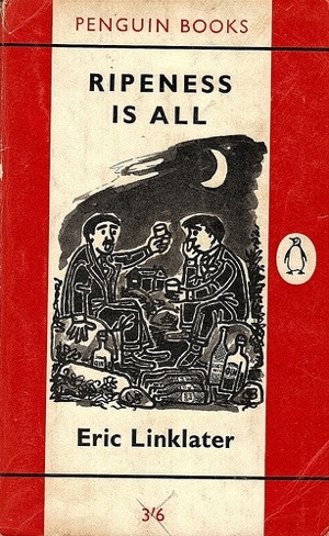
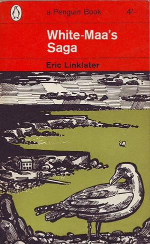
As well as quite a few covers for Penguin Books in the late 1950s and early 1960s.

John Griffiths penguin book cover ripeness is all

John Griffiths Eric Linklater book cover penguin

But that’s it.  Does anyone else know any more than that?  I hope so.

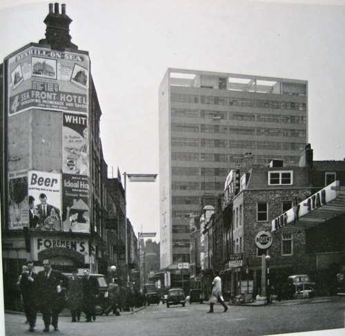
Finally, an extra treat from Motif 3.  Reyner Banham is writing about new office blocks in London, including this one for Thorn Electric at Seven Dials.  I’ve been past it so many times, but had no idea it was by Basil Spence.

Reyner Banham picture Basil Spence office block seven dials with posters

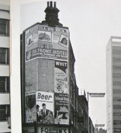
But that, you won’t be surprised to learn, wasn’t what caught my eye.  Because here are some posters too, as they were meant to be seen.

Banham poster detail

Proof, as if any more were needed, that not all posters were ever design classics.  Although I think we could do with a few more along the lines of Beer – Best Long Drink in the World!