Door 22

Christmas is getting close now and the turkeys, quite rightly, are starting to look worried.

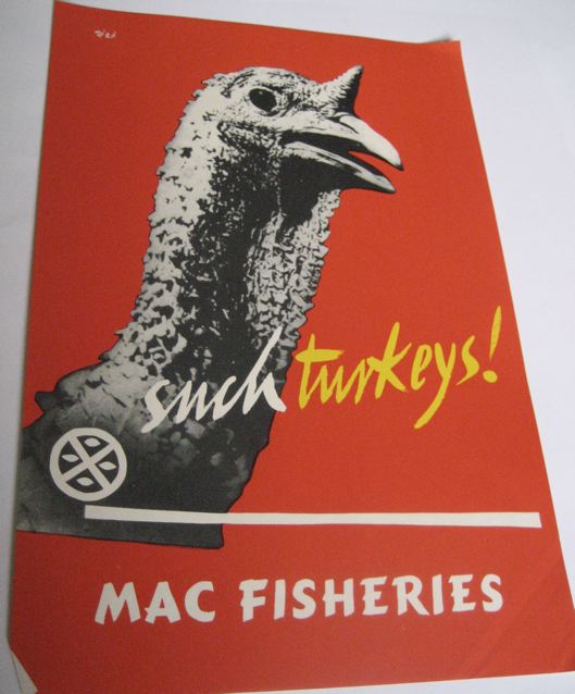
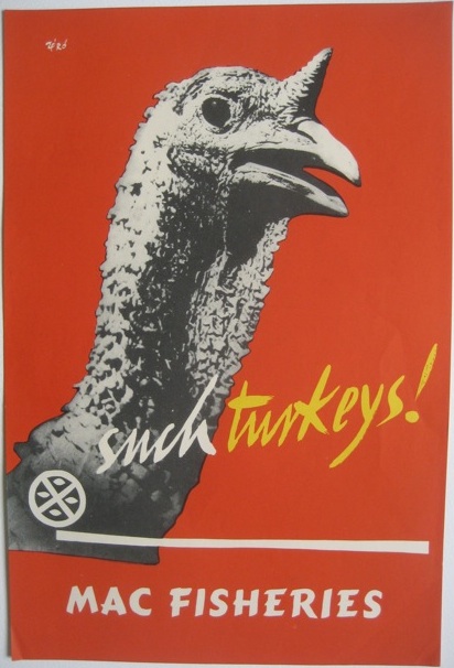
Macfisheries Christmas turkey poster 1950s Hans Schleger

Mind you, I can’t see why the fish is looking so chipper, there’s going to be plenty of smoked salmon about too.

Even though only the bottom one is signed Zero, both of these are from the period when Hans Schleger was in charge of their house style and Macfisheries must have been the handsomest shop on the High Street (as we’ve mentioned here before now).

Such Turkeys Macfisheries Hans Schleger Zero poster 1950s

Mmm, such posters!

Something fishy going on

Now here’s a thing.  To be precise, it’s a website about Macfisheries, full of pictures of pre-war shops and employee reminiscences.  But it’s also got a fair smattering of the work of Hans Schleger, who designed pretty much the entire corporate identity for the food chain throughout the 1950s, from shop layout to packaging design and advertising.

To whet your appetite, here are some packaging designs (photos from the Hans Schleger exhibition at the V&A in 2007).
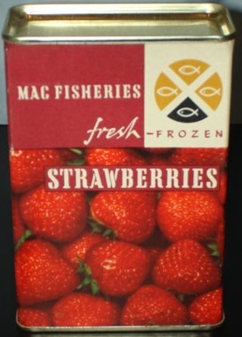

Hans Schleger strawberries packaging Macfisheries

Hans Schleger shrimp packaging Macfisheries

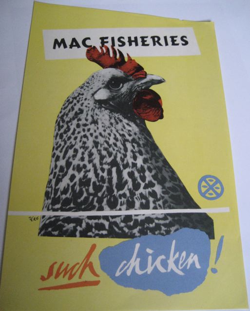
But what I really wanted to draw your attention to are the brilliant in-store posters that Schleger and his studio designed to be displayed in the shops.
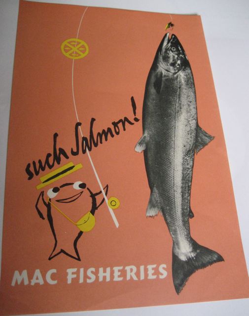
Hans Schleger salmon Macfisheries poster

Hans Schleger chicken vintage poster Macfisheries

Macfisheries Hans Schleger turkey poster

I want to buy salmon, turkey and chicken right this minute.  From a beautifully-designed shop please.

But these posters have got me thinking.  Because I have never, ever seen one of these in the wild – at an auction or on eBay (and if anyone has, there’s a comments link below where you can tell me all about it at the bottom of this post).

One of the reasons, I suppose, that railway posters and London Underground posters have ended up being so collectable is that they are out there to be collected in the first place.  Both the railway companies and London Transport did sell contemporary editions of their posters*.  So pristine copies – however few – were kept and framed and had at least a fighting chance of surviving for longer than the duration of the advertising campaign.

Whereas, I’m guessing, the Macfisheries posters were put into a wet and rather smelly bin at the end of the week or month.  And so now next to none survive, apart from perhaps the few above and those that Schleger himself kept and which are now at the National Archive of Art and Design (about whom I am going to grumble at length one of these days as they are absolutely inaccessible online).  I’d imagine that as a result, they are quite valuable; then again, it might work the other way, as there’s no established market in them.  I rather doubt that though.

* I once saw on eBay a 1930s poster advertising that London Transport posters could be bought at their 55, Broadway headquarters.  Not only did I fail to buy it, I didn’t even keep an image of it, and now I can’t track it down at the London Transport Museum.  Any clues, anyone?

Modernism to go

Right now, you can pick up the bargain of the year so far on eBay.  It’s this:

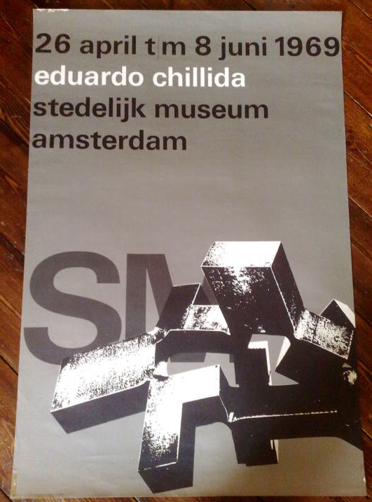
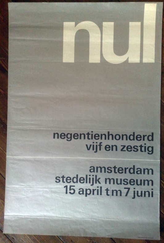
Wim Crouwel vintage poster stedelijk museum

and this

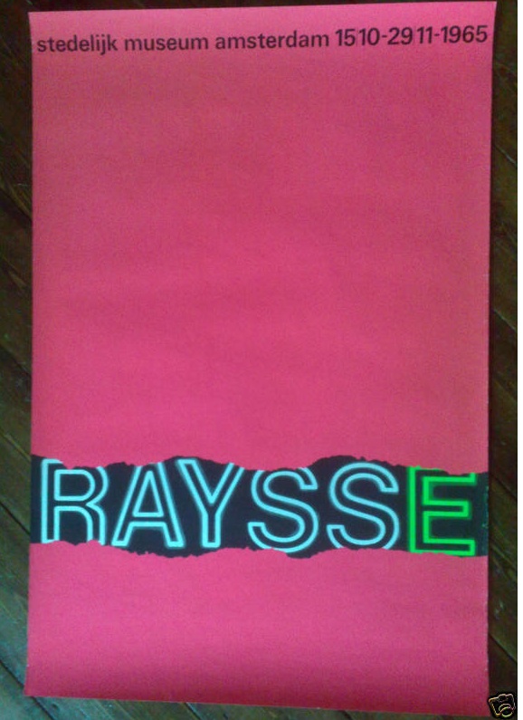
wim crouwel vintage poster raysse museum

and also this

wim crouwel vintage poster 3 stedelijk museum

In fact it’s five posters designed by Wim Crouwel for the Stedelijk Museum in Amsterdam in the 1960s, and as I write, they are currently going for under £10 for the lot.  Which is madness.  They’d be a bargain just for five anonymous pieces of good design, but for five pieces of Wim Crouwel’s work, it’s a crime.

We simply don’t have designers like Crouwel here in the UK.  This isn’t only because we didn’t do this kind of formal, grid-based, type centred modernism.  (To get a sense of how mainstream it was in Holland, just imagine the British Museum or the V&A commissioning a poster like this in the 60s, and then go and have a lie down to clear the resulting headache.)

It’s also because, for some reason, very few designers in this country have achieved the ubiquity managed by Crouwel.

“It was actually quite difficult to avoid Wim Crouwel’s work. In the 1960s the Netherlands was inundated with posters, catalogues, stamps designed by him, even the telephone book.”
– Karel Martens

Who can match this?  Abram Games did design the Festival of Britain symbol, it’s true, but he hardly styled the entire 50s.  Perhaps Hans Schleger is the only one who can come close* – with his work for Libertys and MacFisheries (of which more later), the John Lewis logo and even the London Transport bus stop roundel to his name, it would have been easy to live, travel and shop in a Schleger-shaped world.  But did many people ever notice they were doing this? I rather doubt it.

Anyway, this is a bit of a distraction from the business in hand, which is that there are five brilliant pieces of design for sale for not very much money at all so far.  Proof that eBay can still come up with the goods sometimes.

*I am disregarding Pentagram as I find most of their designs a bit safe and dull.  Perhaps I was living a visual life shaped by Pentagram in the 1970s and 80s, but if I was I didn’t care much either way.  But if you think I am in need of correction on this – or you’ve got a better example – please do say.