Things. In archives.

Now that there are posters in archives doesn’t exactly count as hot news.  But it’s worth revisiting nonetheless, for a couple of reasons.

One is that new delights can appear.  It’s been said before, but I love the VADS archive as a model of how digitisation can work brilliantly.  And every so often I go back and discover that items have been added.  I’m sure I’ve never seen this Lewitt-Him ROSPA poster before as I would have remembered a puss in boots as fine as this.

Lewitt Him vintage ROSPA safety poster world war two propaganda

Puss can be also found in the Jan Le Witt and George Him: Design book which is one of the vast backlog of books which I’ve failed to mention on here.  Like every other title in this series I’ve seen, it’s a very good outline introduction to their lives and work.  So that’s one down, unfortunately another three arrived this week.

Elsewhere, new archives spring up.  I was moaning very recently that the Wellcome collection had a fine digital catalogue but no images.  But now there is Wellcome Images.  Almost an entire universe from germs to tattoo designs, but also containing posters.  Which is where I found this. Once again, modernism is exactly the right style where progress can be celebrated – and a fall in infant mortality can only be good.

Infant Mortality poster Wellcome images

This very pure, almost continental modernist design is by Theyre Lee-Elliott, who I’d never come across before.  But it turns out that  he also designed the archetypal airmail wings.

Theyre Lee Elliott airmail wings design in use on airmail stamp

As well as the Imperial Airways Speedbird logo, a design which endured beyond Imperial’s incorporation into BOAC and well into the time of British Airways.

Imperial Airways speedbird logo designed Theyre Lee-Elliott

Those two designs alone – both classics which survived well past World War Two and beyond – should have been enough to secure Lee-Elliott more fame than he currently has.  But Lee-Elliott also designed some rather good posters.  Some of these were expansions of his logo designs for Imperial and the GPO.

Theyre Lee Elliott Imperial airways vintage travel poster showing speedbird logo

Theyre Lee Elliott Airmail poster for GPO 1936

But he also designed a pair of really rather wonderful posters for London Transport in 1936 (from the wonderful LT Poster archive).

Theyre Lee Elliot vintage London Transport poster light 1936

Theyre Lee Elliot vintage London Transport poster Four times the number carried 1936

As well as these posters for Southern Railway, all from 1937 (from the more idiosyncratic NMSI archive).

Theyre Lee Elliott Stock rambling vintage poster for Southern Railway 1937

Theyre Lee Elliott Stock Horse racing poster for Southern Railway 1937

Theyre Lee Elliott Navy Week Vintage poster for Southern Railway 1937

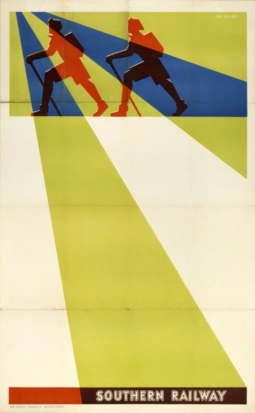
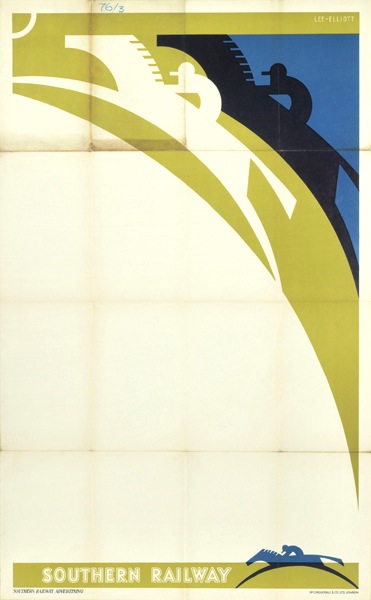
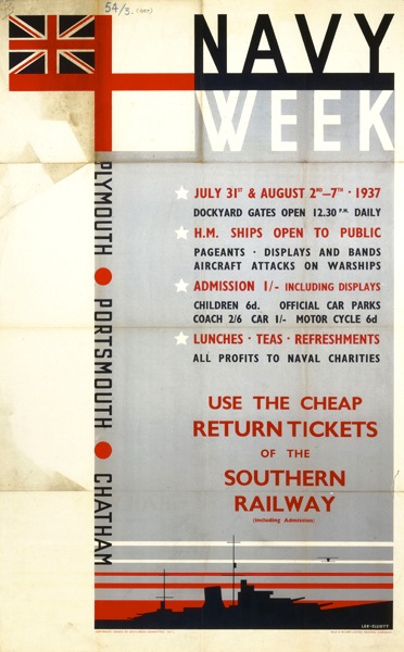
A set of work which makes it all the more mysterious that he is not celebrated as one of the great modern designers in this country.

His later life may be one reason for this.

Theyre Lee Elliott Trooping the Colour Vintage London Transport poster 1952

Although he designed one more poster for London Transport in 1952, he seems to have given up graphic design for fine art – in particular paintings of dancers. Here’s a brief biography as told by one of his nephews:

David Theyre Lee-Elliott went from Winchester to Cambridge and thence to The Slade School of art and lived in Chelsea all his life, dying at the age of 85 in 1988. He never married but had seven nephews and nieces. Before the war he painted the scenery and backdrops at Sadlers Wells and met all the stars and painted hundreds of action pictures of them. Whenever he came to stay he always painted pictures for us of our toys and where we lived during the war and after. A lot of his paintings were bought by the stars of stage and screen of yesteryear.

This recollection – as well as many others – came from a dance blog, Oberon’s Grove – which has articles on Lee-Elliott’s dance paintings (here and here) which are a worth investigating if you want to know more about the man.

But he did more than paint dancers – there’s an interesting commentary one of his paintings held by The Methodist Church Collection of Modern Christian Art (a new discovery for me) which describes his compulsion to paint religious imagery despite, apparently, having no religious faith.

I’m clearly just scratching the surface here; Theyre Lee-Elliott was clearly a very complex and unusual person – apparently he had a novel written about his life at some point too – and I find it extraordinary that he has disappeared so completely from the history books, at least as far as graphic design is concerned. So if anyone can shed any more light on his life and work, as ever, I’d love to hear from you.

This has rather digressed from the simple post about online archives that I’d intended when I started writing.  But, in the course of it all, I did discover one more.  The Smithsonian Museum in Washingon has a collection of Air Travel posters online, called Fly Now! which is worth some of your time. Or possibly quite a lot of your time, given that there are 1,300 or so posters in their catalogue.

The collection is brilliantly omnivorous too, containing everything from design classics to high kitsch.  I will definitely have to come back to it one day when I’ve picked through it properly. But in the meantime, have some surprised llamas to brighten your Friday.

Llamas for Braniff.  Lllamas for all.

Vintage design for modern times

Tom Eckersley is all over the web at the moment.  Yesterday he was here on Grain Edit (and hence tweeted and reposted hither and thither).  And over the last few months, he’s also been herehereherehere and even all the way over here in Italy.  (There are loads more, I just lost the will to look at them all).  The two images below are currently spreading across the web like a virus.

Tom Eckersley Keep Britain Tidy vintage poster

This is in part – a big part – because the Eckersley Archive is both so big and so available.  But it must also be because there is something about Eckersley which is particularly appealing to today’s designers and students.

What’s noticeable about the posters which have, mostly, been chosen from the archive is that they tend to be Eckersley’s much more simple and graphic work, from the 60s and later.

Tom Eckersley Pakistan Airways vintage poster

What’s missing from the tides of Eckersley’s work ebbing and flowing across the web are the earlier, more whimsical posters.  Posters like this one:

tom eckersley seal guinness vintage poster

Or even this:

tom eckersley mablethorpe vintage poster

(This just went for £110 at Talisman Railway auctions, which is a bit of a bargain, even if it is a bit battered).

There is one exception to this, which are his Please Pack Parcels Very Carefully series, which the BPMA have been using quite a bit recently.  If I am truthful, I’m a bit cross about this.

Tom eckersley china dog vintage poster

It’s not that it’s not a lovely poster, it is, and of course everyone should get a chance to see it, if only to prove that Tom Eckersley did a bit more than just sparse modernism.  But it’s mine.  This was the first poster I ever bought (more on that some other time) and it’s sitting watching me as I write right now.  So hands off everyone.  Go and find another poster to tweet about please.

Here’s one to start with, another lovely piece of sparse modernism.

Mr Crownfolio and I are off to turn this into a twitter button.  We may be gone some time.  In the meantime, you can follow me on Twitter here.

These classic posters, they’re all rubbish you know

This link to Design magazine online has been on the bookmarks for a while, but I’ve never quite got round to exploring it.  But, a bit of random surfing while bored and tired the other evening came up with this:

Design magazine archive posters 1969

It’s an article about how most modern public information posters are rubbish.

“…the standard of the majority of most of these posters is very low indeed… The copy is often unconvincing or repelling, the artwork amateur, the design dull or muddled. Sadly staring out from tatty municipal notice boards, or lost among the sports and theatre fixtures on office notice boards, these staid, sometimes pompus lectures are rarely in themselves convincing.”

Which is all well and good, but the ascerbic thrust of his article is rather undermined by the illustrations, which are of some truly classic posters of the period.  To be fair, he’s not actually saying that these are bad, but it’s still hard to get worked up when faced with images like these from Mount/Evans, which are light years ahead of any informational poster produced today.

mount/evans vintage COI posters

Here’s the last one in glorious technicolour for your proper enjoyment.

vintage mount evans COI poster every girl should know

And as if that wasn’t enough, there’s also a lovely spread of GPO ‘Properly Packed Parcels Please’ posters (yes, again), by Malcolm Fowler, Thomas Bund and Andre Amstutz.

vintage GPO properly packed parcels posters Design

Again, here’s the Amstutz in its full glory (if not great size) thanks to the Postal Heritage archive.

vintage GPO properly packed parcels please poster Andre Amstutz

In part, I know, these posters do look good partly just because they’re old.  But I also genuinely think that you’d be hard-pressed to find any public information poster that is half as well designed these days – and if anyone can prove me wrong, I’d love to see the evidence.  So, Design Magazine, you may have found the wealth of posters unconvincing and repelling, but with forty years worth of hindsight, you didn’t know how lucky you were.