This link to Design magazine online has been on the bookmarks for a while, but I’ve never quite got round to exploring it. But, a bit of random surfing while bored and tired the other evening came up with this:
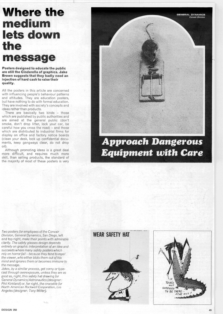
It’s an article about how most modern public information posters are rubbish.
“…the standard of the majority of most of these posters is very low indeed… The copy is often unconvincing or repelling, the artwork amateur, the design dull or muddled. Sadly staring out from tatty municipal notice boards, or lost among the sports and theatre fixtures on office notice boards, these staid, sometimes pompus lectures are rarely in themselves convincing.”
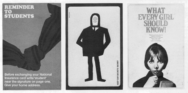
Which is all well and good, but the ascerbic thrust of his article is rather undermined by the illustrations, which are of some truly classic posters of the period. To be fair, he’s not actually saying that these are bad, but it’s still hard to get worked up when faced with images like these from Mount/Evans, which are light years ahead of any informational poster produced today.
Here’s the last one in glorious technicolour for your proper enjoyment.
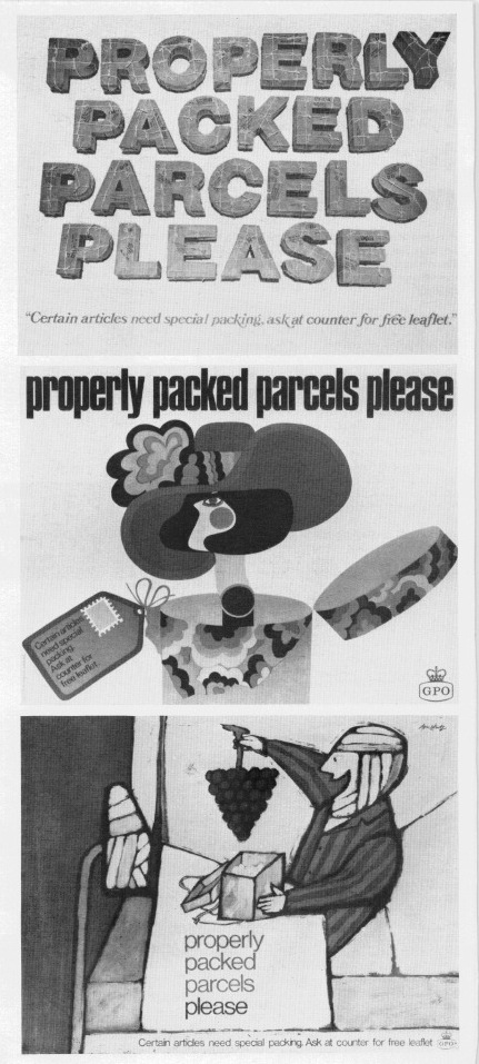
And as if that wasn’t enough, there’s also a lovely spread of GPO ‘Properly Packed Parcels Please’ posters (yes, again), by Malcolm Fowler, Thomas Bund and Andre Amstutz.
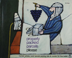
Again, here’s the Amstutz in its full glory (if not great size) thanks to the Postal Heritage archive.
In part, I know, these posters do look good partly just because they’re old. But I also genuinely think that you’d be hard-pressed to find any public information poster that is half as well designed these days – and if anyone can prove me wrong, I’d love to see the evidence. So, Design Magazine, you may have found the wealth of posters unconvincing and repelling, but with forty years worth of hindsight, you didn’t know how lucky you were.


All is not lost – while government public information posters don’t catch the eye much these days – I recently saw some rather good posters produced by the Samaritans in the window of our local council offices.
Annoyingly I can’t seem to find good linkable images on the Samaritans’ own site – but there are a couple of samples here and here.
I guess it boils down to the evident care and thought that’s gone into these. Hand lettering (or manipulated lettering, at least) is always a good signifier for this in the age of Illustrator and InDesign.
I agree, my biggest bugbear with modern posters (London Transport, are you listening?) is the lack of integration between the text and the image. More often than not, the type just seems to have been slapped onto a blank space at the bottom. But those Samaritans ones are good. Any more out there?