Clean as new

Now it’s not often that I get to discover a whole new genre of posters, but today I can share just that with you.  Dry cleaning posters.

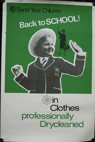
vintage dry cleaning poster school clothes

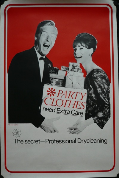
This whole collection from, I am guessing, the 60s and 70s, was sent to Quad Royal by Roly Seaton.  I think the Kenneth Williams-a-like here is one of my favourites.

vintage dry cleaning poster party clothes

Roly acquired them when a dry cleaners in Leeds was closing down, and left them outside the shop for any takers.  I imagine them having been very dapper in Leeds in the 1960s.

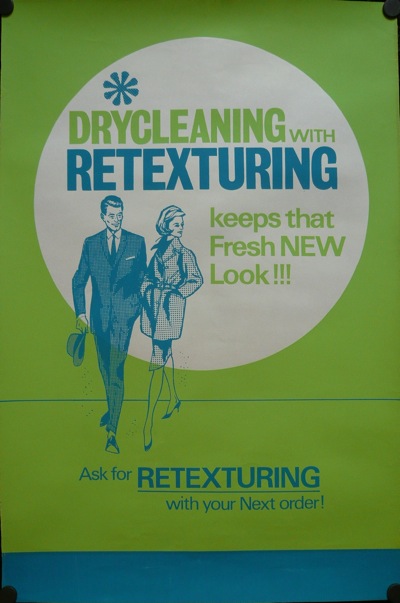
retexturing vintage dry cleaning poster 1960s

And very well textured.  But, quite apart from the kitsch amusement value, I’m interested in these posters for a couple of reasons.

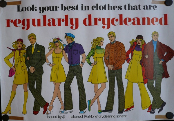
One is that they do, once again, show just how the overall standard of graphics had declined by the 1970s.  This poster was clearly done by someone whose day job was illustrating Simplicity patterns.

vintage 1970s dry cleaning poster hand drawn figures

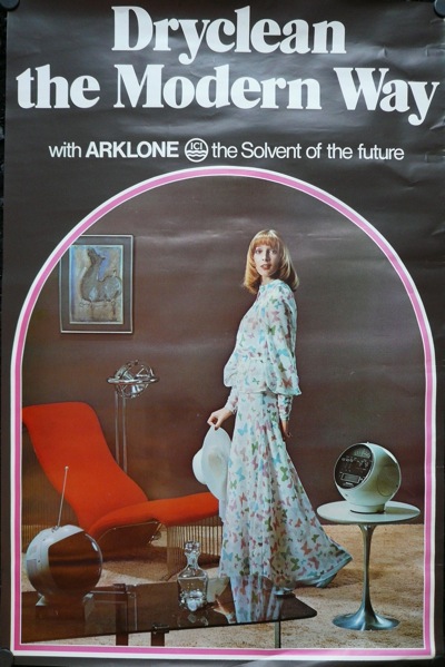
While all that this one has going for it is the fabulous 1970s image of modernity that it wants you to believe in.

vintage 1970s dry cleaning poster

Shagpile, smoked glass, round TV; truly this has to be the future.

Now I wouldn’t claim that any of these posters are design classics, and I don’t suppose I’ll ever know who designed them or when, but they do illustrate once again just how little we know of the visual past.  Even after just forty or fifty years, so much of the graphic design that people saw on a daily basis has entirely disappeared.  And not just from the dry cleaners.  Every greengrocer, every chemist, every corner shop would have been full of posters and signs, hand drawn or printed, good or bad, but almost all of which have gone.

What we think of as the appearance of the 1960s is a very partial construct, made up of London Underground posters, a few high end pieces of graphic or corporate identity design which are now collected and revered, and perhaps a few films.  But what most people saw on a daily basis was very, very different – and perhaps as hard to recreate now as the mindset of the Middle Ages.  It’s a sobering thought.
We’re all going to the zoo tomorrow…

Now I don’t normally do European posters.  I know nothing about their styles or their designers, and I have no idea what anything is worth.  This is mostly self-protection; rather too much of my brain is already cluttered up with images and facts about British graphics and posters, when it should be more worried about paid work and what’s for dinner, never mind adding all of Europe to the load.  And anyway, if I started finding out about them, I’d discover lots of ones I liked, and then I’d have to buy them and where would it all end.  Etc.

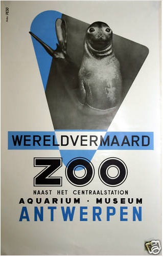
But this one has got through the defenses today, mainly because it is such a great bit of photomontage.

antwerp zoo poster from ebay

Who could fail to like that?  I still don’t know anything about it mind you. It’s on eBay, and the listing says it’s by Studio Peso.  The listing also says that it’s “fifties”.  I have a slight raised eyebrow at that, but then that, given my ignorance, is probably of no consequence.  So if anyone reading can tell me anything about it, please do.  My mind could be broadened here.

It’s being sold by someone in Belgium who wants €95 for it.  Now I think that’s quite reasonable, but please do tell me if you think otherwise.  He’s also got a surprising range of other classy posters on offer.  Including another one that I am almost tempted to buy.

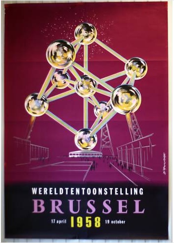
Atomium poster from eBay

Apart from the great colour, this is mostly  because I visited the Atomium a couple of times as an impressionable teenager, at a time when it had been left to moulder gently since the 1958 expo.  So the entire interior, signage and exhibitions inside were all shrines to high 50s design (and optimism about atomic power).  This experience of being dipped straight back into the atomic 1950s must be one of the reasons I’m still so fond of the era now.  And it is also one of the weirdest structures ever built.  (Fancy travelling on an escalator along the arm of an iron crystal?  The Atomium is probably the only chance you’ll get.)

But if you haven’t been converted to the world of the Belgian poster, here is something more traditional.  And cheaper, even if it is in the States.

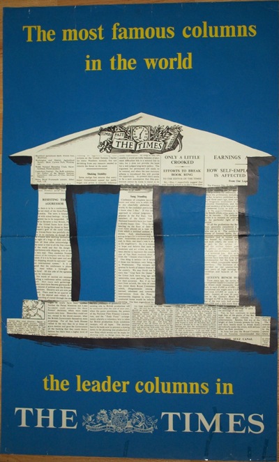
Poster for the Times

I’ve investigated this poster before, and come up with a blank, so if you know anything about it, please do say.  But my main observation is that it’s a single sheet, and so impossibly big which, along with the damage at the bottom, will probably keep its value down.  Personally, my money’s on the seal, or it would be if I dared dip my toe into European waters.

Britain Can Make Lovely Posters

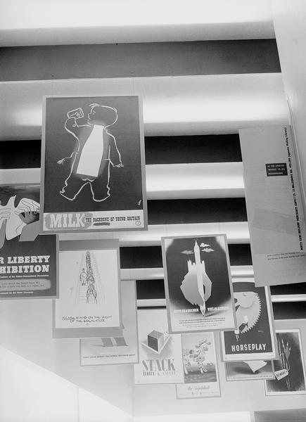
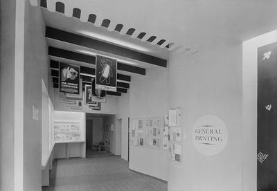
A further digression here.  I’ve spent the morning assembling the first draft of the links page, and in the course of it have rediscovered this wonderful photograph:

Britain can make it poster exhibition

It’s the General Printing part of the 1947 Britain Can Make It exhibition at the Victoria & Albert Museum.  The aim was to showcase the consumer goods which would lead the country’s manufacturing recovery after the war.  Although the show was wildly popular, it was generally known as ‘Britain Can’t Have It’ as the country was still under heavy rationing, and almost all the goods on display were designed for export.

Britain Can Make it posters wuder

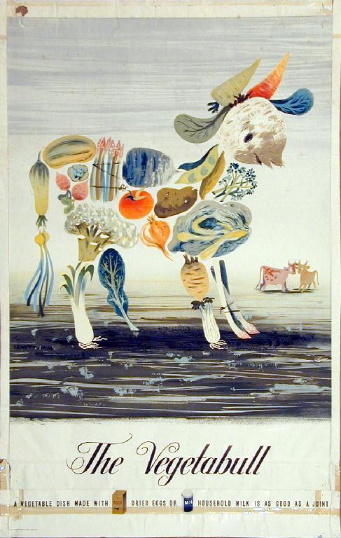
At least the posters above would have been an exception to this.  I can identify a Games, the Lewitt-Him Vegetabull (below, any excuse) and a Fougasse.  The caption also tells me that the front poster about Milk is a James Fitton.  If you can identify any others, I’d love to know.

Lewitt Him vegetabull poster

The image comes from the VADS archive, which is a collection of more images and resources than one person can reasonably use in a lifetime.  They’ve got a good (if slightly over design-historical) introduction to Britain Can Make It if you’re interested in learning more.  I’d just like to have a wander round the exhibition really.  And then take the posters home, of course.

On the buses (or not)

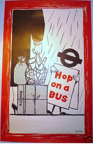
I keep planning posts, but then they get taken over by events.  Like this, another interesting poster that’s popped up on eBay.

vintage bus strike LT poster

This isn’t, I will freely admit, a classic piece of design, but it is an interesting piece of social history.  I can’t explain much better than the seller has.

This is one of a series of 3 posters issued by London Transport in 1958 to encourage passengers back onto the buses after a disastrous strike by crews. All 3 posters were drawn by Lobban and featured humorous scenes of people in inclement weather being encouraged onto a bus by a figure with its head made up of the London Transport bullseye.

A brief bit of investigation means that I now know that the 1958 bus strike went on for seven weeks and, everyone seems to agree, had a huge impact on London commuting.  In an age of increased car ownership, many people went to work in their car, and never went back to the buses (hence the slight desperation of this poster).

Because of this, many less popular bus routes were axed and garages closed, driving even more people onto their cars or the Tube.  And so we arrive at the overcrowded and gridlocked London of today.

So there you go.  I have been educated by eBay and now know something I didn’t before.  Even if I don’t necessarily want to buy the poster.

Modernism to go

Right now, you can pick up the bargain of the year so far on eBay.  It’s this:

Wim Crouwel vintage poster stedelijk museum

and this

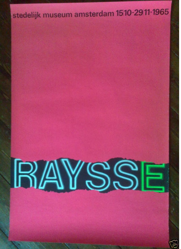
wim crouwel vintage poster raysse museum

and also this

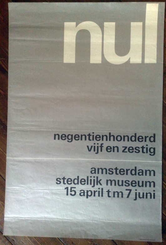
wim crouwel vintage poster 3 stedelijk museum

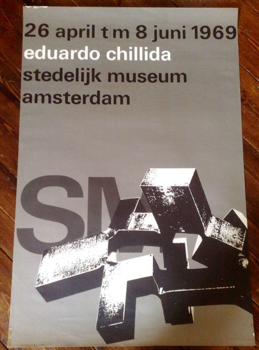
In fact it’s five posters designed by Wim Crouwel for the Stedelijk Museum in Amsterdam in the 1960s, and as I write, they are currently going for under £10 for the lot.  Which is madness.  They’d be a bargain just for five anonymous pieces of good design, but for five pieces of Wim Crouwel’s work, it’s a crime.

We simply don’t have designers like Crouwel here in the UK.  This isn’t only because we didn’t do this kind of formal, grid-based, type centred modernism.  (To get a sense of how mainstream it was in Holland, just imagine the British Museum or the V&A commissioning a poster like this in the 60s, and then go and have a lie down to clear the resulting headache.)

It’s also because, for some reason, very few designers in this country have achieved the ubiquity managed by Crouwel.

“It was actually quite difficult to avoid Wim Crouwel’s work. In the 1960s the Netherlands was inundated with posters, catalogues, stamps designed by him, even the telephone book.”
– Karel Martens

Who can match this?  Abram Games did design the Festival of Britain symbol, it’s true, but he hardly styled the entire 50s.  Perhaps Hans Schleger is the only one who can come close* – with his work for Libertys and MacFisheries (of which more later), the John Lewis logo and even the London Transport bus stop roundel to his name, it would have been easy to live, travel and shop in a Schleger-shaped world.  But did many people ever notice they were doing this? I rather doubt it.

Anyway, this is a bit of a distraction from the business in hand, which is that there are five brilliant pieces of design for sale for not very much money at all so far.  Proof that eBay can still come up with the goods sometimes.

*I am disregarding Pentagram as I find most of their designs a bit safe and dull.  Perhaps I was living a visual life shaped by Pentagram in the 1970s and 80s, but if I was I didn’t care much either way.  But if you think I am in need of correction on this – or you’ve got a better example – please do say.

These classic posters, they’re all rubbish you know

This link to Design magazine online has been on the bookmarks for a while, but I’ve never quite got round to exploring it.  But, a bit of random surfing while bored and tired the other evening came up with this:

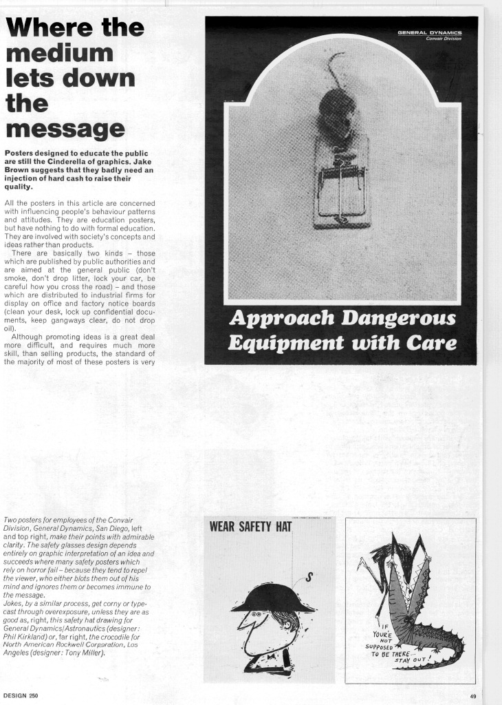
Design magazine archive posters 1969

It’s an article about how most modern public information posters are rubbish.

“…the standard of the majority of most of these posters is very low indeed… The copy is often unconvincing or repelling, the artwork amateur, the design dull or muddled. Sadly staring out from tatty municipal notice boards, or lost among the sports and theatre fixtures on office notice boards, these staid, sometimes pompus lectures are rarely in themselves convincing.”

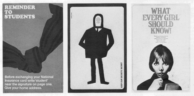
Which is all well and good, but the ascerbic thrust of his article is rather undermined by the illustrations, which are of some truly classic posters of the period.  To be fair, he’s not actually saying that these are bad, but it’s still hard to get worked up when faced with images like these from Mount/Evans, which are light years ahead of any informational poster produced today.

mount/evans vintage COI posters

Here’s the last one in glorious technicolour for your proper enjoyment.

vintage mount evans COI poster every girl should know

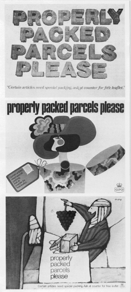
And as if that wasn’t enough, there’s also a lovely spread of GPO ‘Properly Packed Parcels Please’ posters (yes, again), by Malcolm Fowler, Thomas Bund and Andre Amstutz.

vintage GPO properly packed parcels posters Design

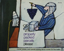
Again, here’s the Amstutz in its full glory (if not great size) thanks to the Postal Heritage archive.

vintage GPO properly packed parcels please poster Andre Amstutz

In part, I know, these posters do look good partly just because they’re old.  But I also genuinely think that you’d be hard-pressed to find any public information poster that is half as well designed these days – and if anyone can prove me wrong, I’d love to see the evidence.  So, Design Magazine, you may have found the wealth of posters unconvincing and repelling, but with forty years worth of hindsight, you didn’t know how lucky you were.