I have three ideas bobbing around in my head today, along with a suspicion that they are in some way connected, even if I can’t quite identify how yet. The only way to find out is to write them down, so apologies in advance if it turns out that they aren’t.
Let’s start with the most tangential, the North Sea Radio Orchestra. Who are brilliant, but so far off the topic of this blog that I won’t say much more than that, except that they are very English, historically rooted and pastoral (and thus also connected to yesterday’s post) but also modern. Trying to find out a bit more about them, thougb, I was struck by – that’s struck in the sense of really quite irritated by – a review of one of their concerts.
“it’s frequently a fine and lovely thing. But in some ways it can’t help feeling like a retreat… Certainly there are moments of beauty, but ultimately it’s like stepping back into an alternate, pre-war England where rock’n’roll – not to mention mass industrialisation and immigration – never happened. Which is fine for a night, but I wouldn’t want to stay.

Out and About: Autumn Woods, Keith Cunningham, 1950
The implication here is that the modern world of cities and tarmac has wiped out the rural and romantic aspects of Englishness for good. Even at face value this is a fairly contentious statement: I live in a small town, the countryside is not very far from my front door and I can say with some certainty that, despite the factories, Tesco and a global economy, the fields and hedges are still there. But more to the point – at least for this blog – this sets out very clearly one point of view in a problem that I keep coming back to on Quad Royal, that of Englishness and modernism.
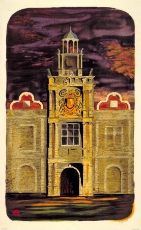
Out and About: Country Houses, S John Woods, 1950
For the reviewer (one Ben Graham, you can read his whole review here if you want), the modern tarmacadam world has made the ‘old’ version of Englishness, rooted in the pastoral and the historic, in the tracks over the fold of the hills, irrelevant. The real world is only now contained in the fluid city, in machines and cars and – for him at least – loud electric guitars. And while I’ve made the argument sound a bit daft here, this is in the end the central narrative of modernism. Only things which represent the streamlined bustling city can be modern, the rest is pointless, even reactionary. By which standards the English regularly and repeatedly fail at being modern in any way.
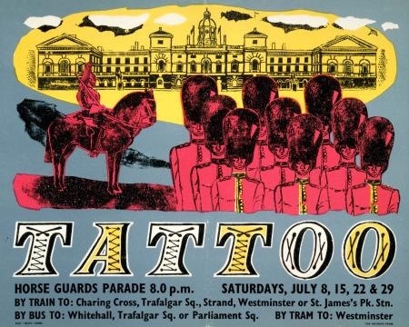
Tattoo, Anonymous, 1950
Another story is, though, starting to gain some currency (in this book this book for starters), which is that the British/English were producing modern design, and thinking about it very hard; it’s just that what they produced was a different modern which maintained a connection to older traditions as well. We live in a country which has both landscape and cities; modernism’s inability to reflect this was the failure, not us. So modern British design doesn’t always look like you expect. (And modern British music might not always have an electric guitar in it either).
All of which brings me back to Graphis 31, the survey of British Graphic design in 1950. Now, if ever there was a moment in which Britain wanted to be modern, this has to have been it. A whole new post-war world was being built in which everything was going to be different, preferably with bright colours and all mod cons (this is, I know an over-simplification and I’ve put the opposite point of view on here before now, but I think it’s nonetheless true that if ever there was an urge for total modernity in this country, the early 1950s was that time).
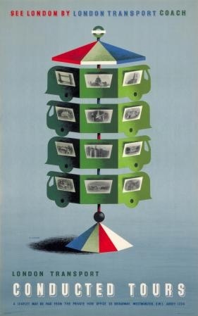
See London, Abram Games, 1950
But when you look at the Graphis, the work just isn’t as ‘modern’ as you’d expect. Where I was struck by this most was in the case of the London Transport posters. Six are illustrated, and yes, some of them have the clean lines and modern styling that might be thought to signify this new world.
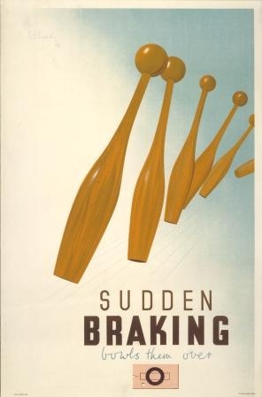
Sudden Braking, Pat Keely, 1945
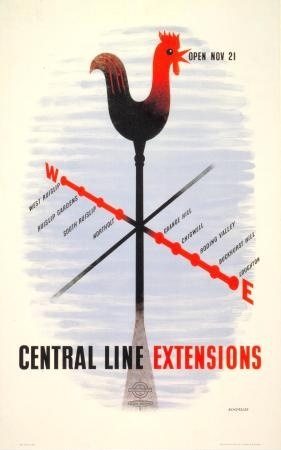
Central Line Extensions, Tom Eckersley, 1948.
But quite a few of them don’t.
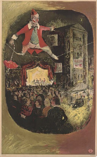
Lewin Bassingthwaighte, The Circus, 1949
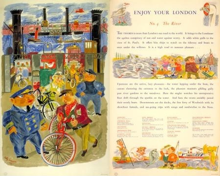
Betty Swanwick, The River, 1949
While this one just hovers somewhere in between the two.
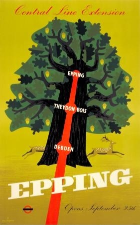
Epping, C K Chapman, 1949
All of which brings me, by accident, to an idea that I’ve mentioned before, which is to take a slice through 1949 or 1950 and see just what the design really did look like then. I’ve always had London Transport posters in mind for this project, because it’s quite a comprehensive archive and one with, if anything, a bias away from conservatism (compared, say to product advertising), so it would be a tough proving of the theory.
Graphis has in some ways already run that test for me. The majority of the posters they reproduce are from 1949 (a year when, at least judging by the LT Museum archives, not that many posters were printed in that year anyway). I’ve supplemented this throughout the post with posters from 1950. And in terms of numbers at least, the victory is on the side of what we might as well call romanticism (i.e. the style of Graham Sutherland or John Piper) rather than the clean lines of International Modernism. What’s more, much of the modern design comes from the pen of just two designers, Tom Eckersley and Abram Games.
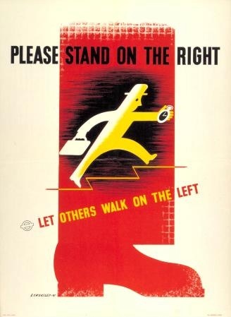
Please Stand On the Right, Tom Eckersley, 1949
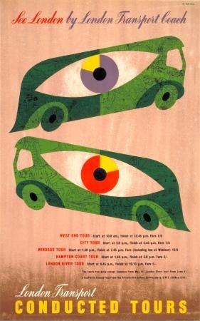
See London by London Transport Coach, Abram Games, 1950
Although an honourable mention must also be made for this Bruce Angrave, just because it is great.
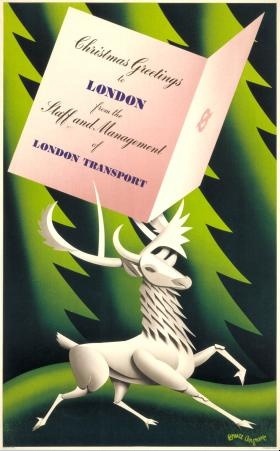
Christmas Greetings to London, Bruce Angrave, 1949
It’s also notable just how many designs use rural imagery too. Now this may be a function more of London Transport than the mood of designers at the time; after all, one of the purposes of the posters was to get people to use the Underground more, taking leisure trips out to the far flung – and still unspoilt – fringes of the network.
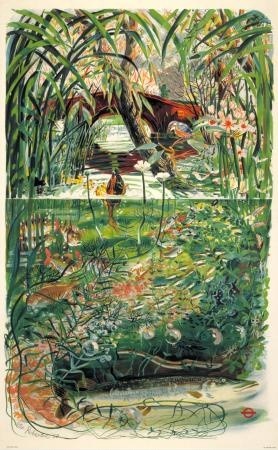
Out and About: the streams, Peter Roberson, 1950
But even the images of urban life, of art galleries and street markets, are done in a similar style.
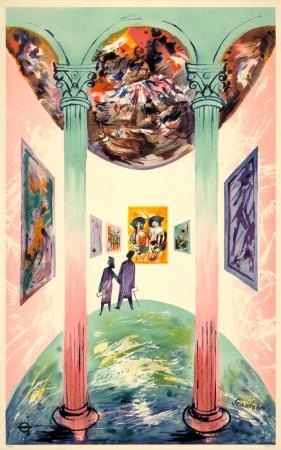
Enjoy your London: Art Galleries, R Scanlon, 1949
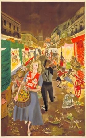
Enjoy Your London: Street Markets, A R Thomson, 1949
So does this mean that all those designs weren’t modern? Far from it. Because remember what I said up there about Sutherland and Piper? These were modern artists in the Britain of the 1950s, working in a new style. I’d be quite happy to bet that if you were a commuter standing on a Tube platform in 1949 or 1950, these posters would have seemed fresh and exciting, as modern as can be. Even though they don’t always represent the mechanised city in action, in the appropriate style.
Which leads me to two thoughts. One is that modern can perhaps only be judged at the time – if it seemed new, different, exciting to the eye of a bystander when it was produced (worthy of inclusion in Graphis, say) then it was modern. From a distance it’s all to easy to exclude things that don’t fit our historical preconceptions of a time, so perhaps we’re not necessarily best placed to judge.
The other is that British or English modernism is perhaps more subtle and balanced than its European counterpart. To paraphrase Patrick Wright, we are always aware that we are living in an old country, and so we have to include this past into our depictions of the modern world, otherwise we are not telling the truth. The fields and their earthworks are always still there, however many industrial units we build.
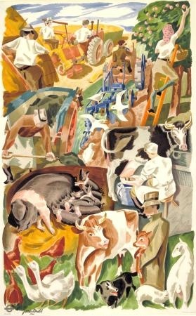
Out and About: the farms, James Arnold, 1950
Which means that modern design doesn’t have to have clean lines and sharp edges all the time. And our music doesn’t have to be rock and roll either. In which case I’d very much like to recommend I A Moon by the North Sea Radio Orchestra. It’s very modern, you see.
The notion that Britain somehow wallowed in a dark victorian backwater whilst Europe and the USA got modern just isn’t borne out by the wonderful cinemas, lidos, ice cream parlours, underground stations to name but a few examples of modernist architectural design. Artists like Piper used colour in a way which was utterly modern and predated Warhol and other Pop artists.
Britain made the transition from a rural to an industrial and urban society long before any other country in Europe. By the end of the nineteenth century, for instance, only 2% of GDP was in the form or agricultural rents. The change from the county to the city that excited so many modernists was consequently old hat to the British by 1950. They had been there, done it and got the T shirt years before artists like Abram Games even saw the light of day.
Since the British had transformed themselves into an urban society, which depended for its wealth on the factory, it is also hardly surprising that they liked to think of the country as different, relaxing and exciting. This must have been especially true in the 1950 when British had a large manufacturing sector than any other country in history to that date and probably since. People who spend their lives among the grime of forges and smoking chimney have a natural tendency to look with pleasure on sea and sky, trees and green fields.
And anyone who remembers the endless grime of London well beyond the 1960s, , would have no difficulty understanding the rational behind London Transport’s reasons for pushing the romantic appeal of the country. Nothing illustrates this point better, by the way, than the changing status of Islington as a desirably place to live. No right thinking person would have regarded this part of London as a good place to live before the Clear Air Act and Betjeman’s romantic view of surburbia and the country is almost certainly linked to his having father whose business was based in the Pentonville Road – a world of fog, yellow sunsets and chronic bronchitis.
One other point in connection with Britain’s successful transformation into an urban and industrial country long before France, Germany and Russia, for instance.
This success brought Britain enormous wealth and power. It’s people were far richer on average than the inhabitants of any other country and at the height of its power, in the years between the first and second world wars, it ruled a quarter of the world’s population.
Many of the countries that had been Britain economic equal before the middle of the seventeenth century regarded is success as challenge. If it could become so rich and powerful so could they and by similar means. They also decided that the most effective way of competing with and overtaking Britain was to leap frog its development by embracing the newest methods of production and technology. This gave them a natural reason for pushing the idea of Modernism partly because they needed to convince their people of the benefits it would bring.
There was no need in Britain, however, to persuade the people to accept urbanisation and industrialism. They had been attuned to this idea for over a century. What interested them was the problem of reconciling the environmental and social cost of production with a civilised lifestyle – a problem that underpins a lot of British art which is commonly described as romantic.
And this problem is still a matter that needs to be solved in many of the European countries that developed after Britain. It would be interesting to consider, for instance, whether the low birth rates in Italy, Germany and Japan, which are well below replacement rate, are the result of a failure to tackle a question the Modernists never seem to consider: how can I live well with steelworks at the bottom of the garden?
Yes to all of that. In fact more than just a yes, it’s a really interesting perspective on modernism in Britain (and the need for modernism in Europe) which I hadn’t fully considered before.
And it’s a set of thoughts which lead off in all sorts of interesting directions. For instance, the way that at the height of modern Victorian Britain, the way that designers were pillaging almost very historical style available, perhaps as a way of making this quite extraordinary, even scary, modern world less fearsome. The need to look modern comes much later, either when this work has been done, or when the notion of a modern world has become more acceptable to the majority of people. After all, the transition from the field to the factory isn’t necessarily a comfortable one.
But I do think that there is more to the British love of the countryside than just as a respite from the dark satanic mills. It has more symbolic value than that, not only as the repository of ‘authentic’ Britishness, but also as a purification device. The wealth of Manchester industrialists is tainted, and can only become acceptable when it has been invested in land and a country house, in a kind of money laundering. And so, when Piper, Kauffer et al return to the landscape, it also has this depth of meaning to it as well as being a rest for the sore eyes of Londoners. (This is once again the fantastic simplification of an argument which has already filled quite a few books written by people who know a great deal more about the subject than I do).