While I am often griping about how posters cost too much on eBay these days, there are, every now and then, exceptions. Some of which I point out on here, some of which Mr Crownfolio and I throw a bid at. A few such bargains have arrived here recently (well, via a trip to the sorting office; we have a ridiculously small letterbox now, which is an absurd thing if you collect posters), and a couple are quite interesting.
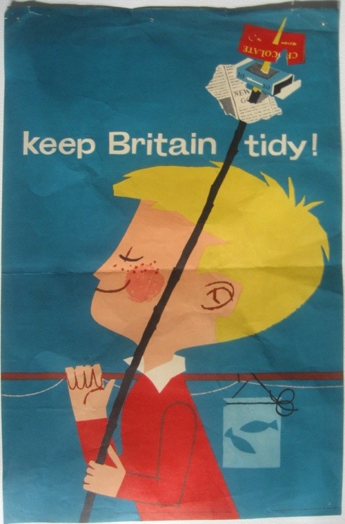
First up, an anonymous Keep Britain Tidy poster, about which I know nothing at all but would probably date as being around the same time as the first Reginald Mount designs for the campaign.
It looks like the work of Harry Stevens, but could frankly be by anyone or no one. If you’ve got more idea than that, please let me know.
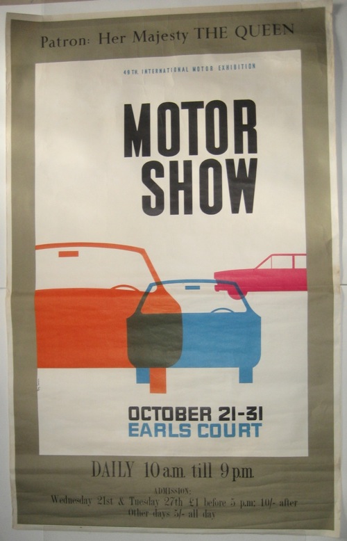
Secondly is this 1960s poster for the Motor Show. It’s worth a look because it’s quite good, and also because this kind of poster doesn’t crop up very often.
It’s by Roy Carnon, who did a fair bit of illustration in the 1950s and 60s but, much more important than that was ‘visual concept artist’ to Kubrick on 2001: A Space Odyssey and is therefore Very Important.
But there are other reasons to like it too; for me it’s a visual embodiment of the great British dilemma of ‘just how modern are we?’. The centre panel is a very good 1960s-modern poster. But then, somewhere along the line, someone has had a crisis of confidence and thought that you just can’t put The Queen into that kind of design, it’s just not fitting. And so we have a nice tasteful border with unthreatening serif type in which to put her. It’s a brilliant metaphor for the whole muddle, and revealing in a way that a truly perfect bit of design wouldn’t be.
Finally, the third poster is simply rather nice. It’s from 1967 and the painting is by Paul Millichip, who is still alive and working in the Chilterns.
Although I do think the typography is a bit unusual; I’d more expect to find it on a poster of the 1930s or 1960s. But I am sure there are plenty of examples out there which prove me wrong.


The typography of the motor show poster leaves a good deal to be desired. The sans serifs work quite nicely with the illustration, but Perpetua has been plonked above it for the Queen and a condensed seriffed face used at the bottom. The type in the central panel has been carefully aligned with the graphic and that on the border has been centred with no reference to it. Could do better, as my school reports used to say at the time.
Congratulations to Mr. Crownfolio for his Ebay searching & filtering skills, continuing to turn up overlooked treasures, as he does! The Motor Show poster is most interesting – transitional designs have so much to tell us about the tensions & preoccupations of their times. I think there can be little doubt that another hand altogether is responsible for framing the completely free-standing design within, and can’t you just hear the gnashing of teeth & sense Roy Carnon’s frustration as politics & nervousness frustrate his impeccably modern intentions …
Agreed with both of you; but the perfect Carnon poster would not only have been rather more than a tenner, and also, oddly, less informational. There probably is a 1960s Buckingham Palace edict that says, You Cannot Put Her Majesty In Anything Other Than A Serif…