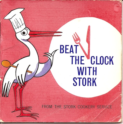
A perfect charity shop find today. Three of my favourite things – County Shows, 1950s graphics and old cookery books – all together in one small leaflet.
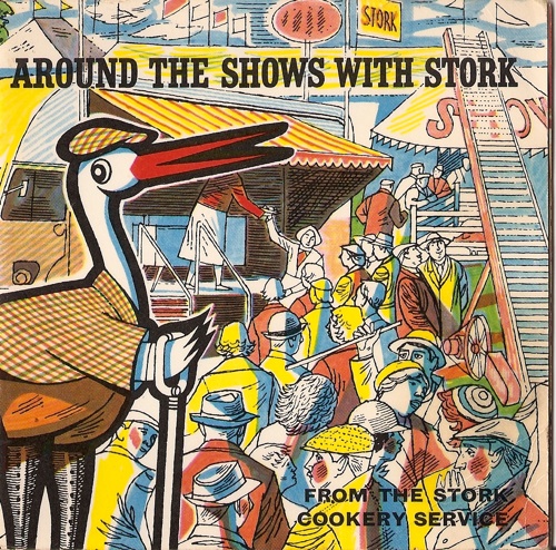
That picture on the front is apparently the Stork Demonstration Van introducing people to a lot of new and interesting recipes on its visits to the country’s agricultural shows. The big supermarkets still do exactly the same thing at County Shows today.
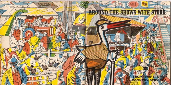
If you spread out the whole cover, the real business of the agricultural show is going on at the back; marquees, stock judging and shiny new tractors and mowing machines.
I think that is a really wonderful piece of work. Sadly, there is not a lot more inside, only one small depiction of the Demonstration Van itself.
The rest is the usual food photography of the 1950s, with the colour saturation turned up to 11. Oh it must have been good to have colour printing back after the war. So good that they were prepared to overlook the fact that it didn’t really make the food look tasty.
The booklet is anonymous, with no one taking any credit for that wonderful cover. In a way, I find that quite pleasing, because this booklet is a great example of a particular type of British food advertising. There are line drawings, usually in black and white, more often than not there’s a sense of humour about it too (just go back and look at Mr Stork in his tweeds on that front cover). It often spills over into recipe books and pamphlets from the newspaper and magazine advertisements where it really belongs. I suspect that a great deal of it springs from the relentless Ministry of Food campaigns during World War Two.
40 million of their advertisements were printed every week throughout the war, and it was one of the most successful Home Front campaigns. So no wonder it set the style for more than a whole decade afterwards.
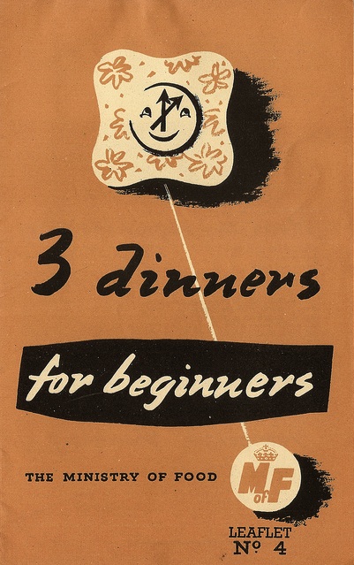
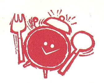
I did get another Stork booklet at the same time; sadly it’s not quite so exuberant.
But its little graphic inside is even more of a direct link to those wartime illustrations.
This kind of work isn’t glamorous or valuable. It probably isn’t even noticed very often (the fact that these kind of designs were produced for women, and for the home, probably doesn’t help their case either). But it is important. These graphics were everywhere for at least fifteen years, quite probably much longer than that (I have a whole heap of this kind of ephemera, but sadly it’s all in storage so I can’t dig it out for an answer). They were everyday graphic design, not something that people stepped back and pointed at, but part of the warp and weft of daily life, creating the sense of place and time even if they mostly went unsung.
Not all graphics are produced by heroic designers, and not all design has to stop you in your tracks. Everyday design can be just as important. And more often than you expect it can be as good as well.

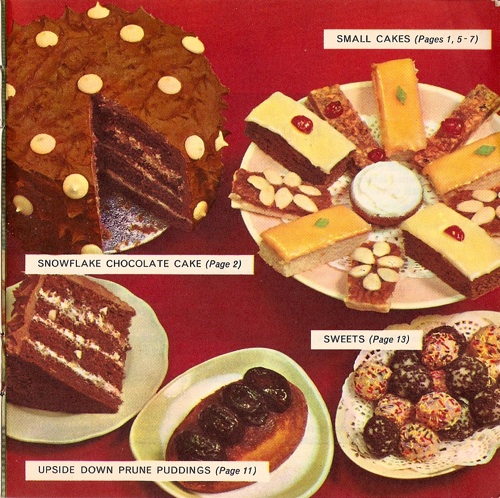
I suspect that the colour saturation is probably to do with the state of printing technology at the time and the care taken by the printer.
I have these two Stork recipe booklets, and eight more! The county show one is definitely my favourite, although another one – “Away from it all with Stork” – has a die-cut front cover with a caravan window and a porthole (sadly, my copy is damaged).
I certainly share your enthusiasm for old recipe books/booklets of this era, and am equally fascinated and repelled by some of the food photography. But maybe that’s because some of the recipes are truly revolting (I notice you refrained from scanning the page featuring “Frankfurter Rolls in Parsnip Cheese”!)
The illustrations are light-hearted and exuberant, and I’m sure you’re right that because they are aimed at women and the domestic realm they are easily overlooked. They lack the prestige of more ‘important’ commercial artwork.
Once upon a time, I started scanning some of my recipe booklets in this Flickr set:
http://www.flickr.com/photos/trevira/sets/72057594097599442/with/122520570/
Despite my earlier comment, some of the food styling is great, featuring some fabulous mid century tableware.
I am sure you are right and that printing technology had quite a bit to do with what was achieveable at the time, but the food photography of that era has a supersaturation which must be down to conscious choice as well. The aesthetic is pretty universal across almost every recipe book of the era that I’ve ever seen (as Sarah’s fantastic Flickr set shows), and they are choosing the accessories – as with the red tablecloth above – to play up to it and make sure you got a techicolour headache.
Why you’d want to do this, though, is an interesting question, and one I don’t know the answer to. There’s an odd ambivalence about food at this time; everything about the dining experience has to look as modern as possible, but quite often at the expense of the food itself. Take the plates, for example. They are desperate to look up to date, but as a result often have images of quite strange things on them – Parisian street scenes, dogs, furniture, pot plants – which while they are signifiers of modernity, aren’t usually associated with food when you’re a grown up. But then what was available (and people’s sense of what could be eaten in particular) hadn’t yet recovered from rationing. So perhaps they are trying to divert our attention from the taste? I don’t know. But someone really should have written a thesis about 1950s food styling and I would love to see it.
And of course printers inks – in particular certain colours and I can’t remember which ones – were in very short supply during the war, so there was also a great hunger for pictures which looked like this.