I know that it’s been said before on here, but it’s a thought that’s worth repeating. Not all old posters are nice. Not all of them are examples of great graphic design either. Some of them are, quite frankly, mediocre.

I’ve been reminded of this truth by a lot of coach posters which has just come up in an auction (the auction itself was today, but I’m not suggesting that you’d want to buy them). They are described as:
Approx. 20 various posters, mainly for coach tours to UK seaside and city destinations (Blackpool, London, Glasgow). All with wear – staining, torn edges and corners, to varying degrees. Approx. average size 29” x 20 ½”
But none of them are the usual suspects. There’s no Daphne Paddens here, nor anything by Harry Stevens or Studio Seven either.
In part I think that this is because a good number of these posters are actually pre-war.
But even the ones that might date to post 1945 aren’t the same as the ones we are used to seeing.
They’re produced by northern coach companies to start with.
Almost all the posters that I like and which get sold at auction and on eBay are, it’s worth noting, for more southerly companies.
Now I have a theory about this – which has to remain a theory for the moment because I can’t face the prospect of researching the histories of various bus companies and their takeovers. I think that the good quality coach posters are an aberration rather than the norm, because they were all the work of one bus company, and that’s Tillings.
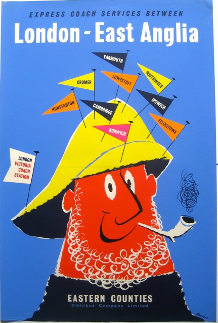
They were a huge conglomerate, who ran a vast number of local bus and coach companies in the years before and after the Second World War. (Can I just say that I’ve had to look up several bus history pages in order to make that statement, including one which invited me to listen to a man singing a song about Eastern Counties buses, so I’m already well out of my comfort zone here). The posters I like – so the Paddens and the Stevens and so on – are, I am pretty sure, all produced for Tillings companies.
So it’s not that coach posters tend to be good design. It’s Tillings’ coach posters that were good. I like to imagine them being commissioned by some unknown coach guru, equivalent to Frank Pick at LT, or Jack Beddington at Shell, but who has, sadly, disappeared from history.
Meanwhile, in other, Northern, coach companies, the same standards of taste were not being applied.
All of which proves, once again, that we have to apply a lot of critical thought to the posters that we’re presented with in archives (and, frankly, by blogs like this). They are sifted and sifted again: by what happens to survive, by what people decide is worth keeping, by what gets photographed and digitised, and by what ‘curators’ like me decide to show. But that isn’t the whole picture, by quite a long chalk, and whenever something marginalised like this comes up, we should pay close attention.
Oh, and while I’ve been writing this blog post today, the auction has been and gone. So I can now tell you that the posters fetched, £320, well over the estimate of £150-200. Which also goes to show that taste is a very variable thing.
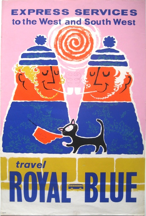
Tillings were one of two large groups in the bus and coach industry in the 1950s and 1960s. The other was the BET group. Tillings were much more centralised than BET in their organisation, and this seems to have extended to posters as well. There are a number of Tillings posters where the main design is identical for all their subsidiaries; all that differs is the name of the company. I think, given the technology of the era, that the posters were printed in bulk and then batches overprinted for each company.
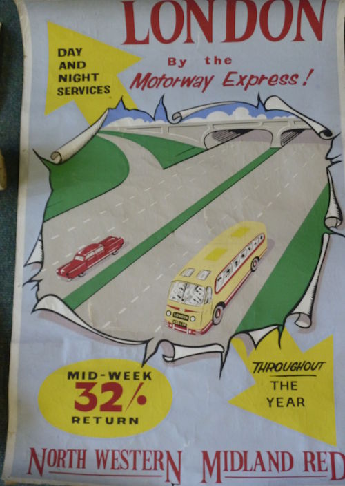
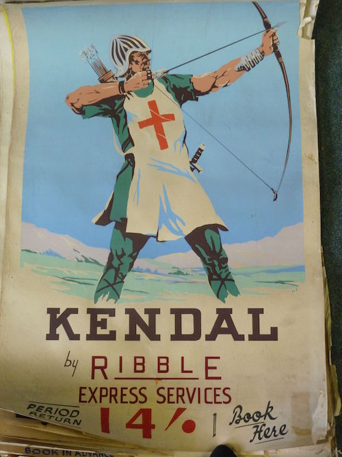
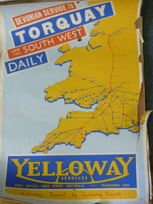
Of the posters shown, North West Road Car, Midland Red and Ribble are BET, Eastern Counties and Royal Blue are Tillings. Yelloway was an ‘Independent’, not belonging to either group.
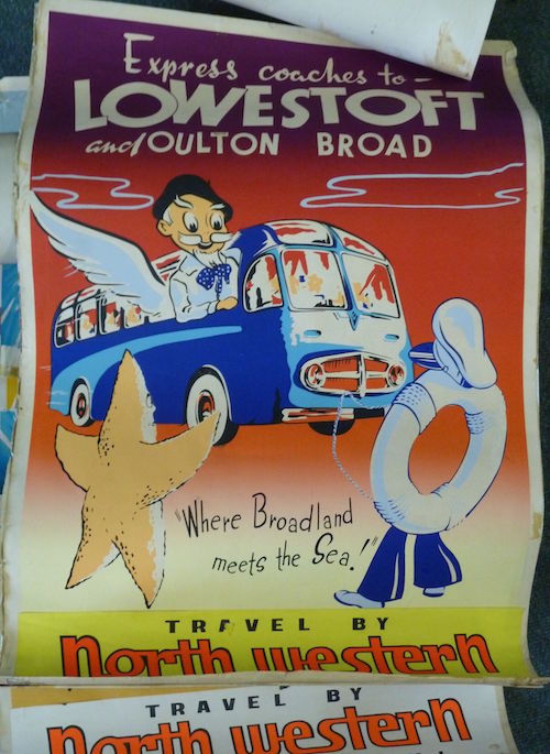
The style of coach puts the first poster in the 1950s, the service on the motorway [almost empty!] puts the second no earlier than 1959 and possibly just into the 1960s. The style of the coach in the Lowestoft poster also puts that in the 1950s, I believe. I suspect that the Southport poster is also 1950s because of the style, and the reference to the family doctor to me implies post-NHS.
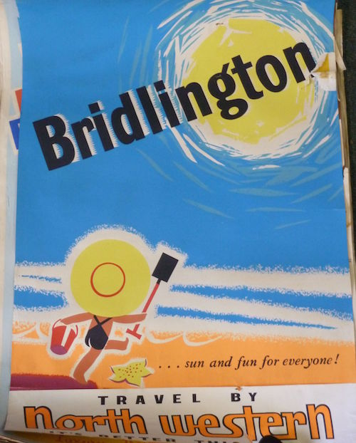
That Bridlington poster had another life;
http://www.scienceandsociety.co.uk/results.asp?image=10175608&itemw=4&itemf=0001&itemstep=1&itemx=25
Somehow it looks more appealing as a railway poster…or am I biased?!
Thanks for that. One day I will go through the Tillings archive and do some proper research, if there is anything there to be found. I did do a bit of looking around at Yelloways, and think that route poster is pre-war, because the compamy acquired some N Wales routes just after the war.
And yes, of course it looks better as a railway poster! Interestingly the date on that is 1959. I wonder then if it is a conscious reference back to Tom Purvis.