Owls, further

It’s seems to be book week here on Quad Royal.

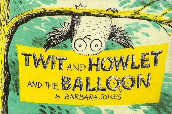
I was leafing through the wonderful Barbara Jones book (as mentioned before, but I have now read it and it is worth every penny and some more) and found this.  It’s late Barbara Jones, from 1970, but she’d clearly lost none of her touch, especially where owls were concerned.

Barbara Jones Twit and Howlet book

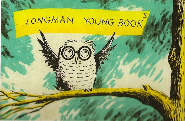
There is more owlage on the other side.

Barbara Jones Twit and Howlet back cover

And, from the sound of it, even more within.

The Owls were a large family of uncles, aunts, cousins and Grandma, who lived in an oak-tree called The Pines. Howlet and Twit, the twins, were the youngest of them, and sometimes they were indulged and sometimes they were sat upon, like everyone else.

But I shall never know any more of it than that.

Because, having a thing for owls, and Barbara Jones owls most of all, I went out searching.

And it is there.  But it’s £650.  Ouch.

So no more pictures – unless of course someone out there has a copy?

Autumn thoughts

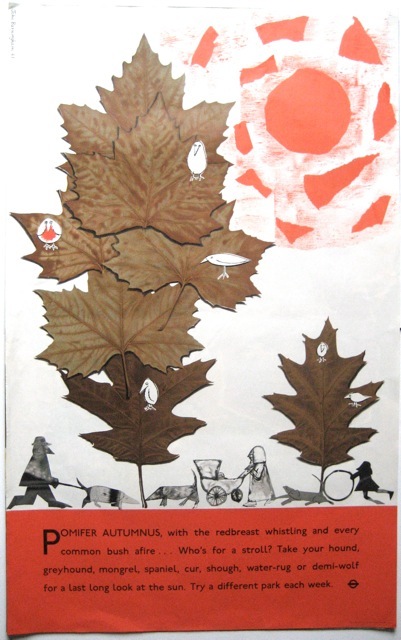
One of the pleasures of the last Morphets sale was a few of John Burningham’s delightful London Transport posters.  We bought this one.

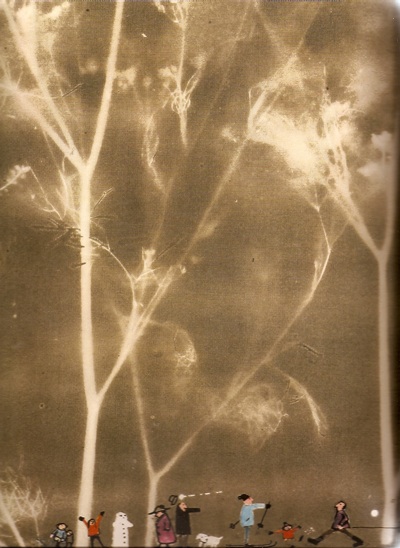
John Burningham Prunifer Autumnus London Transport poster Morphets

It’s even better in person, as everyone on the poster, the people, the dogs and especially the birds, are all real characters.

Perhaps that’s not so surprising.  Because, if you have anything much to do with small children, he’s much better known as a writer and illustrator of children’s books (and a few for adults).  That’s what he spent most of his life doing.

But when he was just setting up as an illustrator in the early sixties, he was commissioned to produce a series of posters for London Transport, each of them very different.

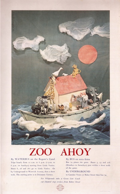
John Burningham Zoo Poster London Transport

This one is probably my favourite, as much for the eccentric text as the picture itself.

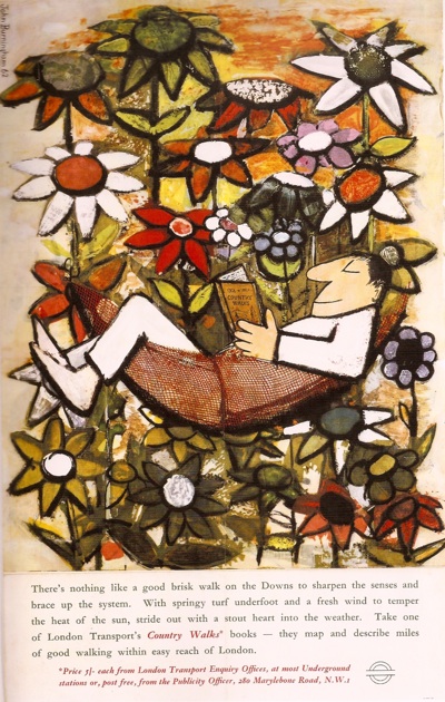
JOhn Burningham Country Walks poster London Transport

This is a farmer.  He has forgotten his bucket.  The cow’s name is Buttercup.  The wheel came off the cart on the last load of hay.  Green Rover, the god, is helping the hens find the egg they laid yesterday.  The goose won’t lay any golden eggs as he is a gander.

First steps in farming are best made with London Transport’s Country Walks Books.

All of these images come from his autobiography, John Burningham,which came out last year, which also means I could scan in this fantastic detail from his Winter poster from 1965.

John Burningham detail of Winter London Transport poster 1965

Here’s the whole thing.

John Burningham London Underground winter poster whole

The day [my first] poster was to appear at London Underground stations and bus shelters, I got up early and went on a local tour.  I thought people would be discussing my poster, but their reaction seemed to be to ignore or lean against it.  This was disconcerting, but happily I continued to do more posters for London Transport.

I can’t recommend the book too highly, even if you have no interest at all in children’s illustration.   Burningham had an idiosyncratic childhood, raised by Conscientious Objector parents and a succession of off-beat and progressive schools, including, finally, Summerhill.    He writes very well, but, even better, the book is very much written with a designer’s eye, telling the story through images as much as words.  There aren’t as many books like this as there ought to be.

John Burningham rush hour poster London Transport

If you don’t want to buy it, although I can’t think why that might be, there are a couple of interesting articles out there fom the book’s publication, including an interview and this thoughtful review.

John Burningham Downs poster London Transport

So there’s no excuse not to discover, not only his work, but also what a fascinating and thoughtful designer he is.

Havinden it all

She made me do it.  (Points to Shelf Appeal at the next desk).  She posted about Ashley Havinden and asked a question.  So then of course I googled.  And found this.

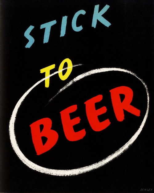
Ashley Havinden Stick To Beer poster

Which meant I had to post it.  I can’t tell you much about it though, other than that it comes from the Penrose Annual 1939 and really should be reproduced right now.  Who needs ‘Keep Calm and Carry On’?

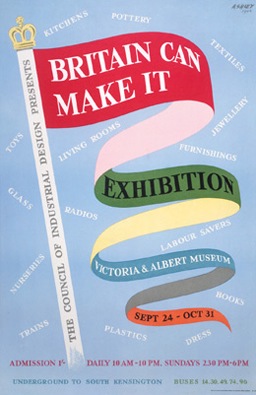
That alone would be enough.  But both Shelf Appeal and the search have reminded me that Mr Havinden was an interesting cove.  He was clearly a man of such prodigious talents.  As well as enlivening socks, it seems that he invented the idea of the brand as personality and was responsible for huge swathes of the Britain Can Make It Exhibition, including its poster.

Ashley Havinden Britain Can Make It Poster

But  he isn’t that well known these days.  Which is strange because I get the impression that just before and after World War Two, he was considered very influential indeed; the man who, along with McKnight Kauffer, brought modernism to Britain.

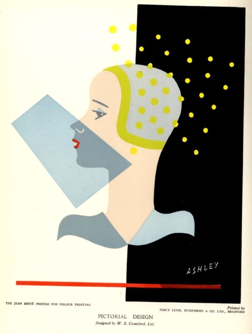
an illustration about printing Ashley Havinden

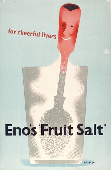
I think there are a couple of reasons for this.  One is that he spent most of his working life as an Art Director at the Crawfords Agency.  So not only did a lot of his work perhaps go out anonymously, but he was an art director as much as designer, a back room boy.  Which still made him very influential.  I’ve been flicking through Designers in Britain in search of him, and discovered that he commissioned Tom Eckersley, for instance, to produce this campaign for Eno’s Fruit Salts

Tom Eckersley Eno's Fruit salts advertisement 1947

(Eno’s went from McKnight Kauffer pre-war, to Eckersley in 1947; they always did have good taste in graphics).

But I think Havinden’s other problem is that he didn’t produce many posters.  Which is a daft reason for leaving someone out of the histories, but it is the lens through which graphics of the time are, mainly, viewed.

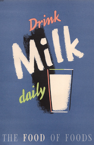
The few of his posters that I can find seem to have been produced for the war effort.

Ashley Havinden drink milk daily

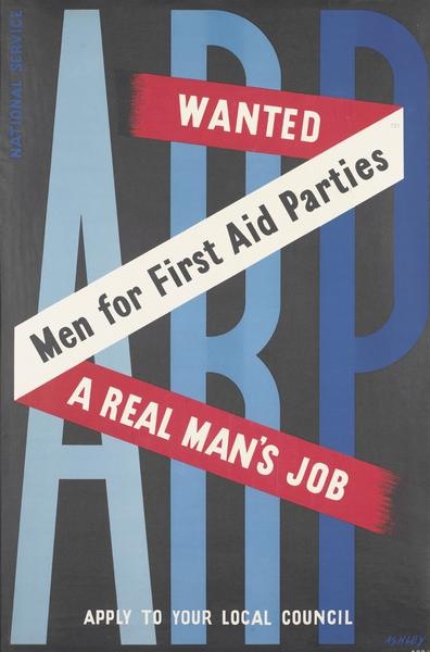
Ashley Havinden First Aid parties poster

Perhaps there are more – in which case, I’d love to see them.

I’ve got a few more thoughts on why he is perhaps not as well-known as he might be, but they’re going to have to wait until I’ve read this book (for which I also have to thank Shelf Appeal) in case I am completely wrong.

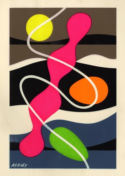
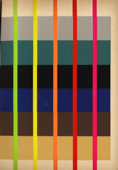
But whatever the book says, I definitely don’t think his obscurity is deserved.  Take a look at these images that he produced in the early 50s (from the 1953 Penrose Annual, which was also on the shelves).  They’re illustrating an article he wrote on “Designing for Fluorescent Printing” (top tip: use a dark background).  He was an artist and a modern, and rather a good one too.

Ashley Havinden from Penrose Annual 1953

Ashley Havinden Penrose Annual 1953

Last of the summer wine

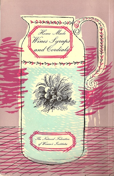
I was thinking about elderberry cordial, and so dug this out of a drawer.  Then I was so struck by what a beautiful image it is that I forgot all about recipes and went off on the trail of its design instead.

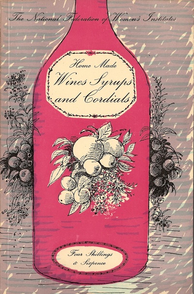
WI wine book front cover

The book is the Womens Institute Book of Home Made Wines Syrups and Cordials.  Curiously, it has an introduction by our old friend Sir Stephen Tallents of GPO and Empire Marketing Board fame (who says that country wine is a good thing and so is the W.I.), but it’s the illustrations that are the real star here.

They’re by Roger Nicholson, who did what I think is an even more lovely job of the back cover.

WI wine book back cover

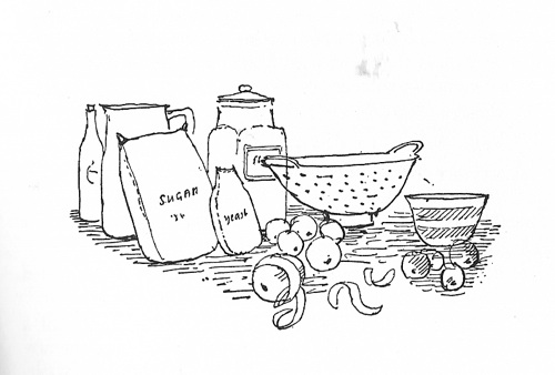
As well as a series of very attractive line drawings for the inside too.

WI wine book illustration equipment

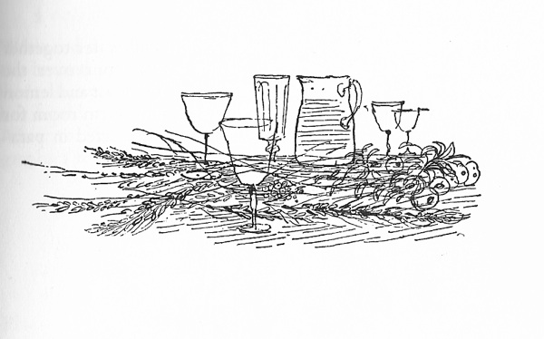
This is for Equipment, while below is Herb Wines.

Herb wine illustration

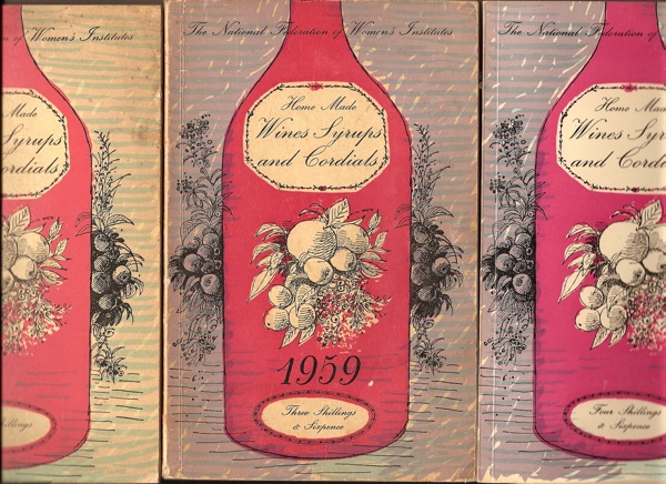
The first edition was 1954, which I’m guessing must be when the drawings date from, but it was published in exactly the same form until at least 1967.  I should know, for some reason I have three copies.

3 copies of the same book

Still, it is very useful.

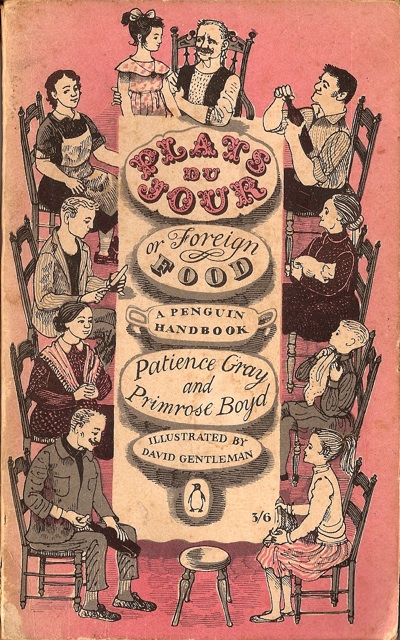
Something about the style reminds me of this book, the wonderful Plats du Jour, illustrated by David Gentleman, which happened to be on the shelves above.

Plats du Jour front cover David Gentleman

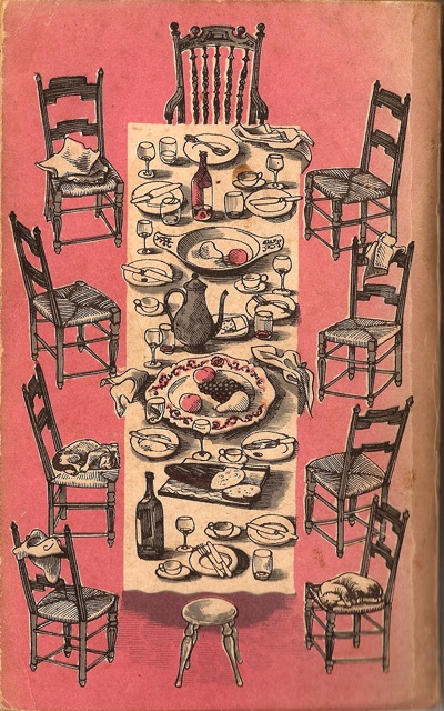
And which also has a similarly appealing back cover.

Plats du jour back cover

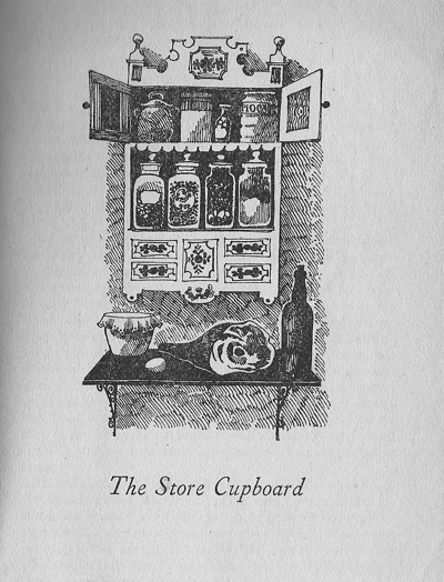
This too has lovely black and white illustrations heading each chapter.

The Store Cupboard from Plats du jour

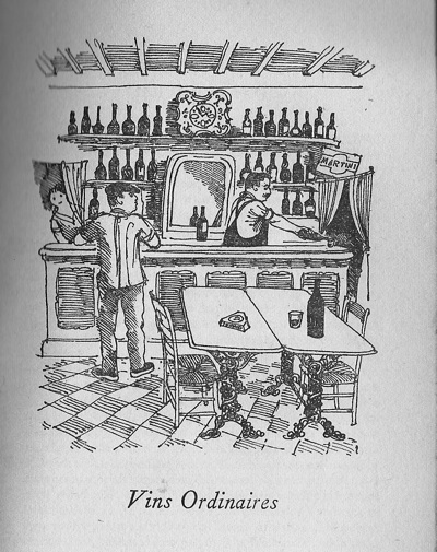
I could quite happily scan each and every one of them, except that I’m afraid I would break the spine.

vin ordinaires from plats du jour

Plats du Jour was published in 1957, so together these books are a reminder that there was a lot more going on in post-war Britain than just modernism.  I’m thinking about this a lot at the moment, partly because of Paul Rennie’s book, and will write some more on it in a week or two.  But for now, I wanted to celebrate Roger Nicholson.

He turns out to be the sort of person who ought to be better known.  He painted and did graphic design as well as these illustrations, but his main work was in fabrics and the like – he was Professor of Textile Design at the Royal College of Art in the late 50s and 60s and produced some very well-known wallpaper designs as well.

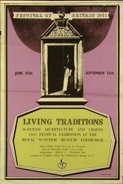
But I can’t turn up a lot of his stuff.  Here’s a poster he designed for the Festival of Britain (thanks to the Museum of London archive that I’ve mentioned before).

Nicholson Festival of Britain poster Living Traditions

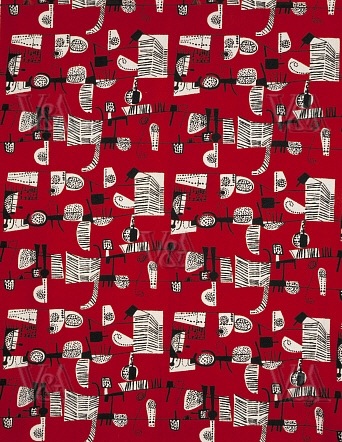
And here is one of his textile designs from 1951.

Roger Nicholson textile design

But that, I am afraid, is it.  It’s a real shame, I would have loved to see more and to know more.

I did managed to find one short biography as well, which offered an intriguing quote about his work.

It was Roger Nicholson’s gift and curse as an artist that he was incapable of making an ugly mark on a piece of paper.

There are far worse ways to be remembered, but I think he deserves a bit more than just this.

Designer O’ Nine Lives

Not for the first time, or indeed the last, we’re exploring the cross-over between children’s illustrations and graphic design of genius, this time in the company of Tom Eckersley.

It seems to be fairly well known that he did the illustrations for a couple of children’s books, but it’s rather harder to actually catch sight of them.

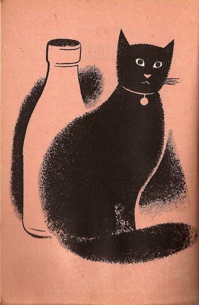
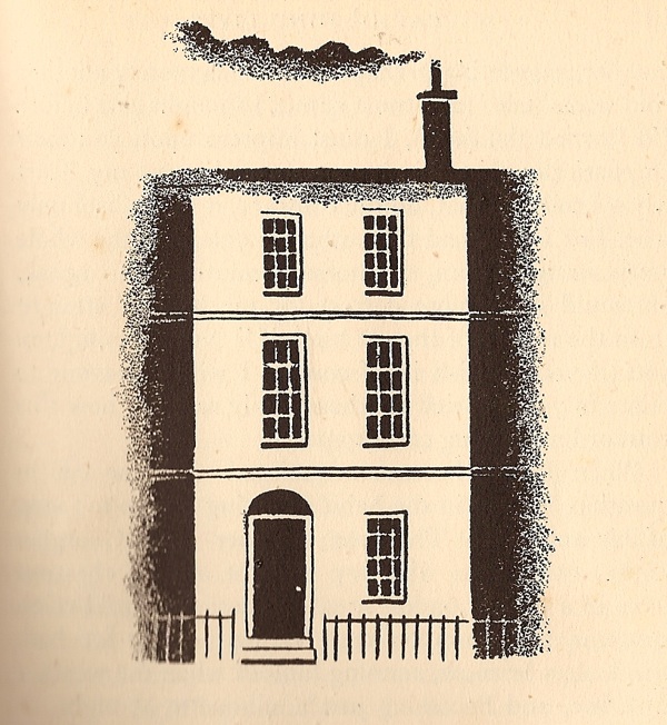
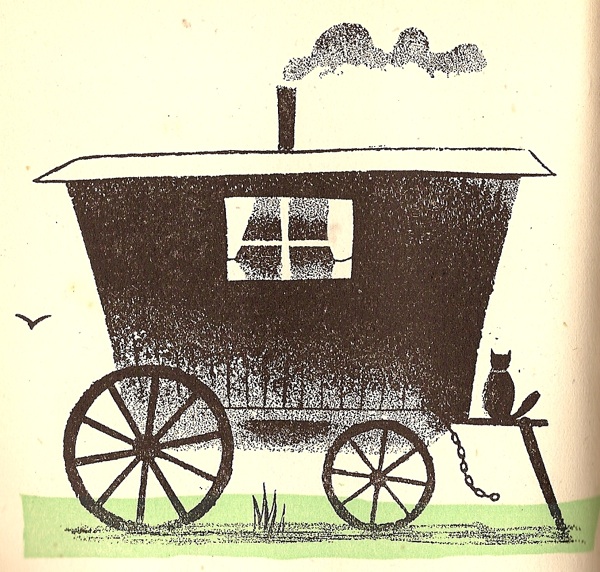
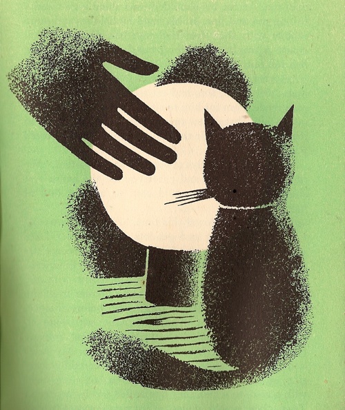
Tom Eckersley illustration for Cat O' Nine Lives

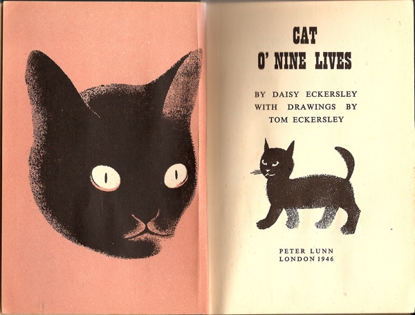
So today, here are some of the illustrations he did for Cat O’Nine Lives back in 1946.

Tom Eckersley illustration for Cat O' Nine Lives frontispiece

Quite apart from the design, the book has an autobiographical interest too.  It was written by his first wife Daisy, and is dedicated “To our sons: Anthony and Richard”.

Tom Eckersley illustration for Cat O' Nine Lives

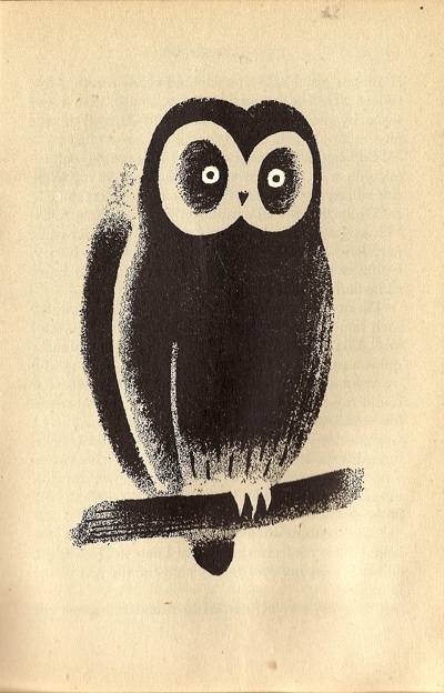
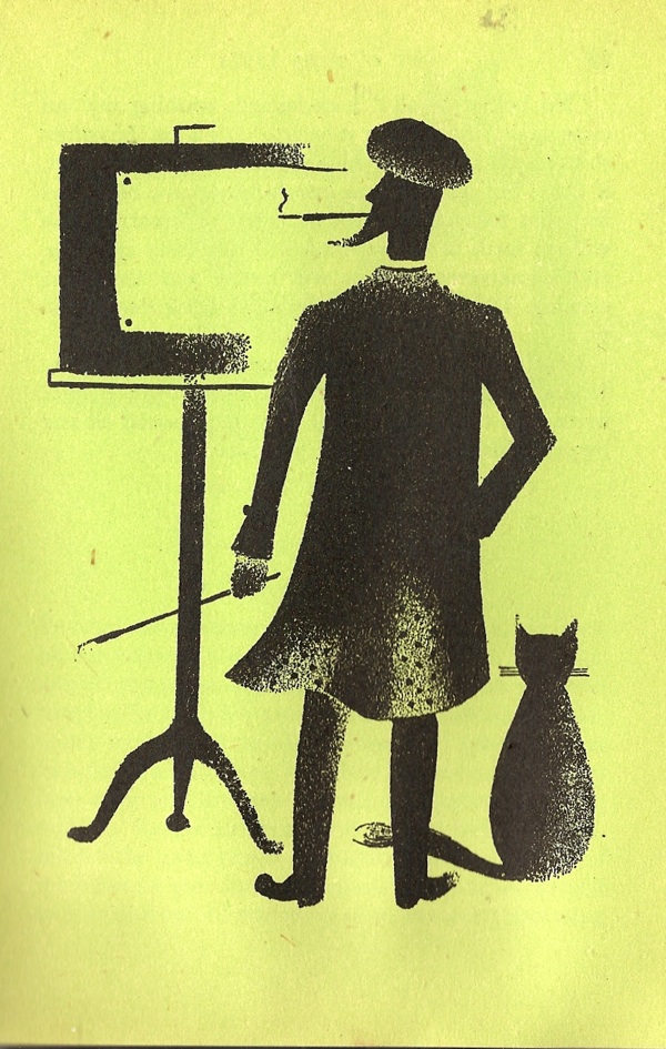
I haven’t counted all the illustrations, but there are two kinds.  Some are full-page, inserted into the chapters on and with the whole page overprinted so that it is a different colour, like the owl and the artist below.

Tom Eckersley illustration for Cat O' Nine Lives

Tom Eckersley illustration for Cat O' Nine Lives

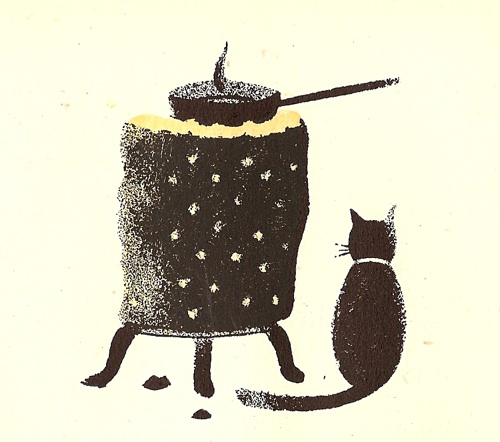
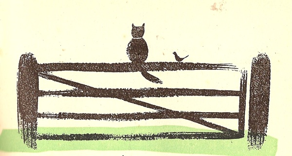
Then there are smaller illustrations at the start of each chapter.

Tom Eckersley illustration for Cat O' Nine Lives

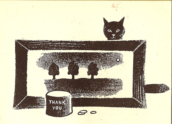
Some are entirely black and white, a few have a single additional colour.

Tom Eckersley illustration for Cat O' Nine Lives

The paper quality isn’t the greatest, and the book itself is quite small (about 4.75″ x 7″), but given that it was printed just after the war this probably isn’t surprising.

Tom Eckersley illustration for Cat O' Nine Lives

What I find really interesting is how simple his illustrations are at this point in his career.  It’s as though he started out with an almost minimalist style, then became much more complicated and ornamental throughout the 1950s, and then, gradually, he unpicks this to become more and more simple once again.

Tom Eckersley illustration for Cat O' Nine Lives

You will notice that I say nothing about the story.  I quite like cats, but still find it fairly fey going.  But should you ever trip over it in a second hand book shop, don’t let that put you off.  As you can see, it’s worth it for the illustrations alone.

Tom Eckersley illustration for Cat O' Nine Lives

Further Coaching

It’s the last stage of the giant Daphne Padden archive-fest on Quad Royal.  Most of the posters I’m putting up today are for coach companies and so have at least been seen before.  In fact well over half of these are on sale at Morphets tomorrow, so if you take a fancy to any of them, you can probably have one, although I can’t promise at what price.
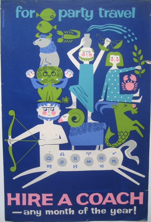
Daphne Padden coach party travel star signs

I know I should stop making fun of these poor northerners and their low prices, but this one is estimated at £50-100.   The rabbits below get the same estimate, and you get another spring poster to boot.  If only.
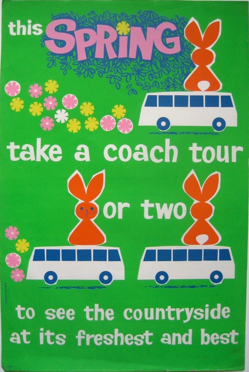
Coach tour rabbits Daphne padden coach poster

But I haven’t just come here to mutter about Morphets once more, there are a couple of things worth saying about these posters.
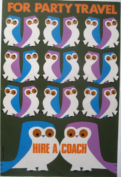
Daphne Padden Owl Party travel poster

One is just what a difference an archive makes.  Daphne Padden’s posters are beginning, over the last few years, to surface into the general design consciousness.  But I do wonder whether she would have been better known if she’d worked for British Railways or London Transport as well.
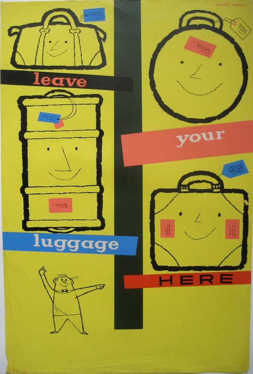
Daphne Padden luggage poster coaches

Royston Cooper has had a similar, if less dramatic problem.  Both he and Padden designed a whole series of really great posters for the coach companies.  But because the coach companies both had a more chequered history, and were never really considered as a national asset in the same way anything which ran on rails, the nuts, bolts and printed matter of their past didn’t end up being preserved.
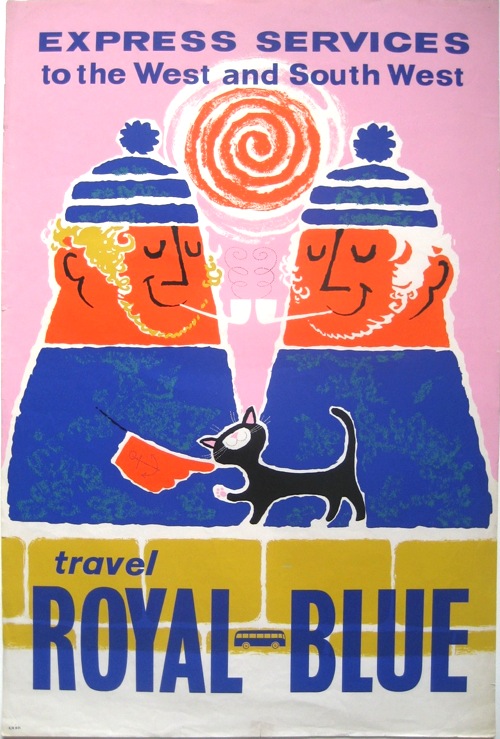
Lovely Royal Blue Daphne Padden coach poster

A very brief summary of what happened in the world of coaches is that the many small companies like Royal Blue which served the different parts of the UK, were gradually bought up and amalgamated into larger groups.  In 1947 – after a war in which few coaches ran – the whole industry was nationalised, eventually becoming National Express.  This was then split up and de-nationalised between 1983 and 1987.  And somewhere in all of that, we stopped caring about coaches and, most likely, a whole pile of history was thrown out into a skip.
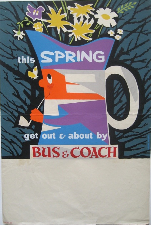
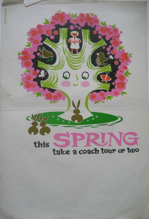
Spring coach poster Daphne Padden

With the result that we now don’t really know anything about coach posters at all, never mind having an archive or even dates for them.  Well, except for a few like the one below.
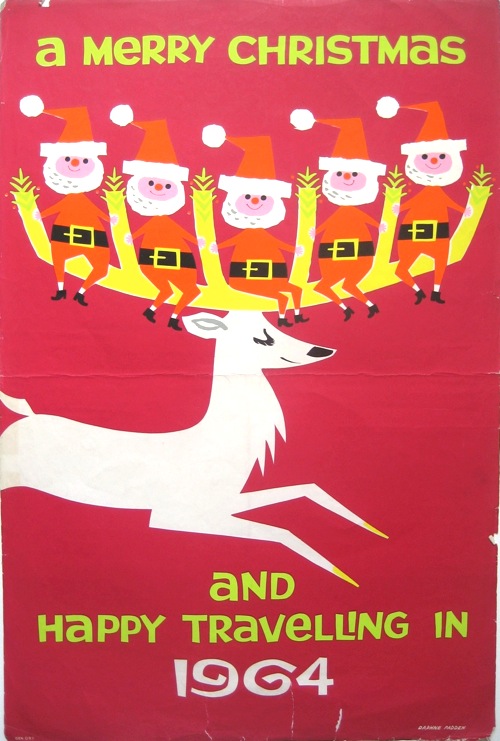
Daphne Padden Christmas Coach Travel 1964 poster

Which is an enormous shame as there are some wonderful posters made for the coach companies which have almost disappeared into oblivion.  And is why I keep banging on about them here, trying to give them some kind of visibility on the web.
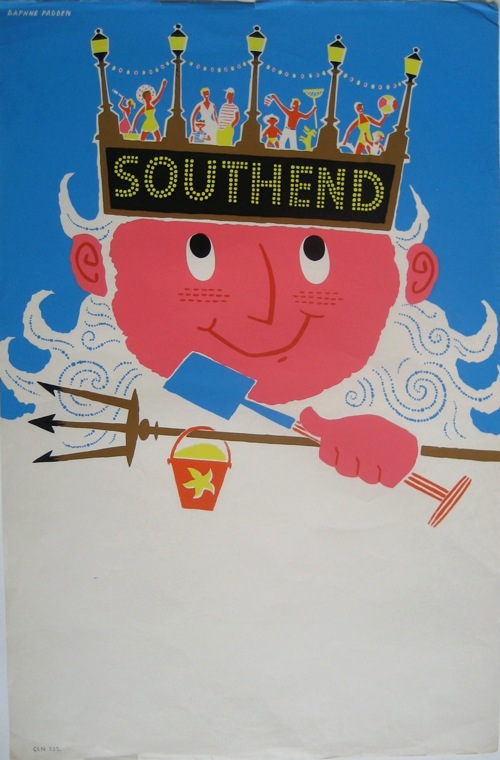
Daphne Padden Southend coach poster

My other thought is a bit more positive though, which is that her particular style of design is now becoming interesting (possibly even fashionable) for a wider audience of designers and, possibly, collectors.  Take a look at the Fears and Kahn website, which I’ve been meaning to mention for a while.  They’ve put together, for selling, a rather distinctive set of posters, some from  coach companies, but very much in this particular idiom.  I’m hoping that this will be the start of more recognition for designers like Padden and Royston Cooper.
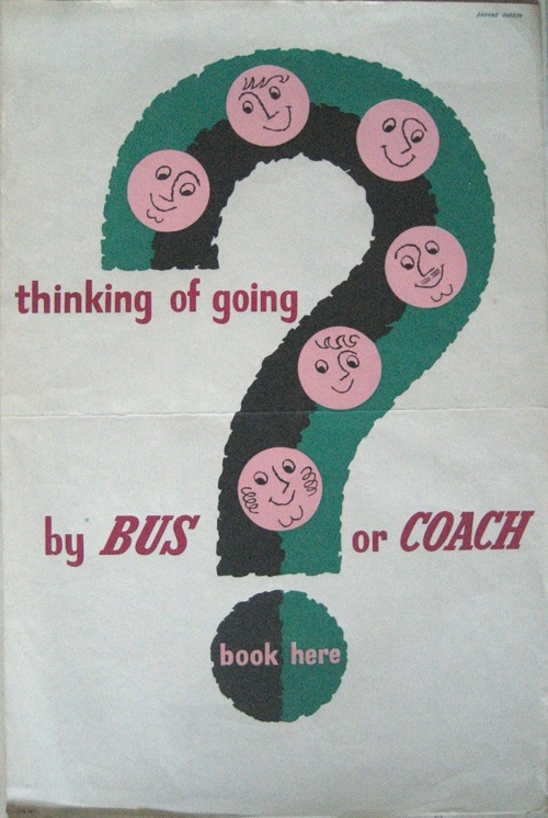
Daphne Padden Coach information poster

And finally, a few odd notes on some individual items.  I am guessing that this is some kind of early artist’s proof for her famous Royal Blue poster.
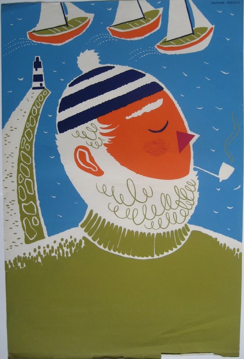
Daphne Padden Royal Blue artists proof

What’s odd, is that it’s not a print with just one colour missing – the text in the final poster is in the same dark blue as his hat and the lighthouse.
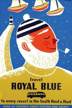
Finished Royal Blue Daphne Padden poster

Even odder, is that his smile is missing in the proof too.  I’m glad he cheered up.

And finally, I just like these.  I think they should be on t-shirts or something.
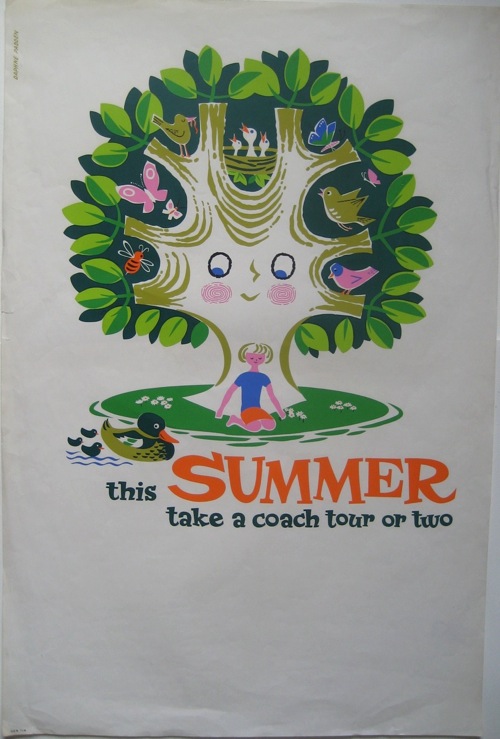
Daphne Padden Summer coach tour poster tree

Daphne Padden spring coach tours poster tree

Do we have any takers for Quad Royal branded goods?