Coming in to land

Another thing that Morphets has made me think about is the work of Lander, Reginald Montague Lander to be precise.  (I used to think he was called Eric, perhaps as the result of a misattribution somewhere, but he isn’t.  So there.)

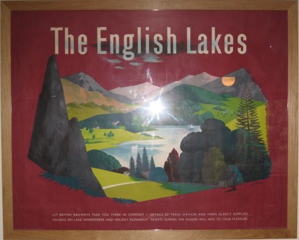
Now, I am a huge fan of his work, mainly as a result of this poster.

British Railways RM Lander English lakes poster

It’s a poster I have a sentimental spot for, because it’s the first one I ever bought at auction.  But I also think it’s brilliant; it’s a modernist re-imagining of the great tradition of railway Quad Royal landscape posters in a way that really works.  I can’t think of another poster quite like it.  (Apologies for the flash reflection, by the way, it’s an unfortunate side-effect of framing things).

So, considering that he can produce posters as great as this, why doesn’t he get more recognition for his work?  There are a couple of reasons I think.

One is that, reinforcing Paul Rennie’s point of the other day, his stuff rather falls between two stools.  The vast majority of his posters were produced for British Railways.  But they’re not (with the odd exception above) the kind of nostalgic landscapes that railway collectors really fall for.  So the railway buffs don’t much care for his stuff, and the mid-century modernists don’t notice him that much because, well, it’s railway posters.  (Almost all the images here come from the National Railway Museum via the NMSI search engine, as you can see.  No one else seems to have any quantities of his work at all).

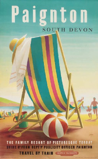
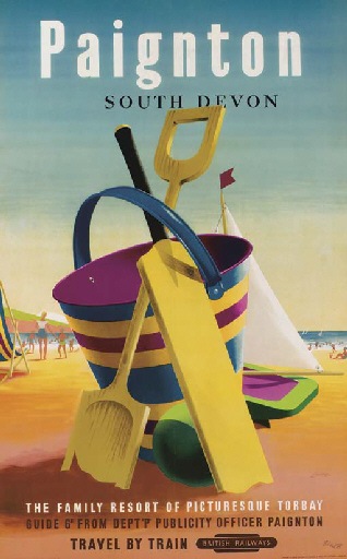
He did produce a few images which are instantly recognisable, and do sell, in particular these two for Paignton, both from 1956-ish.

Lander Paignton Poster British Railways

Lander Paignton British Railways poster

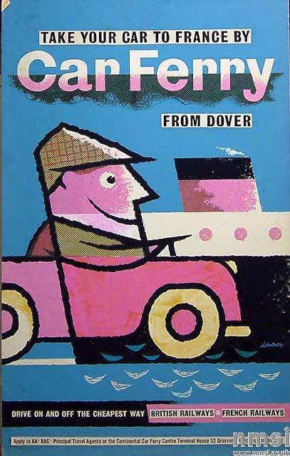
At its best, his work can hold its own with any of the designers of the time, as the images above, and this 1960 poster  show.

Lander Car Ferry British Railways poster

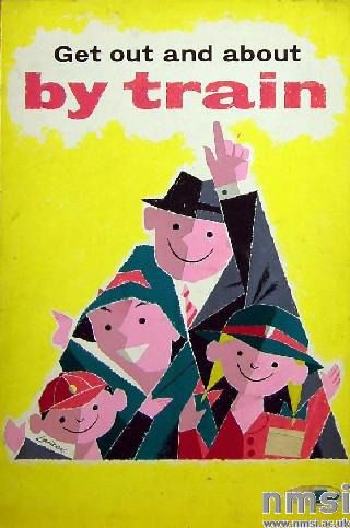
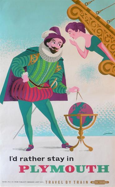
But part of the problem is that he can’t be pinned down to a recognisable Lander style.  He did cheerful cartoons in the style of Amstutz and  Bruce Angrave, or even early Tom Eckersley.

Lander original painting for get out by train british railways poster

Lander Plymouth British Railways poster

(Original painting from 1960, poster from 1961).

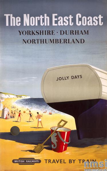
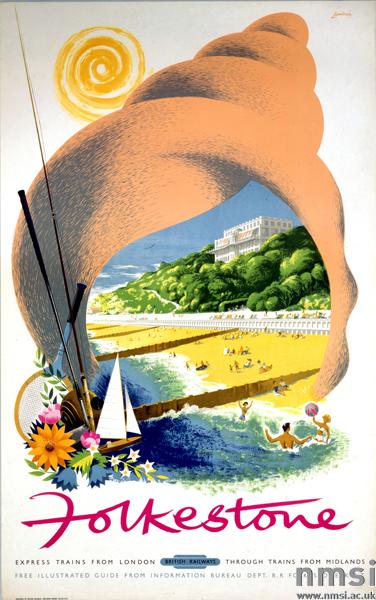
He could do more traditional railway posters too; these are from 1957, and the second one reminds me a great deal of Percy Drake Brookeshaw, although with slightly less migraine-inducing colours.

Lander British railways north east coast poster 1957

Lander British railways folkstone poster 1957

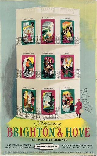
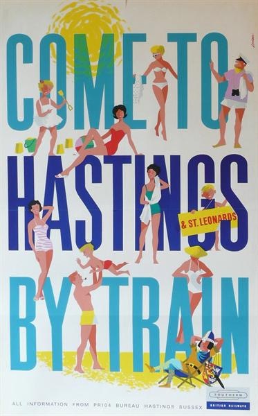
He could do you whimsical neoclassical or modern text if you wanted, too.

Lander Brighton and Hove british railways poster

Lander Hastings by train British Railways poster

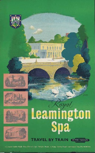
He was also very good at drawing complicated buildings.

Lander Leamington Spa poster British Railways

But this great long list also hints at the other problem with his work.  He was so prodigously productive, that not every poster of his is great, or even good.  How could they be when he seemed to be churning out a poster every other day?

But that’s not a reason to under-estimate his great designs.  He still deserves to be seen by more than just railway poster fanatics.

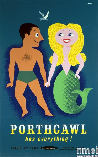
Lander Porthcawl British railways poster

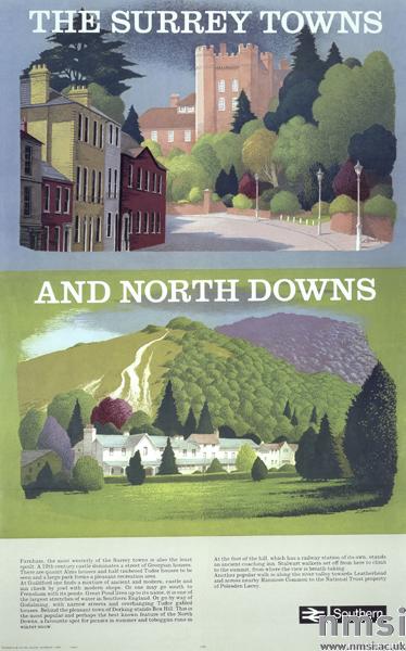
It’s also worth noting that his extraordinary energy meant that he carried on as a poster designer for far longer than almost anyone else.  We’ve got a selection of BR posters of his from 1978.  And the NMSI collection includes a set of designs from 1980, including this.

Lander Surrey Towns British Railway poster 1980

I had no idea that anything of the sort was being commissioned by then.

Finally, should I have persuaded you about Mr Lander’s work, Hastings and the Plymouth poster above are both for sale at Morphets tomorrow and Thursday, estimated at £75-125 and £1oo-150 respectively, along with fifty or more others.

Lander mixed lot from Morphets

Hurry now, it’s almost time to get your bids in.
Owl Saving Time

I did promise some more Daphne Padden posters in due course, so, now that I have managed to produce some reasonable photographs, here goes.  One day I will discover thousands of pounds in my purse and pop out to buy an AO scanner, but until then, you’ll just have to make do with these.

To start, this is a rather eclectic selection, mainly because I haven’t seen any of these before now and it’s good to get them out into the world.

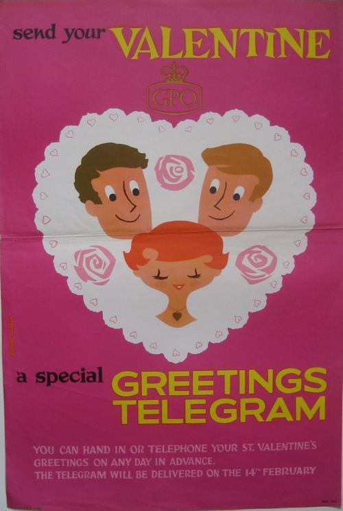
The GPO one is quite straightforward – and rather sweet – although I can’t find it in the BPMA’s catalogue.

Daphne Padden GPO vintage valentine telegram poster

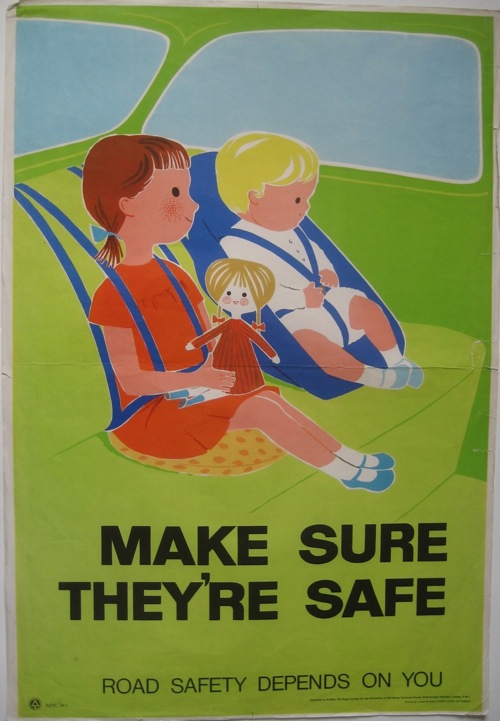
The same is true of the ROSPA seat belt poster.  (I distinctly remember having seatbelts very much like this, and I suspect the poster is just the right vintage for this to be true!)

Daphne Padden ROSPA seat belts for children poster

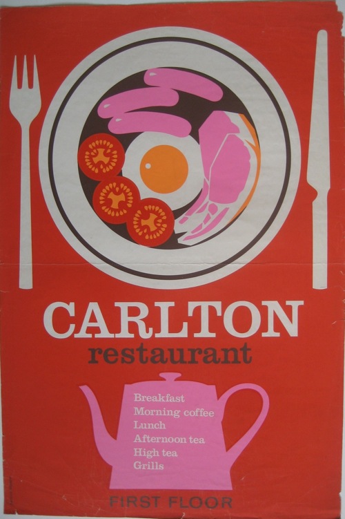
But I can’t tell you the first thing about the Carlton Restaurant, other than that I rather like both their colour scheme and the look of their breakfasts.

Daphne Padden Carlton Restaurant poster

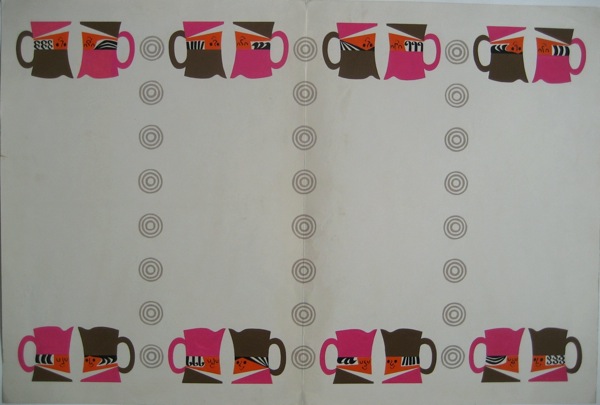
Any ideas?  I think this art work may have been for them as well, simply from the colours and the crockery.

Toby jug artwork Daphne Padden

All of these posters came from the sale of Daphne Padden’s work after her death, and sadly came with nothing that might identify them or what they were for.  I don’t even know whether they were ones she particularly liked, or simply ones that had survived.  So if anyone can tell me anything more, I’d love to know.

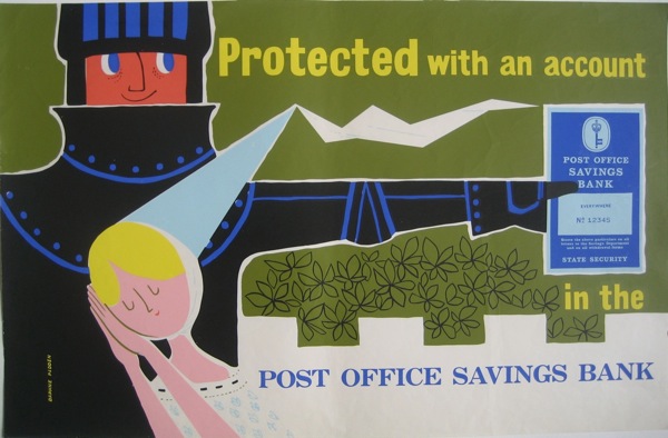
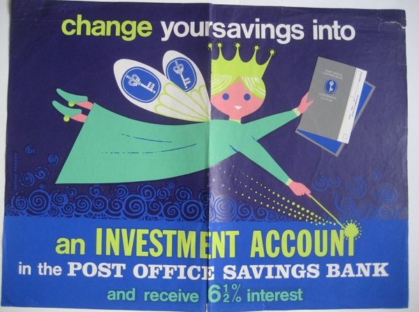
Also among them were a whole pile of Post Office Savings Bank posters, including this rather lovely pair promising you fairy-tale endings if only you’d save.

Daphne Padden Post Office Savings Bank Knight poster

fairy Daphne Padden post office savings bank poster

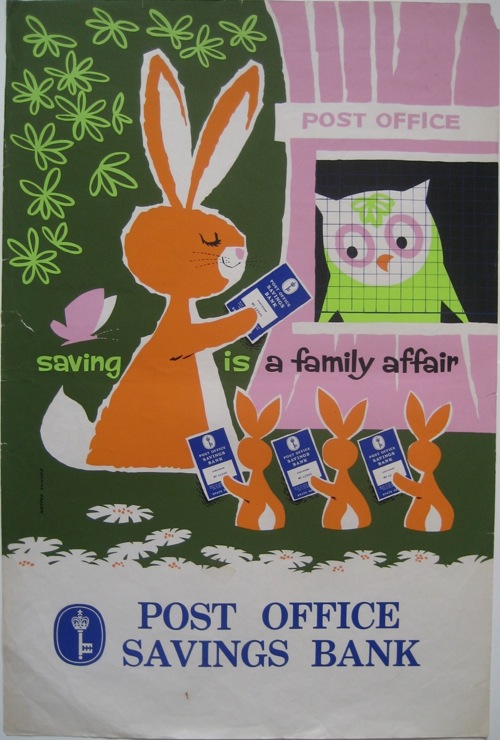
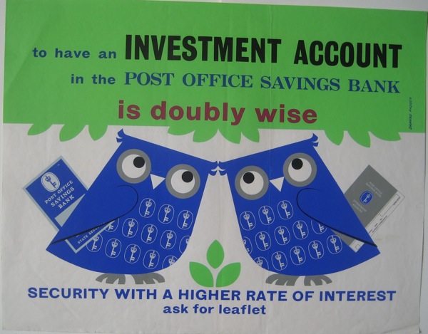
There are also some rather fine animals.  I posted the rabbits last week, but the owls also get a starring role on their own.

Post Office Savings Bank poster owl and rabbits Daphne Padden

Daphne Padden poster owls Post office savings bank

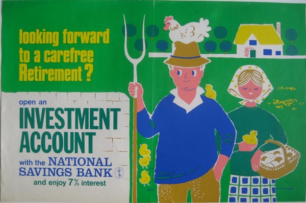
These I can at least make a stab towards dating.  The Post Office Savings Bank turned into the National Savings Bank in 1969, and Padden did posters for both of them in very similar styles and even colour schemes.

Daphne Padden National Savings Bank farmer poster

So I am guessing that the vast majority of these date from the second half of the 1960s, and perhaps the very early 1970s.

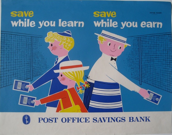
This one, though, feels a bit earlier and is probably my favourite.

Daphne Padden Post Office Savings Bank poster child and butcher

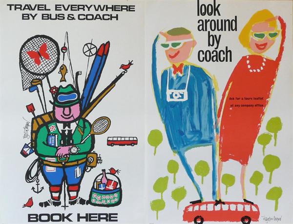
That’s not all, either.  Next time I’ll post the slightly more familiar, but still wonderful coach posters.

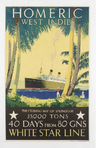
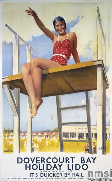
But before then, a couple of footnotes.  One is that there’s quite a bit of confusion out there between Daphne Padden and her father, Percy, who also designed posters.  If you go through Christies’ past lots, quite a few of them are ascribed simply to ‘Padden’, while this poster is sold as being by Daphne.

Percy padden White Star vintage poster

Which, given that she was born in 1927 and this poster is most likely earlier than that, seems implausible.  But they’re not the only ones to make the mistake.  The NMSI also ascribe this one to her (an error which probably goes back to Science and Society photo library cataloguing).

Dovercourt Bay Percy Padden poster railways

They date it to 1941, but I would have thought it more likely 1930s.  Even in 1941, though, Daphne would only have been 14, so again, I think it’s most probably her father’s.  There’s a nice tranche of work for someone in attributing out their posters one day, if anyone out there fancies taking it on.

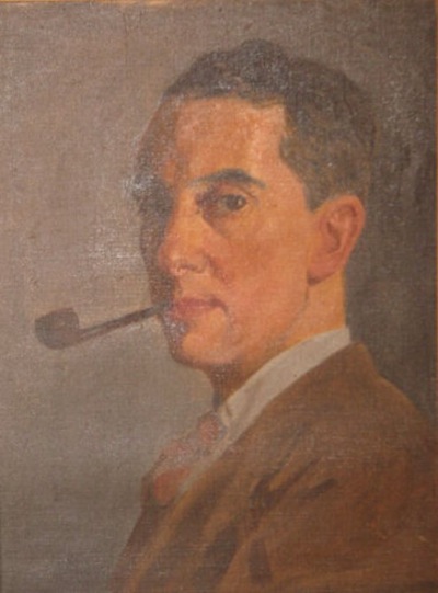
On a more personal note, when the posters were sold, it was sad to see some sentimental items in with them.  Here’s her father, in a self-portrait done when he was younger.

PErcy Padden self portrait

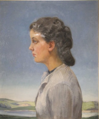
And here’s his portrait of Daphne in 1940.

Daphne Padden oil portrait by Percy Padden

I do hope the pictures went to someone who knew who they were.

Artist and Balloonist

Last time I posted about Royston Cooper, I was shocked just how little it was possible to find out about him.  To the tune of nothing.  Christies could give me his dates, but that was about it.

Royston Cooper bus tour posters from Morphets

But, his widow, Marie, got in contact with the blog to say thank you for mentioning him.  I asked her to write something about him, so that the next person to search would at least do better than I had.

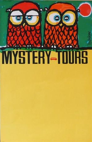
Owl mystery tours coach poster Royston Cooper

And she has, for which I am very grateful.

Royston Cooper 1931-1985 Designer/artist/painter/typographer.

Commissioned to design posters/prints/decorative drawings/brochures/annual reports/packaging/restaurant decor for major companies in UK and Europe. Always with a new approach.

Jovial character. Studio of 23 years in Belsize Park, London NW3.  Popular meeting place for clients and artists alike.

Also Balloonist flying his own balloon ‘Sunny Money’ G-BDBI in UK/France/Belgium/Germany/Sweden/Gordon Bennett races in the U.S.

I rather like the sound of him from that.

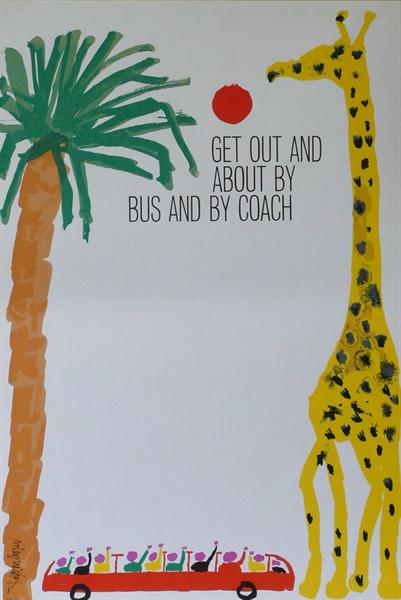
Royston Cooper giraffe coach poster from Morphets

Since I first wrote, Artist Partners have also put up a slightly more formal CV for him, which is great.  I’m really pleased that his life is now being recognised in proportion to the wonderfulness of the work.

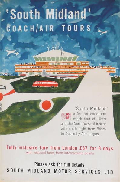
Air Coach poster Royston Cooper

All the images, incidentally, are Royston Cooper posters which are on sale at Morphets in a few weeks time, and I’ve chosen only ones I’ve never seen before.  Don’t eat them all at once.

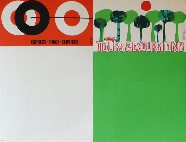
Two coach posters by Royston Cooper from Morphets

And now for something completely different

It’s very easy to reconstruct the past through the sensibilities of today.  We go back through the copies of Graphis and Modern Publicity, wade through the posters and the magazines that remain, only picking out the things that chime with us now.  And so we put together a story about the fifties which is about how a friendly kind of modernism finally caught hold in Britain.  But that’s not the whole story, just one thread out of the many different styles and designs that were going on at the time.
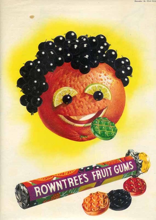
And why, you may ask, am I being told this once more?  It’s because I’ve found this website, a lovely tour round the work of illustrator Norman Weaver, put together by his daughter.

Norman Weaver Rowntrees fruit gums advertisement

The website would be worth a visit for Weaver’s biography alone, which includes training as a cabinet-maker for Heals, being General Eisenhower’s personal map-maker during the war, becomng an official photographer during the aftermath of the concentration camps and finally settling down to a career as a a still life artist.  And he worked with Beverley Pick for a while too, creating giant murals for the Festival of Britain.  It’s enough for five lives, and well worth a read.
Norman Weaver Heinz advertisements

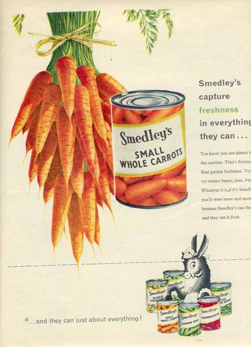
But the other reason to take a look is that Weaver’s work is important.  If you flip through any magazine of the period (and I can speak with some authority here, having been required to read both Woman and Woman and Home right through from 1949-1963 in my time) they are full of these kinds of slightly hyper-realistic illustrated advertising.  And Weaver was one of the very best exponents of this style.

Norman Weaver Smedleys advertisement

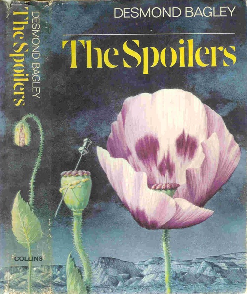
He was represented by Artist Partners, and like many illustrators of the period did a lot more than just advertising.  There are some very recognisable book jackets too.

Norman Weaver book cover for the spoilers

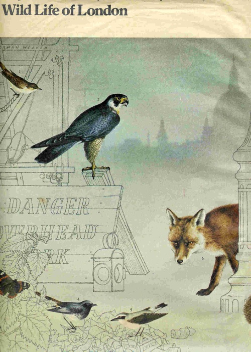
As well as some beautiful wildlife illustrations – these were for a Sunday Times article about wildlife returning to London.

Norman Weaver London wildlife

But it’s still the commercial and advertising drawings that are the most compelling for me.

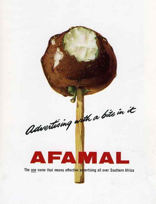
Norman Weaver Afamal advertisement

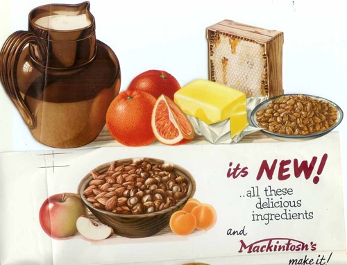
I think that’s because they tell another one of the really important stories of the time.  While the architects and the designers were all busy embracing Scande-lite modernism, with its wide plains of wooden floors and less is more ethos, for an awful lot of people the opposite was true.  More was very definitely more.

Norman Weaver mackintosh food ad

The rising tide of consumer goods in the years after the war must have seemed almost impossibly abundant after rationing, utility and bombs, a time at last of fridges, colour and as much food as you could want to eat.

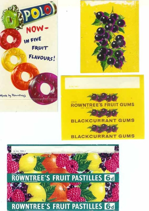
Weaver’s drawings celebrate this bounty in all of its vibrant, glistening detail.

Norman Weaver sweet wrappers

It’s impossible not to look at the past through the lens of the present, and I know that one of the reasons I like these illustrations is the fantastic colour and optimism – the latter in particular isn’t something you often find in modern design.

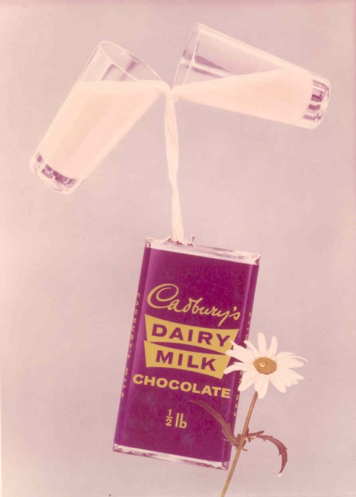
Norman Weaver Cadburys Dairy Milk

So all I’m really doing is telling another, slightly different story about what things looked like fifty or sixty years ago, it’s not any closer to the truth than any other.  But it’s a start.

Starting Small

I did promise some more Daphne Padden a couple of weeks ago, but there is a vast mound of posters to photograph (forty or more, not counting the duplicates) and with all the windows open for a breeze to stop my brain boiling in the heat, it’s not the easiest job right now.

So, as a starter, here are some small things, but ones that you might not have seen before.  (One or two of them might make it onto eBay in the next week or two, as we do now have quite a bit of her stuff…)

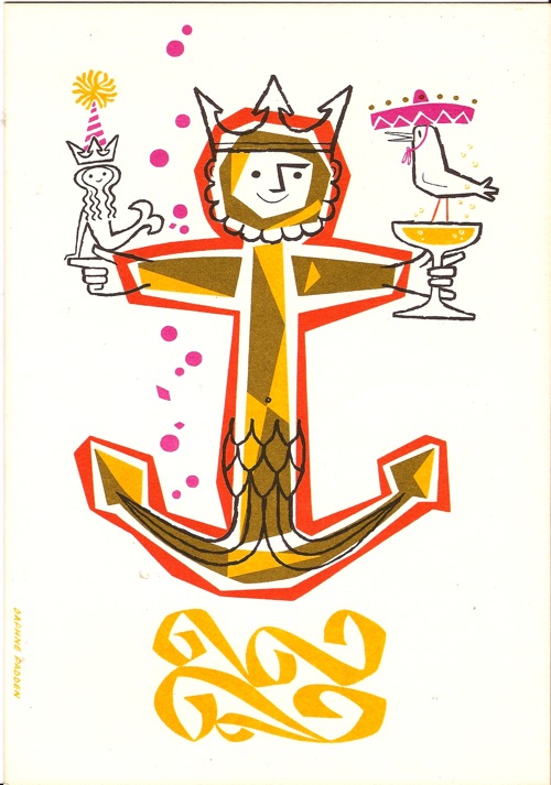
Daphne Padden P&O menu from estate sale

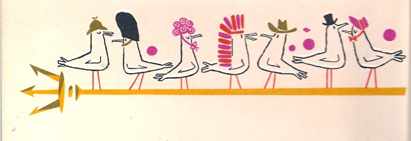
I’m guessing that this is another menu for P&O, but I can’t say for sure as it’s blank inside.  There is also a rather delightful trident-load of little birds on the back.

Daphne Padden menu birds on trident from back

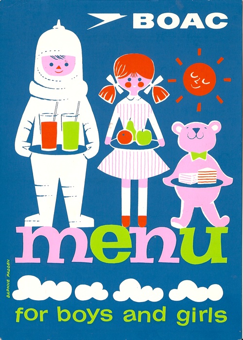
Then there’s a BOAC children’s menu.

Daphne Padden BOAC children's menu

I don’t know when this was done, but the food police weren’t too much in evidence then; the menu includes chocolate biscuits, preserves and Madeira cake, but no mention of vegetables at all.

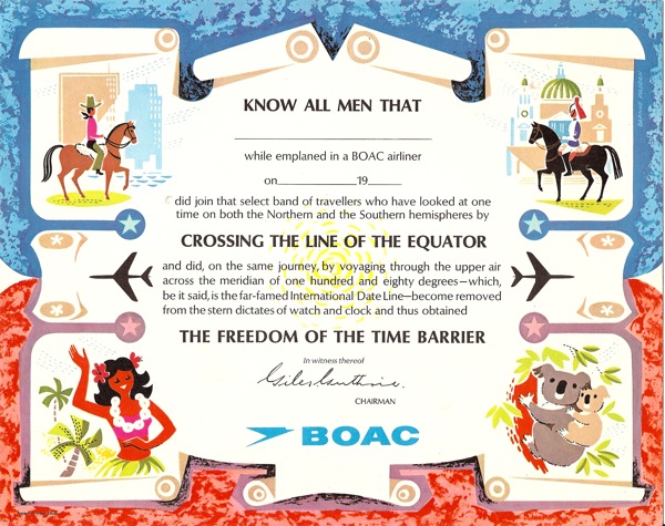
This equatorial certificate was for BOAC as well.

Daphne Padden BOAC equator certificate

She clearly liked all three of these designs, as they’d been framed for display and kept that way.

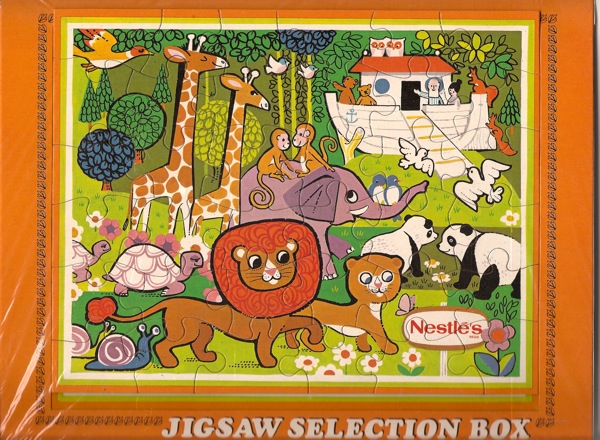
Finally, there’s a jigsaw for Nestle.  My guess would be that this came with a box of chocolates or biscuits.

Daphne Padden, Nestle animal jigsaw

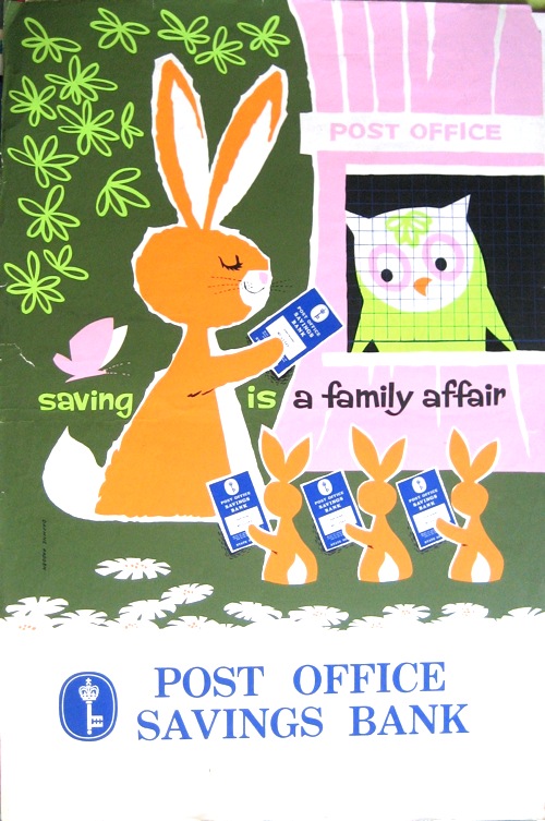
The lions are particularly fine – and there will be plenty more animals when I do get round to photographing the posters properly.  Here’s an owl and four rabbits to whet your appetite until then.

Daphne Padden National Savings Poster

The return of Mr Huveneers

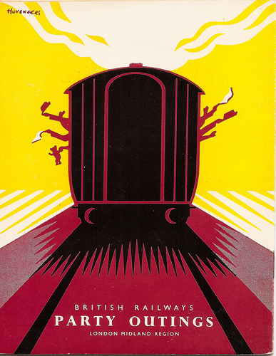
Mike Ashworth, whose Flickr stream brought us the wonderful lost posters of Notting Hill Gate, is clearly a man with much design ephemera to his name.  He very kindly sent me a link to this – a wonderful brochure cover by Pieter Huveneers from 1956.

PIeter Huveneers LM party brochure cover 1956

Now I blogged about Pieter Huveneers a while back, trying to find out discover whether the British designer of the 1950s then became the Australian corporate design guru of the 60s and 70s.  I had one enigmatic reply which said that this was the same person, but no more information than that.  Still, it’s good to know that he didn’t just disappear.  And it does give me an excuse to post this, which I love.

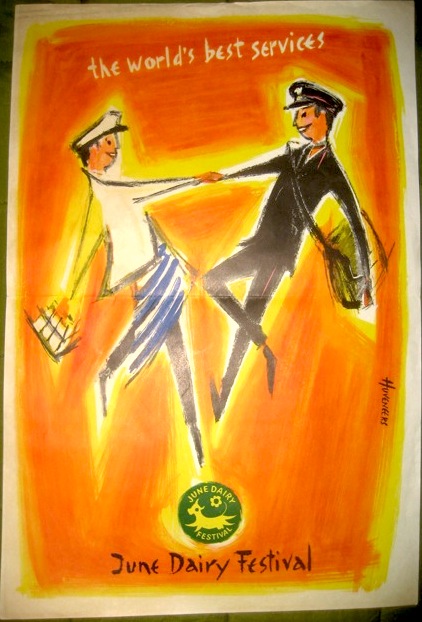
Pieter Huveneers vintage poster June Dairy Week

It’s a 10″ x 15″, and while Google has taught me that the June Dairy Festival was a big and regular do in the 50s, I still don’t really know what it was, or what the postie had to do with it.  So, once again, any information would be gratefully received.