Tom Eckersley : life and work

As promised a while back, the moderately personal biography from Tom Eckersley : A Life in Design, slightly edited down for your entertainment and education.  With some pretty pictures too.

Tom Eckersley LCP exhibition poster Looking Back
LCP Exhibition poster, 1979

Tom Eckersley OBE RDI AGI was born in Lowton, Lancashire on 30 September 1914.  His birth preceded that of the concept of ‘graphic design’ as it is understood today, which, as Tom observes, had its roots in the twenties and thirties.  Tom began his career at what he recalls as “that stimulating time when certain artists, supported by enlightened clients, saw opportunities to use their art and their vision to solve communication problems.  They began to realise the many exciting visual possibilities that could be derived from the major art movements taking place in Europe between the wars.”

Tom Eckersley offset thingy
Press advertisement for paper manufacturers, c1965

Tom’s parents were great readers, their house was full of books on all subjects, and Tom spent a lot of his childhood reading and drawing.  At his mother’s suggestion, he enrolled at Salford Art School at the age of 16.  Here his artistic abilities and his dedicated approach to work were recognised and he was awarded the Heywood medal for best student.  Here it was too that he met fellow student Eric Lombers, with whom he came to London in 1934 aged 20, to embark upon a career as a freelance poster designer.

Eckersley Lombers vintage poster for London Transport 1935
Eckersley Lombers, London Transport 1935

The two shared a tremendous enthusiasm for their art and for the poster.  “The early thirties made a strong and lasting impression on me,” Tom reflects, “helping to shape my attitude to graphic work.  At that time the poster was perhaps the most significant form of publicity, the great Cassandre and other French designers produced avant-garde posters, as did McKnight Kauffer and Hans Schleger in England.  This greatly influenced me and I soon became seriously involved in poster design.”

Eckersley Lombers Austin Reed ad
Eckersley Lombers, Austin Reed poster, 1938

The Eckersley-Lombers team was fast established among leading poster artists at this exciting time in the history of commercial design.  Certain clients and advertising agencies were looking to artist to produce material that was both functional and aesthetically pleasing, and the team was commissioned by Shell, the BBC, London Transport, the GPO, Austin Reed and advertising agency W S Crawford.  Tom and Eric also worked as visiting lecturers in poster design at the Westminster School of Art.

Eckersley Lombers gas mask vintage poster
Eckersley Lombers, ARP poster, 1939

When war broke out the volume  of commercial advertising declined.  Tom and Eric joined the Royal Air Force and the Army respectively and so their partnership came to an end.  Tom continued his creative output in the early war years with a powerful set of posters for the Royal Society for the Prevention of Accidents.

Tom Eckersley ROSPA vintage poster rogue 1945
ROSPA, 1945

The ideas were conceived whilst he worked in camp, as a cartographer, and executed in a makeshift studio during 24-hour home leaves.  Later he transferred to the Publicity Section of the Air Ministry, lived at home, and did work for a number of clients, including the GPO, an association  which had begun before the war and continued for many decades after.

Eckersley GPO address letters vintage poster 1944
GPO, 1944

In 1948 Tom was awarded the OBE for services to British poster design.  He had reached the top of his profession and many a ‘man in the street’ who did not know the Eckersley name was familiar with his posters.  Tom’s flawless clarity of purpose, his rich imagination and his gentle humour had impressed many messages upon the public: that they should avoid industrial injuries, shave with Gillette razors, dress at Austin Reed and fill their cars with Shell, to name but a few.

Tom Eckersley Gillette dog poster
Magazine advertisement for Gillette, early 1950s

His great qualities had created lasting images that pleased, amused and were rcalled and talked about long after the campaigns had run their time.  Tom’s international reputation was established too, and in 1950 he was elected member of the Alliance Graphique Internationale.

Tom Eckersley private presses exhibition poster LCP
LCP Exhibition poster, n.d.

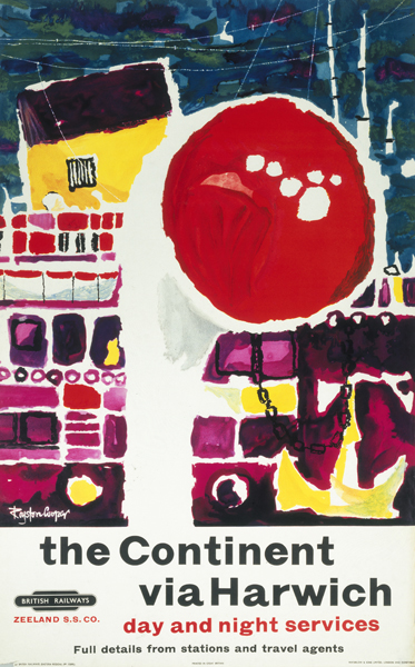
In 1957, Tom became Head of Design at the London College of Printing, a post which he held until 1977, whilst designing posters for a number of clients, some new, like Cooks and UNICEF, and some of whom, like London Transport and W S Crawford, had first commissioned his work before the war.

Tom Eckersley Lincolnshire Vintage poster British Railways
Lincolnshire, British Railways, 1961

[This biography was written in 1994, Tom Eckersley died in 1997. All images come from the Eckersley archive at the University of the Arts.]

Addendum:  I carefully typed all of this out, and then found another, possibly even more interesting, biography as a PDF.  So now you can choose between them.

By coach, via Royston

I was planning to do a random image amnesty today, which would have been a collection of fabulous posters that I have picked up but not managed to jemmy into a blog post, and which are all now idly shuffling their feet in the great image waiting room which is my computer desktop.

Except I’m not going to, because this one was first.

Royston Cooper bus poster

Which meant I got distracted by thoughts of just what a great designer Royston Cooper was and went off to explore.  So now this post is made up of what I found along the way.

Mostly this was lots of lovely posters.  Like these from 1962, 1959 and 1962 again.

Royston Cooper shopping by bus vintage poster

Royston Cooper Hastings Poster  1959

Royston Cooper Country Afternoon tickets

He’s probably best known for his Keep Britain Tidy posters.  This one from 1962 is the one you find most often,

Royston Cooper vintage Keep Britain Tidy poster lion

including at the bottom of our stairs.  But the later (1965) pelican is also fine.

Royston Cooper vintage Keep Britain Tidy poster pelican

What’s intriguing about searching for him online is that, unusually, the vast majority of results came from auctions.  There are a few pieces of his work in the NRM collection including this 1960 poster.  Sailing from Harwich has never looked so glamorous.

Royston Cooper vintage poster 'The Continent via Harwich', BR (ER) region, 1960.

And there’s also this slightly grim NRM image of another great design.

Royston Cooper How to run a railway pink vintage poster

1962 again.  Must have been a vintage year for him.

This railway brochure (an object which combines both railwayana and ephemera and thus is very frightening to me indeed) came from a railway flickr set.

Royston Cooper Railway brochure

But that’s about it.  And there’s nothing written about him either, literally all I know are his dates, 1931-1985, and even those are from Christies.

Even without information, though, people must like him because his work certainly sells.  The Hastings poster above went for over £1000 at Christies four years ago, and they’ve sold lots of other posters that just don’t appear anywhere else.  Like this 1965 effort for VSO  – and it went for £110, what a bargain.

Royston Cooper VSO vintage poster Christies

As well as this second lovely coach poster from 1958 (spectacularly modern for the date and costing a mere £192)

Royston Cooper coach poster 1958 Christies

and this less characteristic piece of 1965 Times advertising as well which went for £300.

Royston Cooper Top People Take the Times poster Christies 1965

I’m going to try and find out a bit more background, but for now, here are some more coach posters to keep you happy while that happens.  And if you do know anything about Royston Cooper at all, please get in contact, I’d really like to hear from you.

Royston Cooper 2 x Thames Valley posters Christies 1960

A Gentleman and a poster designer

Saturday’s Guardian has an interview with David Gentleman, in which he says he came to feel, apropos of his political works,

“that my outrage should have been channelled into posters, not shut up out of harm’s way in a book”.

I wish he’d just done more posters full stop.

By complete coincidence, I’d just been wandering through the Design Council Slide Collection on VADS, looking for posters which weren’t to do with railways or ROSPA or London Transport (another story for another day) and had pulled out a handful of his posters for the National Trust.  Which are brilliant.

David Gentleman poster National Trust Camborne Beam Engine
1972 poster for the National Trust (and winner of a Poster Design Award to boot)

David Gentleman National Trust poster Knole gardens
1976 poster for the National Trust (apologies for the cropping, it came that way)

He also did some dramatic posters when the NT property of Petworth was threatened by a by-pass in 1976.

David Gentleman Petworth bypass poster

David Gentleman Petworth bypass poster

But perhaps his most outstanding achievement are the set of posters he designed for the Stop the War Coalition, which I think are amongthe best poster designs of the last twenty years in this country.  Maximum emotional impact, minimum means.

David Gentleman No War poster

David Gentleman No More Lies poster

David Gentleman Bliar poster

(There’s a very good interview about these last posters in the AGI magazine, from which I learned that Gentleman also thought up the Bliar slogan as well as designing the posters.  Really, he is a genius.)

But don’t let all that make you think that all he can do is dramatic protest.  Here are two London Transport posters he also designed, one a pair poster from 1956

David Gentleman vintage pair poster London Transport 1956

and the other from 1973.

David Gentleman Victorian London LT poster

And that is pretty much all I have been able to find.  Which – given the quality of the ones that he did do – is a great shame.

Good Design

For a change, let’s look at something which isn’t a poster.

Kathy Kavan’s post about Galt Toys design and branding (which I remember with great clarity from my own 70s childhood) led me to designer Ken Garland’s own website.  It’s a treasure trove of delights, like these Design magazine covers from 1958-60.

Design Magazine August 1958 Ken Garland design

Design Magazine April 1959 Ken Garland design

Design Magazine January 1960 Ken Garland design

It’s hard to imagine a government-sponsored quango (which the Council for Industrial Design was) producing anything as fresh and interesting as this now.

These covers for the Architectural Review meanwhile, from 1957 and 1959, still look irrepressibly modern.

cover for Architectural Review 1957

Architectural Review 1959 Ken Garland

David Carson himself would have been proud of these two.

But these last two aren’t very typical of Garland’s work which is, in the main, an understated and very British take on modernism.  Whatever you think the story of British modernist graphics is – or isn’t – there’s a moment in the 1960s where the UK takes on board the mainstream of European graphic thought and makes it mainstream.

Ken Garland committee of 100 poster 1961

Poster for Committee of 100, 1961

Designers like Garland also add something new to the modernist mix though.  There’s a lightness of touch and even a sense of humour which makes them distinctively British.

Galt Toys catalogue spread

But go and take a look for yourself, it’s an exemplary website and archive with lots of interesting thoughts about the designs and the process which led to them, as well as the images themselves.

Turning over several new leaves

I’ve always liked James Fitton.  And I can say that with some confidence, as I had this postcard on my wall at university (quite some time ago now).  It’s one of his designs for the Ministry of Food, from just after the end of the war.

James Fitton Turn Over A New Leaf WW2 vintage poster

I’ve still got the postcard; more pleasingly, we also now own one of the original posters too.  It may have taken me twenty years, but I’m still quite chuffed about that.

Even a cursory look at his poster designs reveals a man who had a whole range of styles at his command.  This Ministry of Food poster is from the same period, but can hardly be recognised as coming from the same hand (slightly pallid image from the Design Council Slide Collection).

James Fitton WW2 vintage poster clear plate

This milk poster is also from that era (and, trivia fans, is the one that you can see in the front of these images from Britain Can Make It).

James Fitton Ministry of Food vintage milk poster

What that last poster does particularly show is Fitton’s use of really luminous colour (which must have been particularly hard to achieve with wartime/utility paper and printing materials).  His 1941 posters for London Transport (also here) have the same almost supernatural, and very appropriate, glow,

James Fitton WW2 poster london transport outside it's dark

By 1948, they’re almost dazzling.  And of course in an entirely different style.

James Fitton The Seen London Transport vintage poster 1948

All of the above would, you’d think, would be more than enough to make him a revered and often-mentioned designer.  But it turns out that’s not the half of it.  The following is just an outline of what he achieved, the full shilling lives can be found here, here and here.

Throughout the 1930s, he was probably best-known as a cartoonist for left-wing periodicals such as the Daily Worker and Left Review.  His work was influential and seen as avant-garde at the time (as in the use of real newspaper print in the cartoon below).

James Fitton Cartoon for Left Review

After the war, he continued working as a cartoonist and illustrator for magazines such as Lilliput.

James Fitton Cartoon for Lilliput

Then there was the painting.

James Fitton 1948 painting Brixton street scenet

(This 1948 Brixton street scene is now in the Museum of London).

And he taught, he served on official bodies, and the Design Council slide collection suggests that he even found time to design some fabric too.

James Fitton fabric design Design Council slide collection

All of this while holding down a day job as the Art Director of Vernons, which he helped make into one of London’s leading advertising agencies.  I’m exhausted just reading about it.

It may be that being able to work in so many disciplines is one of the reasons why he’s not so well known today; the collectors and writers about Lilliput don’t know about his posterworks, the cartoon historians have no idea that he’s also in the collection of the Tate Gallery and so on.  I think it’s a pity, and also unfair, as his poster designs are not only the equal of those by better known designers, but also have a haunting quality which perhaps carries over from his artworks.  In some ways I’d rather live with a Fitton on my wall (if anyone would like to send some, please feel free) than with many other posters.  Am I alone in thinking that?  Answers in the comments box below if you please. After this last rather lovely London Transport poster from 1937.

James Fitton vintage London Transport Poster Ballet 1937

Eckersley discovered (twice)

I hadn’t meant to return to Tom Eckersley so soon, but Mr Crownfolio came across this on eBay.

Tom Eckersley his graphic work cover

“What do you think?” he said.

“I think it’s very expensive,” I said.  With a starting price at £100, it certainly is, even if it is a limited edition of 500.

“Do you know what,” he said after we had stared at the screen for a few more minutes.  “I think we’ve got this on the bookshelves downstairs.”

I looked blankly at him, certain that I have never seen this book before in my life.  But it turns out that he’s right.  Which means that we can’t have paid £100 for it as I would definitely have remembered any transaction of that sort (to put this into perspective, I could count the number of posters that we have paid more than £100 for pretty much on the fingers of one hand).  Perhaps it isn’t the limited edition, we thought – but it is too, copy number 100.  You may consider me surprised.

While this whole episode may have left me wondering how close I am to utter senility, the upside in terms of the blog is that I can show you some of the book – in particular a few images that don’t seem to be in the Eckersley archive.  (Apologies, incidentally, for the slightly poor quality of the scans; I am terrified of damaging the spine of a book that is clearly more valuable than I thought – and I’d also say that the colour reproduction in the book isn’t as bright as it might be).

Cover for The Director Tom Eckersley
Cover for The Director, 1954

National Bus Company ad Tom Eckersley 1974
National Bus Company Poster, 1974


Imperial War Museum Poster, 1981

Apparently the image above Eckersley himself thought to be amongst his best work.  I think I can actually remember seeing it displayed on the tube when I visited London, back in the day.

But the book has also made me look at a couple of other designs properly.  Like this one, for an exhibition in Sweden in 1960, which is almost impossibly modern for its date.

Tom Eckersley Swedish exhibition poster

As well as this, from 1973, which is nothing short of genius in its minimalism.

Tom Eckersley valuables poster

The other really useful thing about the book is that it has a slightly more detailed and personal biography of Tom Eckersley than you might find on the web.  So I’m going to revive my long-lost copy typing skills and put a slightly edited version of it on here for you at some point this week.  Illustrated with a few more images from the book.  You’ll hardly need to buy a copy yourself.

Finally, one further benefit of all of this is that I have looked at our bookshelves properly (generally they are Mr Crownfolio’s domain) and discovered all sorts of contemporary design and  poster annuals, so I will, gradually, get round to scanning and posting about them all.