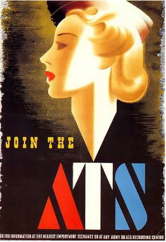
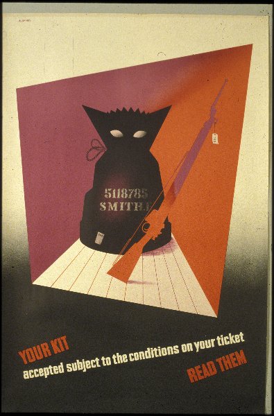
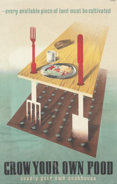
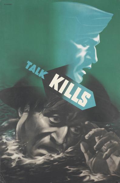
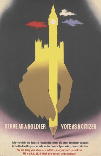
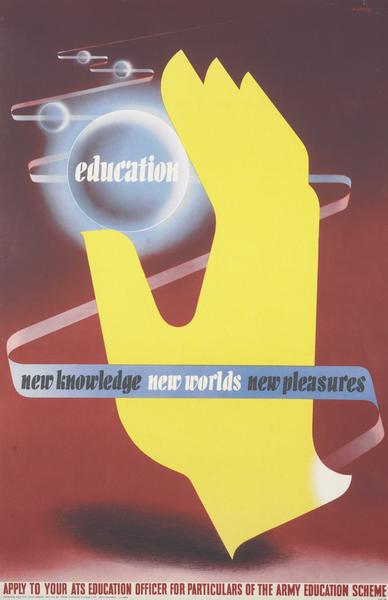
When I posted this Games poster on the blog last week, I mentioned that there was more to be said about the subject.

I’ve been meaning to write about Abram Games’ war posters for a while now and that poster (which incidentally fetched £950 at Onslows when it was sold a few days ago) has finally made me do it.
Games did design some of the most striking and, in a few cases controversial, posters of the war, but you might be wondering how much more there is to be said than that.

But these posters are actually an exception to the usual run of WW2 Home Front posters, something which isn’t often pointed out. To start with, they were almost entirely designed for a particular subset of the Home Front: the serving soldier, whether at home or abroad.

This is because Games didn’t work for MoI or one of the other ministries, nor even for one of the advertising agencies. He created his own job in the army, which gave him great freedom to do exactly what he wanted – not only could he choose his style but in some cases he even chose the subject matter too.

Later on in the war he also had Frank Newbould as his assistant, which, given that Games was 27 and Newbould was a rather more experienced 59, must have been an interesting situation. (If you want to know more about Games’ wartime service, there’s a good section on it in this book .)
.)
This situation meant that Games was able, unlike almost any other designer in the war, to produce a coherent set of poster which were modern in both their design and their social message. Sometimes their subject matter and execution were the same as the mainstream Home Front publicity and posters.

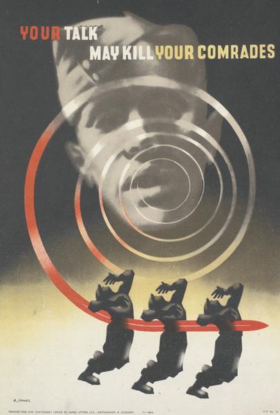
On occasion, though, they were very different. For example, Games’ army equivalent to the Careless Talk Costs Lives has a graphic representation of the possible results. Men will die.

The above poster is perhaps the best-known, but the design below is even more explicit.

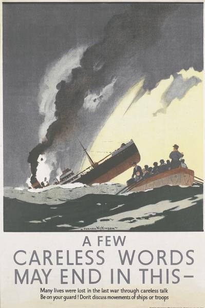
Nothing similar was ever produced for the general public. Whether posters should show such direct consequences of careless talk was debated more than once within the Ministry of Information during the war. But the MoI always decided against ‘pictures which hurt’, turning down one proposed campaign as ‘too tough and realistic’. Even this design by Norman Wilkinson kept death at arm’s length; the men in the foreground have survived.

When Games’ posters are included in more general surveys of Home Front posters, without any explanation of why they are different, this subtlety disappears. The posters, instead, are seen to cover all approaches when that wasn’t the case.
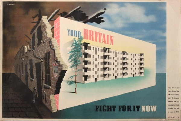
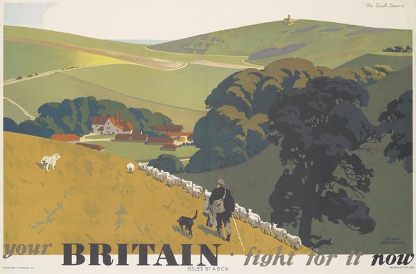
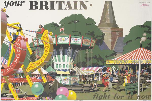
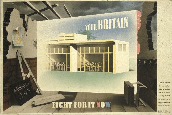
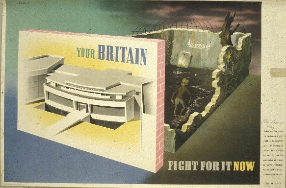
Perhaps the most important results of Games’ freedom to work was the Your Britain Fight For It Now series. These posters were not only designed by Games but Newbould too.

The results are an example of their partnership of modern and traditional working at its best; the different posters would have appealed to very different people and so the message would have got across to the widest possible public.

But that’s a digression, because what’s important about these posters is their message. Newbould’s posters are exhorting the soldiers to fight for an image of an idealised and traditional Britain (located, as this deep Britain tends to be, in the countryside). Games’ designs use the same slogan but have a different message. Fight, he is saying, for a better Britain after the war, and he locates this future in an urban and modern idiom.

In the wake of the Beveridge Report in 1942, this wasn’t a particularly novel idea. But it wasn’t one which was being expressed in posters elsewhere. The Ministry of Information repeatedly applied to the Cabinet for permission to produce sets of posters along these lines, but the request was always turned down, quite possibly on the orders of Churchill himself.

All of which gives further resonance to Churchill’s banning of the Finsbury Health Centre poster above. (I’ve written a fuller explanation of the controversy here if you would like to know more.)
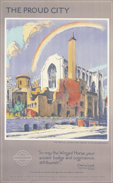
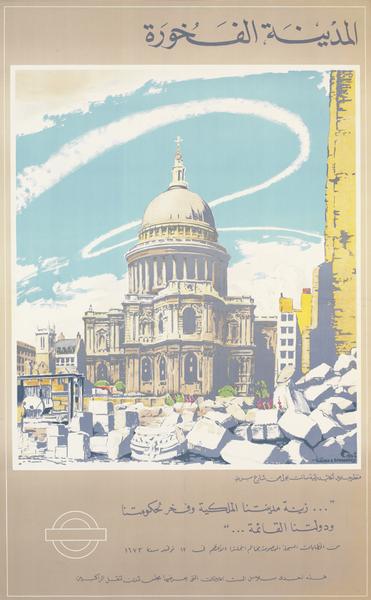
The Ministry was clearly frustrated by this restriction, as can be seen by its use of Walter Spradbery’s The Proud City series

This series of posters came into being because they were commissioned by the London Passenger Transport Board, another organisation which was less constrained than the Ministry in terms of the propaganda it could produce. But the MoI made use of this loophole too, paying not only for the posters to be printed in the tens of thousands, but also to be translated into multiple languages and distributed to Britain’s allies.

All of which underlines why it is so important to separate out Games’ work from the broader mass of Home Front posters and propaganda. Because if they are all just lumped in together, as is so often the case, the results are misleading.

Not only do we see a much more modern set of posters than the average person in the street ever did, we also believe that this message of building a better Britain was a commonplace. But in doing so we are imposing our retrospective justifications for the war onto the past – and distorting it. Because at the time this kind of propaganda was not taken for granted; rather it was something controversial and disputed – and what’s more, something which was definitely not seen on the streets of Britain during the war.

If you think, incidentally, that I’ve been banging on about World War Two posters quite a bit recently, I have. There is a good reason for this, too, but all will be revealed in the New Year.
All images, once again, from the VADS/IWM online archive.
