Holiday Haunts

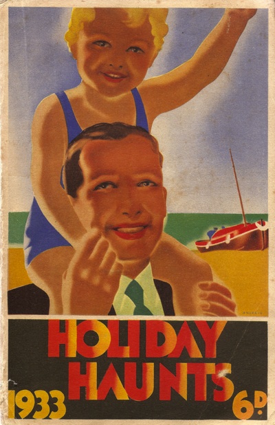
Once again, I’m thinking about holidays.  I actually have got round to booking the Crownfolios’ annual fortnight, but two things have brought my mind round to the subject again.  Or to be precise, to Holiday Haunts. This was the railways’ annual guide to hotels, B&Bs, and other such places to stay in Britain, the idea being, of course, that you got there by train.

In the first place, the ever-attentive Mike Ashworth sent this over, pointing out that it was by Bruce Angrave.

Bruce Angrave Holiday Haunts brochure cover

Considering the date and the Art Deco style, it must have been one of the earliest things he did.  Which is interesting enough on its own.

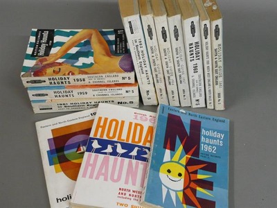
But it also, and unsurprisingly, got me thinking about Morphets, where a whole slew of Holiday Haunts material is for sale.  Anyone fancy 20 volumes from the 50s and 60s for your shelves?

20 volumes of Holiday Haunts at Morphets

It’s lot 584 if you do.

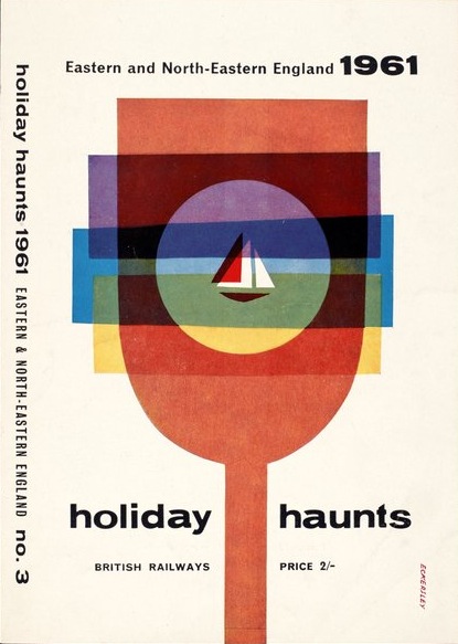
Now, I know that we’re veering close to the dangerous territory of railway ephemera here, but bear with me.  Can you see that Eckersley peeking out at the bottom left of that picture above?  Well exactly.  Here it is in full.

Eckersley holiday haunts cover image 1961

Now Holiday Haunts was a blockbuster publication.  At the height of its success it sold over 200,000 copies a year, so covers like this, and indeed the Angrave above, would have meant modern design going into the homes of huge numbers of railway-travelling, seaside-holidaying people who perhaps wouldn’t have seen it otherwise.  I hope they, or at least their dissident teenage children, liked it.

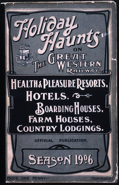
Because this is ephemera, I won’t go into too much detail but Holiday Haunts was originally created by the GWR in 1906,

'Holiday haunts on the Great Western Railway' guidebook, 1906.

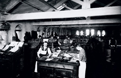
reached its height in the 1920s and 30s,and was then continued by British Railways after nationalisation in 1947.  And I am mostly telling you this because I have found this photo.  It’s the 1930 edition of Holiday Haunts being printed at the old Butler and Tanner print works in Somerset.

Printing Holiday haunts

These men were printing about 50 metres from where I am typing this now.  I’d be able to see the building from my window, if they hadn’t taken the top two floors off when they converted it into flats.  So, Holiday Haunts, printed right next door to Quad Royal.  How about that.

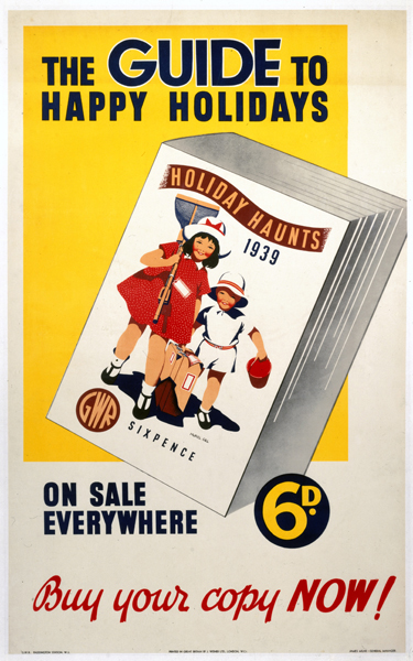
The Guide to Happy Holidays', GWR poster, 1939.

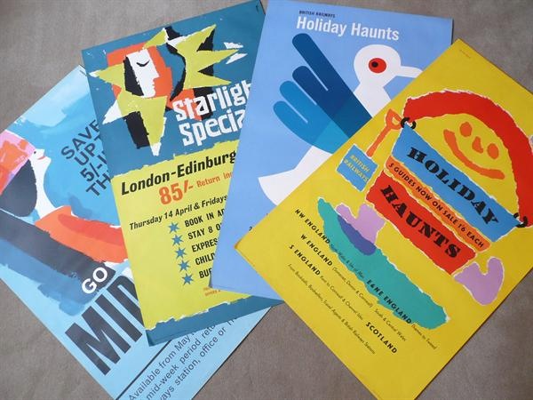
But, in case you think me entirely lost to ephemera and local history, there is more purpose to this.  Because designers like Eckersley and Games didn’t just design covers for Holiday Haunts, they also designed posters to advertise it.  I’ve mentioned this Morphets lot already – there’s an Unger in there too.

holiday haunts posters

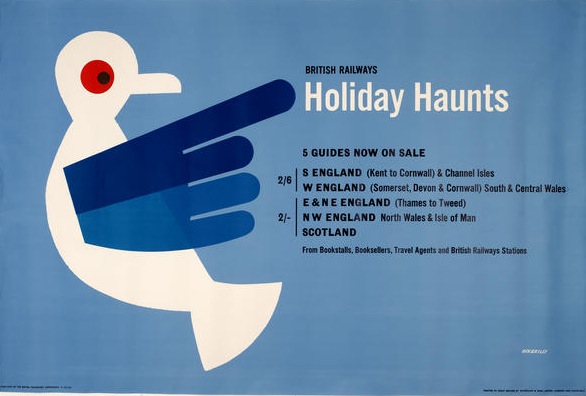
Here’s a different version of the Eckersley poster, courtesy of VADS and the Eckersley archive.

Holiday Haunts eckersley poser

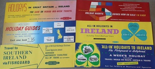
But there were also carriage-print scale posters too (top right, below, again from Morphets).

Holiday Haunts carriage prints

But there’s more of an attraction for me in Holiday Haunts than just the great posters and the cover designs.  It also evokes a nostalgia in me for a past I never had.

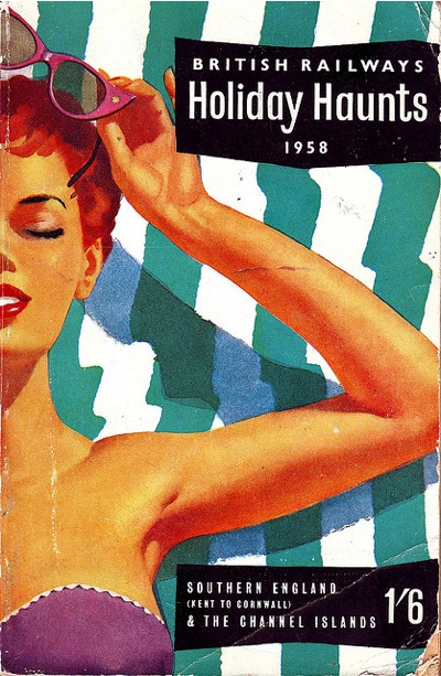
Holiday Haunts 1958 cover

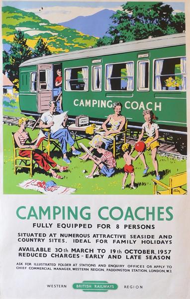
The kind of British seaside holiday where the sun shone every day and you could get tea in proper cups on the beach (I know this is true, I’ve seen it on railway posters).  The kind of holiday where your family would stay in a camping coach.  And like it.

Riley 1957 vintage camping coaches poster

(Riley, 1957, also on sale at Morphets.  Isn’t everything.)

There are probably some clues in here about what posters – and particularly railway posters – mean today, and why they attract us so.  Ah the past, when the countryside was prettier, things were simpler  and people were happy anyway even if they did have to stay in a shed.  Possibly, but also possibly not; there were just fewer consumer goods and people thought that a railway coach for 8 for a week was a form of luxury.  Mind you, I’m off to stay in a mobile home on a French campsite.  So perhaps holidays – and people –  haven’t changed that much after all.
Bloggery

Or possibly Oh Bloggery.  Because there is a whole world out there where blogs reference other blogs and link up to other posts and then blog about blogging, all of which ends up being so self-referential and post-modern that it makes my head spin.  So Quad Royal tends to just plough its specialised little furrow, minding its own business and talking about posters.

This post (the hundredth, incidentally), is a rare exception, mainly because I want to say thank you.  QR has been going for less than five months, and yet there are now a proper amount of people subscribing (138 at the last count).  Which I never really expected for a blog which is, in the end, just someone wittering on about what they do and don’t like.  With some pretty pictures.  So you are all too kind.

While we are doing self-referential and bloggery will eat itself and so on, I can also point at Shelf Appeal‘s lovely  banner.

Emily sutton Shelf appeal banner

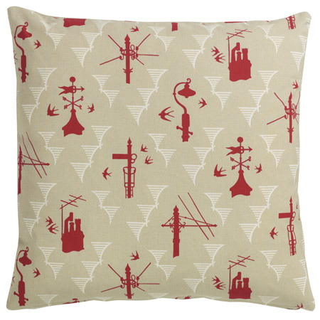
It’s by Emily Sutton (who comes via the very delightful St Jude’s) and, although it’s new, it’s just what I would choose where I not so overwhelmed with old things that new graphics are too much to even think about.  Should you want new stuff to go with your old things, St Jude’s is a very fine place to try.  I am currently coveting this cushion (and will probably buy it in due course when we haven’t just had to repair the car and buy a new dishwasher…)

St Judes Kensal Rising cushion

The third and final blog-related item is even more of a digression, although it is at least about old things.  But The Country Seat is such an absorbing read that I really needed to point it out.  Now I have an odd fascination with this, but whether you think that stately homes are a) the greatest work of art created in British culture or b) the gilded icing on a decadent lifestyle created by the exploitation of others is actually a bit irrelevant.  Because what is so good about this blog is that it is excellent, well-researched journalism written by someone who really knows what they are on about.  Every post is not only readable but a proper story, to the extent that it’s better than a good half of what appears in the papers (particularly true should you have the misfortune to read the Observer).  It’s the spare time creation of an enthusiast, but why he’s not getting paid to do this when he does it so well, I do not know.

Right, that’s over now.  As you were.  Tomorrow will be business as usual, with old things.  Posters even.

Modern British Collecting

I’ve had Paul Rennie’s Modern British Posters: Art, Design & Communication for a few weeks now, and am guiltily aware that I haven’t given it a proper mention yet.  Now there are a whole heap of real life reasons why this hasn’t happened, which I won’t go on about, but I am also aware that I’m finding it hard to come to a conclusion about it.  Which is absurd, so here are a few thoughts which may or may not come to a definite answer at the end.

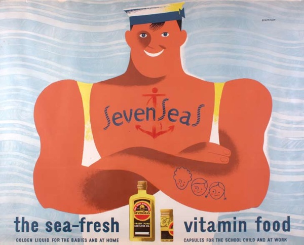
Tom Eckersley Seven Seas vitamins advertising vintage poster
Tom Eckersley, Seven Seas Vitamin Oil, 1947

This doesn’t mean that I don’t like it.  The book is beautiful and would justify its cover price (more on that below) for the illustrations alone.  You’ve seen a few on the blog already, there are plenty more littering this post.  There simply isn’t another book covering these subjects in this detail and with this kind of wonderful reproduction, so it’s a great thing to have.

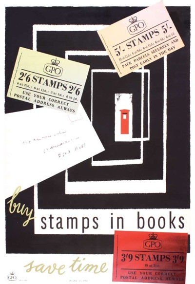
H A Rotholz, vintage GPO poster stamps in books
HA Rothholz, Stamps in Books, GPO, 1955

Even better, the book mentions Quad Royal which is very flattering indeed.  So now it’s been immortalised in print, I’d better keep this thing going for a while, rather than just be a fly-by-night blog.

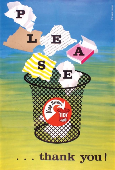
Reginald Mount Keep Britain Tidy poster
Reginald Mount, Keep Britain Tidy, 1950s

But as well as the book being a whole treasure trove of beautiful images, Paul Rennie also makes some really good points about posters and collecting, so much so that I am going to repeat them all over again here.  At the start, he observes that part of the reason that no one else has written this book before him is that the world of the poster, in Britain at least, is absurdly fragmented.

For example, railway posters, motoring posters and war propaganda all form specialised archives within separate institutions. Within the context of these distinct institutions, there is no urgent requirement to integrate the various and disparate parts into a history of visual communication.

I’ve touched on this in posts before – this odd disjunction between disciplines results in quirks like the National Railway Museum not thinking about its posters in terms of designers on their website and many other odd occurrences.  People who know all about railway posters might have no idea about the history of the Ministry of Information; the Imperial War Museum has no reason to care about what designers did before or after the war.  As a result, Modern British Posters is therefore pretty much the first decent survey of the whole, and that can only be applauded.

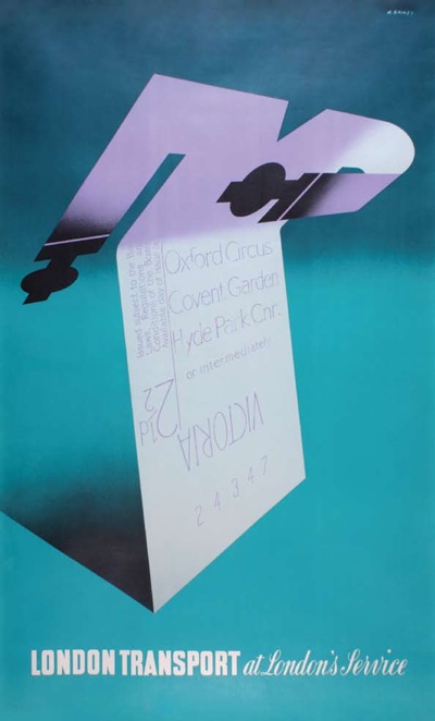
Abram Games London Transport poster
Abram Games, At London’s Service, London Transport, 1947

I’m also really interested when, at the end of the book, he sets out the history of how they started collecting, and the rationale behind what they chose to buy.  Partly because he started out by being fascinated by the Festival of Britain and then, in discovering more about Abram Games and the Festival symbol, found himself intrigued by a wider world of graphics and communication.  I trod exactly the same path too (I still have the little Festival badge that I used to wear on my hat as a teenager); it makes me wonder how many people have followed the same thoughts, and also why the Festival exerts such a potent hold over our imaginations even now.

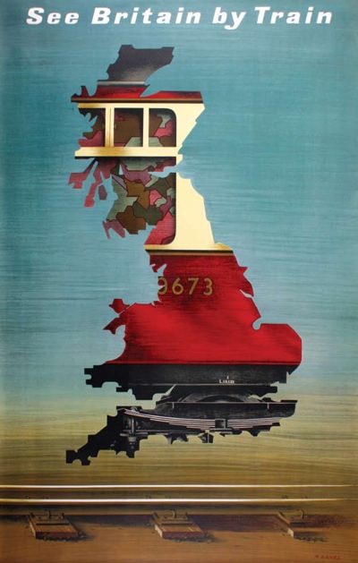
Abram Games British Railway Poster
Abram Games, See Britain By Train, British Railways 1951.

But he also explains why they bought what they did.

Our collecting began, back in about 1982, with an interest in modern design… In 1982, the words British and Modernism seemed like a contradiction in terms.

The direction of our collecting was formed in relation to this widespread,and misguided, perception of British resistance to modernity. Conveniently, it turned out that British items were generally of little interest to international collectors and were, accordingly, less expensive to purchase.

In a way, I wish he’d put this manifesto right at the start of the book, because it’s really important.  This is partly because this is – and Paul Rennie freely acknowledges the point himself – a very partial book.  Every single illustration is from their own collection and so knowing the history behind it makes a big difference to the way you might read the book as a whole.  (I have been trying to work out whether there is a similar unifying idea behind our own collecting; so far I have only managed to come up with: It was cheap and we liked it).

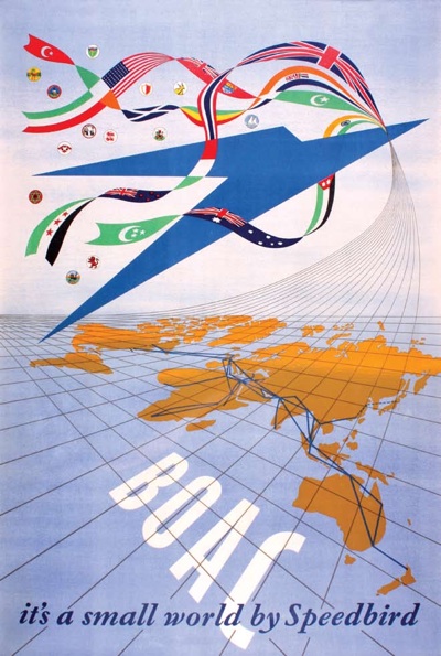
Henrion BOAC poster
Henrion, BOAC Speedbird, 1947

The idea of the British relation to modernism itself is really interesting, and something I’d want to think about at length and probably devote a whole blog post (0r three) to.  But it also informs a lot of the arguments that he’s making in the main bulk of the book, so it would have been good to know beforehand.

Now, I have to confess that between these two ideas I did get a bit lost in the middle of the book. Now this is partly I think a problem of the form – Paul Rennie is heroically attempting a complete survey not only of the history of posters in Britain, but also of the social and economic conditions which affected how they were produced.  So it is, of necessity, a bit of a race through quite a lot of ideas and thoughts.

But also – and this is the bit I have been pondering for a while – Modern British Posters is at heart an academic book.  It’s having a dialogue with a lot of other books, and theories of art and design, ideas about cultural production and the transmission of modernism, and that simply isn’t a conversation that I am part of any more.  Academia and I gave up on each other more than twenty years ago, and since then I have been concentrating on the much simpler task of telling stories about people and things.  So the fault is probably with me rather than the book, for which I can only apologise.  I’d be interested to hear what anyone else thinks about this, particularly if you’re a design historian and have read it.

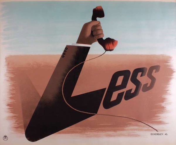
Telephone Less Tom Eckersley 1945
Tom Eckersley, Telephone Less, GPO, 1945

If you haven’t read it yet, and want to have an opinion, which of course you do, I am pleased to say that there is also a special Quad Royal readers’ offer (we’ve never had one of those before, get us).  The book is available at a massive 40% off the list price to you our esteemed reader.  To get hold of it, just email jess at blackdogonline.com, with Quad Royal Readers Offer as the subject line, and she will sort out the rest.

Owl Saving Time

I did promise some more Daphne Padden posters in due course, so, now that I have managed to produce some reasonable photographs, here goes.  One day I will discover thousands of pounds in my purse and pop out to buy an AO scanner, but until then, you’ll just have to make do with these.

To start, this is a rather eclectic selection, mainly because I haven’t seen any of these before now and it’s good to get them out into the world.

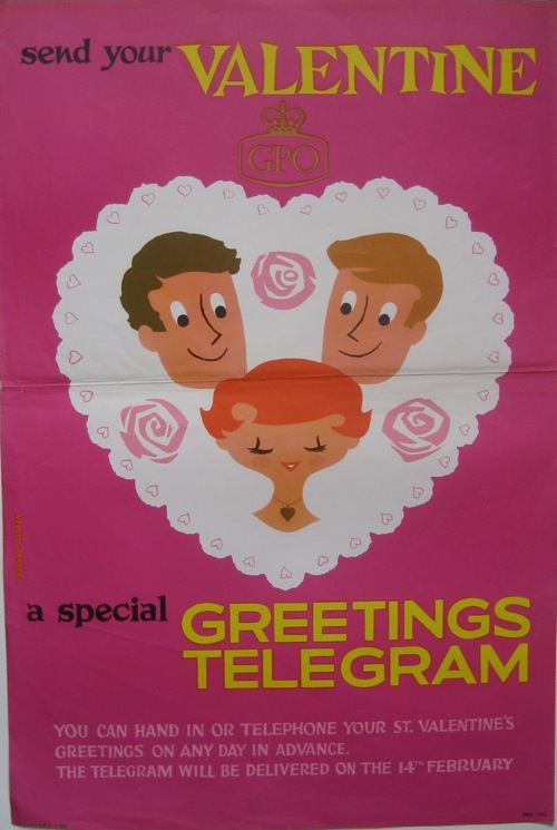
The GPO one is quite straightforward – and rather sweet – although I can’t find it in the BPMA’s catalogue.

Daphne Padden GPO vintage valentine telegram poster

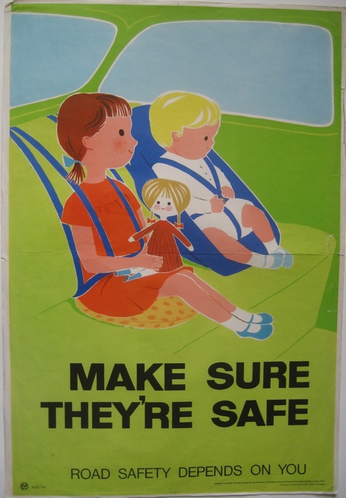
The same is true of the ROSPA seat belt poster.  (I distinctly remember having seatbelts very much like this, and I suspect the poster is just the right vintage for this to be true!)

Daphne Padden ROSPA seat belts for children poster

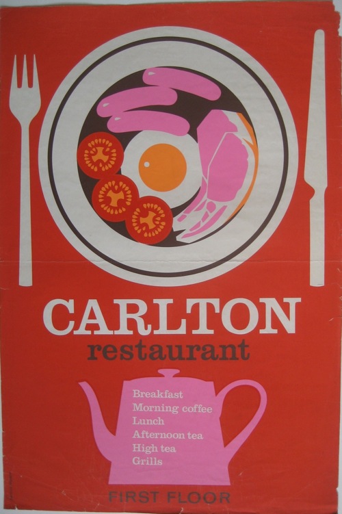
But I can’t tell you the first thing about the Carlton Restaurant, other than that I rather like both their colour scheme and the look of their breakfasts.

Daphne Padden Carlton Restaurant poster

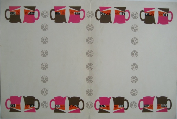
Any ideas?  I think this art work may have been for them as well, simply from the colours and the crockery.

Toby jug artwork Daphne Padden

All of these posters came from the sale of Daphne Padden’s work after her death, and sadly came with nothing that might identify them or what they were for.  I don’t even know whether they were ones she particularly liked, or simply ones that had survived.  So if anyone can tell me anything more, I’d love to know.

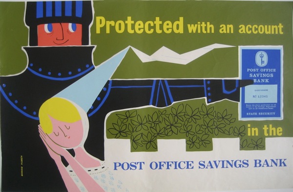
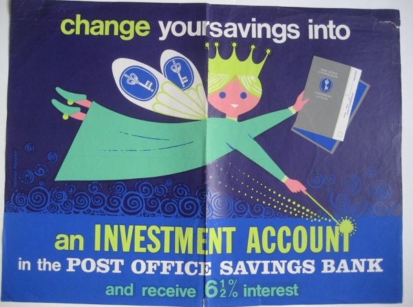
Also among them were a whole pile of Post Office Savings Bank posters, including this rather lovely pair promising you fairy-tale endings if only you’d save.

Daphne Padden Post Office Savings Bank Knight poster

fairy Daphne Padden post office savings bank poster

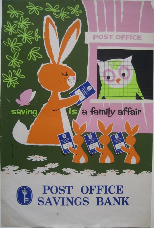
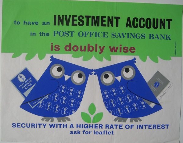
There are also some rather fine animals.  I posted the rabbits last week, but the owls also get a starring role on their own.

Post Office Savings Bank poster owl and rabbits Daphne Padden

Daphne Padden poster owls Post office savings bank

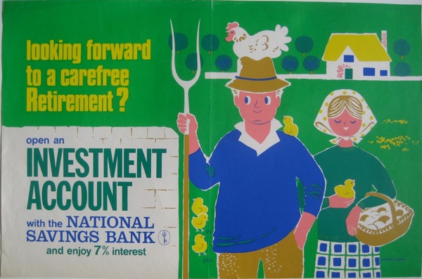
These I can at least make a stab towards dating.  The Post Office Savings Bank turned into the National Savings Bank in 1969, and Padden did posters for both of them in very similar styles and even colour schemes.

Daphne Padden National Savings Bank farmer poster

So I am guessing that the vast majority of these date from the second half of the 1960s, and perhaps the very early 1970s.

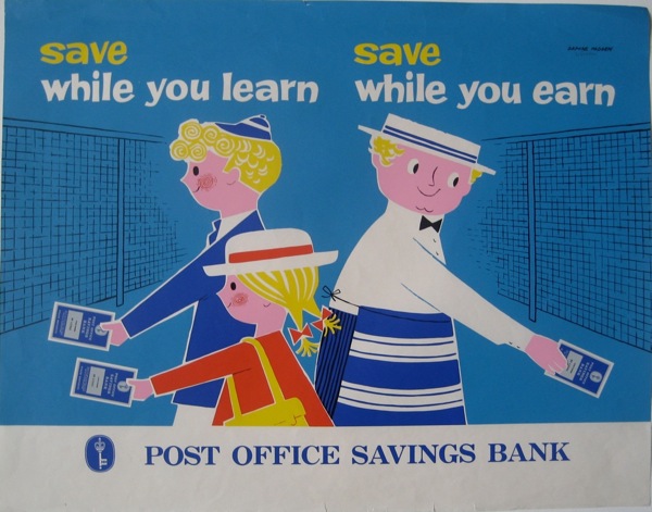
This one, though, feels a bit earlier and is probably my favourite.

Daphne Padden Post Office Savings Bank poster child and butcher

That’s not all, either.  Next time I’ll post the slightly more familiar, but still wonderful coach posters.

But before then, a couple of footnotes.  One is that there’s quite a bit of confusion out there between Daphne Padden and her father, Percy, who also designed posters.  If you go through Christies’ past lots, quite a few of them are ascribed simply to ‘Padden’, while this poster is sold as being by Daphne.

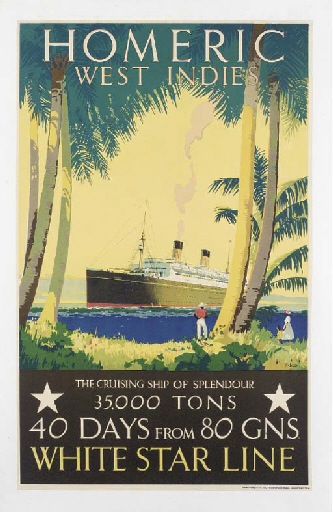
Percy padden White Star vintage poster

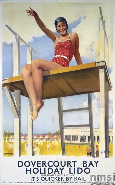
Which, given that she was born in 1927 and this poster is most likely earlier than that, seems implausible.  But they’re not the only ones to make the mistake.  The NMSI also ascribe this one to her (an error which probably goes back to Science and Society photo library cataloguing).

Dovercourt Bay Percy Padden poster railways

They date it to 1941, but I would have thought it more likely 1930s.  Even in 1941, though, Daphne would only have been 14, so again, I think it’s most probably her father’s.  There’s a nice tranche of work for someone in attributing out their posters one day, if anyone out there fancies taking it on.

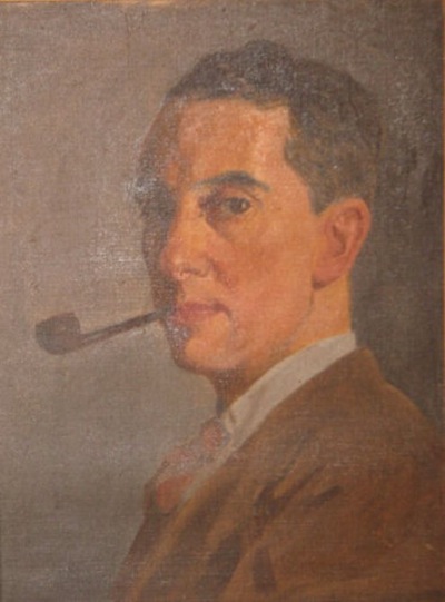
On a more personal note, when the posters were sold, it was sad to see some sentimental items in with them.  Here’s her father, in a self-portrait done when he was younger.

PErcy Padden self portrait

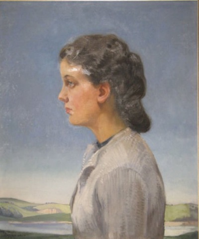
And here’s his portrait of Daphne in 1940.

Daphne Padden oil portrait by Percy Padden

I do hope the pictures went to someone who knew who they were.

Artist and Balloonist

Last time I posted about Royston Cooper, I was shocked just how little it was possible to find out about him.  To the tune of nothing.  Christies could give me his dates, but that was about it.

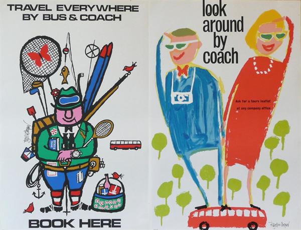
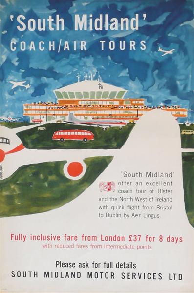
Royston Cooper bus tour posters from Morphets

But, his widow, Marie, got in contact with the blog to say thank you for mentioning him.  I asked her to write something about him, so that the next person to search would at least do better than I had.

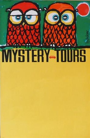
Owl mystery tours coach poster Royston Cooper

And she has, for which I am very grateful.
Royston Cooper 1931-1985 Designer/artist/painter/typographer.
Commissioned to design posters/prints/decorative drawings/brochures/annual reports/packaging/restaurant decor for major companies in UK and Europe. Always with a new approach.

Jovial character. Studio of 23 years in Belsize Park, London NW3.  Popular meeting place for clients and artists alike.

Also Balloonist flying his own balloon ‘Sunny Money’ G-BDBI in UK/France/Belgium/Germany/Sweden/Gordon Bennett races in the U.S.

I rather like the sound of him from that.

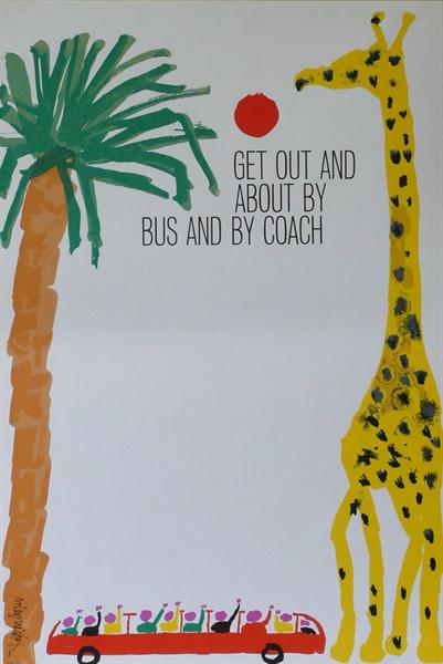
Royston Cooper giraffe coach poster from Morphets

Since I first wrote, Artist Partners have also put up a slightly more formal CV for him, which is great.  I’m really pleased that his life is now being recognised in proportion to the wonderfulness of the work.

Air Coach poster Royston Cooper

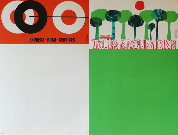
All the images, incidentally, are Royston Cooper posters which are on sale at Morphets in a few weeks time, and I’ve chosen only ones I’ve never seen before.  Don’t eat them all at once.

Two coach posters by Royston Cooper from Morphets

And now for something completely different

It’s very easy to reconstruct the past through the sensibilities of today.  We go back through the copies of Graphis and Modern Publicity, wade through the posters and the magazines that remain, only picking out the things that chime with us now.  And so we put together a story about the fifties which is about how a friendly kind of modernism finally caught hold in Britain.  But that’s not the whole story, just one thread out of the many different styles and designs that were going on at the time.

And why, you may ask, am I being told this once more?  It’s because I’ve found this website, a lovely tour round the work of illustrator Norman Weaver, put together by his daughter.

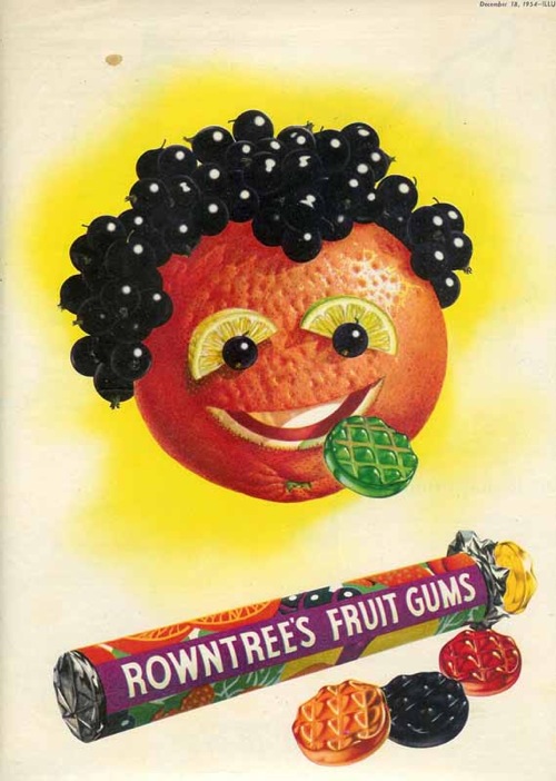
Norman Weaver Rowntrees fruit gums advertisement

The website would be worth a visit for Weaver’s biography alone, which includes training as a cabinet-maker for Heals, being General Eisenhower’s personal map-maker during the war, becomng an official photographer during the aftermath of the concentration camps and finally settling down to a career as a a still life artist.  And he worked with Beverley Pick for a while too, creating giant murals for the Festival of Britain.  It’s enough for five lives, and well worth a read.

Norman Weaver Heinz advertisements

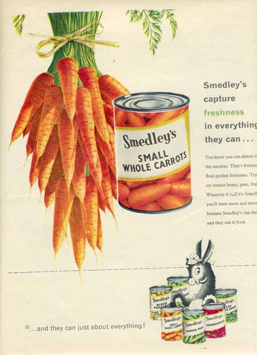
But the other reason to take a look is that Weaver’s work is important.  If you flip through any magazine of the period (and I can speak with some authority here, having been required to read both Woman and Woman and Home right through from 1949-1963 in my time) they are full of these kinds of slightly hyper-realistic illustrated advertising.  And Weaver was one of the very best exponents of this style.

Norman Weaver Smedleys advertisement

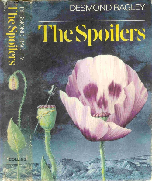
He was represented by Artist Partners, and like many illustrators of the period did a lot more than just advertising.  There are some very recognisable book jackets too.

Norman Weaver book cover for the spoilers

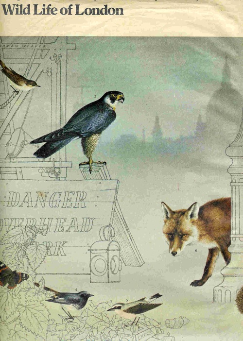
As well as some beautiful wildlife illustrations – these were for a Sunday Times article about wildlife returning to London.

Norman Weaver London wildlife

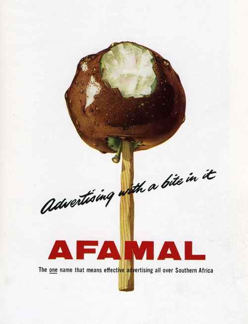
But it’s still the commercial and advertising drawings that are the most compelling for me.

Norman Weaver Afamal advertisement

I think that’s because they tell another one of the really important stories of the time.  While the architects and the designers were all busy embracing Scande-lite modernism, with its wide plains of wooden floors and less is more ethos, for an awful lot of people the opposite was true.  More was very definitely more.

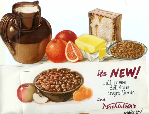
Norman Weaver mackintosh food ad

The rising tide of consumer goods in the years after the war must have seemed almost impossibly abundant after rationing, utility and bombs, a time at last of fridges, colour and as much food as you could want to eat.

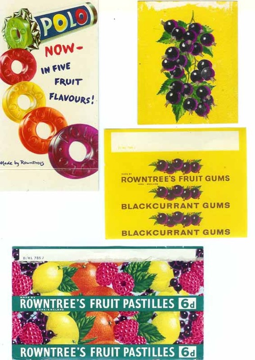
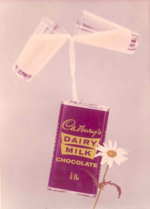
Weaver’s drawings celebrate this bounty in all of its vibrant, glistening detail.

Norman Weaver sweet wrappers

It’s impossible not to look at the past through the lens of the present, and I know that one of the reasons I like these illustrations is the fantastic colour and optimism – the latter in particular isn’t something you often find in modern design.

Norman Weaver Cadburys Dairy Milk

So all I’m really doing is telling another, slightly different story about what things looked like fifty or sixty years ago, it’s not any closer to the truth than any other.  But it’s a start.