Tag: bus posters
Christmas bay
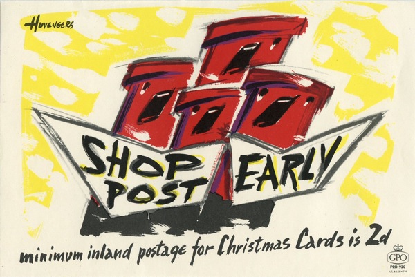
For once, eBay has come up with something seasonal. Even better, it’s a classic GPO post early poster.
This 1957 design by Huveneers has already come up on the Advent Calendar here, and now you can have your own if you like. Bidding starts at a moderately steep £22 (well I think it’s steep given that it’s 22cm x 15cm, which isn’t a great deal of poster) but they don’t come up that often, so the seller may be right this time.
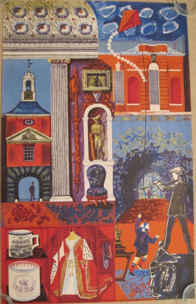
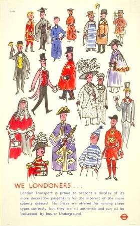
Elsewhere on the bay, the delightfully named i.m.weasel has some London Transport posters to sell. Only a few, but some rather good ones. Shall we start with this Henrion?
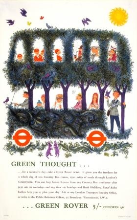
Then there’s this Sheila Robinson too.
And a rather good William Johnstone that I haven’t come across before (the colours remind me of James Fitton’s post-war posters, for what it’s worth).
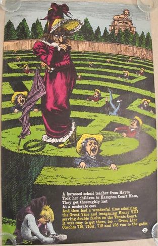
But the star of the show is this David Gentleman pair poster.
Now, I do have a few caveats about these auctions. One is that – in the case of the Johnstone and the Henrion – he illustrated them with the London Transport Museum catalogue image as his main pictures. Which is a bit cheeky.
The other is that all of these items have a reserve on. And I’d suspect that these are fairly steep ones too, given that the David Gentleman poster has a Buy It Now price of £1,000 attached. Which is, yes, what it has fetched at Christies earlier this year. But firstly that was with two Sheila Robinson posters (proof once again that these multiple lots make it almost impossible to value anything properly). Secondly, if you want a good price for a poster, putting it in an auction which ends on December 22nd probably isn’t the way to get it. And finally, I think that there is a more general point, which is that if you want a Christies price, you probably do still have to sell at Christies, and pay their premiums. But I shall watch and see what happens with interest. Although probably without bidding.
It’s also worth noting that this John Bainbridge is still floating about for sale on a Buy It Now too.
Currently on for £90, which is down from its original starting bid of £120, but still a bit tatty round the edges.
While, in the endless re-settling and rearrangement of the posters from the last Morphets sale, these two are also available on Buy It Nows.
Curiously, the Bigg (above) is at £100, while the Atkins, which I infinitely prefer (always the sucker for a chalk horse though) is only £75. But in both cases that’s significantly more than their auction price.
Tomorrow, more GPO admonishments but this time seen on their natural habitat of a wall.
Travel Safely
Karen at Travel on Paper emailed earlier this week to say that they are having an Open Studio this weekend.
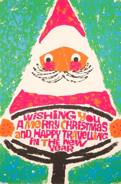
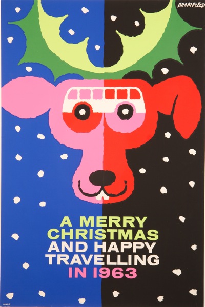
Now, we don’t advertise just any old event here on Quad Royal. But she swayed me by including two fabulous Christmas coach posters along with the invite.
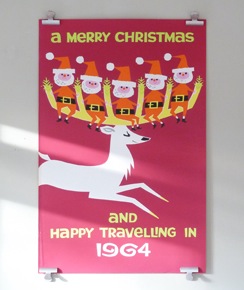
Father Christmas at the wheel, above, is by Clarke, and the reindeer by Bromfield.
Which makes a couple of excellent bonus images for the advent calendar, so thank you very much to them. There will be more from the coach companies later this month, once the GPO have calmed down a bit.
Should you want to turn up and see more of this kind of thing in the meantime, their Open Studio is:
10-12 DECEMBER – Friday evening 6-9pm Saturday & Sunday12-5pm
and they live at:
Clockwork Studios, First Floor, 38B Southwell Road Camberwell SE5 9PG
This is half a mile from where I used to live, but over 100 miles from where I live now, so sadly I won’t be there. But have fun if you are.
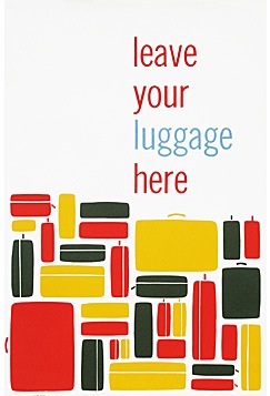
Leave your Paddens here
I spy with my little eye…
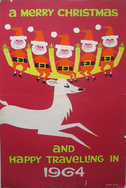
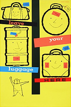
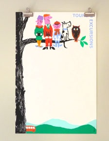
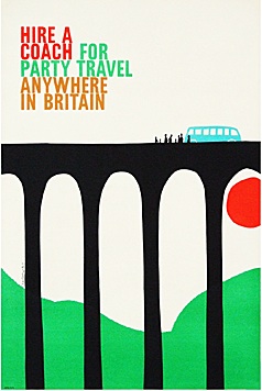
…some Daphne Padden posters for sale. And I’m rather pleased about it as her work really does deserve more attention and acclaim than it has got so far.
The one above is being sold by Elephant and Monkey for £95, but Fears and Kahn have this (for a somewhat more taxing £475).
While Present and Correct have all of these,
at prices ranging from £135 – £175. Which is a lot more of her work than I have ever seen on sale before – and at interestingly variable prices too; it’s still perhaps a bit early to judge what her real market value is yet.
Now while I would like to read this entirely as the start of the Daphne Padden revival, that is of course just a small part of what’s happening here. These bright and punchy 1960s graphics have been starting to surface for a couple of years now – mainly due to the efforts of shops like Fears and Kahn.
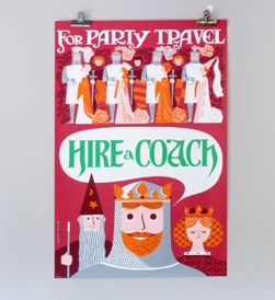
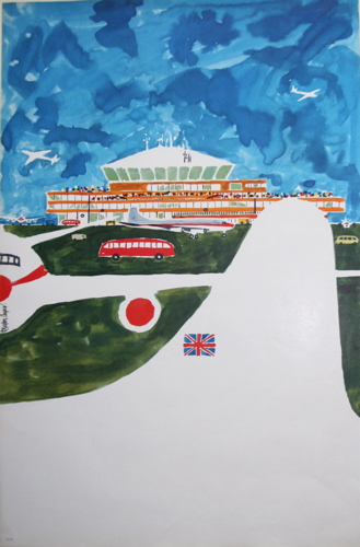
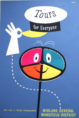
But the real story is, of course, Morphets. The vast slew of 1960s and 70s posters that were released at their July sale is now working its way into the dealers. Because all of these people aren’t just selling Daphne Padden, they’re also selling a whole heap of other coach and rail posters along with them. So Elephant and Monkey have Royston Cooper and Harry Stevens.
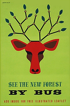
Fears and Kahn have this splendid stag.
And Present and Correct can offer this rather good rendition of a family tree.
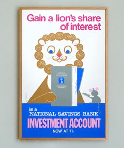
In each case there are plenty more where that came from on the websites too, small and large, cheap and expensive. But, at my guess, almost all originating from Morphets. The only one I know wasn’t in the sale was the Daphne Padden lion and mouse – but I am happy to be corrected if anyone out there knows better.
What will be interesting to see is whether this lasts. Did the Morphets sale release a flood of stock onto the market which will come and then disappear because no one else preserved these posters? Or will the high prices entice more of these graphics out of their hiding places and up for sale? I’d love there to be more, but I’m not really optimistic that they are out there to be sold. We shall see.
Put it there
What do these four posters have in common?
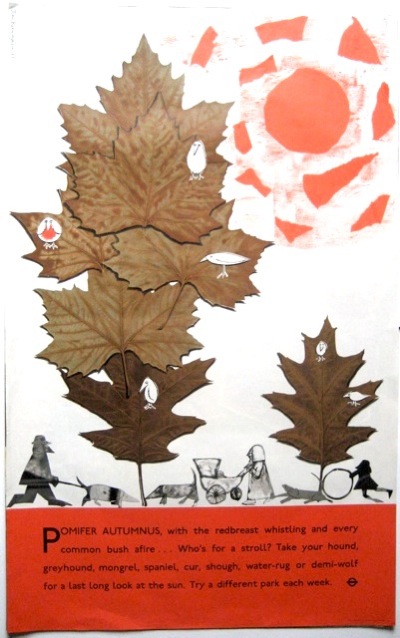
John Burningham, London Transport, 1961
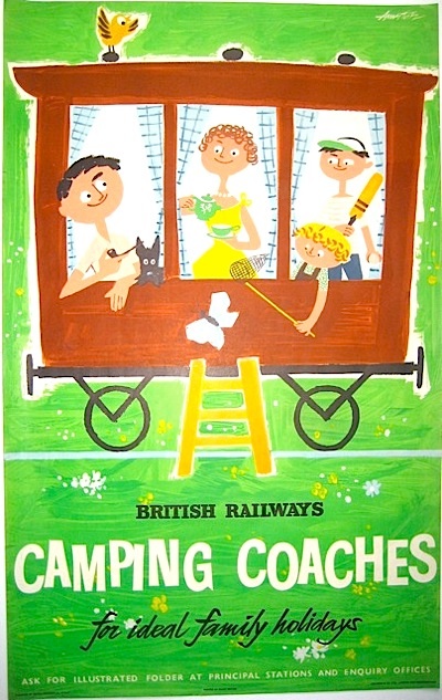
Andre Amstutz, British Railways, 1956
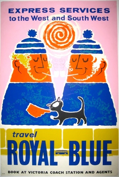
Daphne Padden, Royal Blue Coaches, c. 1957
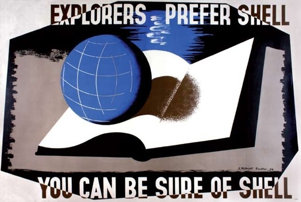
Edward McKnight Kauffer, Shell, 1934
Well, three out of the four of them are on the walls here, but you’re not really expected to know that. Perhaps more to the point is that they represent four out of the five areas of ‘collectable’ posters: railways, London Underground, Shell and coach* posters (the fifth for me would be World War Two posters, for what it’s worth).
*This may be wishful thinking on my part, but we do seem to have quite a lot of them now (thanks to Malcolm Guest, mainly) and so they are at very least collectable by us. Anyone else?
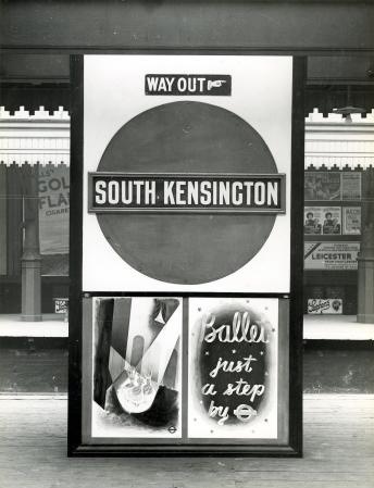
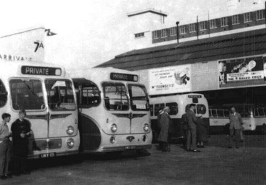
But those four areas also share something more than just being collectable. In each case the companies they are advertising owned the hoardings that the posters went on.
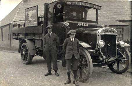
That’s reasonably obvious for the bus, tube and train stations – but Shell posters were also designed to be displayed on the vans which delivered petrol to the garages.
Now set down like that it doesn’t seem like so much of a blinding revelation. But it isn’t, as far as I know, something which has been much commented on. And yet it had a big impact on their posters.
The most obvious example is that all of these companies had a much greater incentive to produce posters than anyone else. Not only was this in effect a subsidised form of advertising for them, but they also needed to churn them out in order to fill up spaces when they hadn’t sold enough commercial advertising.
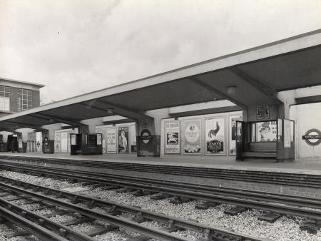
Here’s Enfield West Station in 1934, with a McKnight Kauffer poster for Eno’s Salts clearly visible on the hoardings.
They also continued to produce posters in great numbers later on, when the poster had ceased to be the main medium for advertising, because the spaces were still there and still needed filling.
In addition, there may have been more reason for the companies to produce ‘artistic’ and possibly also more subtle posters, because this will have a very direct effect on the station environment. Although this probably worried Frank Pick more than it did the owners of Victoria Coach Station.
I’ve also read an interesting suggestion that in the early days, London Underground commissioned lots of posters of wide open spaces to counteract the perceived claustrophobia of the tube, but I don’t think there’s any proof of that.
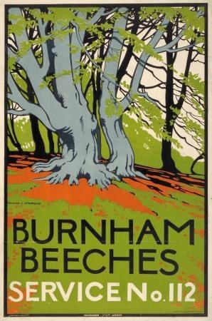
Burnham Beeches, Walter Spradbury 1912
Now originally this was going to be my only point, that all of these people owned their hoardings and so had to invest more in posters and poster design than other companies, which in turn may be one reason why their posters are collectable. And that this hadn’t really been noted until now.
But then I found a really interesting article by David Watts (insert Jam or Kinks record into your head here as you wish) about pre-war depictions of Yorkshire in railway posters. It’s an exemplary look at how posters worked and were consumed, rather than just what they looked like, and backed up by a ton of research. The world of posters could do with a lot more of this kind of rigorousness (not that I’m volunteering to read 200 volumes of railway company internal correspondence, you understand).
One of his points is that the context of railway posters is all-important. They didn’t need to have pictures of trains on, because they were posted up in stations. The fact that they were advertising railway travel rather than just the location pictured could be asssumed.
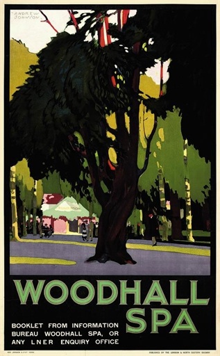
Andrew Johnson, no date
The same is true of London Transport posters. They can just say Go to Uxbridge.
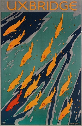
Charles Paine, 1921
That you’d use the underground to do so is implicit in the fact that the poster is displayed at a tube station.
But, as Watts points out, this contextualisation of the posters has other implications.
…omitting any visual reference to rail travel allowed posters to be detached easily from their ‘mundane commercial purpose’.
So the companies, as I’ve mentioned before, could promote their posters as examples of good design for the masses, and even as fine art, in part because they didn’t need to say Go By Train in large letters at the bottom.
Now Watts argues that this made railway posters at least a rather poor form of advertising. And he does put forward some evidence that the train companies themselves thought this way by the early to mid 1930s too. Images of trains, or at least the idea of train travel did become more prominent after then – as in the Tom Purvis that is coming up at Christies next month.
But he also says – and I think that this is entirely right – that the fact that the posters were semi-detached from their commercial purposes is one of the factors that has made them so collectable. They exist in a limbo between fine art and outright commercialism, and are so more appealing than an advertisement for Eno’s Fruit Salts or Gilette Razors.
Although it is worth remembering that it’s only because the companies were promoting them as ‘art’ that these posters are available to collect at all. Shell, Underground and railway posters were all available for sale to the public when they were first produced, so they do survive in attics and collections, while the most commercial billboard posters weren’t and so aren’t. (I’ve mentioned this in passing before, but really ought to pull together all the sources on this one day, because it’s not said often enough. Even here.)
But I think there’s also another way in which the context affected railway posters in particular (although the same is probably also true of London Transport and coach posters to some degree as well). Watts points out how much the railway posters are selling an image of ‘deep’ England, by which he means an archaic, un-modernised and highly rural vision of the countryside. Now whenever this vision is called up at this time, it is almost always intended as a direct contrast to the modernity, ribbon development and speed of the 1920s and 30s.
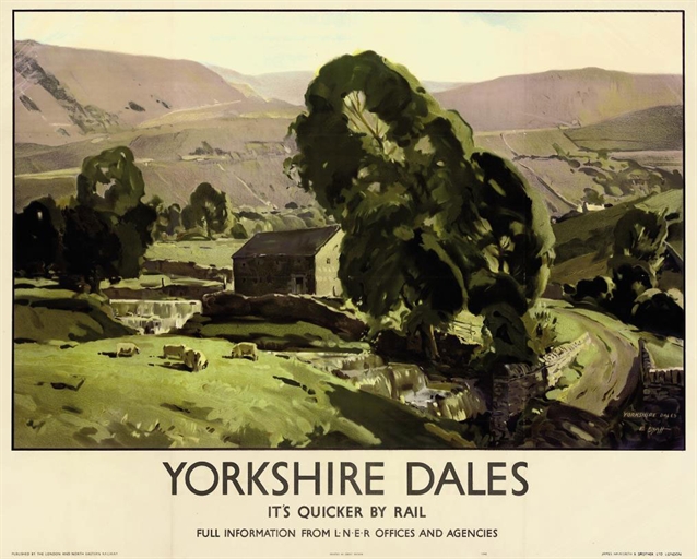
Edwin Byatt, 1940
But in the railway station, that contrast is always there anyway. Most of these poster would have been displayed in an urban setting, and even where they were put up at local stations, there was the machinery and bustle of the railway itself. So the posters are also using their context to suggest that there is an alternative, an escape. And that’s something else that they don’t need to spell out in words at the bottom.
1962 and all that
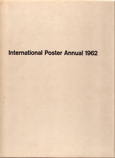
Our subject today is this, which arrived in the post the other day.
It’s a book which does what it says on the cover. Posters, lots of them. And most of them from 1960 or 1961. Can’t argue with that.
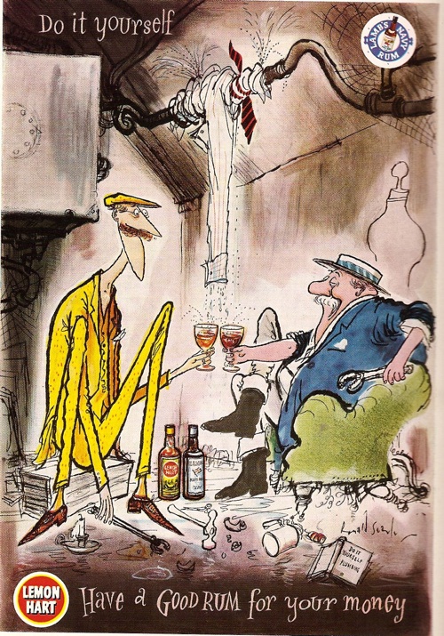
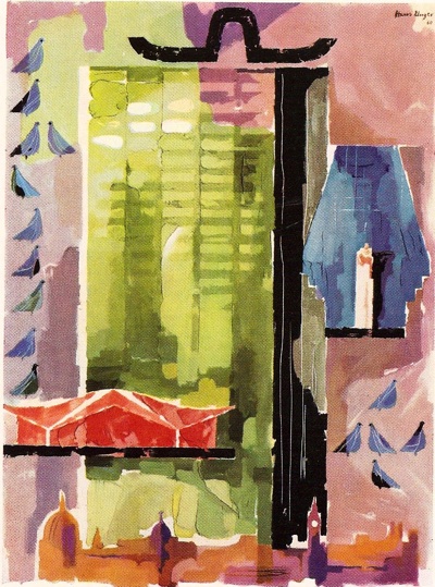
Unfortunately, the vast majority are reproduced in black and white. The only artists to earn some colour coverage for Britain are Ronald Searle and Hans Unger.
(The Unger is a poster for coach travel, but you’d be hard pressed to guess that as there is no text in the reproduction at all.)
Sadly, most of the rest of the pictures are not only monochrome, but also small; I’ve found better images where I can but, as you will see, this hasn’t always been possible..
Now I do like these kind of annuals, and not simply because they’re a lovely wallow in a golden past of poster design. It can also be thought-provoking to see a cross-section through time like this. For a start, you get a good overview of where design was.
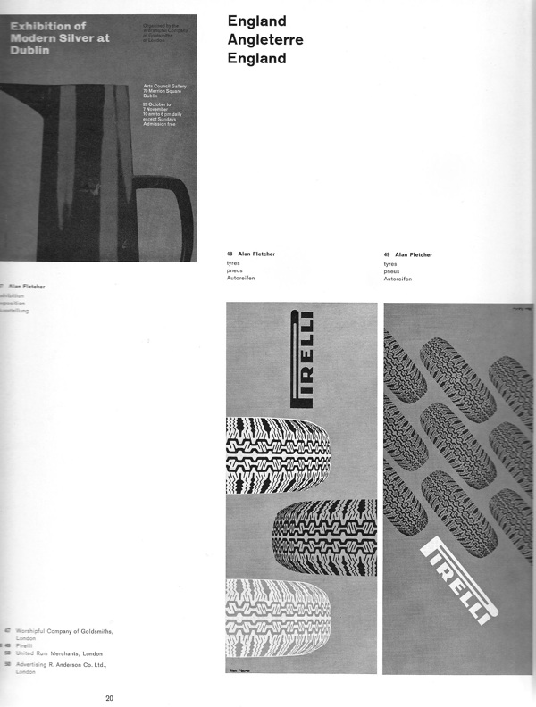
And 1962 turns out to have been quite an interesting time; the whimsy of the mid to late 1950s hadn’t quite departed yet, but the tide of sans-serif modernism was definitely on the rise. Which means that the Ronald Searle illustration above was paired with these three Alan Fletcher designs on the opposite page.
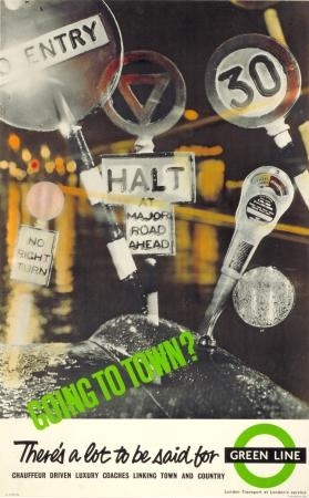
And London Transport could win commendations for this,
as well as this – which was, incidentally, produced by an agency, S.H. Benson Ltd, rather than a designer.
The times they are indeed a-changin’.
But there’s another way in which this selection is worth our attention; the posters included are not simply an archaeological sample of posters past, they’re also a picture of what 1962 thought was important then. Which isn’t always what you might expect now.
There are some things on which past and present do agree. London Transport posters are good – these two are by Dorrit Dekk and G.B. Karo.
In total, over a fifth of the posters shown were designed for London Transport, which is an impressive proportion. But just to prove that posterity (or archival survival) doesn’t always get it right, there are even more coach posters than there are LT exhibits (by one), including these two Royston Coopers.
The same is true of the designers: Abram Games, Hans Unger, FHK Henrion and Tom Eckersley are also all, unsurprisingly, feted.
Abram Games for London Transport
Hans Unger for GPO
But then there are a few designers included that might not be the first to spring into your mind today. 1962 really liked four of these coach posters by Christopher Hill.
His stuff doesn’t seem to come up much these days(apart from at Morphets, of course, what didn’t) but these two are both available at Fears and Kahn for the right kind of money.
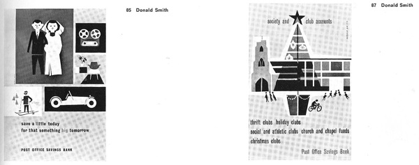
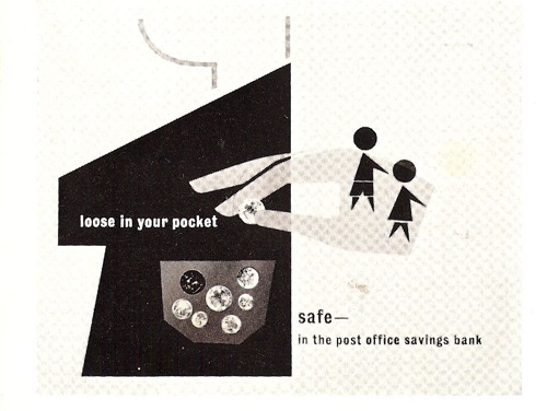
I’ve never heard of Donald Smith before at all, but he has five posters in the book in all, including these three very delightful posters for the Post Office Savings Bank below. (Where is the Post Office Savings Bank archive, does anyone know?)
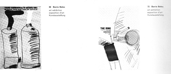
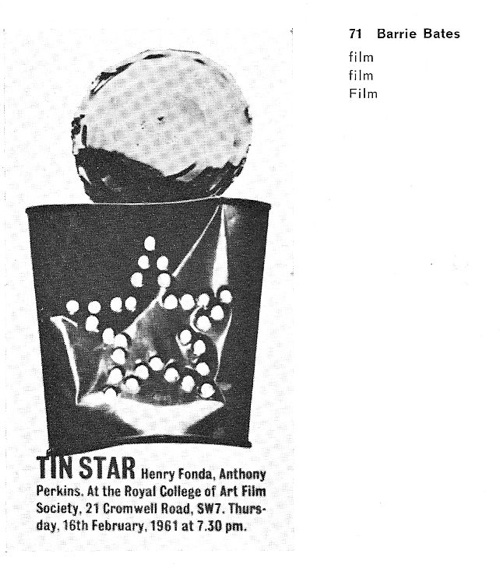
But most mysterious of all was Barrie Bates. He had four posters included, and they’re all very striking.
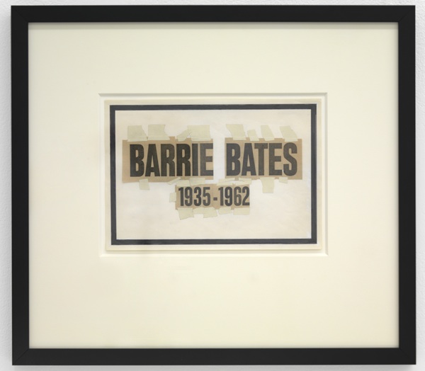
So why had he not turned up elsewhere? It transpires that there was a very good reason for this. Because in 1962, he became someone else altogether.
When he came to the end of his graphics course at the Royal College of Art, Barrie Bates bleached his hair and eyebrows in order to become Billy Apple, conceptual and pop artist extraordinaire.
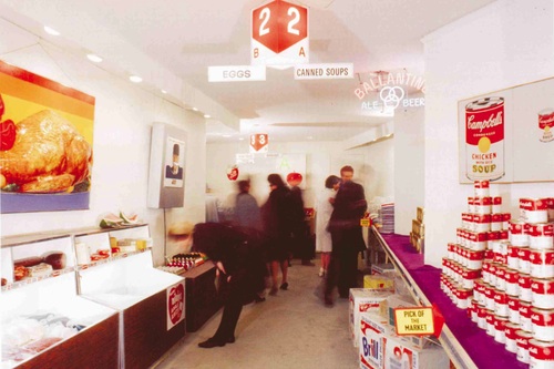
This is American Supermarket, the 1964 New York show, a landmark Pop Art exhibition. With exhibits by, amongst others, Andy Warhol, Claes Oldenburg, Tom Wesselmann, Jasper Johns and one Billy Apple.
Apple/Evans was working for Madison Avenue advertising agents at the same time, which rather pleases me, as he was eliding the difference between product and art even more than the exhibition might have suggested. And it’s also good to know, given how good his 1962 work was, that he hadn’t given up on graphics altogether.
P.S. You’ll be pleased to know that Billy Apple is still working as an artist in Auckland, New Zealand, and there is plenty more information about him and his work out there if you’re interested.
