Survivors

When I wrote about poster hoardings and their rather surprising effects last week, the comments section ended up as a bit of a debate on how posters survive.  Were the few that remain only saved because the designers and a few other far-sighted people connected with their production and display collected them (the Malcolm Guest model)?  Or were there more which were sold on to the public of the time as well?

I promised to go away and try and find out as much as I could and report back.  There’s lots more research that can be done, so this is very much a work in progress.  But by asking the questions here, I’m hoping that I might get some answers from you as well.  So please do pile in if you can help.
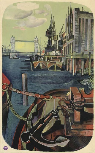
John Minton London's river vintage london transport poster
John Minton, London’s River, 1951

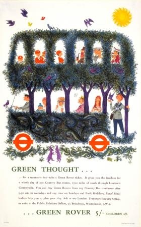
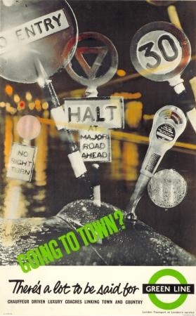
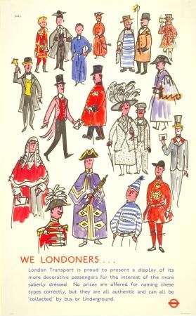
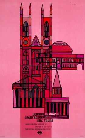
What strikes me is that some kinds of posters survive in disproportionate quantities.  Any auction, or even a look at eBay will show you a lot of London Transport posters or railway posters, with lesser amounts of Shell and Guinness items too.  But very little British commercial advertising survives at all – you can go through swathes of auction catalogues without seeing any for months or even years.

The same is true of GPO posters – which are examples of great design but nonetheless come up very rarely. (To give you an idea of how rarely, Christies catalogue archive can turn up only 10 or so GPO posters which have come up for sale.  Put in “shell poster” and you get hundreds of results.  I daren’t even type in railway poster.)

Lewitt Him 1951 vintage GPO poster
Lewitt Him, 1951

So my suggestion would be that the kinds of posters which survive in numbers were also sold on to the public one way or another.

There is no dispute that this is what London Transport did (as mentioned on here before).  Here’s Oliver Green of the London Transport Museum on the sales pattern in the 1920s:

A typical print run in the 1920s was 1,000, of which 850 were required for posting on the system where they were displayed for one month.  The remaining 150 copies were available for purchase at the company’s head office for between about two and five shillings, depending on the printing cost.  Posters in demand with the public were invariably those which followed the more traditional artistic designs, such as Gregory Brown’s St Albans, Fred Taylor’s Kew and Dorothy Burroughes’ For the Zoo.  These three were all in the top ten of a bestsellers’ list which was announced by the Underground in 1923.
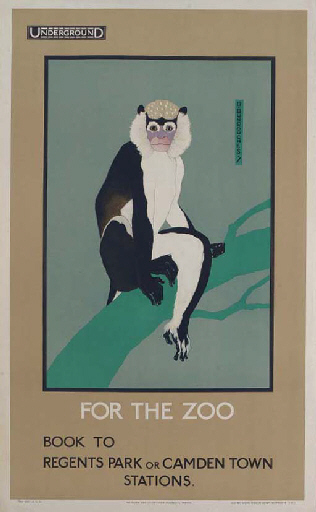
Dorothy Burroughes Zoo vintage london transport poster 1922
Dorothy Burroughes, 1922

By 1931 the best sellers were selling over 300 posters each, and London Transport were selling a total of 10,000 posters in a year.  But even the modern art posters did sell to some.

Edward Bawden has also recalled that he and Eric Ravilious, when students together at the Royal College of Art in the 1920s. looked forward eagerly to the appearance of a new Kauffer Underground poster which was then, literally, one of the cheapest forms of good modern art available.
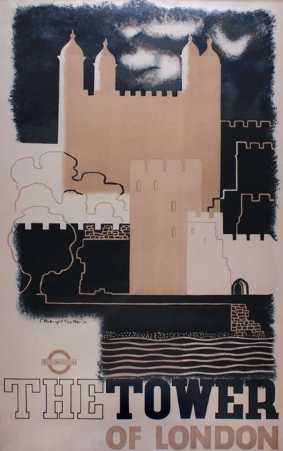
McKnight Kauffer vintage London Transport poster 1934
McKnight Kauffer, 1934

In 1933 the London Transport poster shop opened in their headquarters at 55, Broadway, and designs were, it seemed, commissioned specifically with shop sales in mind.
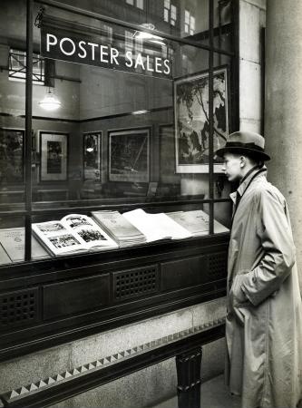
London Transport poster shop exterior
London Transport shop,c.1935.

Furthermore, some posters were also created so that they could be easily cut down for framing and display in the home.
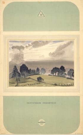
Laura Knight September Freshnes 1937
Laura Knight, September Freshness, 1937

Poster sales continued on and off, with a break for the war, sometimes only to schools and other educational establishments, sometimes to the public.  Claire Dobbin writes about it in some detail in her essay in London Transport Posters if you want to know more.

She also mentions is that London Transport held poster exhibitions too, at Burlington House in 1928 and the Victoria and Albert Museum in 1949.
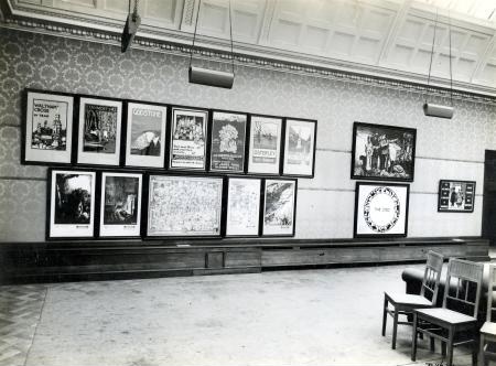
LT exhibition Burlington House 1928
London Transport poster exhibition at Burlington House, 1928

For London Transport, these were infrequent special events, but in the case of  the railway companies, exhibitions were a regular feature of their promotions. David Watts catalogues them in the essay I was referring to the other day.

Annual poster exhibitions were held at the LNER’s King’s Cross station in London between 1923 and 1927. Between 1928 and 1933, with the possible exception of 1931, they were held in either the New Burlington or Grieve’s galleries in the West End. In 1936 a private exhibition was held in Marylebone, presumably at the LNER station. In 1937 the exhibition reverted to the West End. LNER poster exhibitions were held annually in Edinburgh between 1924 and 1938. Their exact location is not stated, except for 1935, 1937 and 1938, when it was Waverley station. Numerous other localities hosted occasional LNER poster exhibitions, including: Aberdeen (1929–30, 1934), Barnard Castle (1934–36), Bournemouth (1934), Bradford (1934–35), Brighton (1936), Cleethorpes (1935), Dundee (1934), Gateshead (1936), Glasgow (1929–30), Grimsby (1934), Ipswich (1935), Kingston upon Hull (1932–36), Leeds (1934), Lincoln (1934, 1936), Manchester (1935–36), Newcastle upon Tyne (1930, 1934–36), Norwich (1933), Shef?eld (1933, 1936–37), Yarmouth (1934) and York (1932–36). […] It is likely that other localities also hosted exhibitions of LNER posters and that those listed above held them in more years than shown here. Exhibitions seem not to have been systematically recorded.

That’s quite a lot of exhibitions.

Now, I can’t lay my hands on any proof that posters were sold at these events.  But posters were definitely sold by railway companies.  Pre-war artists had contracts which paid them for every copy sold to the public, for a start.

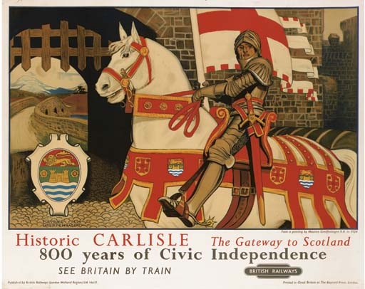
And the LMS marketed posters to the public – possibly by the same system of writing in as London Transport used.  When the company produced a series of posters designed by Royal Academicians in 1924, they “sold well”, and Maurice Greiffenhagan’s image of Carlisle was top of the pops, selling to the public “in large numbers”.

Maurice Greiffenhagen Carlisle vintage Railway poster LMS

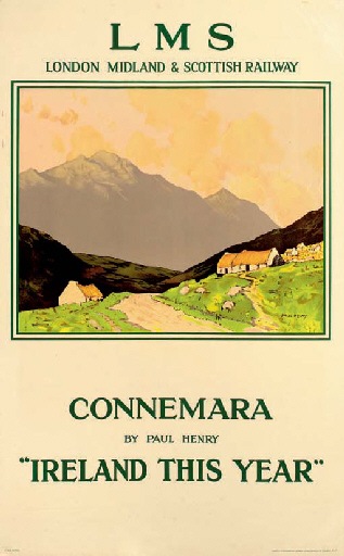
In 1931, the LMS even published a list of its six best-selling posters.  Like the railways, traditional art was what the public wanted to buy, with Paul Henry’s views of Ireland taking the top two places.

Paul Henry Connemara 1926 vintage railway poster

So railway posters were definitely for sale.  Which just leaves Shell and Guinness posters to account for.
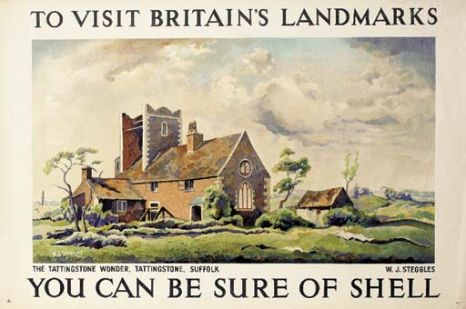
W Steggles Tattingstone wonder shell poster
W Steggles

Shell held exhibitions of its advertising too.  The first was at New Burlington Gardens in 1931 and then later they were held at Shell-Mex House and around the country. These were reviewed in the press and attracted thousands of visitors.  And, yes, the posters were for sale.  Michael Heller has reseached Shell’s inter-war corporate branding.

Its posters rapidly became collectors items, available by subscription from Shell or through its popular published catalogue collections.

Which just leaves Guinness posters, about which I can find out nothing right now.  But  I think I might be prepared to make a guess that they also were sold given that they survive in the numbers they do.

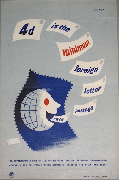
Bromfield Foreign letter GPO poster 1951
Bromfield, 1951

By way of a contrast, let’s go back to the GPO posters.  We’ve got a fair number (in fact a rather embarrassing quantity), but what’s interesting is that I know the direct provenance of most of them.  A few came from the Malcom Guest collection, a few more (all by her) from Daphne Padden’s estate.  But the greatest number came from eBay, sold by a man whose uncle went to his local post office in the early 1950s and asked if he could have their posters when they’d finished with them.    They’re not just floating about like the railway and London Transport posters, only thanks to rare and chance collections are they kept.
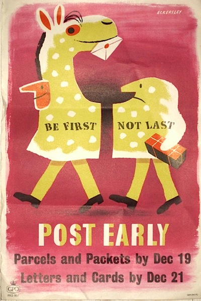
Tom Eckersley vintage GPO poster 1955
Tom Eckersley, 1955

Which makes me think that we’re very lucky that Shell, London Transport and the Railway Companies wanted to improve the nations taste by selling posters.  Otherwise practically nothing would survive.

Sources

I haven’t given references in this, mainly because footnotes and blogs don’t mix well.  But most of the information came from these books:

London Transport Posters: A Century of Art and Design

Underground Art: London Transport Posters, 1908 to the Present

Art for All: British Posters for Transport (Yale Center for British Art)

Railway Posters 1923-1947

as well as from Michael Heller’s paper, Corporate Brand Building at Shell-Mex Ltd in the Interwar Period.  Do ask if you want any more detail and I will do my best.
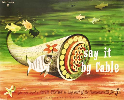
Poster pot

As if last week didn’t give you enough posters to fritter your monies away on, there are still more.  Really quite a lot more too.

First, Swann Galleries, whose auction is on 15th November.  Usually the appearance of a whole swathe of high quality London Underground posters on the other side of the Atlantic would be worth making a fuss over.  This time though, unfortunately for them, they’re in competition with the stellar collection on sale at Christies this month.  With the result that theirs don’t look quite as enticing.

Alma Faulkner vintage London Transport poster 1928
Alma Faulkner, 1928, est. $1,000-1,500
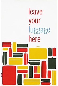
This may just be because I am jaded.  But I also think that there’s a different feel to this collection – a bit more pastel and bucolic, possibly even a bit more fey, which means that they don’t appeal to me as much.

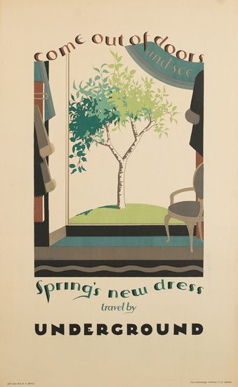
Austin Cooper vintage London Transport poster out of doors 1923
Austin Cooper, 1923, est. $1,500-2,000
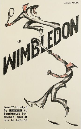
There are a few exceptions to this, though.  One is this wonderful piece of modernism by Andrew Power (which, the catalogue tells me, was a pseudonym used by Sybil Andrews, something I didn’t know).

Andrew Power wimbledon vintage london transport poster 1933
Andrew Power, 1933, est. $4,000-6,000
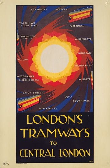
There is also this fabulous vision of modern transport.
Harold McCready vintage London transport tram poster 1930
Harold McCready, 1930, est. $1,200-1,800

Although it does make me very unsure about taking a tram, for fear of the large explosion when they all reach the centre.

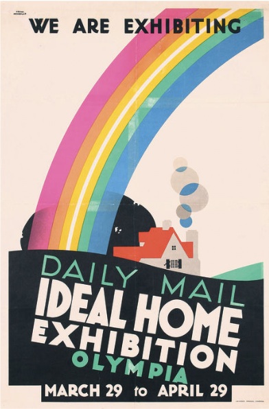
Even further away in San Francisco, Poster Connection have only a handful British posters at all in their auction on 6th November.  Your starter for ten are two Frank Newboulds for the Ideal Home exhibition.

Frank Newbould 1928 vintage Ideal Home poster
Frank Newbould, 1928, est. $600.

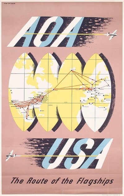
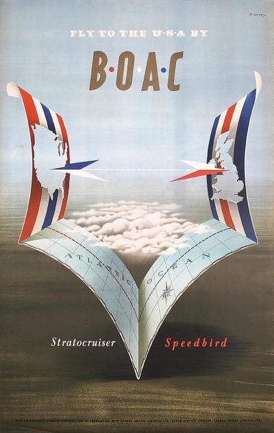
My favourites are these two Lewitt-Hims for BOAC.

Lewitt Him vintage BOAC poster 1948
Lewitt Him, 1948, est. $400.

Vintage Lewitt Him BOAC poster 1948
Lewitt Him, 1948, est. $500

And there’s also a Games.

Abram Games BOAC poster 1949
Abram Games, 1949, est. $500

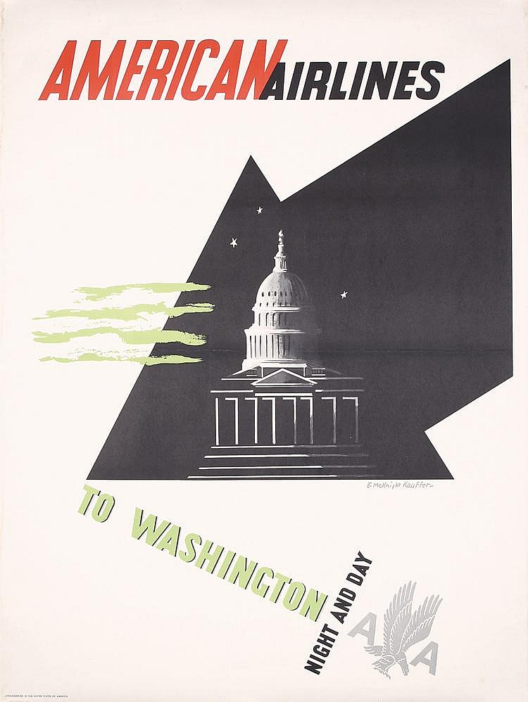
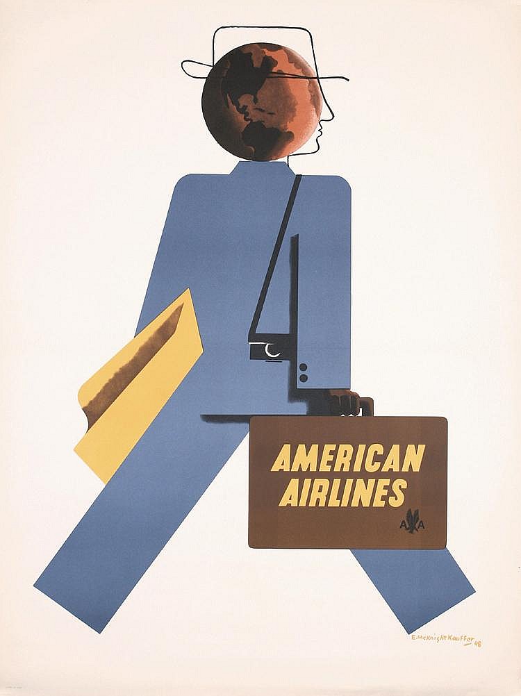
Plus a couple of interesting McKnight Kauffers too.

mcKnight Kauffre vintage American Airlines poster
McKnight Kauffer, 1948, est. $700.

Vintage McKnight Kauffer American Airlines poster
McKnight Kauffer, 1948, est. $800

The whole catalogue is worth looking at though, as they have put together a selection of the European greats, including Herbert Leupin, Donald Brun and Raymond Savignac.

Donald Brun 1949 Vintage poster
Donald Brun, 1949, est. $300

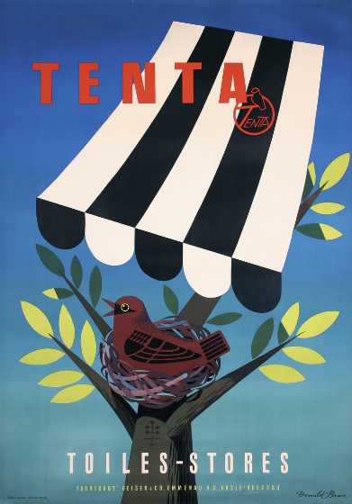
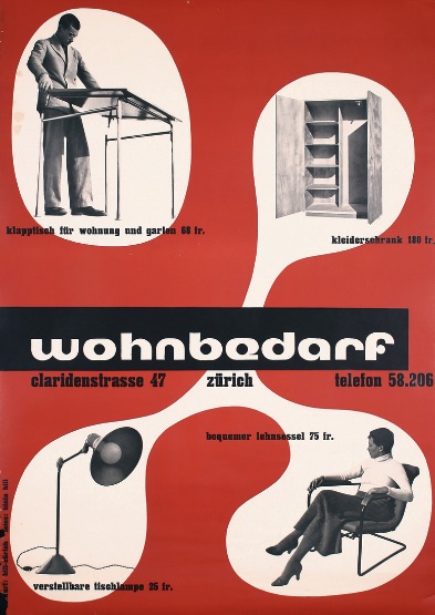
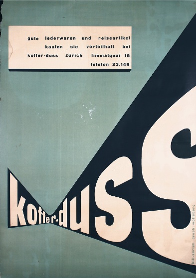
And I’ve rather taken a shine to these two by Max Bill, mainly because no one in Britain ever really did type like this and so I pine for it.

Max Bill vintage poster 1933
Max Bill, 1933, est. $1,700

Max Bill vintage poster 1933
Max Bill, 1933, est. $1,000

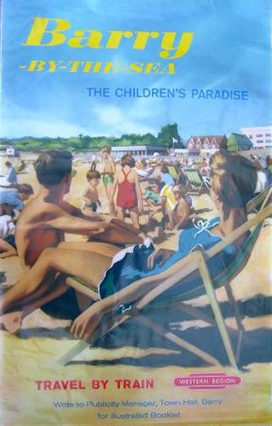
That’s not all, either.  G.W. Railwayana have an auction on 13 November (with no estimates in the catalogue, in case you wonder why I haven’t attached them).  For those of us who aren’t after Pictures of Trains, there are only a few curiosities, like this rather nice bit of early 1960s Ladybird book styling.

British Railways vintage poster barry 1961
Anonymous, 1961

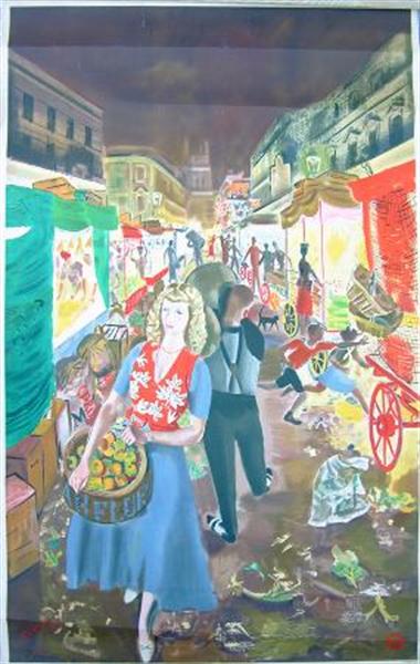
Although this is rather nice – it’s half of a pair poster of London’s Street Markets, from 1949 and would be a lovely thing to look at every day.

London Street Markets vintage poster 1949 AR Thomson
A R Thomson, 1949.

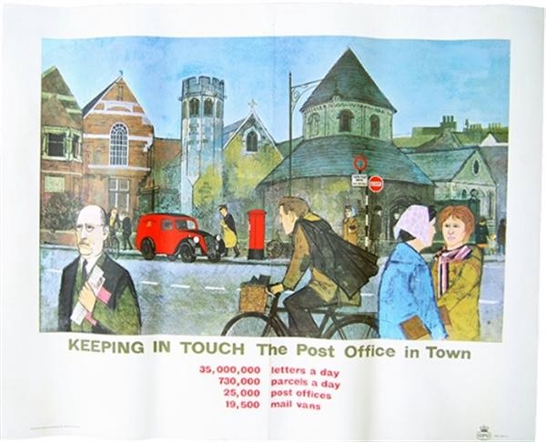
I’m pointing out these GPO Schools posters, simply because they’ve come up for discussion here last week.

Keeping in Touch, the post office in town vintage poster 1960s

These (there’s another one too) are quite late, 1960s, and not very appealing if you ask me (we had some, no idea why, and sold them).

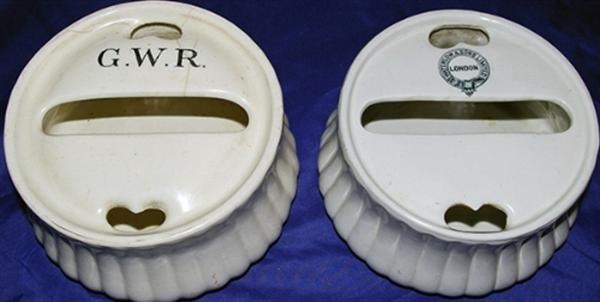
But, if you’re interested in piecing together the archaeology of poster display, this little lot is quite interesting, even though it isn’t a poster.

Poster Paste pots

They’re poster paste pots, designed, I suppose, to be non-spill and to get just the right amount of paste on your Tom Purvis.  What’s particularly interesting is that one, unsurprisingly has  GWR on it.  But the other says Waterlows – who were of course one of the great printers of posters.  So is this a very early promotional gift?  I need to know.

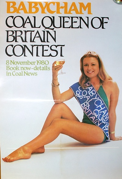
And finally, who wouldn’t want to be Babycham Coal Queen of 1980?

I am speechless

Yours with Scotland For Me (7 assorted); Visit Moscow; Manchester plus others.  A bargain in the making.

1962 and all that

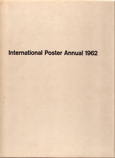
Our subject today is this, which arrived in the post the other day.

International Poster Annual 1962 - cover

It’s a book which does what it says on the cover. Posters, lots of them.  And most of them from 1960 or 1961.  Can’t argue with that.

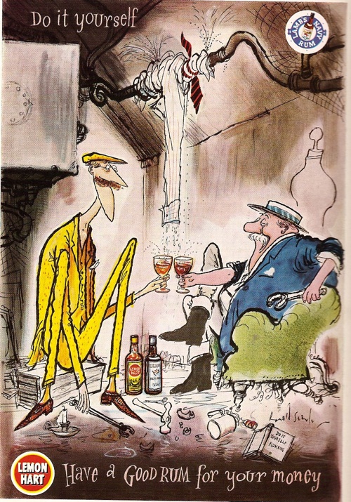
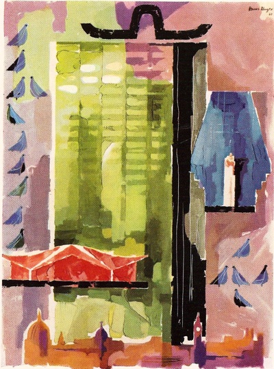
Unfortunately, the vast majority are reproduced in black and white.  The only artists to earn some colour coverage for Britain are Ronald Searle and Hans Unger.

Ronald Searle rum advertisement from IPA 1962

Unger coach poster IPA 1962

(The Unger is a poster for coach travel, but you’d be hard pressed to guess that as there is no text in the reproduction at all.)

Sadly, most of the rest of the pictures are not only monochrome, but also small; I’ve found better images where I can but, as you will see, this hasn’t always been possible..

Now I do like these kind of annuals, and not simply because they’re a lovely wallow in a golden past of poster design.  It can also be thought-provoking to see a cross-section through time like this.  For a start,  you get a good overview of where design was.

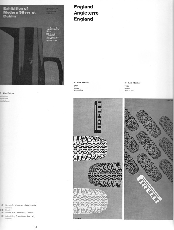
And 1962 turns out to have been quite an interesting time; the whimsy of the mid to late 1950s hadn’t quite departed yet, but the tide of sans-serif modernism was definitely on the rise.  Which means that the Ronald Searle illustration above was paired with these three Alan Fletcher designs on the opposite page.

Alan Fletcher designs in IPA 1962

And London Transport could win commendations for this,

Bartelt vintage london transport poster 1960

as well as this – which was, incidentally, produced by an agency, S.H. Benson Ltd, rather than a designer.

Vintage LT poster S W Benson agency, IPA 1962

The times they are indeed a-changin’.

But there’s another way in which this selection is worth our attention; the posters included are not simply an archaeological sample of posters past, they’re also a picture of what 1962 thought was important then.  Which isn’t always what you might expect now.

There are some things on which past and present do agree.  London Transport posters are good – these two are by Dorrit Dekk and G.B. Karo.

Dorrit Dekk london transport poster from ipa 1962

G B Karo vintage London Transport poster from IPA 1962

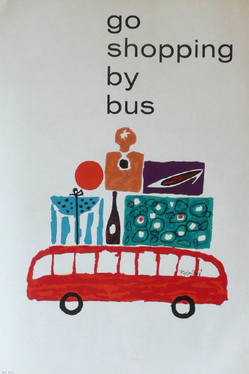
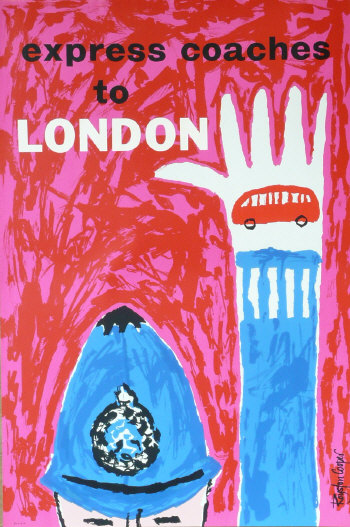
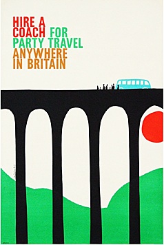
In total, over a fifth of the posters shown were designed for London Transport, which is an impressive proportion.  But just to prove that posterity (or archival survival) doesn’t always get it right, there are even more coach posters than there are LT exhibits (by one), including these two Royston Coopers.

Royston Cooper go shopping by bus

Royston Cooper Express coaches to London

The same is true of the designers: Abram Games, Hans Unger, FHK Henrion and Tom Eckersley are also all, unsurprisingly, feted.

Abram Games conducted coach tours London Transport poster 1962

Abram Games for London Transport

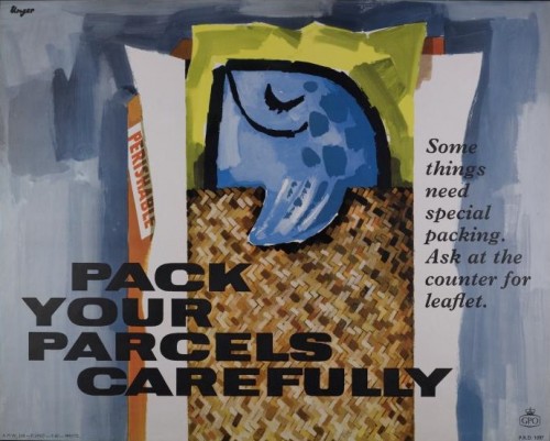
Please Pack Parcels Carefully Unger GPO poster

Hans Unger for GPO

But then there are a few designers included that might not be the first to spring into your mind today.  1962 really liked four of these coach posters by Christopher Hill.

Coach poster Christopher Hill from International Poster Annual 1962

Coach poster Christopher Hill from International Poster Annual 1962

His stuff doesn’t seem to come up much these days(apart from at Morphets, of course, what didn’t) but these two are both available at Fears and Kahn for the right kind of money.

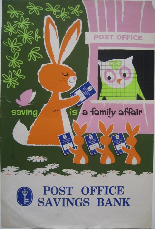
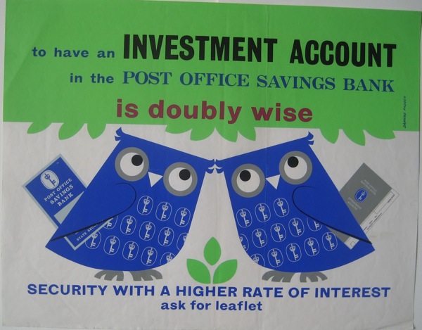
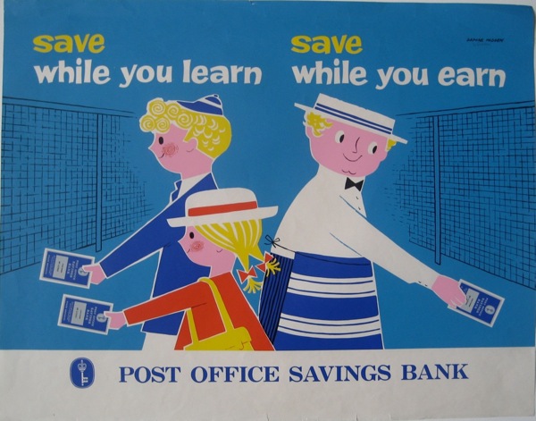
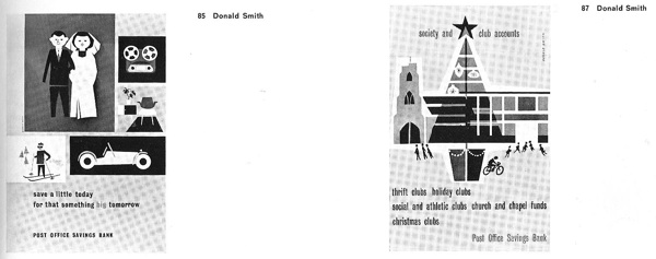
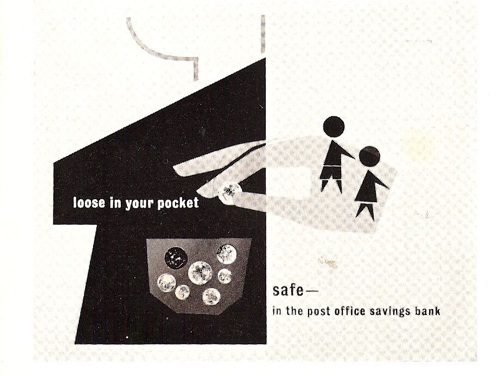
I’ve never heard of Donald Smith before at all, but he has five posters in the book in all, including these three very delightful posters for the Post Office Savings Bank below.  (Where is the Post Office Savings Bank archive, does anyone know?)

Donald Smith Posters in IPA 1962

Donald Smith posters in ipa 1962

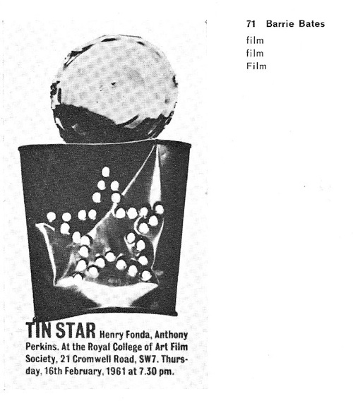
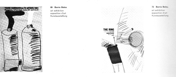
But most mysterious of all was Barrie Bates.  He had four posters included, and they’re all very striking.

Barrie Bates posters in ipa 1962

Barrie Bates from IPA 1962

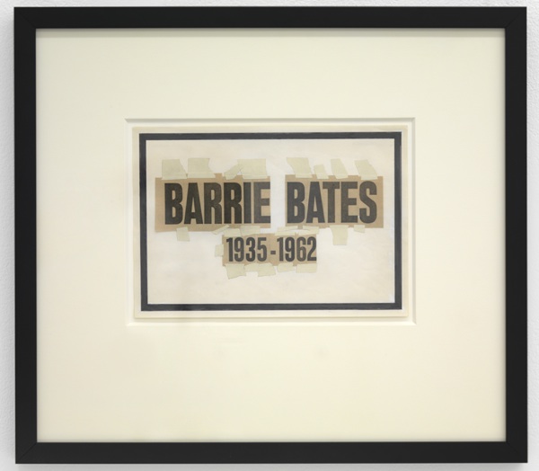
So why had he not turned up elsewhere?  It transpires that there was a very good reason for this.  Because in 1962, he became someone else altogether.

Billy Apple artwork

When he came to the end of his graphics course at the Royal College of Art, Barrie Bates bleached his hair and eyebrows in order to become Billy Apple, conceptual and pop artist extraordinaire.

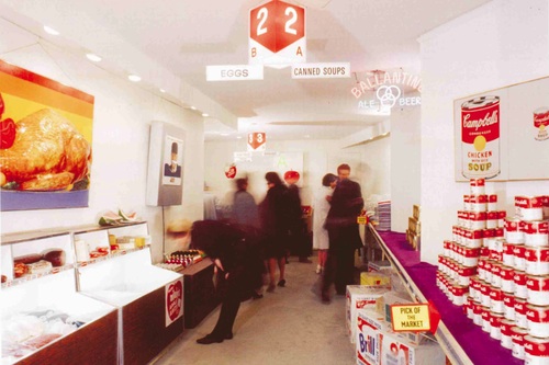
American Supermarket exhibition 1964

This is American Supermarket, the 1964 New York show, a landmark Pop Art exhibition.  With exhibits by, amongst others, Andy Warhol, Claes Oldenburg, Tom Wesselmann, Jasper Johns and one Billy Apple.

Apple/Evans was working for Madison Avenue advertising agents at the same time, which rather pleases me, as he was eliding the difference between product and art even more than the exhibition might have suggested.  And it’s also good to know, given how good his 1962 work was, that he hadn’t given up on graphics altogether.

P.S.  You’ll be pleased to know that Billy Apple is still working as an artist in Auckland, New Zealand, and there is plenty more information about him and his work out there if you’re interested.

Modern British Collecting

I’ve had Paul Rennie’s Modern British Posters: Art, Design & Communication for a few weeks now, and am guiltily aware that I haven’t given it a proper mention yet.  Now there are a whole heap of real life reasons why this hasn’t happened, which I won’t go on about, but I am also aware that I’m finding it hard to come to a conclusion about it.  Which is absurd, so here are a few thoughts which may or may not come to a definite answer at the end.

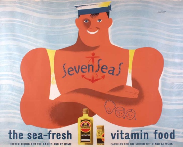
Tom Eckersley Seven Seas vitamins advertising vintage poster
Tom Eckersley, Seven Seas Vitamin Oil, 1947

This doesn’t mean that I don’t like it.  The book is beautiful and would justify its cover price (more on that below) for the illustrations alone.  You’ve seen a few on the blog already, there are plenty more littering this post.  There simply isn’t another book covering these subjects in this detail and with this kind of wonderful reproduction, so it’s a great thing to have.

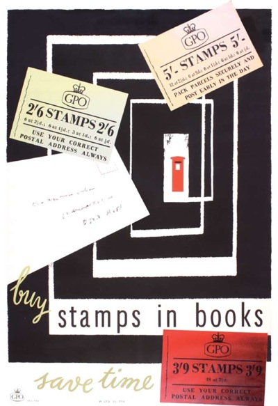
H A Rotholz, vintage GPO poster stamps in books
HA Rothholz, Stamps in Books, GPO, 1955

Even better, the book mentions Quad Royal which is very flattering indeed.  So now it’s been immortalised in print, I’d better keep this thing going for a while, rather than just be a fly-by-night blog.

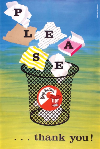
Reginald Mount Keep Britain Tidy poster
Reginald Mount, Keep Britain Tidy, 1950s

But as well as the book being a whole treasure trove of beautiful images, Paul Rennie also makes some really good points about posters and collecting, so much so that I am going to repeat them all over again here.  At the start, he observes that part of the reason that no one else has written this book before him is that the world of the poster, in Britain at least, is absurdly fragmented.

For example, railway posters, motoring posters and war propaganda all form specialised archives within separate institutions. Within the context of these distinct institutions, there is no urgent requirement to integrate the various and disparate parts into a history of visual communication.

I’ve touched on this in posts before – this odd disjunction between disciplines results in quirks like the National Railway Museum not thinking about its posters in terms of designers on their website and many other odd occurrences.  People who know all about railway posters might have no idea about the history of the Ministry of Information; the Imperial War Museum has no reason to care about what designers did before or after the war.  As a result, Modern British Posters is therefore pretty much the first decent survey of the whole, and that can only be applauded.

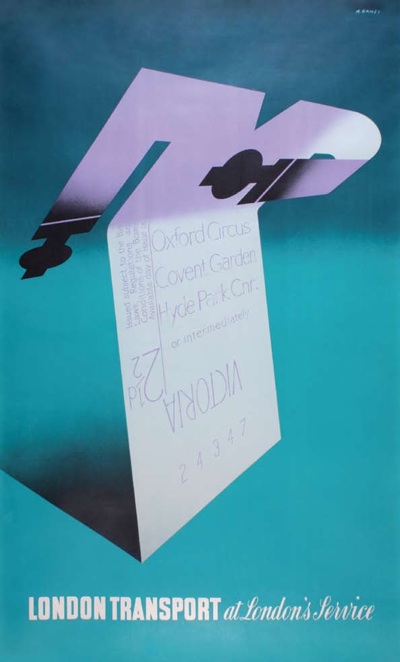
Abram Games London Transport poster
Abram Games, At London’s Service, London Transport, 1947

I’m also really interested when, at the end of the book, he sets out the history of how they started collecting, and the rationale behind what they chose to buy.  Partly because he started out by being fascinated by the Festival of Britain and then, in discovering more about Abram Games and the Festival symbol, found himself intrigued by a wider world of graphics and communication.  I trod exactly the same path too (I still have the little Festival badge that I used to wear on my hat as a teenager); it makes me wonder how many people have followed the same thoughts, and also why the Festival exerts such a potent hold over our imaginations even now.

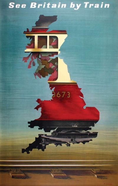
Abram Games British Railway Poster
Abram Games, See Britain By Train, British Railways 1951.

But he also explains why they bought what they did.

Our collecting began, back in about 1982, with an interest in modern design… In 1982, the words British and Modernism seemed like a contradiction in terms.

The direction of our collecting was formed in relation to this widespread,and misguided, perception of British resistance to modernity. Conveniently, it turned out that British items were generally of little interest to international collectors and were, accordingly, less expensive to purchase.

In a way, I wish he’d put this manifesto right at the start of the book, because it’s really important.  This is partly because this is – and Paul Rennie freely acknowledges the point himself – a very partial book.  Every single illustration is from their own collection and so knowing the history behind it makes a big difference to the way you might read the book as a whole.  (I have been trying to work out whether there is a similar unifying idea behind our own collecting; so far I have only managed to come up with: It was cheap and we liked it).

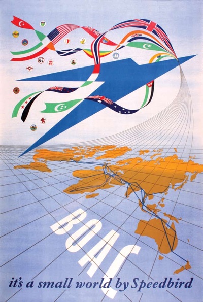
Henrion BOAC poster
Henrion, BOAC Speedbird, 1947

The idea of the British relation to modernism itself is really interesting, and something I’d want to think about at length and probably devote a whole blog post (0r three) to.  But it also informs a lot of the arguments that he’s making in the main bulk of the book, so it would have been good to know beforehand.

Now, I have to confess that between these two ideas I did get a bit lost in the middle of the book. Now this is partly I think a problem of the form – Paul Rennie is heroically attempting a complete survey not only of the history of posters in Britain, but also of the social and economic conditions which affected how they were produced.  So it is, of necessity, a bit of a race through quite a lot of ideas and thoughts.

But also – and this is the bit I have been pondering for a while – Modern British Posters is at heart an academic book.  It’s having a dialogue with a lot of other books, and theories of art and design, ideas about cultural production and the transmission of modernism, and that simply isn’t a conversation that I am part of any more.  Academia and I gave up on each other more than twenty years ago, and since then I have been concentrating on the much simpler task of telling stories about people and things.  So the fault is probably with me rather than the book, for which I can only apologise.  I’d be interested to hear what anyone else thinks about this, particularly if you’re a design historian and have read it.

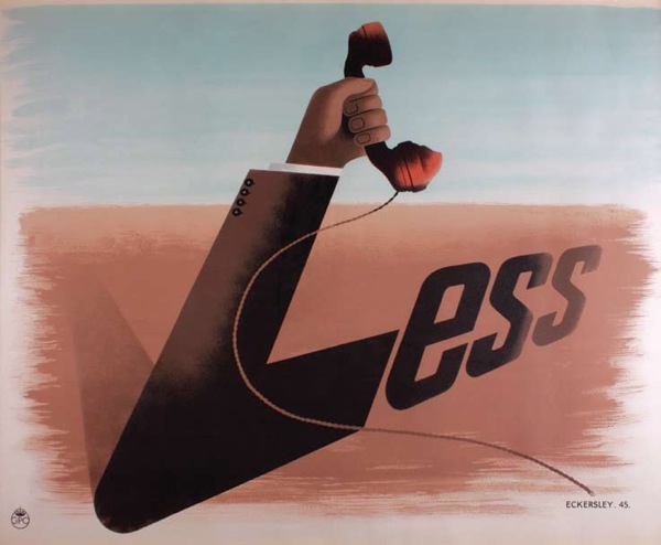
Telephone Less Tom Eckersley 1945
Tom Eckersley, Telephone Less, GPO, 1945

If you haven’t read it yet, and want to have an opinion, which of course you do, I am pleased to say that there is also a special Quad Royal readers’ offer (we’ve never had one of those before, get us).  The book is available at a massive 40% off the list price to you our esteemed reader.  To get hold of it, just email jess at blackdogonline.com, with Quad Royal Readers Offer as the subject line, and she will sort out the rest.

Owl Saving Time

I did promise some more Daphne Padden posters in due course, so, now that I have managed to produce some reasonable photographs, here goes.  One day I will discover thousands of pounds in my purse and pop out to buy an AO scanner, but until then, you’ll just have to make do with these.

To start, this is a rather eclectic selection, mainly because I haven’t seen any of these before now and it’s good to get them out into the world.

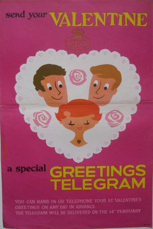
The GPO one is quite straightforward – and rather sweet – although I can’t find it in the BPMA’s catalogue.

Daphne Padden GPO vintage valentine telegram poster

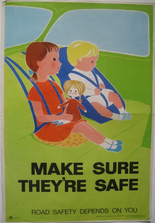
The same is true of the ROSPA seat belt poster.  (I distinctly remember having seatbelts very much like this, and I suspect the poster is just the right vintage for this to be true!)

Daphne Padden ROSPA seat belts for children poster

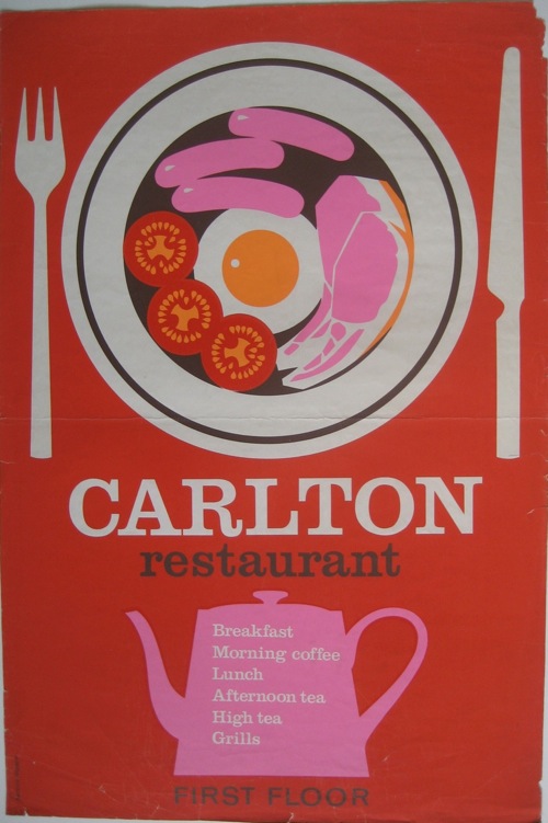
But I can’t tell you the first thing about the Carlton Restaurant, other than that I rather like both their colour scheme and the look of their breakfasts.

Daphne Padden Carlton Restaurant poster

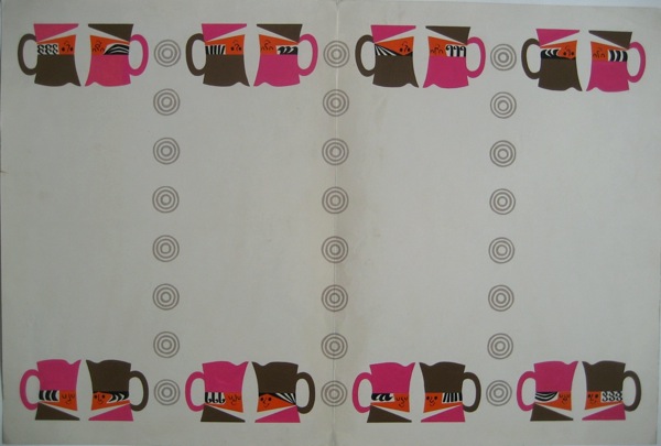
Any ideas?  I think this art work may have been for them as well, simply from the colours and the crockery.

Toby jug artwork Daphne Padden

All of these posters came from the sale of Daphne Padden’s work after her death, and sadly came with nothing that might identify them or what they were for.  I don’t even know whether they were ones she particularly liked, or simply ones that had survived.  So if anyone can tell me anything more, I’d love to know.

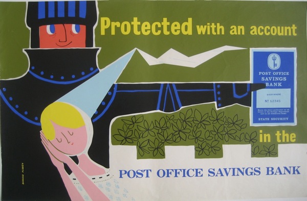
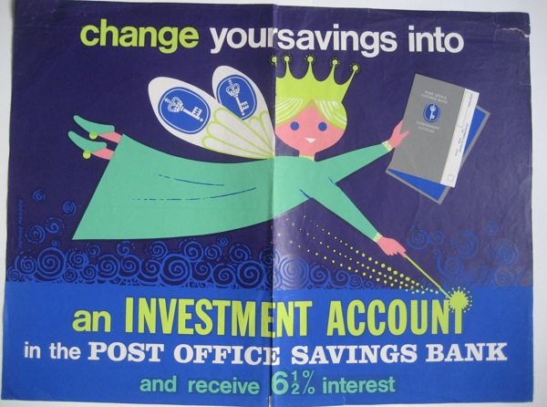
Also among them were a whole pile of Post Office Savings Bank posters, including this rather lovely pair promising you fairy-tale endings if only you’d save.

Daphne Padden Post Office Savings Bank Knight poster

fairy Daphne Padden post office savings bank poster

There are also some rather fine animals.  I posted the rabbits last week, but the owls also get a starring role on their own.

Post Office Savings Bank poster owl and rabbits Daphne Padden

Daphne Padden poster owls Post office savings bank

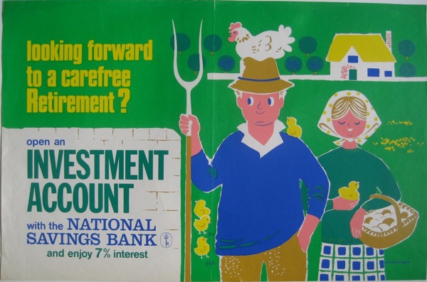
These I can at least make a stab towards dating.  The Post Office Savings Bank turned into the National Savings Bank in 1969, and Padden did posters for both of them in very similar styles and even colour schemes.

Daphne Padden National Savings Bank farmer poster

So I am guessing that the vast majority of these date from the second half of the 1960s, and perhaps the very early 1970s.

This one, though, feels a bit earlier and is probably my favourite.

Daphne Padden Post Office Savings Bank poster child and butcher

That’s not all, either.  Next time I’ll post the slightly more familiar, but still wonderful coach posters.

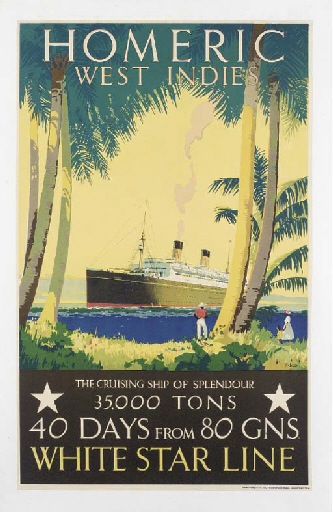
But before then, a couple of footnotes.  One is that there’s quite a bit of confusion out there between Daphne Padden and her father, Percy, who also designed posters.  If you go through Christies’ past lots, quite a few of them are ascribed simply to ‘Padden’, while this poster is sold as being by Daphne.

Percy padden White Star vintage poster

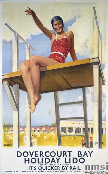
Which, given that she was born in 1927 and this poster is most likely earlier than that, seems implausible.  But they’re not the only ones to make the mistake.  The NMSI also ascribe this one to her (an error which probably goes back to Science and Society photo library cataloguing).

Dovercourt Bay Percy Padden poster railways

They date it to 1941, but I would have thought it more likely 1930s.  Even in 1941, though, Daphne would only have been 14, so again, I think it’s most probably her father’s.  There’s a nice tranche of work for someone in attributing out their posters one day, if anyone out there fancies taking it on.

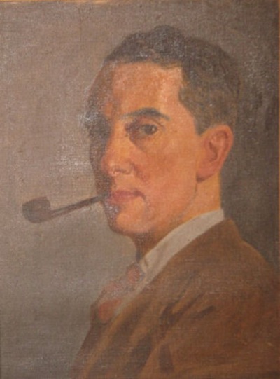
On a more personal note, when the posters were sold, it was sad to see some sentimental items in with them.  Here’s her father, in a self-portrait done when he was younger.

PErcy Padden self portrait

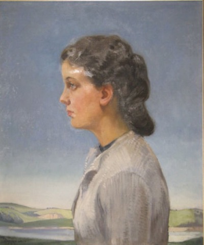
And here’s his portrait of Daphne in 1940.

Daphne Padden oil portrait by Percy Padden

I do hope the pictures went to someone who knew who they were.

The return of Mr Huveneers

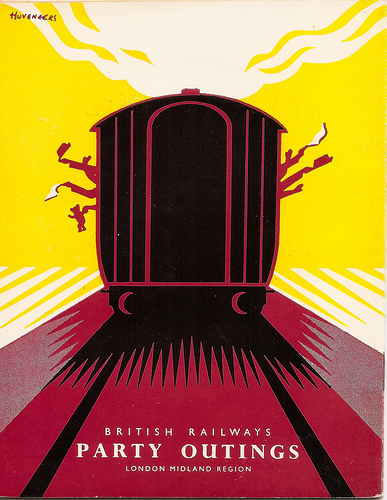
Mike Ashworth, whose Flickr stream brought us the wonderful lost posters of Notting Hill Gate, is clearly a man with much design ephemera to his name.  He very kindly sent me a link to this – a wonderful brochure cover by Pieter Huveneers from 1956.

PIeter Huveneers LM party brochure cover 1956

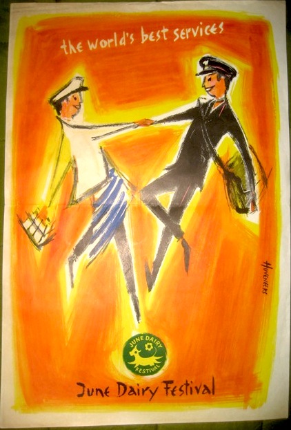
Now I blogged about Pieter Huveneers a while back, trying to find out discover whether the British designer of the 1950s then became the Australian corporate design guru of the 60s and 70s.  I had one enigmatic reply which said that this was the same person, but no more information than that.  Still, it’s good to know that he didn’t just disappear.  And it does give me an excuse to post this, which I love.

Pieter Huveneers vintage poster June Dairy Week

It’s a 10″ x 15″, and while Google has taught me that the June Dairy Festival was a big and regular do in the 50s, I still don’t really know what it was, or what the postie had to do with it.  So, once again, any information would be gratefully received.