A Gentleman and a poster designer

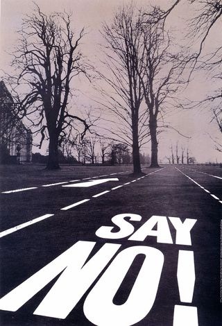
Saturday’s Guardian has an interview with David Gentleman, in which he says he came to feel, apropos of his political works,

“that my outrage should have been channelled into posters, not shut up out of harm’s way in a book”.

I wish he’d just done more posters full stop.

By complete coincidence, I’d just been wandering through the Design Council Slide Collection on VADS, looking for posters which weren’t to do with railways or ROSPA or London Transport (another story for another day) and had pulled out a handful of his posters for the National Trust.  Which are brilliant.
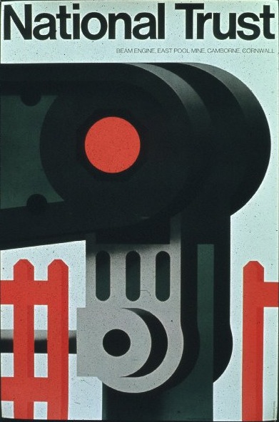
David Gentleman poster National Trust Camborne Beam Engine
1972 poster for the National Trust (and winner of a Poster Design Award to boot)
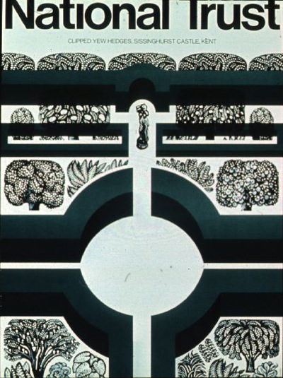
David Gentleman National Trust poster Knole gardens
1976 poster for the National Trust (apologies for the cropping, it came that way)

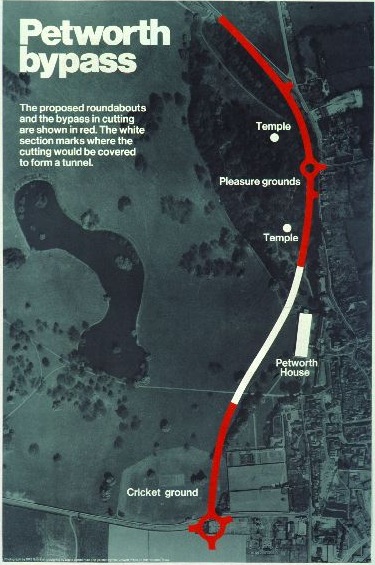
He also did some dramatic posters when the NT property of Petworth was threatened by a by-pass in 1976.

David Gentleman Petworth bypass poster

David Gentleman Petworth bypass poster

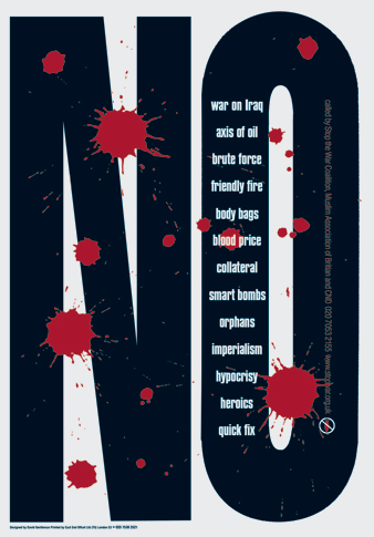
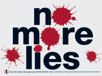
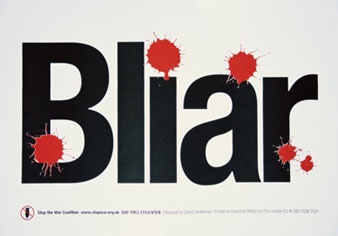
But perhaps his most outstanding achievement are the set of posters he designed for the Stop the War Coalition, which I think are amongthe best poster designs of the last twenty years in this country.  Maximum emotional impact, minimum means.

David Gentleman No War poster

David Gentleman No More Lies poster

David Gentleman Bliar poster

(There’s a very good interview about these last posters in the AGI magazine, from which I learned that Gentleman also thought up the Bliar slogan as well as designing the posters.  Really, he is a genius.)

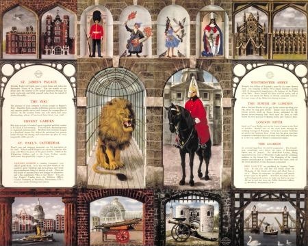
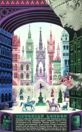
But don’t let all that make you think that all he can do is dramatic protest.  Here are two London Transport posters he also designed, one a pair poster from 1956

David Gentleman vintage pair poster London Transport 1956

and the other from 1973.

David Gentleman Victorian London LT poster

And that is pretty much all I have been able to find.  Which – given the quality of the ones that he did do – is a great shame.
Turning over several new leaves

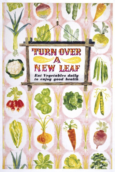
I’ve always liked James Fitton.  And I can say that with some confidence, as I had this postcard on my wall at university (quite some time ago now).  It’s one of his designs for the Ministry of Food, from just after the end of the war.

James Fitton Turn Over A New Leaf WW2 vintage poster

I’ve still got the postcard; more pleasingly, we also now own one of the original posters too.  It may have taken me twenty years, but I’m still quite chuffed about that.

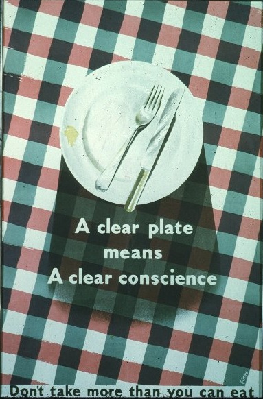
Even a cursory look at his poster designs reveals a man who had a whole range of styles at his command.  This Ministry of Food poster is from the same period, but can hardly be recognised as coming from the same hand (slightly pallid image from the Design Council Slide Collection).

James Fitton WW2 vintage poster clear plate

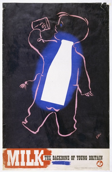
This milk poster is also from that era (and, trivia fans, is the one that you can see in the front of these images from Britain Can Make It).

James Fitton Ministry of Food vintage milk poster

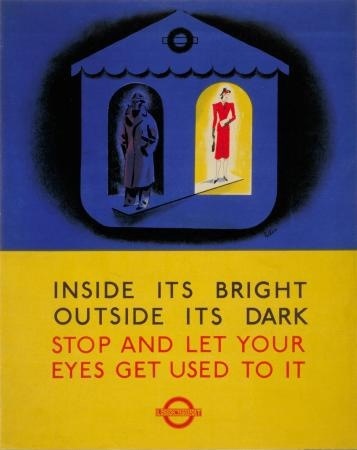
What that last poster does particularly show is Fitton’s use of really luminous colour (which must have been particularly hard to achieve with wartime/utility paper and printing materials).  His 1941 posters for London Transport (also here) have the same almost supernatural, and very appropriate, glow,

James Fitton WW2 poster london transport outside it's dark

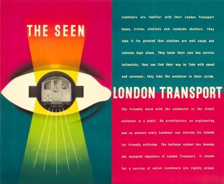
By 1948, they’re almost dazzling.  And of course in an entirely different style.

James Fitton The Seen London Transport vintage poster 1948

All of the above would, you’d think, would be more than enough to make him a revered and often-mentioned designer.  But it turns out that’s not the half of it.  The following is just an outline of what he achieved, the full shilling lives can be found here, here and here.

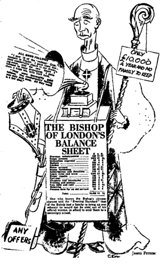
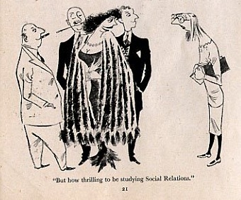
Throughout the 1930s, he was probably best-known as a cartoonist for left-wing periodicals such as the Daily Worker and Left Review.  His work was influential and seen as avant-garde at the time (as in the use of real newspaper print in the cartoon below).

James Fitton Cartoon for Left Review

After the war, he continued working as a cartoonist and illustrator for magazines such as Lilliput.

James Fitton Cartoon for Lilliput

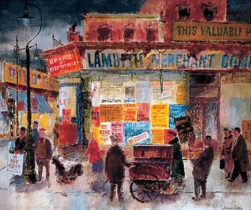
Then there was the painting.

James Fitton 1948 painting Brixton street scenet

(This 1948 Brixton street scene is now in the Museum of London).

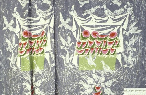
And he taught, he served on official bodies, and the Design Council slide collection suggests that he even found time to design some fabric too.

James Fitton fabric design Design Council slide collection

All of this while holding down a day job as the Art Director of Vernons, which he helped make into one of London’s leading advertising agencies.  I’m exhausted just reading about it.

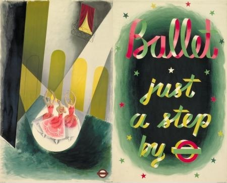
It may be that being able to work in so many disciplines is one of the reasons why he’s not so well known today; the collectors and writers about Lilliput don’t know about his posterworks, the cartoon historians have no idea that he’s also in the collection of the Tate Gallery and so on.  I think it’s a pity, and also unfair, as his poster designs are not only the equal of those by better known designers, but also have a haunting quality which perhaps carries over from his artworks.  In some ways I’d rather live with a Fitton on my wall (if anyone would like to send some, please feel free) than with many other posters.  Am I alone in thinking that?  Answers in the comments box below if you please. After this last rather lovely London Transport poster from 1937.

James Fitton vintage London Transport Poster Ballet 1937

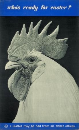
It’s Easter, don’t move

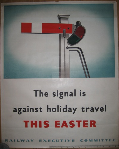
We seem to own a piece of railwayana, how did that happen?

Wartime Easter travel vintage railway poster

Fortunately, this didn’t end up being as relevant as it might have been this Easter.

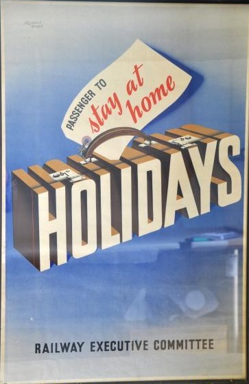
But it still has a purpose, as you can also buy its cousin in a few days time in Chertsey.  If that makes its estimate of £150-250, there may be another one coming onto the market quite swiftish.

Railway Executive committee vintage railway poster stay at home holidays

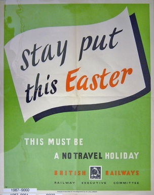
The auctioneers have this down as 1930s, but they’re both published by the Railway Executive Committee, who ran the railways from the start of WW2 in 1939 until nationalisation created British Railways in 1948.  And the ‘don’t travel’ message pretty much has to be wartime, I should think.

By way of completeness, here is a third from the National Railway Museum collections.

Railway Executive Committee vintage WW2 poster

They’re all by Reginald Mayes, who was staff artist for the London Midland and Scottish Railway before the war and so presumably stayed on to produce a wide range of anti-travel and propaganda posters for the Railway Executive Committee.  What’s interesting is that I can’t find any traces of anything he designed for the London Midland, so it looks as if he only started signing things after 1939.  If anyone can tell me any more, please do.

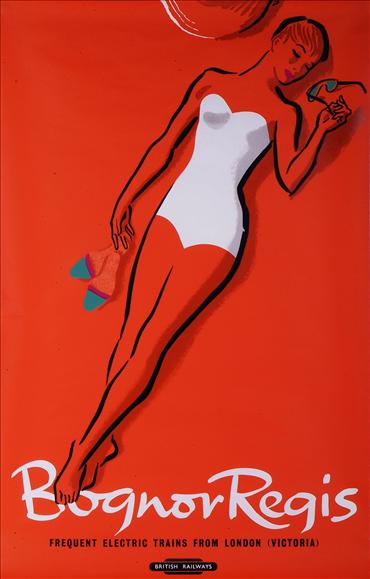
In other auction news, Dreweatts in Bristol are selling a second collection of works by Percy Drake Brookshaw, once again being sold by the family of the artist (I blogged about the first sale in February).  Some are the same posters,

Percy Drake Brookshaw bognor regis vintage poster

and quite a few are in the same style as those in the last sale (i.e. with the colour turned up to 11).

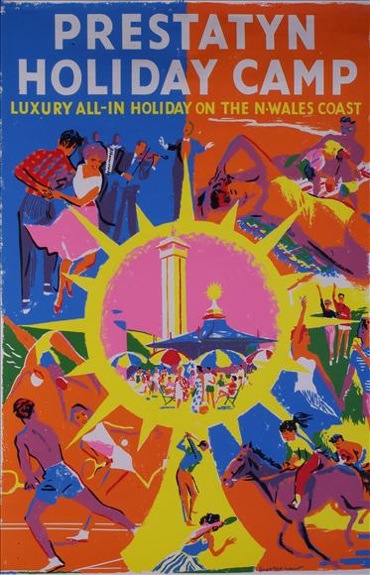
Percy Drake Brookshaw Prestatyn holiday camp vintage poster

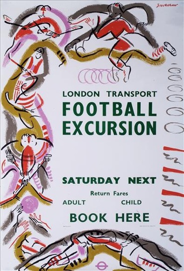
But there are also a couple of interesting ones.    This 1958 London Transport poster is rather lovely, and you’d get two copies for an estimated price of £50-70, which seems entirely reasonable to me.

Percy Drake Brookshaw London Transport vintage football excursion poster

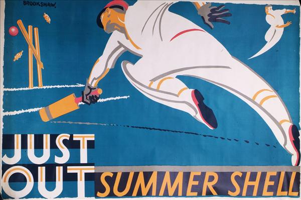
Meanwhile the big estimate of £300-400 is on this Summer Shell poster.

Percy Drake Brookshaw Summer Shell vintage poster

The Shell Poster Book tells me that it’s from 1933 (there, incidentally, is an archive that would really benefit the world were it online) so it may well go for more.  Happy shopping.

There’s no escaping this

Not with BBC iPlayer, there isn’t.  So for those of you who managed to be out there having a life on Sunday evening, and thus are still skipping around with joy in your hearts and a twinkle in your eye, here is five minutes of television to turn your gills green with envy.

It’s the Antiques Roadshow (available there for another 4 days or so).

At about 52 minutes in, you will find a man who accidentally bought 100+ vintage travel posters for 50p as an eleven year old.  Watch away, then feel free to whine and gnash your teeth along with me in the comments box.  And also tell me whether or not you think the valuation is just a bit on the high side.

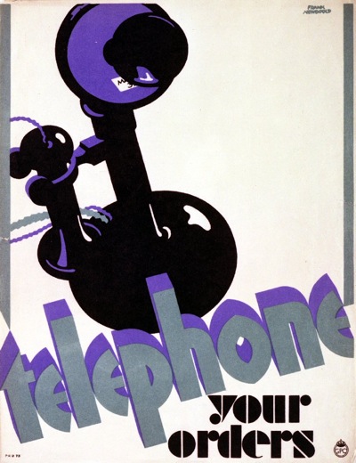
For those of you who are outside the UK and thus barred from the wonder that is the BBC iPlayer, here is an executive summary.  Man goes to auction as 11 year old,  buys nondescript roll of paper which is part of job lot, ends up with 120 or so travel and other posters.  There were only 9 of his haul on show on the programme; starting with two liner posters that I’m not that fussed about, but then moving on to two Frank Newboulds for the GPO, one of which was a close relative of this one, if not identical, and neither of which I’ve ever seen before.

Frank Newbould telephone your order GPO vintage poster

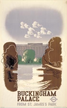
Then there was a McKnight Kauffer of Buckingham Palace.

McKnight Kauffer vintage London Transport poster Buckingham Palace

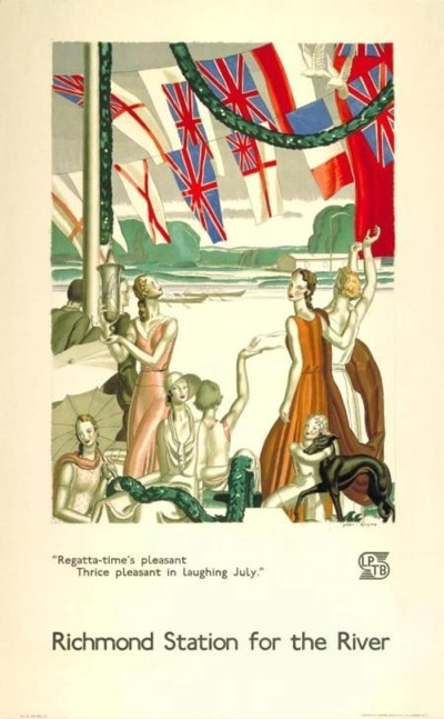
And four posters by Jean Dupas, all of which look to me like book covers for Evelyn Waugh novels,

Dupas LPTB vintage poster riverside

but which are, if you want to be a bit nerdy about them, noteworthy for having the very short lived LPTB logo on them (public demand soon brought back the roundel).

Interestingly, all of these posters date from 1934.  Even more interestingly, if you’re the owner, the show’s expert valued them at £30,000+.  (I’d quite like another opinion on that, especially these days.  Or maybe she buys all her posters from Mayfair dealers.)  Then that was it, and we’re back to Fiona Bruce for another lame link.

There, now it’s just like you watched the programme, isn’t it?

Shine a light

This was sold on eBay on Friday.

Hans Schleger London Transport vintage poster

From 1944, it is a lovely piece of Hans Schleger/Zero in prime linen-mounted condition.  Mr Crownfolio and I did have rather deluded hopes of picking it up for a pittance, seeing as it was being sold in the States.  But it went for nearly £250 – unsurprisingly – which means that I can bring myself to tell you that the same seller has another one from the series on offer this week.

Hans Schleger ww2 vintage blackout poster london transport

In a way, I’m not really upset that we didn’t get the first poster.  It’s a classic, but I’m not sure I like it enough (certainly not £250 of enough).  Would it ever get framed and hung on the wall?  I don’t think so.

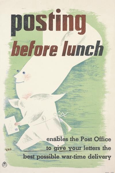
One of the reasons is that it may be a classic World War Two London Transport poster, but I’m not sure it’s a classic Schleger.  His posters are usually either a bit stranger, or at very least a bit wittier, like this GPO poster from just a year or two later (known in our house as the ‘Prawn Chef’).

Hans Schleger Zero GPO Posting before lunch poster

I wonder if there is a reason why his London Transport posters are so sensible.  Because the other thing that has struck me about the two offered on eBay is just how much they resemble other designers’ work on the same themes – and how much they all resemble each other.

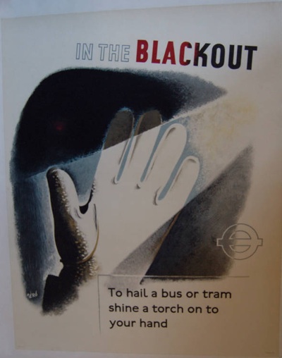
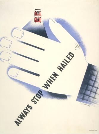
Here’s Tom Eckersley on the other side of the question – reminding bus drivers to stop when they are hailed in the blackout.

Tom Eckersley London Transport vintage WW2 blackout poster

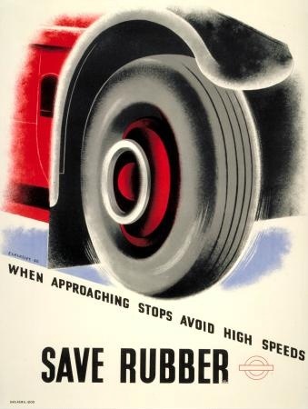
And also reminding the drivers to save rubber.

Tom Eckersley WW2 London Transport poster save rubber

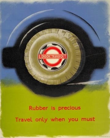
While James Fitton (whose work really does deserve more appreciation than it gets) informs the travelling public that they too can help save this precious wartime commodity.

James Fitton Save Rubber poster London Transport WW2

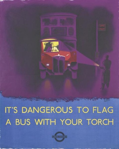
And finally, we’re pretty much back at the beginning again, as Fitton also tells us how not to flag down a bus during the blackout.

James Fitton blackout London Transport WW2 poster

Two things strike me from this series.  One is what a great designer James Fitton was, in particular for his luminous use of colour.  His posters easily stand up to the work of both Eckersley and Schleger.

The other – which was the thought that started all of this off – is that, for such a diverse set of designers, the results do have more in common than I would expect.  This is mainly in the way that they’ve all used a simplicity of technique, each poster illustrating the issue fairly literally with no visual puns or distracting images.  I wonder whether, somewhere in the heart of the London Transport wartime archives, there is a memo which says: This is war.  And safety.  So don’t let the designers get away with any of their clever-clever stuff.  Oh, and on the way out, make sure you give them an airbrush.  Perhaps I should write to the London Transport Museum and ask.