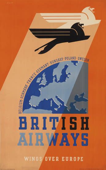
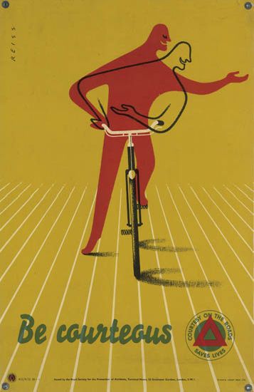
Is it really efficient?

On we must go with the endless stream of auctions.  Today it is Onslows, which takes place on Friday.  What can I tell you about it?

Well the first thing that will strike you as you browse through the catalogue is precisely what a tonnage of Shell posters they have – and there are more too, tucked away at the end.

Keith Grant Somerset Shell Educational poster Wiltshire
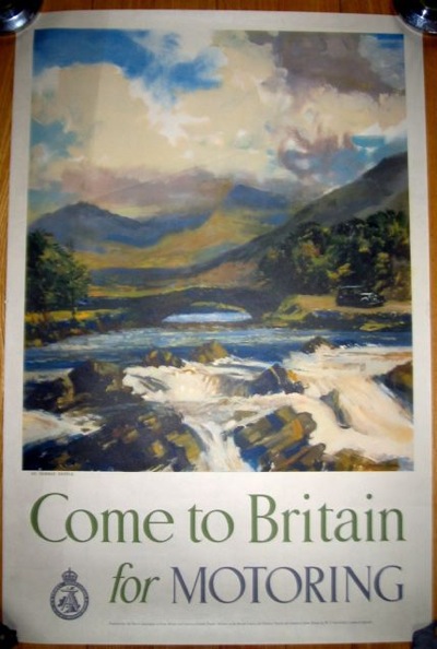
Keith Grant, est. £100-150

I really must take a look at what these actually sell for, because the higher estimates of £100-150 do always strike me as slightly fanciful, but then a few always manage to reach that.  Certainly,  I don’t see them going as high at other auctions or on eBay.  Watch this space and I will report back.

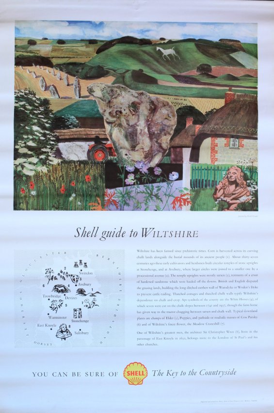
That would, however, be an utterly reasonable price to pay for these Tristram Hillier items, which have the same estimate.  I’ve written about them before but, frankly, any excuse.

Tristram HIllier Shell guide to fossils educational poster

Tristram Hiller shell guide to minerals educational poster

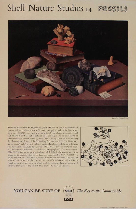
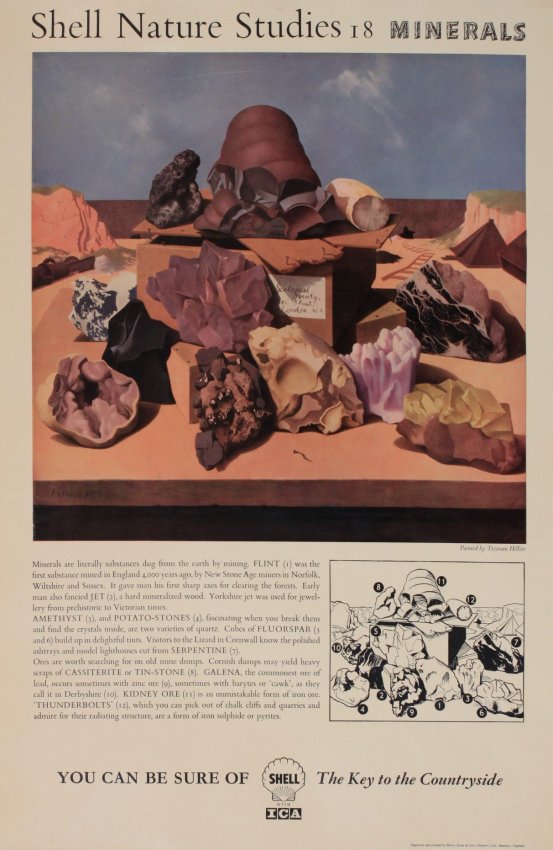
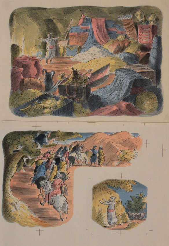
What I haven’t ever written about properly, however, are the Shell educational posters themselves.  Must do that one of these days.

Meanwhile back at Onslows, the other thing that will strike you about the auction is a job lot of GPO posters, some being sold singly, some as individual lots.

1950 Harry stevens air mail GPO poster
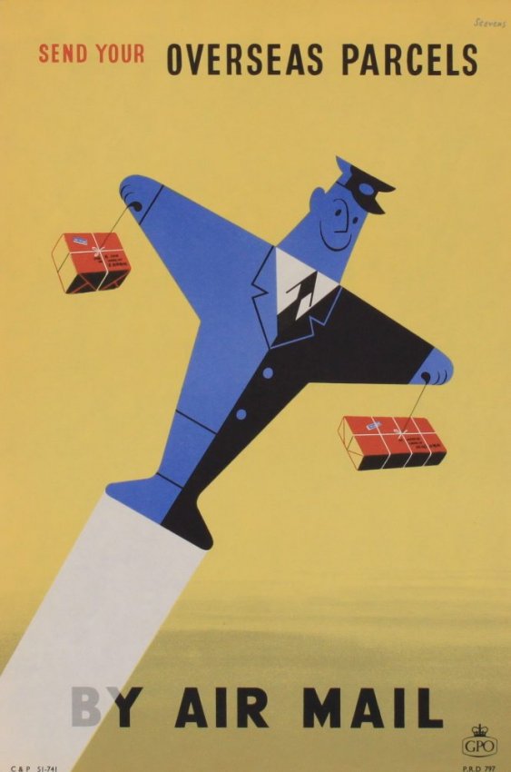
Harry Stevens, 1950, est. £70-100

Sams 1954 minimum 4d letter rate GPO poster
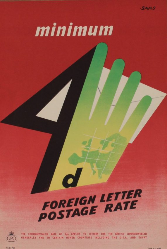
Sams, 1954, est. £60-80

Now I happen to know the story behind these posters, and it’s one to make any archivist’s hair curl.  Back in the early 1980s, the Royal Mail in their Mount Pleasant HQ were having a sort out.  Sensibly, they decided that two copies of each of the posters they had produced should go to an archive – these are the ones which the BPMA have now.  Rather more bogglingly, they put the rest in a skip.  The seller rescued a selection that he liked.  Some were sold at Bloomsbury in March, this is another batch.

1950 Martin Aitchison Your Letterbox is it really efficient ?, GPO poster
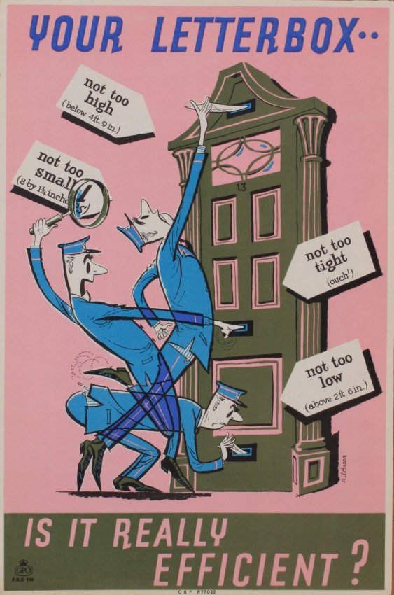
Martin Aitcheson, 1950, est. £40-50

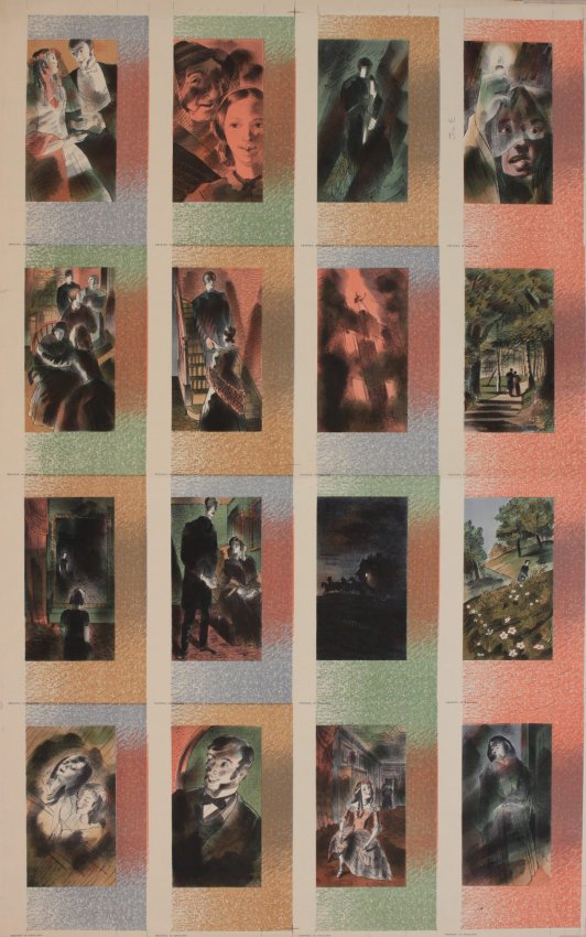
Other than that, the other two interesting items are two rather lovely sets of proofs, one by Barnett Friedman and the other by Edward Ardizzone.

Barnett Freedman (1901-1958) Wuthering Heights (16 plates) , Jane Eyre (16 plates) and Anna Karenina (16 plates), proof uncut lithograph sheets for illustrations from Heritage Press NY 1952,
Barnett Friedman, 1952, est. £200-300

Edward Ardizonne (1900-1979) lithograph proof sheets for Sinbad, Fairground Freak Show and WW2 sentry
Edward Ardizzone, est. £30-50.

I like them a lot, but what you’d actually do with them I’m not entirely sure.

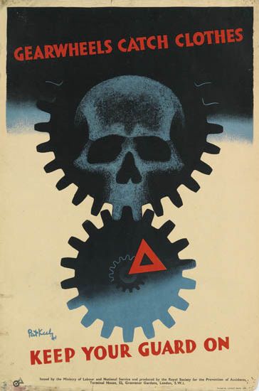
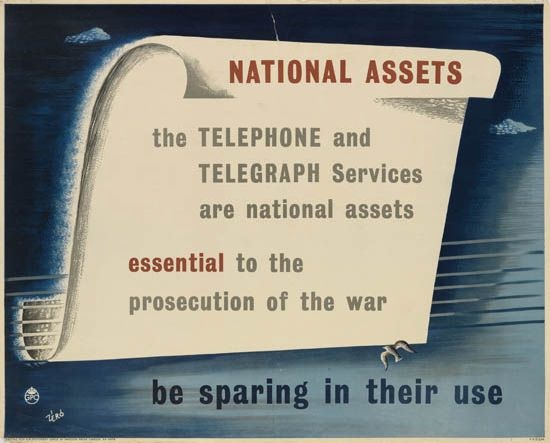
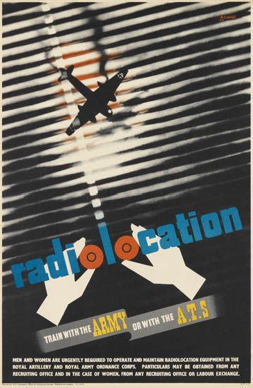
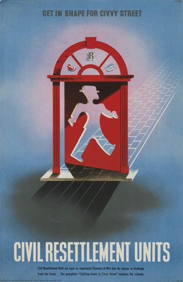
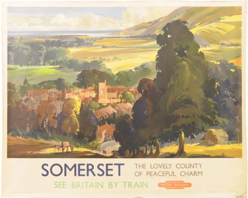
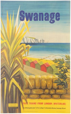
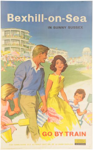
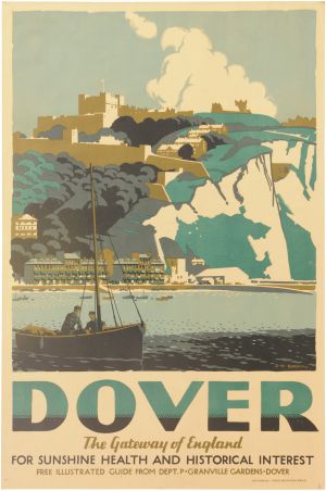
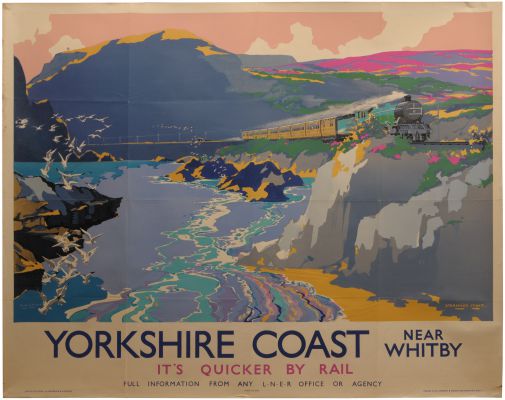
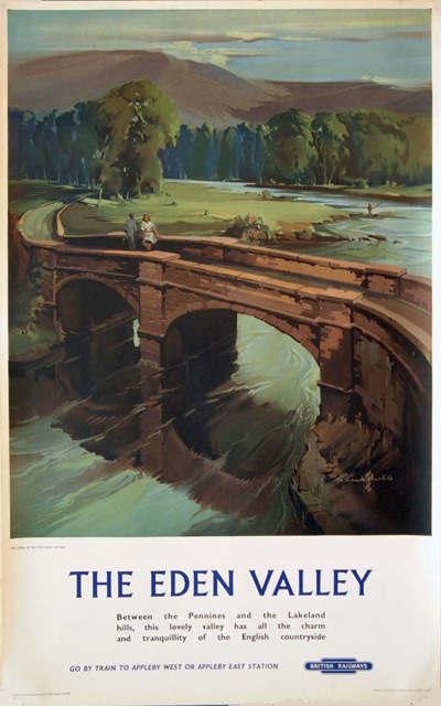
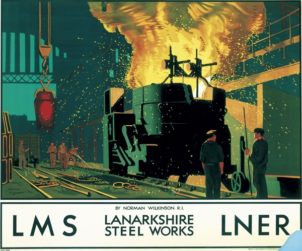
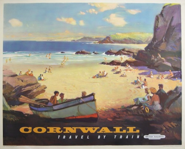
Meanwhile the rest of what is on offer is the usual mix of foreign stuff that I am going to ignore, railway and travel posters, and, as ever, a fair selection of World War Two Home Front posters.

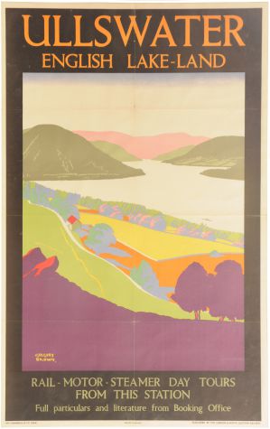
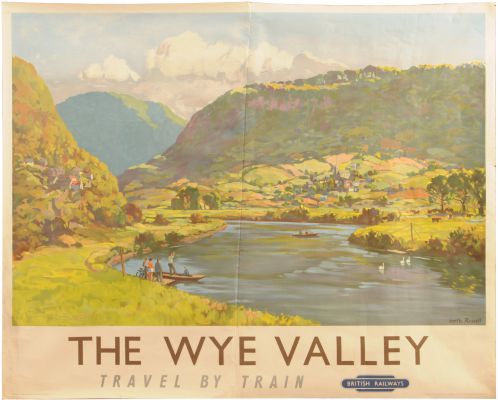
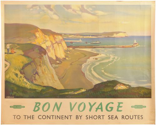
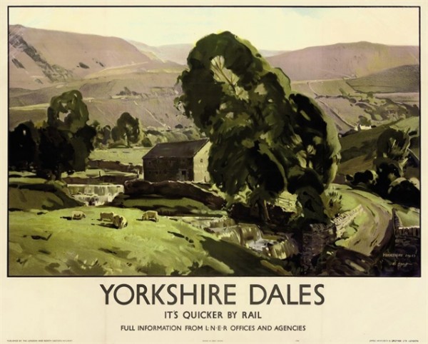
This is probably the stand-out railway poster for me.

Frank Newbould (1887-1951) Scarborough, original poster printed for LNER poster by Waterlow c. 1930
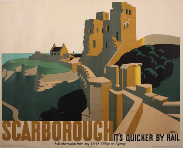
Frank Newbould, 1930, est. £700-1,000

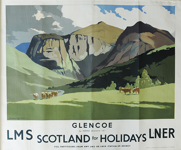
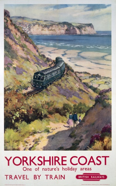
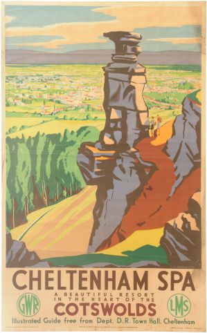
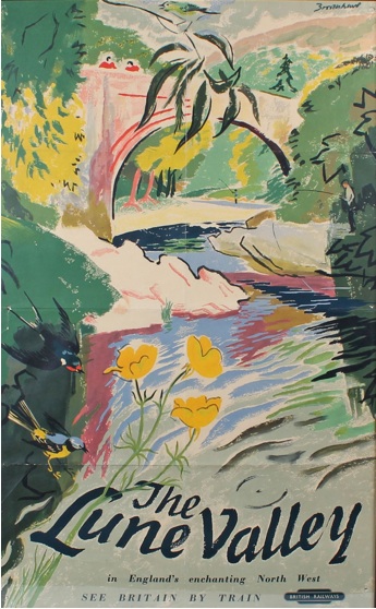
Although, as even a cursory flick through this blog would reveal, I am always a sucker for this series.

L A Wilcox (Lesley Arthur 1904-1982) Cornwall Travel by Train, original poster printed for BR(WR) by Jordison 1960 BR poster
L A Wilcox, 1960, est. £600-700

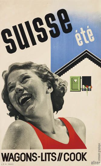
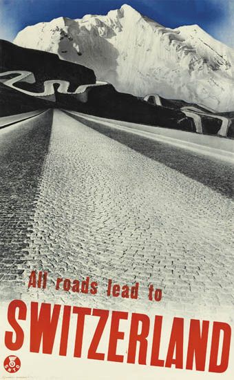
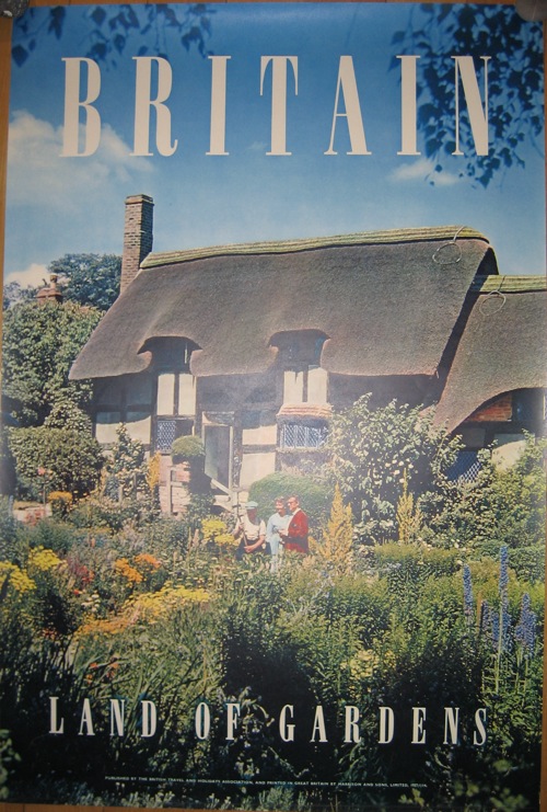
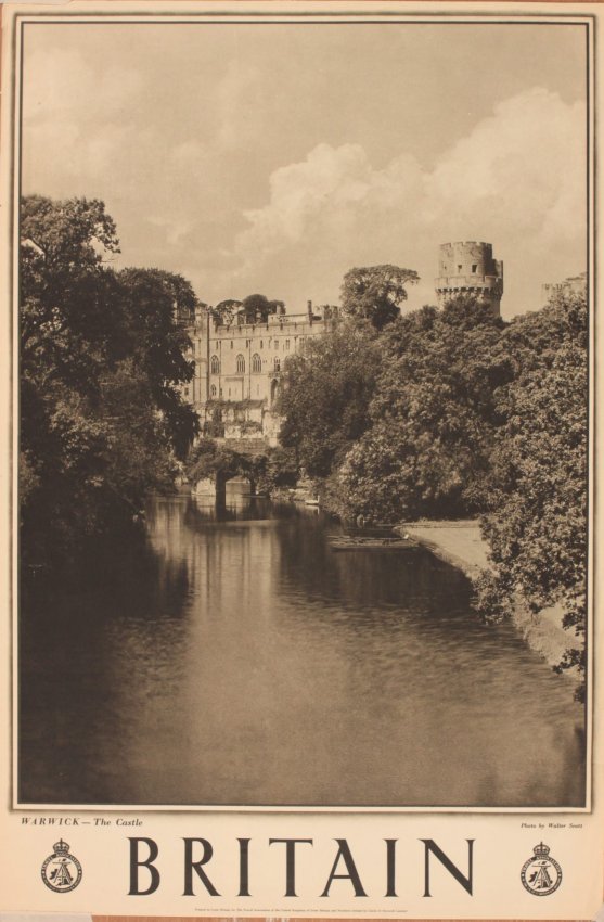
The main event in the travel poster section, at least if you are me, is a stream of these black and white British travel posters.  A couple are quite interestingly early.

Brighton travel poster 1938
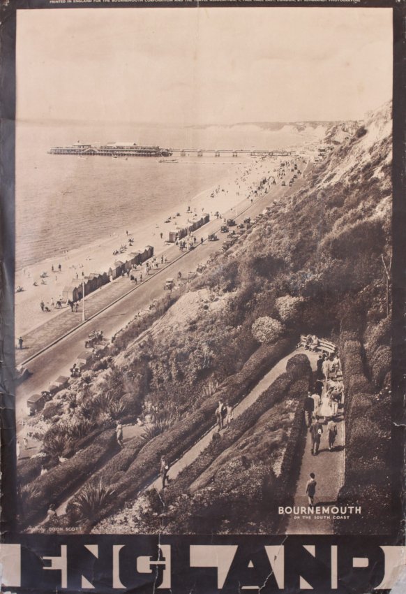
Anonymous, 1938, est. £50-70

The vast majority are not.

Walter Scott's Britain Warwick - The Castle, original sepia photographic poster printed for The Travel Association circa 1948 poster
Anonymous, c. 1948, est. £50-70.

While this in no way constitutes a recommendation to buy one, these posters are quite interesting as historical artefacts.  Take a look at the date: it’s just after the war has ended, and Britain is desperate to pay back the war loans.  And one of the ways to do that, is of course American tourist dollars; so these posters wing their way over to the States to try and persuade our American cousins to come over here.  But I often wonder just how well they worked.  Because America is sleek, glossy and most of all technicolour, but Britain is broke.  So our posters come in black and white and are printed on the cheapest, thinnest paper imaginable.

Of course none of this explains why the 1938 poster is equally as shoddy.  Perhaps the British Travel and Tourist Association were just cheapskates, all the time.

The reason I’ve thought about these posters so much is that Mr Crownfolio and I, some years ago, bought a whole roll of these posters from America for about £30.  We tried to sell a couple on eBay but basically got laughed at.  But then, a couple of years later we tried again, and the prices started rising – so much so that one of the last ones went for over £100.  And now they are at Onslows, well I never.

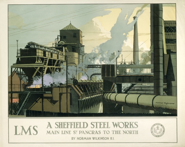
In the war section, meanwhile, this is probably the most classic poster.

Norman Wilson (dates unknown) Dig for Victory, original WW2 poster printed for HMSO by Chromoworks c.1940 propaganda poster
Norman Wilkinson, 1940, est. £300-400.

While this is my favourite.

Coughs & Sneezes Spread Diseases, original WW2 Home Front poster printed for HMSO by Chromoworks circa 1940
Anonymous, 1940, est. £40-50

Just look at the difference in prices, I am clearly in a minority of one on this.

For a change, there aren’t that many London Transport posters in there, but it’s worth persevering through the whole catalogue, because a pair of gems, both by Abram Games, are tucked away at the end.

Abram Games london zoo lovely poster
Abram Games, 1976, est. £100-150

Abram Games (1914-1996) London Transport Conducted Tours, original poster printed by Waterlow 1950 London Transport poster
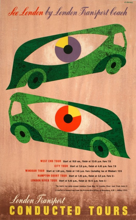
Abram Games, 1950, est. £400-500.

In fact that poster above is the very last one in the sale.  And probably one of the best.   But it’s an exception, and I am slightly worried by the general lack of good posters like that from the Onslows sale.  Because with Christies having got so expensive, there’s a real need for an auction house selling the stuff that, well, Christies used to – the Games, the Eckersleys and the Royston Coopers to start with, never mind the Daphne Paddens.  But they aren’t appearing here – so where have they gone?  They haven’t entirely migrated to the railwayana auctions, so where have they all gone?  Do any of you know, because I certainly don’t. And I’d like to.

Designer’s eye

So here I am submerged in house renovations when there are poster auctions which I need to tell you about.  First in the line, mainly because it’s in just a few days time, is the forthcoming Swann Auction of Modernist Posters.

Now, with their being in New York, there are usually only one or two items of interest for us in a Swann auction, things like this, which although wonderful are somewhat outside the Quad Royal remit.

WALTER ALLNER (1909-2006) SUISSE ÉTÉ / WAGONS - LITS // COOK. travel poster
Allner, est. $1,500-2,000

HERBERT MATTER (1907-1984) ALL ROADS LEAD TO SWITZERLAND. 1935 travel poster
Matter, 1938, est. $2,000-3000

There are also a set of Theyre Lee-Elliott posters for the embryonic British Airways.

THEYRE LEE-ELLIOTT (1903-1988) BRITISH AIRWAYS / PARIS & SCANDINAVIA. 1938. Travel poster

M26145-31 001

M26145-29 001

All three are from 1938 and estimated at $800-1,200.  While we’re on the subject of British Airways, there is also this, which is apparently a very early example of photography in an airline poster.

DESIGNER UNKNOWN IT'S SMART TO FLY BRITISH AIRWAYS. Circa 1938. travel poster
Anonymous, c.1938, est. $800-1,200

If only flying were so glamorous now.

The main reason we’re here, however,  is lots 185-222 which are, in the main, from the collection of F H K Henrion.  There is one piece of his own work.

FREDERIC KAY HENRION (1914-1990) ARMY EXHIBITION. 1943. propaganada poster
F H K Henrion, 1943, est. $600-900

But what’s really going on is Henrion looking at the work of his fellow designers.  So there are examples from Reginald Mount, Pat Keely, Hans Schleger, Eckersley and many others – so many that I can’t include all of the ones I like.

REGINALD MOUNT (1906-1979) BONES MAKE EXPLOSIVES. Circa 1944.  world war two poster
Reginald Mount, 1944, est. $600-900

PATRICK COKAYNE KEELY (?-1970) GEARWHEELS CATCH CLOTHES / KEEP YOUR GUARD ON. 1941.  rospa poster
Pat Keely, 1941, est. $400-600

ZERO (HANS SCHLEGER, 1898-1976) NATIONAL ASSETS / BE SPARING IN THEIR USE. Circa 1940. GPO poster
Hans Schleger, 1940, est. $400-600

As well as a substantial selection of Abram Games’ designs; I don’t know if they were friends or whether Henrion was a particular admirer of his work.

ABRAM GAMES (1914-1996) RADIOLOCATION. 1941. World war two poster
Abram Games, 1941, est. $2,000-3,000

ABRAM GAMES (1914-1996) CIVIL RESETTLEMENT UNITS. 1945. army poster
Abram Games, 1945, est. $700-1,000

ABRAM GAMES (1914-1996) MEN LEAPING AHEAD IN INDUSTRY READ THE FINANCIAL TIMES EVERY DAY. 1955. poster
Abram Games, 1955, est. $2,000-3,000

I’ve even found a rare example of an Ashley Havinden poster.

ASHLEY HAVINDEN (1903-1973) KEP / DELICIOUS WITH FISH. Circa 1950.
Ashley Havinden, 1950, est. $400-600

Not everything is by a big name, either.  This very striking wartime image is simply by A.R., about whom I can tell you nothing.

A.R. (MONOGRAM UNKNOWN) POST OFFICE SAVINGS BANK. Circa 1942. poster
A.R., 1941, est. $500-750

Henrion clearly never stopped looking at posters and thinking about them as long as he worked, because there are a host of later examples too.

ALAN FLETCHER (1931-2006) D & AD 21ST. 1983. poster

So I strongly suggest you go over there and take a peek, not only for the insight into a designer looking, but also because Swann’s catalogues are properly written and informative.

MANFRED REISS (1922-1987) BE COURTEOUS. Circa 1955.  ROSPA poster
Manfred Reiss, 1955, est. $400-600

And now if you’ll excuse me, I have to order a skip.

Results

I promised a while back that’s I’d revisit the most recent Great Central Railwayana auction and see what the posters on offer actually went for.  A course of action necessitated by the fact that railwayana auctions never, it seems, publish an estimate of what they think a poster is going to sell for.  This sometimes makes me think that I must be missing out on loads of cheap bargains, passed over by railway enthusiasts who would rather look at pictures of trains, or at a push, landscapes.

Claude Buckle Somerset
Claude Buckle, sold for £300

This was probably true once upon a time, but it definitely isn’t any more.  Posters are expensive wherever you buy them, and railwayana auctions are no exception to this rule.  The only difference seems to be that posters with a railway rather than design interest might fetch more than they would do at a more general sale, which is fair enough.

A Southern Railway quad royal poster. THE FOUR BELLES RING THE SOUTHERN COAST, by Shep
Shep, sold for £1550

But landscapes and seaside scenes aren’t exactly going cheap either, with this example inexplicably (to me at least) at the top of the range.

poster, LITTLEHAMPTON, by Allinson  British railways poster
Allinson, sold for £860.

Also failing to be bargains are the more decorative posters that I like the best.

Bromfield British railway poster swanage
Bromfield, sold for £490

Gregory Brown Ullswater travel poster
F Gregory Brown, sold for £520.

Even kitsch, which only a few years ago wouldn’t have been very valuable, reaches just the same prices as it would at a general auction sale.

Bexhill British Railways poster 1950s
Anon, sold for £300

The news isn’t all bad, as a couple of odd bargains did slip through.  I very much liked this poster and said so when I looked over the auction.  But I was clearly on my own in this.

Burley Dover Southern railway
Burley, sold for £120

While the Wye Valley was also inexplicably unpopular for a pretty landscape.

Wye Valey russell British Railways poster
Russell, sold for £130

But is there anything else we can conclude beyond my initial assessment that a railwayana auction is unlikely to give you a cheap poster?  I’m not sure there is, really.  There is a very small chance that you might get a bargain, particularly if you were buying for quality of design rather than for meticulous reproduction of countryside or trains.  But equally you might not, and there appears to be no way of telling either.  Perhaps the answer is to put a low bid on anything you half-fancy and hope that it works once or twice per sale.  But that does seem a bit of a random way of buying, even to me.

If we look wider, there is another, rather terrifying conclusion to draw as well.  Because that last auction was actually pretty cheap compared to what else has been going on recently.  The most recent GW Railwayana auction was, frankly, boggling in its prices.  Here is just a small selection.

Glencoe Norman Wilkinson LMS LNER poster
Norman Wilkinson, sold for £1,200

London Norman Wilkinson LMS LNER poster
Norman Wilkinson, sold for £3,550

Terence Cuneo Day begins LMS poster
Terence Cuneo, sold for £6,100

To me, that’s all looking, well, expensive; not just beyond Onslows’ prices, but nudging Christies too.

Not everything headed out at that kind of stratospheric level though.  At this particular auction, the kitsch didn’t do quite as well, in particular this delightful poster which I took a shine to at the time.

Geoff Sadler thornton cleveleys poster british railways 1950s
Geoff Sadler, sold for £180

Although nothing went desperately cheap, and the right poster, clearly, could get the money in.

Rhyl British Railways poster leonard 1961
Leonard, sold for £440

Neither of these sales are exceptions, either. If I go back to the last couple of GCR auctions, the pattern is very much the same.

Morecambe anonymous holiday poster family on beach
Anon, sold for £520

Ayr Laurence british railways poster
Laurence, sold for £620

Frank Mason Yorkshrie Coast vintage LNER 1930s railway poster
Frank Mason, sold for £4,100

With just the very occasional bargain to keep my hopes up.

Largs Ayrshire Lander poster British Railways 1950s
Lander, sold for £50

Oh, and this, which I was very disappointed to see going cheap, mainly because we’ve got a copy.  Never mind.

Tom Purvis East Coast baby yellow railway poster

Tom Purvis, sold for £230

I could go on, but it would only pain me.

Perhaps the most striking thing about railwayana auctions, though, is how much they, and the market, have changed.  The magic of the internet allowed me to revisit a GWRA auction from 2004.  It’s a different world.  There are only about ten posters for sale, of which the vast majority went for very little.  £50 could have bought you either of these for example.

'Yorkshire Coast’, BR poster, 1959. Anonymous

buckle-eden-valley

Compare that to their last auction, where there are several dozen posters on offer, some of very high quality, and many fetching extremely high prices.

This is a big change indeed in under ten years, and it’s something that isn’t often acknowledged.  That includes by the auctions themselves, for whom it seems posters are a bit of a sideline compared to the real business of metal name plates and station platform signs.  But these days, the railwayana auctions together must easily turn over as many posters as Onslows and Christies combined.  I shall pay them a bit more respect in future.  We all should.   And perhaps they could return the favour with some estimates.

Peaceful charm

I’m not really supposed to be here at all, what with it being the Easter holidays and so on.  But Great Central Railwayana have sent me the catalogue for their forthcoming auction, and guess what, it’s got posters in it.  So I thought you might like to know.

That said, I can’t quite work myself up to a fever pitch of excitement about the selection; rarely have I seen an auction so full of posters which look exactly as I’d expect railway posters to look.  This Claude Buckle is probably my favourite of the very many that there are on offer.

Claude Buckle Somerset

Although there are several others which just look wierdly pedantic and over-detailed, like Ladybird drawings except without the kitsch appeal.  Fred Taylor is not on form in this one.

Fred Taylor Royal windsor british railways poster

While this, by Costelloe, comes from the Observer Book of Bus Spotting.

Northern Ireland poster costello

The area of design where Ladybird illustration shades into kitsch is also present, as with this anonymous effort.

Bexhill British Railways poster 1950s

But if railway posters we must have – and it appears we must – there are some to like as well.  This series have always been amongst my favourites, because, I think, the typography isn’t boxed off in a frame.

Cornwall British Railways poster

And I’ve always been a sucker for that Festival of Britain-esque typeface anyway.

This Bromfield for Swanage is also rather good.

Bromfield British railway poster swanage

And I like this one as well, although I am unable to give a coherent explanation as to why.

Bon Voyage British railways short sea routes poster

Maybe I just need a holiday.

Just to keep us all on our toes (see, I was paying attention) there is also a single London Transport poster, by Frank. M. Lea

Frank M Lea The Tower tram poster

Perhaps the most interesting set of posters, though, are these three, which to me all look to be stylistic cousins.

Cheltenham Spa British Railways poster birtwhistle

To be specific, they are all railway posters with a distinct resemblance to classic Batsford book covers, as designed by Brian Cook.

Gregory Brown Ullswater travel poster

None of them are, though  – the first one is by Birtwhistle, the middle one by Gregory Brown and the very striking version of Dover below is by D. W. Burley.

Burley Dover Southern railway

I’d like to think that it’s someone with particular taste selling their collection, but it’s probably just chance.

You might even include this 1946 Walter Spradbery in the collection too if you were feeling generous.

Thames Valley railway poster walter spradbery

I’m always rather intrigued by these posters which, although they date from just after the war, still have the ghost logos of the old railway companies on them.  It always makes me wonder what people knew, or at least what they wanted to believe. The Railway Executive had been running the railways for six long years, and surely, after the General Election, people must have known that nationalisation was coming.  But these few posters still slipped out, as though someone, somewhere, wanted to believe that it would be possible to carry on as though nothing had changed.  Even the image here reeks of that kind of nostalgia, as though the art deco days of before the war could still be reached, just a few stops further down the train line.  Or am I being too fanciful?

This, of course, is a a railwayana auction, which means that there are no estimates and I do not have the foggiest what any of these posters  might fetch. But I am going to make a resolution about that, and at some point in the next week or so (school holidays permitting, which they don’t much), I will go back through a couple of old railwayana catalogues and take a look at achieved prices.  And then, probably, curse all the bargains I have missed.  Never mind.  I’d quite like to know what this would go for too.

spratts sign

Northern return

Last year, I wrote about depictions of the industrial North of England in posters, or rather I pointed out their rather conspicuous absence.  At which point I got quite a lot of comments, mostly saying that I was wrong, and pointing me at posters like this.

Norman Wilkinson Sheffield Steelworks LMS poster

Which is, I am forced to admit, is exactly what I was complaining didn’t exist, a railway poster of Northern industry.  There are, as it turns out, a whole series of Norman Wilkinson posters doing the same sort of thing, including the Runcorn design that I included in the original post, and  a few more to boot.

‘Grangemouth Docks’, LMS poster, Norman Wilkinson industrial  'A Midland Coalfield', LMS poster, c 1935.

'Lanarkshire Steel Works', LMS/LNER poster, c 1935.

I have to say that that last one is the best Norman Wilkinson I’ve ever seen, and if anyone wants to send me a copy feel free.

But Wilkinson wasn’t the only artist working in this series – this poster is by Frederick Cayley Robinson.

Frederick Cayley Robinson Cotton poster LMS 1924

Now on the one hand I clearly am wrong, there are quite a few posters of Northern Industry.  At the same time, though, I don’t think this changes the argument.  The Cayley Robinson poster is dated to 1924, which is the same date as I have seen given to a couple of the Norman Wilkinson posters.  Railway poster dating is not an exact science – the NRM itself dates them to 1923-48 – but I’d hazard a guess that these are all part of the same series.  Which means that putting these kind of images on a poster was, possibly, tried once as an experiment and then never done again.

Now this might have been because the Board of Directors of the LMS thought it unseemly, but it might be because they discovered that this kind of poster didn’t play well with the public.  And at this time, they were able to be reasonably certain about what was and wasn’t popular, because not only did the company sell copies of its posters to the public, it took some notice of how they were doing too.  In 1924, they were able to comment that this poster, by Maurice Greiffenhagen, was selling to the public “in large numbers” (more on this here if you’re interested).

‘Carlisle, the Gateway to Scotland', LMS poster, 1924. Maurice Greiffenhagen

There may be an implicit comparison here with the industrial scenes, or at least I’d like to think so.

None of this can be proven, of course, but what is the case is that this series does seem to have been the only one, which I think means that my overall point about the scarcity of these images (and especially after World War Two when a new technological and manufacturing Britain was going to take over the world) still stands.

But what about the Lake District and the Yorkshire Dales, people complained in the comments.  What about posters like this (any excuse)?

Lander (Eric dates unknown) The English Lakes, original poster printed for BR(LMR) by Waterlow

Or indeed these, and many others like them?

Edwin Byatt Vintage railway poster 1940

Lune Valley 1950 poster Percy Drake Brookshaw

They are northern, granted, but they aren’t industrial which is the real gap in the imagery.  But as ‘mm’, who commented, points out there is another interesting divide to be found between northern and southern landscapes.  It’s a diversion, but it’s one well worth taking.

Maybe the northern landscapes are too wild and untamed to be fondly remembered in the sense you mean. Perhaps it is a safe, cultivated landscape we yearn for or think of as British!

I think this may be true, and it’s worth remembering that the Lake District only became popular, rather than being seen as a rather frightening and uncivilised wildness at the start of the eighteenth century.  There is definitely an ‘otherness’ to these places.

There is something else going on here too, which is a kind of conflation.  Englishness becomes a shorthand for Britishness.

Britain Land of Gardens poster for American tourism early 1950s

While England in its turn tends to be represented by the Southern.

Old england National Savings poster heritage

I thought we should have a few dog-ugly posters by the way, as it was all getting a bit safe and pretty further up there.

All of which means that, however much we admire the Lake District, or Scotland, or the Peak District, it would look a bit odd to have one of the images of these areas with ‘Britain’ or ‘England’ stuck at the bottom.  Although like all good generalisations, there are of course exceptions.

Come to Britain for motoring vintage tourist poster

All of this is covered in much more depth and complexity in David Matless’s peerless book Landscape and Englishness, and now that this has emerged from storage (hurrah) I will have to reread it and, I suspect, post on the subject again.

For the last word, however, I must return to the comments.  Nick S posted this wonderful bit of writing by Harry Pearson which comes, it turns out from a book about football.  But bear with me on this one, it’s not simply relevant, it sums the whole thing up to perfection.

In the North-East, England, or the notion of England, seems a long way off. The North-East is at the far corner of the country but it is separated by more than just miles. There is the wilderness of the Pennines to the west, the emptiness of the North Yorkshire moors to the south and to the north, the Scottish border. The nearest major city to Newcastle is Edinburgh, and that is in another country. Sometimes the North-East seemed more like an island than a region. And there was more. As a boy, I can remember looking through one of those colour illustrated encyclopaedias and coming upon a full-page picture that caught my attention. There were cottages festooned with hanging baskets, burgeoning gardens, white picket fences, a village green, a duck pond, a cricket match, a district nurse on a bicycle, and, doubtless, a future prime minister sitting outside a thatched pub sipping warm beer. The caption underneath read ‘An Everyday English Village Scene’…. this caption was clearly a mistake. Because I lived in an English village and it didn’t look anything like that!

“Twenty years later I went to see a friend of mine in Sonning-on-Thames. It was a hot June day and as we walked across the churchyard I realised that this was, spiritually if not figuratively, the village in the encyclopaedia…. This was England. England, their England. It wasn’t like the North-East at all.

Which is why you won’t often find a picture of a Northern scene with the caption ‘England’ or ‘Britain’ on it.  And even if you do, it definitely won’t be showing their industries.

Who knew?

Today’s news is that I did something to something yesterday and discovered a whole new online archive.  For a collection that I had no idea even existed in real life.

It turns out that the British Council owns a socking great heap of posters.  Made up of things like this McKnight Kauffer.

SOCRATES AT THE BRITISH MUSEUM. BY UNDERGROUND 1926 Edward McKnight Kauffer

And this Purvis.

EAST COAST JOYS 1932 Tom Purvis

And even this anonymous psychedelic gem.

Beat the breathalyser smoke pot

These – and the many hundreds of others which go with them – come from the Alan Mabey archive, whose story is told on the British Council’s website as follows.

Mrs Phyllis Mabey donated this collection of over 300 posters to the British Council in August 1977. At the time she wrote “I should be very glad to hand the collection to The British Council as a gift, as I feel sure that it could not be in better hands, and it will be kept as a collection and not broken up.I wish that the collection be preserved as an entity and that it should be known as the Alan Mabey Collection.

I’ve tried to Google Mr and Mrs Mabey without finding anything out at all, least of all why they failed to give the whole lot to me.  But I can tell you one or two things about Alan Mabey just from looking at the archive.

The first is that he liked McKnight Kauffer very much indeed, because he must have owned pretty much every poster that Kauffer ever produced.  At leas that’s what it looked like.

SPRING CLEANING: EAposter - EASTMAN'S THE LONDON DYERS AND CLEANERS 1924 Edward McKnight Kauffer

There are acres of Kauffer’s designs for London Transport on the site, which I won’t bother illustrating because you’ve almost certainly seen them before.  But Alan Mabey also picked up some other designs of Kauffers which don’t come up anything like as often.  These two are new to me.

poster - READ 'CRICKETER' IN THE MANCHESTER GUARDIAN 1923 Edward McKnight Kauffer

vintage poster POMEROY DAY CREAM 1922 Edward McKnight Kauffer

I think more modern advertising should be along these lines.

The archive would be worth your time simply for these, but there is plenty more, because Alan Mabey had the kind of catholic taste that I can only approve of.  He liked Shell posters and London Transport too, although interestingly there aren’t many railway posters.  Amongst these are plenty enough of the recognised heroes and heroines of graphic design – not just Kauffer, but also Dora Batty, Austin Cooper and Frank Newbould.

poster ORIENT LINE CRUISES Frank Newbould

But he also bought some less obviously collectable posters, the kind of commercial art, in short, which is so often left out of the record.  The first of these is by Robert Gossop from 1928, the second is dateless and anonymous.

poster THE WAY ABOUT HEALS AT THE SIGN OF THE FOUR POSTER 1928 Robert Percy Gossop

JAMAL THE FREEDOM WAVE vintage poster 1930s

This F Gregory Brown is also rather fine.

WITNEY BLANKETS "FLEECY, LIGHT AND WARM" NO DATE F Gregory Brown

What doesn’t tend to be represented as much is the kind of post-war poster that I love most of all.  There are one or two, to be sure, like this 1963 Abram Games.

poster KEEP BRITAIN TIDY 1963 Abram Games

Again, this is matched with some of the more commercial work of the time.

PASCALL SWEETS MAKE LIFE SWEETER 1947 advertising poster

CHRISTMAS WISE D H EVANS 1946 Barbosa poster reindeer

The first is anonymous, but the second one is by Barbosa, and the website gives a rather wonderful biography for him.

Artur Barbosa was born in Liverpool, the son of the Portuguese vice-consul and a half-French mother. He studied at Liverpool School of Art and the Central School of Art in London. Whilst still a student he produced illustrations for Everybody’s Weekly and The Radio Times, in addition to producing book covers. He is probably best remembered for his cover illustrations for the Regency romances of Georgette Heyer. In addition to cover illustrations, Barbosa also designed for the stage, produced drawings for fashion magazines and the leading advertising agencies. Barbosa was at school with Rex Harrison, the friendship endured into adulthood when Harrison commissioned Barbosa to design the interiors of his villa in Portofino. This in turn led to a commission to refurbish Elizabeth Taylor’s yacht, the Kalizma.

What is present though, as the poster at the top has hinted, is a major collection of psychedelic posters from the 1960s.

FAIRPORT CONVENTION 1968 Greg Irons  poster

What I can’t tell you is whether any of this this represents Alan Mabey’s taste or not, because the British Council has been augmenting the collection over the years.

 Since the bequest the collection was augmented by post-war works by leading British artists and designers acquired by General Exhibition Department.

They must have been doing that quite heavily too; they say that the bequest was over 300 posters, but the online catalogue runs to 843.  Which is quite a lot.

F Godfrey Brown Ideal Home Show exhibition 1930s poster

There are two things to say about the archive.  One is that only about a quarter of the poster are illustrated.  However much I have tried to work through the full list of titles, my feel for the collection is still very much based on what I have seen rather than read.  I actually found the collection when looking for a Tom Eckersley Post Office Savings Bank poster from 1952, so there is plenty more treasure within.  How about this wartime Edward Wadsworth lithograph, produced by the Council for Encouragement of Music and the Arts?

SIGNALS 1942 Edward Wadsworth  lithograph CEMA

I need to know more.

The other point worth making is that this is actually one of the major British poster collections.  It may not be quite as large as the V&A’s, but it has some of the same scope and ambition.  But I had no idea that it even existed.  So what else is out there that I need to know about?