As promised, some more of the Daphne Padden designs that she left to Oxfam.
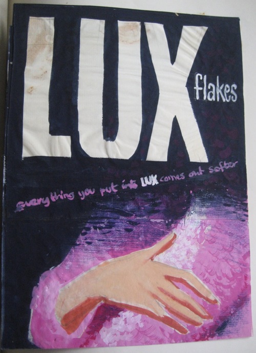
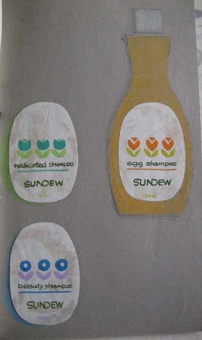
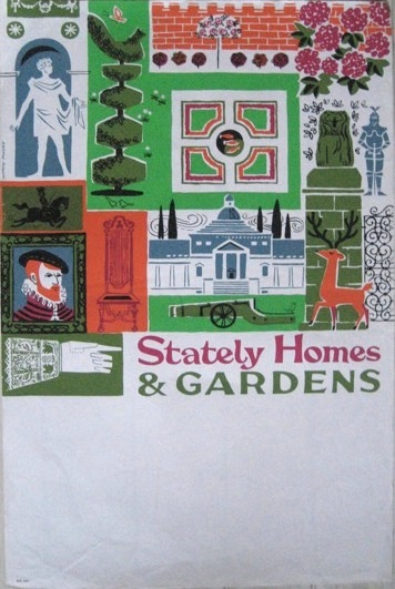
In many ways, having seen the first batch, there are no great surprises here as the range – everything from posters to packaging design – is very similar. But it’s still very interesting. For example, I had no idea that she did this packaging design, which does look vaguely familiar to me.
There’s plenty more of this kind of thing too – her work really did extend from poster design into packaging as well as the fifties went into the sixties.
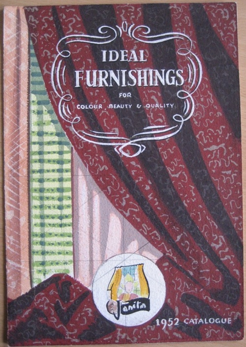
There are loads more quirky little things too. Who would have known that she had designed this early 1950s catalogue without seeing this design?
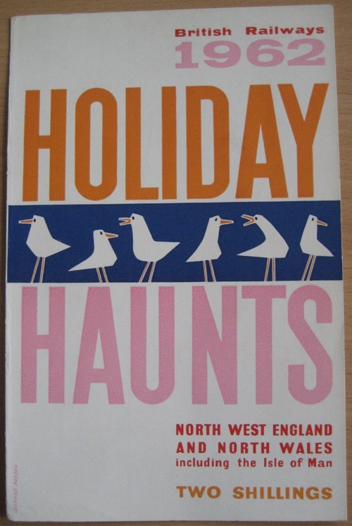
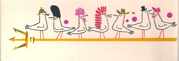
And I had no idea that she had done this Holiday Haunts cover either. The seagulls are familiar too, I seem to remember them from one of her P&O menu designs.
Although now I go back and look they have definitely put on their glad rags for cruising.
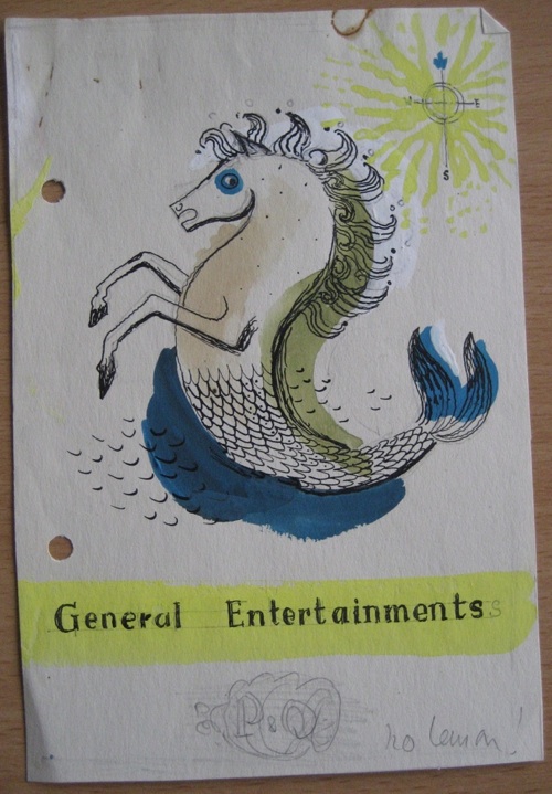
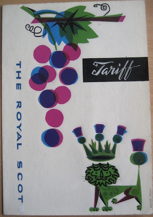
While I’m on the subject, there are also one or two more nice designs for menus in there in addition to the one at the top.
Once again, only the most assiduous combing through ephemera fairs and eBay would ever have brought this to light.
But there’s more to what remains than just a joyous skipping through unseen designs (although let’s be honest, that’s fun). I’m also beginning to learn a bit about her design processes from what remains. At least I think I am.
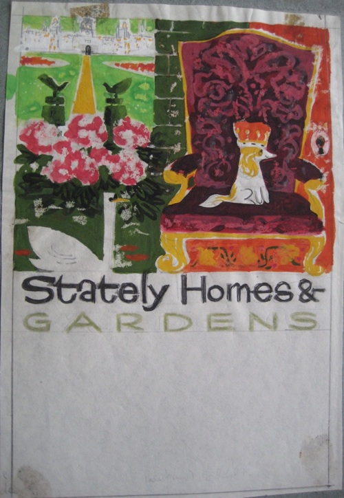
It looks as though the first step was a rough sketch. She might have prepared a good handful of these, and I wonder if they sometimes got shown to a client, at least a client she trusted.
I love the dog on this, but I don’t think this design ever got printed, more’s the pity – at least this is the only version I’ve ever seen.
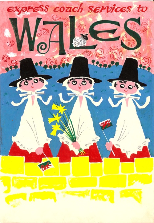
Sometimes, particularly in the early days of her career, I think she would work up these small sketches as detailed pen and ink drawings to show her clients. Here’s one for her Wales poster which was in the collection that we bought. Note the delightful sheep nestling on the ‘L’.
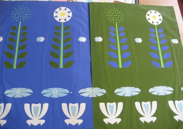
Then I think if the design was commissioned she produced a near full-sized collage. Here’s one for what I am guessing is a fabric pattern.
This is what I believe went to the printers, and if they ever came back from that inky place possibly went to the client. What is certainly the case is that none of these have turned up in either archive for a commissioned design. So my guess is that all the ones that she kept were, for one reason or another, never produced. Perhaps she was keeping them in case they came in handy later.
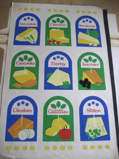
For some of her more complex designs (which I tend to assume are earlier although I couldn’t prove that), she also used ink along with the collage, as is the case with this splendid cheeseboard.
There’s lots more, but I am going to end with a question. I’m guessing that this sketch is for a coach poster.
It feels curiously familiar, but I can’t find the actual poster it refers to, just this one.
Was it ever produced or not, or am I just getting the two confused – does anyone out there know?
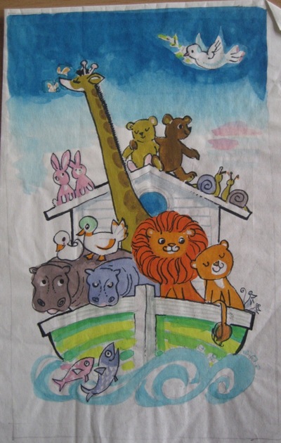
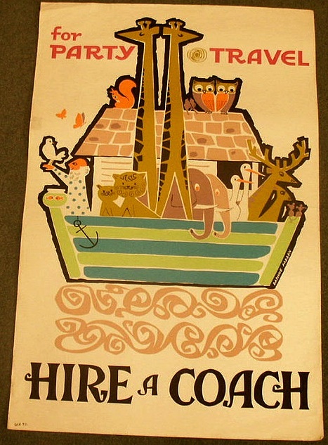
I think I would remember if I had seen an embracing pair of teddy bears on a poster before! John Burningham did a Noah’s Ark poster design that both you & I have seen recently. Do you think this may be why this is striking a chord? I do love the pair of butterflies tickling the nose of the sadly solitary giraffe ..
Yes I think you’re right there, this design falls somewhere between the Burningham and the poster that she did do. So I feel as though I’ve seen it, even if I haven’t!
Most of all though, I do wish that spaniel on a chair was a proper poster…