Pheasants and Leaves

This post is mostly by way of a thankyou to Shelf Appeal, who pointed us at an eBay listing earlier in the week.  And so we won this, which I am very pleased about indeed.

James FItton turn over a new leaf vintage WW2 poster

It’s by James Fitton and is a lovely bright copy of one of my favourite ever posters.  So much one of my favourite posters that we now have two copies, but this is not only the much better one but was also considerably more of a bargain.  It’s going to be lovingly restored and will be up on the wall shortly.

Elsewhere on eBay I would like to refer you to this.

Pheasant Margarine poster from eBay

I’m not too impressed with the poster as a thing, but as an idea, it’s fantastic.  Is the margarine made by pheasants, for pheasants or from pheasants?  Or is it simply for spreading on pheasants?  I think we need to know.

RIP COI

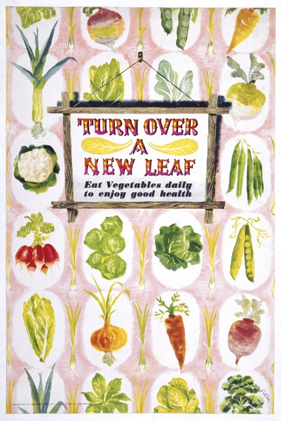
So the Central Office of Information is to be no more (news here in the Guardian).  This is a sad end because once upon a time they produced some rather wonderful posters.  Here’s a handy thought from them for this time of the year.

COI remember your passport when travelling abroad Reginald Mount Eileen Evans vintage poster

Coincidentally, I reccently bought a history of the COI from Abebooks.  (I don’t suggest you do the same: this would be the driest book I have come across for some time, had it not been beaten by History of The Second Word War: Food Volume 2 – Studies in Administration and Control which currently sits on my desk, waiting to bore me out of my wits.)  The real problem, at least as far as I am concerned, is that the book  doesn’t mention posters much.  Here’s pretty much the most interesting – or at least relevant – paragraph in the whole thing.

Over this entire period [i.e. since 1946] the COI has also had the part-time services of Reginald Mount and Eileen Evans as consultants and designers of a long succession of award winning posters, most notably for health education.

Posters like this.

Mount Evans hand palmistry stop smoking vintage poster central office of information

Which does at least answer the question I raised a few weeks back, which was when did Mount/Evans leave the COI and set up on their own?  Although the answer does seem to be a kind of Schroedinger-esque uncertainty principle in which they both left in 1946 when the COI was founded and at the same time never left.  I suppose that as long as we never look in the Ministry box, it will be fine.

What does seem to be true is that the vast majority of the COI posters I have come across seem to be by either Mount/Evans or Reginald Mount on his own.  My very slightly anal database tells me that we have had 28 COI posters at various times, but with very few other artists represented.  One is Thelwell, who produced a whole series of Countryside Code cartoons.

Thelwell Countryside code poster Central Office of Information

While the other is the magnificent Royston Cooper.

Brian the Lion Royston Cooper vintage poster Keep Britain Tidy Central Officec of Information

I also suspect that this Henrion may also be a COI production, but can’t prove it.

FHK Henrion vintage poster Keep Britain Tidy exhibtiion

But that’s almost it.  Which is surprising, because the COI book has a list of designers who worked for them, and it reads like a who’s who of graphic design in the 1950s and 60s.

For posters and book illustrations in the department’s lifetime these have included Rowland Hilder, Milner Grey, John Minton, Topolski, Ardizzone, Abram Games, Ashley Havinden, F H K Henrion, Hans Unger, Eckersley, Laurence Scarfe, James Fitton, Ronald Searle, Edward Bawden, Andre Amstutz, Tunnicliffe and the Crosby/Fletcher/Forbes group.

Now, I can see that our collection is a bit skewed, simply because we bought a lot of Mount/Evans posters at auction a few years ago when what I suspect was their studio archive was being sold off.  But even then, whenever we’ve seen and bought other COI posters they’ve been by them too – like this Keep Britain Tidy design by Reginald Mount.

Keep Britain Tidy vintage poster Reginald Mount for COI

A search of auction houses and archives like VADS reveals pretty much the same pattern – much Mount/Evans and Mount, very little else from the COI.

One reason for this may lie in the history of the COI itself.  The Central Office of Information was formed in 1946 as a replacement for the Ministry of Information, which had produced most of the government’s publicity and propaganda requirements during the war.  But for many people, propaganda of any time was seen as fundamentally not British and unsuited to a democratic state – i.e. this was something that the Nazis did and therefore, by definition, we shouldn’t.  It could only be justified by the needs of war, and so the Ministry had to go at the end of hostilities.

The problem with this was that the war itself didn’t finish so neatly.  Austerity and rationing continued right into the early 1950s, and indeed was stricter in the late 1940s than it had been during the war.  This in turn meant that much of the wartime instruction and exhortation to work hard and make a nutritious meal out of little more than cabbage had to carry on too.  So when the Central Office of Information was founded, it had quite a lot of work on its hands, and I suspect that many of those artists worked for the COI in those early years.

However it’s very hard to tell which these are; my suspicions are that most get lumped in under the heading of ‘World War Two’ posters.  For example, I’ve seen both of these posters, by Lewitt-Him and James Fitton respectively, dated to 1947 rather than during the war itself.

Lewitt Him Vegetabull vintage poster Ministry of Food

Turn Over A New Leaf vintage poster James Fitton Ministry of Food

Neither of these would have been produced by the COI, since the Ministry of Food ran its own posters and publicity throughout the war and I can’t imagine changed that afterwards, but they are good examples of how the wartime messages carried on past 1945.  The only COI poster I know of which is definitely from this period is by Dorrit Dekk.

Dorrit Dekk bones still needed for salvage vintage poster Central Office of Information

Dorrit Dekk only started producing posters in 1946, when she was demobbed from the WRNS and went to work for Reginald Mount at the COI, so this must be from between then and 1948 when she left.  But without knowing this biography, it would be impossible to date the poster and it too would probably be ascribed to the war years as well.  So I imagine that vast swathes of the COI’s early output has either disappeared, or been labelled as ‘wartime posters’ and, unless someone puts in a formidable piece of archival research one day, will never be known.  I also suspect that those were the posters designed by that great list of artists in the book.

As the years went on, the need for government publicity decreased – although this anonymous COI poster is reminiscent of wartime appeals.

Civil Defense COI vintage poster

Judging by her hairdo, I’d put this at quite soon after the war anyway, but I’d be interested to hear if anyone else knows more.

By the late 1950s or early 1960s though, the government just didn’t have as much to say.  Get a passport on time, don’t drop litter, smoke a bit less.  Don’t drink and drive.  And remember to tell the milkman when you go on holiday.

Mount Evans stop the milkman when you're off on holiday vintage poster

It doesn’t have quite the same heady excitement as the war years.  Although the designers were allowed out for a few digressions, such as United Nations Day.

Mount Evans United Nations Day poster 1967

Not every COI poster was aimed at the general public either; Mount/Evans also produced a number of internal campaigns for the government, most notable ‘Keep Our Secrets Secret’ which I’ve mentioned before on here but which are so excellent that I can’t resist posting one more time.

Mount Evans vintage combination  number poster COI

What Every Girl Should Know Mount Evans secrecy poster Central Office of Information

The other reason why there were fewer posters, of course, is that they were no longer the biggest game in town.  More and more, the COI’s main campaigns were conducted through short films, whether in the cinema or in public information slots on the television.  (Should you be interested, the National Archives have put tons of these online for your amusement).  Only the less important messages like UN Day or internal communications would have been put out by posters alone.

But all of this has now gone, and every government message will just be put out by advertising agencies and be indistinguishable from commercial campaigns.  Perhaps one day someone will produce an illustrated and possibly even interesting history of the COI, to show us just what design classics they did produce in their heyday.

Hoarding

Today, a very unusual sight.  Yet it’s one that shouldn’t be a rarity at all, because it’s posters doing what they are intended to do, advertising things.  Here on hoardings sometime in the mid 1950s.

Advertising hoarding c1955/6 with several ads on it including Patrick Tilley

Mostly, this is such an everyday scene that no one takes any notice, never mind a photograph.  But this time, an up and coming poster designer was recording some of his work appearing.  That designer was Patrick Tilley, and he’d designed the Hartley’s Jelly ad in the centre.

Patrick Tilley Hartleys Jelly poster 1950s

I can’t tell you how excited I am to see these.  It’s not just that Tilley’s posters are lovely, these photos are also a great chance to see posters in the wild, rather than collected and curated and hung on people’s walls.  Which means we can find out a bit more about how they really functioned at the time.  Take this set.

More Posters on Walls including Patrick Tilley and Donald Brun

The Patrick Tilley design is for MacDougalls flour.

Patrick Tilley vintage poster McDougall's self raising flour 1950s

But take a look to the left. The HP Ketchup poster seems to have been signed by Donald Brun.

HP Tomato Ketchup poster Donald Brun 1950s vintage

I sort of half knew that some of the great European poster artists of the 1950s had worked in Britain, and had come across it happening here and there.  But it’s still odd to see their work on a British poster hoarding, advertising a very British brand.  And the image seems vaguely familiar, but I can’t trace it anywhere.  Because that’s the other thing about these posters, they’re also very rare.

Patrick Tilley McDougalls flour advertising poster on hoarding 1950s

Unlike in Europe, Britain’s commercial posters were never (with the exception of Guinness) made available to the public or collected.  So it’s not even that only a few survive, probably most of these posters have disappeared entirely.  They might be in the archives of the company they’re advertising or the agency that created them; they may even have been recorded in a magazine or design annual.  But I’d be prepared to bet that a fair proportion of these posters have disappeared without trace, or at least would have done without these photos.

Mostly, it seems, it’s the artists that keep the records (as was the case with Daphne Padden’s packaging designs).  Patrick Tilley kept not only these photographs, but also the original artwork that he presented to the agency, The London Press Exchange, to get the commission.

Patrick Tilley MacDougal flour design pitch

But not everything is sweetness, light and good design on the hoardings.  Once again, the photographs are a reminder that, along with the award-winning posters by great designers that we choose to remember, there was also quite a lot of dross too.  Like the tattoo and charity adverts in the first photograph, or that for Swan Vestas next to the McDougalls ad.

Swan vestas vintage billboard advertising poster from photograph

I mention this quite a lot, and in a way it’s an obvious truth, but the presence of all these rather average posters must have affected how people saw the good posters too, even if I’m not sure how.  Perhaps people got used to just tuning out posters, and so everything got ignored; or perhaps the good posters looked even better because they had a dull picture of a box of matches next to them.  I don’t know, I really don’t.

But the other reason that its important is that, by allowing only the good posters through our filter, we distort what they tell us about their times.  We will see only classy posters, probably for up-market products.  Which means that we’ll miss some things entirely.  Take a look at this set below.

Osram Gas VP wine posters on billboard 1950s

The Osram and Gas posters are both very good.

Patrick Tilley Gas poster 1950s

Vintage Osram hoarding poster

The top one is by Patrick Tilley, the Osram advertisement by ‘Rim’ which raises a whole set of other questions (if you can tell me who this is, I would love to know).  But it’s the one on the far right which intrigues me most.  It’s neither bad nor good, but take a closer look at what it’s advertising.

VP wine 1950s vintage advertisement

Drink fortified British Wine when you sit down in front of the television (tv being clearly a new and exciting innovation).  Now there’s a thought you’d never get from anywhere else.

Patrick Tilley vintage McDougalls advertisement 1950s

And thank you very much to Patrick Tilley for taking the photographs, and keeping them, as well as allowing me to use them here.

The unknown known

I keep saying that what we know about graphic design is very much a partial history.  But it’s a fact that’s worth repeating, because I’m increasingly discovering just how little knowledge we, or I at least, do have.  Take Daphne Padden, for example.

Daphne Padden take your children to the seaside poster

To go by what can be found in archives and auctions, the extent of her work would seem to be designing posters for coach companies and menus for P&O, along with a few odds and ends for British Railways and the GPO.

Daphne Padden menu P&O

But, as I mentioned the other day, we’ve now got some of her artwork and other odds and ends from her estate, and it’s a very revealing collection indeed.  There are of course sketches for posters in there.

Daphne Padden artwork for wales poster

What’s different about this collection, though, is how much it reveals about her other work, in particular packaging design and corporate image.  These are just a few pages from a small portfolio that she must have put together to show the range of her work.

Daphne Padden portfolio cigarette packet design 1960s?

Daphne Padden portfolio coach poster design

Daphne Padden portfolio cigarette packets

Daphne Padden portfolio exhibition design

But that’s not the half of it.  I knew, because we’d bought the placard below last year, that she’d done some design work for Marks and Spencer.

Daphne Padden chef design for Marks and Spencer

But at some stage, it seems she did really quite a lot of their packaging.  She kept both designs and the end product, and these cover everything from yoghurt posts to the wrappers for tights, along with much much more.

Daphne Padden Marks and Spencers Washing Up Liquid design

Daphne Padden M&S angel sandwich design and finished

Daphne Padden Marks and Spencers Christmas cake design

Judging from the pricing (and the inflation rate between design and finished packet) these are probably from the early to mid 1970s.  But Marks & Spencers weren’t the only company she designed packaging for, either.

Daphne Padden Hathaways Jam design

Daphne Padden frozen strawberries packaging

Had this carrier bag disappeared, as it easily might have done, Daphne Padden would just be a poster artist, no more.  I’m very glad to have these, and to see how much she did really do, but it also makes me wonder about all the other bags of stuff which did get thrown away when other designers moved house or moved on.  It’s heart-breaking to think about it but it’s also necessary: we must always  remember just what a small and unrepresentative proportion of graphic design history does get kept, and that we will never fully comprehend the true extent of what we do not and will never know.

Back again

I know that I keep promising to come back to subjects on this blog, and then it never quite happens.  There on the other hand, sometimes subjects come back to me, especially designers.  One of the great joys of writing about a particular designer is that quite often people get in contact with their own memories of the person concerned.  I’ve blogged about this before with Hans Unger, and it’s wonderful to get a sense of how much that person was respected and remembered.  Recently, quite a few people emailed who had worked with Pieter Huveneers.  In addition to being a great designer, he must also have been an inspiring boss and mentor.

I was also sent this by Jim Pennington, who never worked for Huveneers but does know good design when it comes his way.

Mullard transistor manual Huveneers

It’s manual of transistors from the late 195os or early 1960s.  Everything you need to know about the valves of the day, apparently.  But rather lovely.

More surprisingly, a lot of people have got in contact about Denis Constanduros who, you may remember, did a few rather lovely posters for Shell and then saw how the world was going and went off to produce historical TV dramas instead.

He seems to have had a large extended family which, combined with a highly googlable surname,means that lots of his relatives have found the blog and got in touch.  His grandson sent me a very interesting range of material, including this 1939 article from the Radio Times.

Denis Constanduros Radio Times article

So, in between the water carrying and play writing he was still painting as well.  There is also a picture of him and his aunt Mabel from the year before.

Denis and Mabel Constanduros

Meanwhile, Jonathan Spector, who isn’t a relative, sent me this book jacket illustration by Denis, for one of his aunt’s books.

Denis Constanduros Book jacket

This only survived by dint of being a wartime rarity.  Jonathan bought a wholly other book, called People are Curious, written by James Hanley and published in reprint edition in 1945.  But on the reverse of the jacket, off centre, was this – obviously the result of wartime paper rationing.  I think I preferred his posters though.

That’s not the only email that arrives here at Crownfolio Towers either.  Quad Royal is now important enough, it seems, to get press releases.  So should you want this poster, for example, for a scooter which was apparently ‘a joy to own, as long as someone else was paying the repair bills’,

Sunbeam Scooter bsa poster

I can tell you that there’s a gallery in Canada with just the thing for you.

Back on home turf, I’ve also been contacted by VintageSeekers, who are a new antiques site with a small number vintage posters on their books.

Weston Super Mare vintage british railays poster Vintage Seekers

What Vintage Seekers is, though, is a shop window for dealers, which means that you are paying not only dealers’ prices, but commission on top.  So the poster above, quite apart from being for a place which you’d only want a poster of if you’d never been there, is £695.

I did get mildly excited when I saw a link to a Whisky Galore poster, as I had some memory that it was a good one.  What I was thinking of was this, which is by Tom Eckersley and I have been meaning to put up for your delectation for ages now.

Whiskey Galore poster tom eckersley

What I actually saw when I got to the page was this.

Whisky Galore not very good poster

Which is rather more in the style of a Ladybird book and, furthermore, will set you back £2,800.

All of which is enough to send me back into the arms of eBay, where even the silly prices suddenly look more reasonable.  This wartime Pat Keely is £99.95.

Pat Keely vintage world war two propaganda poster

While the listing doesn’t mention his name, this car ferry poster is by Lander (and dates from 1960, fact fans).

Lander vintage 1960 car ferry poster British Railways

This is a bit of an oddity, as I have no idea what the Pye logo is doing there, particularly as the poster seems to have ended up in America.

Vintage Pye Cambridge travel poster most odd

Although apparently the poster says that Pye were Britain’s largest exporters of radio and television.  I’m still not really any the wiser.

Finally, what I need right now is a time machine, to go straight back to 1973 and attend this.

Transport flea market flyer

Imagine the bargains there would be for the taking.

Artwork

Well my trip was a definite success, you’ll be pleased to hear.  The mission was a trip to a solicitors’ office in the Home Counties in order to sift through some of the last remaning pieces from Daphne Padden’s estate.  And it was worth the journey up the A303, as I have come back with a whole carrier bag full of goodies.  From which there definitely is a very interesting story to tell, when I get the time to sift through it all properly.  In the meantime, some original artwork for your Friday delight.

The Torbay Express apparently still runs, but I bet it doesn’t have a menu as nice as this these days.

Daphne Padden Torbay Express menu artwork

This greetings telegram is wonderful in its detail.

Daphne Padden greetings telegram artwork

And also came with its own matching envelope.

Daphne Padden greetings telegram artwork envelope

As far as I can tell, this was never used.  I don’t think I’ve mentioned it before, but there is a small and good book about Greetings Telegrams by Ruth Artmonsky, which has a full list of all the commissioned designs, and there is nothing by Daphne Padden there.  I wonder why this was done in such detail then?

Finally, a small early sketch…

Daphne Padden old salt artwork

That fisherman is clearly a close cousin of this pair, with their black cat and pipes.

Daphne Padden Royal Blue poster ours from morphets

All of which is simply a taster, as there will be plenty more gems to come from the bag next week too.