Back again

I know that I keep promising to come back to subjects on this blog, and then it never quite happens.  There on the other hand, sometimes subjects come back to me, especially designers.  One of the great joys of writing about a particular designer is that quite often people get in contact with their own memories of the person concerned.  I’ve blogged about this before with Hans Unger, and it’s wonderful to get a sense of how much that person was respected and remembered.  Recently, quite a few people emailed who had worked with Pieter Huveneers.  In addition to being a great designer, he must also have been an inspiring boss and mentor.

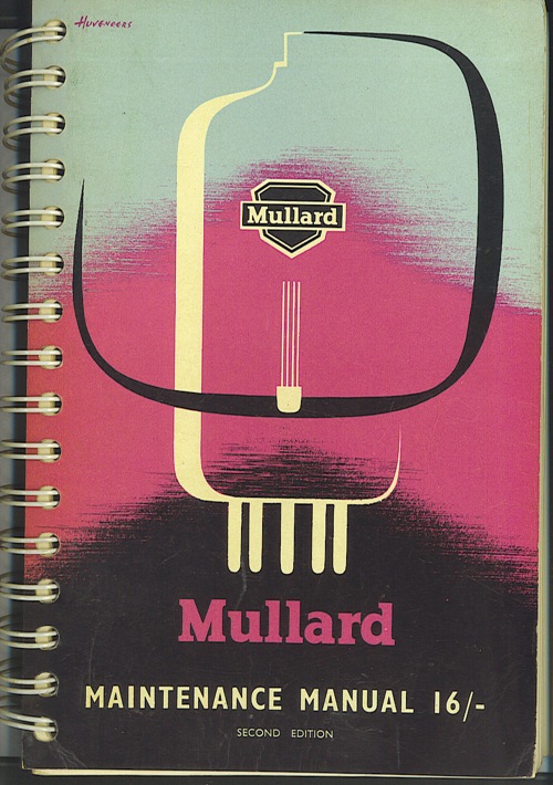
I was also sent this by Jim Pennington, who never worked for Huveneers but does know good design when it comes his way.

Mullard transistor manual Huveneers

It’s manual of transistors from the late 195os or early 1960s.  Everything you need to know about the valves of the day, apparently.  But rather lovely.

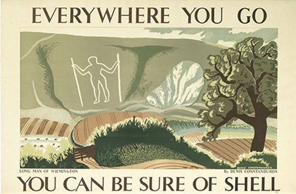
More surprisingly, a lot of people have got in contact about Denis Constanduros who, you may remember, did a few rather lovely posters for Shell and then saw how the world was going and went off to produce historical TV dramas instead.

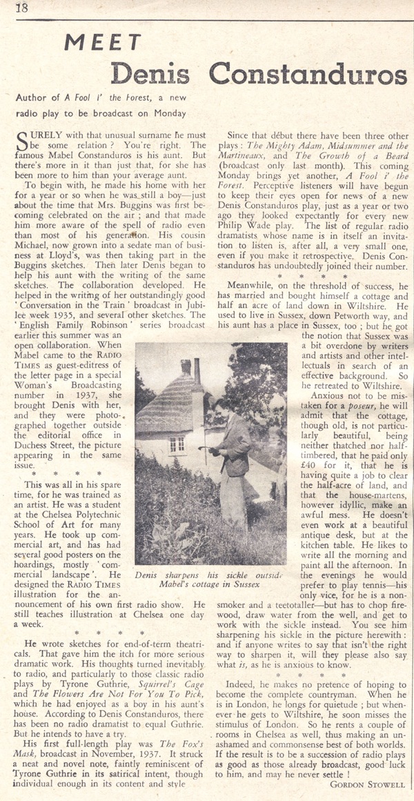
He seems to have had a large extended family which, combined with a highly googlable surname,means that lots of his relatives have found the blog and got in touch.  His grandson sent me a very interesting range of material, including this 1939 article from the Radio Times.

Denis Constanduros Radio Times article

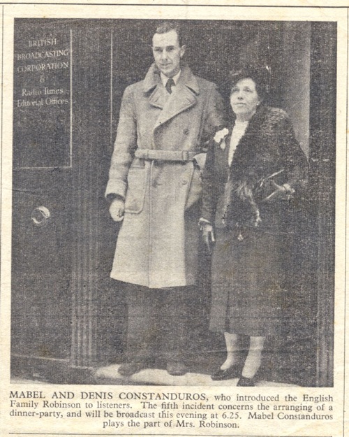
So, in between the water carrying and play writing he was still painting as well.  There is also a picture of him and his aunt Mabel from the year before.

Denis and Mabel Constanduros

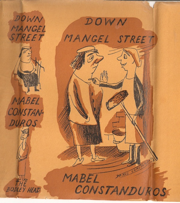
Meanwhile, Jonathan Spector, who isn’t a relative, sent me this book jacket illustration by Denis, for one of his aunt’s books.

Denis Constanduros Book jacket

This only survived by dint of being a wartime rarity.  Jonathan bought a wholly other book, called People are Curious, written by James Hanley and published in reprint edition in 1945.  But on the reverse of the jacket, off centre, was this – obviously the result of wartime paper rationing.  I think I preferred his posters though.

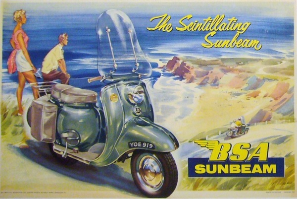
That’s not the only email that arrives here at Crownfolio Towers either.  Quad Royal is now important enough, it seems, to get press releases.  So should you want this poster, for example, for a scooter which was apparently ‘a joy to own, as long as someone else was paying the repair bills’,

Sunbeam Scooter bsa poster

I can tell you that there’s a gallery in Canada with just the thing for you.

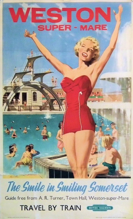
Back on home turf, I’ve also been contacted by VintageSeekers, who are a new antiques site with a small number vintage posters on their books.

Weston Super Mare vintage british railays poster Vintage Seekers

What Vintage Seekers is, though, is a shop window for dealers, which means that you are paying not only dealers’ prices, but commission on top.  So the poster above, quite apart from being for a place which you’d only want a poster of if you’d never been there, is £695.

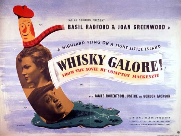
I did get mildly excited when I saw a link to a Whisky Galore poster, as I had some memory that it was a good one.  What I was thinking of was this, which is by Tom Eckersley and I have been meaning to put up for your delectation for ages now.

Whiskey Galore poster tom eckersley

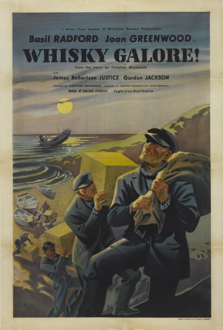
What I actually saw when I got to the page was this.

Whisky Galore not very good poster

Which is rather more in the style of a Ladybird book and, furthermore, will set you back £2,800.

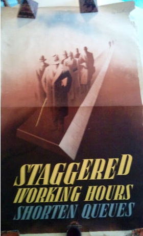
All of which is enough to send me back into the arms of eBay, where even the silly prices suddenly look more reasonable.  This wartime Pat Keely is £99.95.

Pat Keely vintage world war two propaganda poster

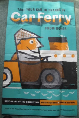
While the listing doesn’t mention his name, this car ferry poster is by Lander (and dates from 1960, fact fans).

Lander vintage 1960 car ferry poster British Railways

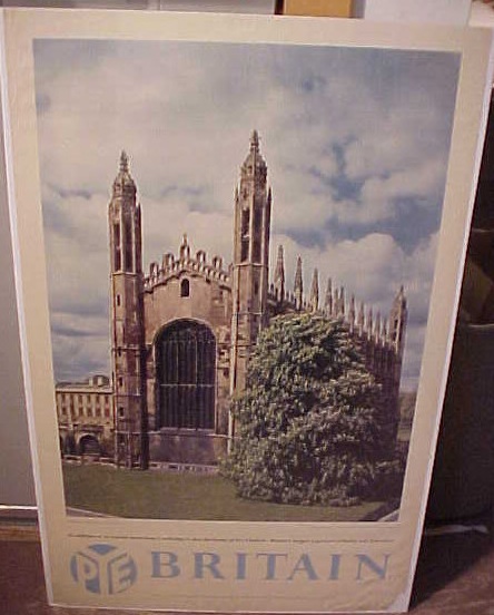
This is a bit of an oddity, as I have no idea what the Pye logo is doing there, particularly as the poster seems to have ended up in America.

Vintage Pye Cambridge travel poster most odd

Although apparently the poster says that Pye were Britain’s largest exporters of radio and television.  I’m still not really any the wiser.

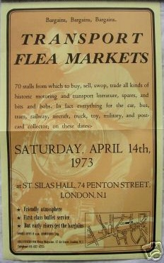
Finally, what I need right now is a time machine, to go straight back to 1973 and attend this.

Transport flea market flyer

Imagine the bargains there would be for the taking.
Now we are one

To my surprise, Quad Royal is a year old this week.  So happy birthday to us.  Now I am not going to write a long and self-congratulatory post, but we will be waving a few flags, as there are a couple of things which do need to be said.

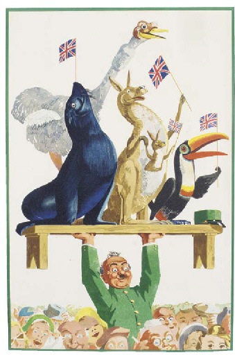
Guinness coronation poster vintage John Gilroy animals toucan

First and foremost is a thank you to everyone for coming over and not only reading but commenting and linking and generally adding to Quad Royal.  It’s been a great pleasure meeting people and conversing with them, not only on the blog, but also by email and on Twitter.  (Pleasingly, we’ve just reached 200 followers on Twitter in time for this birthday, but if anyone else would like to follow Quad Royal on Twitter, it would be lovely to see you too).  I’ve learnt a lot from some very knowledgeable people, and it wouldn’t have been one tenth as much fun without everyone.  So thank you.

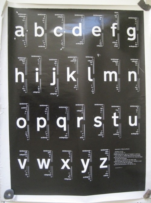
But getting to one has also made me think a bit about what the purpose of the blog is, other than a form of occupational therapy for me.  It’s something I’ve been forced to consider anyway, as last week’s post about the Kinneir and Calvert Railway Alphabet (except it may not be that, go and look at the comments if you want to follow the story in all its typographical detail) has attracted more attention than anything else ever posted on here.  Not only have the modernist type-nerds of the world tweeted it and linked to it, but it has turned out that the two posters (one illustrated below) are not only rare but of some historical importance.

black rail type Kinneir calvert again

Which is, to say the least. surprising.  If  you rewind to the beginning of it all, Mr Crownfolio and I bought a huge lot of misc posters from the tail end of the Malcolm Guest sale for the grand sum of £10.  These then sat about in the corner of a room for six months in a tube marked ‘selling’.  After I finally remembered that this was there, with the thought of putting them on eBay, I had a proper look at them for the first time.  And when I did that, along with a bit of research, they turned out to be more interesting than I thought.  Then, when they were up on the blog and other people had a good look at them they turned out to be really quite rare indeed.

All of which has made me realise that one of the important things about this blog is looking at graphics and posters closely.  Because quite often they can turn out to be much more interesting than a cursory glance would lead one to suspect.  The alphabet posters are perhaps the most extreme example of this, but it’s true of so many of the things featured on Quad Royal over the last year.  Posters can tell us stories about how people lived, and what they thought about how they would like to live; they are designed by interesting people whose lives are intertwined with some of the important ideas of the last century, and in amongst all that they are a great pleasure to look at.

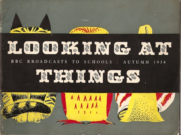
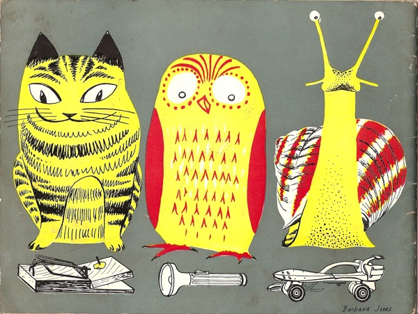
Of course, Barbara Jones got there long before I did.

Barbara Jones BBC Schools booklet 1954

barbara jones school booklet 1954 looking at things reverse

Her BBC Schools series is all about the pleasures of seeing in detail.  So here’s to another year of looking at things.

Incidentally, in case you think this is all a bit self-important and puffery, here’s a further cautionary tale.  In writing this, I looked up the original Morphets lot which had the type posters in, to find out what we paid for them.  Only it said ‘4 typographic posters’.  Sure enough, down the back the shelves where miscellaneous things live were two more historically important documents.  I really would have made a very bad museum indeed.

Books and Canons

Right, back to the bookstacks once more.  In a way I’m rather pleased that there’s a backlog of things I need to write about, it shows that posters and graphic design are starting to be taken seriously.  But more than most, today’s book is both necessary and useful.

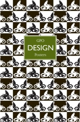
Paul Rennie GPO Poster Design book cover

It’s GPO Design by Paul Rennie, a neat guide to the posters of the GPO.  Evem better, it’s reasonably priced and available.  That doesn’t sound like much to ask, but in this case, it’s about time.  Because until now, the only book ever written on GPO design was published by a private press in a limited edition, and went for £320 at auction the last time I saw a copy.  Which makes me particularly grateful for this.

What you get is a fairly straightforward run through the history and structures of the GPO as it affects poster design, the varying kinds of GPO posters and what they were meant to achieve, and a look at some of the artist and designers who worked on the campaigns.  Plus of course, lots of lovely posters to look at.

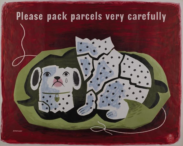
Tom Eckersley vintage poster Please pack parcels very carefully GPO 1957
Tom Eckersley, 1957

It’s simple, but given that absolutely nothing else is available, it’s exactly what’s needed.

So, for example, I now know why so many GPO schools posters survive compared to the commercial campaigns: they were sent out in their thousands to schools, where they were so much more likely to be kept, or at least thrown to the back of a cupboard, compared with the ones sent out to Post Offices.

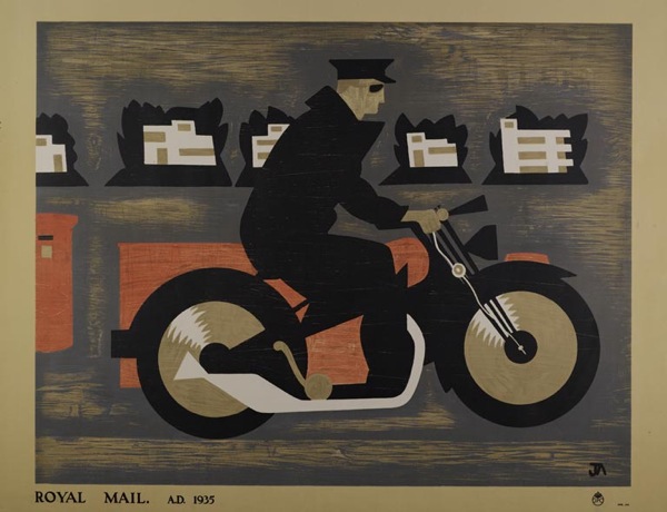
John Armstrong vintage GPO educational poster 1937
John Armstrong, educational poster, 1935

Although, I have to say, I don’t find the designs of the school posters half as satisfying as the commercial ones, as they have a tendency towards the dreary.  The only exceptions being the McKnight Kauffer ones, which are rather fine.

McKnight Kauffer, vintage GPO educational poster 1937
McKnight Kauffer, educational poster, 1937

The book has provoked me to some thoughts, though.  Although they’re not really criticisms of the book itself, as it is meant to be a brief and straightforward run through.  My target is probably more design history as a whole, as reflected in this particular text.

What is starting to bother me is the existence of an established hierarchy of designers.  At the top of the tree are those who were also fine artists.  The chapter on individual designers here begins with Paul Nash, and moves on to ‘fellow member of Unit One, theatre designer and surrealist’ John Armstrong’, only later moving on to the poster designers themselves.

Implicit here is the idea that design itself is not enough, it is better (whether that is aesthetically more pleasing or simply more worthy) if it has been touched by the hallowed hand of fine art.  Alone, it does not deserve the attention.

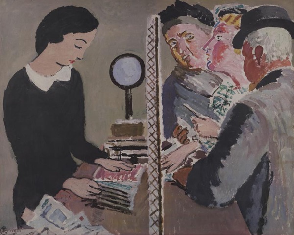
Perhaps it is possible that posters designed by artists are generally better, although I’m not sure I subscribe to this point of view.  But where it really gets irritating is the continual reproduction of this Vanessa Bell design.  It turns up everywhere that GPO design is discussed.

Vanessa Bell unused post office design 1935

Now, this is a failed poster.  It was rejected by the GPO and never used.  Even Bell herself didn’t think the design worked.

I don’t know why it has been so, but for some reason it has taken me ages to do anything I thought would do at all – I think partly because of the difficulty of getting several figures into a small space and yet making them tell at a distance. I have stood about in Post Offices until your employees looked so suspicious I had to leave! – and yet I don’t know that in the end what I have done has much resemblance to a Post Office. However, there it is…

Letter from Vanessa Bell in BPMA archive, quoted in essay by Margaret Timmers

It is possible to see the design as an example of where art and commercialism failed to meet, and Rennie does discuss it in this context briefly.  But I don’t think that this alone is enough to account for its ubiquity.  Because this isn’t just art, it’s Bloomsbury art.  And Britain loves the Bloomsberries, to the extent that it can skew our critical and historical judgement sometimes.

But even when we get the artists out of the way, the book still chooses to comment on the prevailing list of designers, from Austin Cooper and McKnight Kauffer at the top, then moving down to the post-war brigade of Eckersley, Henrion, Schleger et al. (How and why this canon has developed is an interesting question and one I’ll come back to another day as this post is already quite long enough as it is.)

Hans Schleger vintage GPO poster design 1945
Hans Schleger, 1945

Partly this annoys me because I got my critical grounding in English Literature during the late 1980s, where any belief in the Canon of Dead White Males was to be stamped on as a sign of a backward and outmoded way of thinking.  I’m probably not so extreme about it now, but the ingrained urge to stamp hasn’t quite gone yet.
But again, I also think that it can get in the way of us seeing what is really there.

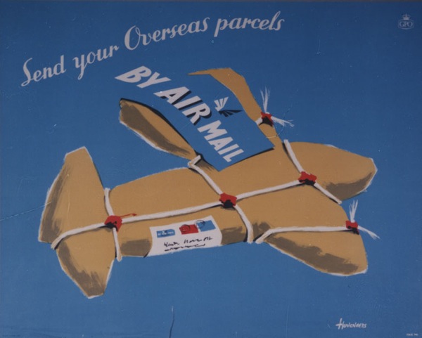
Pieter Huveneers vintage airmail poster 1954
Pieter Huveneers, 1954

Because one of the joys of the GPO Archive is that they commissioned a wide range of artists, some of whose work I’ve never seen anywhere else.  (The illustrations of the book do reflect this, by the way.)

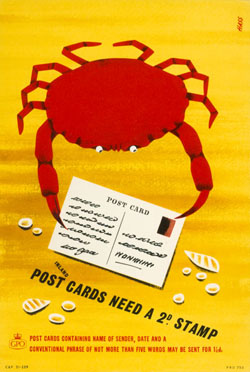
For example, I was furtling around in there this morning for another reason altogether and came across this, which I have known and liked for ages.

Derrick Hass postcards crab vintage GPO poster
Derrick Hass, 1954

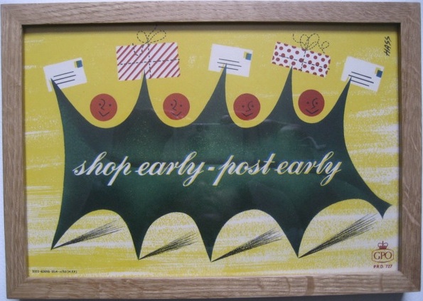
It’s by Derrick Hass, who also did this Christmas design, as seen on here before.

Derrick Hass shop early post early vintage GPO Poster holly

Now it turns out, after I got curious, that Derrick Hass went on to have an extraordinary career in advertising, working as an art director in most  of London’s top agencies for almost forty years, and winning prizes for his work into the 1990s.  His life and work is an important part of graphic design history, and one I’d like to know more about.

But if we only keeps looking at what we already know, histories like that will fall by the wayside.  So it’s fantastic that one book on GPO Design is at last available, but now we need a much bigger one too.  One which tells all the stories.

Set fair for Hastings

After seeing the Bruce Angrave Hastings poster yesterday, Mondagogo tweeted with a link to her photos of this wonderful object.

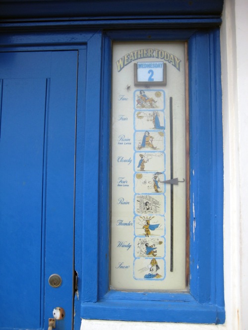
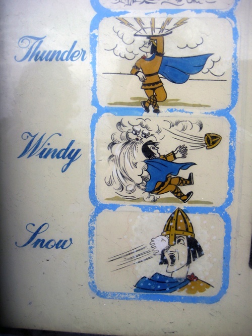
Cartoon forecasts on Hastings Victorian Weather station

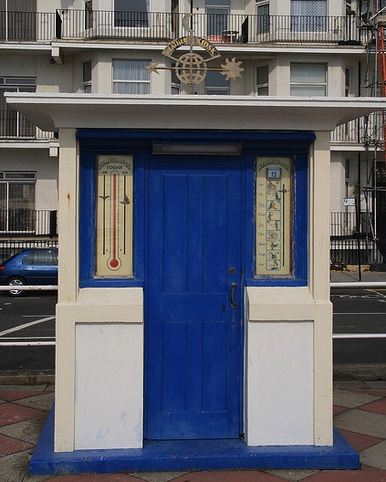
It’s a strange mechanical weather forecasting device – part of the Victorian weather station in Hastings.  Here’s the whole thing.
 Hastings Victorian Weather station

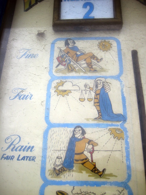
Although if you look closely, the cartoons aren’t actually Victorian.

Cartoon forecasts on Hastings Victorian Weather station detail

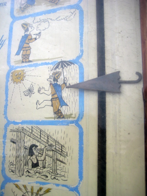
In fact they look suspiciously as though they might also be by Bruce Angrave.  Certainly the chins seem familiar…

Cartoon forecasts on Hastings Victorian Weather station detail

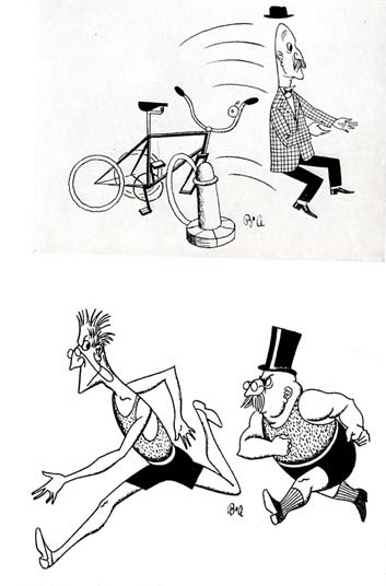
It seems Angrave did do cartoons as well as poster design (and illustration, and write books, and paper sculpture and  a lot more besides).  Here are a couple which were reproduced in Graphis in 1946

Bruce Angrave cartoons from Graphis 1946

Compare and contrast.

Cartoon forecasts on Hastings Victorian Weather station details

It certainly looks like his work, but I can’t prove it one way or another.  In a weird omission no one seems to have written anything at all about the weather station, so if you are in Hastings and know more, I’d love to hear from you.

And thanks to Anna from Mondagogo for the loan of the pictures.

Paperlicious

It’s all Shelf Appeal‘s fault again.  Her post about Bruce Angrave led to this French blogger posting some more late last year which was then tweeted by Kickcan & Conkers.  Which led in turn to some tapping and muttering in the next door room as Mr Crownfolio searched the web.  A few days later the postman rang on the doorbell.

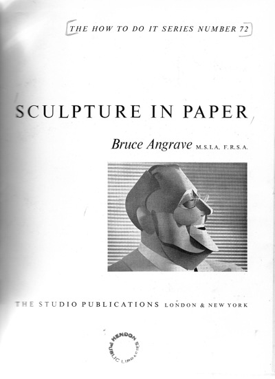
Inside front cover of Bruce Angrave paper Sculpture book

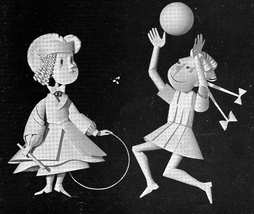
Ex-Hendon library, with no dust jacket and all in black in white, but still a good use of just a few pounds.  Because it’s packed with goodies.  Quite apart from Angrave’s own work, like these figures for the Festival of Britain,

Bruce Angrave paper sculpture figures from Festival of Britain

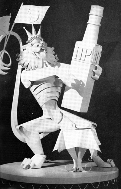
there’s also a history of paper sculpture through the ages, as well as a review of paper sculptors working at the time.  And there were quite a few of them about.  This 5′ high paper fantasia was built by Alan Farmer for the Ideal Home Show.

Alan Farmer figure for HP Sauce Ideal home show from paper sculpture book

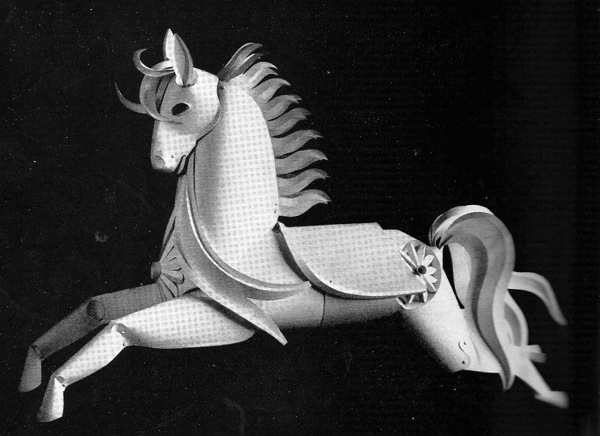
While this fairground horse was produced by Studio Diana for the British Industries Fair.

Studio Diana horse for British Industries Fair from Paper Sculpture book

Interestingly, along with a number of other examples in the book, the horse was commissioned by Beverley Pick, who clearly liked paper sculpture a great deal.

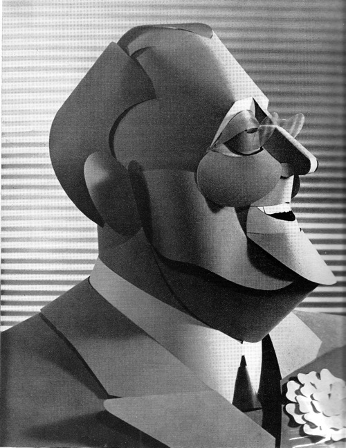
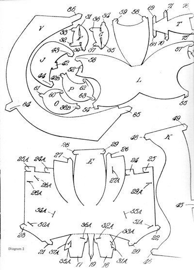
But best of all, there are instructions on how to make your own paper sculpture.  Perhaps you would like to make your own version of the wonderful gentleman here.

BRuce Angrave paper sculpture of posh old codger

Bruce Angrave paper sculpture how to diagram

The diagram above is just the beginning, there are also another ten pages of diagrams, instructions and photos.  There’s nothing like jumping in at the deep end, is there.  But if anyone wants to have a go, I will happily scan the whole thing, and then feature the finished results on here.

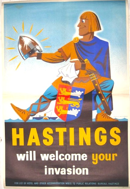
Quite apart from enjoying the book for its own sake, it has also provoked me to some thinking.  For a start, it’s made me look at Angrave’s posters again. Some are conventionally produced, like this Hastings poster that I’ve mentioned before.
Angrave hastings vintage travel poster

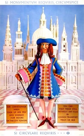
But others, like this 1964 London Transport poster, are actually produced as paper sculptures (and then photographed?  I have no idea).

Bruce Angrave London Transport poster 1964 Christopher Wren

We’ve got a copy of that somewhere I think.

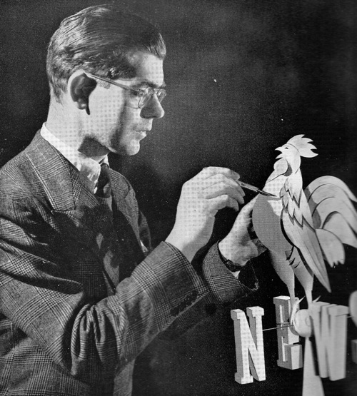
But the other thought is provoked by this, the frontispiece photo.  In it Angrave is producing a logo for Pathe News, for use in what would now be called an ident.

Bruce Angrave makes Pathe News cockerel logo in paper

I had never thought that part of the purpose of paper sculpture was to produce CGI before the computer was up to the job.  But perhaps it was.

Folded over

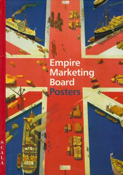
So, time to tackle the vastly overdue heap of new books which need our attention.  First in line is a book I have mentioned a while back, Empire Marketing Board Posters by Melanie Horton.

Melanie Horton Empire Marketing Board cover

Now I am going to try to be as nice as I can about this book, but it’s going to be difficult given the format it comes in.  Because it’s been designed by someone who a) had a rather over-blown sense of his own importance in the process, and b) hates narrative.

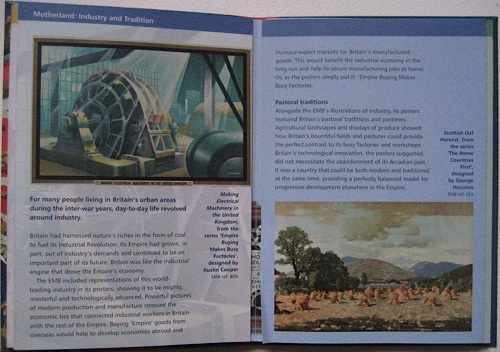
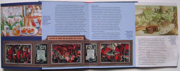
Although this book might appear at first to have pages, they’re deceptive.

Empire Marketing Board book simple page spread

Instead it is laid out like an Ordnance Survey map on acid.  Some of the spreads fold out like this.

Empire Marketing Board book wide spread

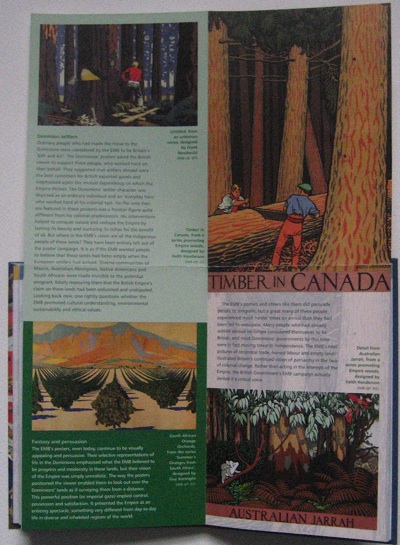
Others fold out like this.

Empire Marketing Board book high spread

Which makes it almost impossible to follow the text.  I think it goes across the unfolded bits first and then into the bits in the middle, but even now I am not entirely sure.  The whole experience is like wandering about in a badly-laid out exhibition without any sense of where you are meant to be.  No, actually, it’s worse than that, because it’s a book.  I’m meant to understand books.

As a result, I don’t even know that I’ve read it properly.  Which is a shame as there are some good nuggets in there.  Like the fact that the Empire Marketing Board posters had their own special display frames, and posters were designed in sets to make the most of this format and changed every three weeks.

empire marketing board specialist poster frame image from book

Apologies for the cropping, the picture is bigger than the scanner.

Now this is interesting, because as we’ve discussed here before, the context in which posters are displayed can make a real difference to their meaning.  So these posters must have been perceived in a very different way to product advertising – I would imagine that they’d be seen much more as propaganda as a result.  But the EMB seemed quite happy with that, as this parliamentary exchange from July 1930 shows.
Mr. MANDER asked the Secretary of State for Dominion Affairs why it is the policy of the Empire Marketing Board not to make use of the ordinary hoardings for their advertising campaign?

Mr. THOMAS The Board have from time to time employed the ordinary hoardings for the display of posters on special occasions. They are, however, satisfied that their own poster frames are better suited than the public hoardings to the special requirements of their main poster publicity campaign.

Although Hansard also tells us that some posters were displayed in other situations too.

The SECRETARY of STATE for DOMINION AFFAIRS (Mr. J. H. Thomas): During the 12 months ended 30th June, 1931, 16 new sets of posters have been displayed by the Empire Marketing Board on their special frames. In addition, one new poster for display on the commercial hoardings, and 12 new posters for display in shops, have been published.

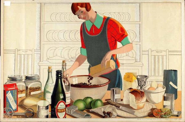
F C HArrison Christmas Empire Marketing Board Poster

I wonder whether the British housewife was more likely to buy Empire raisins if they were advertised next to other products, or if they were lauded on those fantastic long displays?  And I wonder if the EMB ever did the research to find out?

The other interesting nugget is the provenance of the collection itself.  It seems the Manchester City Art Gallery collected them as part of an embryonic ‘Industrial Art Collection’, but this idea was short-lived, the posters disappeared into storage and were only rediscovered in the 1990s.  I’d love to know what, if anything else, was part of that collection.

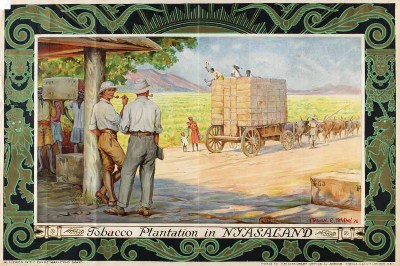
But beyond this, I have a problem with the book, and it’s not just caused by the layout.  The Empire Marketing Board collection is a very difficult one because Empire is a disputed subject, and because some of the posters can only be seen as racist (for a fuller discussion of the issues, see here).

Frank pape Smoke Empire Tobaco

And as a state-funded museum in a multi-cultural city, Manchester City Art Gallery undoubtedly finds itself in a tricky position.  All of which I completely understand.  Unfortunately here all of this contemporary background seems to be getting in the way of the analysis.

Because this is a book in which Melanie Horton does everything except look at the posters themselves.  It divides into two halves, an explanation of the workings of the Empire Marketing Board, and then a very brief scamper through the different themes of the campaigns.  But at no stage does the text ever actually refer to an individual poster, what it shows or how it was designed and what this might have meant then, as well as what it means now.  The ideology that the Empire is bad and therefore all of these posters are morally contaminated comes first and foremost, regardless of the posters themselves. Indeed in places, her argument is rather undermined by the illustrations.  Asking whether the imagery of the posters was representative of the British people as a whole, she says,

They flattered their implied consumers by representing them as stylish, active and independent…

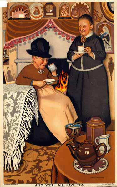
On the opposite page is this, And We’ll All Have Tea, by Keith Henderson

Keith Henderson And We'll All Have Tea

This sense that the posters are not doing what she wants them to do comes to a head in her conclusion.

The posters gave no space to anti-colonial criticism or to any other inconvenient truths that  may have detracted from their message.  Neither do they reflect the conflict and tension that had already come to characterise many parts of Enpire.

This is a bit like complaining that Shell posters don’t mention pollution, or that World War Two posters fail to give adequate space to the Nazi point of view.  They’re advertising, propaganda; it’s what they do.  To expect them to do anything else is absurd, and not a point of view that makes for very good history.

How visual culture like posters and other graphic design is studied is an interesting and unresolved question (there’s an interesting debate over at Design Observer right now).  But however we do it, surely we have to look at the objects themselves.  If we are only able to view them through the lens of our current perspectives, we’re not going to end up seeing very much at all.