What is the range of activity of the commercial artist in Britain?

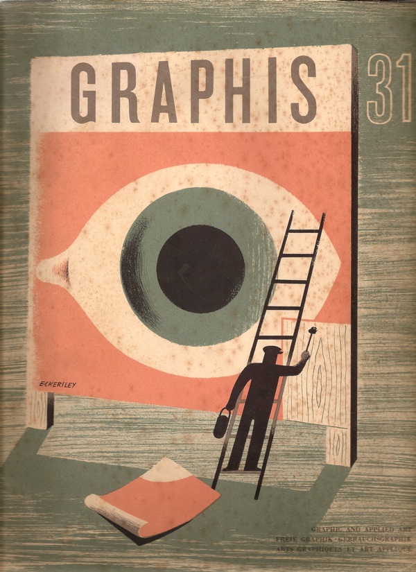
That’s what this copy of Graphis is asking in 1950. (And yes, the cover is by Tom Eckersley).

Cover of Graphis 31 1950 Tom Eckersley cover

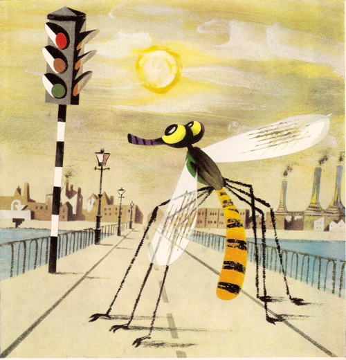
Unfortunately for us, most of the answers are in black and white, apart from this design for Kia-ora by Lewitt-Him.

Lewitt Him Kiaora advertisrement 1950

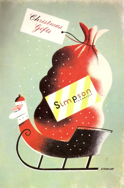
And this Christmas advertisement for Simpsons of Piccadilly.

Simpsons of Piccadilly advertisement 1950

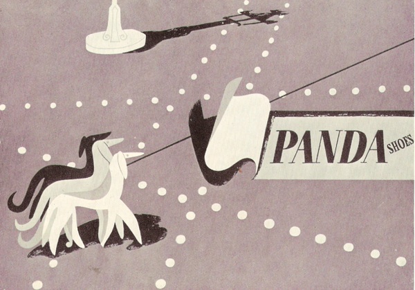
I think there may have been some more at some point, but my copy seems to have a page missing.  By way of compensation, I’ll try and find colour versions of the posters and illustrations they’ve reproduced where I can.  Still, it’s worth putting up with the black and white because there is some wonderful stuff included in their survey of British design.  I would like this Lewitt-Him showcard whatever colour it turned out to be.

Lewitt Him panda showcard from Graphis

Oddly, one of the things that makes this article particularly interesting is the small print.  Each image is credit twice, once to the artist and/or illustrator and once to the advertising agency which commissioned it.  Which means that, for a change, it’s possible to see how posters and advertisments came into being.

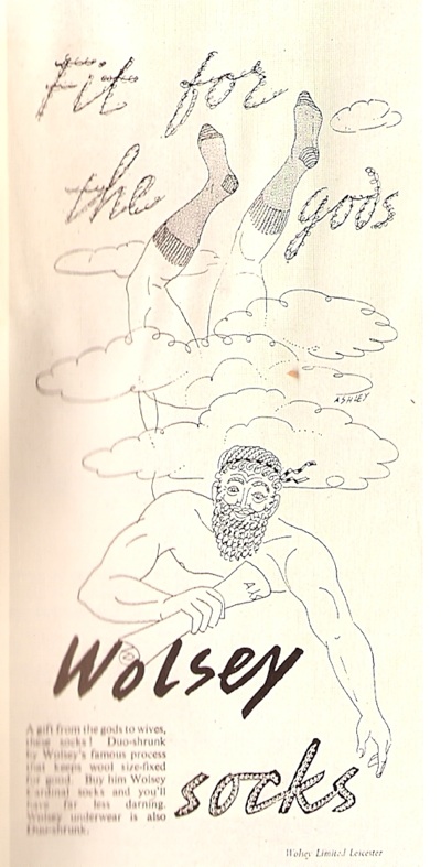
Let’s take Crawfords, for example (I would happily take almost anything from Crawfords’ considerable output if anyone is offering).  Their art director was Ashley Havinden, who did produce some of the illustrations for his own press advertisements.

Design for Wolsey advertisement, illustration by Ashley Havinden

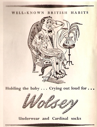
Even within a single campaign, more than one artist might be used though; so this cartoon is by John Parsons.

Wolsey advertisement illustration by John Parsons

(Apologies for the wobbliness of the scans, but I don’t want to damage the magazine.)

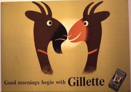
At the same time, Havinden was also commissioning entire campaigns from other designers, like Tom Eckersley’s work for Gillette.

Tom Eckersley vintage poster Gillette goat 1950

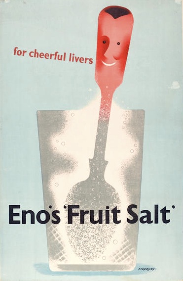
As well as Eno’s Fruit salts, which was also produced by Crawfords.  A different format of this advertisement is reproduced in Graphis;  the French caption provides the extra explanation that Enos is ‘un digestif’.  I think, if forced to make a choice between some French pastis and a glass of Enos, the pastis would win every time.

Tom Eckersley Enos Fruit salts ad 1950


These double attributions of the advertisements, thougb, are a useful reminder that designers of the period were not artists, producing whatever they liked, but were working within a very commercial framework, receiving commissions from people they knew, often, I imagine, to quite a tight brief.  This is something that can get forgotten as we collect and admire posters today; increasingly they become detached from their original purpose and seen as artworks rather than functional pieces of design.  But that’s not how they were originally produced at all.

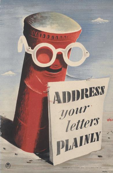
This is a point also made, in a slightly different way, in the essay which goes with these illustrations.  The author, Charles Rosner, thinks that the standard of posters and other commercial art has declined considerably since the war. The only high points are provided by what he calls ‘the cultural and social activities in advertising’, by which he means commissions from the BBC, London Transport, the Arts Council and the GPO.  By which he is also implying designs which aren’t contaminated by the need to sell things.

it's a wartime poster by hans schleger and we've got one too

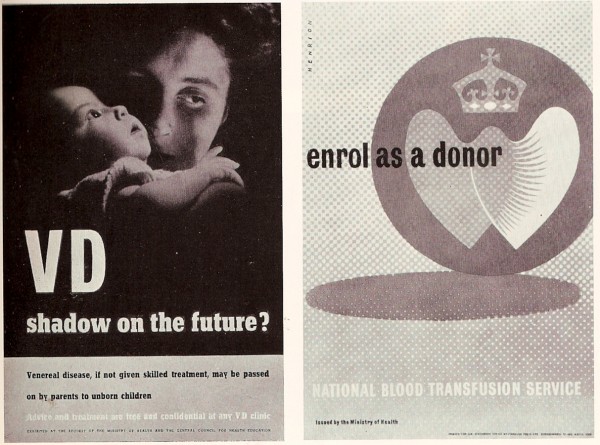
But were these high-minded designs really better?  From this distance it’s hard to say for sure because so little British commercial advertising survives.  But take this page of F H K Henrion’s work.  The poster designs for the government health campaigns are more in the international modernist style with which I tend to associate him.

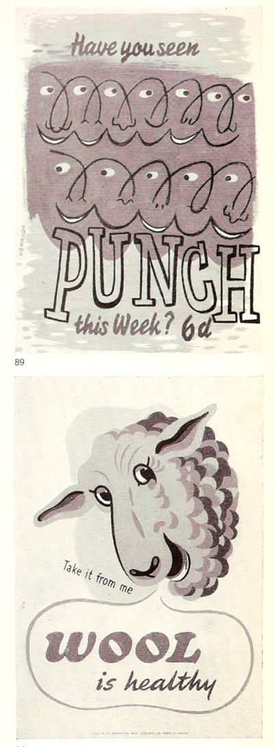
This wasn’t all he could produce though.   Take these fine fish for example.

(I’m rather fond of the sheep too, which is why it’s here, even though it’s not actually by Henrion).

On the opposite page are also a couple of his better-known designs for Punch.

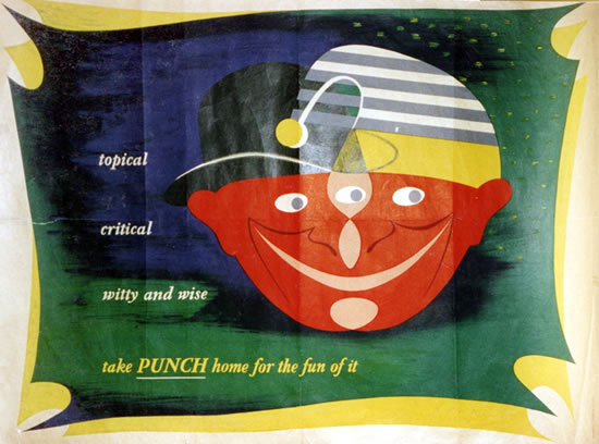
a punch poster by henrion

But which of these are better?  Public information edges or Punch decorative? I find it hard to say, but then my pro-modernist bias probably isn’t as strong as some people’s.  What do you lot reckon?

The text makes an interesting point about posters as well.  Remember, this is 1950, and television advertising hasn’t been imagined yet, but posters are already seen as being in decline, and for reasons I’ve never seen put before.

 Posters are victims of the great speed of modern traffic, congestion of town streets, squeezing out of hoardings from town centres to areas with less appeal in publicity value, and town and country planning regulations, with only vague definitions of the places where hoardings are still allowed to stand.

So the golden age of the poster was partly caused by the fact that people were moving slowly enough to look at them.  Now there’s a thought.

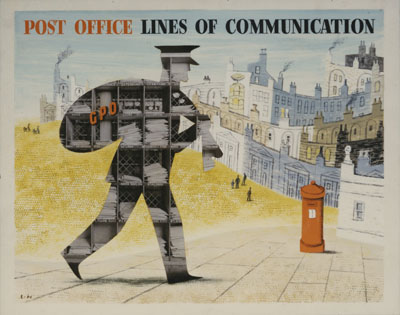
But the article isn’t all about answers, it’s also made me ponder a couple of questions too.  This post is going on a bit, so I’ll return to them in the next few days.  For now you can just have this rather wonderful Lewitt-Him artwork as a clue about the first.  It is illustrated in Graphis, but if anyone has sighted it anywhere else other than the GPO archive, I’d like to hear from you.

GPO vintage Poster lewitt him lines of communication 1950

Advanced or gimmicky?

It’s a bit unfair to apply too much hindsight to other people’s critical judgements.  Classics are sometimes not spotted as such at the time, while designs that are feted often don’t stand the test of time.

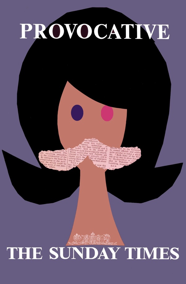
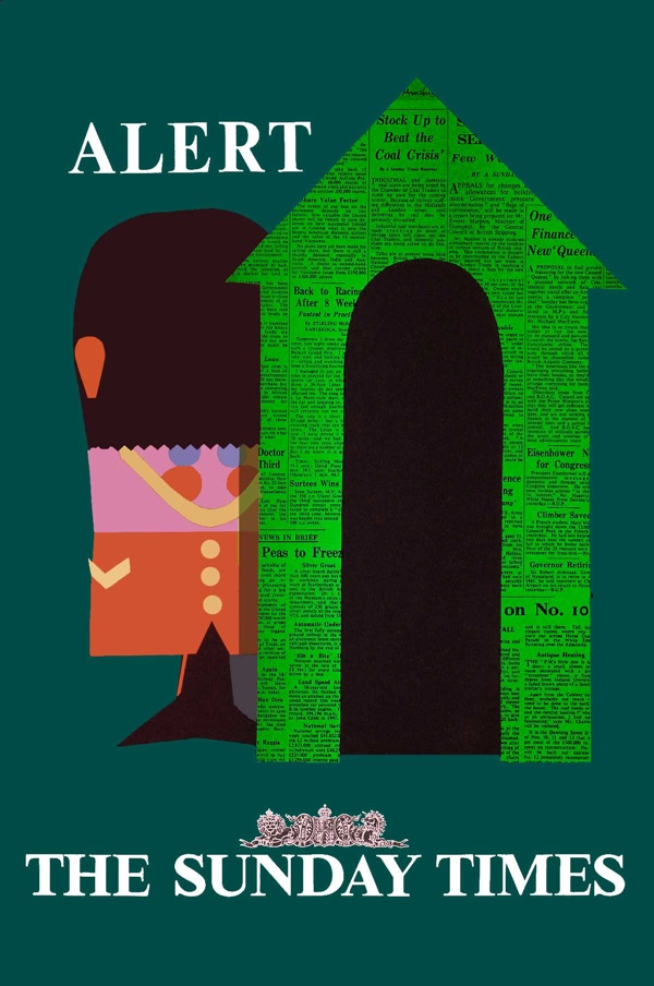
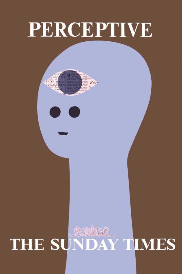
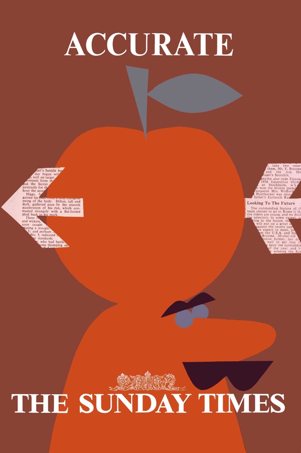
But in the case of posters, it’s so rare to get any kind of contemporary reaction to them that I really can’t resist.  The posters in question are Patrick Tilley’s series for the Sunday Times from 1960, of which this is possibly the most famous.

Patrick Tilley provocative Sunday Times poster 1960

Now I’ve mentioned them on Quad Royal a few times before (here and here for example) and every time I have, the posters have been enormously popular.  As is only right, because they are great bits of design, especially considering how early they were produced.

Alert Patrick Tilley sunday times vintage poster 1960

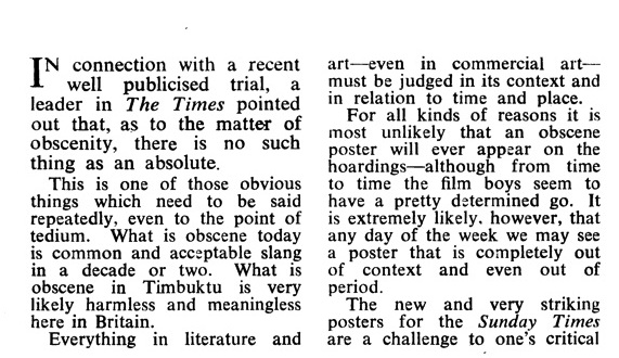
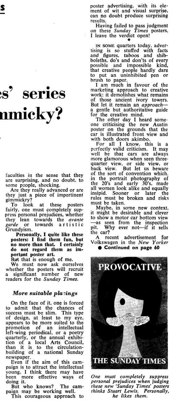
But at the time, the reaction was a bit more snitty.  The critic, one Stuart Lewis writing in Advertisers’ Weekly, is fairly certain about that.

I certainly do not regard them as important poster art.

He also doesn’t think they’ll sell the product, because the style is ‘more suited to the promotion of an intellectual left-wing periodical, or a poetry quarterly’ than a national newspaper.  Although, in the end, he is generous enough to leave the verdict open.

Sunday times vintage poster patrick tilley 1960

I don’t know whether they sold newspapers or not, but I think the jury would be finding pretty emphatically in favour of the posters these days.  They certainly wouldn’t find them shocking, as the article suggests that people did at the time.  (I’ve put the complete review at the bottom, if you want to read the whole thing for yourself.)  I find it pretty hard to be shocked by any of the series of posters, but that’s one reason why it’s good to come across articles like this now and then.  Because the way we see posters, and indeed any other kind of design now, may not be anything like the way they were perceived at the time.  Which has to be borne in mind if we want to read anything into them.

Accurate sunday times poster patrick tilley 1960

A couple of extra points by way of an addendum.  Firstly, the perceptive poster was quite comprehensively plagiarised a few years ago for Modest Mouse (evidence here if you want to see) and so I suppose must be a design classic.  Also, if you were wondering how these posters look quite so neat and tidy (and indeed digital) despite being more than fifty years old, Patrick Tilley cleaned up the scans and adjusted the colours himself.  So this is what they would have looked like if they’d been made now.

And now over to Mr Lewis.

Tilley review part 1

review part 2

Don’t mention (all of) the war

Back in my student days, now rather some time ago, I was sent to chaperone some Belgian friends of the family when they made a short visit to London, to assist with the language and the mysteries of the London Underground. There are three things that I remember clearly from this trip: a meal out at an Aberdeen Steakhouse (an experience I have never found it necessary to repeat), seeing what was apparently ‘the last bomb site in the City of London’ on a guided tour, and taking them to the Imperial War Museum. From the last I brought back souvenirs, postcards of World War Two posters.
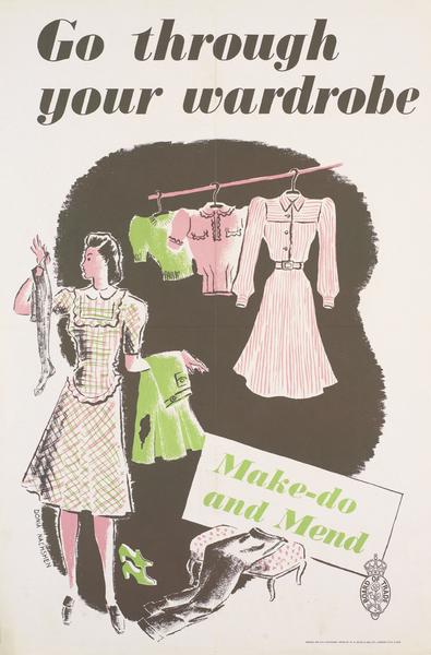
Vintage World War Two Make do and Mend poster c1943

This has to have been one of the experiences which turned me into a poster collector, although at the time I had no idea that such a thing was even possible. I just bought the postcards and stuck them on the wardrobe door in my student rooms.
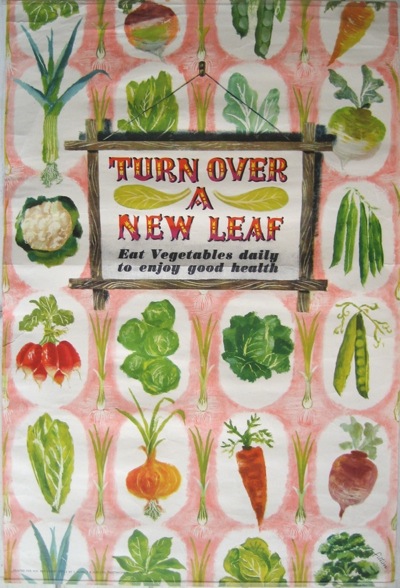
James Fitton Turn Over A New Leaf vintage world war two posters

I have said this before, but it is very satisfying to now have a genuine copy of the James Fitton hanging on the wall when it was one of the ones which I had picked out as a postcard.

But this isn’t just an anecdote about one of the ways in which I discovered posters, I remembered it because I’ve been thinking about how World War posters are used.  Both then and now, it seems that we only want to see in them a highly selective version of the Home Front experience. This is something I say about poster history often enough, but I do find these choices and omissions particularly revealing.  There were a huge number of posters produced during the war, and so the relatively few we pick out end up telling us as much about ourselves and our present day anxieties as it does about the war.  After all, why would we need propaganda anyway these days?
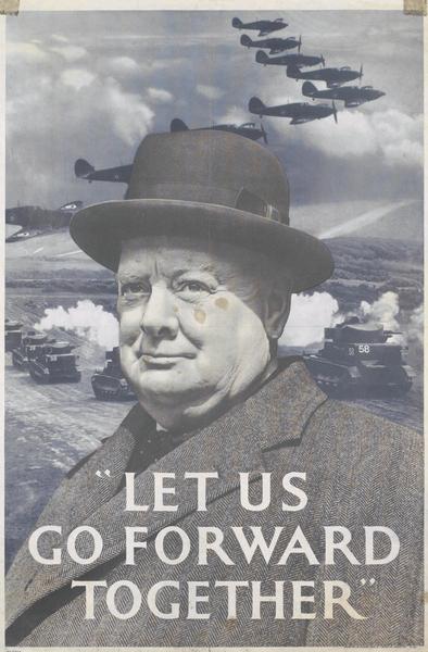
Churchill speech vintage world war two propaganda poster

That there is a ‘myth’ around this era, a vision of World War Two as the high point of the British nation when everyone pulled together selflessly and class-consciousness disappeared in the heat of the battle, is not a new idea. It was first expounded by Angus Calder in The Myth Of The Blitz in 1991 and is now an established part of historical thinking about the period.

Myths don’t arise just by accident, though, they always have their uses. Calder, in his preface, is completely open about why he wants to question the established story of Britain during the War,

My anger, firstly over the sentimentalisation of 1940 by Labour apologists, then over the abuse of ‘Churchillism’ by Mrs Thatcher during the Falklands War, led me to seek, every which way, to undermine the possibility of the mythical narrative.

Even though Calder exposed its mechanics, the myth has refused to disappear. The darkest days of World War Two still represent an apotheosis of Britishness, and one of the ways by which we maintain this idea is through the Home Front posters that we choose to like.

People certainly do like them. Not only do they fetch increasingly high sums at auction when they appear, but a single Home Front poster, Keep Calm and Carry On, has become the Athena poster for the start of the twenty-first century, reproduced, parodied, everywhere. So why do we want to keep repeating these stories, and what use are they to us now?
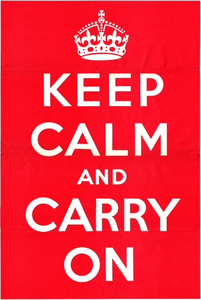
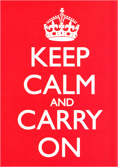
Keep calm and Carry on original image 1939 not the reworking

The core belief is the same as it was when Calder described it:

a myth of British or English moral pre-eminence, buttressed by British unity.

This is still the ideal which has singlehandedly sold almost every copy of Keep Calm and Carry On. But there is not just pride in our achievements here, behind it also lurks anxiety. We wouldn’t need to keep reminding ourselves that Britain was once great if that was still indisputably true. The fear is now that we may be a second-tier nation, dependent on others; perhaps also we are afraid that we have lost our traditional grace under pressure. Perhaps, even, we are afraid that if we were tested so severely again we might be defeated this time. And so we need to keep reassuring ourselves with the story of the war and how well we did.

These are thoughts which are not often articulated elsewhere in our culture. So the posters function like dreams, dragging thoughts up from our subconscious which are not quite safe to express in any other ways. Like dreams, they are visual more than verbal too, so we don’t have to put into words the ideas they express, which might force us to analyse these uncomfortable truths.

Behind other posters lurk other fears too. Still much-loved are those for the various kinds of salvage and austerity; we repeat the slogans and reprint the images.
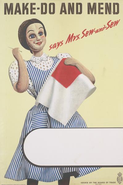
Mrs Sew and Sew Make do and mend vintage world war two propaganda poster

Some of these, particularly ‘Make Do and Mend’ weren’t in fact popular then – housewives felt that they were already doing as much as they could to reuse and repair and some of the tips were therefore a bit insulting. But they are popular now. Even as we buy more phones, more fast fashion and throw more food away, we also know that we consume too much and waste too much. Perhaps we would be better people if we did not, perhaps we might even be more British.
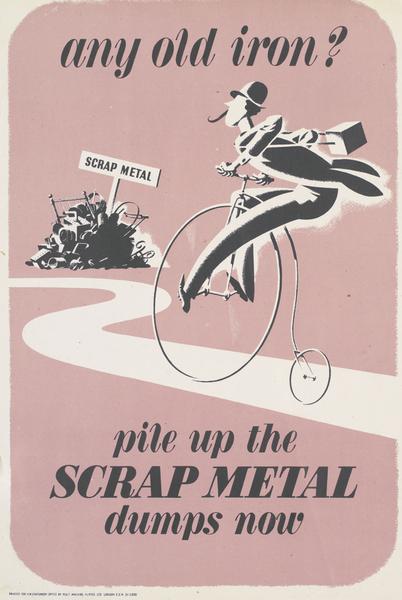
Any Old Iron salvage vintage world war two propaganda poster

The other really popular category are those about food, and in particular, growing your own.  It’s no surprise really that the ‘Dig for Victory’ posters are popular in an era where allotments are over-subscribed and the provenance and Britishness of food is becoming more important.
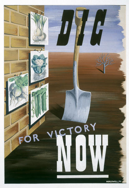
A E Halliwell vintage world war two poster Dig for Victory

Their message seems quite clear if we want to read it, that we are too dependent on the supermarkets, we don’t know where our food comes from, that self-sufficency has to be a good thing.
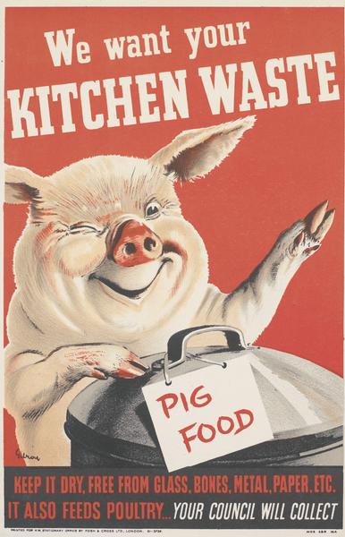
WW2 pig food vintage propaganda poster

But there’s also a deeper undertow at work here. One of the cores of Britishness is an identification with the land and the countryside (see David Matless and Patrick Wright if you want to read some much deeper thinking than mine on the subject). So there is also a fear that as we become more urban, more detatched from the land and its produce that we are losing sight of our essential selves. If we all had a spade and a piece of soil, might we also be better Britons too?
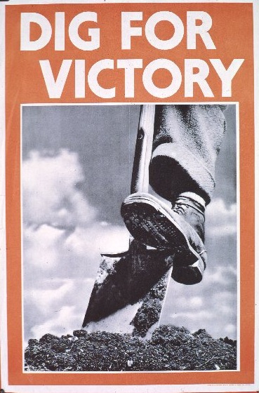
WW2 dig for victory vintage photographic propaganda poster

At this point you may be thinking, yes, well, this is all fine and good but isn’t it reading just a bit much into some old posters which people like because they are pretty and cheerful? Another way of making the point, though, is to look for the absences, the posters that we don’t tend to look at and remember.

A fascinating example of this came with the MoMA exhibition about kitchens earlier this year, which included a set of British Home Front posters by Henrion and the mysterious Herbert Tomlinson.  They don’t tend to get reproduced much in this country, even though they are on the perennially popular subject of food.
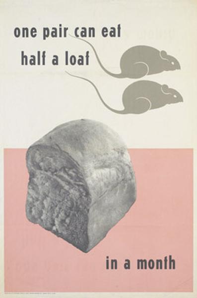
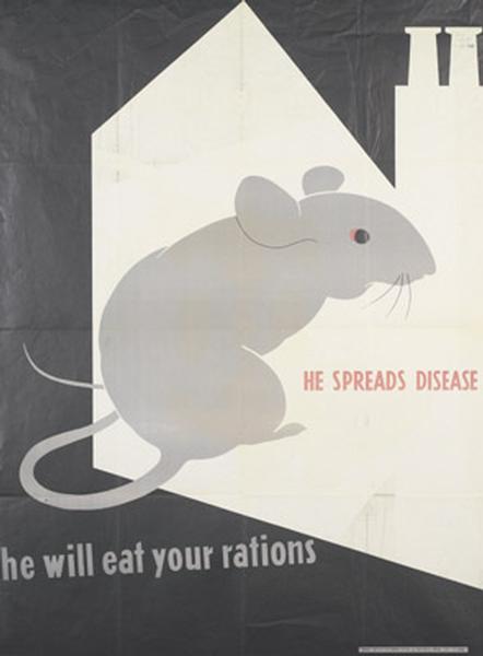
Anti vermin poster world war two home front propaganda Herbert Tomlinson

World war two anti vermin propaganda poster home front herbert tomlinson

MoMA has as its founding principle a wholly other myth, which is the inescapable rise and total superiority of International Modernism. These posters (unlike the vast majority of Britain’s wartime output) fit into that very nicely, so the museum has collected and displayed them. Over on the other side of the Atlantic, though, this is not how we want to remember the war, as a grubby fight against vermin in bomb-damaged homes.
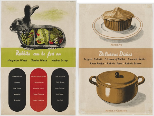
Two posters by Henrion telling you to turn nice fluffy rabbits into PIE

And we certainly don’t even want to think about eating rabbits which have, in the last seventy years, almost completely made the journey from food group to pet. So we have edited them out of the collective record (despite the fact that these are all in the IWM collections too).

The same might be said about posters informing people about VD. This design by Reginald Mount is a design classic, but that still doesn’t mean you’re likely to see it republished very much.
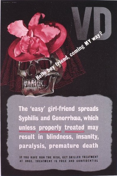
REginald Mount VD vintage world war two propaganda poster

Nor, indeed, this one, for slightly more complicated reasons. The lines are from G.K. Chesterton, the sentiment almost impossible to imagine nowadays.
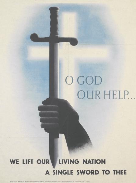
Early world war two vintage propaganda poster oddly indeed

A more subtle example is provided by this Zec poster, which is one of the ones I bought as postcards from the IWM all those years ago.
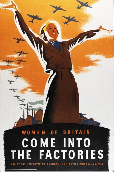
Zec women of Britain come into the factories vintage world war two home front propaganda poster

Then, it was very popular, but this was a time when feminism was more vocal and more active, campaigning for greater workplace equality for women rather than proposing pole-dancing as a form of liberation. So the war could and was represented as a time of emancipation for women when they could do any job they chose, including the dirty factory ones. Nowadays we believe, whether it is true or not, that this particular battle is over and women can do whatever they want; there is no anxiety there any more so we no longer need the poster to express our thoughts and it has sunk below the horizon once more. Its Sovietesque stylings may also have been its undoing too, now that there is little of the heroic to be found in Communism any more, not even for students.

Sometimes the myth requires that we ignore the evidence which is in front of our eyes.  One of the reasons that we want to remember the Home Front is the sense of collective effort, the idea that every single person’s attempts to salvage or save or grow some greens made a difference to the common cause.  It’s a satisfying idea, and not a belief which is easy to have today.

But at the time, the British self-image was very much one of individualism, in clear contrast to Germany, where the individual was subsumed into the masses of the Nazi state.  So if you look at these, and indeed almost any World War Two poster, what you will find time and again is a single person (or indeed elephant) doing their bit out of choice, not as part of a mass movement.

Eckersley Lombers green vegetables poster vintage world war two propaganda

Even in the case of the forces, where you might think that it was good to show that we did have plenty of man-power, the image is much more likely to be of a single ship than a whole marching platoon of men.  The poster below is perhaps one of the more populated ones that British propaganda ever produced.
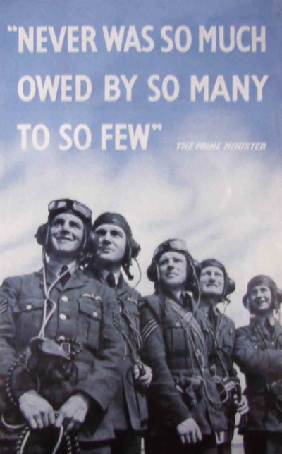
The Few Vintage world war two propaganda poster

But even then, the men are not only clearly represented as individual people, but also characterised as ‘The Few’.  However much we like the idea of the wartime social spirit, we’re never really going to find it in the posters.

A more complex example are the set of posters by Abram Games imagining post-war life in comparison with what had come before. They are (and I will come back to this aspect of Games’ work during the war another day) quite exceptional, in that generally British posters and propaganda avoided considering the world after the war had ended.
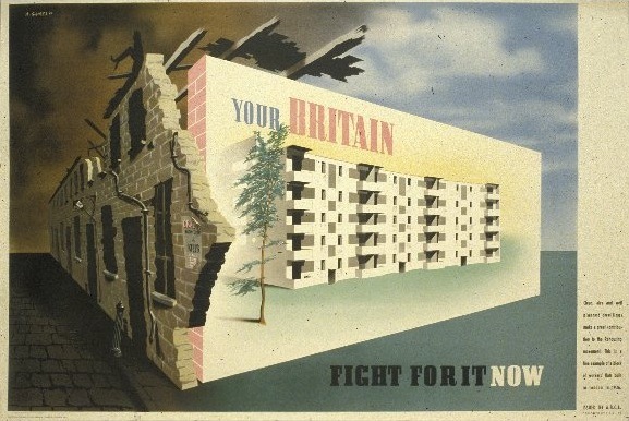
Vintage World War Two ABCA poster Abram Games your Britain fight for it now

The poster of Finsbury Health Centre below is particularly famous, mostly because Churchill very much took against it. He ordered the poster to be suppressed, complaining that it was a ‘disgraceful libel on the conditions prevailing in Great Britain before the war’.
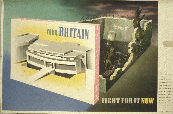
Abram Games abca Finsbury Health Centre rickets vintage ww2 poster

It could be argued that it was the controversy which made the poster’s mark on history. But other poster controversies during the war ended up forgotten; these posters are remembered because they have important resonances as well. For a long time World War Two has been seen as the crucible which dissolved class consciousness and lessened ingrained inequalities, an achievement which was an essential part of the myth. For Calder, this was one of its redeeming qualities.

…at least the Myth had fostered the notion of the mutual responsibility of all for the welfare of all.

But there are not many posters which reflected this ideal, so the few which do are particularly valuable.
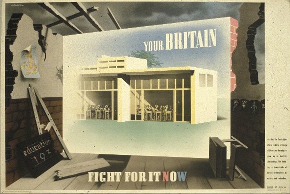
Vintage world war two poster ABCA Abram Games

Or at least they were. We live in a time when many of the egalitarian achievements of the post-war reconstruction – universally available higher education, council housing, a moral investment in state education and social care – are being undone, will these posters in their turn disappear from view? I hope not. Now more than ever we need the reminders that these values are still very much worth striving for.

(Almost all the images are from the Imperial War Museum collections on VADS).
What a Carry On

I’ve never written about the Keep Calm and Carry On poster on here until now, mainly because the internet is already thoroughly pock-marked with its image and the story done to death, so I was bored of the whole thing before this blog had even begun (and rather assumed that everyone else was too).  But I’ve been delving into the history of World War Two posters recently, and rather to my surprise have discovered that a whole chunk of its history – and to my mind the most interesting part – never gets told.

Here it is then, exhibit A, Keep Calm and Carry On.

Original layout of Keep Calm and Carry on vintage World War Two poster 1939

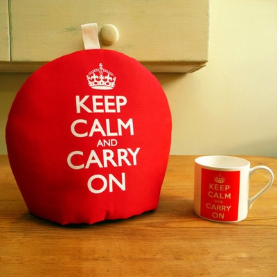
This is actually the original poster, as produced by the Ministry of Information in 1939.  Most of the copies that are around today, not only on posters but also on everything from soap to golf balls (does the world really need this, I am forced to ask) have in fact been reversioned from the original and thus look slightly different.

New reversioned Keep Calm and Carry On

And if you go and look on eBay (which I wouldn’t actually advise) you can find versions where the type has been bastardised even further from the original, but I don’t want to give these ones the oxygen of publicity.

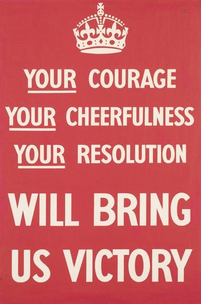
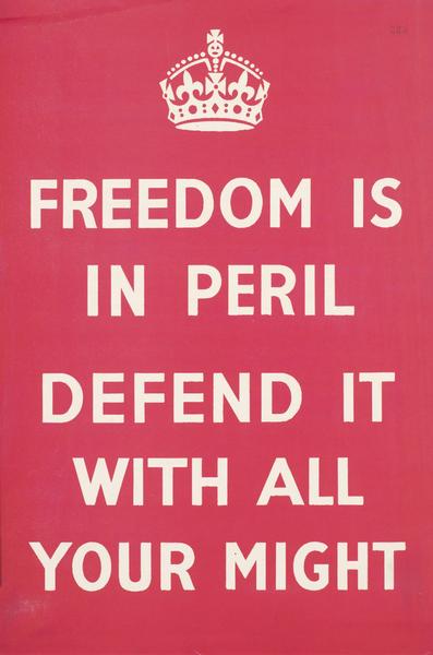
The backstory, as repeated all over the interweb in very similar terms, goes like this.  In 1939, with war looming, the Ministry of Information commissioned three posters with the aim of reassuring the British public when the inevitable came.  They were meant to be messages from the King to his people, and the three slogans were Your Courage, Your Cheerfulness, Your Resolution, Will Bring Us Victory, Freedom Is In Peril and, of course, Keep Calm and Carry On.  Hundreds of thousands were printed, and the first two were plastered all over the country in their hundreds and thousands as soon as war was declared.  But the third – Keep Calm –  was held back in the case of invasion.  This never came, and the poster was eventually pulped and forgotten.  Until in 2000 a single copy turned up in a box of books at Barter Books in Alnwick.  The owners framed it, and then were asked about it so much that they reprinted a few copies.  The rest I think you know.

Keep Calm and Carry On Teacosy

Now were I to be picky (which I’m going to be, because it’s fun) there are a couple of holes in this story.  To start with, the posters weren’t designed by the Ministry of Information, because that didn’t exist until the day after war was declared.  The government was in a tricky situation as war became inevitable.  Although they knew that propaganda would be a vital part of the war, particularly as they would be fighting an enemy with a slick and established propaganda machine of its own, they were equally aware that any Ministry of Information would be very unpopular with the public.  So the plans for the MoI were set up in complete secrecy, and the posters were commissioned by the Home Publicity Committee of a department which didn’t actually exist yet.

What’s more, Keep Calm and Carry On wasn’t designed in case of invasion – when it was commissioned the Germans were hundreds of miles across Europe, and few people imagined that they would be on the coast of the English Channel at any point in the future.  What they did predict was that the start of the war would lead to a massive bombing campaign that would destabilise the country and shatter national morale.  That’s why people would need to Keep Calm and Carry On, and that’s the real story behind this poster – and why it was never used.

Because although people know that Keep Calm and Carry On was created as part of a campaign of posters, what is never said (and I find it intriguing that it isn’t) is that this was a massive and thundering turkey of a failure.  The two posters which were displayed – Your Courage and Freedom Is In Peril – were ridiculed by the press, criticised in the House of Commons and mostly disregarded by the public on the ground that they didn’t really know what they were meant to do.  All of which makes Keep Calm’s success, fifty years on, even more remarkable.

Your Courage original failed world war two propaganda poster 1939

So what was wrong with these posters ?  Most of the criticism was of the Your Courage slogan, which people didn’t really understand (one complaint being that most people associated resolutions only with the New Year) and which wasn’t catchy enough to be memorable.  More worryingly, some people (like Mass Observation) saw the idea that Your Courage would bring Us Victory meant that the general mass of the people would be making a sacrifice on behalf of the upper classes, who would reap the real benefits.  This evoked memories of the last war, where many people felt that ordinary soldiers had suffered while the generals had got off scot free, which wasn’t a particularly good set of associations to be revisiting at the start of another conflict.

One of the other facts about these posters which is often repeated is that the phrase Your Courage was thought up by a career civil servant called Sydney Waterfield.  The implied story here is that the poster was the creation of exactly what people had perceived in the slogan, an out of touch ruling class who had no idea what ordinary British people thought or felt (with the further implication that one of the good results of World War Two was that, as a democratising force, it put a stop to This Kind of Posh Thing).  There is a grain of truth in all this, as the MoI floundered for a couple of years before it began to work well and at one point, amusingly, its Home Publicity was co-ordinated by Kenneth Clark, director of the National Gallery and Harold Nicholson, husband of Vita Sackville-West.  It’s hard to imagine two people further removed from ordinary life.  But in the case of  Your Courage, it may have been thought up by a civil servant, but it had also been approved by a committee which included representatives from two of the big advertising agencies of the time, S H Benson and Odhams, so someone should probably have known better.

Freedom is in Peril original world war two propaganda poster 1939

But that’s applying hindsight to the problem, because the real flaw with the posters was that they were designed for a situation which never actually happened.   Almost all the planning for World War Two worked from one key assumption, which was that the start of war would immediately lead to wave after wave of bombing hitting the United Kingdom.  This would not only cause destruction and casualties on a massive scale, but also hysteria and panic in the general public.  Planners worked on the assumption that for every physical injury there would be three psychiatric cases, leading to three or four million cases in the first six months of the war.  But when war was declared, the bombers never came.  (Nor, as it turned out did the neurosis; in fact psychiatric admissions actually decreased during the Blitz).  So the posters were designed to soothe the shattered nerves of a terrified population.  Unfortunately, when they were displayed in the calm of the Phoney War, they just ended up looking a bit silly.

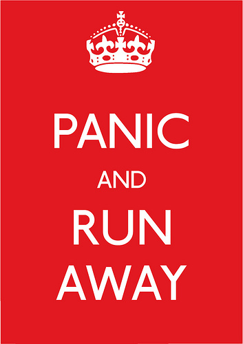
So Keep Calm and Carry On is not, as I’ve seen it described, “an inspiring poster which speaks to us across the ages”; instead it’s the forgotten remnant of a rather spectacular failure, a failure of planning, of understanding, but mainly just a failure caused by events.  Although its modern success has lead to some versions which inadvertently bring up that history.

Panic and run away version

I think that’s a much more interesting story than the anodyne set of facts which tends to be repeated on the internet.  What’s more there is no reason why the story shouldn’t be told – almost all the histories reference Dr Bex Lewis’s thorough thesis on World War Two posters, which contains pretty much all of the information I’ve put in up there (and plenty more besides, including a blog of all of the misguided uses to which it has subsequently been put).  So why don’t people want to tell this story?  I wonder whether, just as there is a myth of the Blitz, which is that everyone kept calm and carried on, there is also a myth of the Home Front Poster, which is that they were all uplifting and inspiring from the very start, and so people were always uplifted and inspired rather than bored and cross and irritated with them (as they were).  And we wouldn’t want the facts to get in the way of that.

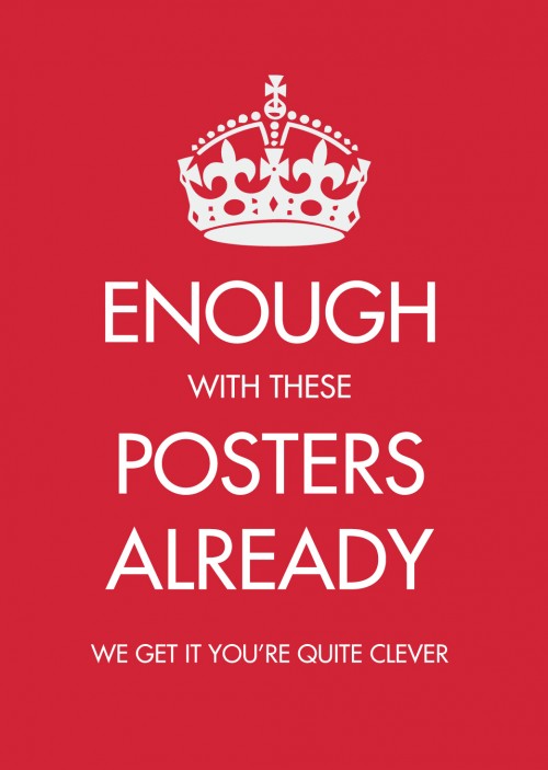
Keep calm parody

Hoarding

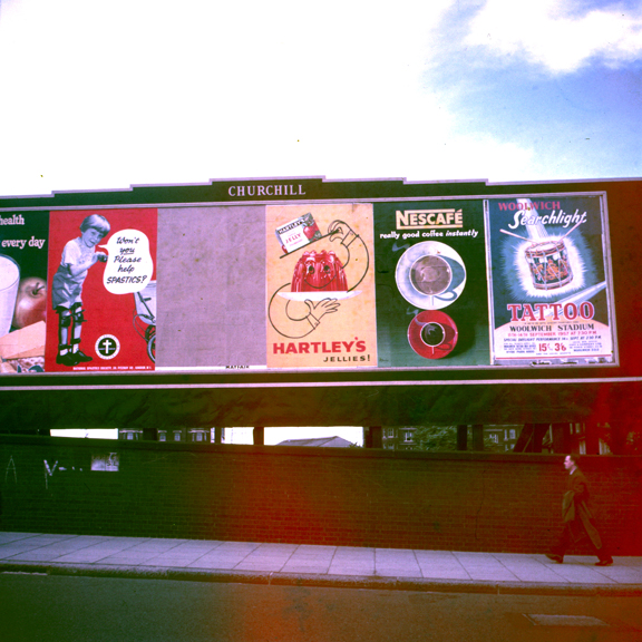
Today, a very unusual sight.  Yet it’s one that shouldn’t be a rarity at all, because it’s posters doing what they are intended to do, advertising things.  Here on hoardings sometime in the mid 1950s.

Advertising hoarding c1955/6 with several ads on it including Patrick Tilley

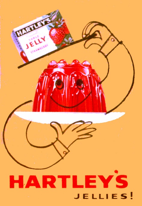
Mostly, this is such an everyday scene that no one takes any notice, never mind a photograph.  But this time, an up and coming poster designer was recording some of his work appearing.  That designer was Patrick Tilley, and he’d designed the Hartley’s Jelly ad in the centre.

Patrick Tilley Hartleys Jelly poster 1950s

I can’t tell you how excited I am to see these.  It’s not just that Tilley’s posters are lovely, these photos are also a great chance to see posters in the wild, rather than collected and curated and hung on people’s walls.  Which means we can find out a bit more about how they really functioned at the time.  Take this set.

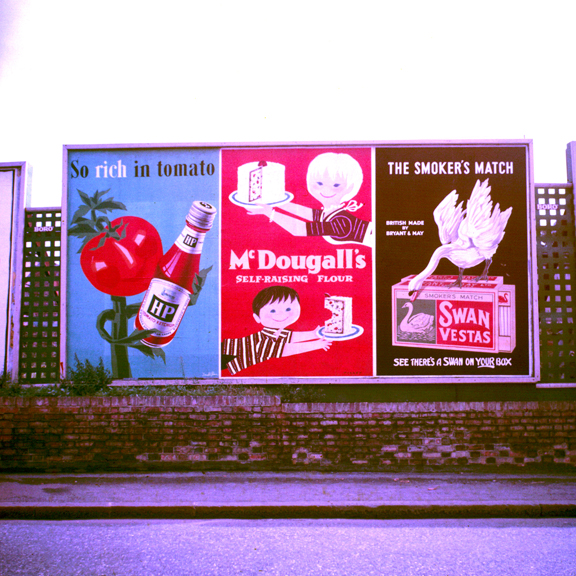
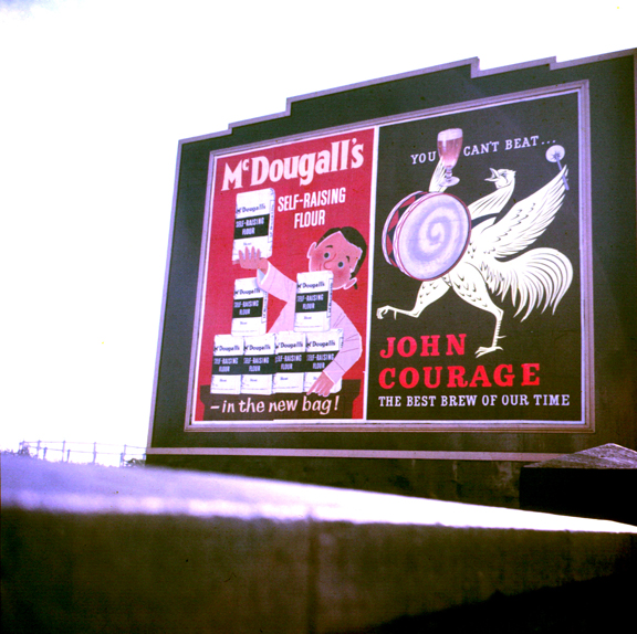
More Posters on Walls including Patrick Tilley and Donald Brun

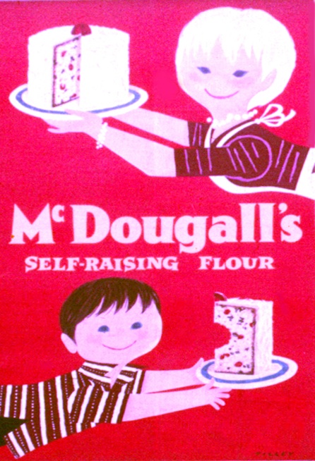
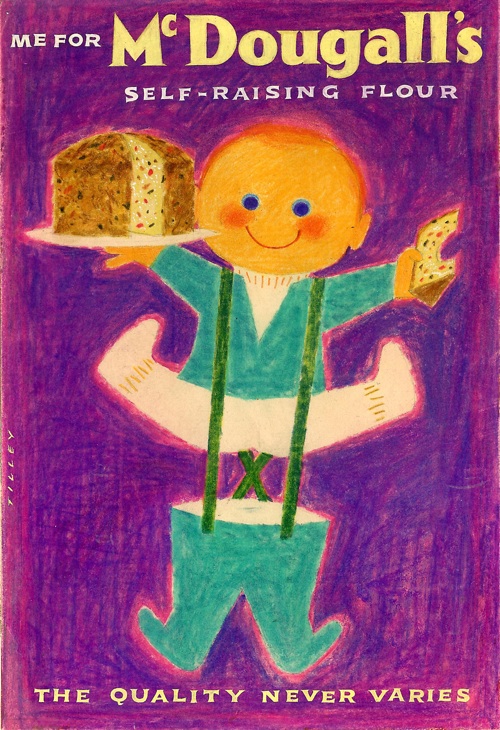
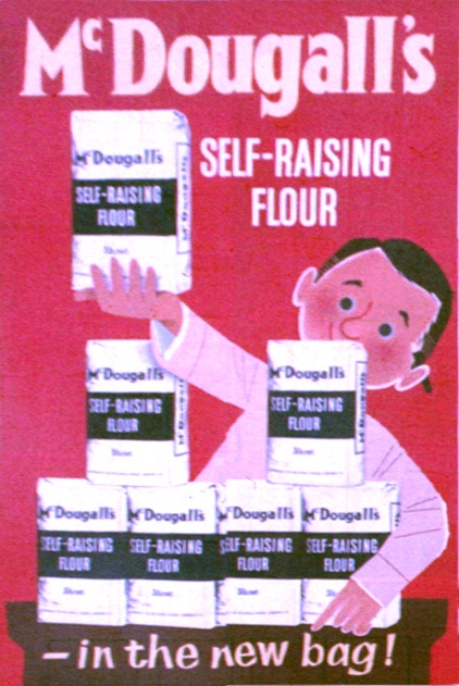
The Patrick Tilley design is for MacDougalls flour.

Patrick Tilley vintage poster McDougall's self raising flour 1950s

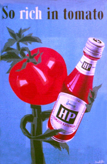
But take a look to the left. The HP Ketchup poster seems to have been signed by Donald Brun.

HP Tomato Ketchup poster Donald Brun 1950s vintage

I sort of half knew that some of the great European poster artists of the 1950s had worked in Britain, and had come across it happening here and there.  But it’s still odd to see their work on a British poster hoarding, advertising a very British brand.  And the image seems vaguely familiar, but I can’t trace it anywhere.  Because that’s the other thing about these posters, they’re also very rare.

Patrick Tilley McDougalls flour advertising poster on hoarding 1950s

Unlike in Europe, Britain’s commercial posters were never (with the exception of Guinness) made available to the public or collected.  So it’s not even that only a few survive, probably most of these posters have disappeared entirely.  They might be in the archives of the company they’re advertising or the agency that created them; they may even have been recorded in a magazine or design annual.  But I’d be prepared to bet that a fair proportion of these posters have disappeared without trace, or at least would have done without these photos.

Mostly, it seems, it’s the artists that keep the records (as was the case with Daphne Padden’s packaging designs).  Patrick Tilley kept not only these photographs, but also the original artwork that he presented to the agency, The London Press Exchange, to get the commission.

Patrick Tilley MacDougal flour design pitch

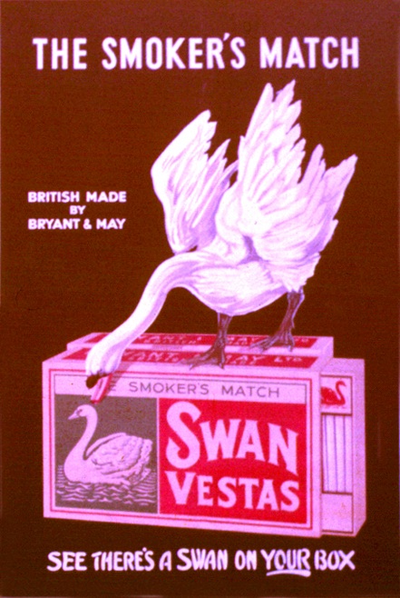
But not everything is sweetness, light and good design on the hoardings.  Once again, the photographs are a reminder that, along with the award-winning posters by great designers that we choose to remember, there was also quite a lot of dross too.  Like the tattoo and charity adverts in the first photograph, or that for Swan Vestas next to the McDougalls ad.

Swan vestas vintage billboard advertising poster from photograph

I mention this quite a lot, and in a way it’s an obvious truth, but the presence of all these rather average posters must have affected how people saw the good posters too, even if I’m not sure how.  Perhaps people got used to just tuning out posters, and so everything got ignored; or perhaps the good posters looked even better because they had a dull picture of a box of matches next to them.  I don’t know, I really don’t.

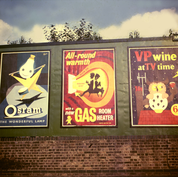
But the other reason that its important is that, by allowing only the good posters through our filter, we distort what they tell us about their times.  We will see only classy posters, probably for up-market products.  Which means that we’ll miss some things entirely.  Take a look at this set below.

Osram Gas VP wine posters on billboard 1950s

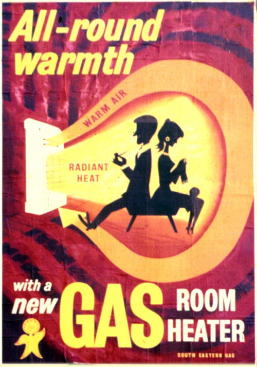
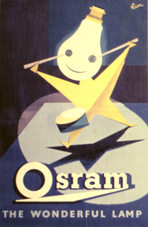
The Osram and Gas posters are both very good.

Patrick Tilley Gas poster 1950s

Vintage Osram hoarding poster

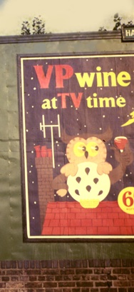
The top one is by Patrick Tilley, the Osram advertisement by ‘Rim’ which raises a whole set of other questions (if you can tell me who this is, I would love to know).  But it’s the one on the far right which intrigues me most.  It’s neither bad nor good, but take a closer look at what it’s advertising.

VP wine 1950s vintage advertisement

Drink fortified British Wine when you sit down in front of the television (tv being clearly a new and exciting innovation).  Now there’s a thought you’d never get from anywhere else.

Patrick Tilley vintage McDougalls advertisement 1950s

And thank you very much to Patrick Tilley for taking the photographs, and keeping them, as well as allowing me to use them here.

Hurrah

I’m not really here today because I’m off on a mission. But here’s something in the meantime.

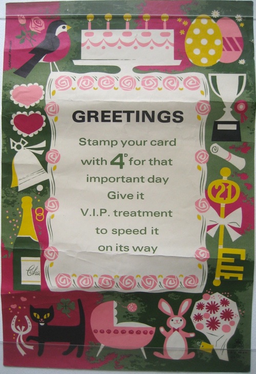
Daphne Padden greetings stamp 4d vintage GPO poster

It’s a little 10″ x 15″ GPO poster, by Daphne Padden, of course.

I’m hoping it’s going to be appropriate, because if all goes well today, I shall be returning with a further heap of Padden posters in the boot.  In which case we will be celebrating with black cats and champagne.  And pictures on here of course.