Posters on Parade

When I was trying to find some festive-looking posters the other day, my search, rather wonderfully, came up with this in the Science and Society picture library.

Poster wagon railway poster display for Blackpool carnival

We find ourselves at Blackpool station in 1925, and the cart is getting ready to take part in Blackpool Carnival.  Here’s what’s on display:

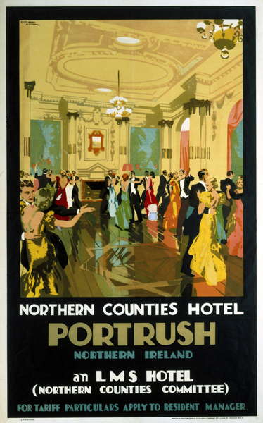
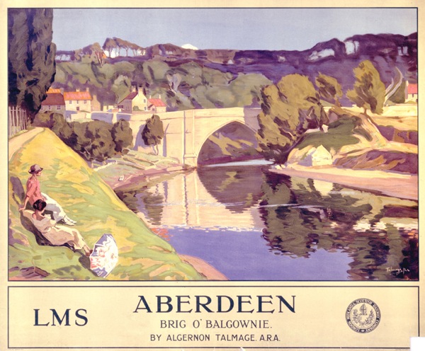
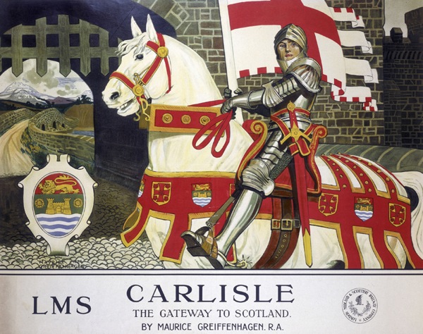
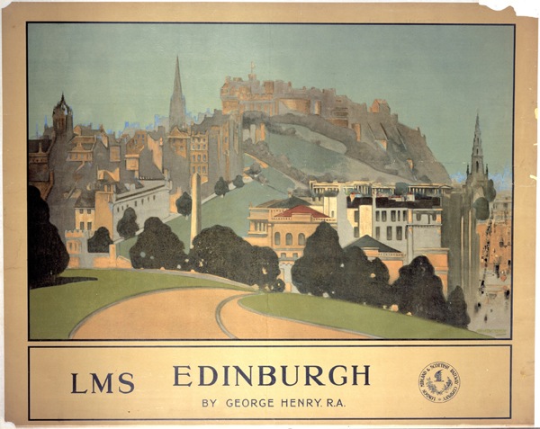
London, Midland & Scottish Railway display pulled by four horses. The display comprises railway posters designed by ‘eminent Royal Academy artists’: ‘Aberdeen’ by Algernon Mayow Talmage; ‘Carlisle’ by Maurice Greiffenhagen; ‘Edinburgh’ by George Henry; ‘The Peak District’ by Leonard Campbell Taylor; ‘The Night Mail’ by William Orpen; ‘Northern Ireland’ by Julius Olsson. The display is to be used in the Blackpool carnival.

This is clearly a fabulous thing simply for existing.  But it’s also interesting in that adds a new layer to how railway posters were shown – and therefore perceived – at the time.

'Aberdeen' by Algernon Mayow Talmage;LMS railway poster, 1924.

We’ve covered quite a bit of this ground on here before, mainly thanks to David Watt’s fine essay on Yorkshire railway posters, which I wrote about a while back.  He makes the point that railway posters are rather unusual because they are displayed at railway stations and so the viewer can assume that they are advertising rail travel, rather than just places.  So they don’t need to show trains or say ‘Travel By Rail’ and this makes them, in his words, semi-detatched from ‘mundane commercial purpose’.  As a result, these posters occupied a middle ground between fine art and the grubbiness of actually selling things.  (This status obviously has implications for modern day collecting of railway posters too, but that’s another thought for another day.)

'Carlisle: The Gateway to Scotland', LMS railway poster, 1924.Maurice Greiffenhagen

These particular designs are more explicit than most about this connection with fine art.  All of the posters on the wagon come from a set of sixteen commissioned by the LMS from Royal Academy artists; they are indeed fine art being displayed on a poster.

As such, they link up with another idea that has come up before, the sense of public bodies using artists and painters in particular for their posters as a form of social good.  I’ve discussed this before in the context of the GPO, Shell and London Transport posters.

The involvement of Shell shows that it wasn’t an attitude that was confined to state-own entities alone, and a similar ethos of public service seems to have been present in the railway companies before the war.  This wasn’t just confined to their publicity; the LNER kept open lines that were running at a loss because they felt that people needed access to them.   So these posters clearly fall into an established tradition of posters which are on the borderline between fine art and advertising, and which are produced, in part, because they are felt to be part of the railway companies’ duties to the wider society they serve.

What’s so interesting about the carnival cart above, though, is that is shows that the LMS had a slightly different attitude to the audience for these posters than I would have imagined – and it’s one that I find rather endearing.

'Edinburgh', LMS railway poster, 1924 George Henry

Until now I’ve always thought of these these posters being on display in stations, where passengers could inspect or ignore them at their will, or in occasional exhibitions (more on these here if you’re interested), where I would have imagined the audience was predominantly middle class.

But at Blackpool, the LMS is taking these posters out, which in itself shows a degree of pride that I wouldn’t have expected, but what’s more it’s taking them out in front of an audience which is probably not quite so genteel and alongside dancing girls, giant dogs and, er, people dressed up as food.

blackpool carnival procession no date

So the LMS is positioning the posters not as ‘high culture’ being foisted on the working classes from above, but very much as part of a thriving and quite varied popular culture.

There are a few other hints too, that this point of view might have prevailed.  This series of posters was one of the LMS’s best-sellers, with Carlisle a particular favourite.  But when I was looking to find the particular posters on display on the cart, I also found a reference to a colour print of William Orpen’s Night Mail.  There are no dimensions given, but I imagine that this would have been a much more affordable version than buying a copy of the original poster.  (And who did buy those? I would love to know.)

Dunluce Castle, Northern Ireland LMS railway poster, 1924 Julius Olsson

Perhaps we need to rethink what the fine art elements of railway posters meant at this time, and indeed later on when they were used by other companies in the same way.  We see something that was imposed on an ultimately indifferent population who were not interested in art, and this may indeed be how the original commissioners of the posters too.  But it’s possible that these images were enjoyed and taken up by a much wider variety of people than we, slightly snobbishly, tend to imagine.

Put Out More Flags

I was asked to help out earlier this week.  Could I find a few vintage posters to act as inspiration for a designer doing a poster for a retro tea-dance? Cakes, bunting, dancing, something nice and festive – it’s not that difficult to imagine the sort of thing. But that sort of thing turned out to be rather harder to find in reality.

If you go back to the 1930s, there was at least dancing, as in this Gordon Nicoll poster from 1932.

Gordon Nicoll Portrush hotel poster LMS 1932

As well as in this rather wonderful London Transport design by Clifford and Rosemary Ellis from 1936.

Come Out To Play London Transport poster Clifford Rosemary Ellis 1936

There’s some glamourous going out in a couple more posters, as in this 1925 Fortunino Matania poster for Southport (on sale once more at Onslows this afternoon if you have a few thousand pounds to spare).

'Southport, For a Holiday In Wintertime, LMS poster, 1925.Fortunino Matania

Which was available in London as well as Southport, it seems.

BRightest London Horace Taylor 1924 London Transport poster

Horace Taylor, 1924, since you ask.

But of cakes and bunting, or indeed anything remotely relevant from the 1950s, not a sniff.  The closest I could get was this.

Kraber Tea on the lawn at Alexandra Palace London Transport poster 1939

Which isn’t really what I was after.  Somewhere – and I have lost it and would love to see it again if anyone can help – there is also a 1950s poster of a husband bringing a tray of tea to his family on the beach.  But even that isn’t really doing what my friend wanted the posters to do.

What’s happening here is something that I’ve mentioned time and again on this blog, the bending of visual memory.  Today, we want to see the 1950s in terms of tea, dancing and bunting, and so that is how we expect them to depict themselves as well.  Except they won’t oblige, mainly because they are too busy building a modern, post-war future – as encapsulated in Nick Morgan’s prize winning poster from last week.

Vintage post office savings bank poster eric fraser 1953 genius

No sign of Coronation bunting here, oh no.  Not when there’s history to be made instead.

In this respect, bunting, vintage bunting, retro bunting on posters for tea dances work in much the same way as our reusing of wartime posters (full post on that subject here).  The meanings tell us far more about ourselves and our worries about the world than they will ever reveal about the past.

Back in the 1950s, bunting was something that you got out for your village fete or Coronation street party, and then put away again.

Newcastle Coronation Street party with bunting 1953

It definitely meant festive, and so appeared in people’s imaginings of the Festival of Britain.

Festival of Britain artists impression from FoB catalogue

Although interestingly it was nothing like as prominent in the actual event.

Bunting outside Royal Festival Hall Festival of Britain

Bunting on the South Bank

Although, of course, every single article about the South Bank anniversary last year had to make mention of getting out the bunting nonetheless.

You can also find a small string of the stuff on the cover of the Battersea Pleasure Gardens brochure too.  Again it’s operating as a sign here: this is not normal life but a carnival.  We are going to have fun.

Festival of Britain battersea pleasure gardens front cover

Bunting in the 1950s was just an everyday object that you got out for the jollities and then put back in the cupboard, nothing worth making a fuss about.  Certainly not worth putting on posters.

Nowadays though, bunting is not just a thing, but a cultural phenomenon, as even the briefest of Google image searches will reveal.

Google search for bunting

It represents, amongst many other things*, a desire to return to a more simple life of making our own entertainments.  A life which had so few visual stimuli that we were pleased with bunting.  A sense of community too.  This is all well and good – and indeed perfect for a nostalgic tea dance.  I don’t have any problems with that.  Just as long as we stop expecting to find it having the same meanings in the 1950s too.


*Bunting does become more problematic when you look at it through the lens of Thorsten Veblen and conspicuous consumption.  Bunting isn’t only the fetishisation of an utterly unnecessary object to prove that you have money to spend, it’s also a signifier of conspicuous leisure, because if you’ve got time to shop for, stitch or even worry about bunting, you do have a fair amount of spare time on your hands.  I preferred the stuff in its 1950s incarnation, I think.


This is not a poster

Or is it?

Chris Ofili Olympic poster 2012 London for the unknown runner

It certainly claims to be a poster, as one of the set commissioned for the 2012 Olympics, in this case designed by Chris Ofili.

Rather against my will, I have to consider these on an almost daily basis, because a selection are on display in a shop window just a couple of hundred yards from our house.  Mr Crownfolio says that he’s quite enjoying them;  I’m less sure.  Here’s Michael Craig Martin’s offering, which I like a bit more but isn’t there.

Michael Craig Martin Olympic 2012 poster Go

The thing is, I’m wrestling with the idea of them being posters.  Here’s the 1948 Olumpic poster, designed by Walter Herz, which is a very different beast.

London Olympics poster 1948 Walter Herz

As is London Transport’s only Olympic offering from that year.

London Transport 1948 Olympics poster

They’ve been created by designers, not artists.  They’re big and informational and no one wanted you to frame them.  So what’s happened in between?

The way that the meaning of the word ‘poster’ has changed over the last sixty or so years was pointed out by the Catherine Flood book which I mentioned a few weeks ago.  It’s one of the most thought-provoking ideas in it.  A poster was once something that was displayed in public as a form of advertising or information, but somewhere in the 1960s it became a smaller-scale object that was bought in shops and displayed on domestic walls.

In some ways, this is a statement of the blindingly obvious.  Even though I knew the facts at some level, I’d never really thought about them properly. But it’s well worth the effort.

We begin in the 1950s, when the display poster is the most prestige form of advertising you can get.  There are specialist poster artists, annuals and competitions and posters are in every urban scene, out there, communicating.  This, then, is a poster.

Tom Eckersley gillette monkey poster

And another three, seen here in their natural habitat.

More Posters on Walls including Patrick Tilley and Donald Brun

At some point in the 1960s, however, things begin to change.  Catherine Flood devotes an entire chapter to this, so I will very much be paraphrasing her descriptions and arguments, but here’s her assessment of where it all begins.

The first flutterings of a consumer love affair with the poster were evident around 1965 in Tom Salter’s trendy Carnaby Street boutique Gear, which was selling comically quaint Victorian advertisements for medicines and corsets blown up to poster size.

The later 1960s are then a very interesting time, in which there is a constant exchange of ideas between these increasingly psychedelic screen prints and posters produced for home display, and the more traditional advertising poster.  Below is a great photograph from the Observer magazine in 1967, illustrating a George Melly article on Poster Power. I’m only sorry that I can’t find a bigger image.

Observer Magazine photograph Patrick Ward poster power 1967

Even so, take a squint at the top left corner.  In amongst the products of the counter-culture are a couple of images you might recognise.  GPO posters to be precise.

Properly Packed Parcels Please vintage GPO poster woman out of hat

That photograph is recording a transitional moment when the poster is just about to become an object for the home, but a few great display designs still exist.  So is this one of the last ‘proper’ posters ever?  It certainly feels that way to me.

The newer kind of designs were certainly seen as interesting cultural artefacts even at the time.  The Daily Telegraph ran its own article about posters in 1968 about how ‘posters are selling in a very pop way’.  They noted that they were

expendable art, the perfect child of the consumer age, that costs as little as five shillings to five pounds, can be thrown away if you are tired of it, framed if you want it forever.

It’s hard not to think about Walter Benjamin at this point.  I’ve expounded on his ideas about reproduction on here before, but the gist of it is (extreme summary of a dense text here) that the nature of art will change absolutely now that images are infinitely reproducible.

the technique of reproduction detaches the reproduced object from the domain of tradition. By making many reproductions it substitutes a plurality of copies for a unique existence. […]. These two processes lead to a tremendous shattering of tradition.

Benjamin had hoped that reproduction would, in the end, lead to revolution. In fact, what we ended up with was this instead.

Athena Tennis girl poster

The Athena poster of the 1970s is the apotheosis of his ideas, an infinitely reproducible and reproduced image that has no original.  They are a genuinely mass market art form,  a true popular culture.  I don’t think Benjamin would be particularly delighted. (It is intriguing that at the very height of Athena’s domination in the early 1970s, John Berger was popularising Benjamin’s ideas in Ways of Seeing on the BBC.  But it’s probably only coincidental.)

What’s notable is that this kind of design didn’t sustain.  Since the 1970s, the poster has increasingly crept back towards the domain of fine art.  If you imagine most of the contemporary posters you see displayed in other people’s houses today, they are most often for fine art exhibitions of one kind or another.  The aura of the work of art had, in the end, too strong a pull to resist; we would still prefer have an image which is associated, however indirectly, with that aura rather than one which just exists in its own right.  (Mr Bourdieu would have a lot to say about this too, but if I go down that line of thought we’ll be here all night and then a bit longer too.)

In a way, though, this is just us coming full circle.  Because the mass-produced piece of art already existed long before the word ‘poster’ shifted over to meet it.  Once upon a time – just before and after the second world war to be precise – they were called art prints, and the School Prints and Lyons Tea Shops series were prime examples of this.  These were not reproductions of old masters, but images designed for unlimited reproduction and to be displayed in public.  They just weren’t called posters, that’s all.

Michael Rothenstein School Print Essex Wood Cutters, 1946

The one above is by Michael Rothenstein and dates from 1948.

The journey from display poster and art print back to art print via the diversion of popular imagery is a fascinating set of shifts, and one which I’ve only skimmed the surface of here.  But to return to our original starting point, there are also a set of Olympic posters which show us the transition exactly as it is happening, and those are the posters for Munich 1972.

Two different sets of posters were produced for these games.  The first feel utterly familiar to us today, because they were designed by fine artists and are, in the end, art prints for collecting.  David Hockney, for example, depicted swimming

David Hockney Munich 1972 Olympics poster swimming

But there are a whole other set of posters too.  Designer Otl Aicher created an entire and rather wonderful graphic identity for the games which even included an infinitely reproducible mascot.

Otl Aicher dachsund mascot 1972 olympics

If you want to read more about Aicher and his designs there are good articles here and here as well as an entire website here.  But part of the graphic scheme was a set of posters.

Otl Aicher Munich 1972 Olympics poster hurdling

Otl Aicher Munich 1972 Olympic poster

Which are, I think, still posters. And that is the journey that takes us from the 1948 Olympic poster to Tracey Emin.

Tracey Emin paralympic poster London 2012

Or not if you don’t want to.

Extended Christmas Greetings

More Christmas joy from the BPMA, which today comes to you in the form of lovely long van posters.

vintage GPO post early poster Eric Fraser 1942

This first offering, from Eric Fraser in 1942, may well not be a Christmas poster at all, but I liked the elephants so much that it can stay anyway.

Beaumont post earlier 1943 vintage gpo poster

This Beaumont also has that wartime urgency a year later, and he’s still exhorting people to post early in 1947 too.

Beaumont 1947 vintage GPO christmas poster

While finally, these Alick Knight robins must be the flying cousins of the skating robin I posted the other day, even though they’re from 1951 rather than 1946.

Robins vintage poster gpo 1951 post early

For more info about van posters, there was a discussion about them here earlier in the year, although one which wasn’t entirely conclusive.  So if you do know anything about these great posters and the vans they travelled on, please do say.

Guildford Calling

I’ve spent too much time standing in queues and having a nervous breakdown in toyshops recently to have kept a much of an eye on eBay.  Mostly that doesn’t matter, as it’s been winding down for Christmas.  But I did miss out on mentioning one interesting set of posters.

Farnham farmers Pork and Bacon week poster from eBay

As you can see, I’m using the word interesting in an academic rather than visual sense here, but these posters are worth a mention nonetheless.

What was on offer was a set of four 1950s advertising posters, all for local businesses in the Guildford area.

Norvic Shoes vintage 1950s poster Co-op guildford

Once again, eBay has turned up a very different slice through graphic design history than the one which usually turns up in the books or the auction houses.  This is the ordinary, everyday world of the poster, a world where a Tom Eckersley, Henrion or Abram Games design would stand out as a gem in amongst, well, posters like these.

Co-op discount vouchers vintage poster

I’m not saying they’re great, I’m not saying they should be collected.  But we should, always, notice them when they turn up in order to remember that they existed (probably in great numbers too).

In case you’re interested, they all went for between £10 and £20, with the camping poster below the most expensive.

Pascalls Camping vintage poster guildford 1950s

And for once it wasn’t us who bought any of them.


Lines of disappearance

As I mentioned then, the Graphis article I posted about a couple of days ago has raised a few questions.

The easy one – in the sense that it is factual rather than philosophical – is about this wonderful set of GPO posters, Lines of Communication.  Four are illustrated in Graphis, of which I can find three in the BPMA catalogue.

GPO vintage Poster lewitt him lines of communication 1950
Lewitt Him

GPO vintage Poster Zero Hans Schleger lines of communication 1950
Hans Schleger

GPO vintage Poster Jessie Collins lines of communication 1950
Jessie Collins

The fourth one in Graphis is also by Schleger, but doesn’t turn up in the BPMA catalogue at all. It does very much remind me of his pre-war poster for Shell too.

Hans Schleger post office lines of communication poster

I think the artwork for this one probably went to the BT archives instead because it’s about telegraphs; there is certainly something likely there, but it’s not illustrated so I can’t say for certain.

But why aren’t these fantastic posters better known?  My guess is that they were never produced.  This is partly because I’ve never ever seen one in an auction or illustrated anywhere else, but also because even the BPMA and BT archives only have the artworks, no printed posters.  Which, considering they are some of the loveliest things ever to come out of the GPO is nothing short of a crime.

It gets worse.  Because there are more in the series that they inexplicably failed to send to the printers either.

Two are by Henrion.

Henrion  Lines of Communication vintage GPO poster

Henrion lines of communication vintage GPO poster

While the third is by John Rowland Barker, aka Kraber. (He’s clearly very interesting, and we will return to him another day I think.)

GPO vintage poster lines of communication kraber john rowland barker

Graphis seem to have merged two different series of posters into one in their article, because the Country Postman image also has a pair.

Vintage GPO poster postman in the potteries Jessie Collins

There is also a third illustration of The River Postman which might have made up the series, but it’s not one tenth as good so I won’t bother you with it.

Judging by their format, these were most likely intended as GPO Educational posters which were distributed to schools rather than displayed in post offices.  But why these ones were commissioned but never printed or sent out I do not know, I really don’t.

Somewhere in the archives, there must be a memo explaining this folly, and one day I will dig it out and tell you why.  For the moment, I will just weep gently.  And if anyone else out there can shed any more light on this, please do let me know.